|
| Group |
Round |
C/R |
Comment |
Date |
Image |
| 54 |
Jan 23 |
Comment |
Peggy, Alan,
Looking at it again this morning; I really like your version of the image! Thanks! |
Jan 23rd |
| 54 |
Jan 23 |
Comment |
Kirsti, I am not bothered by your rendering of the raven. I think it works but it might be better without the overlapping branch if you can make the raven look perched somewhat realistically. The fact that it is also a solid luminous cut-out, just in a slightly different but complimentary tone to Sunray's attests that they are both in the same universe of light, in the same story. The light flare circles to the right are in keeping with that universe and are a good complement, IMO.
|
Jan 22nd |
| 54 |
Jan 23 |
Comment |
Alan, It took me a while to perceive your image. The impact of the strong coloring of the easel in addition to that of the pneumatic topless model distracted me to the point that I barely noticed the beautiful form of the ballerina.. or the mousy gray painter that was supposed to be painting the ballerina. Everything that was gray, just seemed like background and my attention didn't focus on it initially. I distinguished the 3 subjects and understood the allegorical meaning, that Aavo elicited, better, when I viewed Peggy's version. Rendering the easel gray made the ballerina and the painter stand out better and made the irony of your composite more apparent. Aesthetically it works well too as a whole. I find your image amusing now that I get it, or at least I think I do... It's the opposite of my initial impression!
|
Jan 22nd |
| 54 |
Jan 23 |
Comment |
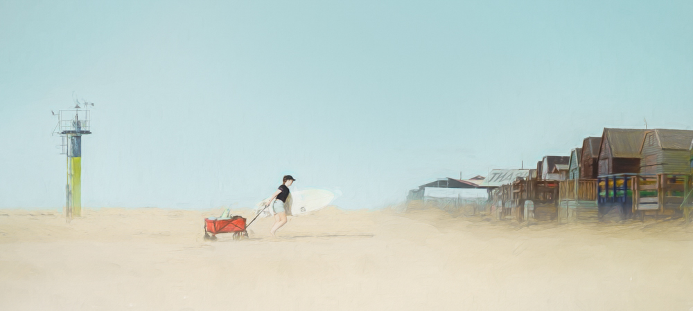
Here is a less panoramic version. You could trim more of the left side off. |
Jan 22nd |
 |
| 54 |
Jan 23 |
Comment |
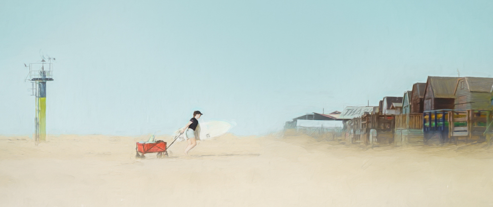
The colors, textures and general feel of the composited elements are great, IMO. The placement of the tower is the issue as Alan and Peggy observed. Balancing 3 separate elements smoothly in our monthly images is an issue I can easily relate to. I haven't successfully done it yet. A composite is better without a third element that doesn't work compositionally or fit in but we are supposed to have at least 3 composited elements for our assignment. We have to change the relationship between the 3 elements. Like Alan, I am big on cropping. A different crop can change the mutual perspective of the elements without removing an element. For example, cropping off some of the top of the picture renders a panorama format. That magnifies the composited elements. Cropping off a little of the left side where the tower is minimizes it's presence, making it more a bookend than a distraction from the eponymous main subject. (The tower does actually match the other elements stylistically and contextually when it is integrated). The lady and the wagon become more prominent, and the surfboard more visible (although light on light may still be an issue), to Aavo's point. The lady and wagon are already on a lower plane than the buildings' foundations but now we actually see it with the magnification. We don't necessarily need to exaggerate it further. With the crop the buildings and the tower serve to frame the lady and the wagon, instead of having 3 stand-alone elements. An interesting feature of your image is the decreasing width of elements from right to left. The buildings are widest but on the right end, then the lady and wagon next widest but in the center of our attention, and finally the pesky tower is the narrowest, on the left side. If you don't like the panorama format you can crop it differently to diminish the effect. |
Jan 22nd |
 |
| 54 |
Jan 23 |
Comment |
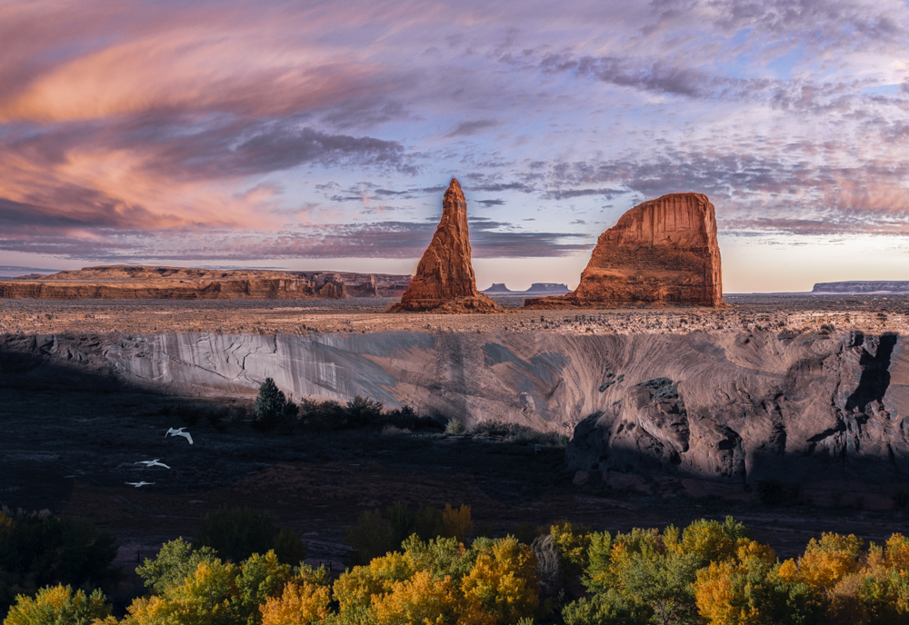
I like this image and I agree with other comments on its merits. I appreciate the subtle rendering of the milky way. The bottom right dark reflection anchors the image. One thing that puzzles me is the straight diagonal plane of the reflection of the trees. Although it could exist in nature it seems to me at odds with the plane of the other landscape elements. I suppose that is intentional/ that's just my different way of seeing.
|
Jan 22nd |
| 54 |
Jan 23 |
Comment |
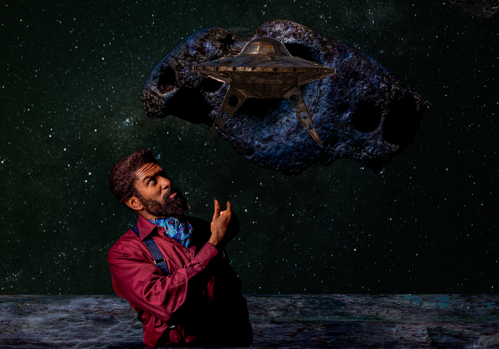
I'm distracted by the artefacts between the little and index fingers and to a lesser extent at the end of the thumb because of the strange shape. The general effect is nicer without them IMO. |
Jan 22nd |
| 54 |
Jan 23 |
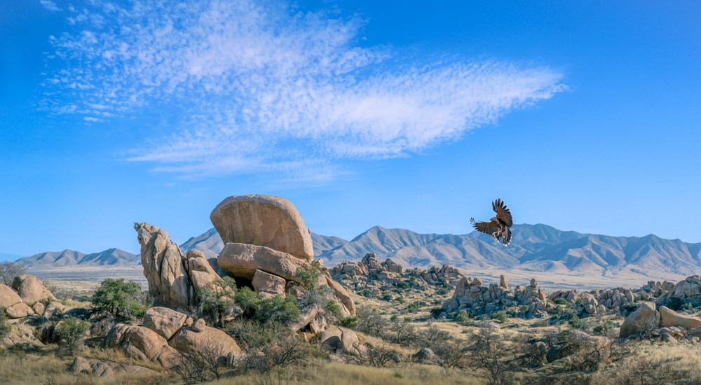
Reply |
Points well taken. These changes make the hawk the main subject and perhaps that is better. The resulting image definitely works and appears natural. Initially I was just balancing a dramatic sky and the landscape as the main subjects - while shooting with accomplished landscape photographers I gathered that skies can definitely be the subject, or a competing subject, and this sky was contemporary with that photoshoot/ that assumption may not be what they actually think - so here the hawk was more of an ornament. I was staging the sky and the landscape essentially, so I deliberately made the placement of the hawk less prominent. It probably makes more sense to viewers with a living thing as the subject. On the other hand, the hawk is very small compared to the other 2 elements. To that effect it had occurred to me to call the image something like "Hawk, Sky, Landscape" sort of like rock, paper scissors, in terms of what dominates. See... I'm debating it out loud. In the end I think you are right. It's a more natural and subtle blend. I still like my original picture; my personal taste is more
dramatic and edgy.
|
Jan 22nd |
| 54 |
Jan 23 |
Reply |
See my reply to Peggy below since it cumulates both of your changes. |
Jan 22nd |
| 54 |
Jan 23 |
Comment |
Aavo, Very cool. Happy New Year! Between the original images and the final it's pixelated. Maybe intentional. |
Jan 3rd |
8 comments - 2 replies for Group 54
|
8 comments - 2 replies Total
|