|
| Group |
Round |
C/R |
Comment |
Date |
Image |
| 54 |
Dec 22 |
Reply |
Thank you. I'm starting to see the light! It explains at least partly why the leaves didn't sit well with the rest. This is a really essential insight. Maybe the leaves don't need to be sacrificed after all. I will have to reproduce this. The detailed how-to is much appreciated. / I need to re-edit the birds, too. The intent was for them to be realistic, like the original picture, but they got washed out in my processing of the global image. Pelicans are sort of like miniature pterodactyls. They were the next best thing. I thought they matched the mood of the background. |
Dec 13th |
| 54 |
Dec 22 |
Comment |
Peggy, everyone, I'm so glad I joined this group. I will not have much time until sometime next week to follow up on all of your suggestions. I'm still very slow. I tried fixing the image as per Kirsti's example and realized that saving multiple layer tiffs instead of psd is not optimal for quick modifications. I need to start over and pay more attention to traceability going forward. I'll get back to you when I have new images from your suggestions. |
Dec 13th |
| 54 |
Dec 22 |
Reply |
Aavo, Yes indeed, Arizona and Utah are great places for landscape photography. Yet I did not shoot landscapes seriously until this year, and that was thanks to the mentoring of club members. I'm just beginning to grapple with the perils of parallax misalignment and polarizer sky.
|
Dec 12th |
| 54 |
Dec 22 |
Reply |
Yes, the birds were part of the quota. I will try what you say. |
Dec 12th |
| 54 |
Dec 22 |
Comment |
Aavo, I really like the original image of the couple. The colors all work in the composite. The façade is very dominating however. I believe I see why you duplicated the "no parking" sign next to the couple, since they are blocking the garage. It might work better though - visually - without the sign next to the couple, IMO. Cropping the top of the picture a little, although a sacrifice of part of the transom and windows, could potentially concentrate the viewers attention more toward the storyline of the people in the image, away from the façade. |
Dec 12th |
| 54 |
Dec 22 |
Reply |
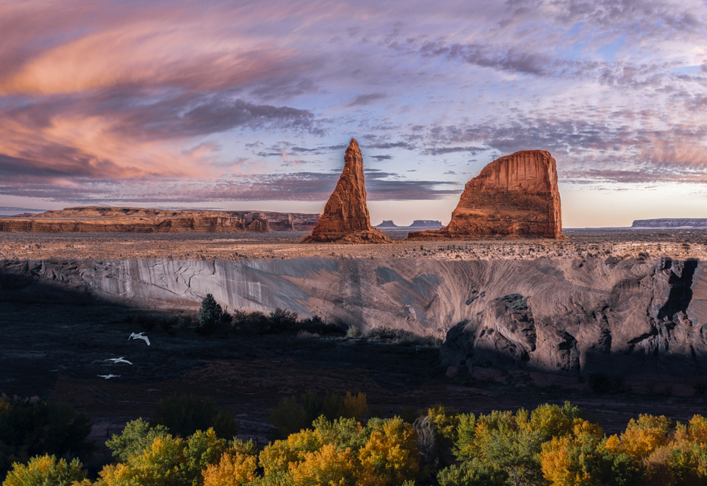
Absolutely! I was rushed and didn't do the top of the plateau. I saw it afterwards. I like your version a lot! I might keep the diagonal line of the shadows however. I'll work on it later tonight. Alan, Brad didn't actually suggest cutting anything explicitly in this text trail. That was Kirsti and Aavo, and me based indirectly on Brad's comment: "The hardest part is letting go of what is for what it will become". I figured he meant letting go of elements we are attached to in the image to make the image better. And I did like the autumn leaves. The image advanced by Kirsti along these lines is much better. The rock formation is called Whale Rock, BTW. Alan, I will try another version without the rock formation. |
Dec 12th |
| 54 |
Dec 22 |
Comment |
You've got a good solid background and balance in all respects. Simple and effective. |
Dec 12th |
| 54 |
Dec 22 |
Comment |
I can't add to any of the above. I like the texture and lighting of the grass under the sheep. I'm guessing the cabin was a necessity to respect the rules. |
Dec 12th |
| 54 |
Dec 22 |
Comment |
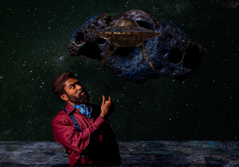
My primary objective in joining the group was in fact to get proficient in Photoshop and less or not at all about the compositing idiom or winning in the creative category. All perfectly valid objectives that I'm open to potentially. I will go with the flow and assimilate what I can. Tech skills are already progressing as a result of scrambling to get an image in. I'm thrilled that it's not a debacle and I'm still here to composite another day! Am I happy with this particular image? It's a start. I like color and texture. I sometimes try something counter-intuitive because I must be doing something wrong that my intuition is not picking up. It doesn't tell a story per se. More of a mood. It might be better without the leaves or slightly crushed and drawn out. It's as you say an experiment, not a final achievement. To be clear I would not present this at my photo club just yet. I'm not sure if it's a good image or path yet. Don't be afraid to critique my images based on your way of seeing things. |
Dec 9th |
| 54 |
Dec 22 |
Comment |
I agree with Brad and Kirsti. Very nice color palette and soft complementary textures from the original beach background. Matching the wildlife was probably hard. Did you do anything special to get them to match the tones of the beach and waves? I'm guessing you used the color picker off the waves and beach. Excuse my asking. |
Dec 9th |
| 54 |
Dec 22 |
Comment |
Hi Alan,
Newbie taking a stab at this. I see how the subjects balance out geometrically. I'm not sure a horizon line is better - all things being subjective.
Maybe a minor enrichment of the background, even some sort of a vignette or texture would counter the impression I have of empty space around the subjects. That's just me.
BTW, really impressed by what you did last month.
|
Dec 9th |
| 54 |
Dec 22 |
Reply |
Brad, I totally agree! I'm not improving on the originals. The sum is not greater than the parts. But I do want to find ways to stitch natural elements together ultimately without it being too geometrical. It could have been a lot worse. That is why I chose relatively good images as a compensation. I'm not yet comfortable with the idiom either. There are a lot of aspects of retouching in which I am not fully proficient, like.. gradients, dodge and burn and especially for compositing, creating shadows. Any further technical advice or aesthetic insight on improving this image is welcome, particularly in view of improving the following month images. |
Dec 9th |
| 54 |
Dec 22 |
Comment |
Hi Kirsti,
This makes me think of little red riding hood, BTW.
If it were my image I might consider cropping out some of the ice to the right of the wolf to balance the viewer's focus. Then again I see how geometrically the white block of ice with black on the outside mirrors the young woman on the other side of the image who has some black on the outside; vaguely similar shapes and light-darkness. But the block of ice is not a subject so maybe it shouldn't receive equal attention to the girl. I agree that the revisions posted make the image work even better. Very effective. |
Dec 9th |
8 comments - 5 replies for Group 54
|
8 comments - 5 replies Total
|