|
| Group |
Round |
C/R |
Comment |
Date |
Image |
| 12 |
Feb 23 |
Reply |
I love the edits - thank you! Yes, I agree, the simple version of the branches on top is best. I had already cropped in for the original, so I will have to play around to see if there's enough detail left after I crop some more -- I'll use Topaz Photo to upsize it. Thanks. :) |
Feb 19th |
| 12 |
Feb 23 |
Reply |
It's a beautiful photo. Thanks for your comment! |
Feb 19th |
| 12 |
Feb 23 |
Reply |
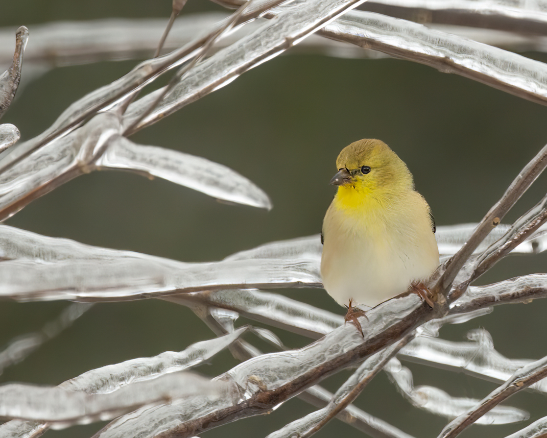
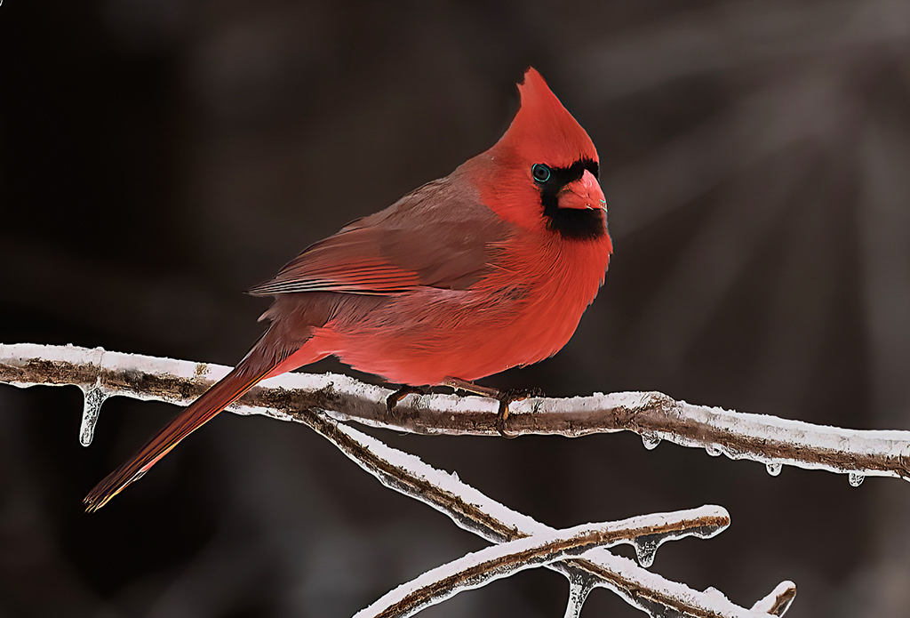
My thoughts are little hard to explain, but thanks for asking. The red seems a little over-saturated, and - what I didn't think of until now - it seems a bit strange to me that his crown is darker than his belly. I've tried my hand at editing it: I've desaturated a little bit, changed the hue to add in a little orange, brightened up his head, and darkened everything (including the branches) from the neck down. Of course, everything is a matter of taste. |
Feb 19th |
 |
| 12 |
Feb 23 |
Comment |
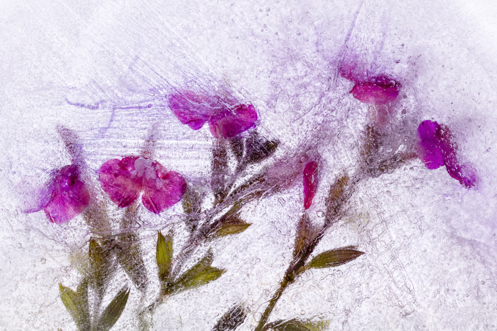
I love the edited version of the photo with the textured background - it makes the difference between a documentary and art that you would hang on a wall. The subject, composition, and crop are spot on. The multicolored feathers in the bottom part of the photo are a beautiful detail. I do see the detail in the original of the feathers on the face, and would like to see more of it in the final version - perhaps a very light use of the burn tool in that area would help? |
Feb 18th |
| 12 |
Feb 23 |
Comment |
Thanks everyone for the comments! I've played around a little bit and here's the updated version. A few of you pointed out (no pun intended) the pointy stick that was aimed at the bird, and then that was all I could see. So here are the changes I made:
- Removed the icy sticks at the top. Just taking out the pointy one looked a little weird
- Brightened the bird
- slightly darkened everything but the bird
- Sharpened up the bird. There was no detail I could recover in the stomach area
- Changed the crop since removing the ice on top left too much background
|
Feb 18th |
 |
| 12 |
Feb 23 |
Reply |
I appreciate the time you took to work with this photo! I've been working on a few similar edits, but didn't think to darken the ice. Thanks! |
Feb 18th |
| 12 |
Feb 23 |
Comment |
Very nice image, and great composition / crop. He's looking a little neon to me. |
Feb 18th |
| 12 |
Feb 23 |
Comment |
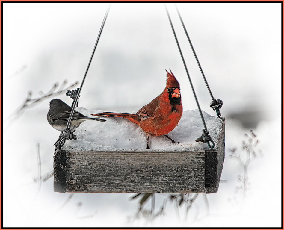
Love the cardinal with his bright pop of color. I agree with the others who say that the junco doesn't add anything to the picture, but of course that's just an opinion. I like the use of the white vignette. Did you try desaturizing the green wire? |
Feb 18th |
 |
| 12 |
Feb 23 |
Comment |
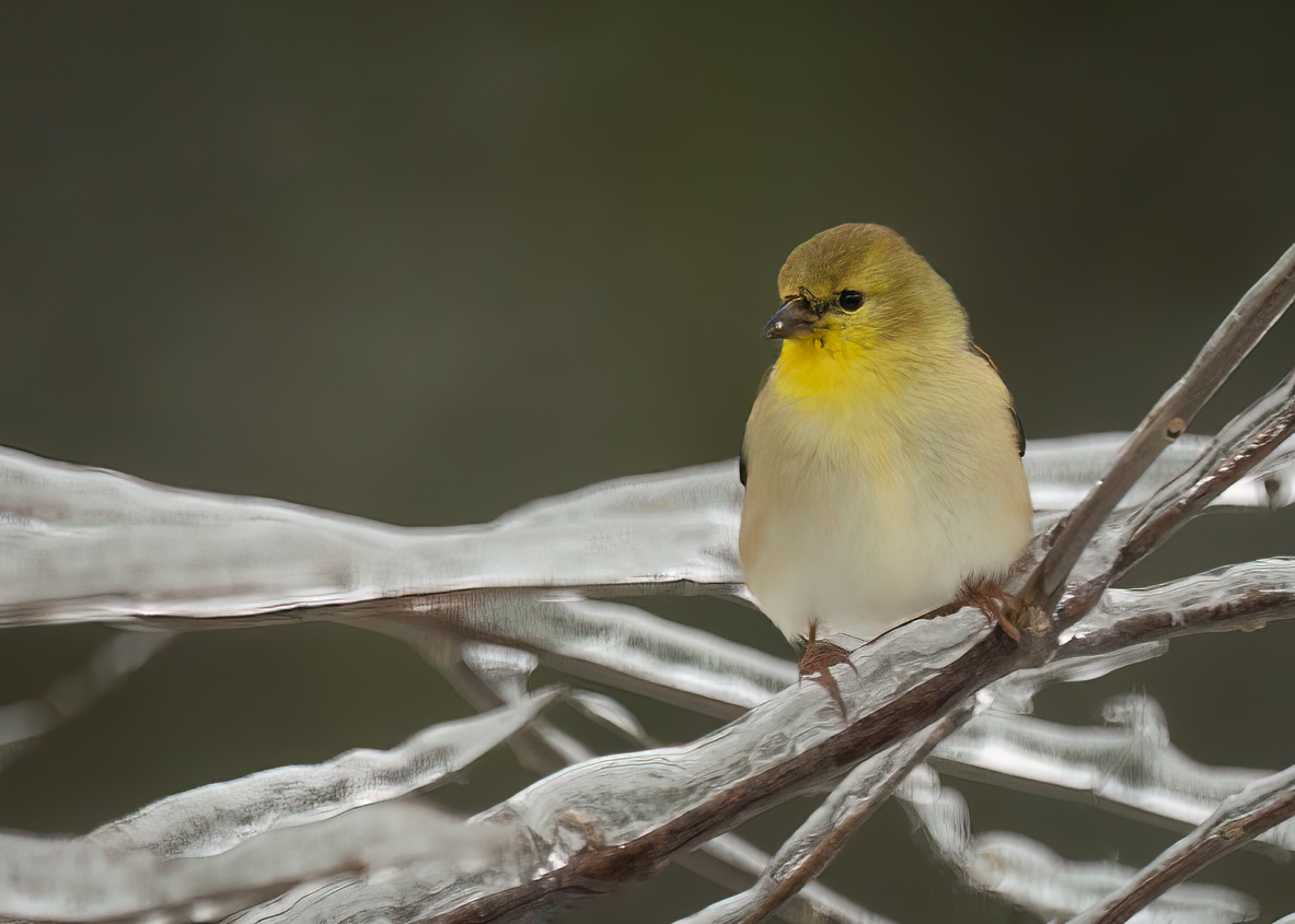
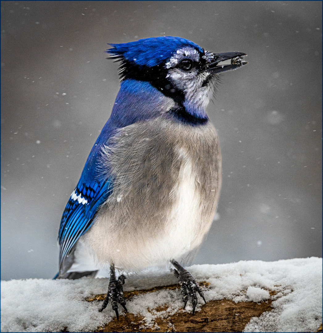
Beautiful photo! And great detail, including the berry and the snow around his eye. I like the original crop because the white detail on his wing is a little too close to the edge in the modified crop. I would like to see it brightened up a bit for two reasons - one, to brighten the catch light in his eye, and two, to even out the white levels between the feathers on his front, the feathers on his wing, and the snow he's standing on (i.e. the snow, the blue feathers, and his eyes look dark to me). |
Feb 18th |
 |
| 12 |
Feb 23 |
Comment |
I like the cold, gray environment with the little birds - even the little bit of brown shows up as color in this scene. Nice use of threes - three birds in a triangle. The left and top birds are nice and clear, but the bird at the bottom right is harder to see (not that you could have asked him to get up and move). A good match for the subject. |
Feb 18th |
6 comments - 4 replies for Group 12
|
6 comments - 4 replies Total
|