|
| Group |
Round |
C/R |
Comment |
Date |
Image |
| 12 |
Jan 23 |
Reply |
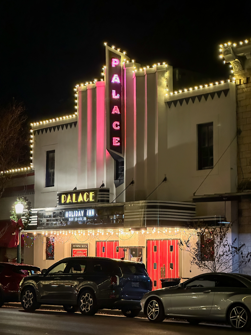
Thanks Lee Ann and everyone for the kind comments, and thanks Carole for the alternate crop. I think Lee Ann has nailed it - it's about the purpose of the photo.
There are times when I enjoy photos *because* they contain a contemporary car - they give a sense of time in addition to place. For example, we have photos of my grandfather with his Model T. Even if he some random guy, I like the feelings the car conveys. (This also goes for the photo of my childhood home with my Dad's big ol' Caddie in the driveway. ;) ) In this case, the Art Deco style of the signage gives away the age of the building, but the cars give away the age of the photo.
|
Jan 18th |
| 12 |
Jan 23 |
Comment |
I was suprised, too, that this wasn't a picture of a bench! I doubt many people would see this as you have. For a change, I may actually like the B&W better. Either way, I love a good minimalist photo with lots of negative space. |
Jan 14th |
| 12 |
Jan 23 |
Comment |
Still a fan of the color version - especially with the blue sky reflected in the foreground. I love your POV, with the leading lines in front, the trees and Oculus in the middle, and the buildings in the back. |
Jan 14th |
| 12 |
Jan 23 |
Comment |
I agree with what the others have said. Architecture doesn't just mean shiny buildings designed by high end consulting firms. This building has a lot of character, and you have brought it out with your post-processing. I wonder what it's actually used for now? |
Jan 14th |
| 12 |
Jan 23 |
Comment |
I love that you chose to "look up" for this assignment. It's something that most people rarely think of, but there are so many interesting things that you can find! The height and the ability to see out of the windows gives me the feeling of being in a vast space. I prefer the color version, but I usually do. ;) |
Jan 14th |
| 12 |
Jan 23 |
Comment |
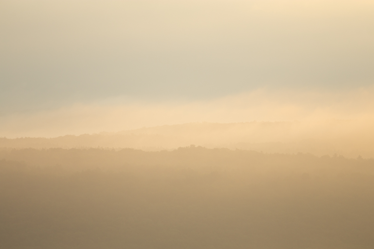
That late afternoon light is beautiful - it really enhances the strong colors and contrast. You've managed to minimize the strong shadows, too. To me, the red, white, and blue evokes a picture of Americana.
Regarding the crop: I prefer the no-tree crop although it seems to throw the picture a bit off balance. It's one of those situations where you could go crazy trying to get a crop that appeals to everyone.
|
Jan 14th |
| 12 |
Jan 23 |
Comment |
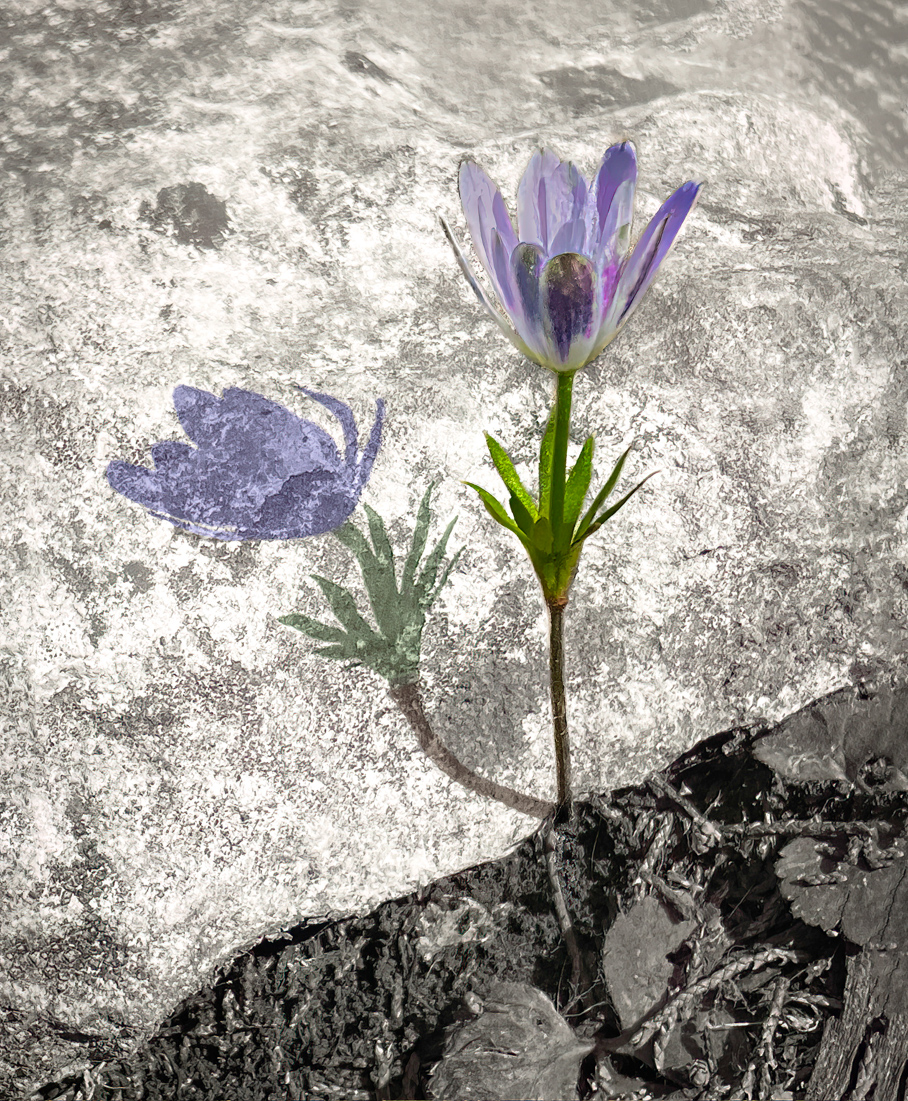
This is both a visually interesting and - of course - thought provoking monument. I appreciate the extra information for context (especially the sunbeam). I like the way that you have captured it, with the flag in the background and surrounded by life. |
Jan 14th |
6 comments - 1 reply for Group 12
|
6 comments - 1 reply Total
|