|
| Group |
Round |
C/R |
Comment |
Date |
Image |
| 11 |
Sep 24 |
Reply |
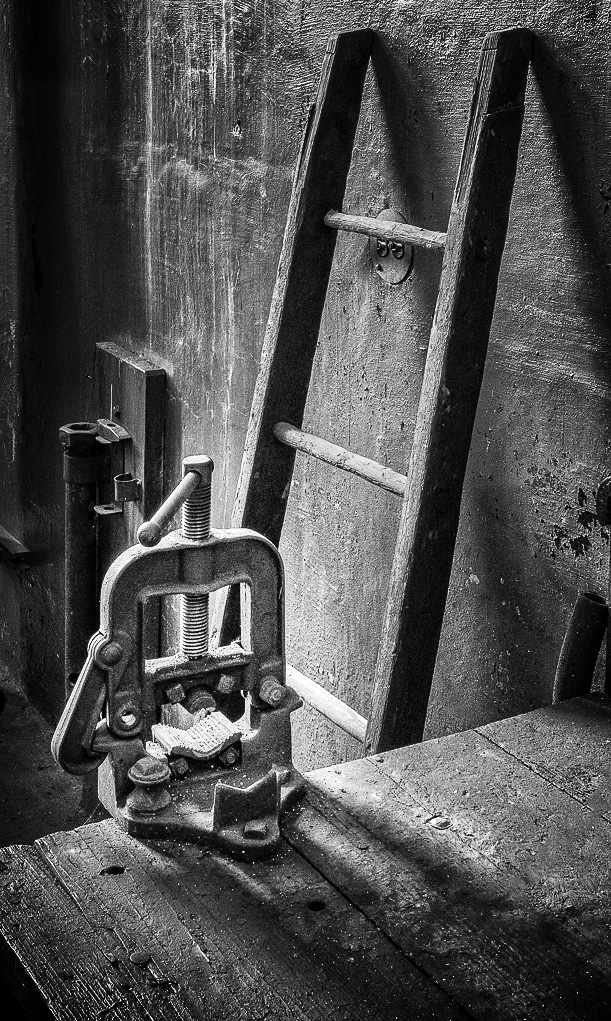
p.s. I forgot to mention how I love the textures you got out of the wood and the walls. They do look like items from the past! |
Sep 22nd |
| 11 |
Sep 24 |
Comment |
Henry - I like your image. It's fun to find these antiques, but hard to get just the right composition you might want. I thought the clamp (?) and the ladder were the "stars" of the image. So, I removed the cord and cropped out the horizontal tools. Using curves, I gave it a more dramatic look. It's another way of looking at your image. It's just under 400pixels, so might not look good. |
Sep 22nd |
 |
| 11 |
Sep 24 |
Comment |
Wonderful natural wildlife scene. So peaceful and serene. Love the gentle curve the two animals make. I have no suggestions for the conversion other than I might have lightened, slightly, the muzzle of the mother. |
Sep 22nd |
| 11 |
Sep 24 |
Comment |
Your edit looks 100% better that the original - much brighter,
sharper and straighter. What a difference! I wonder if the leading line of the water to the weeds, to the snow cap and then the section of the bridge behind it with the decay could be showcased more by slightly darkening the rest of the image. I believe it would give our eye a definite path to travel. |
Sep 22nd |
| 11 |
Sep 24 |
Comment |
What a great character study. I do wish there were more room above his head and on the right. However, I agree about the skulls. Generative fill could remove them so a little more cap could be shown. He has remarkable eyes. In the original, I thought he was a biker because of the suntan on his face that doesn't reach around his eyes. Have you considered darkening slightly where it's darker in the original and creating more light or contrast to bring out his eyes even more? Great job on the grittiness on the face and detail in the beard! |
Sep 22nd |
| 11 |
Sep 24 |
Comment |
Peter, This is a vibrant and sharp image. Nice job on correcting the wide angle. The street has a nice leading line. It's all interesting, but I'm not sure what, exactly, I should focus on. If you have chosen the group of houses at the end of the street, perhaps the houses closest to the viewer should be toned down. Otherwise, I really like your image. |
Sep 22nd |
5 comments - 1 reply for Group 11
|
5 comments - 1 reply Total
|