|
| Group |
Round |
C/R |
Comment |
Date |
Image |
| 11 |
Aug 24 |
Comment |
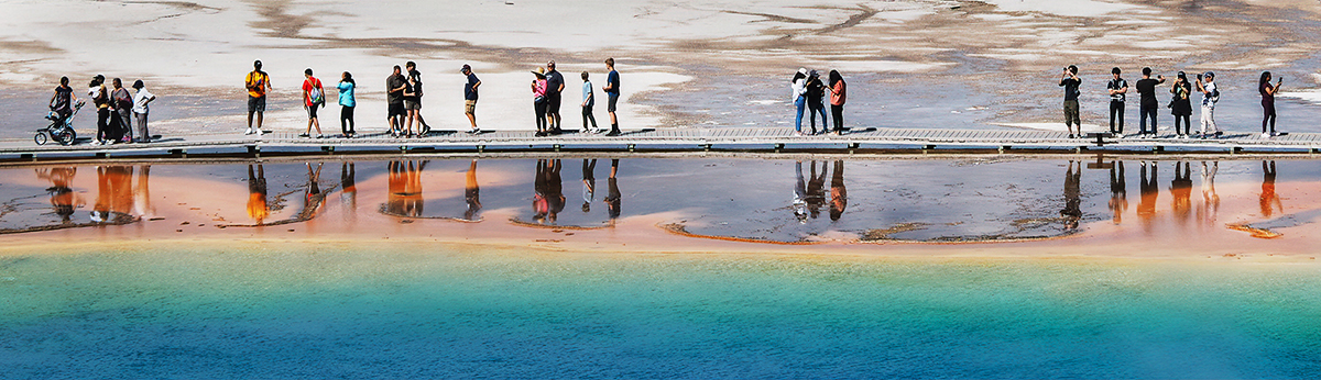
It's like looking in an ice cave with those beautifully textured walls. Nice leading line from the people mover. I love all the different textures of the walls and floor. Much better in B&W. I do love the colors and sheen of the right side wall in the original. Maybe a big crop could result in a cool abstract??? |
Aug 31st |
| 11 |
Aug 24 |
Reply |
Yes, Christian, I can see that they should be lightened. Thanks for the suggestion. |
Aug 31st |
| 11 |
Aug 24 |
Comment |
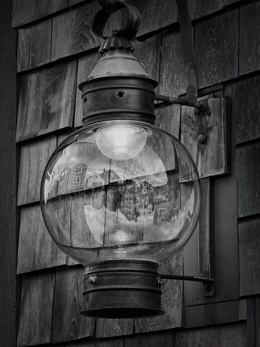
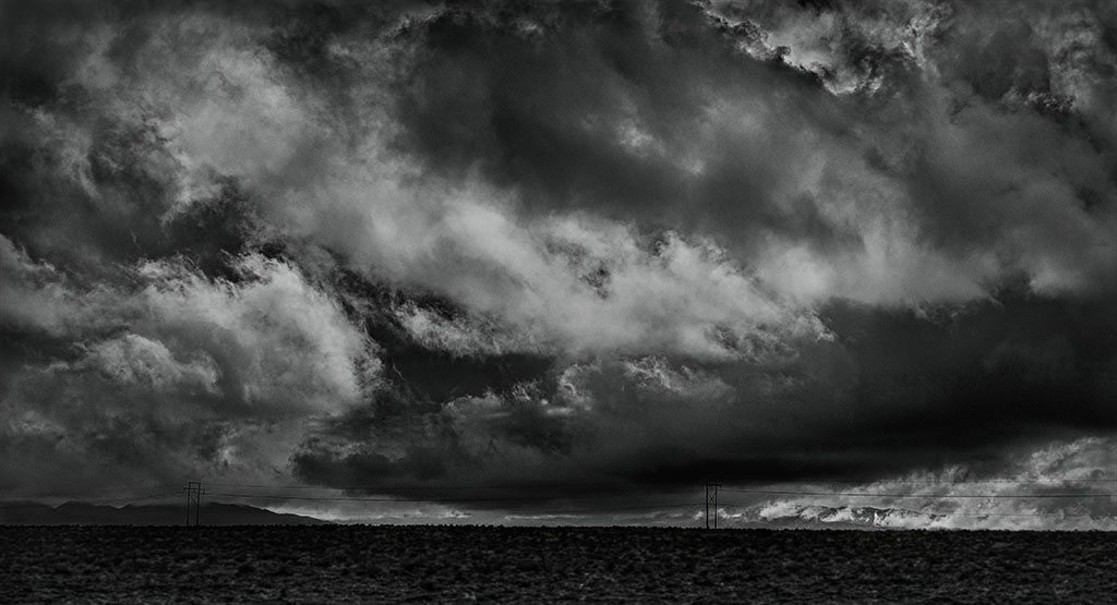
I like the subject and know you were going for a fine art look, but I agree with Jim and Henry that the image is too light. Did you use the Fine Art filter in Silver Efex? Also, it's hard to see the dome. In my opinion, both reworks look better. One is dramatic and the other has a slight vintage look. |
Aug 16th |
| 11 |
Aug 24 |
Comment |
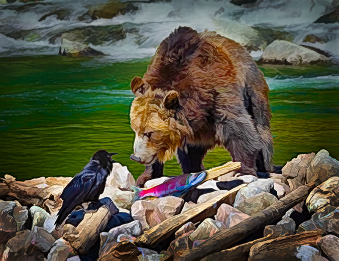
Peter, It's amazing how much detail you were able to get out of the very dark original. Do you think you could get more brightness in his eye? I would tone down the two bright areas in the dirt to his right so they don't compete with the rhino. Yes, this was more successful than the gorilla. |
Aug 16th |
| 11 |
Aug 24 |
Reply |
Thanks Henry. Yes, I will try printing it at some time. I have a really good printer that works well, but it's getting old. Epson 3880. It's great for B&W printing. |
Aug 15th |
| 11 |
Aug 24 |
Reply |
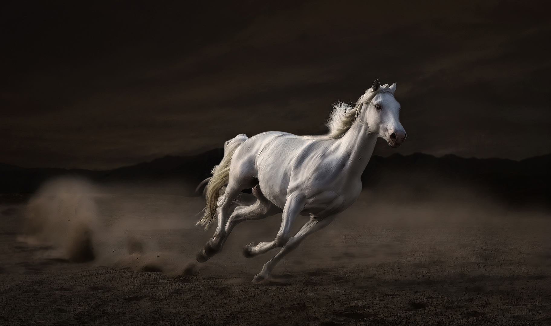
Thanks, Jim. I was concerned about the horse being so centered, but I had to show the kicked-up dust and dirt AND give him room to run on the right. |
Aug 15th |
3 comments - 3 replies for Group 11
|
3 comments - 3 replies Total
|