|
| Group |
Round |
C/R |
Comment |
Date |
Image |
| 11 |
Jul 24 |
Comment |
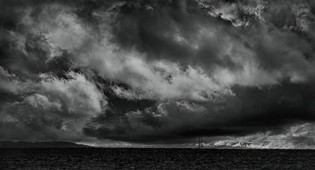
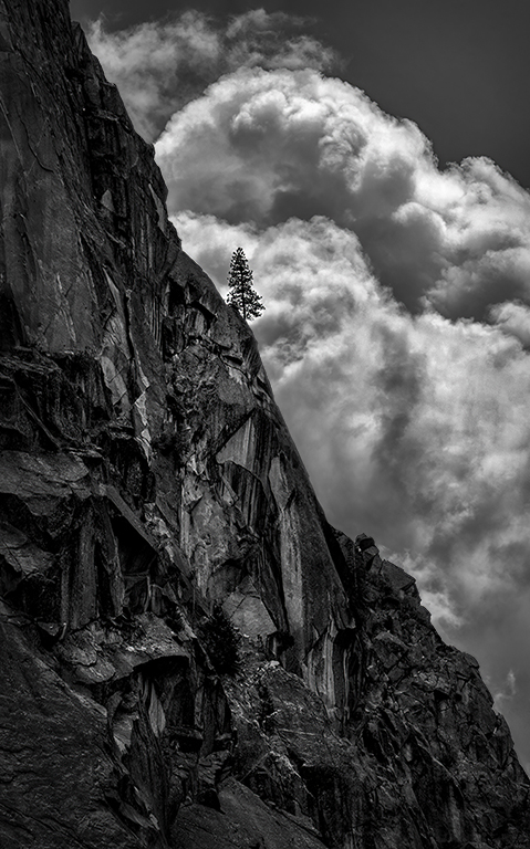
I love this kind of image - a leafless tree against the sky! The B&W conversion is great. I have to disagree about removing the foreground. Maybe a little blurring in the foreground? Maybe removing the trees in the background would simplify this image even more. For a graphic look, it might be worth a try to use a Sky Replacement with no clouds. That way, no cloud textures would be competing with the absolutely beautiful tiny twigs that make this picture! |
Jul 27th |
| 11 |
Jul 24 |
Comment |
Welcome, Peter 2! You are in a group of very helpful members. As for your picture - great job in catching him looking at the camera! Also, the image has interest as it shows him reviewing his notes - rather than posing for you. Since your Leica shoots in B&W, how do you normally process your images? |
Jul 27th |
| 11 |
Jul 24 |
Comment |
You caught the gorilla posing nicely for you. There's not much I can add to the comments already given. When an image doesn't quite make it, look at it with a very critical eye to see what did or did NOT work. The "hard" part is remembering this info! I did notice some magenta and purple colors in parts of its fur in the original image. Not sure why that would happen. |
Jul 27th |
| 11 |
Jul 24 |
Reply |
Thank you, Peter - I tried a landscape version, but there were too many distractions - people, boats, trees, bushes and logs. The vertical cut all those out to give the feeling of emptiness - end of fun on the lake in summer.
I don't know what you use for editing your photos, but I'm sure all of us in this group have at least one or two they could recommend. It DOES take time to learn. |
Jul 27th |
| 11 |
Jul 24 |
Reply |
Thanks, Henry - You noticed the painterly effect I used. As I explained to Jim, the original shot should have been used for the conversion and not the painterly one. |
Jul 27th |
| 11 |
Jul 24 |
Reply |
Jim - I really like your B&W version! I didn't mention that in the original color, I was going for a painterly effect, so an Orton effect was lightly used. I should have converted the original photo to B&W, and not the painterly one. |
Jul 27th |
| 11 |
Jul 24 |
Comment |
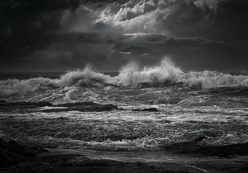
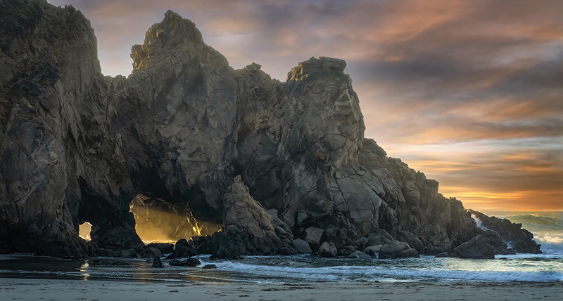
Big Sur! One of my absolute favorite places! Love the B&W version. The diagonal lines give energy to the image. It looks like the center of the top left corner was darkened some. I wonder if cloning from another area to get a bit of texture in there would work? Blown-out areas are tough to tame down! It's a beautiful image. |
Jul 13th |
| 11 |
Jul 24 |
Reply |
Thanks, Jim. I prefer the colored version.
Do you know how to use TK9 confidently? I've heard of Greg Benz, but not Lumenzia.
I like to finish editing AND go for near perfection!!! ;-) |
Jul 13th |
| 11 |
Jul 24 |
Reply |
Thanks, Christian. I didn't realize it ended up at 205k!!! Yes, the color version did well in competition but no ribbon at the Fair.
As far as the TK plug-ins, they are confusing to use. I think Dave Kelley has one or more (free) tutorials on using some features. I haven't decided about the the Magic Mixer. I DO love B&W. |
Jul 13th |
4 comments - 5 replies for Group 11
|
4 comments - 5 replies Total
|