|
| Group |
Round |
C/R |
Comment |
Date |
Image |
| 11 |
Jan 24 |
Comment |
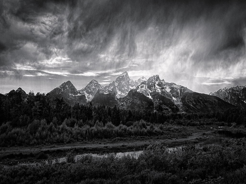
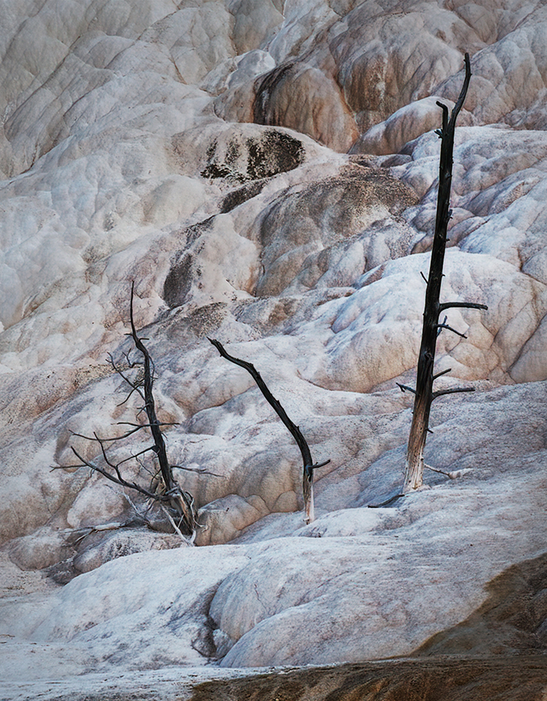
Nice image and conversion. I can feel the cold! I agree with Jim's eliminating the branches. Maybe the highlights on the left edge could be toned down some. Otherwise, I have no additional comments. |
Jan 20th |
| 11 |
Jan 24 |
Comment |
What a sweet face! There's good sharpness on the fur and face, with a softening of the background to make the seal stand out. Highlights are handled well. There are a couple of white things sticking out below the neck. Some kind of seagrass?
Good catch! |
Jan 20th |
| 11 |
Jan 24 |
Comment |
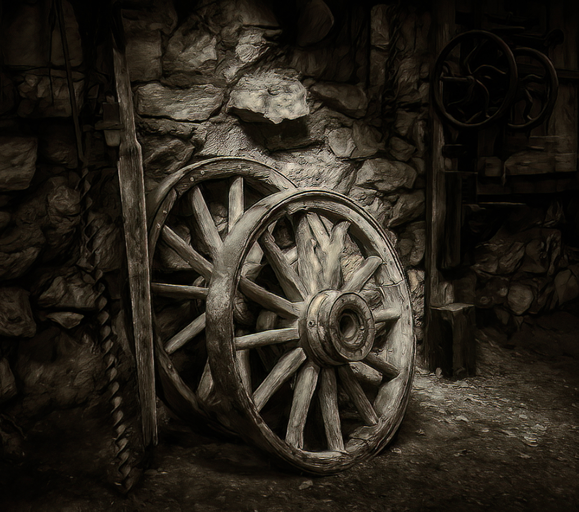
Texture, texture, texture! Beautiful conversion. Glad you moved the container. I thought eliminating the container would be better (as a judge might say), but now I think it adds interest. |
Jan 20th |
3 comments - 0 replies for Group 11
|
| 16 |
Jan 24 |
Comment |
Love the leading line of the fence. I think if the fence at the top and house under the tower could be brightened more it would result in a good balance to the tower. You could try Generative Fill to eliminate the half-house on the right edge. |
Jan 18th |
| 16 |
Jan 24 |
Comment |
What an eye-catching image! Love the conversion to B/W! Adding an eye to the "bird" was a good idea. I think the background sky could be toned down and the man brightened or whitened more so he stands out even more. Maybe adding more contrast to him?
What a fun shot to catch. Good job! |
Jan 18th |
| 16 |
Jan 24 |
Comment |
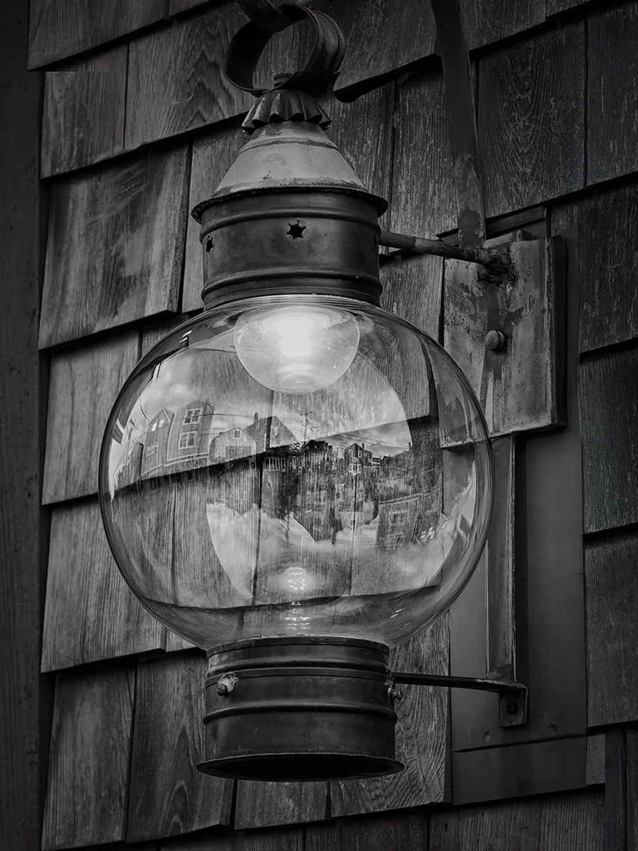
The clock has beautiful details in the post. Adding brightness to the clock face and sharpening to the post would really make this image pop. |
Jan 18th |
| 16 |
Jan 24 |
Comment |
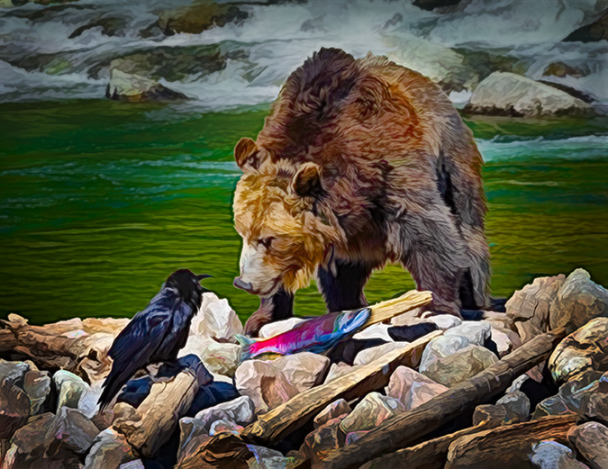
For those of us who haven't been to India or Indonesia, you bring wonderful cultural stories to us. As I see it, the story is in the 3 main figures which are in a nice diagonal line. Maybe all the background could be subdued, leaving the 3 main figures in the "spotlight?" Also, give a little more bottom room to the low-left figure. Good job in processing from the original. |
Jan 18th |
| 16 |
Jan 24 |
Reply |
Walter, Should I show more sky? I didn't want the log in the image, so that's why I ended up this crop. |
Jan 12th |
| 16 |
Jan 24 |
Comment |
Oh, WOW! You've done a beautiful job on my image! I did try giving it pop, but thought the background and foreground would be fighting each other. I agree with darkening the sky to balance with the foreground. After seeing your version, mine is really BLAH! Thanks much, Terry! p.s. Where do you live where it's so green? |
Jan 11th |
5 comments - 1 reply for Group 16
|
8 comments - 1 reply Total
|