|
| Group |
Round |
C/R |
Comment |
Date |
Image |
| 6 |
Sep 23 |
Comment |
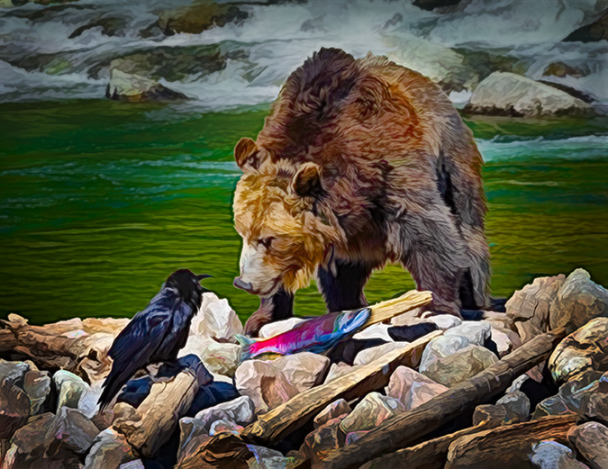
Hello Doris - I'm in Groups 16 and 11. One of my images is also in the Showcase, but I was blown away by your image of the garlic and garlic press! It has WOW and impact. Have you won awards with it? |
Sep 15th |
1 comment - 0 replies for Group 6
|
| 11 |
Sep 23 |
Comment |
I really like your new version. It looks less busy and brings more focus to the building. |
Sep 24th |
| 11 |
Sep 23 |
Comment |
Your dahlia is gorgeous! The sharpness, tones and lighting are beautiful. I only have two comments. Compared to the flower petals, the stem looks flat. You might want to consider adding more contour or a bit of light on the right side to match with the direction on the original flower. Moving around the perfect petals of this flower I spotted the tiniest black dot on one petal on the left. Easy to remove, but not a deal breaker! I could see this on a wall. |
Sep 14th |
| 11 |
Sep 23 |
Comment |
This is a very striking image! I do agree with Jim's comments. It's a shame that tree is there. I wonder if Adobe's generative fill would work there? Nice details on the building especially since it was handheld in a moving vehicle. You transformed a plain snapshot into a beautiful image!
Before buying a mirrorless, my camera was a 7D. It's a great camera but got too heavy. |
Sep 14th |
| 11 |
Sep 23 |
Comment |
It's me again, Jim. One of my B&W images is featured for the month in the Home page. It's the last one. |
Sep 13th |
| 11 |
Sep 23 |
Comment |
I also thought the "buttermilk" clouds were a distraction, until I saw the leaf patterns in the foreground. They create a nice balance to the sky. Some images look good with wide-angle curves, but straightening this one was a good choice. It might have been nice to be able to read some of the closer inscriptions to add to the mood of the image. Nice image - I can almost feel the shade! |
Sep 13th |
| 11 |
Sep 23 |
Comment |
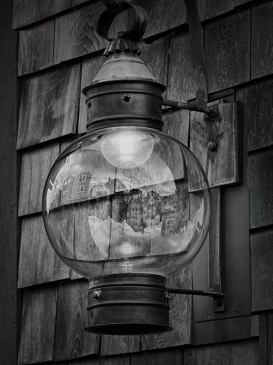
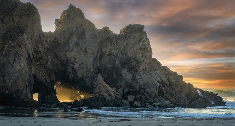
The arch acts as a lead-in line and frame to draw and keep your eye on the lit window. My only comment might be to add a bit more space to the top. Otherwise, it's a very good composition. |
Sep 13th |
| 11 |
Sep 23 |
Reply |
Thank you for the welcome, Henry. Lucky you to go there in winter! If weather permits, the morning skies reflected in water can be spectacular! I look forward to seeing your images. |
Sep 13th |
| 11 |
Sep 23 |
Reply |
Thanks Ian. I was trying to keep the tree reflections, but I DO like the letterbox cropping. It puts more focus on the mountain. |
Sep 13th |
| 11 |
Sep 23 |
Reply |
Thanks, Jim. I played a lot with contrast, but was concerned that the trees would get too dark. |
Sep 13th |
6 comments - 3 replies for Group 11
|
| 16 |
Sep 23 |
Comment |
Terry and others who commented on lightening the water, thanks for the suggestion. I DO like it better with lightening.
Thanks for all the positive (and improvement) comments. |
Sep 28th |
| 16 |
Sep 23 |
Comment |
Your edited version is well done without "overcooking" anything. I especially love how you treated its eye and head - very crisp. If you were to have a title indicating it's in a sanctuary, then leave the leg as it was. You did a really good job with the cloning. The sharpening is fine. |
Sep 15th |
| 16 |
Sep 23 |
Comment |
Nice story-telling shot. The monochrome background really helps the skier and flag stand out. If the skier is the main focus, you might consider toning down the red of the flag and brightening the skier more. I love the determination in his face. Good capture! |
Sep 15th |
| 16 |
Sep 23 |
Comment |
Nice capture. Your eye is lead to the Casino with the curve of the rock and ocean. If the Casino is your main subject, it wouldn't hurt the image to crop some off the bottom and top to emphasize the Casino. The bright green in the foreground tends to take my eye from the boats and building. Maybe a bit of desaturation would tone it down. |
Sep 15th |
| 16 |
Sep 23 |
Comment |
Joan, I love how you processed this image to give it a more painterly look. You brought out so many details that are lost in the original. I wonder if it could use a little overall contrast, or maybe more Vibrance or Saturation to put even more focus on the front car. |
Sep 15th |
| 16 |
Sep 23 |
Comment |
What a great action shot with a lot of energy! I like what Terry did because it allows more room for the planes to fly into. Yes, I agree, the clouds add a great deal of interest to the shot. |
Sep 15th |
| 16 |
Sep 23 |
Comment |
Beautiful dancer, beautiful shot! Great detail. I agree with the comment to darken the background even more. The colors in the costume are vibrant without being over-saturated. |
Sep 15th |
7 comments - 0 replies for Group 16
|
14 comments - 3 replies Total
|