|
| Group |
Round |
C/R |
Comment |
Date |
Image |
| 16 |
Dec 22 |
Comment |
Thanks, Terry. I like your version which brings out the tree and gives a totally different feel to the image. It looks like you cropped it more to bring the tree lower, too. I like both versions! |
Dec 28th |
| 16 |
Dec 22 |
Reply |
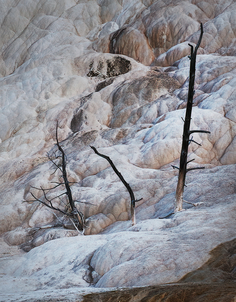
Hi Bogdan - I've already cropped left and top, but will try your suggestions to see if it might look better. |
Dec 24th |
| 16 |
Dec 22 |
Reply |
Thanks for your comments, Renee. It sounds like I succeeded in what I tried to show. |
Dec 19th |
| 16 |
Dec 22 |
Reply |
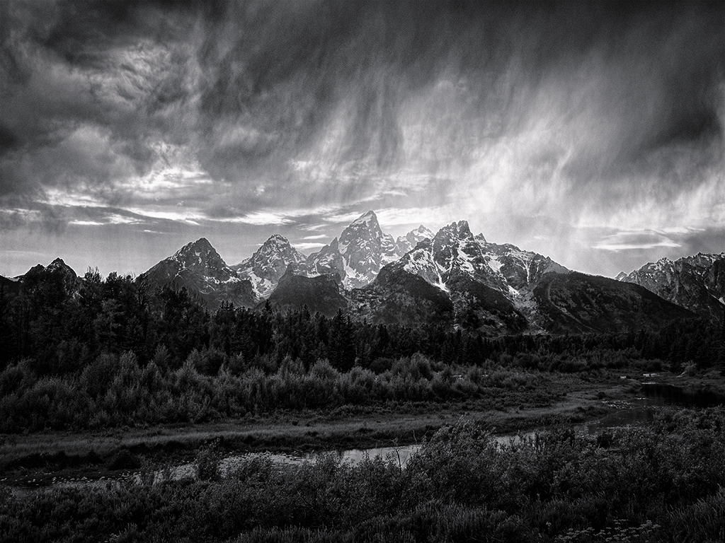
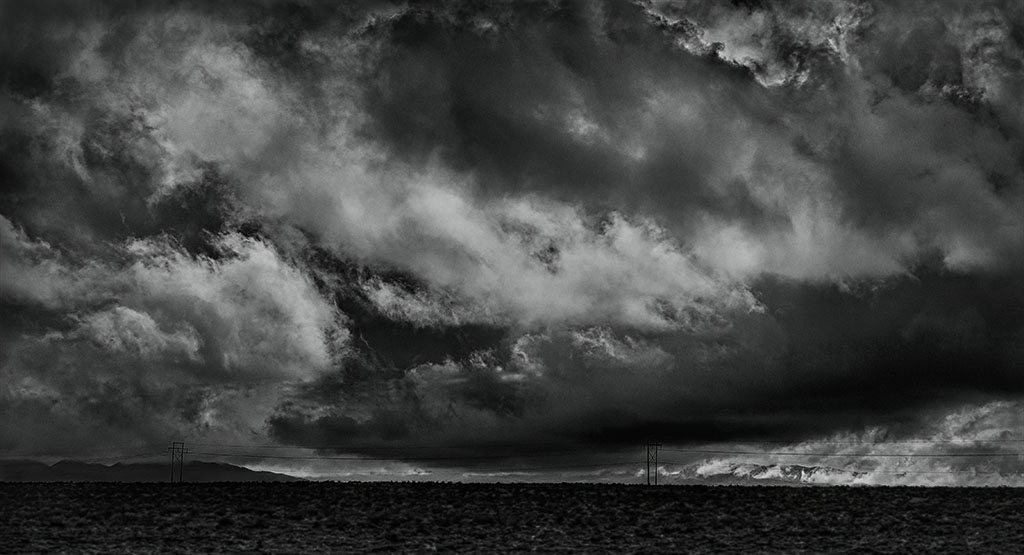
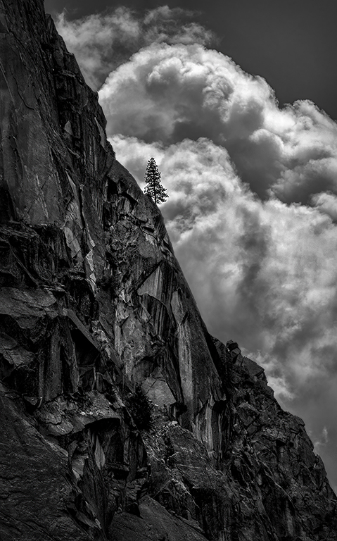
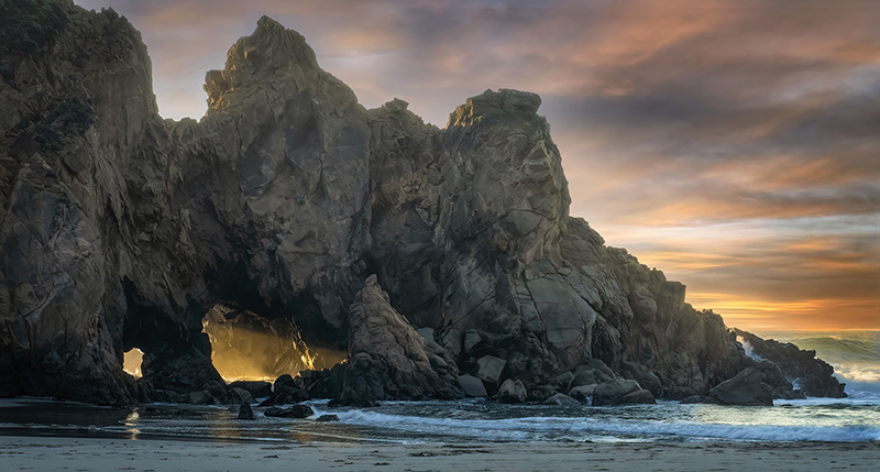
Thank you, Mohanan. I converted to B&W with NIK Silver Efex and used TK7 luminance to tone down cloud highlights and to bring out midtones in clouds and rock, and Curves to add contrast overall. |
Dec 16th |
| 16 |
Dec 22 |
Reply |
Thank you, Walter. I worked hard to bring out midtones. I hope my "story" showed the harsh elements in which life survives in Yosemite. |
Dec 13th |
| 16 |
Dec 22 |
Comment |
Fun image! When I look at the color image, my eye keeps jumping from the grandson to the colors in the wings. In the B&W version, my eyes stay mostly on the grandson. Very crisp and sharp all through the image. Glad he chose this pose rather than a face front with arms outstretched. Maybe he's a natural model! |
Dec 13th |
| 16 |
Dec 22 |
Comment |
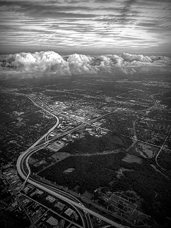
Beautiful image! Good composition. Lucky catch with the gray clouds and area of sunlight on the building. The stones on the building might look even better if they were toned down a bit to show a little more texture. |
Dec 13th |
| 16 |
Dec 22 |
Comment |
I'm always in awe of photographs of birds in flight that are not a blurry mess!� The eye and beak on this one is really sharp. The feathers on the belly look soft, but maybe that's the way they were. Nice angle for the composition. Sky crop was a good move. |
Dec 13th |
| 16 |
Dec 22 |
Comment |
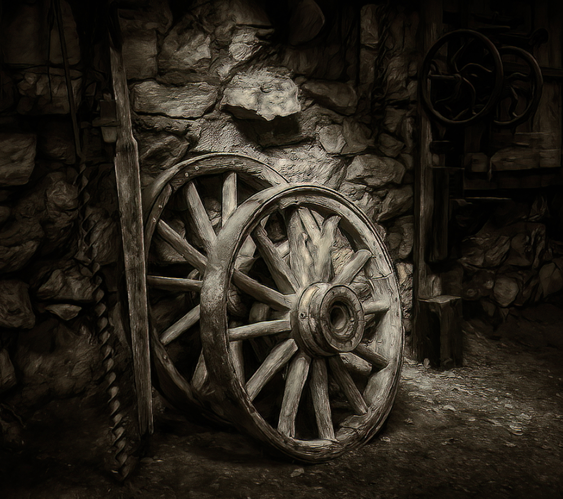
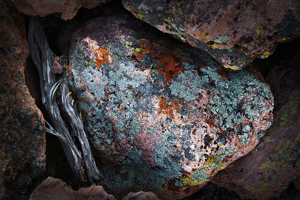
I love shots of old, rusting cars, trains, etc. You did well bringing out the texture and the colors look good. I think the image could use more contrast - especially between the chrome and the paint. |
Dec 13th |
| 16 |
Dec 22 |
Comment |
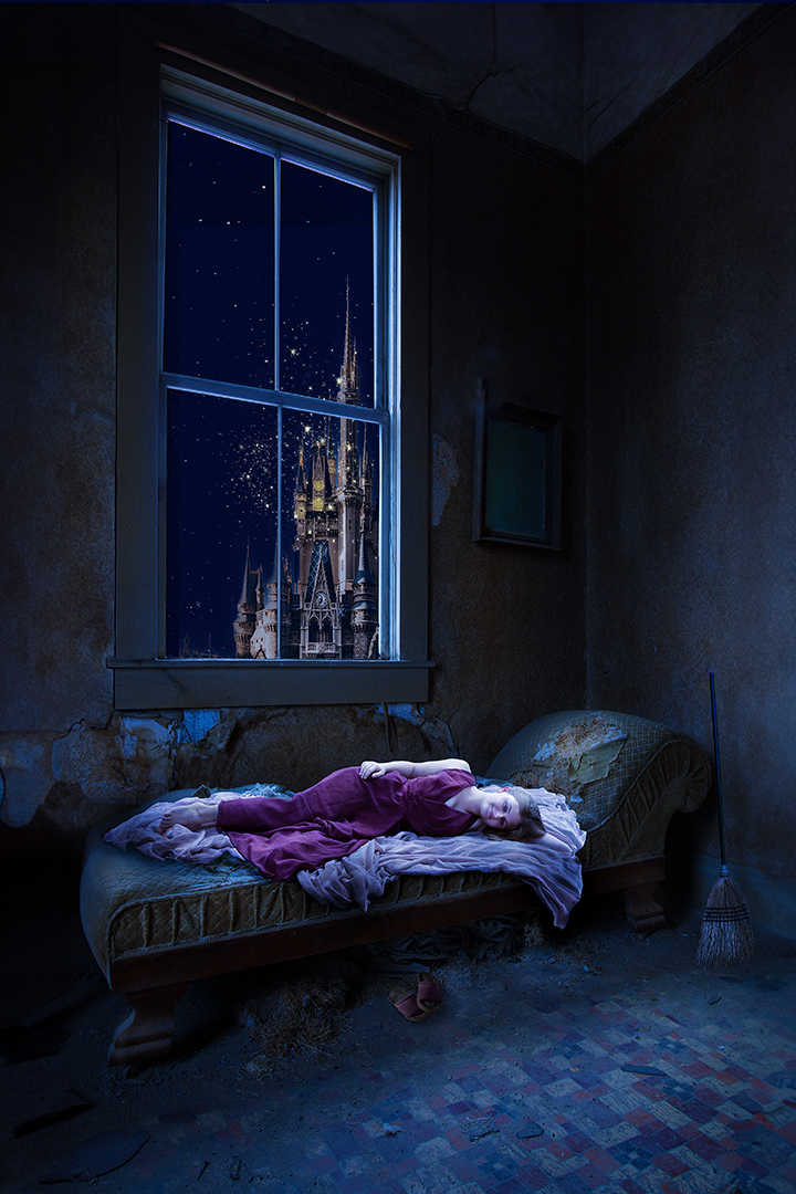
I, too, like what Mohanan has done. I also agree with removing the light streaks at the lower left. In an ideal world, it might have been fun to get the fireworks behind the tree. I can see this as a fun Christmas card to make! |
Dec 13th |
| 16 |
Dec 22 |
Comment |
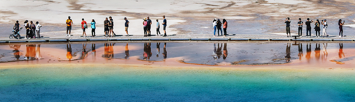
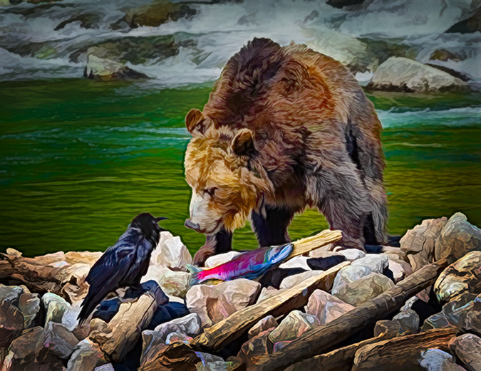
Very nice image. It gives a sense of place and story. The colors are brilliant but not overly saturated. You caught the lighting perfectly. |
Dec 13th |
7 comments - 4 replies for Group 16
|
7 comments - 4 replies Total
|