|
| Group |
Round |
C/R |
Comment |
Date |
Image |
| 3 |
Jun 23 |
Reply |
Thanks. Good point about Lynne's hair, I hadn't noticed that. And I need to look at alternative crops. |
Jun 21st |
| 3 |
Jun 23 |
Reply |
I was hoping she was using Windows. |
Jun 14th |
| 3 |
Jun 23 |
Reply |
Thanks LuAnne. I haven't done a lot of panning so was interested in the shutter speed. |
Jun 12th |
| 3 |
Jun 23 |
Reply |
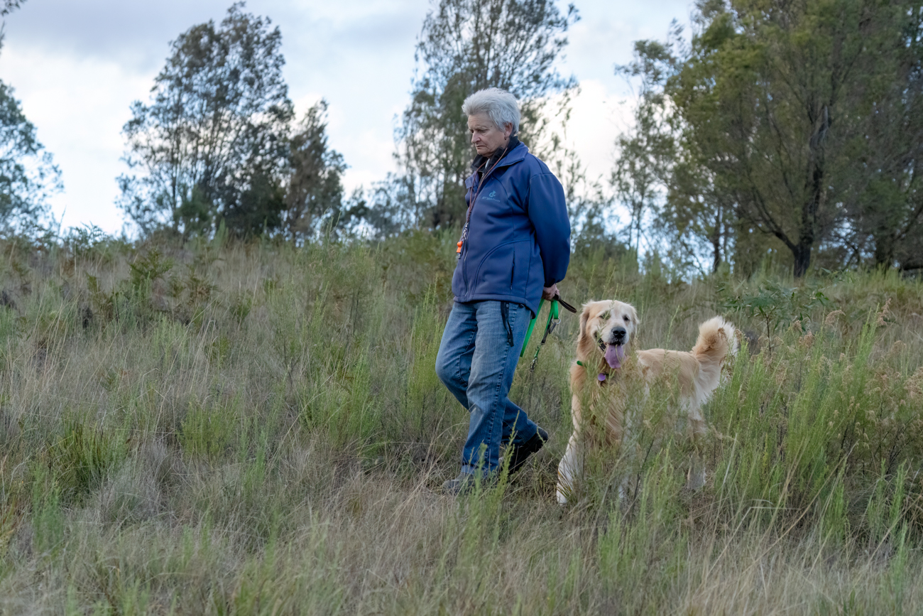
Thanks Luanne, I like the darkening of the background but prefer the original crop. And tracking!! I have trained 3 tracking champions including the Vizsla I have now and am just starting with my Cocker Spaniel puppy. The property in the image is great for tracking. |
Jun 12th |
| 3 |
Jun 23 |
Reply |
Thanks Joan, lightening the subject is worth trying, I did feel that the woman, at least, didn't stand out well, |
Jun 12th |
| 3 |
Jun 23 |
Reply |
Hi Luanne, I don't have a lot of thoughts about the curves but I think they add interest because once I notice one, I can't help going around to find more, and there are so many different ones.
As for the aperture priority, I'm really surprised that the camera chose such a high shutter speed with a stationary subject, especially since the ISO is so high. With my 7R4 I nearly always shoot in manual with auto ISO. That way I can choose the shutter speed and aperture. Only in very difficult conditions is that a problem and then I might need to make compromises. |
Jun 11th |
| 3 |
Jun 23 |
Comment |
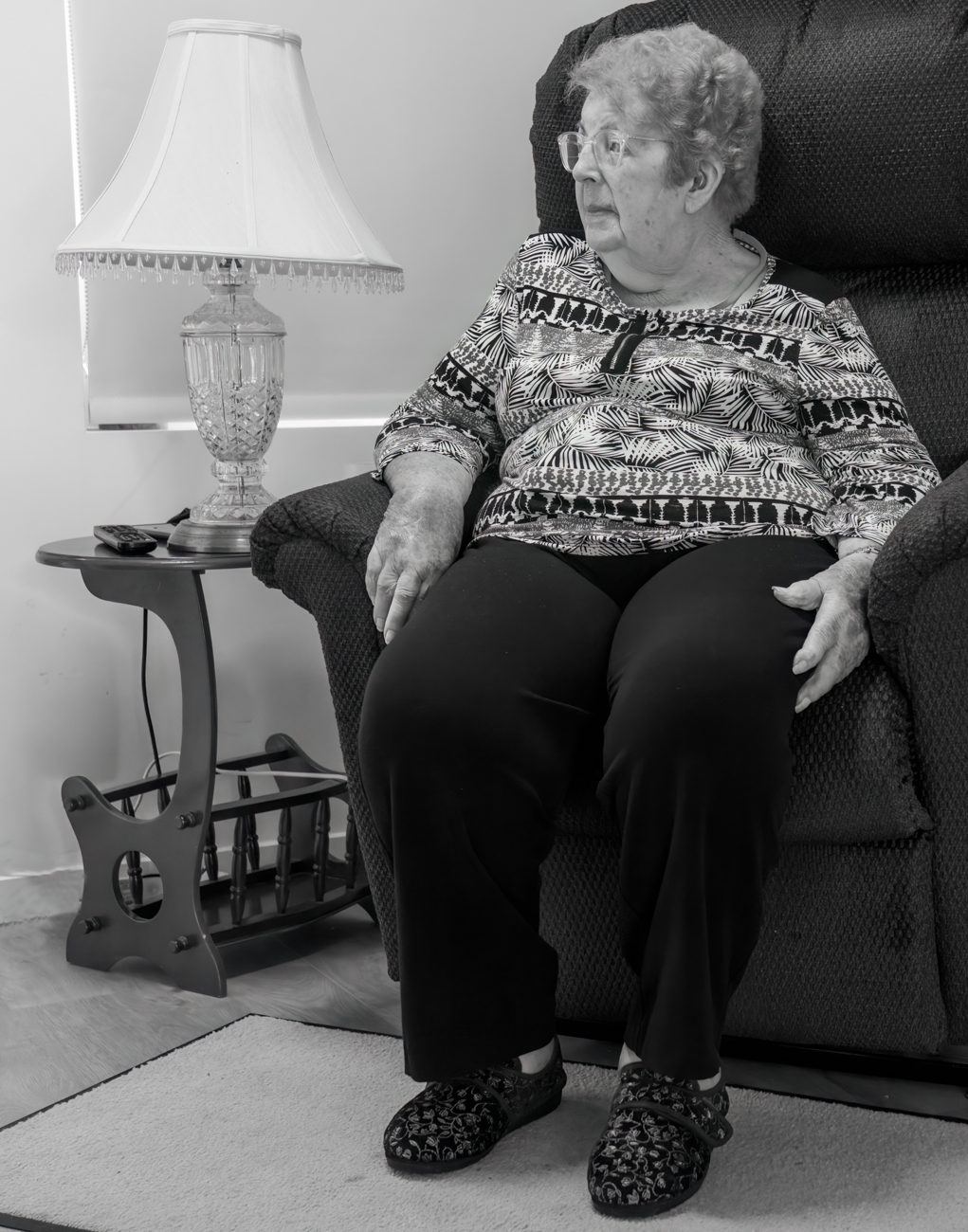
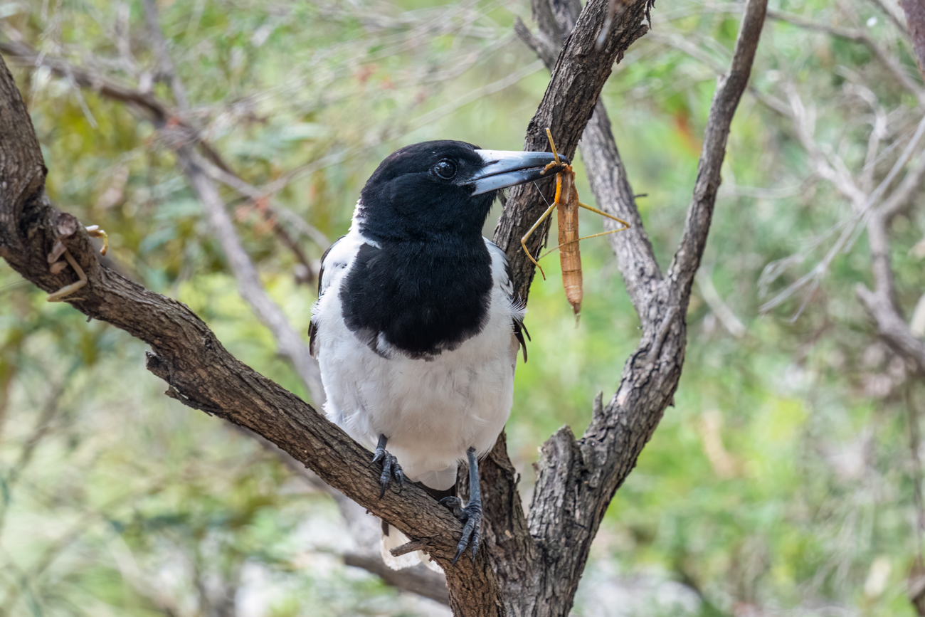
Thanks Michael. Looks like I forgot to tell LuAnne the image title :( I actually called it 'Distracted' because Lynne is distracted by her thoughts and the dog is distracted by her friends. And I will have a look at the highlights in the sky. |
Jun 10th |
| 3 |
Jun 23 |
Reply |
Thanks Ruth. I quite like the dog's head direction but perhaps because I know she was watching her friends. You're right about that branch - I should do that. |
Jun 10th |
| 3 |
Jun 23 |
Comment |
Wow, fancy living near that, it's beautiful. The yellow and blue work well together and the side-lighting on the hills emphasises their shape. I'd be inclined to try reducing the sky by half and making more of the hills. |
Jun 10th |
| 3 |
Jun 23 |
Comment |
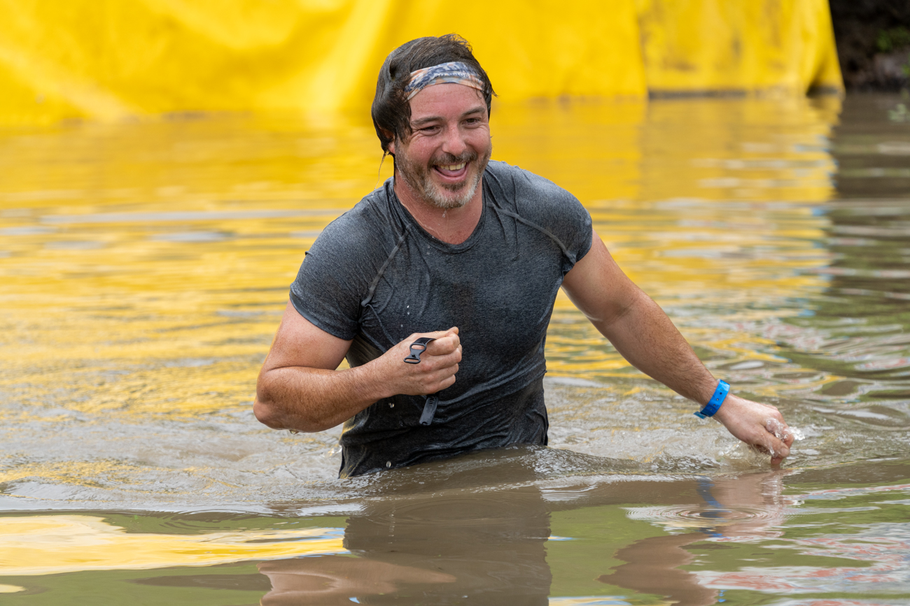
Your phone has done a good job on the men and if you had a bit more rain (and cloud) the background would be less sharp and the board less glary. Did you try Lightroom's highlight slider for that?
I like the expressions on the men but I agree with Michael about the straightening, you have straightened the window and that makes the table slope. The original looks better to me. |
Jun 10th |
| 3 |
Jun 23 |
Comment |
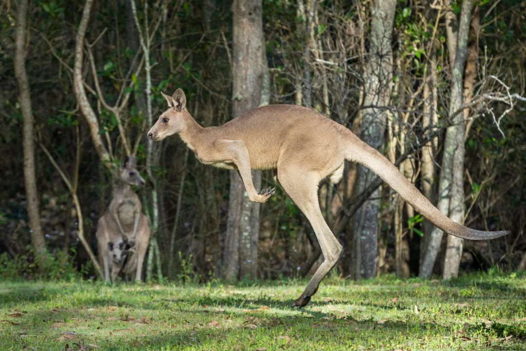
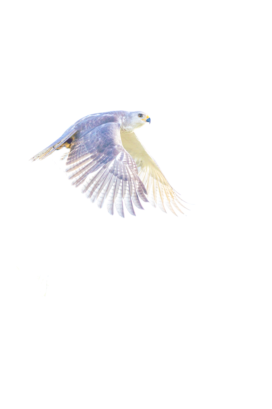
Great image. And I'm also curious about the shutter speed. I suspect that judges would prefer one rider in good focus but I think the image as it is emphasises the speed and the red rider (considerate of him to wear red) is sharp enough to give a point of interest. |
Jun 10th |
| 3 |
Jun 23 |
Comment |
I love this image and went back to last month to look at the previous one. (Last month was a bit of a write-off for me). Both images are beautiful but I prefer this one - the ice is more subtle. I do like Michael's suggestion for more headroom and the suggestion from last month to make a print. |
Jun 10th |
| 3 |
Jun 23 |
Comment |
Please tell me her computer is not a Mac :)
I love the shapes and colours, it's a really appealing image. And I'm envious about your trip. |
Jun 10th |
| 3 |
Jun 23 |
Reply |
I love the idea of the deck of cards!
|
Jun 10th |
| 3 |
Jun 23 |
Comment |
I guess this is a story about curves since each element has its own version. I especially like the reflections in the water below the turtles, they're kind of hints of what they are reflecting.
I wonder about the shutter speed, if you didn't need to spend time correcting noise then I think there's probably no reason to change it for this composition and I think the water ripples would be different - maybe less defined. |
Jun 10th |
7 comments - 8 replies for Group 3
|
7 comments - 8 replies Total
|