|
| Group |
Round |
C/R |
Comment |
Date |
Image |
| 3 |
Dec 22 |
Reply |
Thanks Kieu-Hanh, this is my first attempt at a low key image. I am interested in your comment about it being too fierce. I'll make a point at looking at more low-key images with that in mind. I am certainly gaining some new ideas from this group. |
Dec 19th |
| 3 |
Dec 22 |
Comment |
I can't see your original but I do know that I have never been successful with a shot of the moon like this. The colours are appealing and the whole image looks very serene. I like the shapes made by the bushes in the foreground. |
Dec 18th |
| 3 |
Dec 22 |
Comment |
I'm not a big fan of 'effects' but I think this is a lovely image with some stunning colours. I also like the fact that you have reduced the brightness a bit, that helps the colour and the mood IMO. In the original there's a light spot at the end of the path that got lost a bit in the final edit. I like that spot because the bridge and the path lead to it so it's like a destination. |
Dec 18th |
| 3 |
Dec 22 |
Comment |
Another stunning location! I love the warm colours in the rocks and the detail you have captured. The sky suits the composition well and the background provides context. I'd love to see some of the other photos you took at this spot. |
Dec 18th |
| 3 |
Dec 22 |
Comment |
I do like it! I love the shapes with the curves contrasting with the 'straight' lines. I like the blue being the only colour, too. I also suspect that someone cleverer than me could make more of it. I'd try lifting the whites to increase the contrast without darkening the blacks and making the grey in the bottom left the same shade as the 'white' above it. But it's lovely as it is IMO. |
Dec 3rd |
| 3 |
Dec 22 |
Reply |
Many thanks for your kind comments. In fact, the webinar I watched suggested both deliberately taking high key images and also looking through past images for likely candidates. I liked the option of looking at past images and think that, given the conditions when I took this phots, High Key is a good option. |
Dec 3rd |
| 3 |
Dec 22 |
Comment |
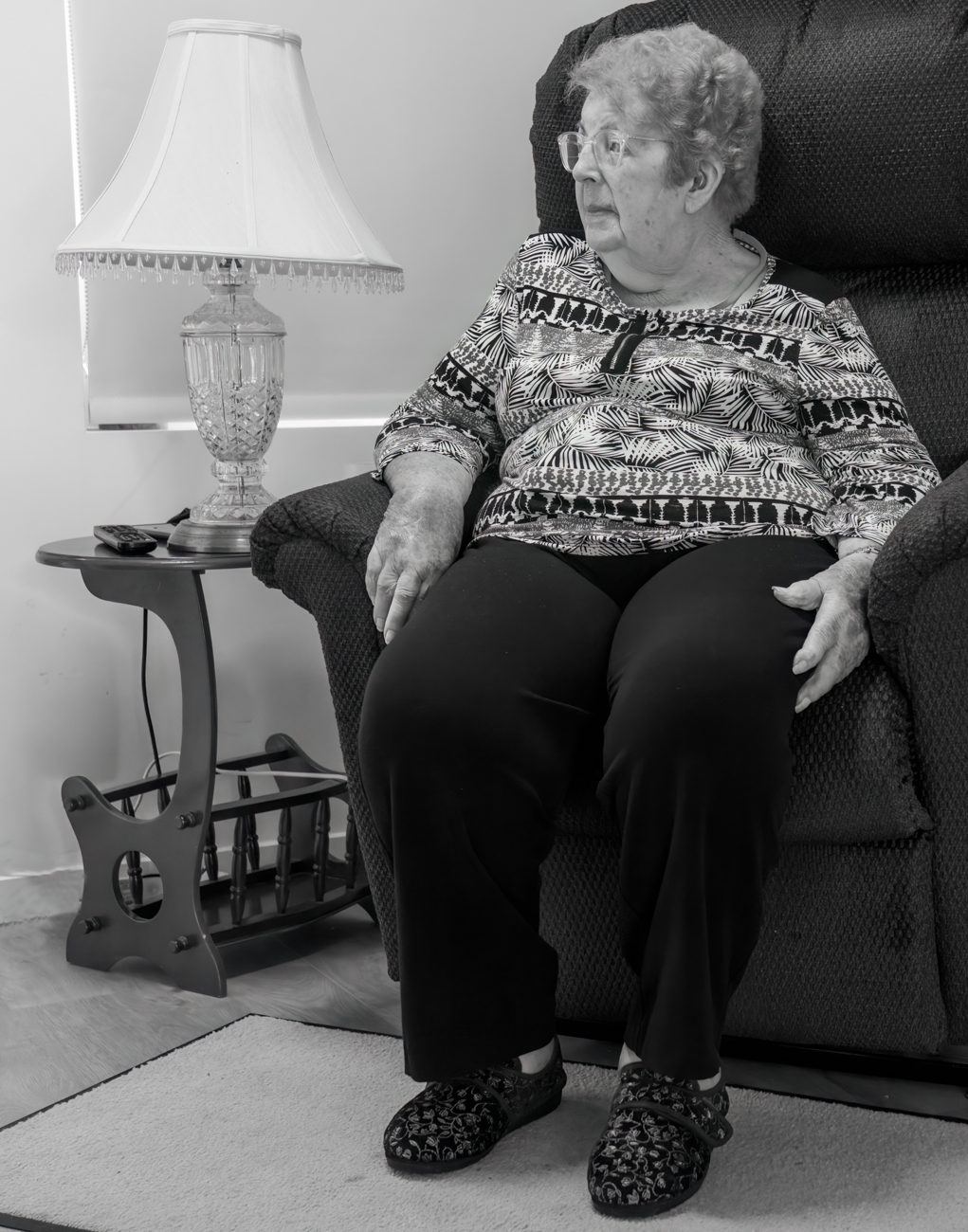
I like the geometry of this image. you could use it as a count the rectangles exercise. I like the grungy look, too. I think you did well to not have the colours too vibrant, the sky fits in with that, too. I find my eye exploring the different shapes then honing in on the imperfect shapes. Are you starting a portfolio about age? :)
|
Dec 1st |
| 3 |
Dec 22 |
Comment |
Wow! Another triumph! The shapes are fairly distinct in the lower portion and virtually absent in the top. I love the organic look in the lower part and the colours, they are stunning. It does look like a landscape of sorts and I think that's part of what keeps the brain engaged. |
Dec 1st |
6 comments - 2 replies for Group 3
|
6 comments - 2 replies Total
|