|
| Group |
Round |
C/R |
Comment |
Date |
Image |
| 36 |
Jun 24 |
Reply |
Thank you so much! |
Jun 30th |
| 36 |
Jun 24 |
Reply |
Thank you for your feedback! I believe the river horizon is level but the hills in the distance are deceiving. |
Jun 29th |
| 36 |
Jun 24 |
Reply |
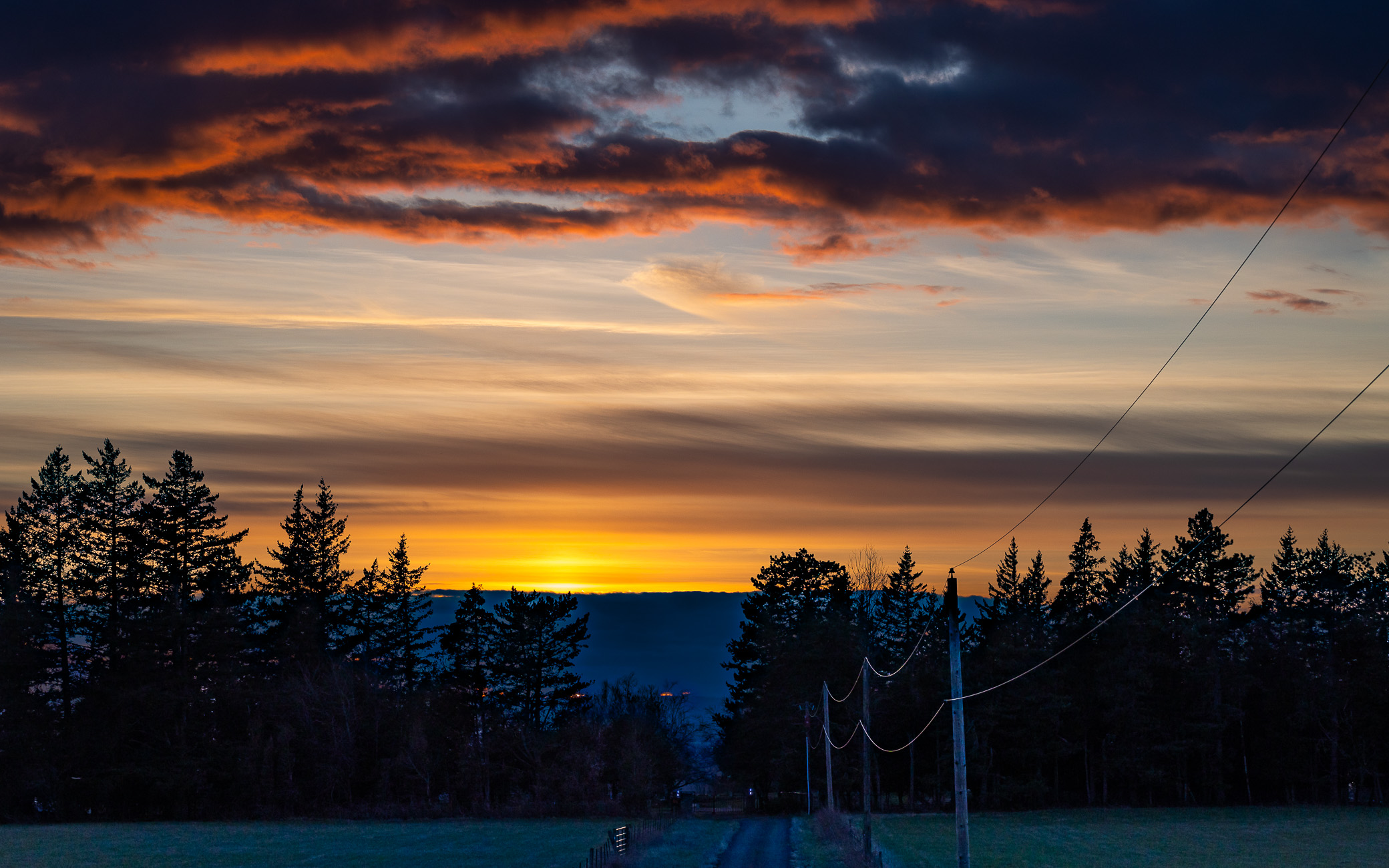
There was pink in the sky. It is very subtle and hard to see in the RAW image. It is slightly enhanced with editing. With opening shadows and color channels. |
Jun 29th |
| 36 |
Jun 24 |
Reply |
Thank you for your feedback! I believe the river horizon is level but the hills in the distance are deceiving. |
Jun 29th |
| 36 |
Jun 24 |
Comment |
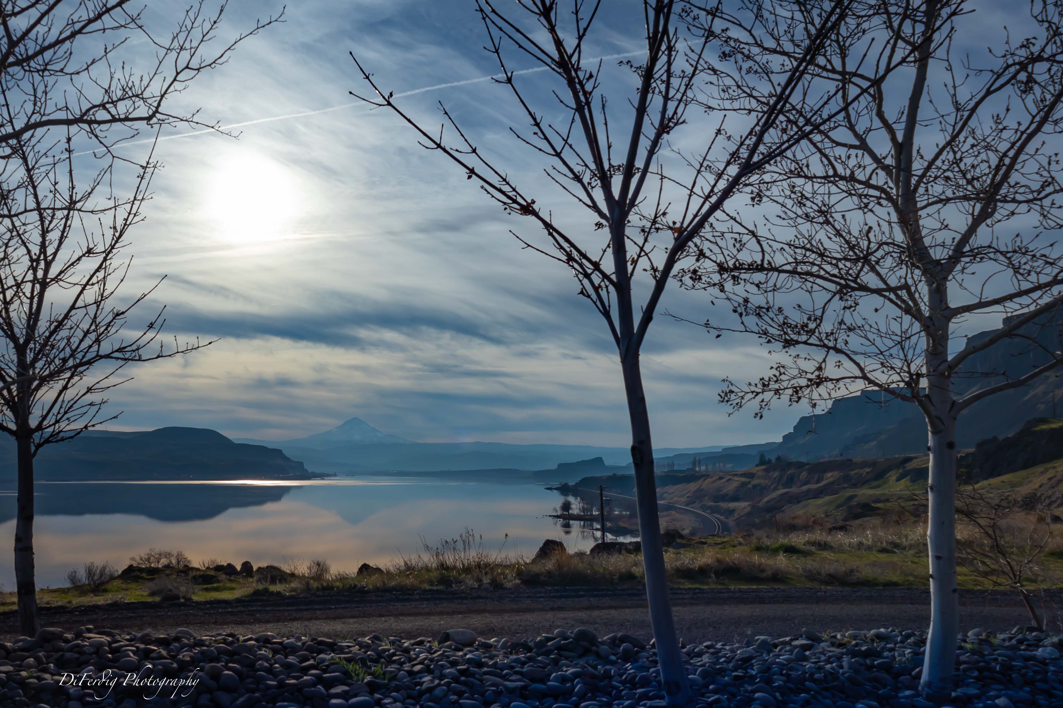
I love this! The simplicity and the color palette are wonderful and serene. It has a very artistic flare to it. I think it would make a very nice large framed print. It would look especially nice in a modern home I think. The darker clouds at the top don't bother me but I do agree with cropping down a little bit only if you can give just a bit more space below the bottom left piling reflection. I think the rectangular long crop is perfect for this. So I would not crop down too much from the top to lose that. I try not to put horizons in the middle of the image, but because the pilings and the reflections are the subject and stand out so much it's not as noticeable. And if it is possible to put more space back at the bottom and crop down from the top it would raise the horizon and I think it would look balanced nicely. And I love the starburst setting the sun, it adds a perfect little gleam.
I wonder how this would look in black-and-white�� |
Jun 20th |
| 36 |
Jun 24 |
Comment |
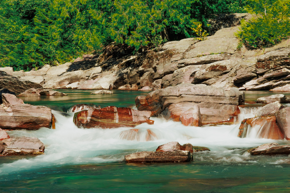
You caught the power of this beautiful waterfall well. Your editing showcases the beautiful colors, and a very natural well done job. At first glance I thought the image was crooked. I wonder if you could've moved to the right or down more to give more space on the left? I'm not sure if dropping the left of the image in post processing would be the correct thing to do or not. But I probably would've tried it. I think shooting at angles like this can be difficult. It looks like a beautiful area.
I too am not a fan of white skies. It looks like a gloomy day. Nothing you could control of course. One of the biggest problems we have with landscape photography. If you ever get back there, hopefully you have nicer weather. |
Jun 20th |
| 36 |
Jun 24 |
Comment |
Nice work with your edits. I like the colors and the reflections that came through editing nicely. The composition looks well balanced. It would be a nice photo for a travel brochure. |
Jun 20th |
| 36 |
Jun 24 |
Reply |
Thank you Larry. I appreciate your input. |
Jun 20th |
| 36 |
Jun 24 |
Reply |
Thank you so much Michael. |
Jun 6th |
| 36 |
Jun 24 |
Comment |
I think the composition works. I like this zigzag in the water and I can see it on the lines of the ground and rocks too. It's well balanced. Hopefully you didn't have to get wet to get this image lol. But sometimes we do what we gotta do right? You must have very steady hands for 1/3 of a second! I like the image. But I am noticing that the water looks dirty and the image as a whole has a bit of a green cast to it. I wonder if you could adjust white balance a bit more�� maybe add in a little magenta and the dirty water would go away as well as the green cast. Overall nice image. |
Jun 5th |
| 36 |
Jun 24 |
Comment |
I love the colors in this image. It is so cheerful yet serene. I like the color of the water. It works well with the pastels of the homes. Great clarity and detail. This looks like an image that should be framed in a beach house. |
Jun 5th |
| 36 |
Jun 24 |
Comment |
This is a beautiful photo. It seems very well balanced in composition. The colors are gorgeous and serene. And the reflection is pristinely clear. Your grievances with the image do not bother me as it seems so well balanced left to right and top to bottom.
|
Jun 5th |
6 comments - 6 replies for Group 36
|
6 comments - 6 replies Total
|