|
| Group |
Round |
C/R |
Comment |
Date |
Image |
| 36 |
May 23 |
Comment |
Beautiful architectural image. Looks like it could be in a magazine. The building is very eye catching and nice to look at with the perfect symmetry. But the colors of green, cream and copper are so complimentary and Lincoln really stands out framed by the green and backlit by the copper. I didn't really notice the lighted trees on the sides until someone else mentioned them. The building and Lincoln are so strong that they don't overly bother me. I would however go ahead a dim the lights just to make this perfect. I find the people very interesting and fun to look at, like desert after a well put together meal! |
May 22nd |
| 36 |
May 23 |
Comment |
Wow! You're a Photo Shop wizard!! Great job. Isn't it funny how we don't see things that as soon as someone else points them to out (the light in the lower left corner) it becomes an eye sore lol. You presented her majesty beautifully. Good luck in the contest. I'll need to plan a trip to see her. |
May 22nd |
| 36 |
May 23 |
Reply |
Thank you for your critique. I see what you mean and why you would crop in closer. I was just so excited about the fog in the valley lol. |
May 22nd |
| 36 |
May 23 |
Reply |
Thank you for your critique. I can see how the barn might take away from this peaceful scene. The clone tool you mention must be in PS? I still need to get comfortable using PS. So far I do most edits in LRc. |
May 22nd |
| 36 |
May 23 |
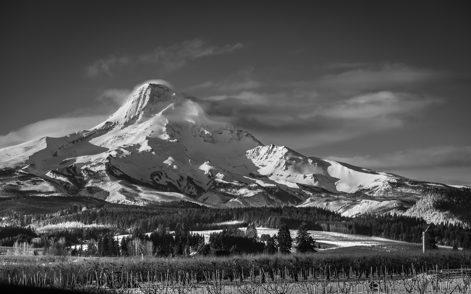
Comment |
I love old barn images! This is a beautiful one! I think it probably isn't as spectacular in color. Love the full range of black, greys and white with so much texture. It feels very well balanced. Congratulations. Well deserving. |
May 22nd |
| 36 |
May 23 |
Comment |
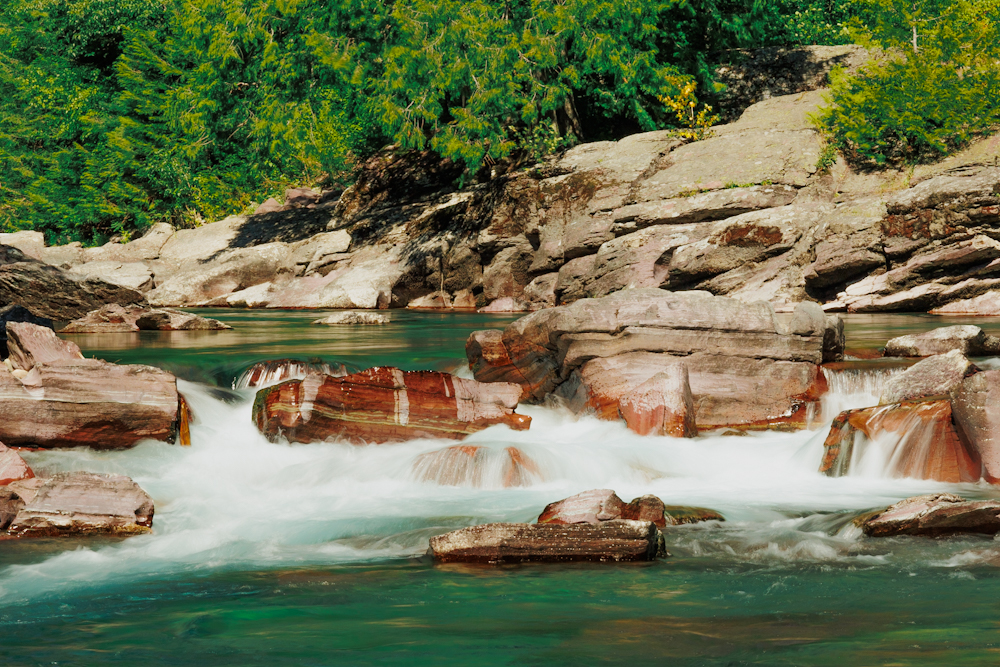
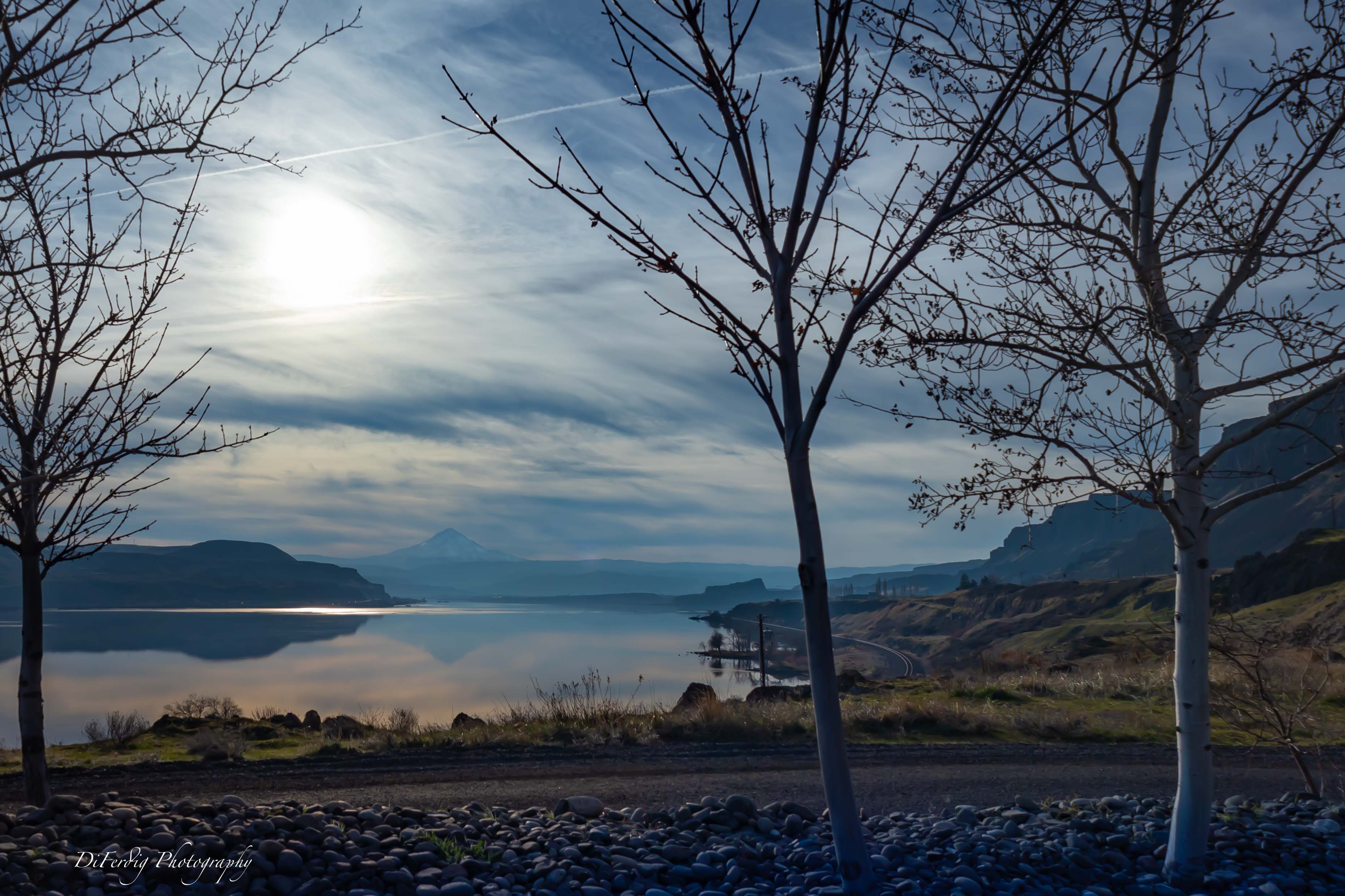
Gorgeous colors! I see reoccurring diamond patterns between the sky and lake. My eyes wander in around my n this photo. This sounds like quite the job. Congratulations. And thank you for the explanation of how you did this. I still need to try stitching for panoramas. |
May 22nd |
| 36 |
May 23 |
Reply |
Here's a real quick black and white. All I did was decrease saturation -100 increased highlights dropped blacks, increased contrast, and added more of a vignette. |
May 11th |
 |
| 36 |
May 23 |
Comment |
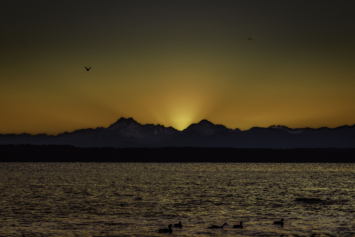
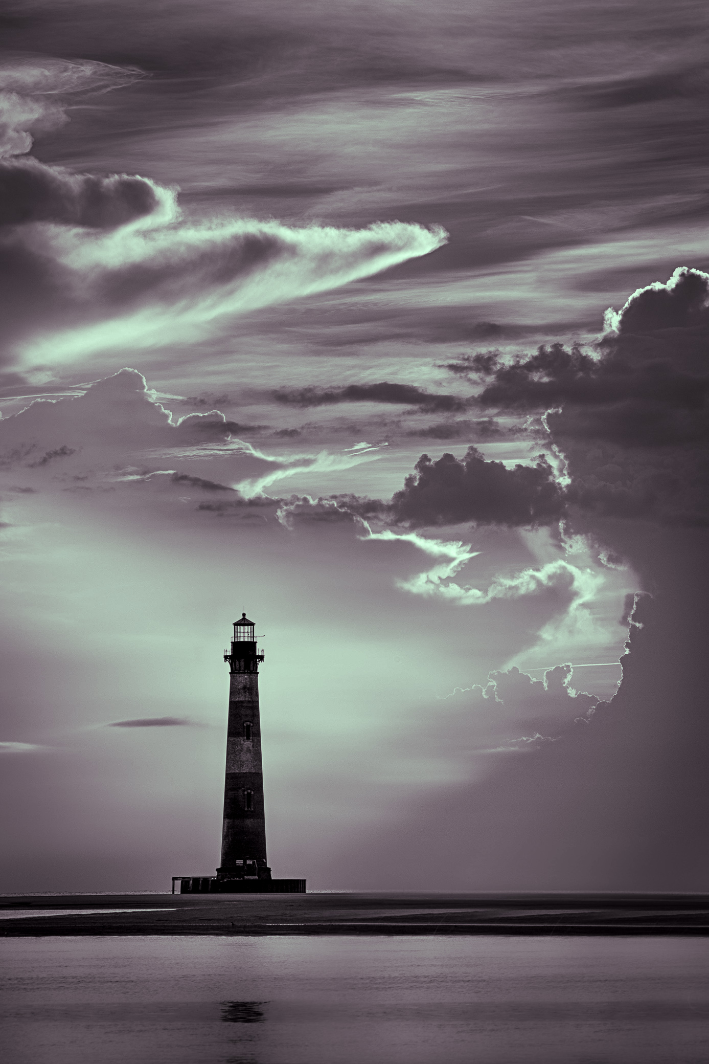
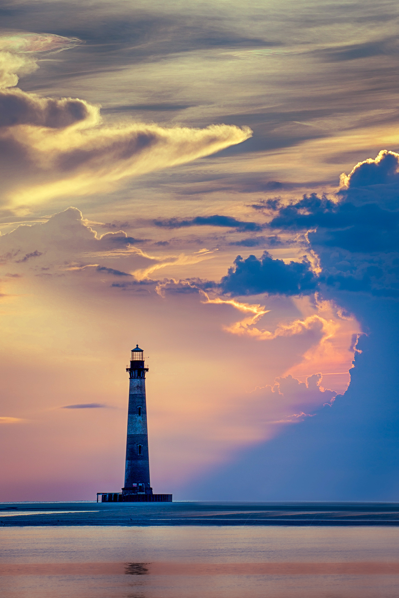
Love the sky! I think it totally makes the image. I used masking in LRc and since you asked I would suggest masking the sky, lighthouse and water all separately to apply edits. This way you can maintain the beautiful sky, brighten the lighthouse if you wanted although I agree with Michael leaving it a little darker is more realistic. You can also (with a mask) decrease texture and possibly clarity on the water to smooth it (like you'd get with a low ss) and I might increase warmth and tint to really play off the colors reflected from the sky. I'd also use a linear gradient at the bottom to slightly darken it.
Here is an edit I did to show you:
*Sky mask - highlight-30, white +20, temp -10
*Masked water with brush - dropped both clarity and texture -100 for a smooth appearance (flattened like Larry said), tint +25 and dehaze 35 to maintain the light house reflection.
*Linear gradient at bottom - exposure -1.25 and saturation -45.
*Global edits - highlight +20, blacks +50, shadows +10, vibrance +30, yellow luminance +50. I also touched the tone curve just enough to bring out the highs and lows. Then I like to add a slight vignette that isn't necessarily noticeable but adds depth and warms up the edges.
I think this could look awesome in black and white too! |
May 11th |
 |
| 36 |
May 23 |
Reply |
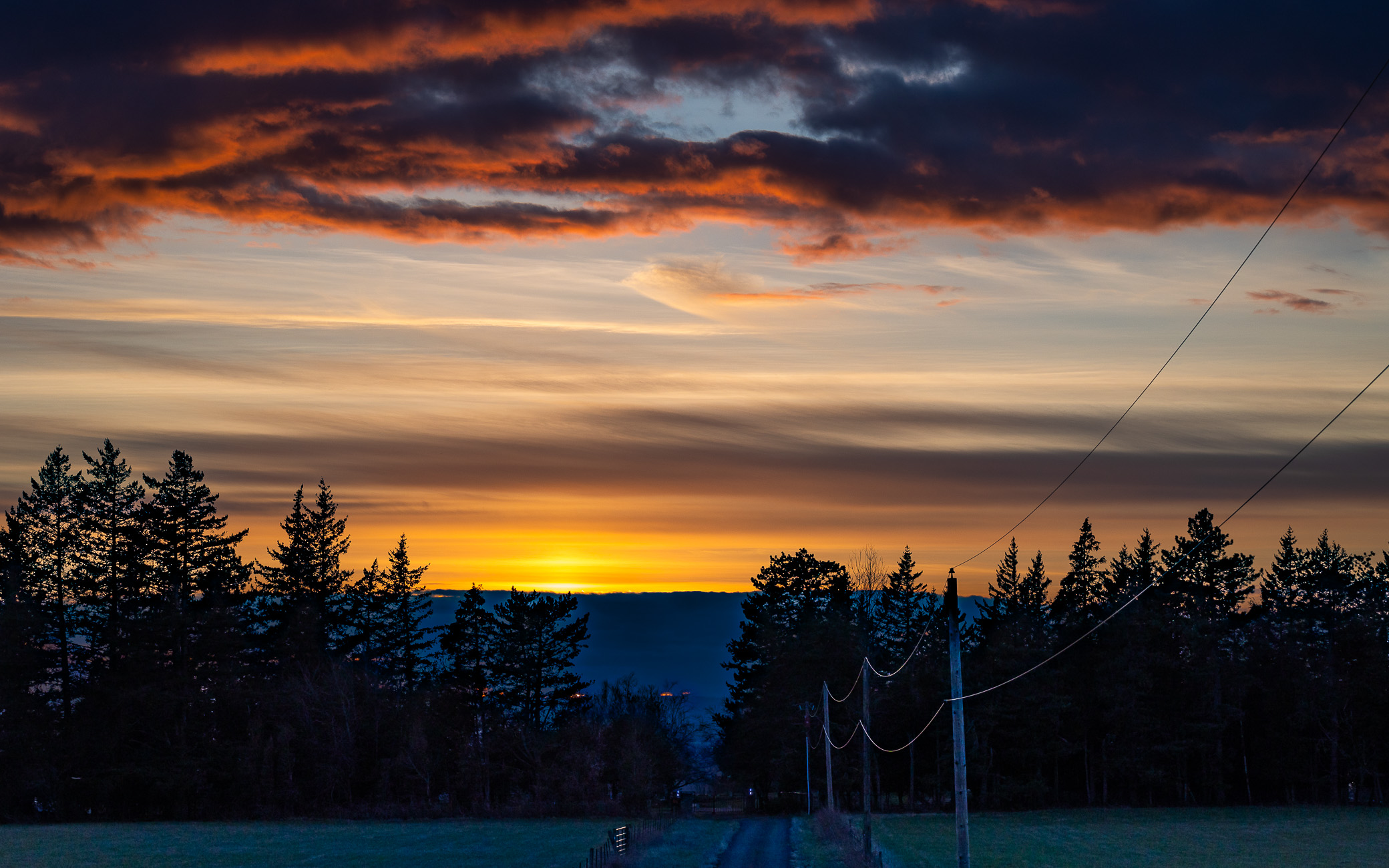
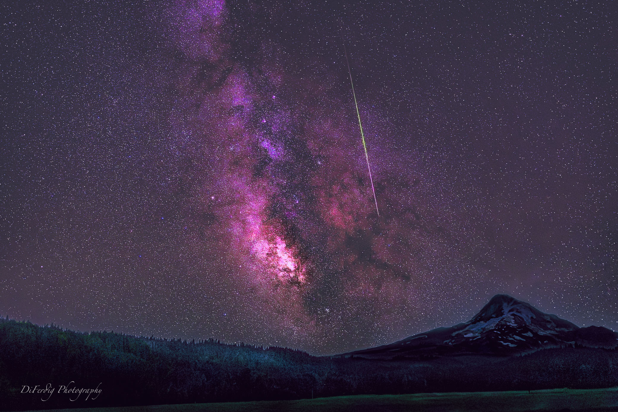
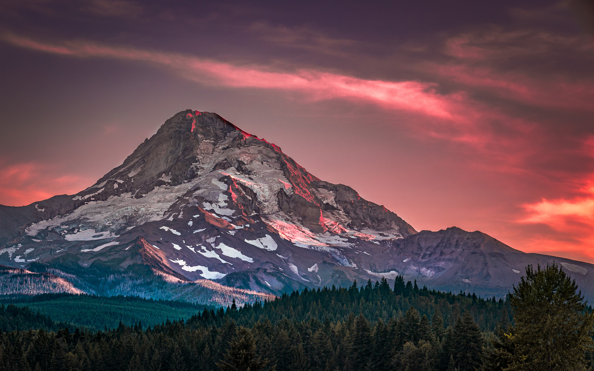
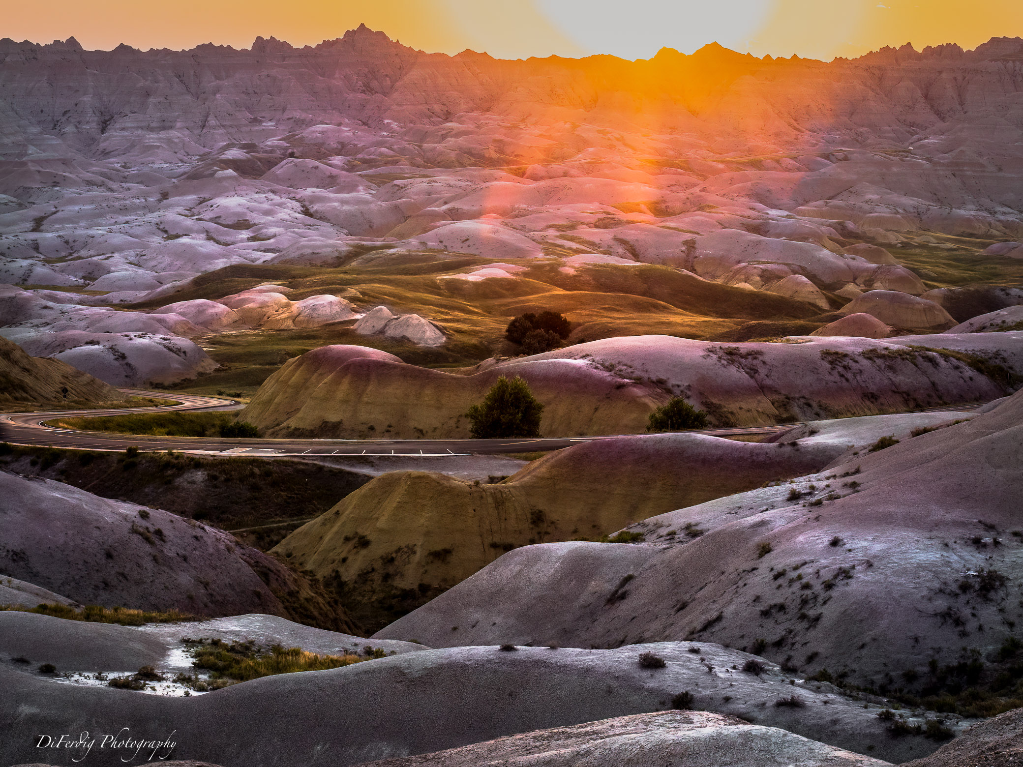
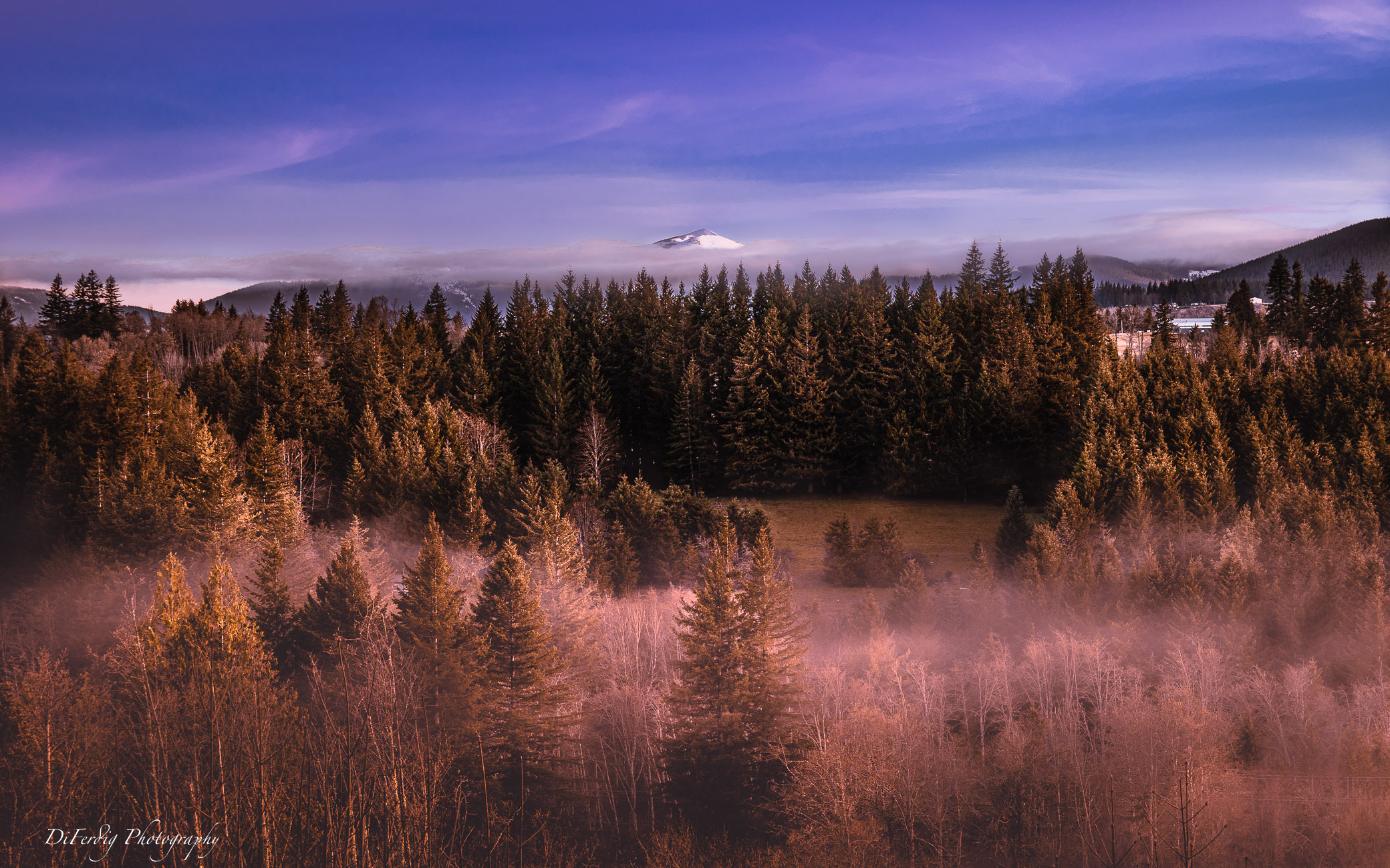
Thank you Larry for your critique. You describe the atmospheric feeling I was going for. I understand what you are saying about the building (barn). I've taken so many photos of this barn from my deck that I guess I didn't think anything of it. To me it is an image of my "neighborhood" and shows off the beauty of where I live. But I totally get what you are saying. I think I'd rather clone out the barn because personally I like the mountain peak in the middle. The clouds you see at the base of that peak are along a ridge line of mountains in front of it so that's all we see of Silverstar Mountain unfortunately. And I'm shooting from (live on) a small mountain so I can't get a much of a higher vantage point. I can think of one place that might work but I'll have to hike or ride my horse to that. Might just do that! |
May 11th |
| 36 |
May 23 |
Reply |
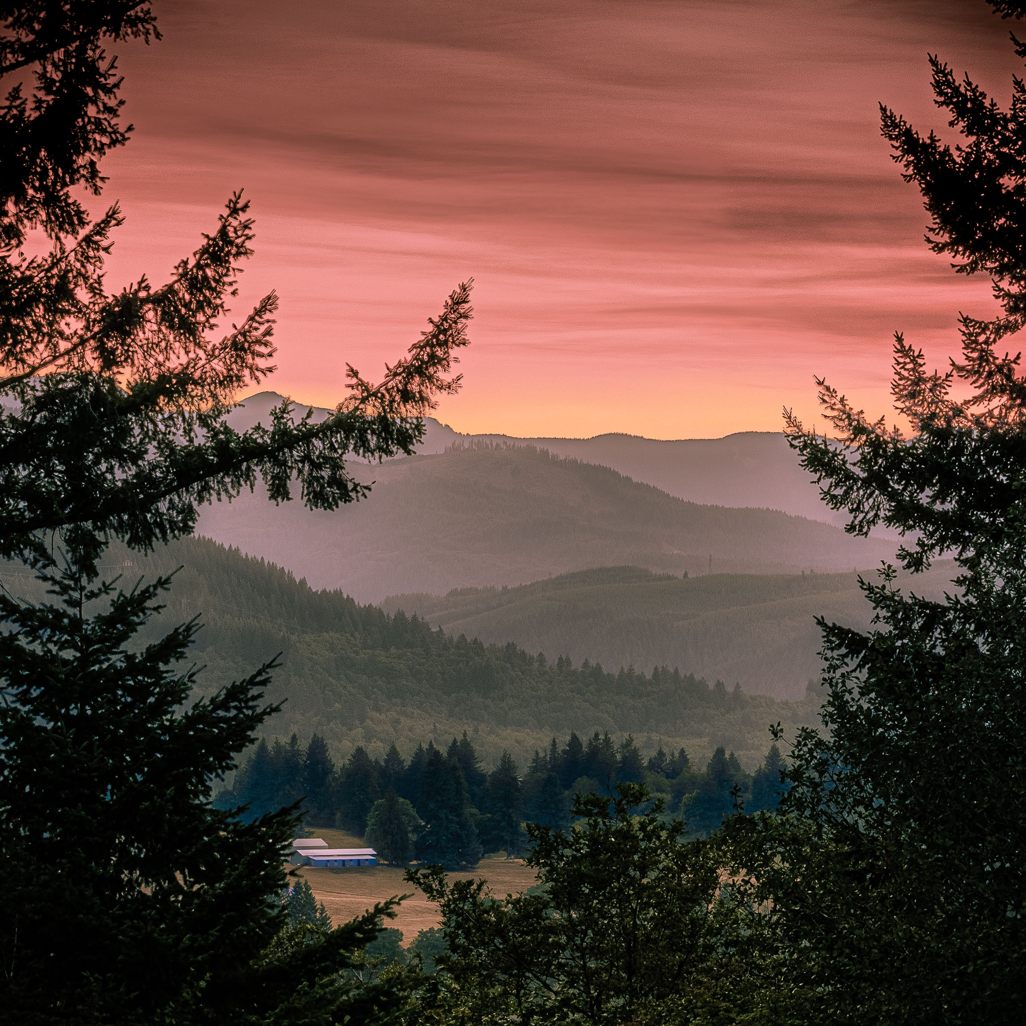
Thank you so much for your critique. I think I agree with you that I would prefer to clone out the building versus a more narrow crop. To me it feels more balanced with the current crop. It's interesting you notice magenta in the foreground. In my edits I usually adjust the color channels but I didn't think I touched magenta. I just checked in LRc and I in fact did not adjust magenta at all. I only adjusted orange, yellow, blue (decreased saturation) and purple where I increased hue +5 which actually made no difference. I did however very slightly decrease the green tone curve midway towards purple but that was to remove some green and give the image warmth. Then I noticed I did do a mask on the bottom half where I did increase tint +15 (added 10) and temp +25 (added 25) in order correct the white balance on the fog. Since I shoot in RAW I recreate what I believe I saw or what seems beautiful to me. For this image I was going for atmosphere with warmth and trying to balance out the little bit of pink/purple that was in the sky to create a fine art feel. I did go back to the mask (after reading your comment) and increased temp and it was also pleasing to me. Thank you again. |
May 11th |
5 comments - 5 replies for Group 36
|
5 comments - 5 replies Total
|