|
| Group |
Round |
C/R |
Comment |
Date |
Image |
| 36 |
Mar 23 |
Comment |
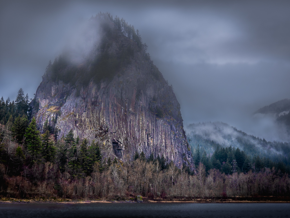
Further developing this image based on critiques. I selectively decreased vibrance and decreased yellow saturation. I again further decreased the white on the fog in the hills and top of Beacon Rock. I added a touch more dehaze to entire image and selectively on the top with an angled linear grad (top left to bottom right). Added a linear grad with dehaze on the left side of the water angled so the sheen on the water isn't so linear. |
Mar 19th |
 |
| 36 |
Mar 23 |
Reply |
There is just one re-edit. I toned down the fog on the right because I thought it was too bright. But I increased vibrance so maybe that did it. :( |
Mar 19th |
| 36 |
Mar 23 |
Reply |
Maybe because I increased vibrance? |
Mar 19th |
| 36 |
Mar 23 |
Reply |
Thank you! |
Mar 16th |
| 36 |
Mar 23 |
Comment |
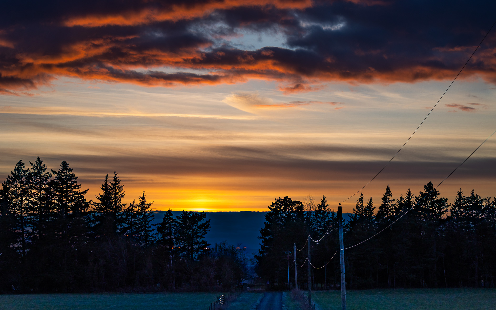
Taking into account recommendations from Michael and Larry. I did this re-edit. I cropped some off the right. I wanted to leave some for depth and I really like the fog. But I did decrease exposure and whites on the fog with brushes because I thought it was too bright and distracting. I also brightened up the fog at the top of the rock because it bothered my husband lol! And as you can see I removed the pier thing that looked like lights. I got rid of the halo and smoothed the water with a lineal grad filter. Lastly I increased vibrance a touch. I want atmosphere and pop. |
Mar 12th |
 |
| 36 |
Mar 23 |
Comment |
Taking into account recommendations from Michael and Larry. I did this re-edit. I cropped some off the right. I wanted to leave some for depth and I really like the fog. But I did decrease exposure and whites on the fog with brushes because I thought it was too bright and distracting. I also brightened up the fog at the top of the rock because it bothered my husband lol! And as you can see I removed the pier thing that looked like lights. I got rid of the halo and smoothed the water with a lineal grad filter. Lastly I increased vibrance a touch. I want atmosphere and pop. |
Mar 12th |
|
| 36 |
Mar 23 |
Comment |
Taking into account recommendations from Michael and Larry. I did this re-edit. I cropped some off the right. I wanted to leave some for depth and I really like the fog. But I did decrease exposure and whites on the fog with brushes because I thought it was too bright and distracting. I also brightened up the fog at the top of the rock because it bothered my husband lol! And as you can see I removed the pier thing that looked like lights. I got rid of the halo and smoothed the water with a lineal grad filter. Lastly I increased vibrance a touch. I want atmosphere and pop. |
Mar 12th |
 |
| 36 |
Mar 23 |
Comment |
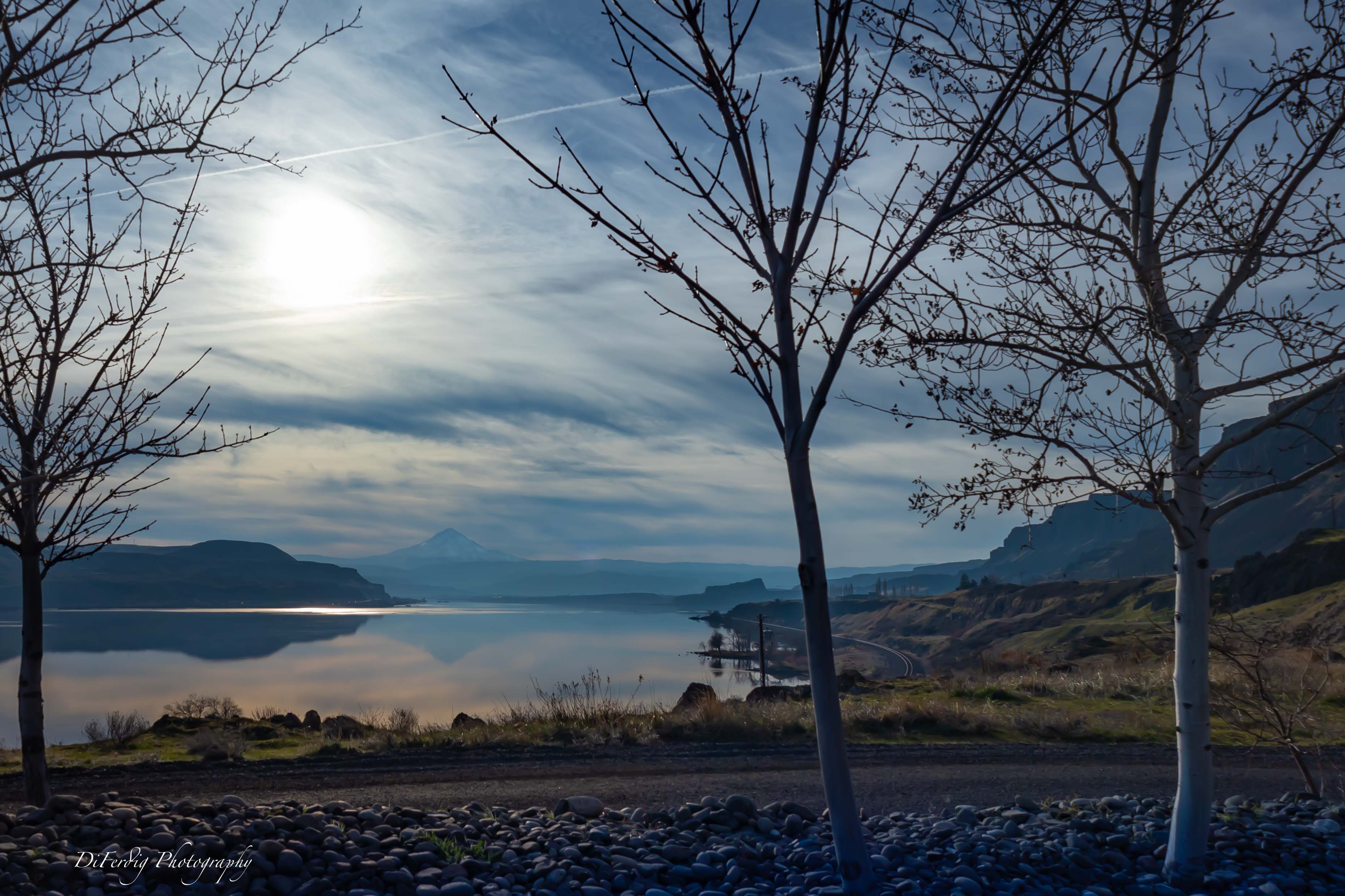
I like your original shot with more of the brown foreground. I'd consider cropping it so this brown foreground is centered at the bottom of the frame as it makes a nice v pointing towards the scene. Agree the trees are over processed some. I like the reflections that I can see. I think if the water was still you'd have an awesome image with nice reflections. Nice job with your edits. |
Mar 12th |
| 36 |
Mar 23 |
Comment |
Nice image. I like the dramatic sky it works nicely with the image. I agree the grass in the foreground should be darkened to draw the eye up towards the castle. Maybe do a radial gradient around the castle to increase the highlights or exposure(?) just a touch�� just to get a feel it's brighter. |
Mar 12th |
| 36 |
Mar 23 |
Reply |
Thank you for your critique. I did fix the halo but I don't think you saw or got the attachment. As I told Michael those are not lights. I think they're part of an old pier or something to block boat traffic. But I can see now how they are distracting. It really does help to have other eyes review the images. I did cut the water sheen quite a bit with a linear grad but I do see what you mean if I had done a long exposure. It would probably look awesome! In my own defense it was extremely cold and it was very painful for me to get this shot as I have Raynaud's disease and my hand warmers quit working! I'll have to be sure that I have ones that are still working. I didn't want to get the tripod out because I was already making my husband wait too long and he wanted to get home :( . Next time�� |
Mar 12th |
| 36 |
Mar 23 |
Reply |
It does really help to have other eyes look at my images. I will look at other crops as I understand what you're saying about weight. Those are not white lights but now I can see how you interpreted them as lights. I think it's either an old pier or something to block boat traffic as there is a boat launch here. I'm actually standing between it and the water. I might use a linear grad to subdue them or clone them out as Larry recommends. Thank you. |
Mar 12th |
| 36 |
Mar 23 |
Reply |
Thank you for your reply. Great learning. |
Mar 7th |
| 36 |
Mar 23 |
Comment |
Very cool shot! at first, I didn't realize I was looking at a reflection until I read Michael's comment. I thought you were shooting towards a building with parallel streets. Great light and sharpness. The time of the evening you shot this seems to be perfect giving to the colorful gradient sky that emphasizes the shape of the city skyline. I'd love to see the light trails version of this picture. |
Mar 7th |
| 36 |
Mar 23 |
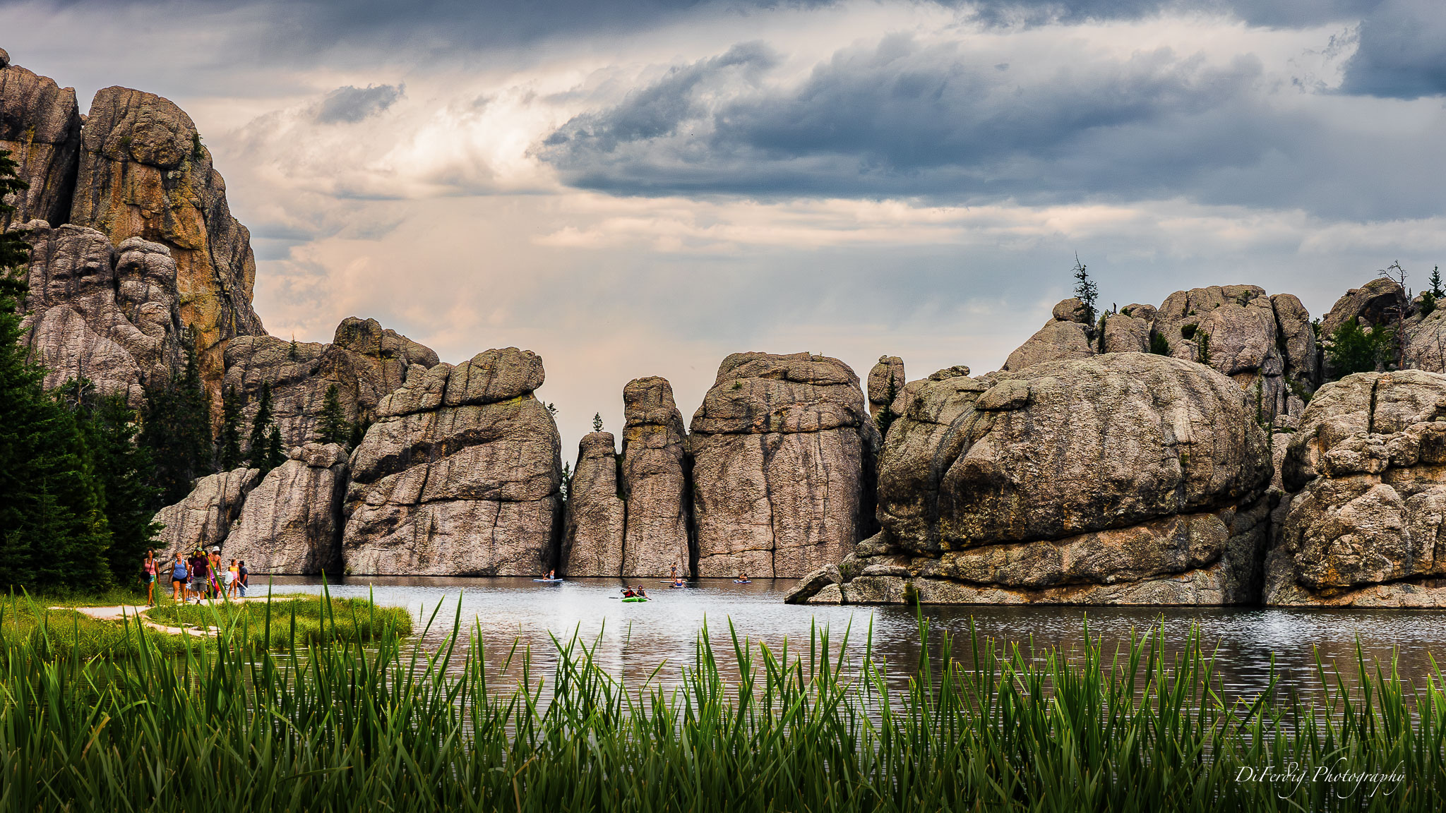
Comment |
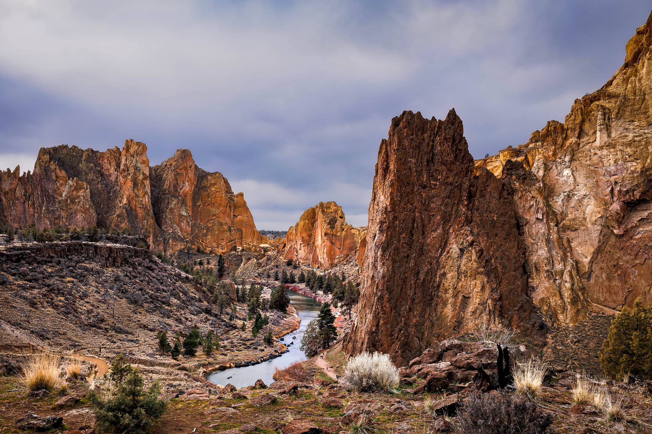
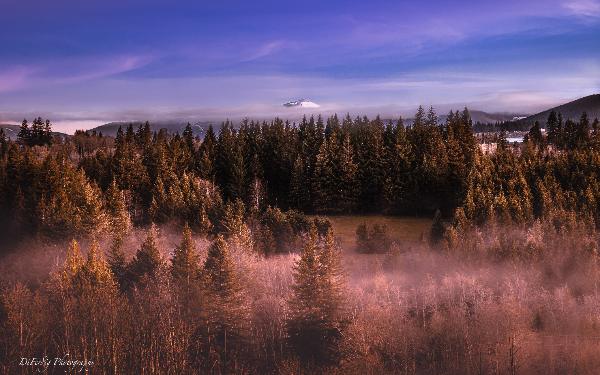
Very interesting image. You captured great light and nice subtle colors. It hard to tell the size of these rocks. At first I thought I was looking at hills. I think it might help to have something or someone in the image to provide perspective and scale. |
Mar 7th |
| 36 |
Mar 23 |
Comment |
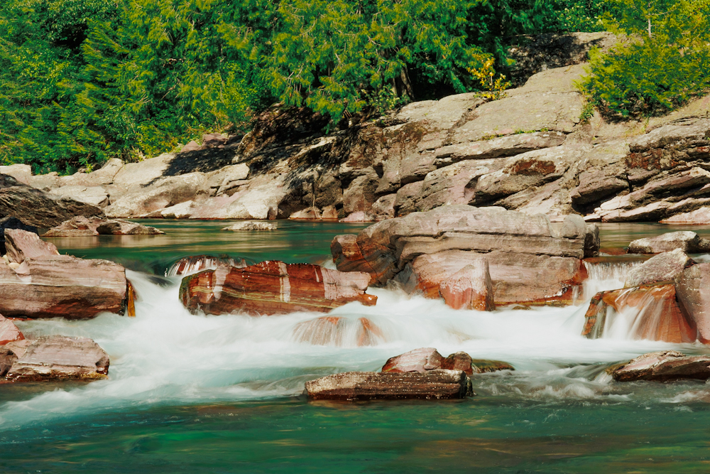
It's a lovely image that does give a peaceful feeling. Is this how you really saw the scene? I know we sometimes edit to give a certain feeling or appearance. It looks a bit brown to me taking away the blue of the water.��it looks like a fine art image. If I were editing I'd choose to darken the light foreground rocks just a touch as they stop my eye just a bit. But that's just me being picky because we're supposed to critique. ;) |
Mar 7th |
| 36 |
Mar 23 |
Comment |
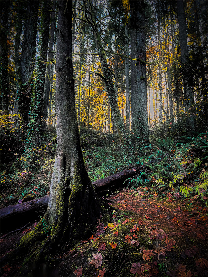
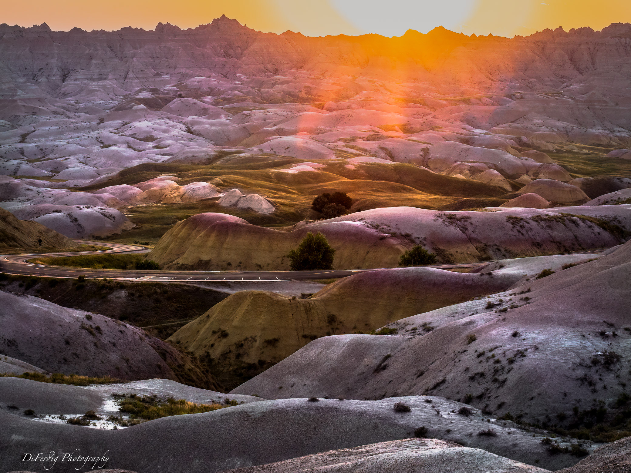
I think this is a nice image of a very interesting tree. I like the layers of the rolling hills. It looks well composed. The bushes don't bother me. It seems you did a good job removing the one bush. I agree the image needs more contrast. Maybe mask the sky and edit it separately. |
Mar 7th |
10 comments - 6 replies for Group 36
|
10 comments - 6 replies Total
|