|
| Group |
Round |
C/R |
Comment |
Date |
Image |
| 62 |
Dec 24 |
Comment |
Michael,
I like the basic idea and love the graphical abstractness of the final image. As a composition the brighter wall in the foreground competes with the clouds for my attention and the dark diagonal line almost splits them in half. I'm not sure how to adjust it so my eye settles on one or is led from one to the other. But since it is the Berlin wall, maybe the division is really what it's all about. Mark |
Dec 27th |
| 62 |
Dec 24 |
Comment |
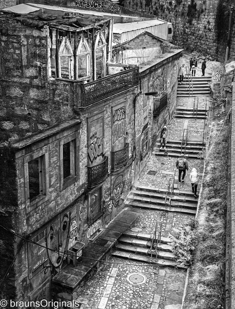
Chris,
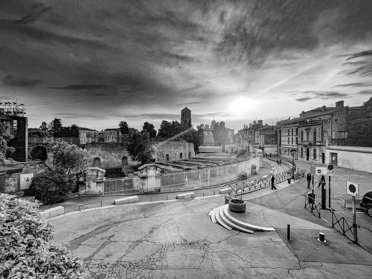
This is a great street scene and really captures the essence of a German town. My first reaction was that it was a bit too sharp. I know that's an odd statement but the buildings on the right side are so crisp that my eye immediately focused there and I had to work at getting back on the road to the tower. I alos am thinking you might play with the cropping a bit at the bottom of the image. The full image of the bicycle is competing with the leading lines and the tower. I didn't' have time to try it but you might crop through the bike in the foreground to see if it allows the viewer to breeze past it donw the road to the tower. Just my thoughts. Mark |
Dec 27th |
| 62 |
Dec 24 |
Comment |
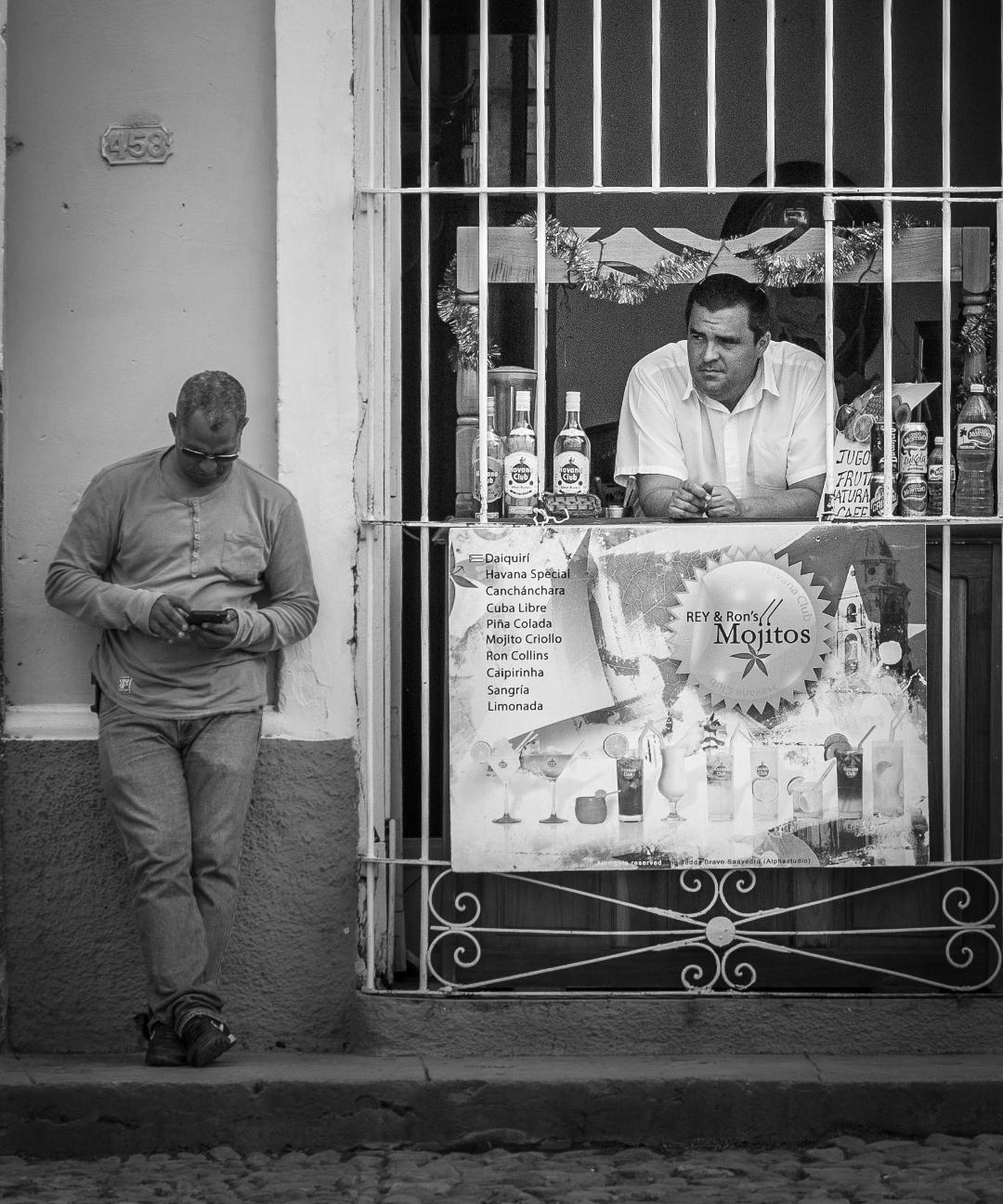
Adrian,
I love it. Your crop saved the moment and forces the viewer to see what you saw, the isolated human form among the geometric strucures of man. The cropped image suffers a bit from graininess but that enhances the mood in my opinion. you could play with noise filters but I'm not sure it would improve the overall image. |
Dec 27th |
| 62 |
Dec 24 |
Comment |
Emil,
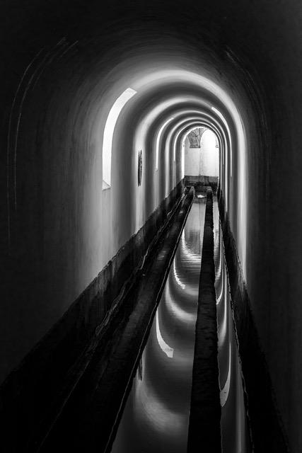
I love getting lost in the background fog and you've done a great job of leading me there. Pulling the detail out of the earthen structure on the left forces me to start viewing the image there but draws me to the point at the end then settling in the fog. As always an outstanding image.
|
Dec 27th |
| 62 |
Dec 24 |
Comment |
Mandy,
Again, converting to monochrome did a wonderful job of downplaying the distracting colors in the background but still provided a great canvas featuring the birds. Normally having a bit more space on the left of the image for the birds to fly into is desirable but in this case the tight crop forces the viewer to spend more time looking at the following bird. The detail and tonal qualities of the birds are great. Nice job. |
Dec 27th |
| 62 |
Dec 24 |
Comment |
Pete,
Definitely an outstanding image. Isolating her from the background was spot on eliminating unnecessary distractions. The depth of field is a bit shallow leaving the baby's back slightly blurred. While it does emphasize the focus on the mother the fact that its the foreground distracts my eye a bit. But overall the strength of the image is the womens expression which you captured magnificently.
|
Dec 27th |
6 comments - 0 replies for Group 62
|
6 comments - 0 replies Total
|