|
| Group |
Round |
C/R |
Comment |
Date |
Image |
| 62 |
May 23 |
Reply |
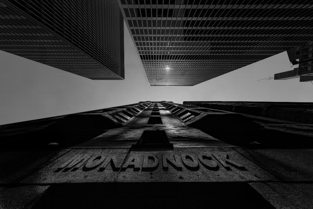
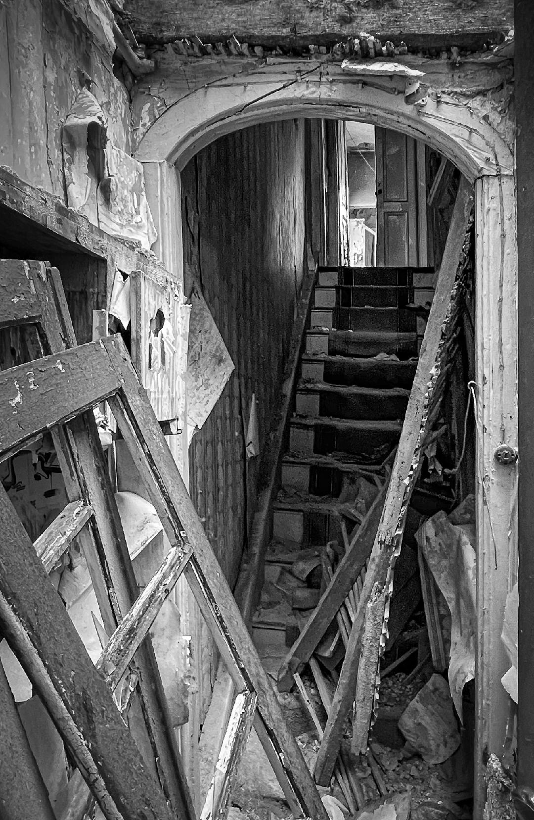
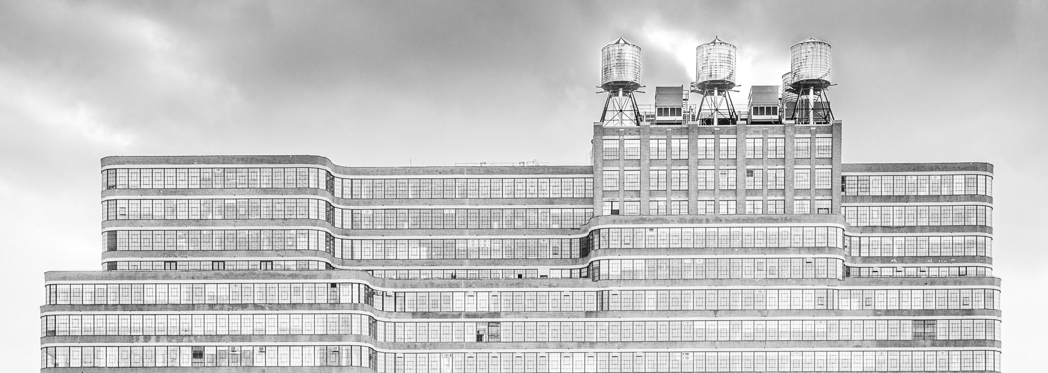
I also adjusted the horizonal alignment to get the roofline at the back of the building aligned with the top of the image. |
May 23rd |
| 62 |
May 23 |
Comment |
|
May 23rd |
 |
| 62 |
May 23 |
Comment |
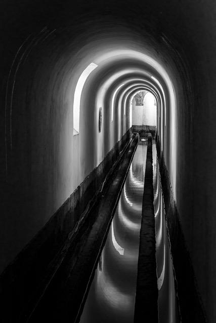
Couldn't help myself. I decided to do a little editing in LR and wanted to share. First I straightened the image so the column on the left were parallel to the edge of the image. Not sure that's the final answer and may need some tweaking. Also dropped a linear gradient in from the bottom right to open up the shadows and finally increased the exposure to lighten the entire image. Just some thoughts |
May 23rd |
| 62 |
May 23 |
Comment |
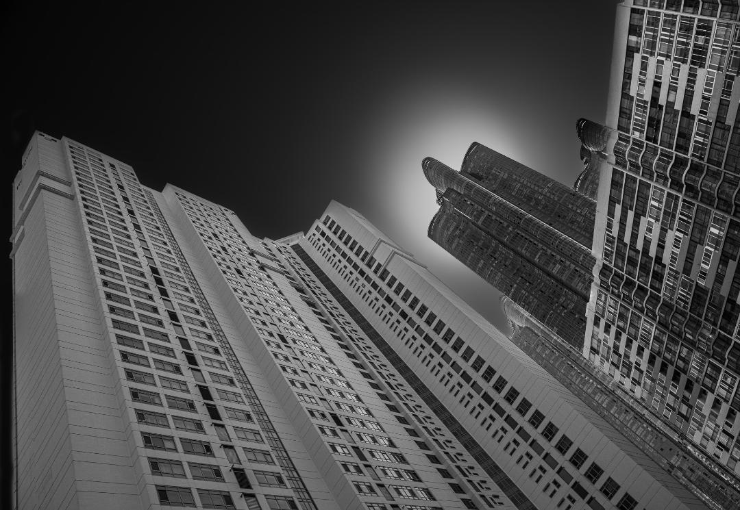
Israel, You do have some great places to photograph and I'm always looking forward to the next adventure you present. I lean more toward the dramatic lighting Emil's edits include but really do think getting the vertical lines of the building parallel with the edge of the print is critical. Both sides would be nice but even if you only get the left side lined up, it gives the viewer a reference allowing them to understand the perspective and implies more intent on your part. That said, I love em all!
|
May 23rd |
| 62 |
May 23 |
Comment |
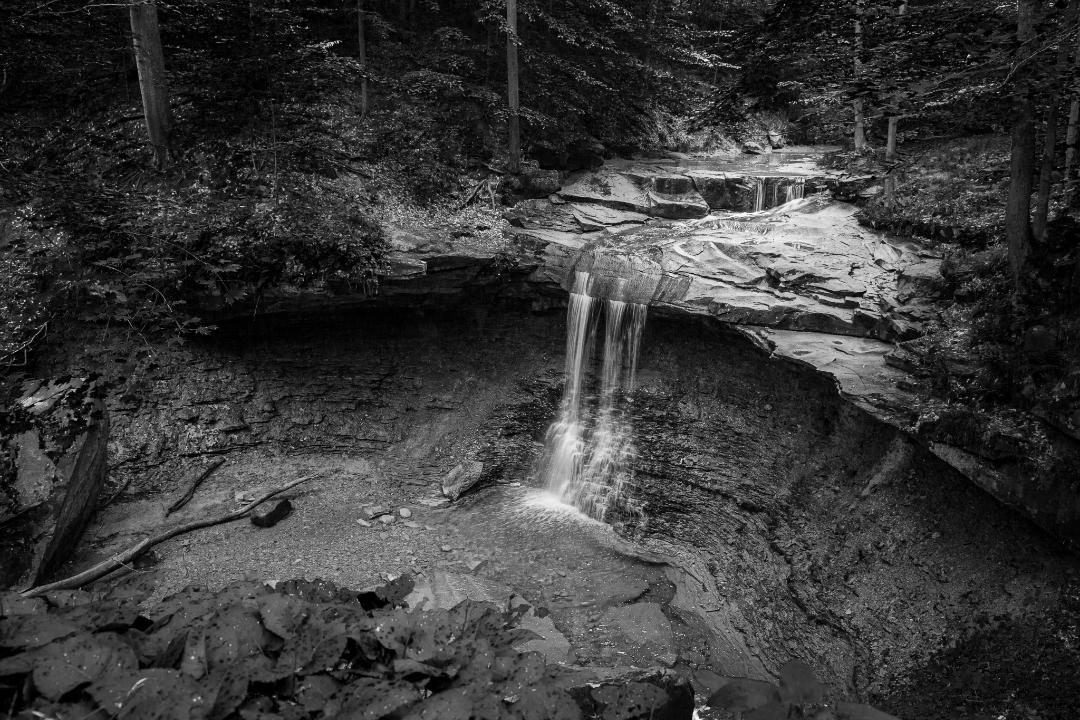
Bob, The composition is outstanding. The way you captured the driftwood creates a triangle of darkness that holds the subject together and keeps pulling me back to the subject. Nice job. |
May 23rd |
| 62 |
May 23 |
Comment |
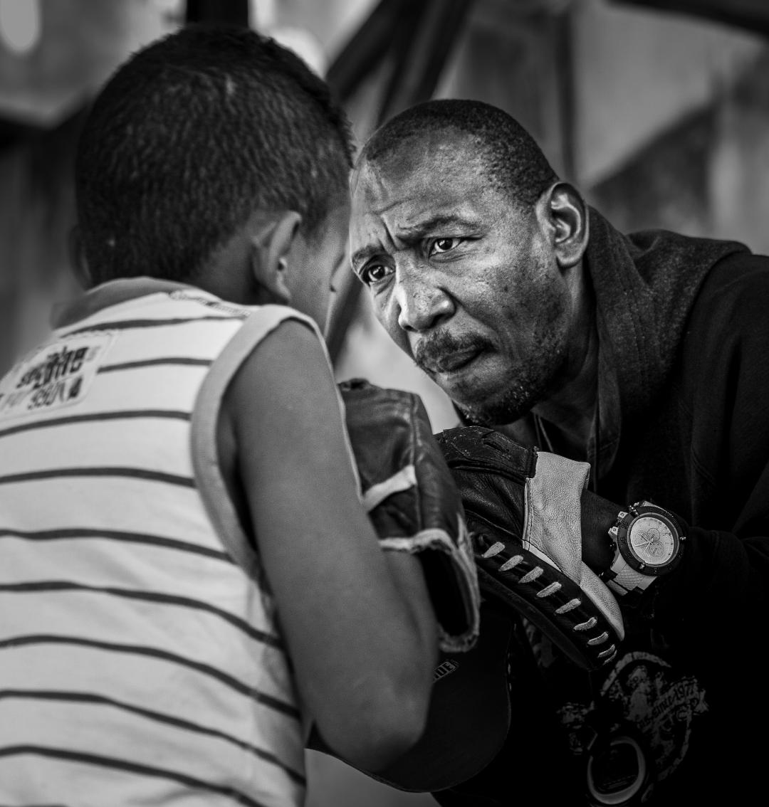
Again, I can't add much at this point. The touchup Emil gave the image really did add the extra 1% to push it over the top. I specifically love the detail/ depth of field throughout the birds feathers. Great capture!!
|
May 23rd |
| 62 |
May 23 |
Comment |
Emil, I do like the image lighted up a bit like LuAnn's edit but the additional modifications you made helped isolate the flowers from the background, which is a must to me. Overall, I like a bit darker background to create very strong separation. |
May 23rd |
| 62 |
May 23 |
Comment |
LuAnn, Being late in the conversation, there's not much to add other than it is a great shot and I do love it in monochrome. Something I've been playing with is dropping out the background completely by substituting a black mask behind the image in Lightroom. It totally isolates the image whether in color or monochrome and forces the viewer to engage only with the detail and lighting of the subject flower. It also isolates it completely from the surroundings, so probably not what you had in mind. Mark. |
May 23rd |
| 62 |
May 23 |
Comment |
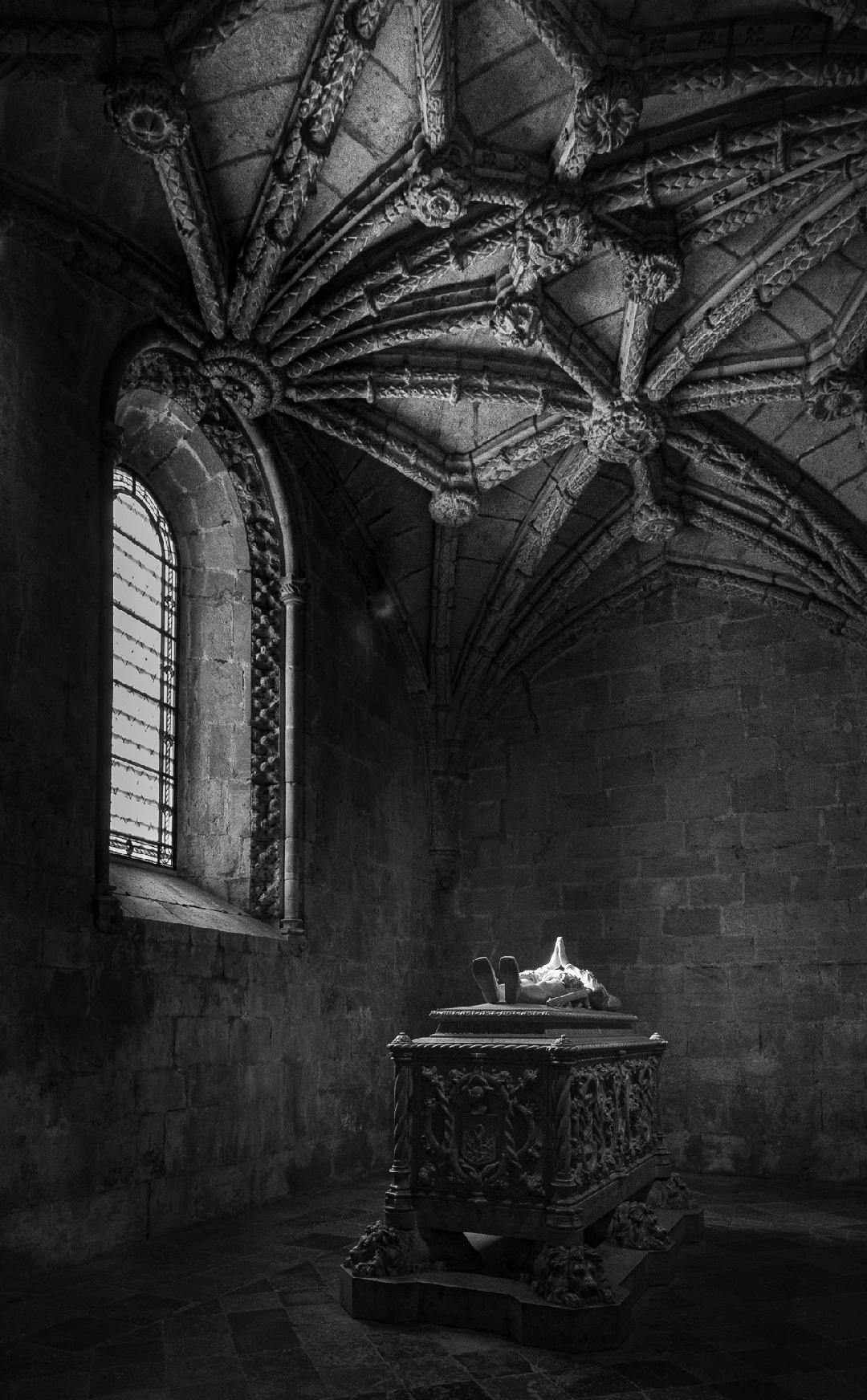
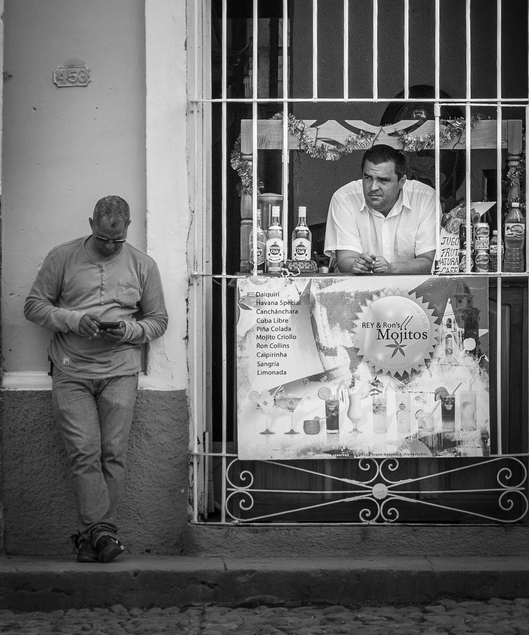
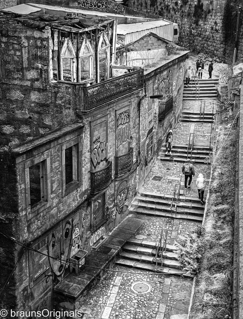
Pete, I love this image. It conveys the solitude of the individual and the grandness of his/her surroundings. Not sure i'd change much. |
May 23rd |
| 62 |
May 23 |
Reply |
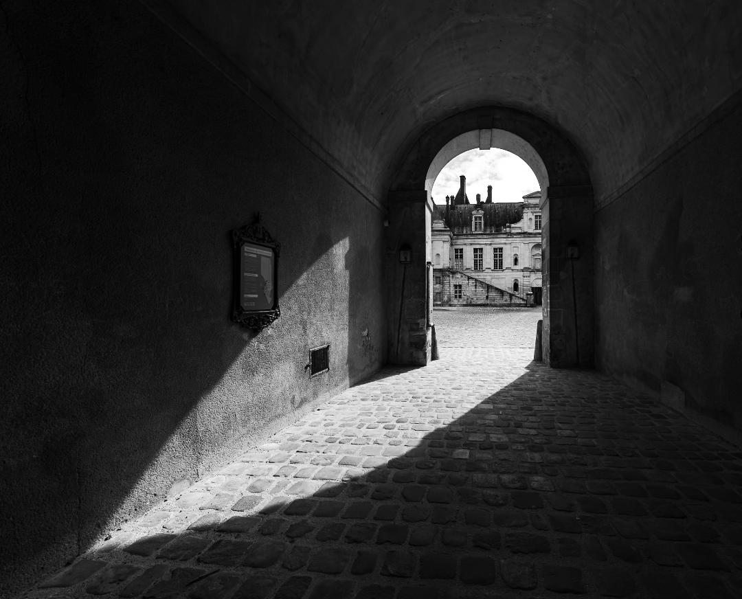
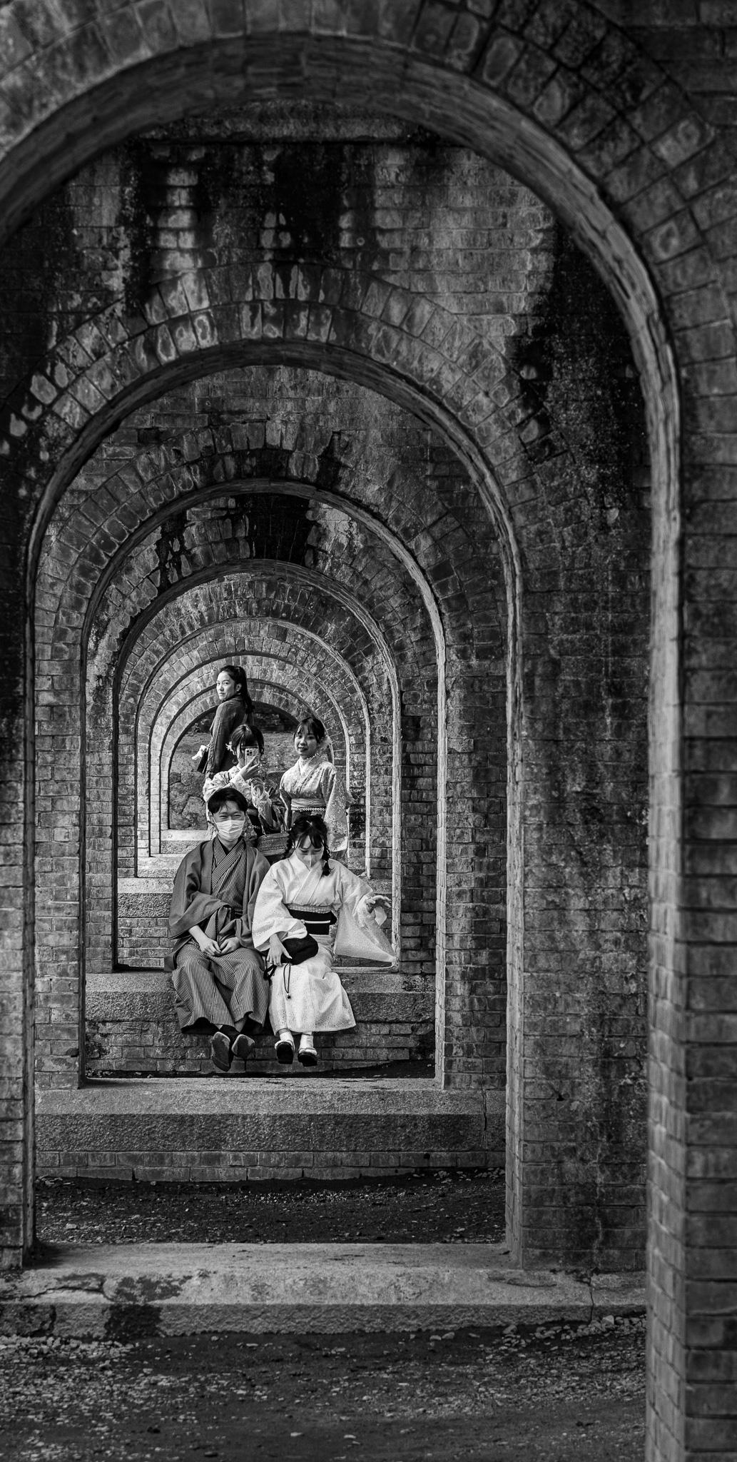
Oliver, Thank you for your thoughts too. I'm liking the brighter lighting of the central features but have to agree with Emil's cropping. I think there needs to be something at the front to anchor the first arch. Mark |
May 23rd |
| 62 |
May 23 |
Reply |
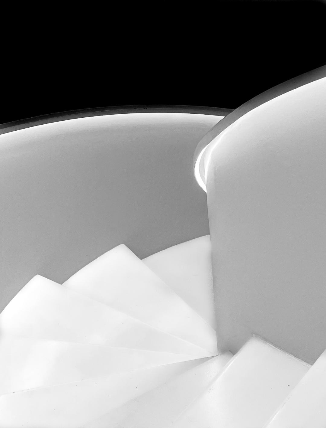
Mee too!
|
May 12th |
| 62 |
May 23 |
Reply |
Emil, I really like it. I played with brightening the subjects but was "afraid" to go too far. From your edits it's very doable and enhances the image. I'm going to play a bit with the cropping. My intent was to draw the viewer from the bottom left up to the subjects, but with your version, the viewer is pulled straight in. I like it!!!! Thanks |
May 12th |
| 62 |
May 23 |
Comment |
Bunny, Thank you for your comments. I did play with the crop and may actually crop it way down to eliminate most of the first arch and foreground. As for conversion, I use the LR Develop BW conversion exclusively. Haven't looked into others. Do you have a favorite? |
May 5th |
9 comments - 4 replies for Group 62
|
9 comments - 4 replies Total
|