|
| Group |
Round |
C/R |
Comment |
Date |
Image |
| 62 |
Nov 22 |
Comment |
Wow, this is absolutely beautiful. The color image is nice and representative but the monochrome version portrays a sense of serenity the scene deserves. You've got all of the elements of a great landscape combined with the mood and excellent detail. Being new to the group, I can't compare it with your prior work, but it doesn't matter since this stands on its own and is outstanding! |
Nov 18th |
| 62 |
Nov 22 |
Comment |
Wow, being late to the game, I'm amazed by all of the great variations on a theme. Bob's original strikes me as a piece of Pop Art, as you said pushing it out there. At first I had difficulty focusing on the florets but eventually did see more detail. Bunny's variation had enough detail that it was easier for me to see the detail. And LuAnn's version took it to another dimension. All very interesting and up for individual interpretation. But, a very nice take on an old subject. |
Nov 18th |
| 62 |
Nov 22 |
Comment |
Bunny, I agree with Oliver, that you've done a wonderful job of taking a simple flower photo and making it an artistic statement. I also think that the higher contrast Oliver add makes it more dramatic and really grabs the viewer and keeping it off center is my preference too. |
Nov 18th |
| 62 |
Nov 22 |
Comment |
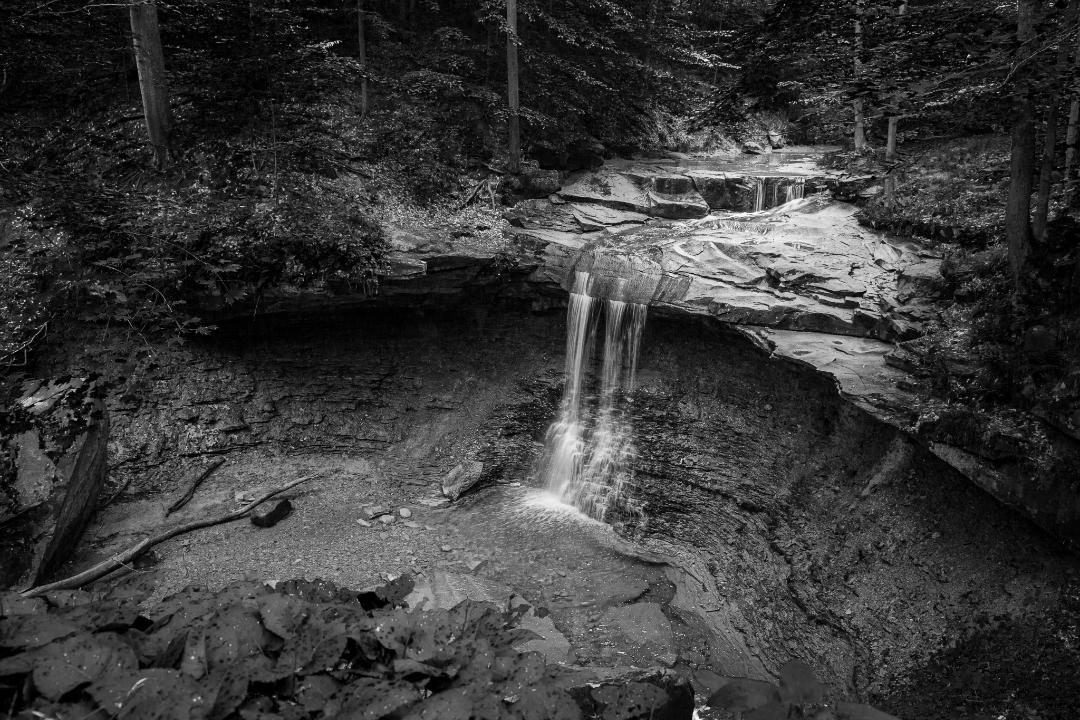
I definitely like the monochrome version best for it's simplicity and how the clouds pull your eye to the Silo's. I like Oliver's idea of adding contrast but feel his example is a bit too much. Maybe a slight increase in the contrast in the clouds. But it's your call and a great image as it stands. |
Nov 18th |
| 62 |
Nov 22 |
Comment |
LuAnn, I don't have much to add. While, initially I agreed with Emil and thought the image a bit too light, I'm liking the faint silkiness of your version best. |
Nov 18th |
| 62 |
Nov 22 |
Comment |
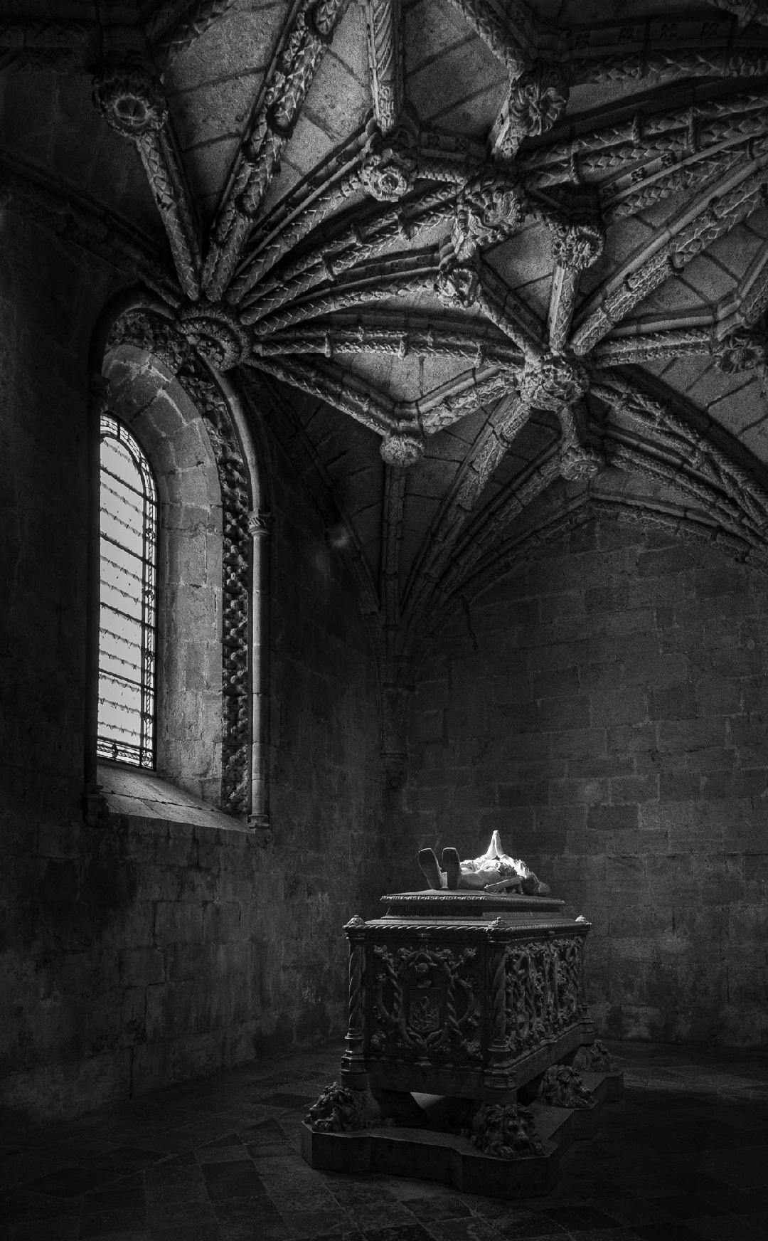
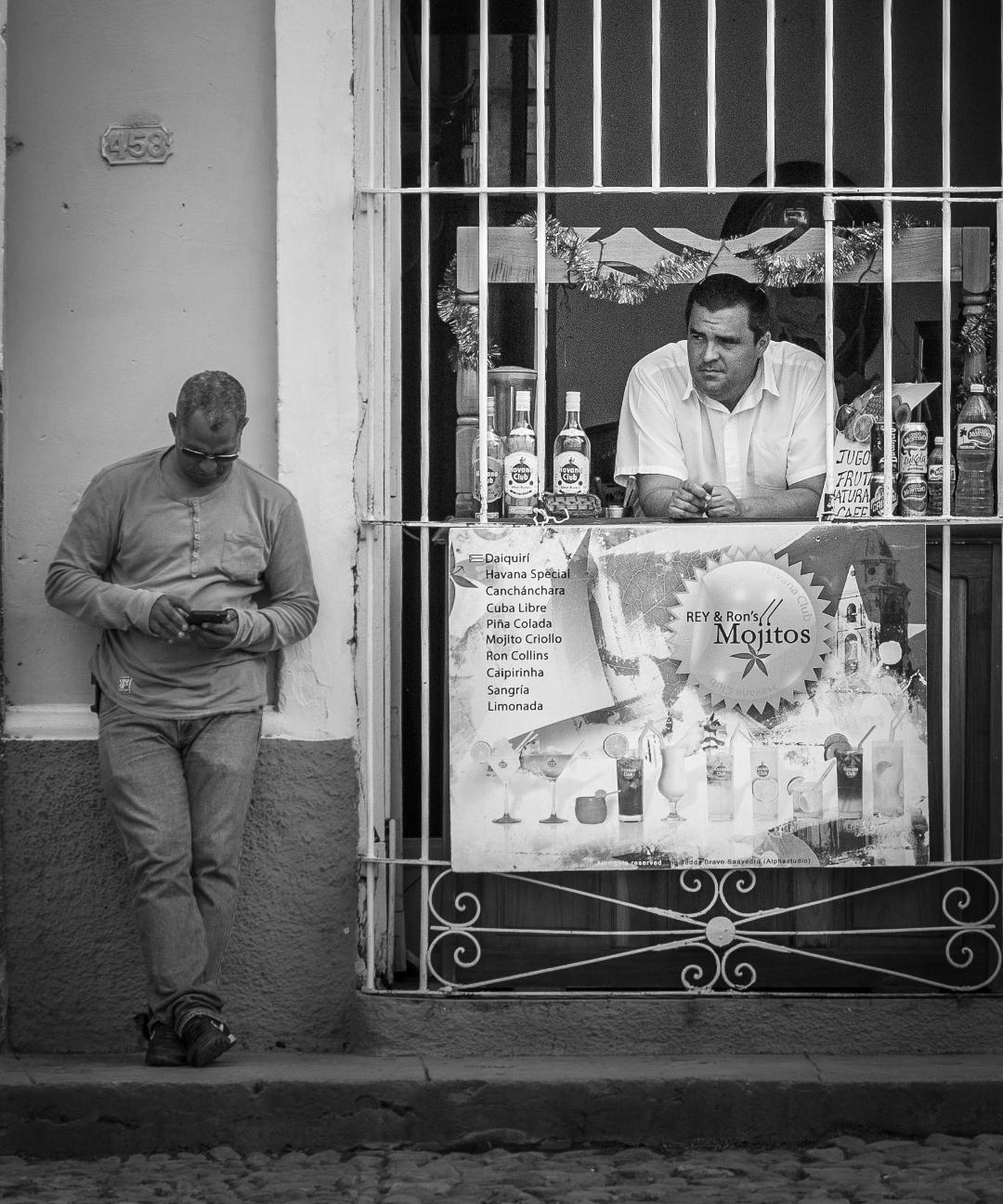
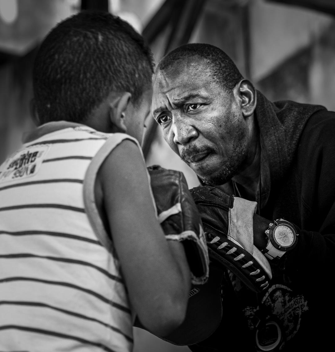
I love the way you captured the subject looking toward but not directly at the viewer. As if he's looking past you and the intensity is intriguing. Overall a great shot and great execution.
|
Nov 18th |
| 62 |
Nov 22 |
Reply |
Thank you for your comments. |
Nov 12th |
| 62 |
Nov 22 |
Reply |
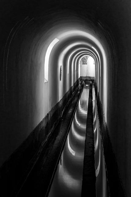
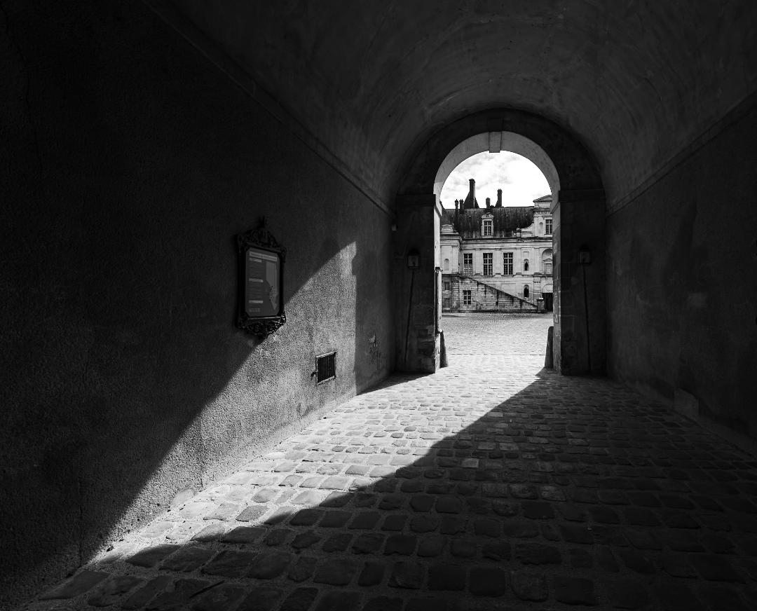
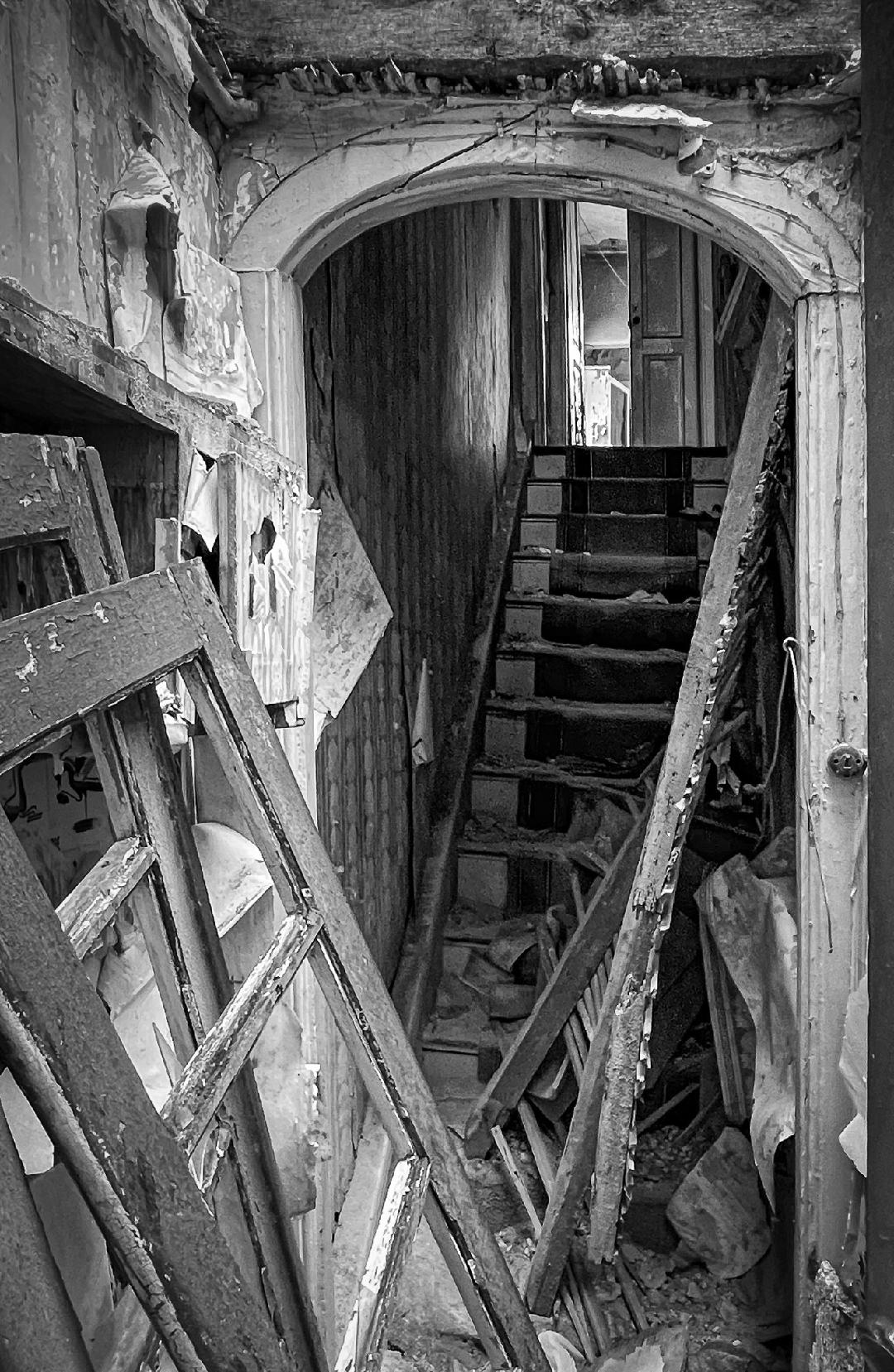
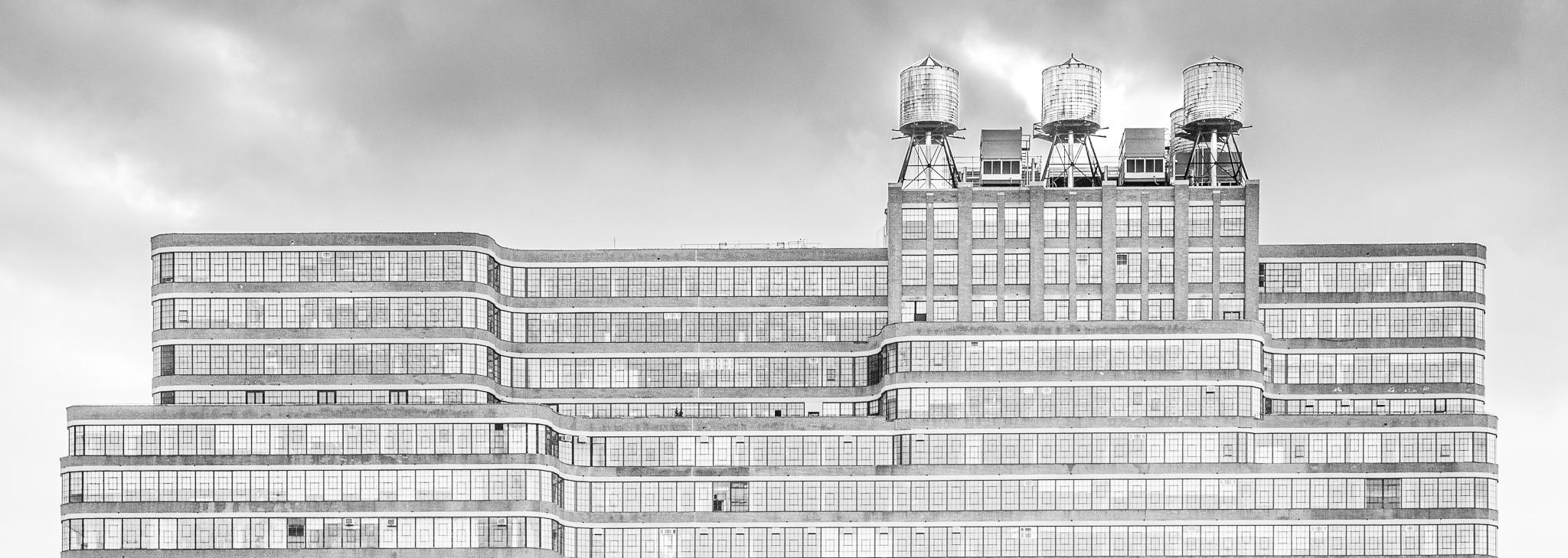
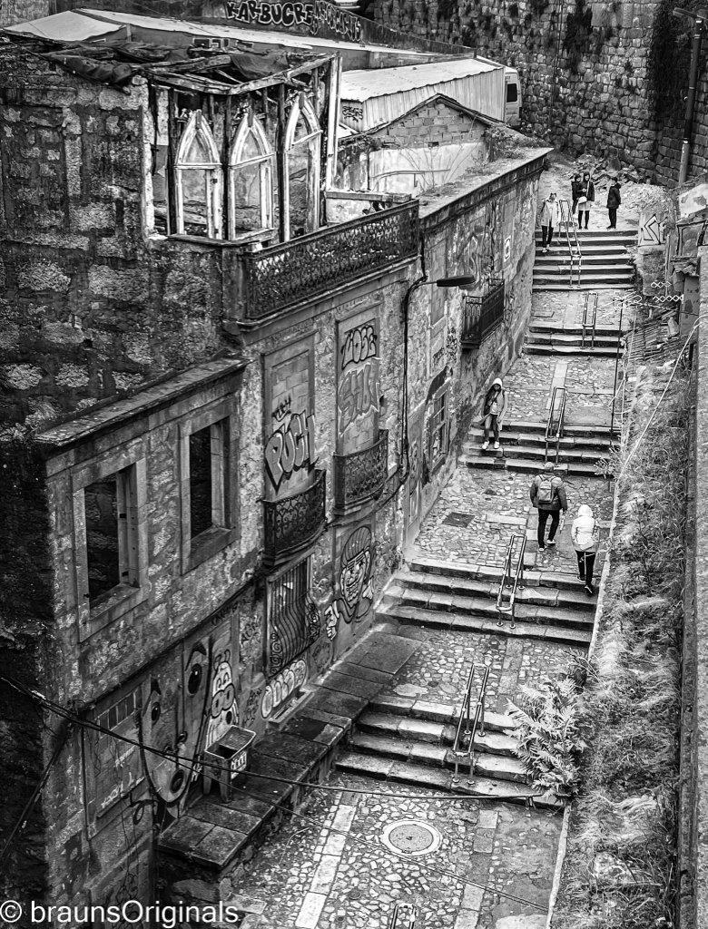
I like the exposure adjustments but am not sure about the cropping. But your cropping did highlight that I should straighten the buildings so the walls are parallel with the edge of the image. Currently they diverge from the frame and are distracting. |
Nov 12th |
| 62 |
Nov 22 |
Reply |
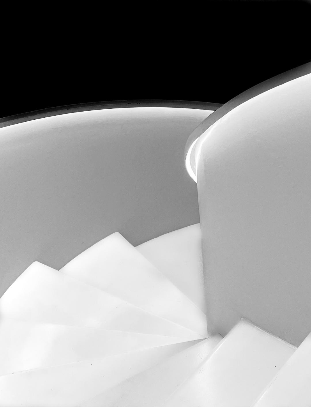
I did darking the building but can see how your edits make the stairs stand out even more. Thank you for the suggestion. |
Nov 12th |
| 62 |
Nov 22 |
Reply |
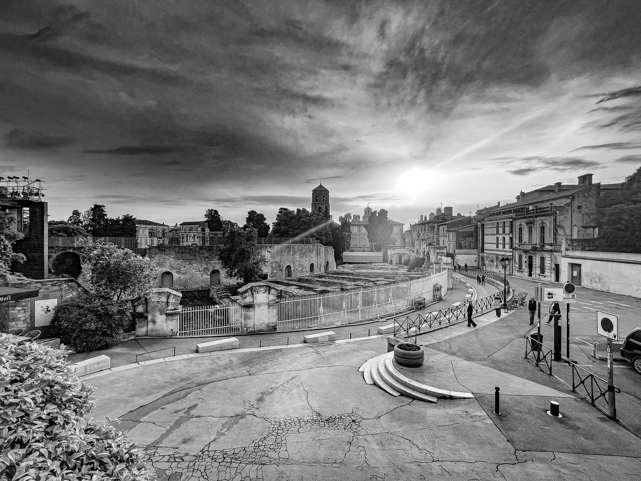
Thank you. I played with the idea of cropping the right edge as you suggested. I left the wall in to act as a barrier to keep the viewer from wandering off the page, but I think it's more distracting as you suggest. I'll make some adjustements and see what I think. |
Nov 12th |
6 comments - 4 replies for Group 62
|
6 comments - 4 replies Total
|