|
| Group |
Round |
C/R |
Comment |
Date |
Image |
| 62 |
Oct 22 |
Reply |
I'll be playing with it to see what I come up with. Thank you for your feedback. |
Oct 12th |
| 62 |
Oct 22 |
Reply |
interesting, thank you for your feedback. |
Oct 10th |
| 62 |
Oct 22 |
Comment |
Wow, so many great ideas. I'll work on it and see where it takes me. Thank you. |
Oct 10th |
| 62 |
Oct 22 |
Comment |
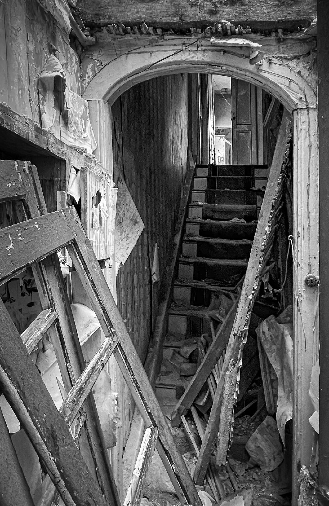
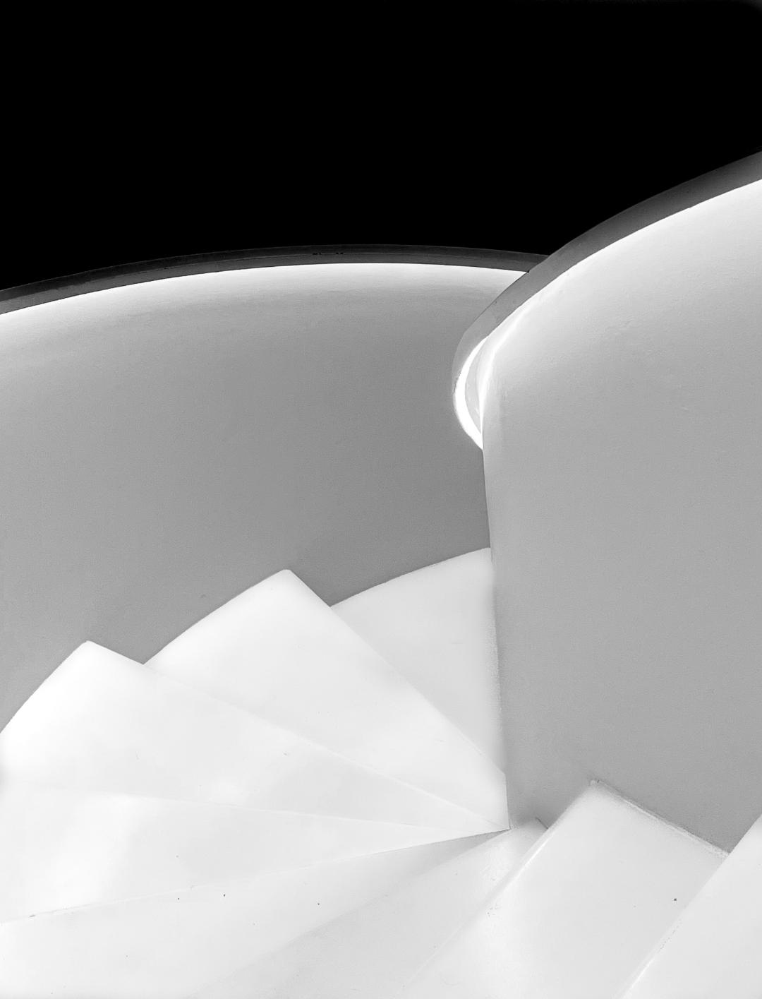
Peter, thank you for your detailed explanation of your process. I love the way you got more detail in the stairs and am going to rework the image to see what I can get out of them. Glad to be a member of this group! |
Oct 4th |
| 62 |
Oct 22 |
Comment |
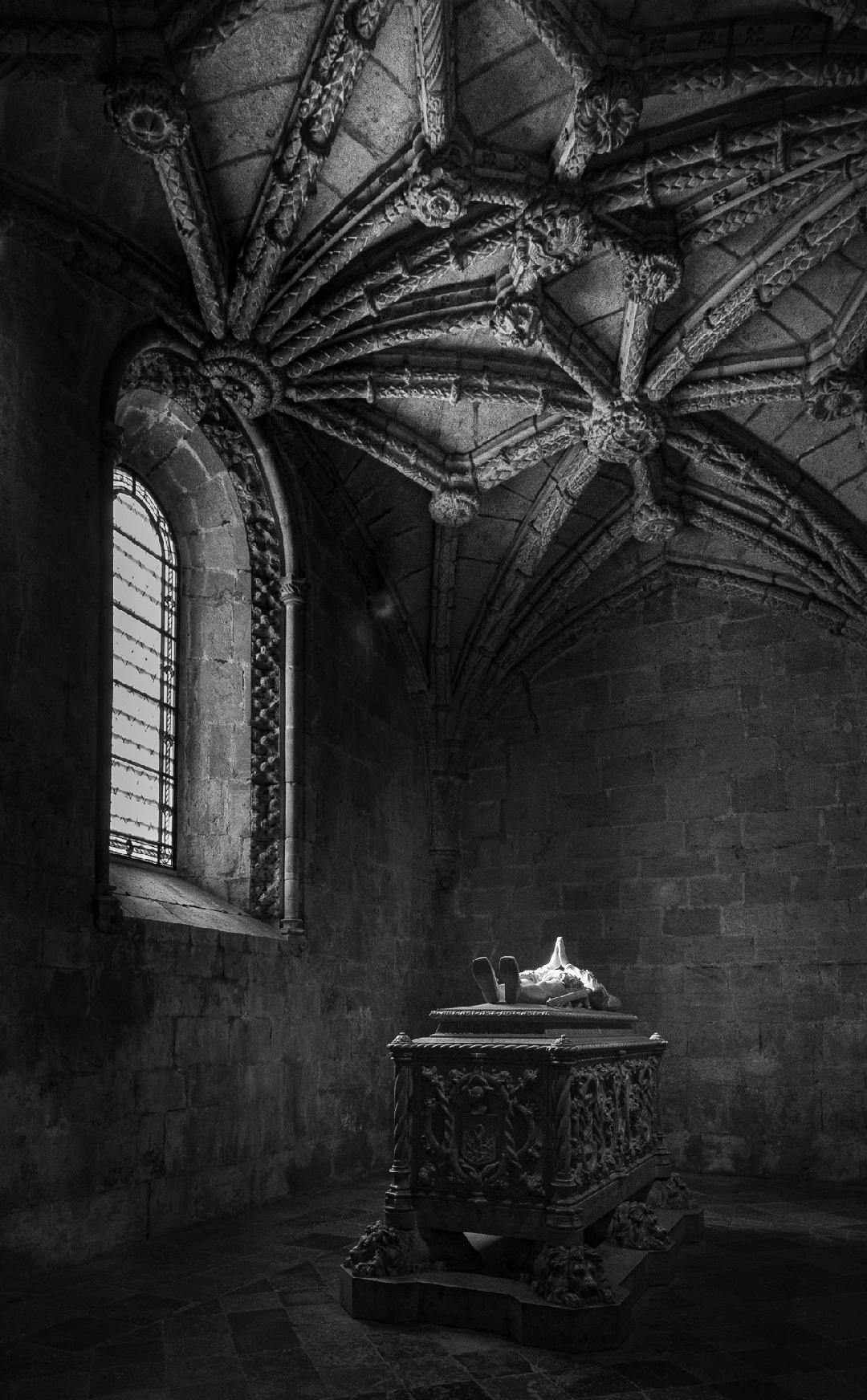
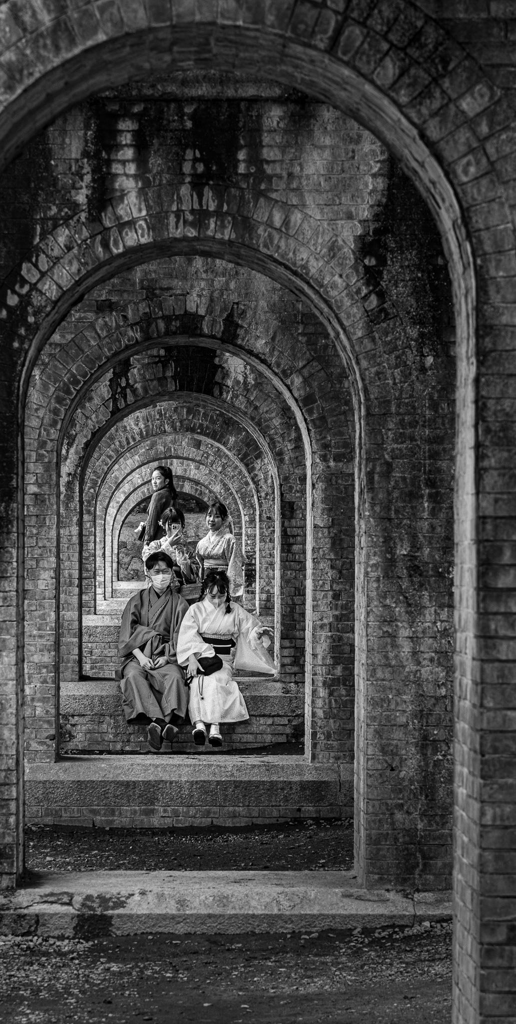
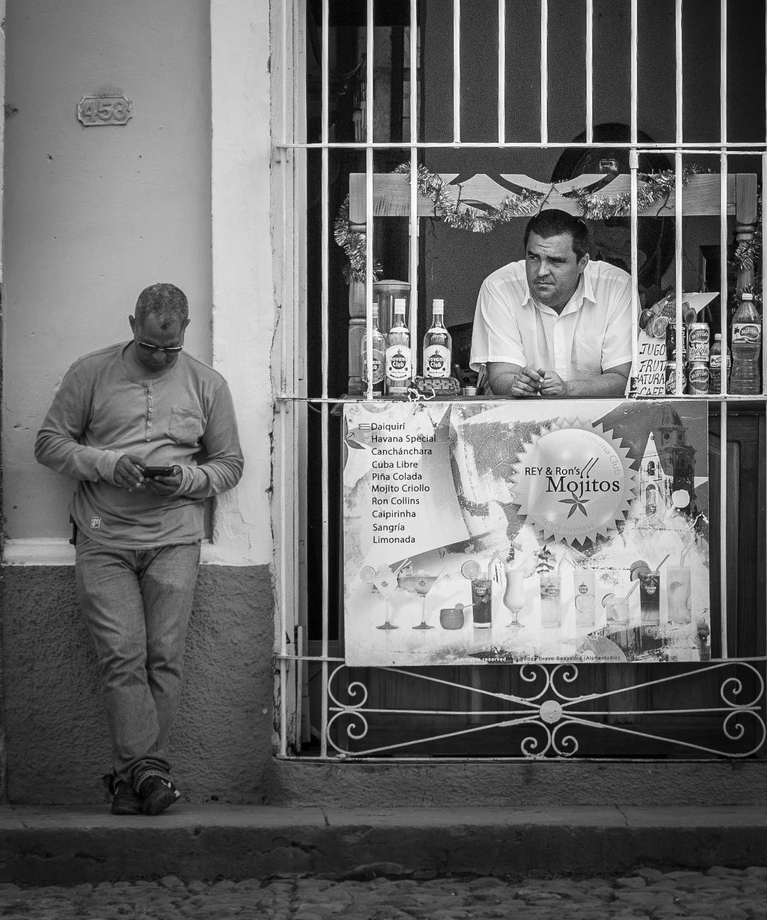
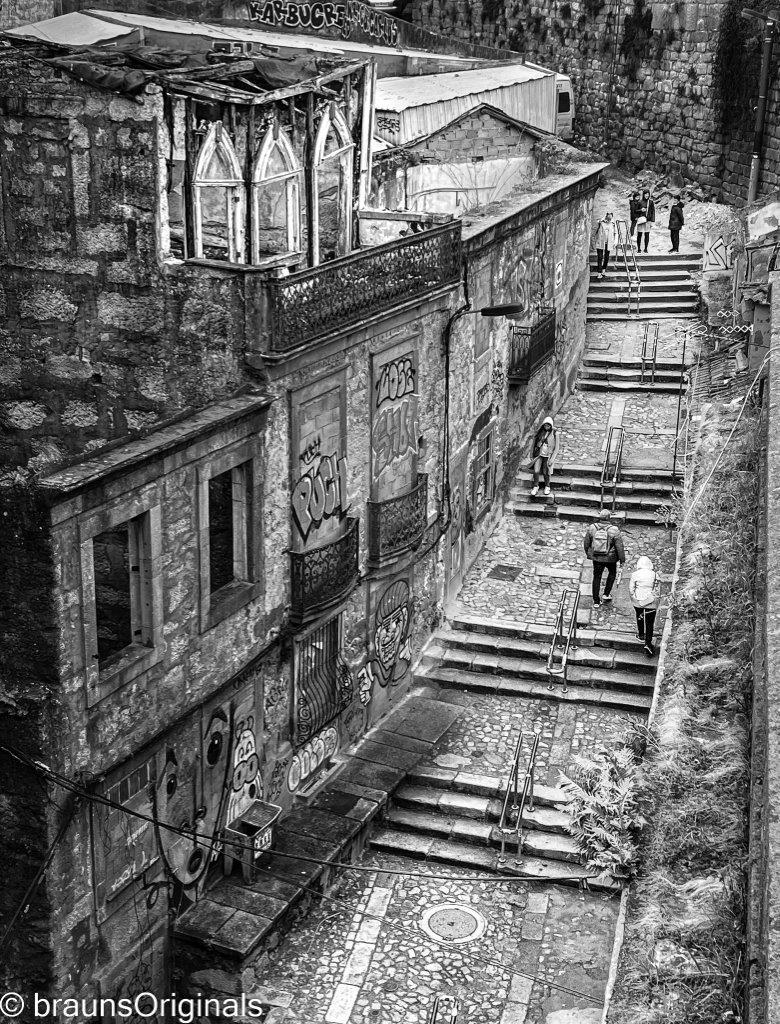
Fabulous subject. Looking forward to seeing more from your trip. This is a good conversion from the original and great cropping to show the context and imply the insignificance of the individual. In the monochrome version, the individual blends into the background a bit too much for my taste. I'd like to see him/her separated a bit from the background to pull me into the image. Not sure if that works or not but it's a thought. |
Oct 3rd |
| 62 |
Oct 22 |
Comment |
Wow, Outstanding use of special effects and the depth of field is perfect for the composition. Beautiful way to take a simple floral photo and turning it into a piece of art! |
Oct 3rd |
| 62 |
Oct 22 |
Comment |
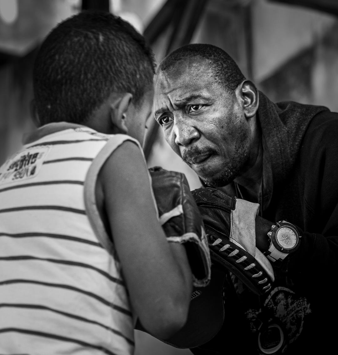
I like the monochrome version much better than the original because the subject is more pronounced. Your use of post processing greatly enhanced the separation too. My eye keeps wandering toward the black sky in the top right corner and while I usually don't like flipping an image horizontally, I'd give it a try and see what you think or see if it can be lighted up to make it less dominate. |
Oct 3rd |
| 62 |
Oct 22 |
Comment |
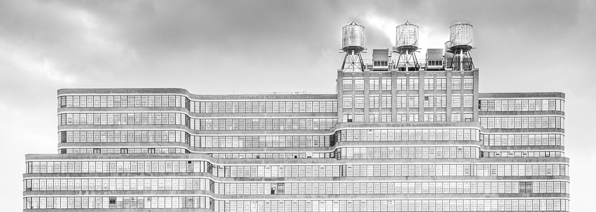
Wow!!! Great conversion and I agree your post work is seamless. Love how you created the separation between the foreground, middle ground and especially how the sky and mountains stand out. |
Oct 3rd |
| 62 |
Oct 22 |
Comment |
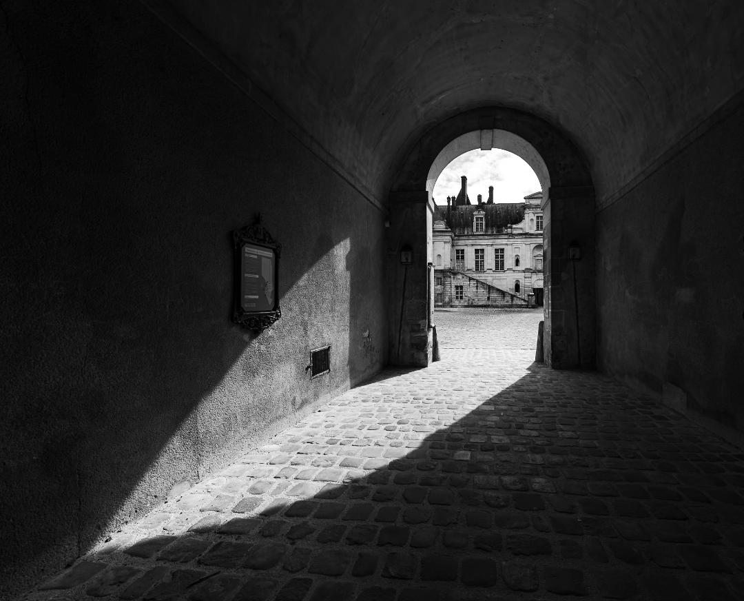
Very nice image and cropping it down the way you have is marvelous. I like the way you've let the background stay visible enough for the viewer to have some context but isn't distracting. My only suggestion would be to crop a bit tighter on the left side as the mass of the door is a bit distracting. |
Oct 3rd |
| 62 |
Oct 22 |
Comment |
This is beautiful and you nailed the lighting. Cudo's. I'd like to see a bit more depth of field. I've been playing with focus stacking in Light Room and With Helicon Focus and find that it helps hold the viewers gaze a bit longer. While most use a tripod, there are videos showing how to do it hand held that work too. |
Oct 3rd |
| 62 |
Oct 22 |
Reply |
Thank you for your comments and the great enhancements to the image. Would love to know what you used to create these. |
Oct 3rd |
8 comments - 3 replies for Group 62
|
8 comments - 3 replies Total
|