|
| Group |
Round |
C/R |
Comment |
Date |
Image |
| 9 |
Mar 17 |
Comment |
I can't suggest any improvements. It must have been an awesome experience. |
Mar 25th |
| 9 |
Mar 17 |
Comment |
The portion of your image I like and feel may be used in the future is along the edge of the right side. The viewers sitting in the bleachers could be part of an abstract composition. I like the mottled colors and the white diagonal lines near the top of the frame. Maybe incorporate the white line above the viewers, the brown and the bit of white line on the left. |
Mar 16th |
| 9 |
Mar 17 |
Comment |
Hi Shaikh, I like your post processed image and don't have any suggestions for improvement. I think the color is better and the cloning you have done with the trees is very natural looking. I see a pleasant travel type scene. |
Mar 16th |
| 9 |
Mar 17 |
Comment |
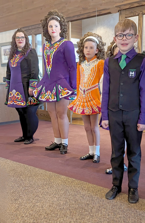
Hi Debbie, You did a wonderful job of post processing on this photo. I'm sure the Dancer would be happy with your work. I find a "backside" image sometimes tells more of a story than having a subject face forward. I see good focus; a sharp image with good color and interest. Technical qualities are excellent. The background color is perfect and the slight vignetting places the viewers eye on the dancer and holds interest within the frame. |
Mar 15th |
| 9 |
Mar 17 |
Comment |
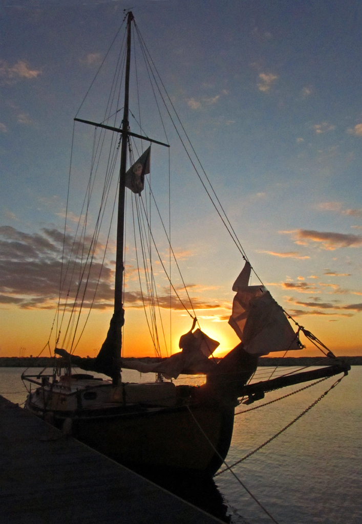
Welcome home....hope to see more travel photos. The color in this image is super. You clicked the shutter at the right time just before the sun was behind the clouds. My only suggestion is to put a frame/stroke around some of your images. I have trouble knowing where the bottom of the frame is. With the background of the website being black we have to think of this. Also, sometimes it gives the photo a nice finished look. |
Mar 15th |
| 9 |
Mar 17 |
Comment |
Hi Allen, What strikes me about this image is the "creative eye" you used in capturing this photograph. The girl is at the right spot in the frame. You were in the right spot with your camera. I like the layers of walls and the light reflected in the flooring directing the viewer's eye to the girl. Her red hair is a great focal point. All of the technical qualities are good plus high interest in the image. Very nice work. |
Mar 15th |
6 comments - 0 replies for Group 9
|
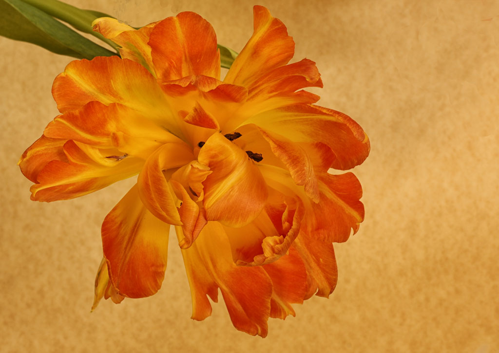
| 63 |
Mar 17 |
Reply |
Hi Charles, I do like the your image better with the stem pointing towards the top of the frame. The original image was bothersome to me because it seemed as though the stem was supporting the weight of the watch. Just my thought though as no one else has mentioned it. It really is a beautiful image, such nice color and sharpness. |
Mar 21st |
| 63 |
Mar 17 |
Comment |
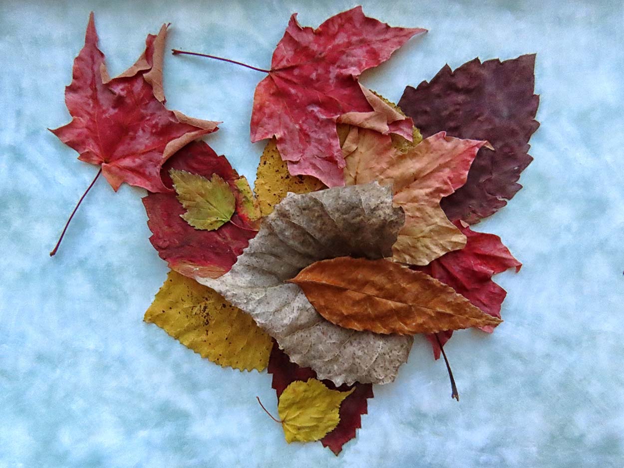
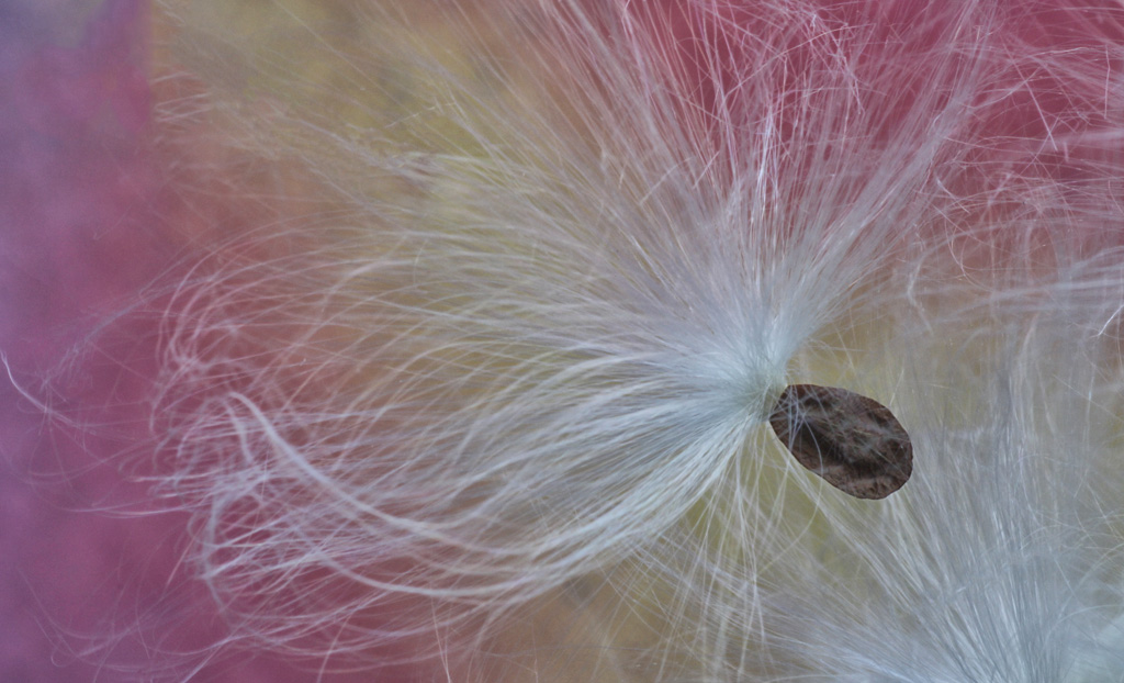
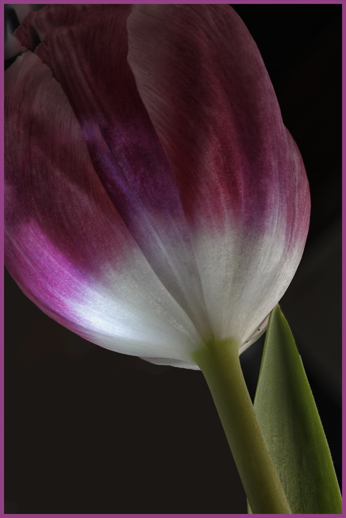
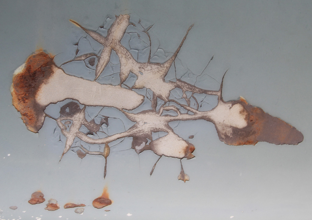
Murphy, your March image has, indeed, strong colors and patterns. It somehow reminds me of a set of colored pencils with some of the tips meeting at the "bullseye" in the right of the frame. There is a little debris there that could be the shavings of a sharpened pencil. Is my imagination working overtime? The point is....I like the strong colors, the combination of them and the questions this image raises in my mind. Your work in obtaining this photograph is admirable. |
Mar 15th |
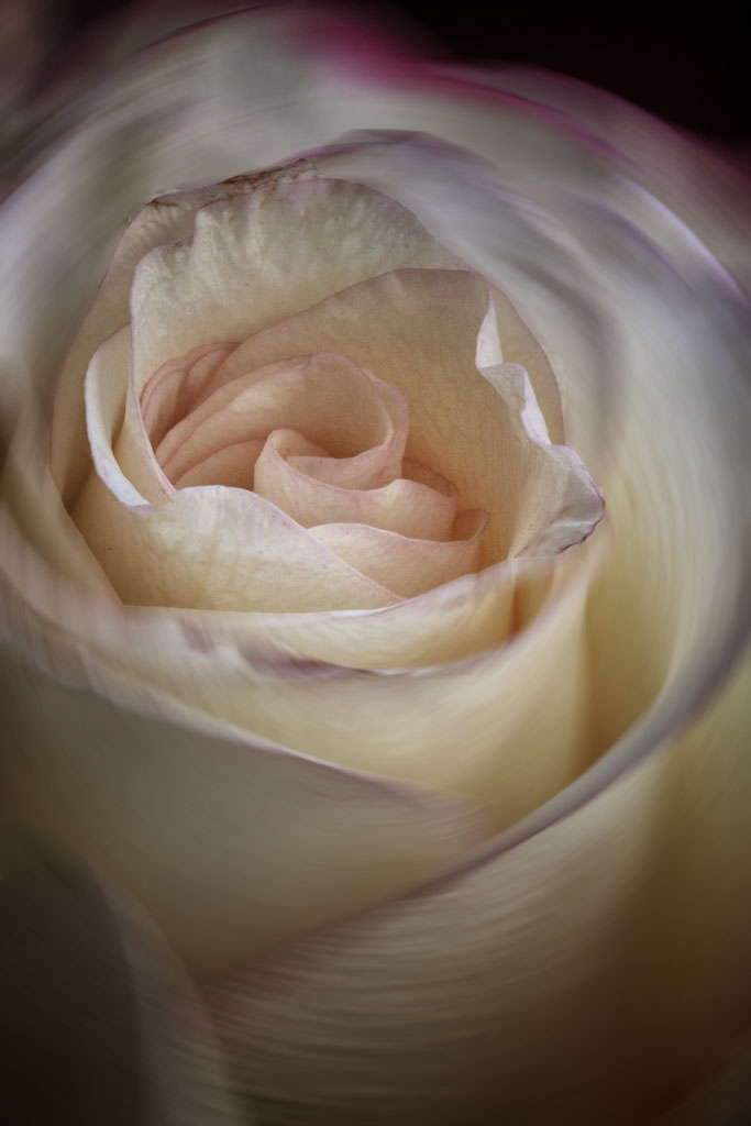
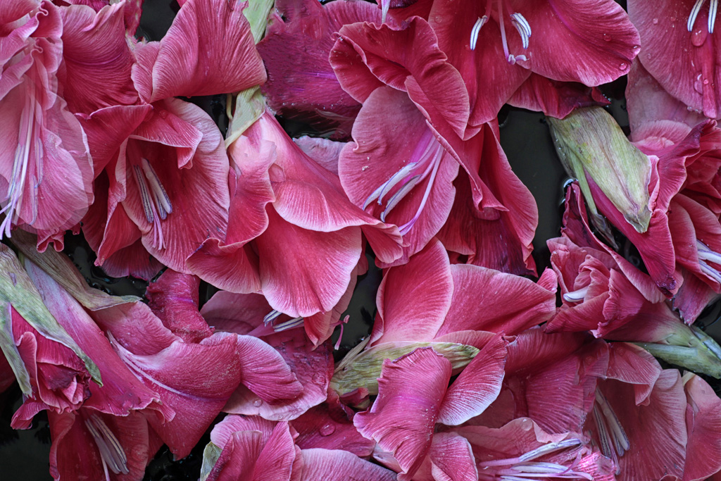
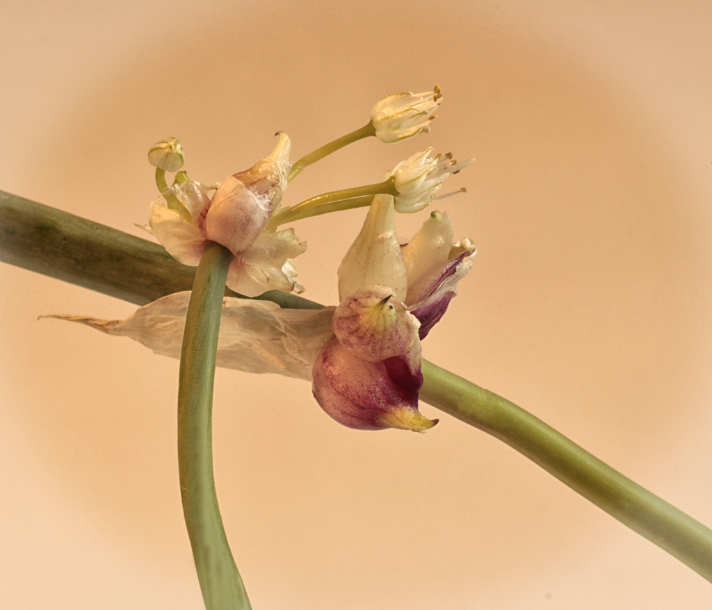
| 63 |
Mar 17 |
Comment |
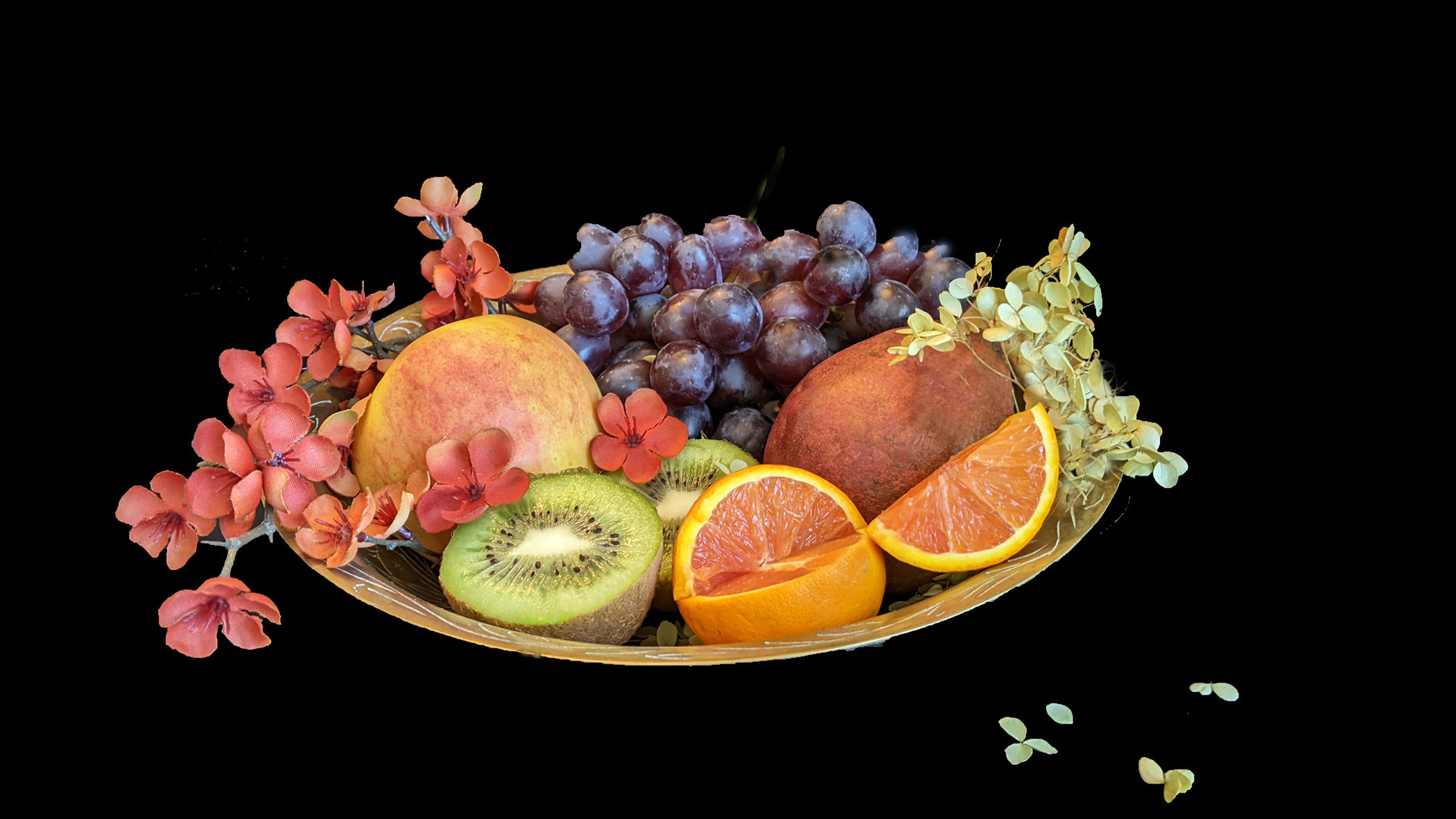
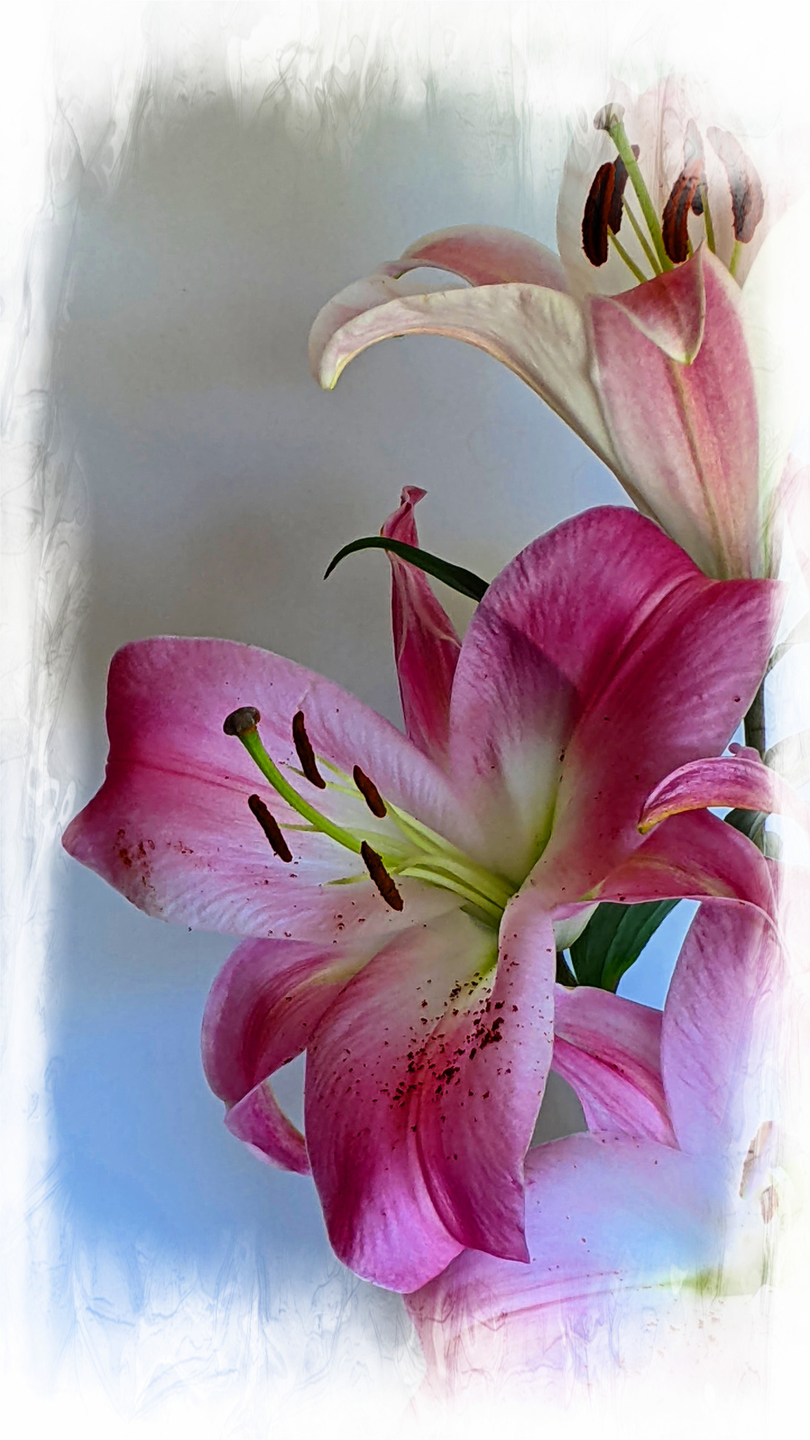
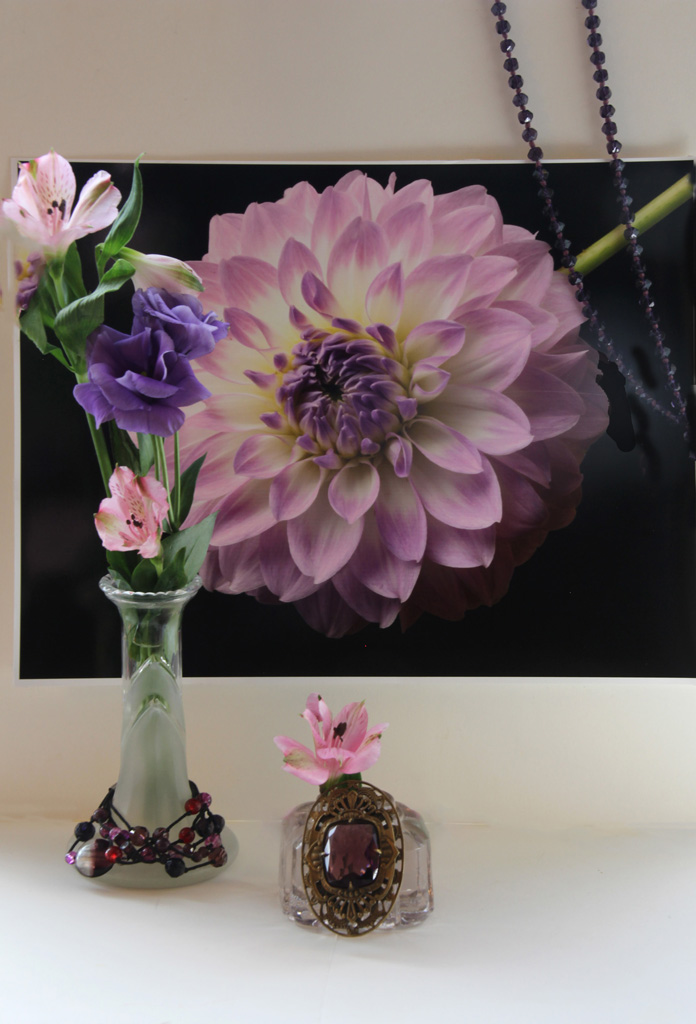
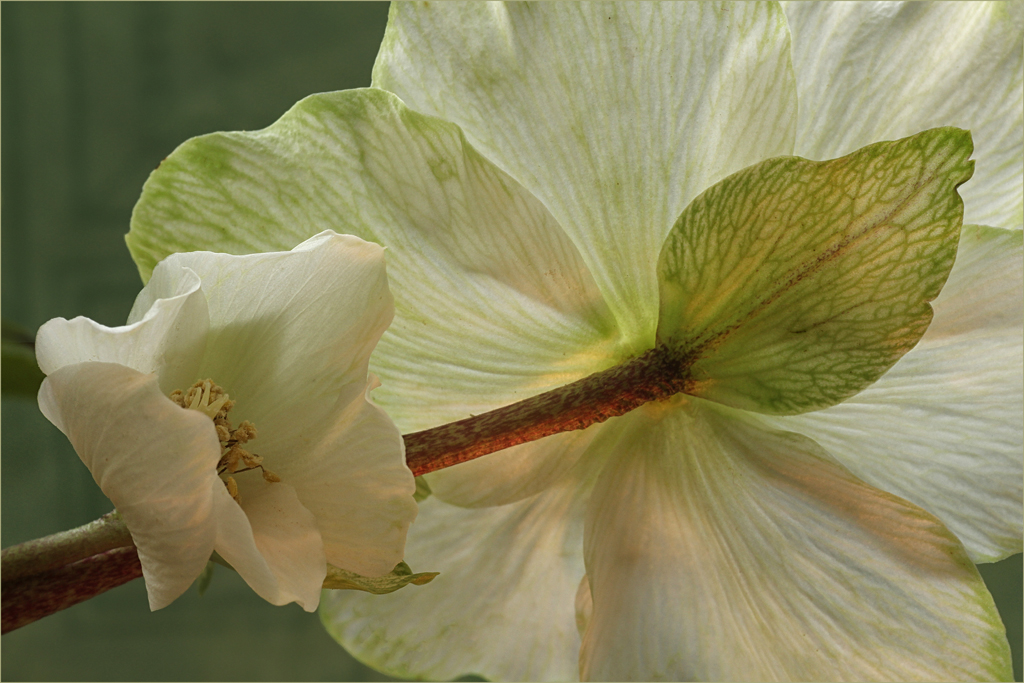
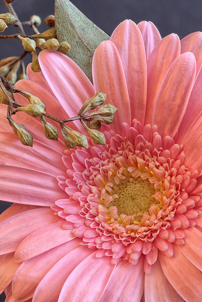
Greetings and welcome. You have given us a beautiful and unusual photograph of a water lily. I am impressed with the background material you have so subtly included; very nice placement behind the lily. The lily itself is pleasingly placed in the frame. I really like how the light is striking the flower and the shadows it projects onto the lower petals. Lovely. |
Mar 15th |
| 63 |
Mar 17 |
Comment |
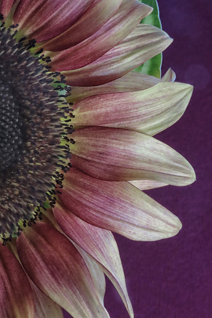
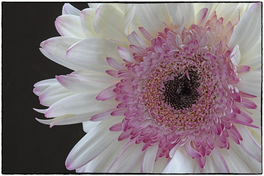
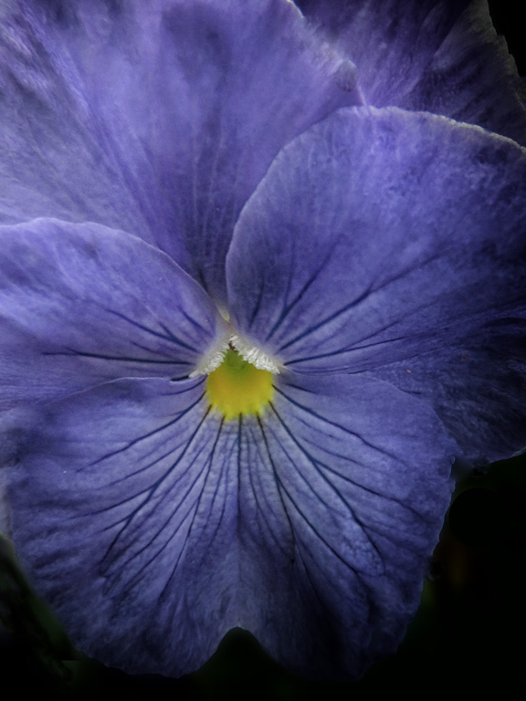
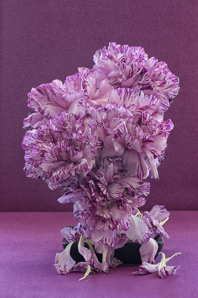
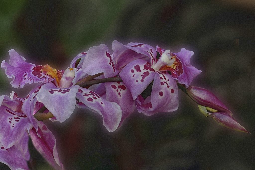
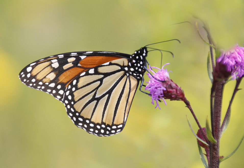
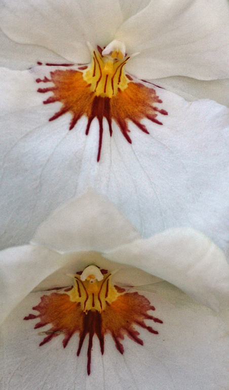
Welcome to Group 63, Lisa. I am looking forward to viewing many of your images. Both of the two you presented this month are great. Have you considered entering the second orchid mantis in competition? Oftentimes simple takes the prize. Both photos are very well done. I cannot imagine the sharpness you obtained on a creature that is so small it fits on your littlest fingernail. The composition of your primary image is very well done. I like your selection of the differing shades of magenta. Great work. |
Mar 15th |
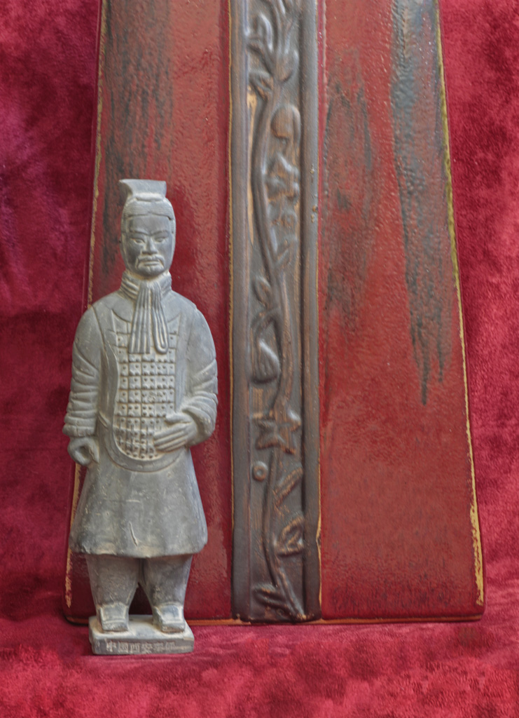
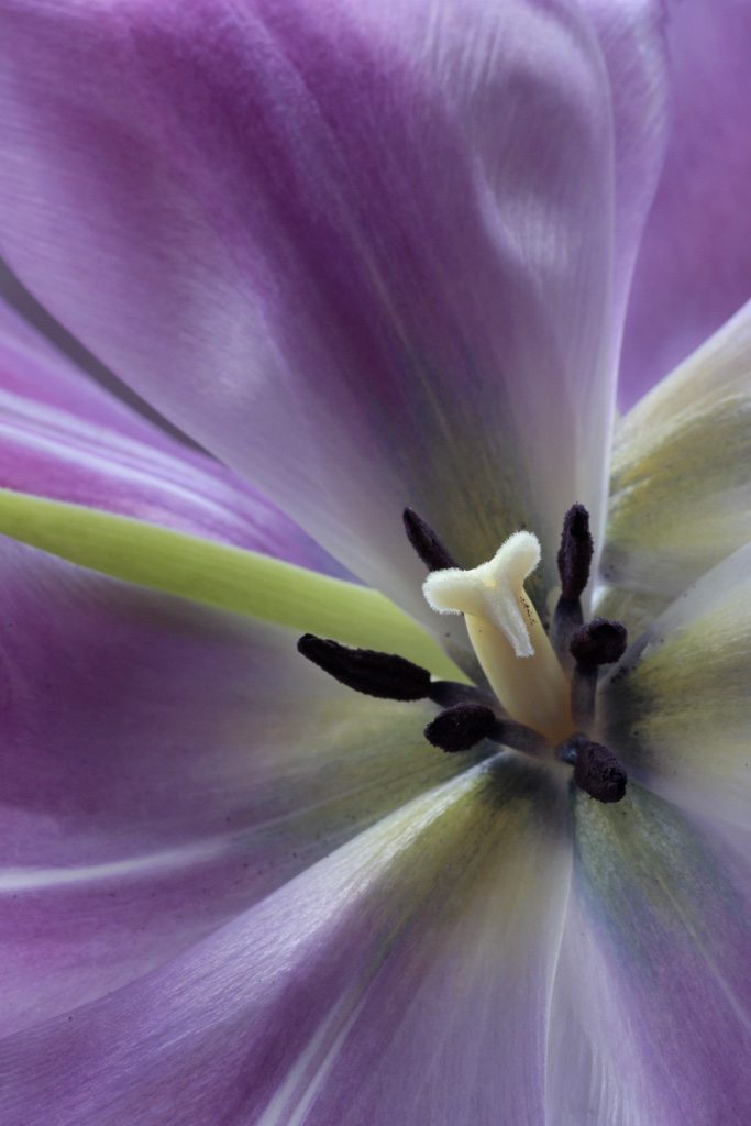
| 63 |
Mar 17 |
Comment |
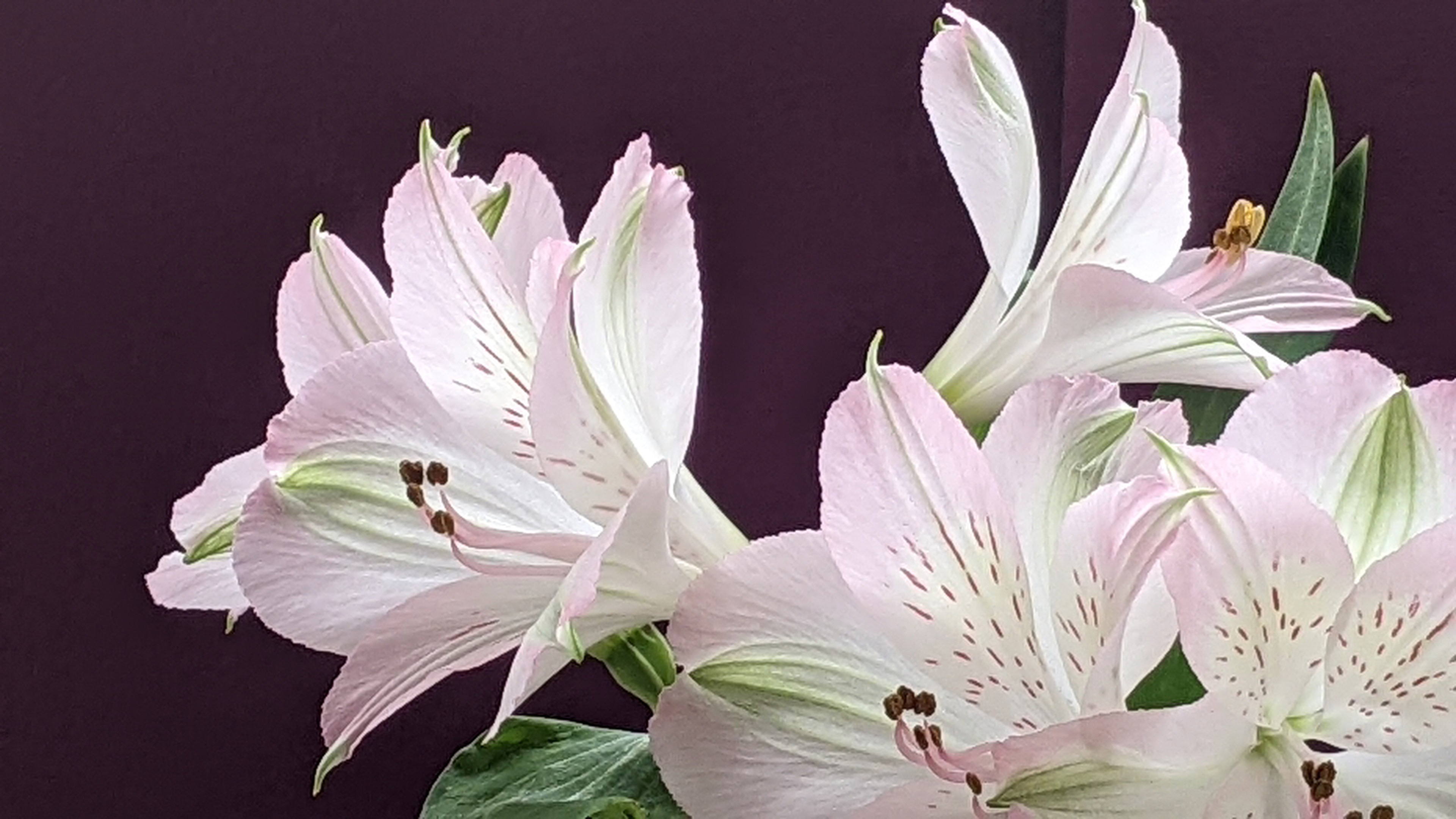
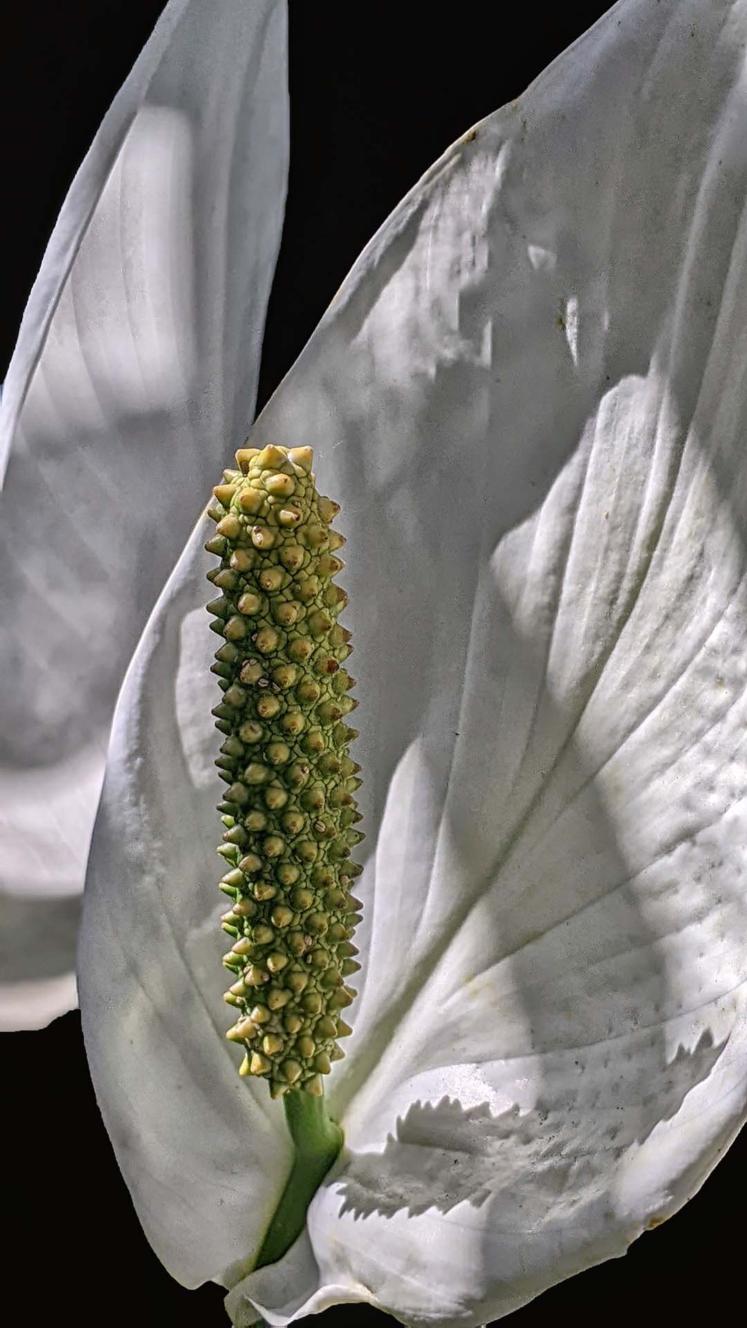
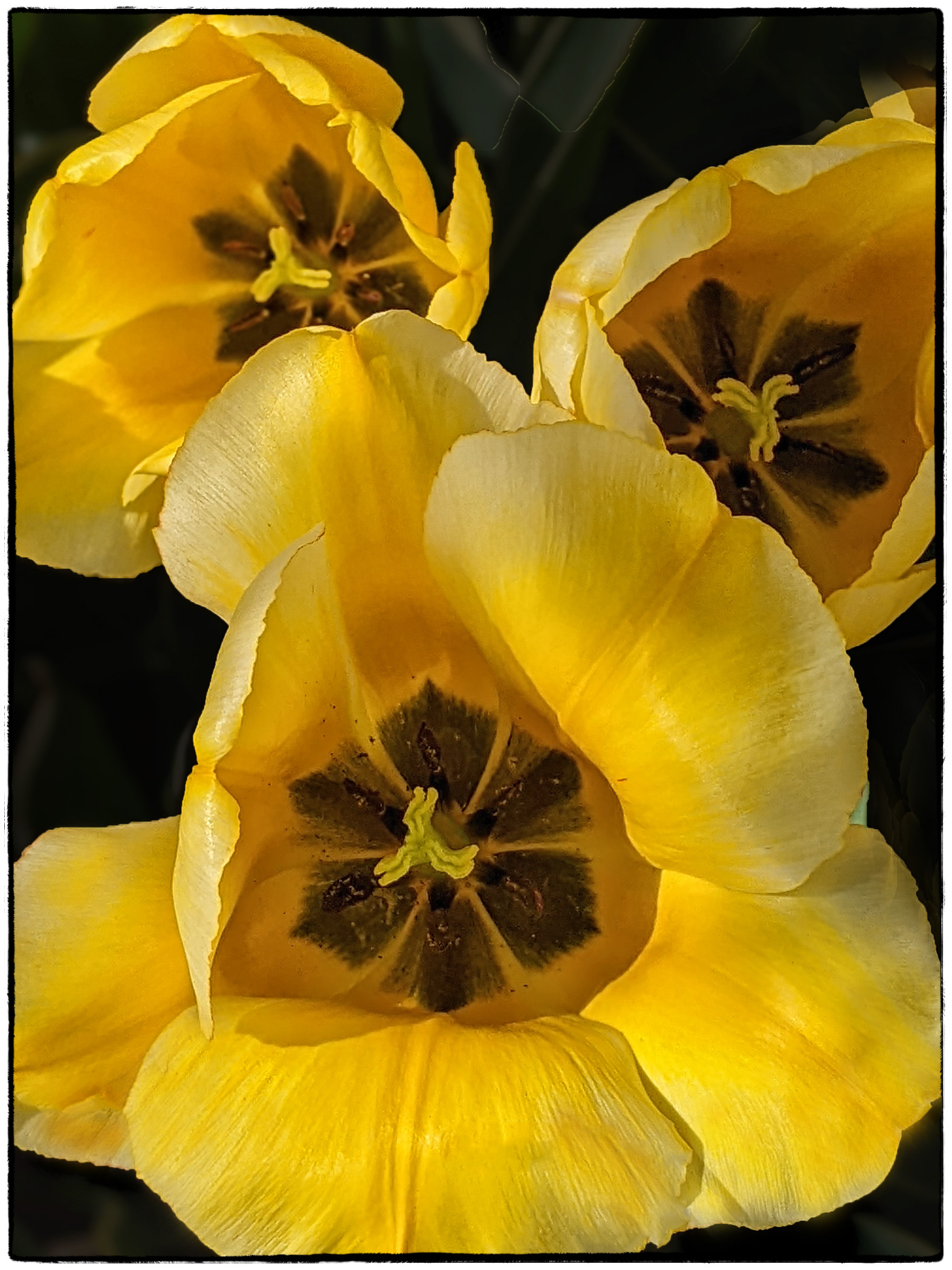
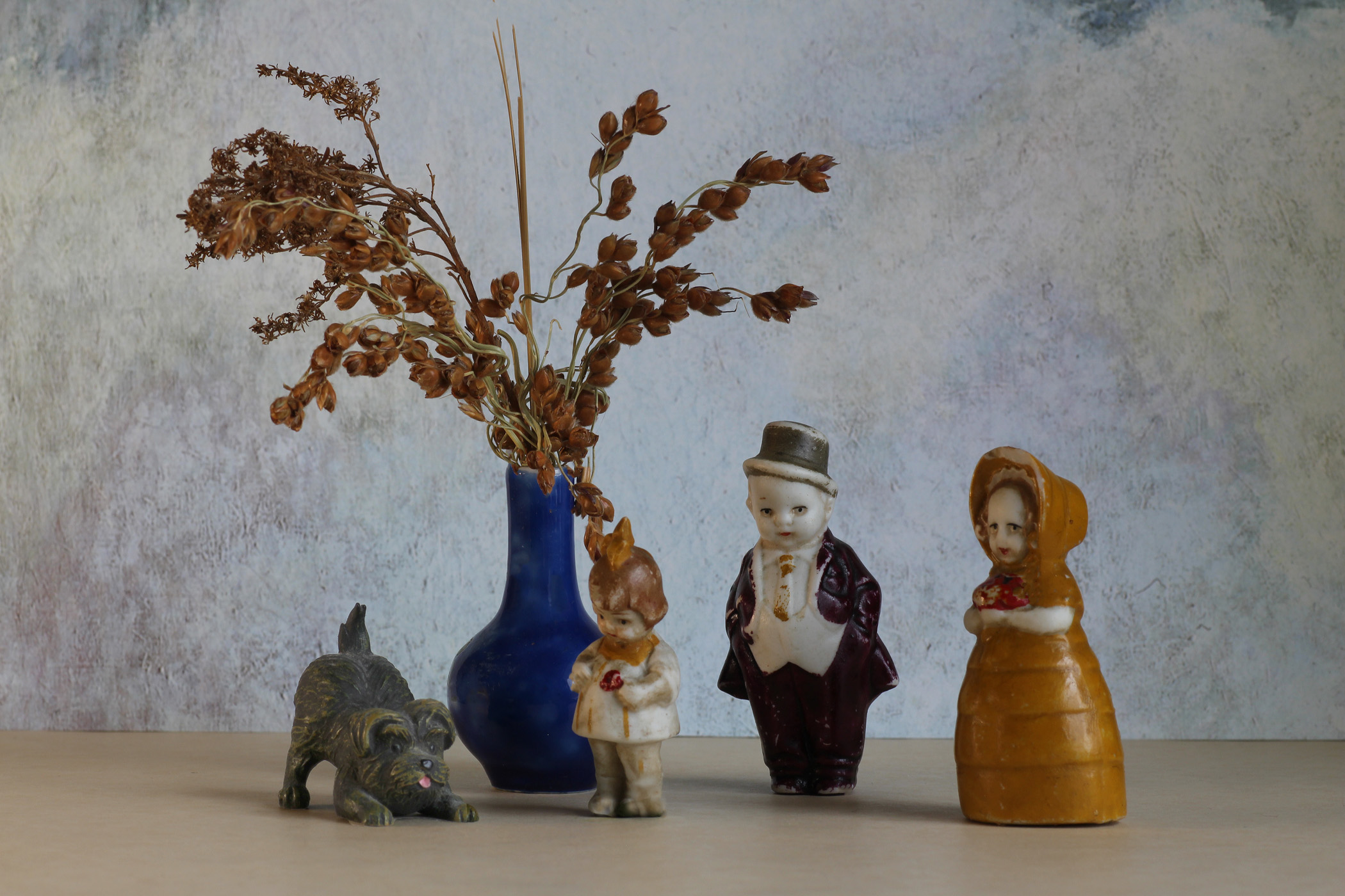
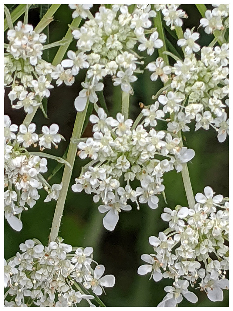
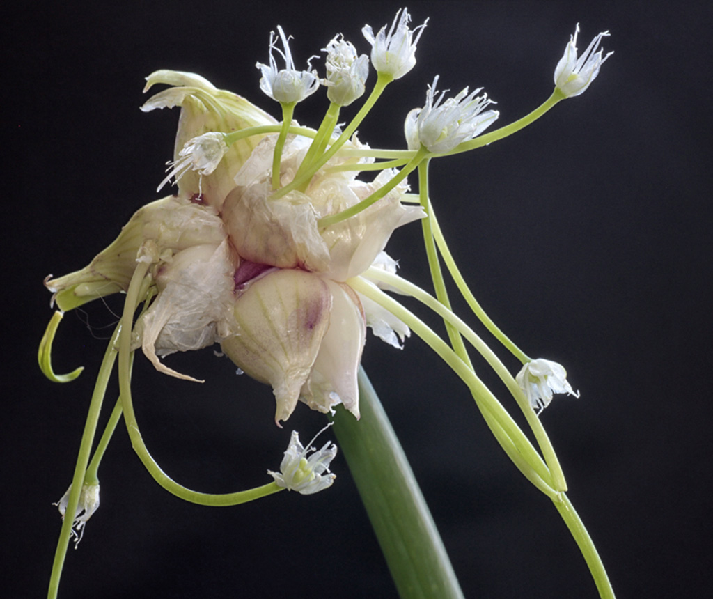
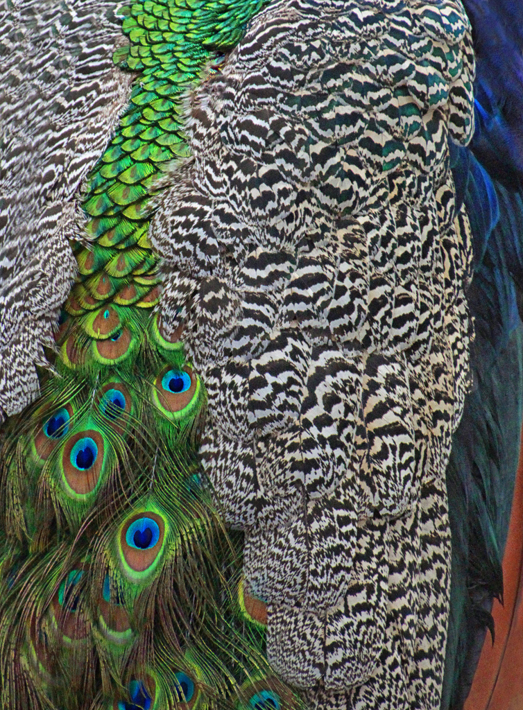
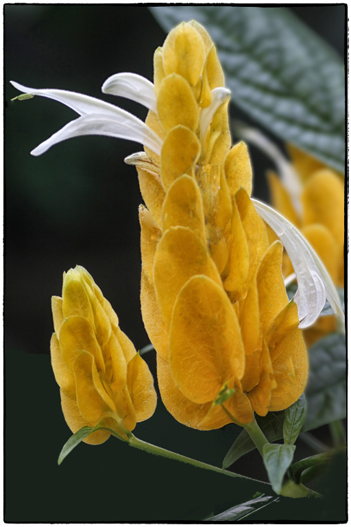
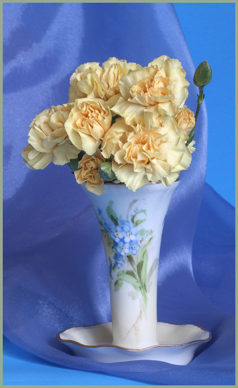
Hi Pat...Welcome back to Group 63. I can understand why your subjects are termed Porcelain. Their surface is shiny as is porcelain. I rather like the effect. I like the lighting particularly on the tallest subject which gives an appearance of translucency. The "ribs" are defined. Good background with its shallow depth of field. I don't know your camera/tripod set up but generally these are hard to photograph as it requires shooting from a low position. You did a good job.
|
Mar 15th |
| 63 |
Mar 17 |
Comment |
Hi Charles, I think the details in this image are right on. The numbering, printed words and background patterns are in sharp enough focus, particularly for an "antique" watch. Realistically photographed. Personally, I would like to see the watch stem turned to the upper right. I really like your idea of photographing against the leather box top as a subtle background. When viewing on my computer screen the texture and colors in the background are not really visible. Perhaps a stroke around the image would set the image apart from the website background. |
Mar 10th |
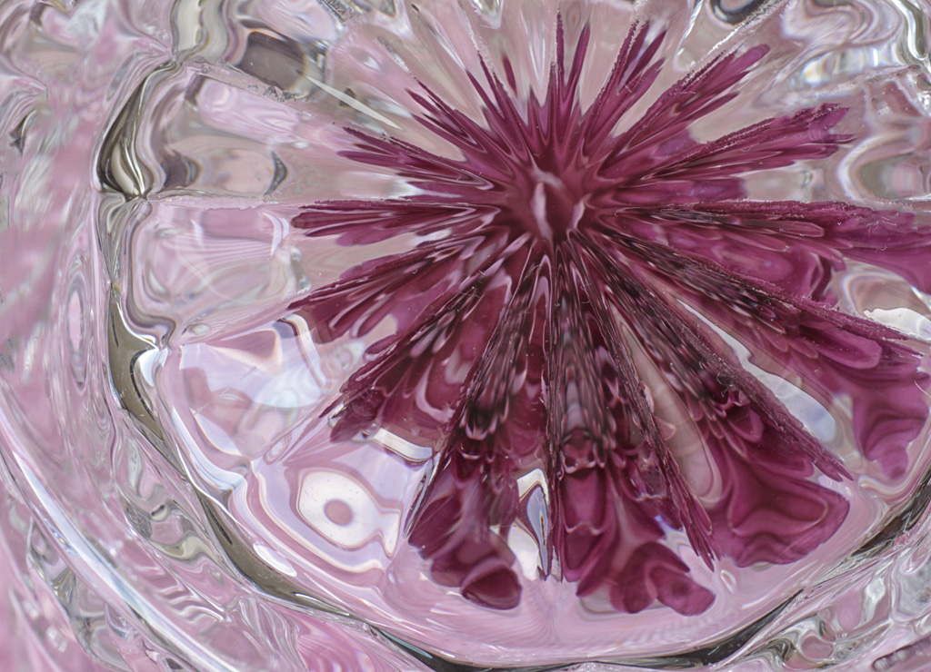
| 63 |
Mar 17 |
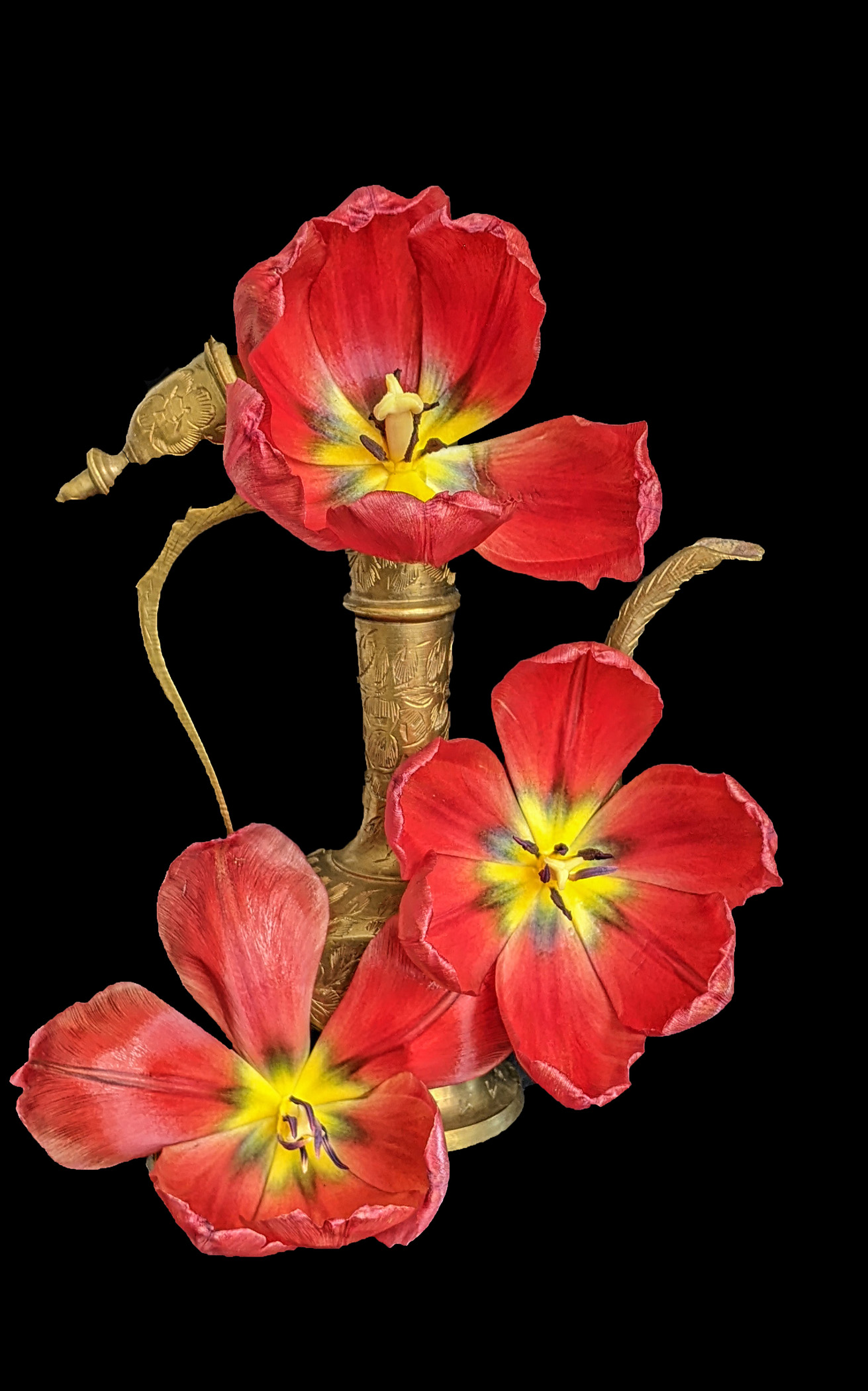
Comment |
Hi Karen, Outstanding image for March. I love it. The queen's warped effect adds interest to an already interesting image. The black framing around her makes her stand apart from the background. I think all the framing in the image is very well done. A closer look at the background reveals, to me, a planned arrangement of the cards. They are not just laid out at random. Your work is highly thought out. Focus and all technical elements are superb! |
Mar 10th |
6 comments - 1 reply for Group 63
|
12 comments - 1 reply Total
|