|
| Group |
Round |
C/R |
Comment |
Date |
Image |
| 67 |
Mar 25 |
Reply |
Thanks! Pretty close to what I did! |
Mar 17th |
| 67 |
Mar 25 |
Comment |
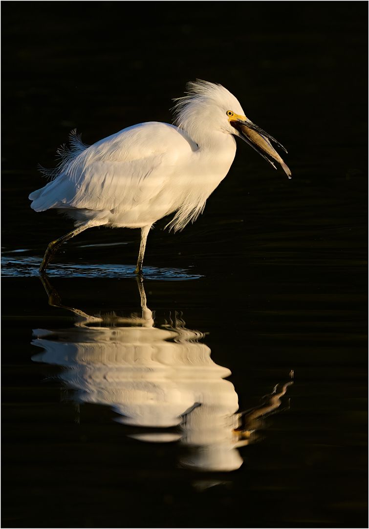
I'm impressed that you were able to get detail out of that. My only criticism of the detail is that it looks "crunchy"- it should look smoother, silkier.
Compositionally, I think this would benefit from cropping in tighter to reduce the busy-ness that Larry referred to. There's a really nice flow and S curve to the water but it's a bit lost with all the other stuff surrounding it. Here's my idea about it. I'm thinking the color version might be more attractive too, since there's some nice shades of colors within the rocks that didn't translate in the b&w. |
Mar 16th |
 |
| 67 |
Mar 25 |
Comment |
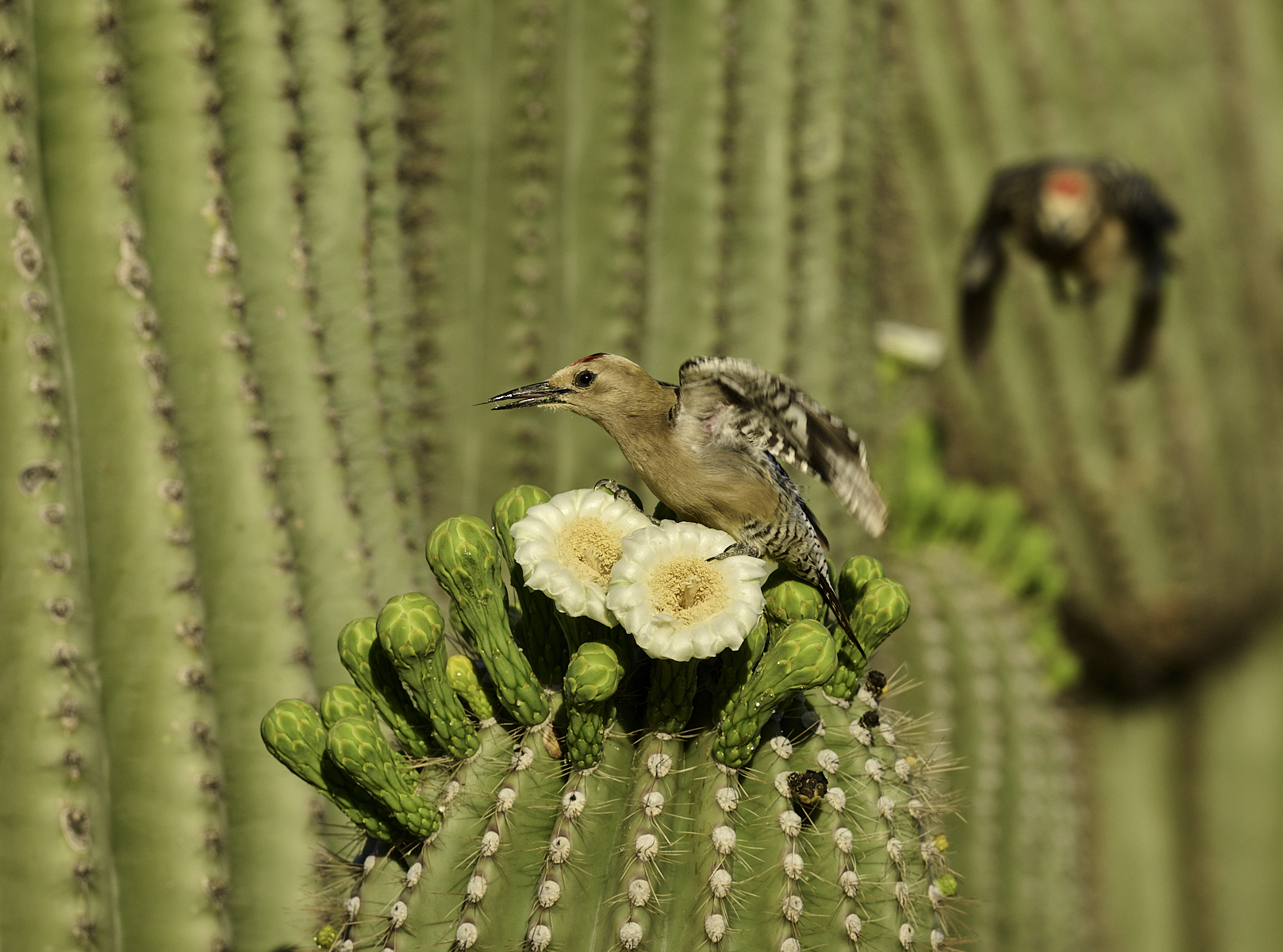
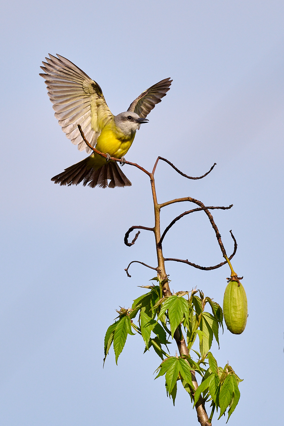
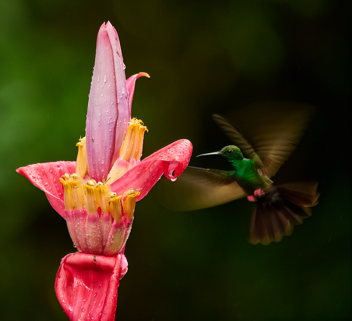
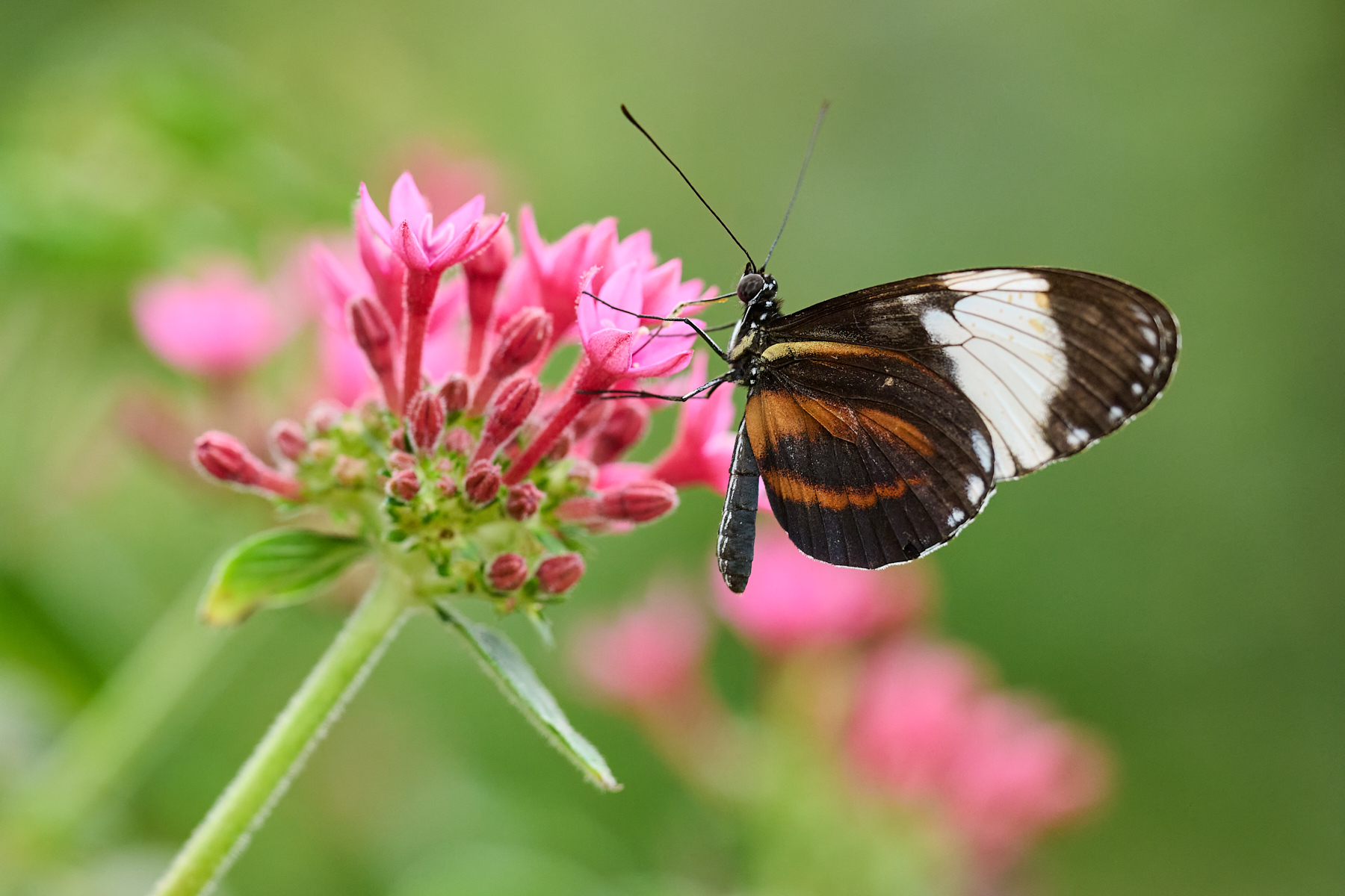
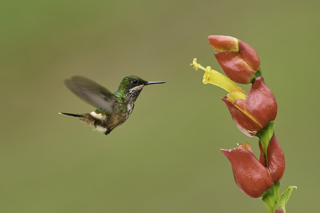
Bud,
Nice wing position captured, with both fully extended, and the bird is placed well relative to the flowers too. I like your processing in terms of what you did to darken the background and warm up the colors. The red is vibrant, which is part of the story with hummers that tend to be attracted to red!
I agree with the others that this could benefit from a crop for composition, so I had to play with my vision for it. Yes the red draws the eye, but I like the repeating reds and opposing shapes of the bloom spikes so tried to emphasize that. |
Mar 16th |
 |
| 67 |
Mar 25 |
Reply |
Larry, you mention a crop but I don't see your version? |
Mar 16th |
| 67 |
Mar 25 |
Comment |
Yes going B&W was a good choice for this image. So great that you managed to capture them with separation in the heads and tails, which is what really matters here. Going for the pan-blur was also a good choice here to help convey the speed of these cats. Opportunities can be fleeting and you definitely made the most of this one.
For me the image is a bit flat, increasing the contrast will give it more punch that fits with the story. I did that with the levels tool- just bringing in the black and white points. A surprise benefit of that ended up being that it emphasizes the light on their faces, which I didn't really notice to start with.
|
Mar 16th |
 |
| 67 |
Mar 25 |
Comment |
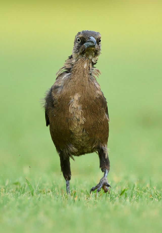
I'm listening! And I've also been thinking about shadows more and more lately, and tending to leave them darker in many cases. We don't always see a lot of detail in shadowed spots in real life, at least when there's both bright areas and shadow areas. I'm less inclined to open shadows, or I should say open them a lot, in those cases. The light is contrasty, and it can look odd when the contrast is missing. I like the contrast in the original, rather than the "flat" look of opening up the gator more.
Different story when there are large shaded areas, like a landscape foreground- our eyes adjust and see the detail, so it isn't odd to see it in the photo.
As for the log, yes it does present a bit of an obstacle. But then, it also acts as part of the story, giving the gator more of a blocker to hide behind.
Anyway, a nice story-telling image! |
Mar 16th |
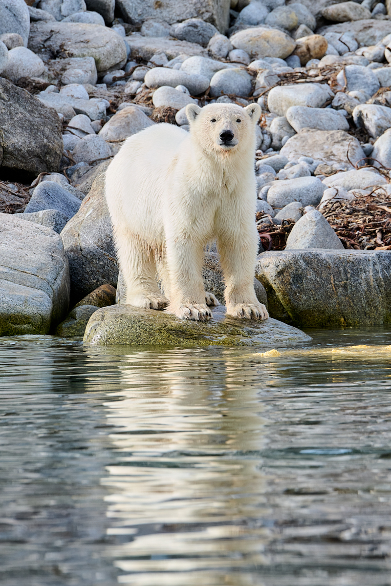
| 67 |
Mar 25 |
Comment |
Pretty cool to get a perched Peregrine at this close of range. My "local" one perches at the tippy top of an electrical transmission tower :(
Very nice job of cropping and processing this. The color is vibrant but natural, and the crop has the branches framing the bird well. It doesn't matter what the camera is- it's what you point it at and do with it! |
Mar 16th |
| 67 |
Mar 25 |
Comment |
A beautiful sunset for sure, great patterns in the clouds. The bird adds a lot, giving a nice point of interest. I do like Butch's crop as well. I'd be interested in Larry's suggestion about bring out more detail in the dark, but I don't mind it as shown. One thing I would suggest though for presentation here when you have a dark edge like this is to put a very thin border on the image- I can't tell where the edge of it is, against the black page. |
Mar 16th |
6 comments - 2 replies for Group 67
|
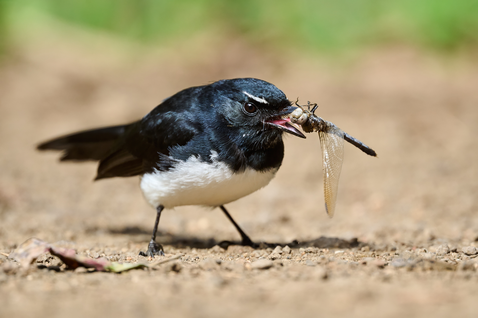
| 72 |
Mar 25 |
Comment |
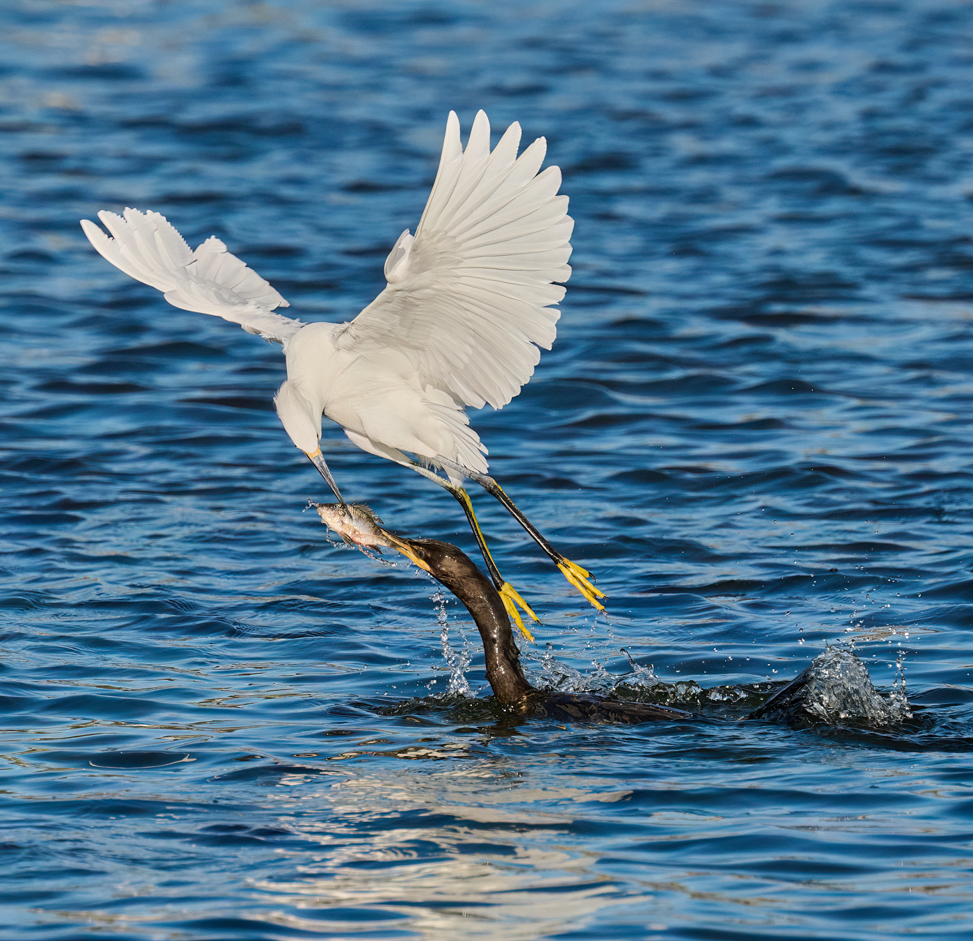
Wow Adrian, that's quite the catch! The fast frame rates we have now really help, but you still have to notice the action and react. I also like the more contrasty version. Well done. |
Mar 16th |
1 comment - 0 replies for Group 72
|
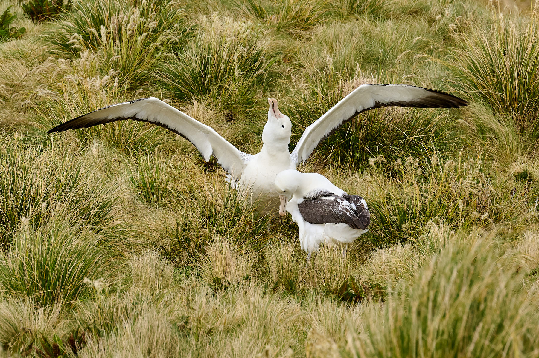
| 91 |
Mar 25 |
Comment |
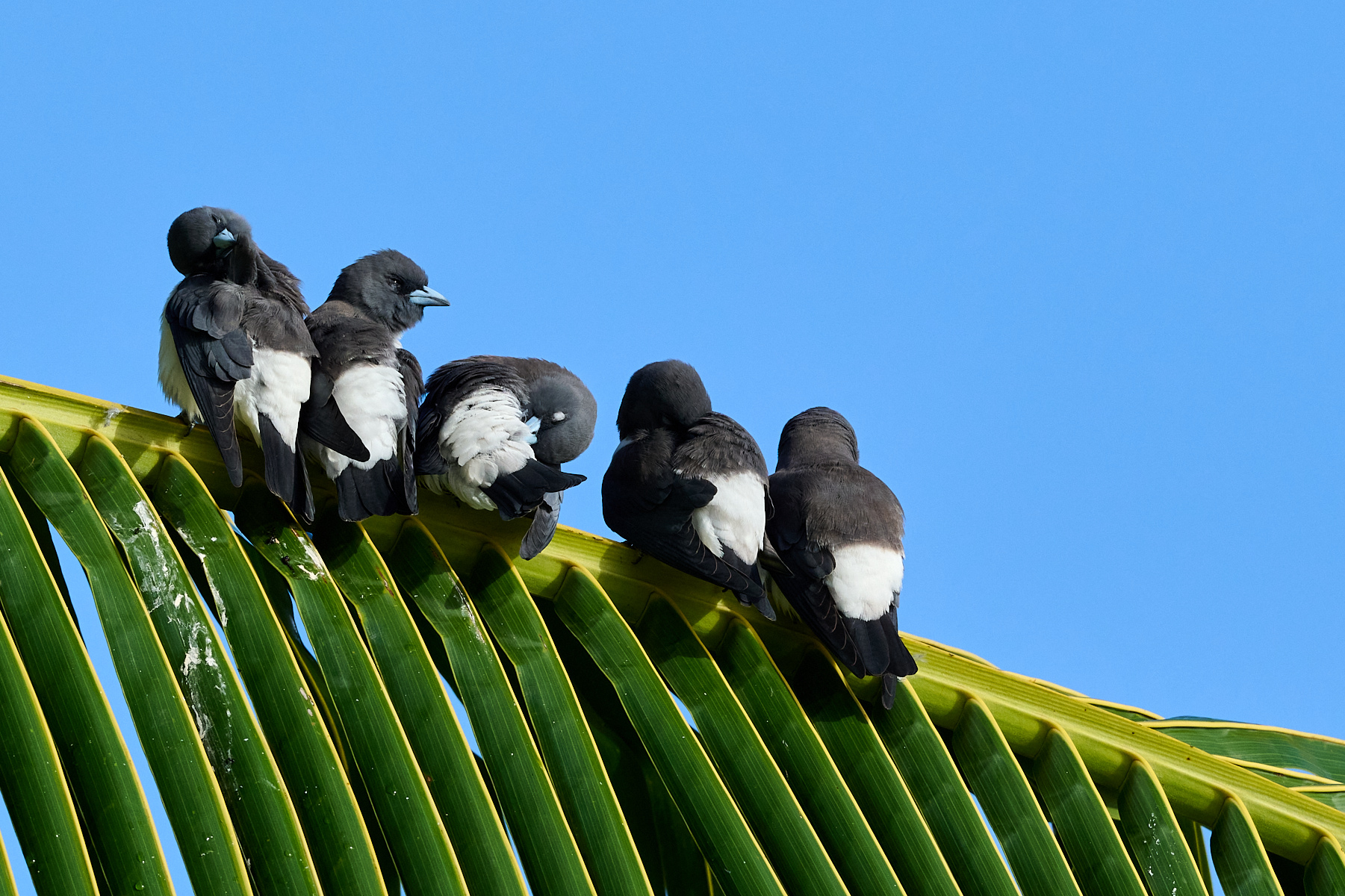
Such a nice story-telling image. Your choice to remove the branch helps a lot with the interaction at the top. But what appeals to me most is the shape of the branches. Everything is facing the same way- all the Terns are facing the same direction as the branches are pointing. It gives a nice sense of movement and flow. The only deviation from this direction is the squawking bird, which gives that even more emphasis. Well done. |
Mar 16th |
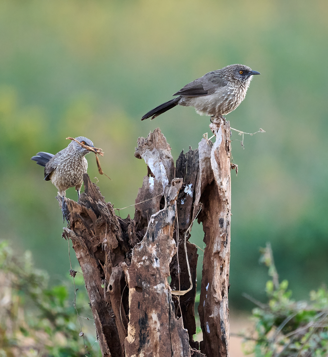
| 91 |
Mar 25 |
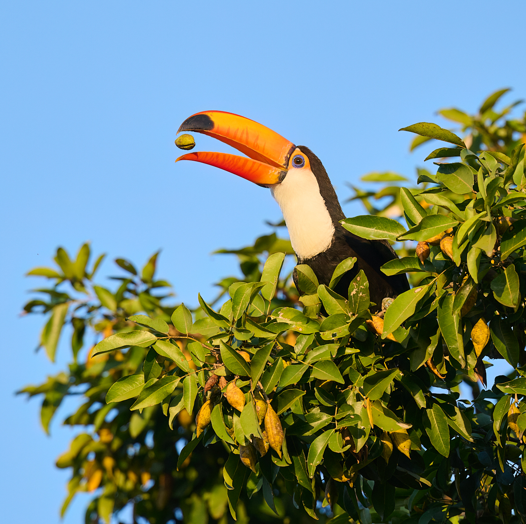
Comment |
What a great opportunity this gave you. The colors in this are so nice- the reds of the house constrasting with the green background. Given how "drab" the bird itself is, that color makes a great setting for it. A lovely image for a greeting card for sure.
|
Mar 16th |
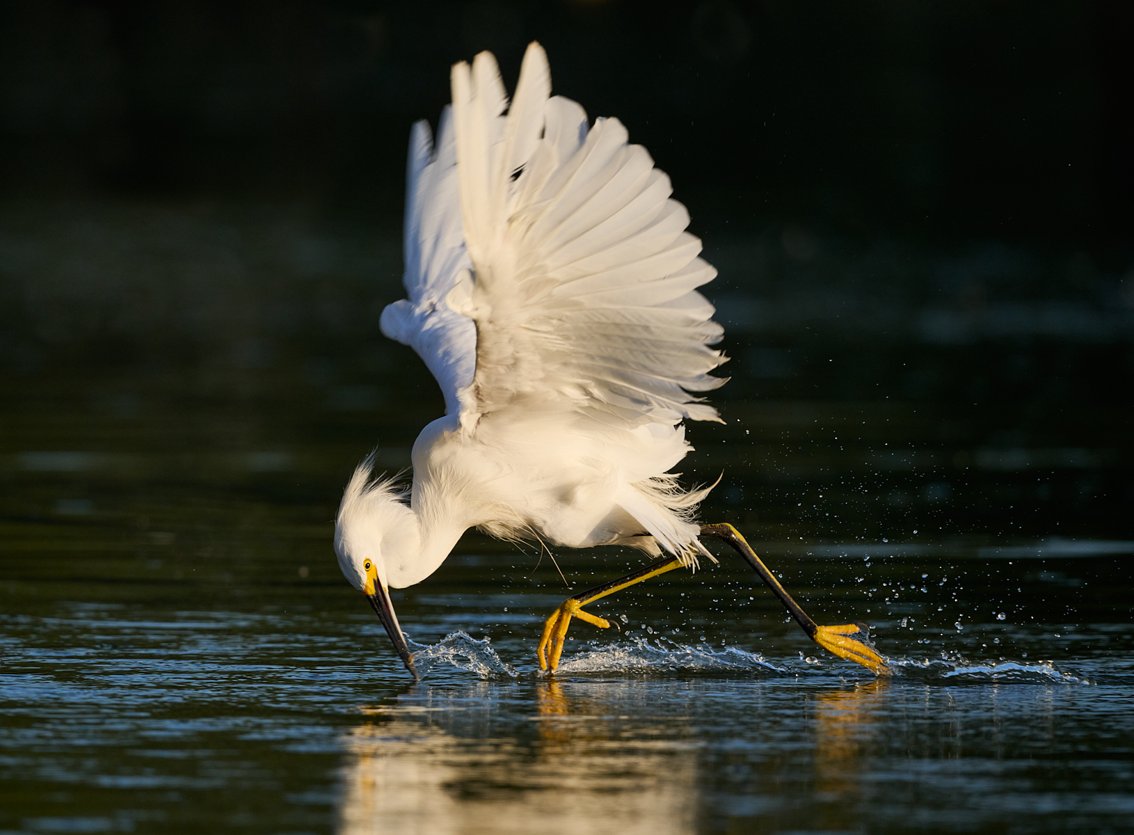
| 91 |
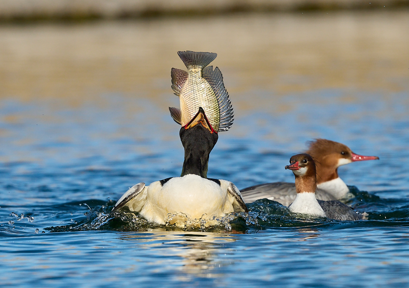
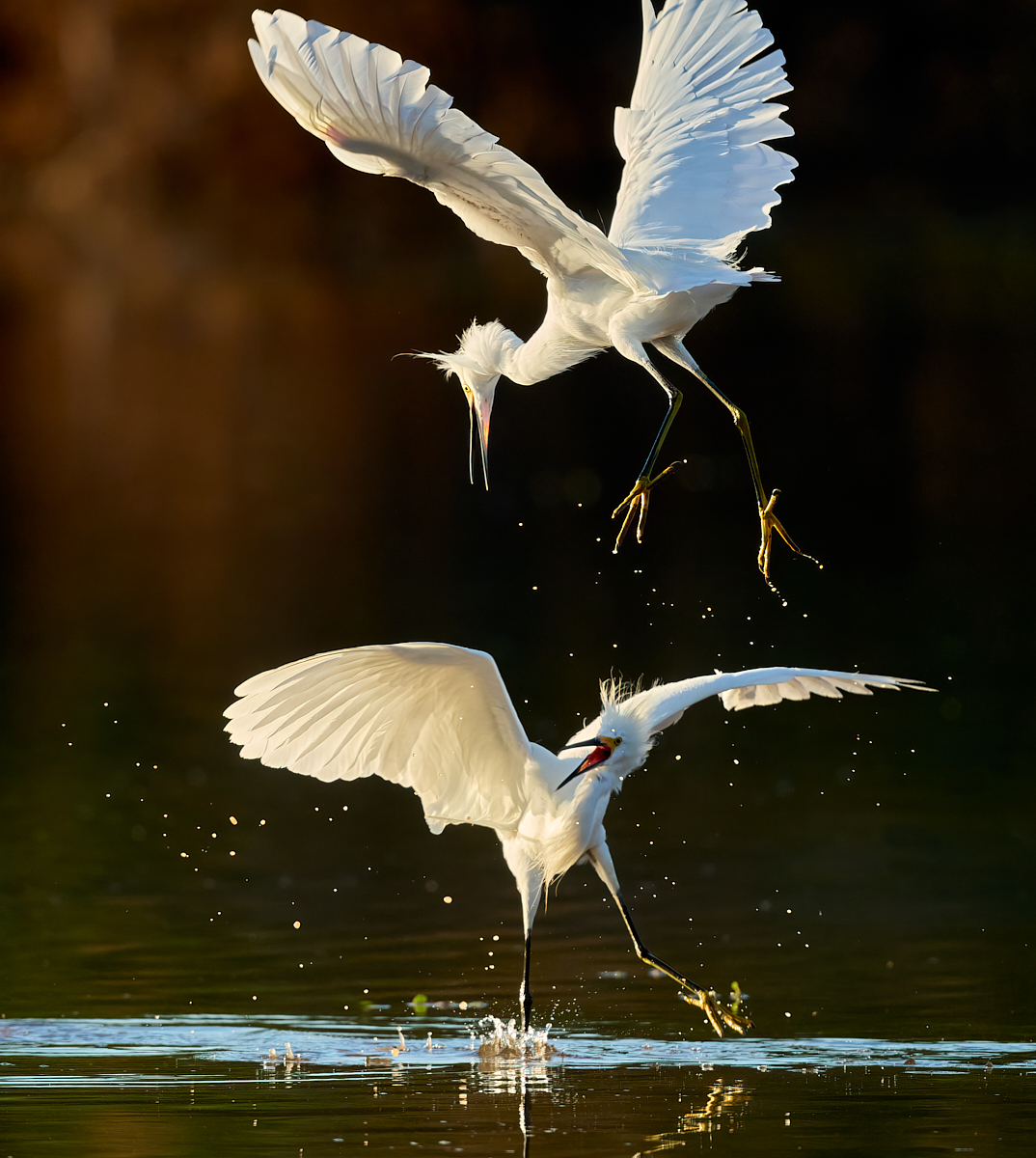
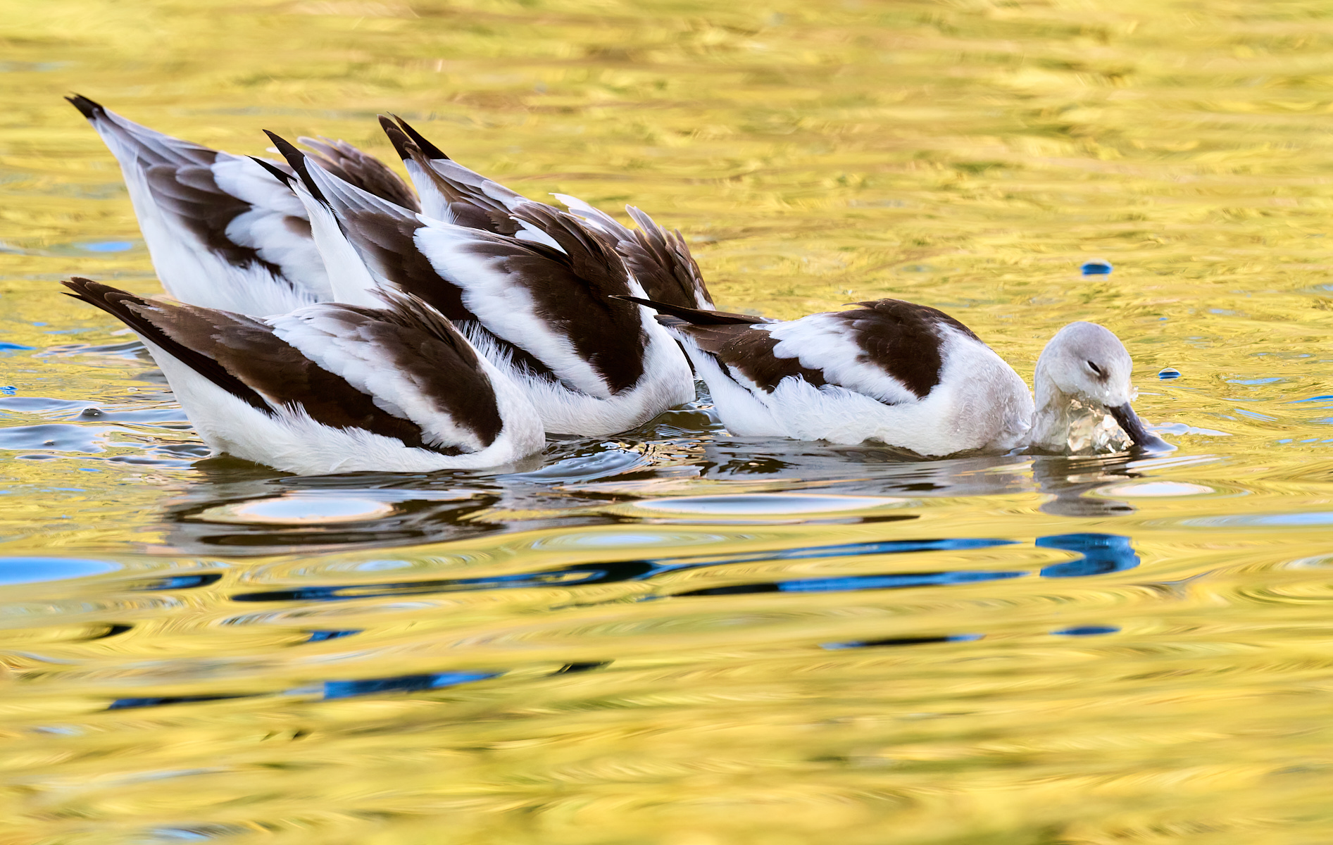
Mar 25 |
Comment |
These shots are always so much fun, they give a real sense of action. You had a good shutter speed to freeze some of the water drops but also have the swoosh of water around the wings. I like the wing position captured here too. I would probably crop this slightly looser, but that's my taste.
The bird is a Crested Duck, native to South America. I've photographed them in Argentina and the Falklands. |
Mar 16th |
3 comments - 0 replies for Group 91
|
10 comments - 2 replies Total
|