|
| Group |
Round |
C/R |
Comment |
Date |
Image |
| 67 |
Jan 23 |
Reply |
Looks like you had a fun outing! Yes this one the stuff on the leaf itself I do recognize as ice :)
|
Jan 9th |
| 67 |
Jan 23 |
Reply |
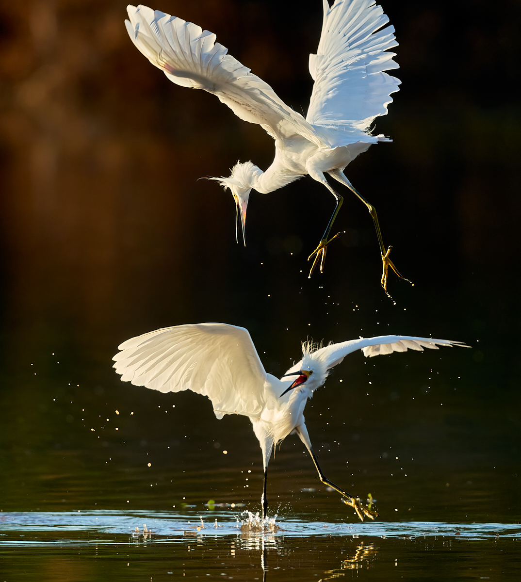
Thanks for the inputs. It actually isn't blown, it's just hard to get detail in whites in bright sun. The "top end" of the curve is at 235 (vs 255 "blown")... But I've reworked it to try to recover more, see the repost below. |
Jan 9th |
| 67 |
Jan 23 |
Reply |
Thanks for the inputs. I've reworked it to try to tone down the whites a bit, reposted below. |
Jan 9th |
| 67 |
Jan 23 |
Reply |
Thanks for the inputs, I've reworked it for the whites, below. This was hand held. The 500mm pf lens is so light and small that I don't use the tripod much any more unless shooting from a blind or other fixed type situation. |
Jan 9th |
| 67 |
Jan 23 |
Comment |
Here's an updated version with slightly more room on the left and more work done on the whites. They aren't blown, even in the original, but it is tough to get detail in whites in bright sun. This time I worked selectively on the bird to reduce exposure and highlights, added some structure, and brushed over a couple of the brighter areas. I wanted to avoid going too far though and turning it in to a gray bird! |
Jan 9th |
 |
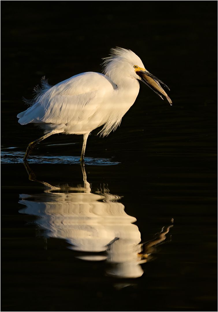
| 67 |
Jan 23 |
Reply |
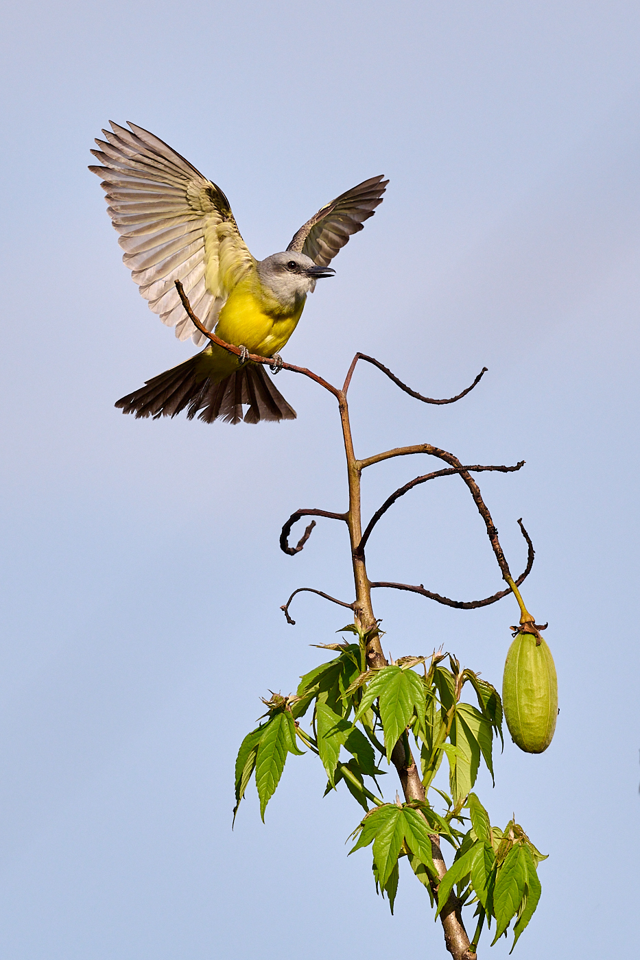
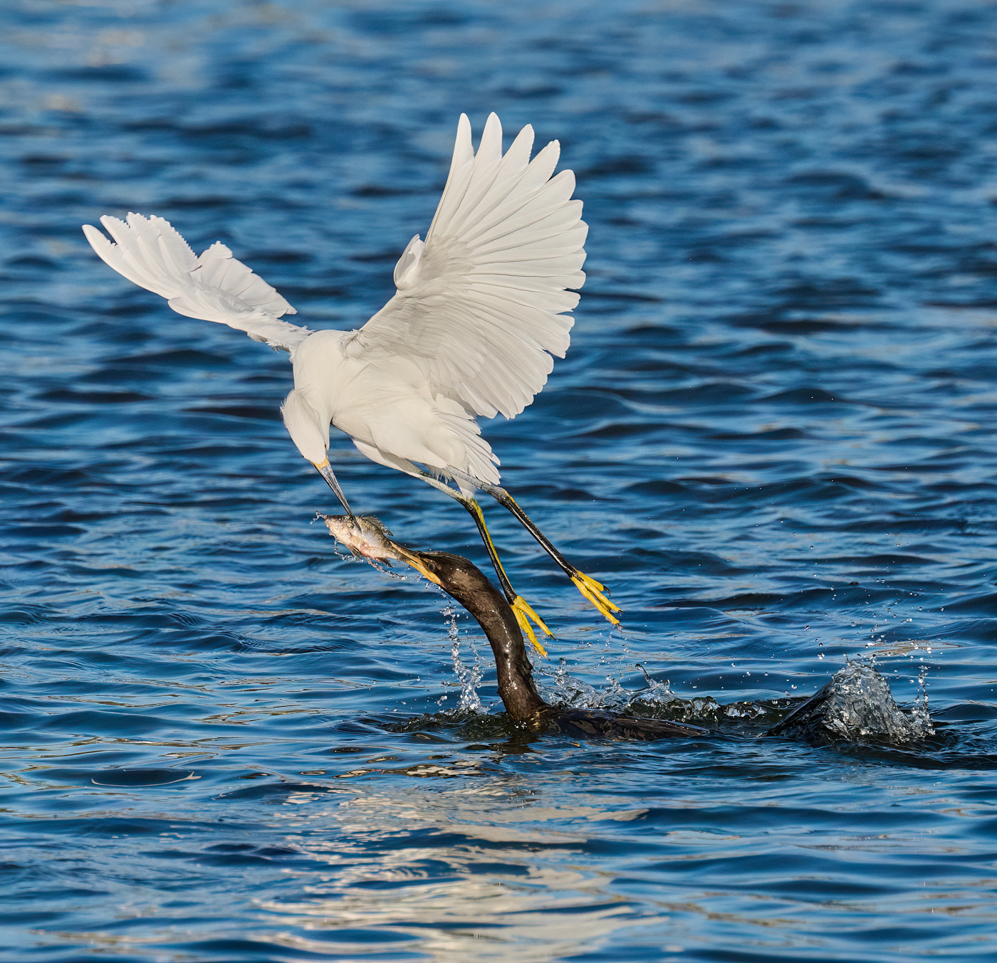
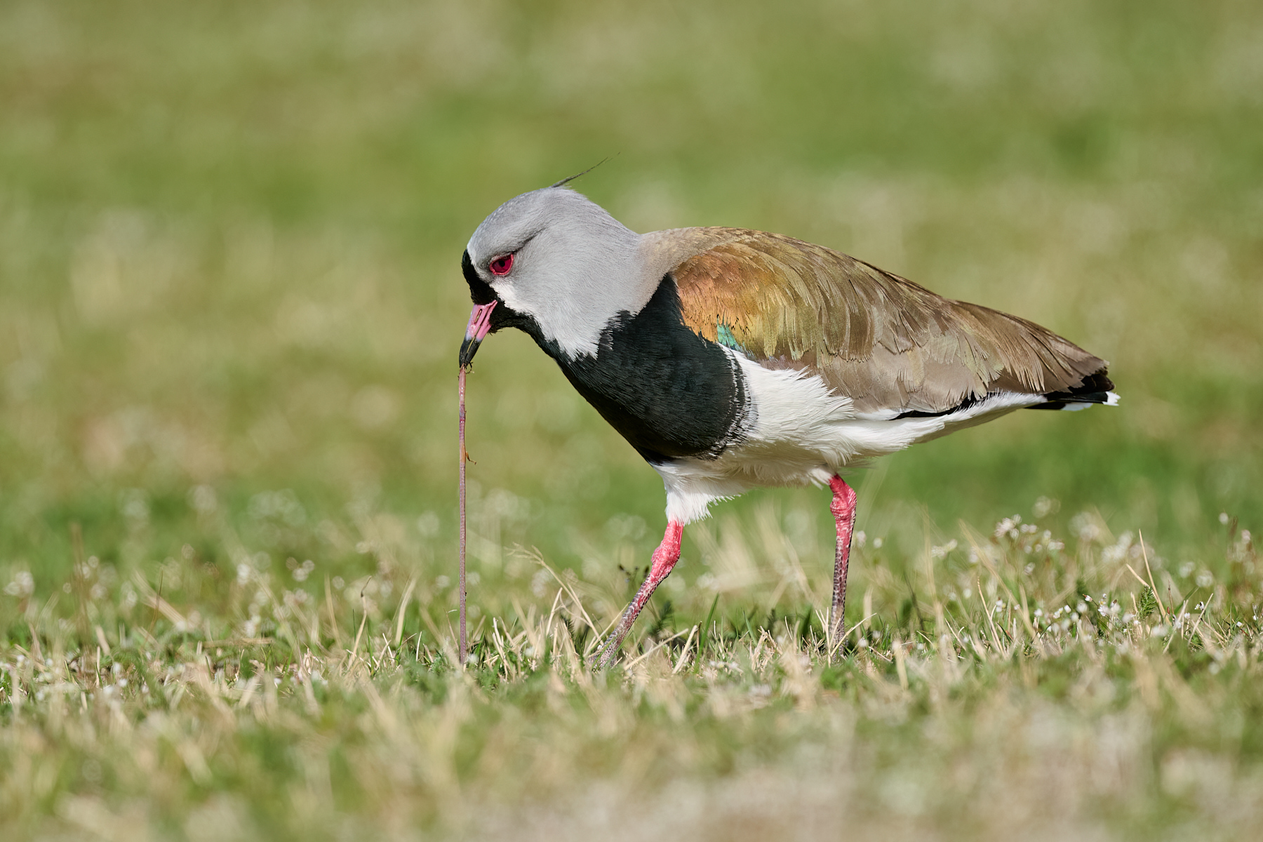
It's interesting that clipped wings are an issue with judges in your area. I haven't particularly noticed that in our local clubs. There seems to be regional preferences in some things! What I do notice in judging is that a "plain" BIF doesn't score well. The bird has to be carrying something or doing something. I think this would actually do pretty well in our club :) |
Jan 9th |
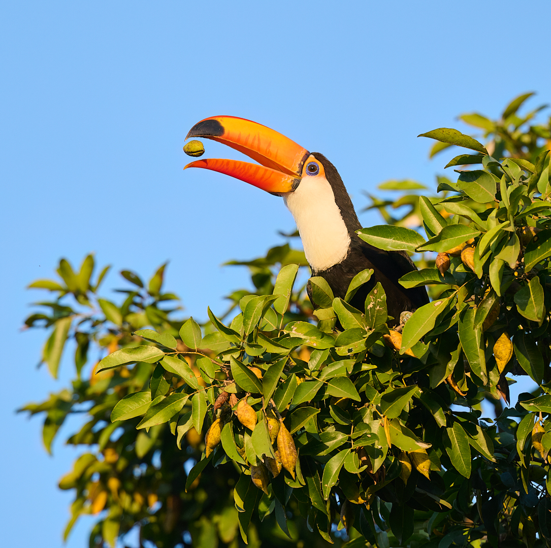
| 67 |
Jan 23 |
Comment |
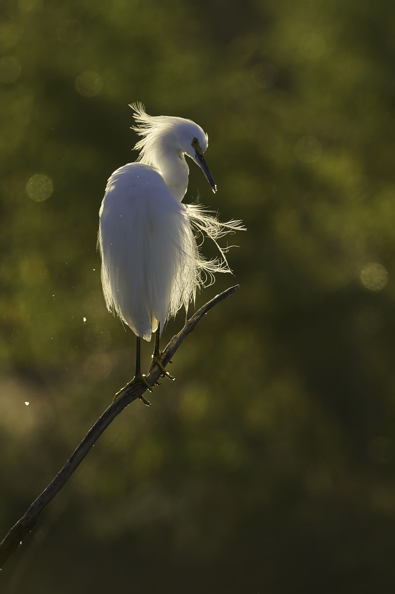
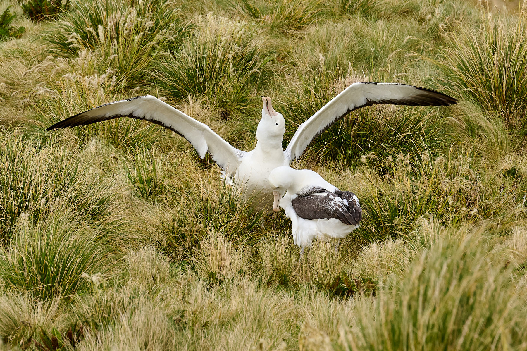
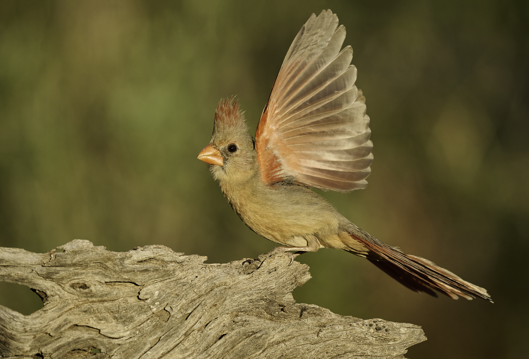
Well your pishing paid off, not only getting him in the open but displaying that crown as well. They're a common bird here in the winter but so hard to photograph!
I like your square crop, it fits well with the shape and head-on view of the bird. I looked at some other ideas, mainly going with a vertical with more space below, but the background has objectionable brighter areas that come in to play with that choice. Since it's directly facing you, adding space either left or right doesn't really help- centered and symmetrical is good with that pose, sort of like a human portrait.
I would prefer not to have the crossing branch, but at least it is going up at a nice diagonal which is interesting from a graphic design standpoint. In a way it frames him.
I don't know if you did any denoising in LR, it could benefit from that or Topaz Denoise to clean up the background. |
Jan 8th |
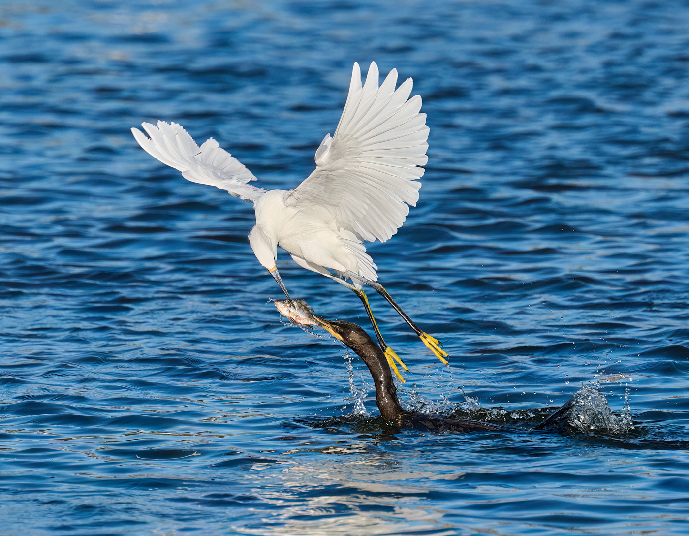
| 67 |
Jan 23 |
Comment |
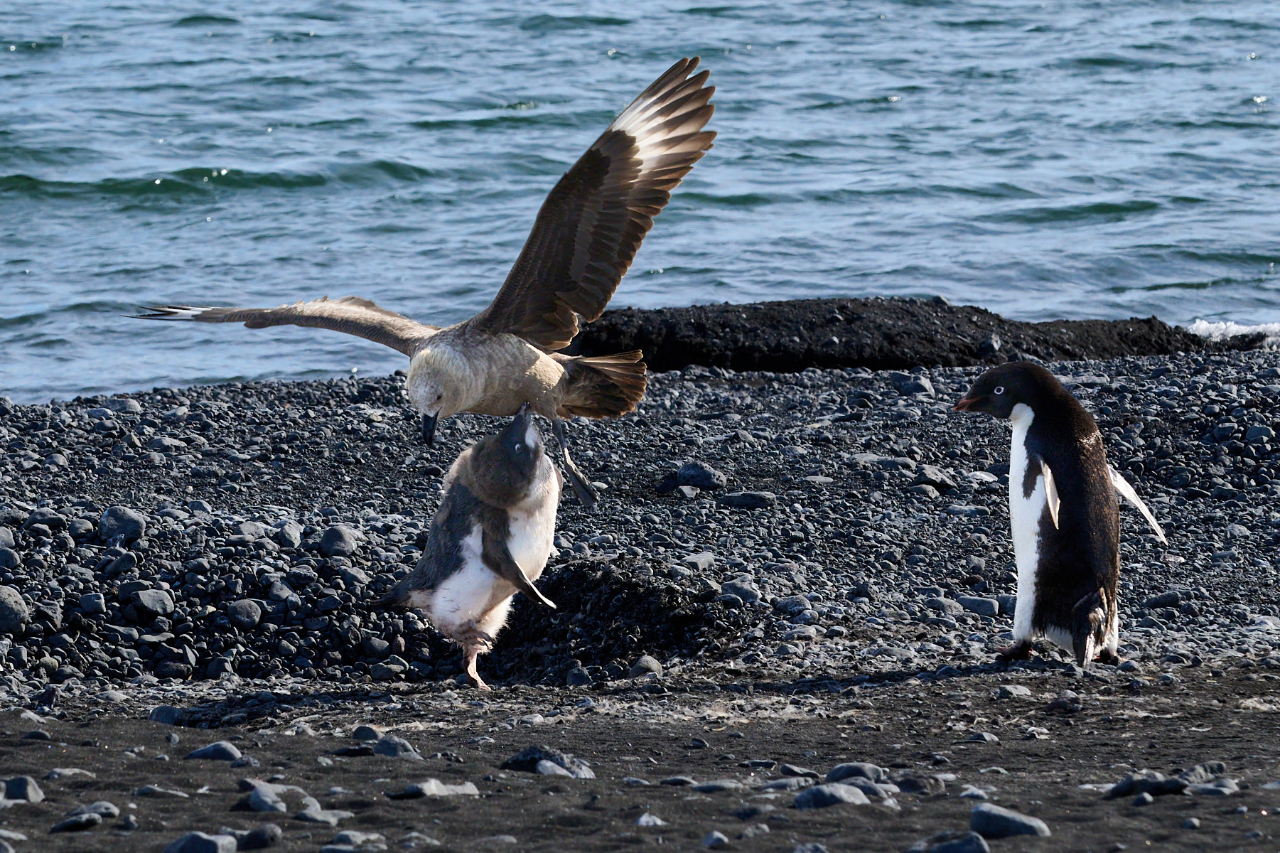
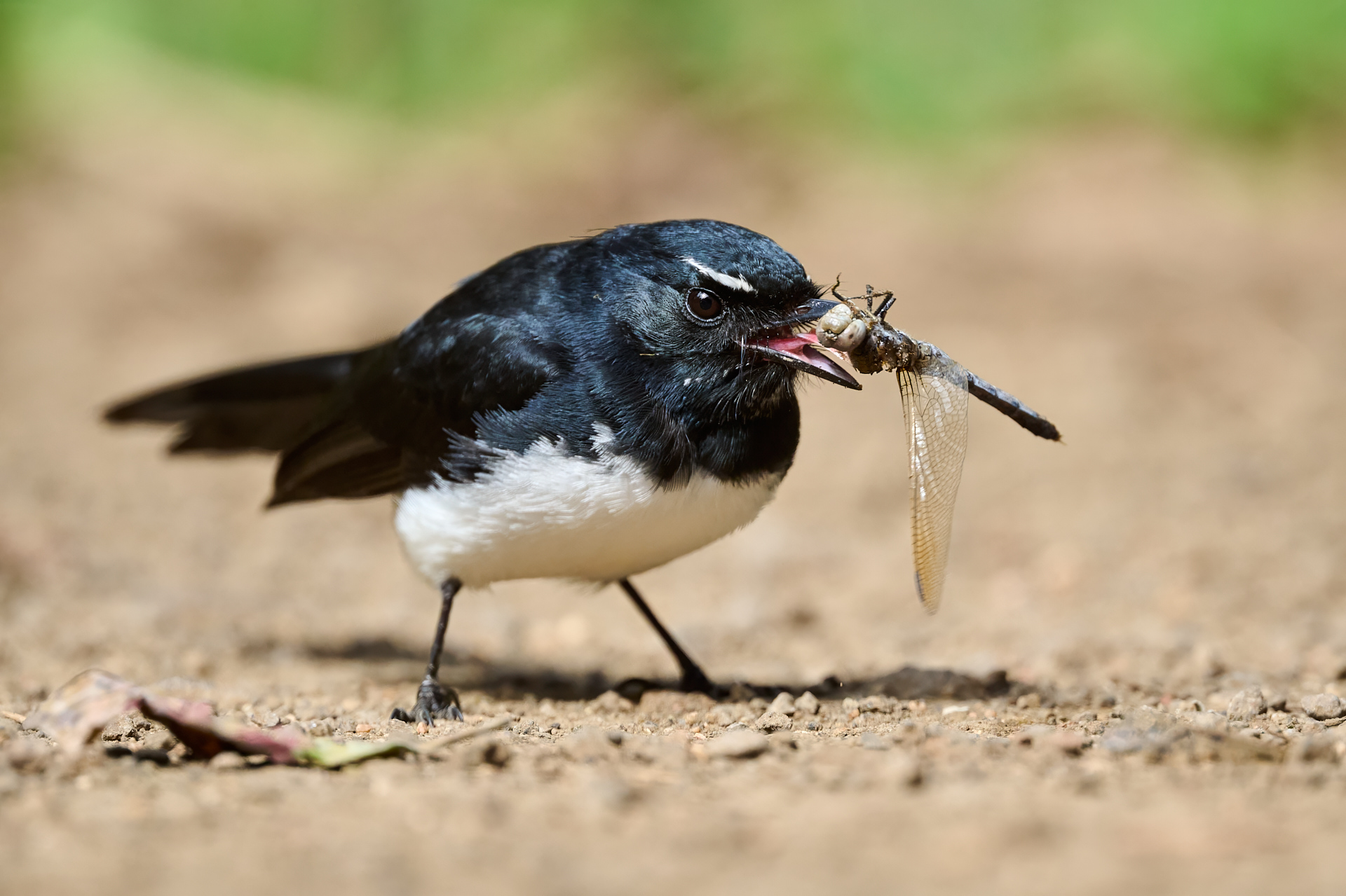
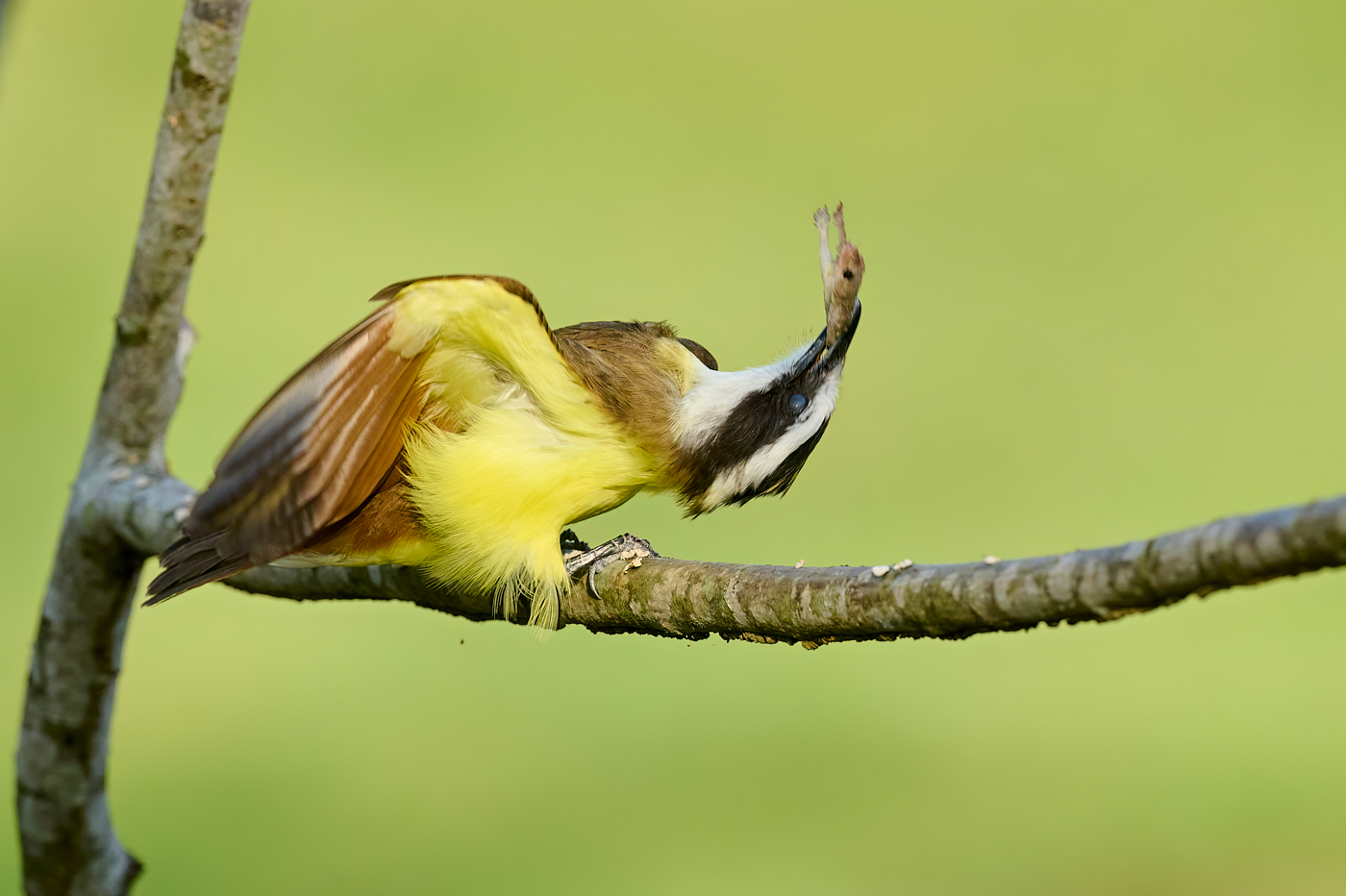
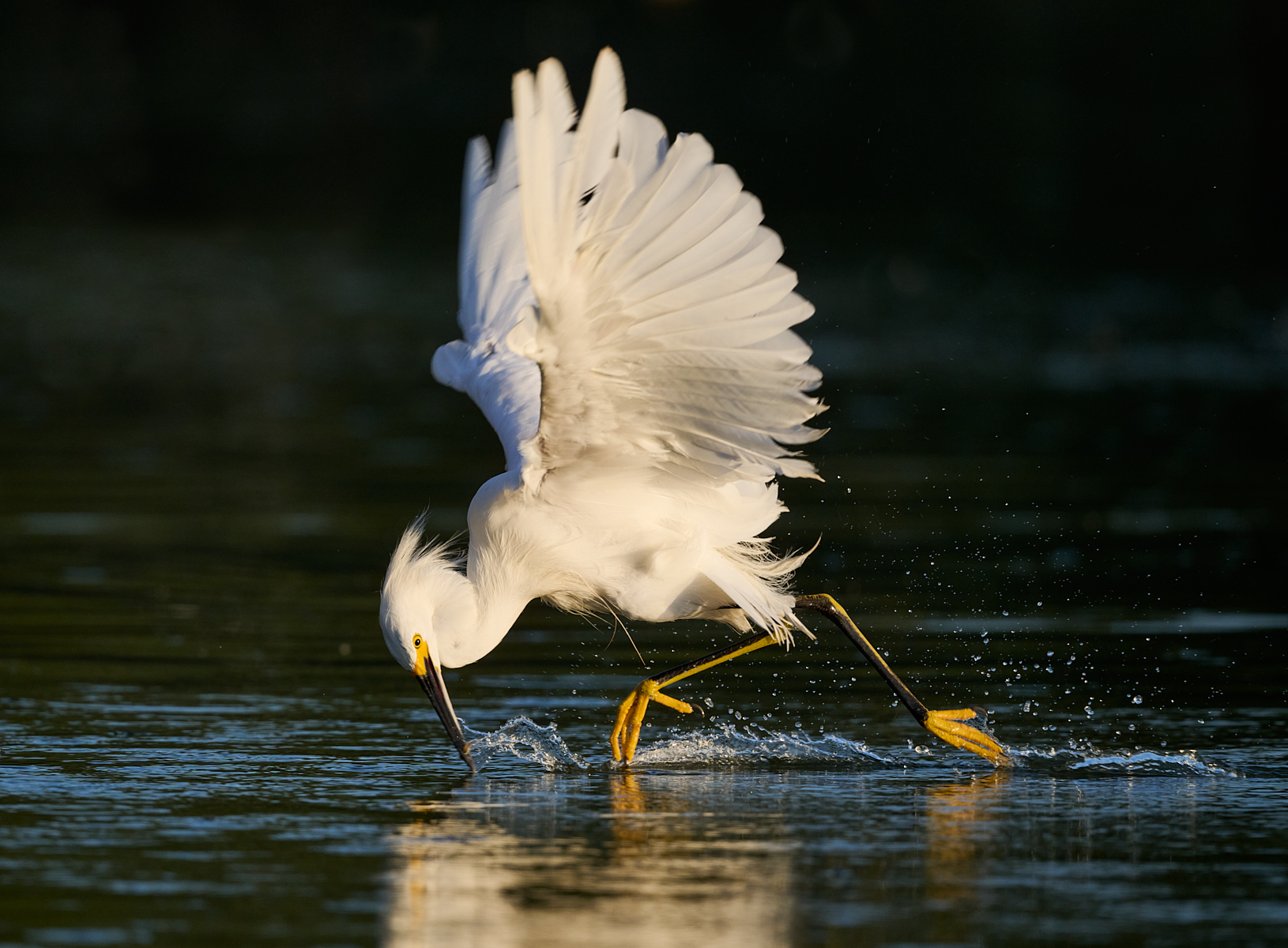
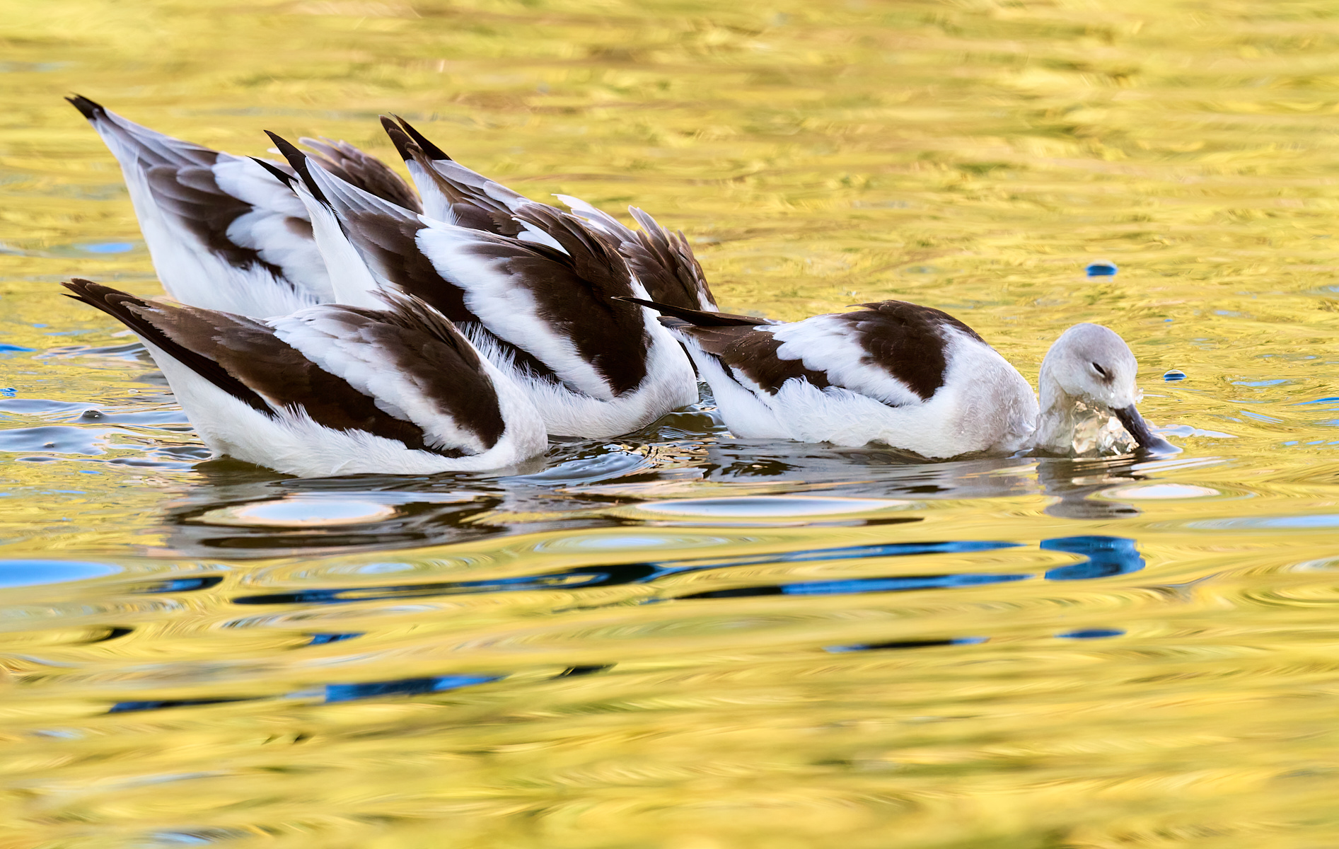
What a striking image this is. The graphic nature with the diagonals and triangles, blacks and whites, is fantastic. Having the action with the insect being eaten is quite dramatic.
Personally, I've no issue with the cropping of wings and tail because it's clearly purposeful and not just an accidental clip. There's really no way to illustrate this behavior without going in tight like this, as noted.
This is also a great example of studying and understanding behavior in order to predict it and set up to capture outstanding images.
|
Jan 8th |
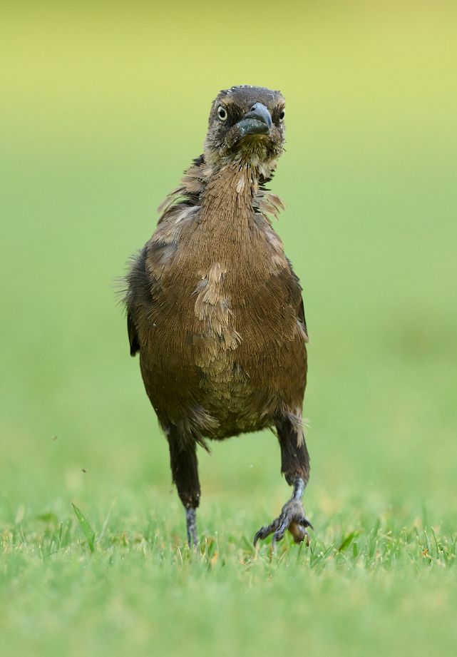
| 67 |
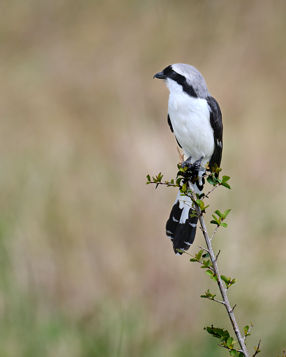
Jan 23 |
Comment |
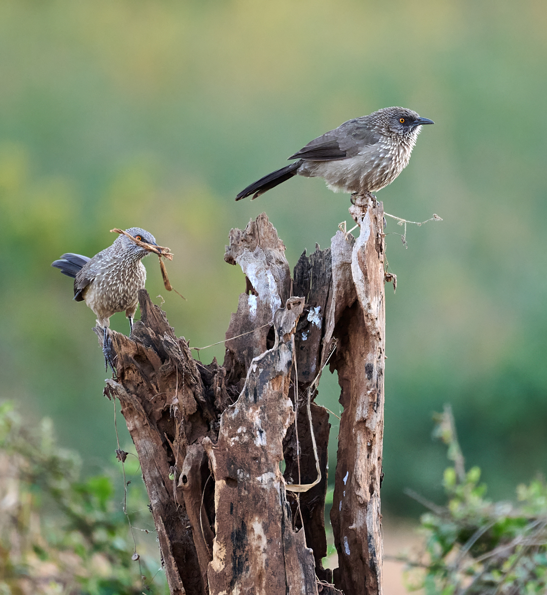
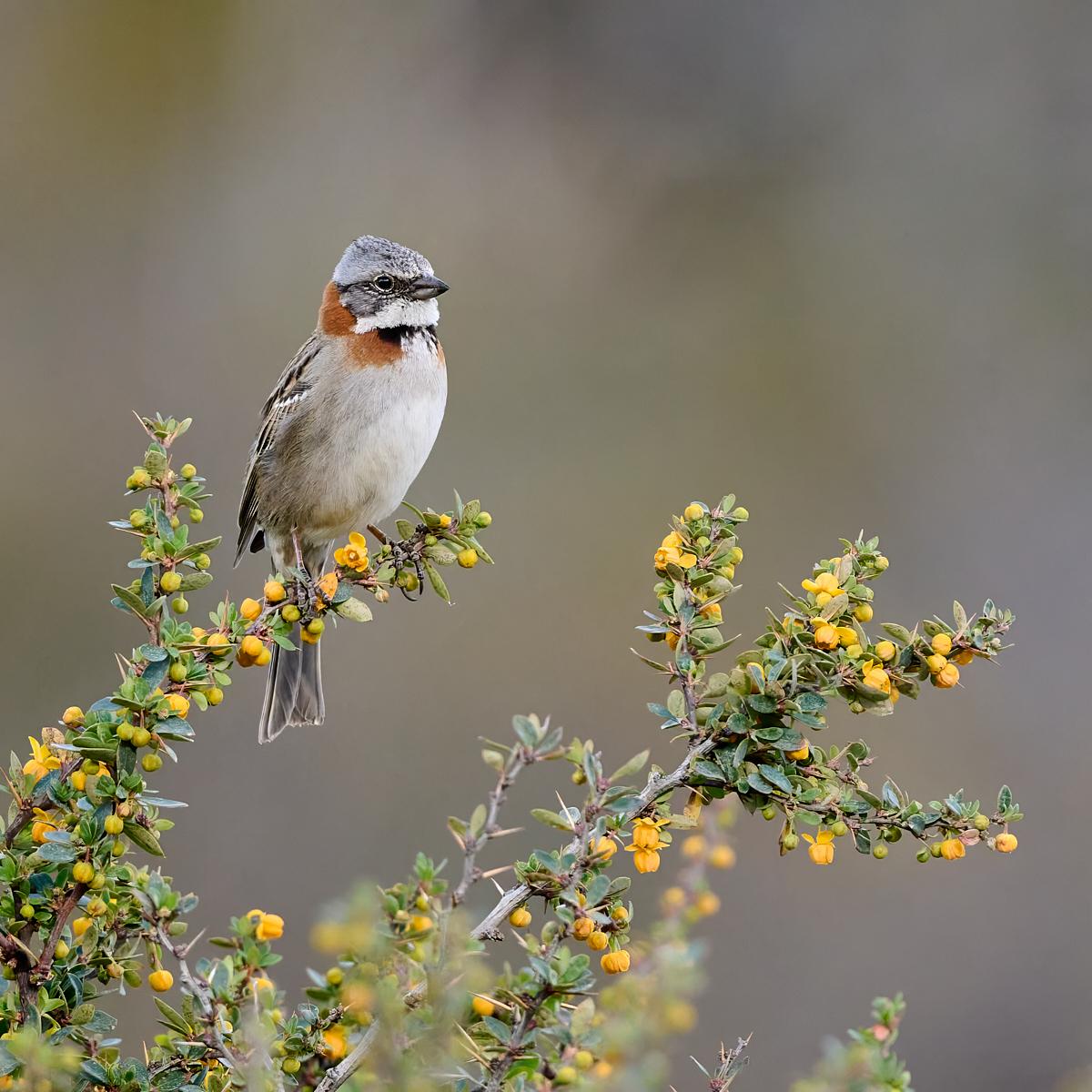
What a great opportunity you found with this bird. Nice pose, attractive perch, in the open with no obstructions. The soft, simple background is lovely.
My personal preference is for a bit more cropped from the left as it feels a bit unbalanced to me. But every time I look at this, your crop grows on me.
Overall, to me this image really lacks contrast. It's a black and white bird, but it looks hazy shades of gray to me. So I tweaked it a bit to increase the contrast by reducing shadows, increasing highlights and brightness. I also bumped the saturation up.
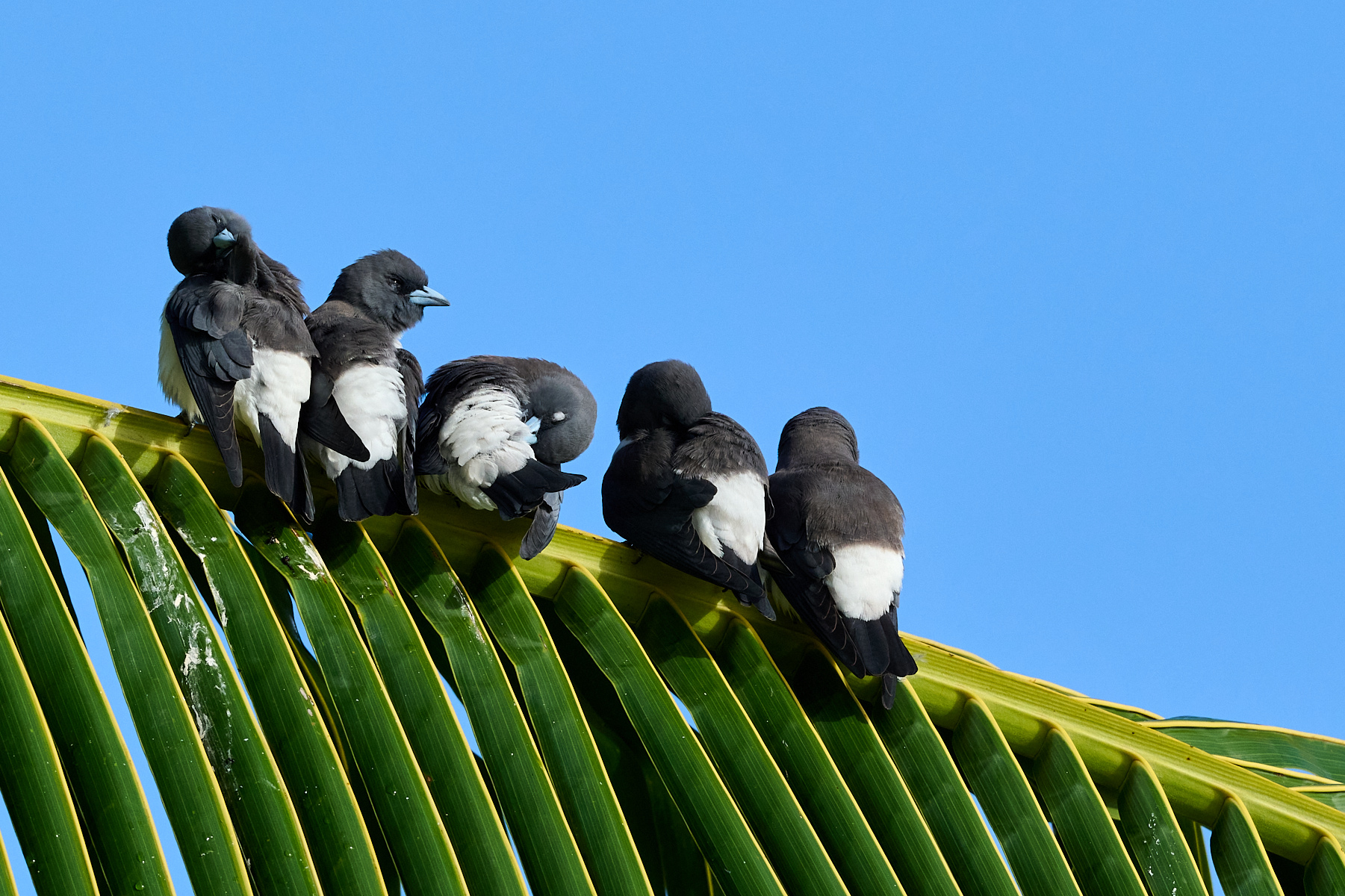
And as a minor point, the birder in me has to mention that this is not a White-crowned Shrike- the top of the head would be pure white if it was- I photographed them in Tanzania. My best guess, going through my field guides, is that it's a Gray-backed Fiscal. ;) |
Jan 8th |
 |
| 67 |
Jan 23 |
Comment |
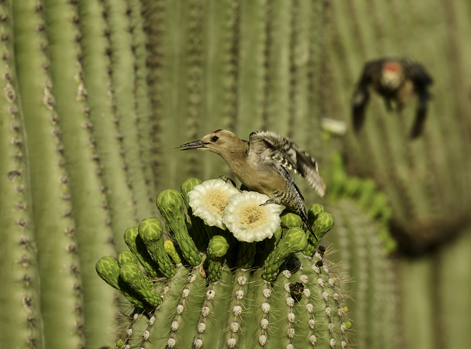
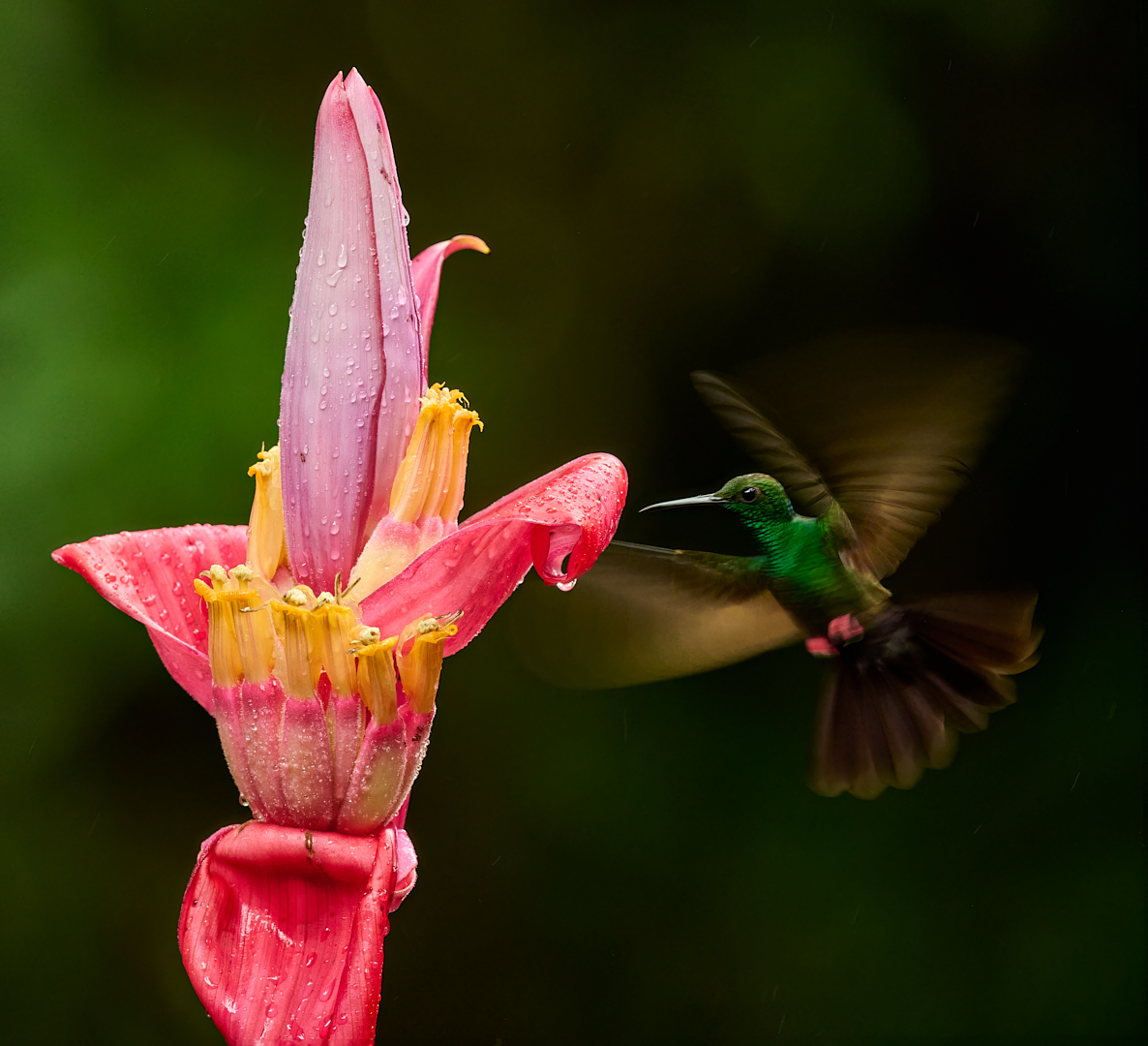
Those bright flowers against the black background totally grab your attention- really nice! I like that there is a slight increase in the height of the flowers going left to right, it's like a subtle diagonal line helping your eye move through the frame. I also like the one flower right in the center that isn't covered over by any others, it gives a focal point to come back to rest on.
I also would prefer a crop from the top so that it's more of a panoramic format, I don't think the extra black is adding anything.
One suggestion for presentation would be to put a thin white border around the image so that the black edge is defined when displayed against a black bacground as here, or on a projector screen. It took me a minute of staring to see where the edge of the frame was. Normally I'm not a fan of "strokes" or borders. But with a large black expanse it can be helpful. |
Jan 8th |
| 67 |
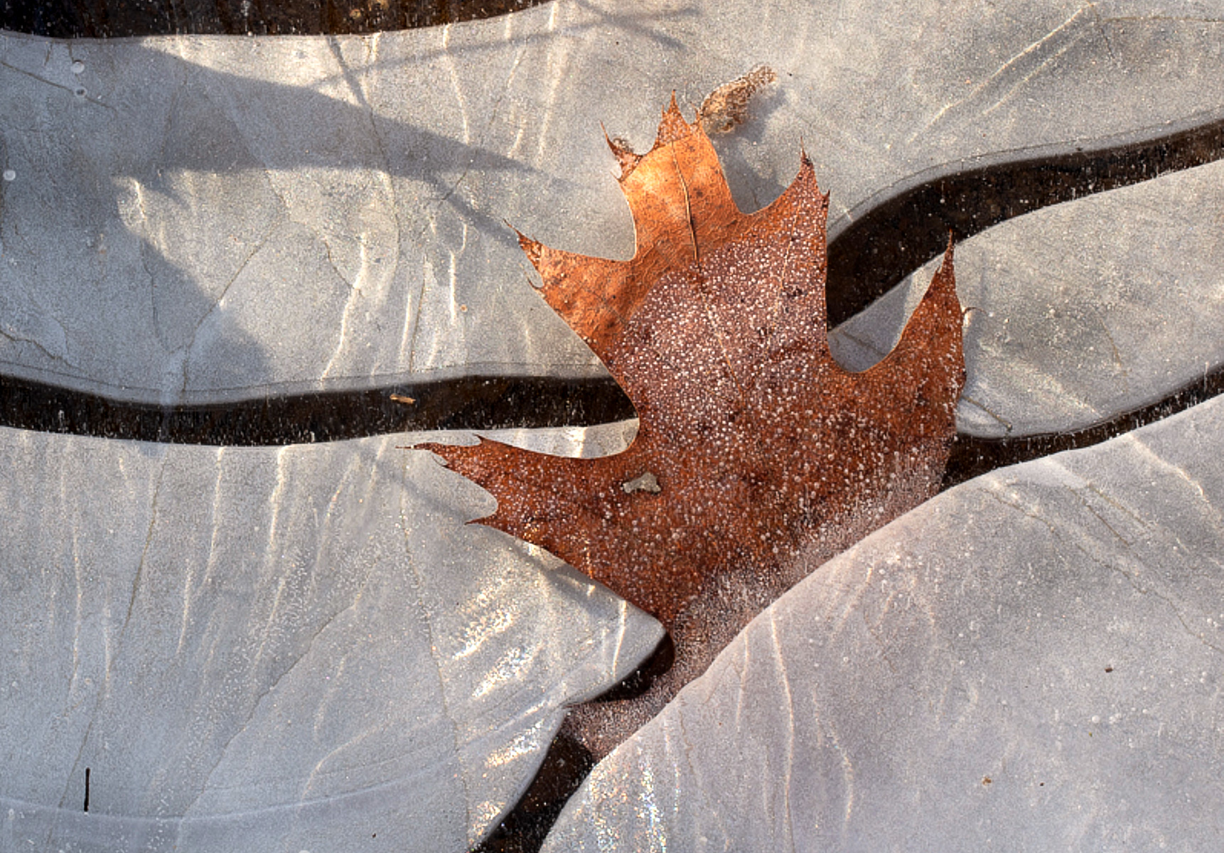
Jan 23 |
Comment |
I really like this! Wonderful shapes and lines that flow and lead your eye through the image. The orange leaf trapped in the ice is an interesting story, even more so with the "rescue" shadow.
I also didn't immediately recognize this as ice, but then I don't see a lot of ice like this here in the desert :) It's kind of dark and silvery as opposed to white that would make me think "ice". So I tried a little edit making it overall brighter and the ice whiter. I also played with a slightly looser crop that keeps more of the impact of the lines. I do like your crop- and think there are probably several other choices that could also work.
Really nicely seen and an interesting, different image. |
Jan 8th |
 |
6 comments - 5 replies for Group 67
|
6 comments - 5 replies Total
|