|
| Group |
Round |
C/R |
Comment |
Date |
Image |
| 67 |
Dec 22 |
Reply |
The reprocessed image looks much better, nice job! I like both of your crops. |
Dec 15th |
| 67 |
Dec 22 |
Comment |
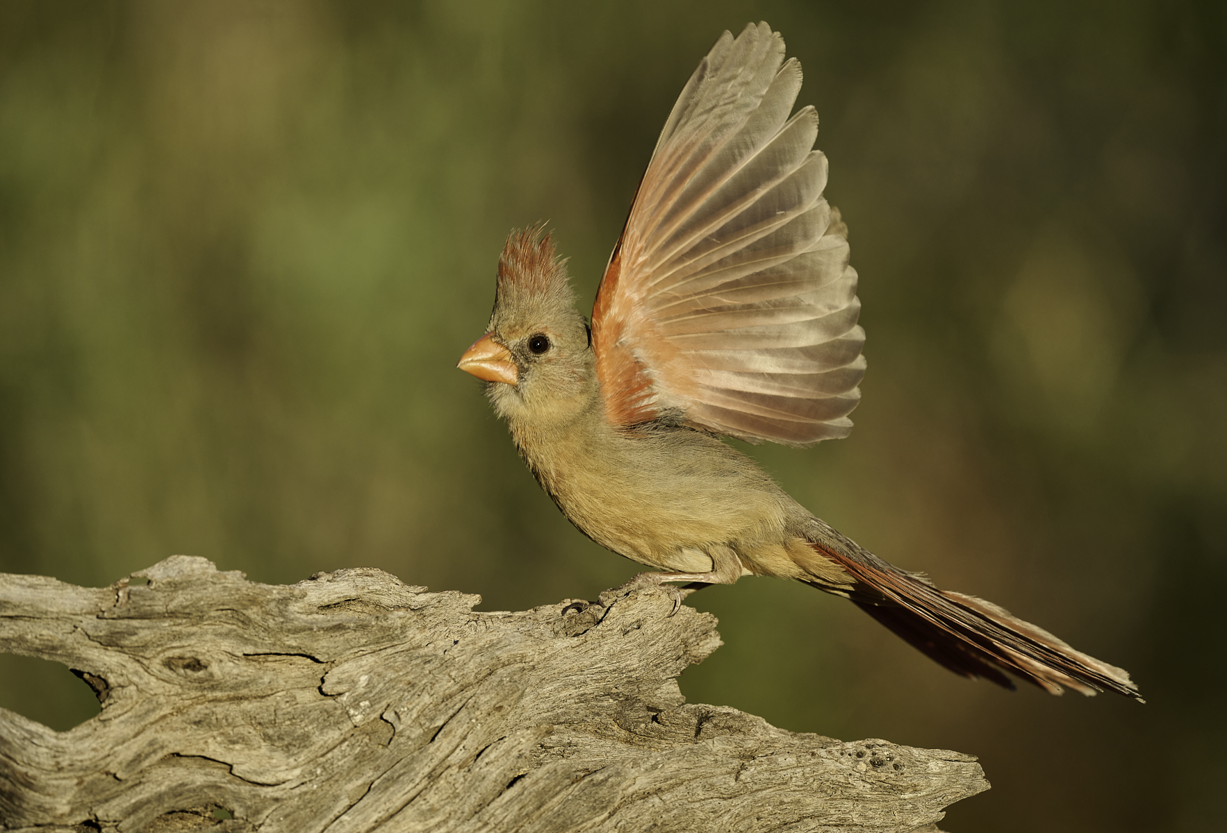
Your low perspective sure put you in a nice place for an intimate connection with the owl, and gave you a nice continuation of the habitat for the background. Having the ability to choose your spot with respect to the light direction sure helps as well.
I didn't realize these owls ate other birds, so seeing it with the wing is quite unusual for me. Around here they mostly seem to eat insects. Interesting that as with a few other bird species, our desert variety are paler and redder than this one is. They are charismatic little owls and I get that sense from this image. |
Dec 12th |
| 67 |
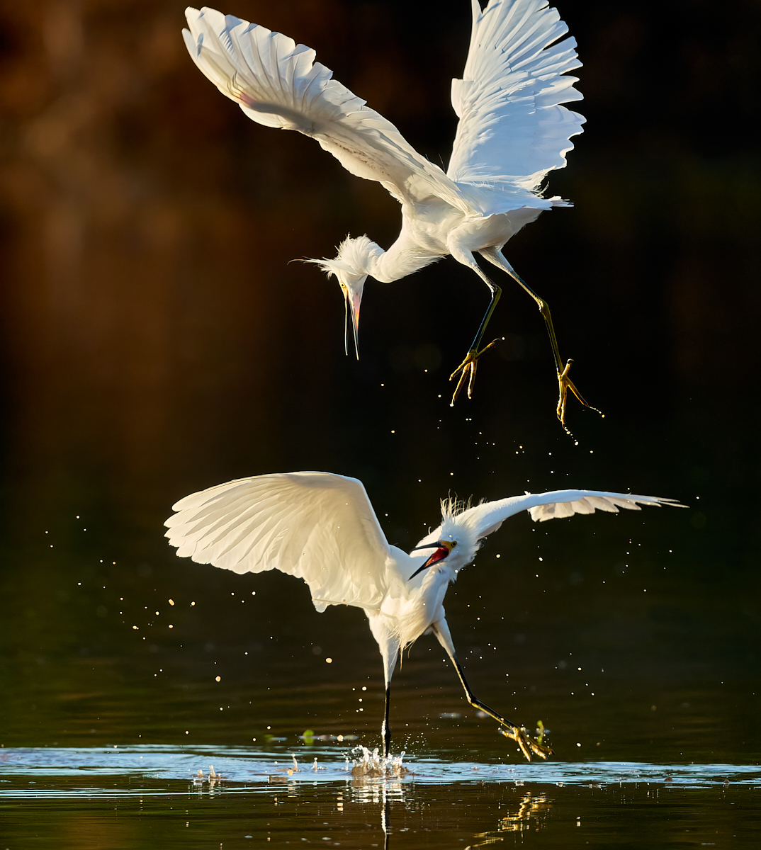
Dec 22 |
Comment |
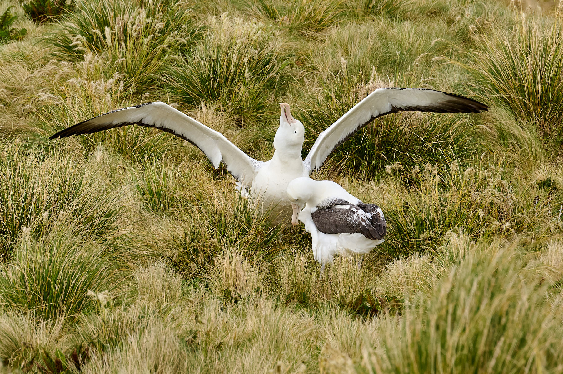
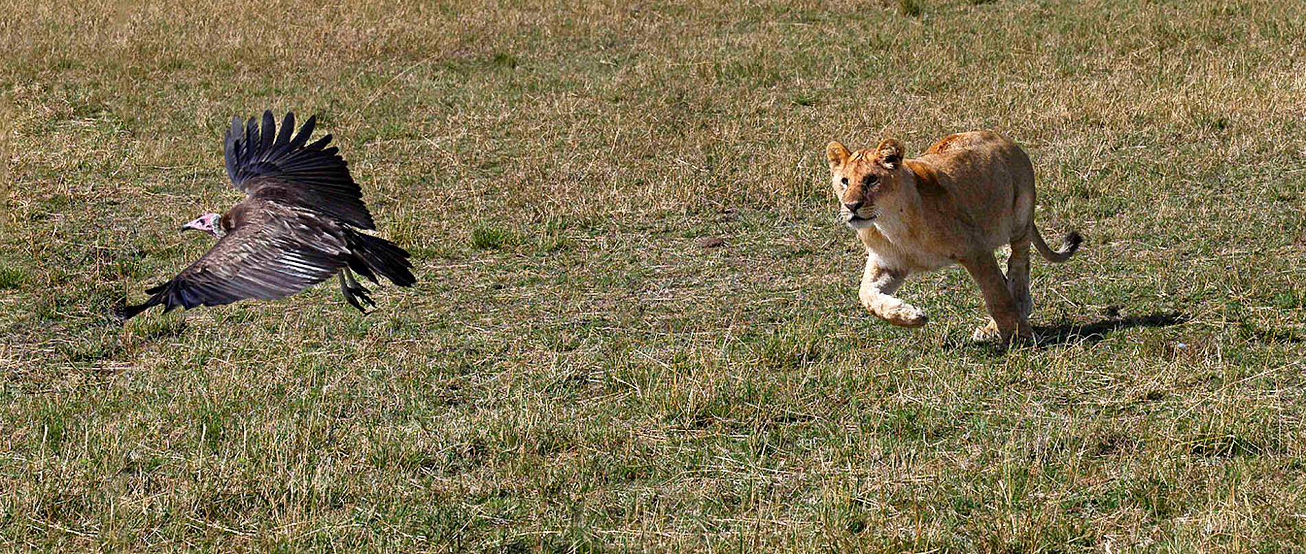
So cool to capture this kind of interaction. You caught a really nice moment with the lion so intently focused on its mission.
To me this looks a bit dark and flat- given the light it could have more pop, without altering the colors. I wanted to give a try at extending the canvas, so I also increased exposure 2/3 stop and brought the white and black points in to increase contrsat. My old version of PS didn't do a great job with content aware fill, I'm sure a newer version would do better. The biggest challenge in doing this is the very slight clip of the vulture's wing. |
Dec 12th |
 |
| 67 |
Dec 22 |
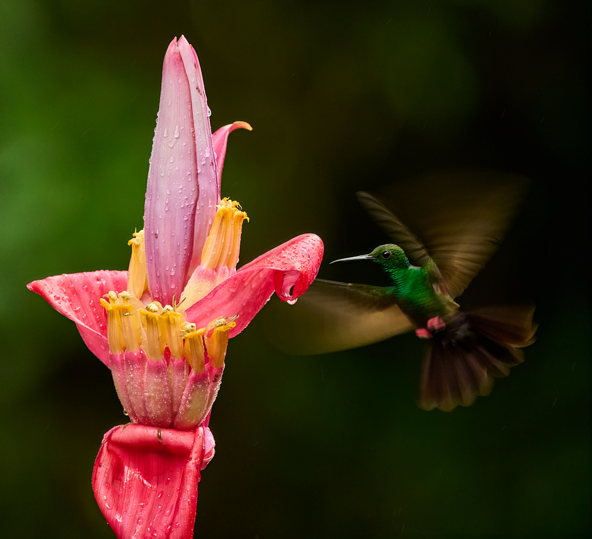
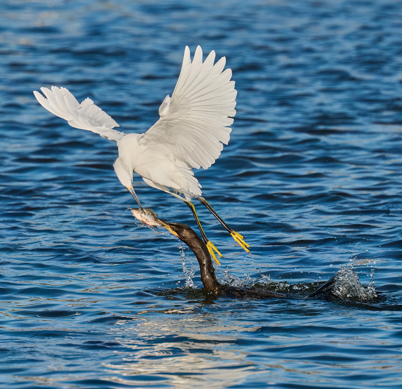
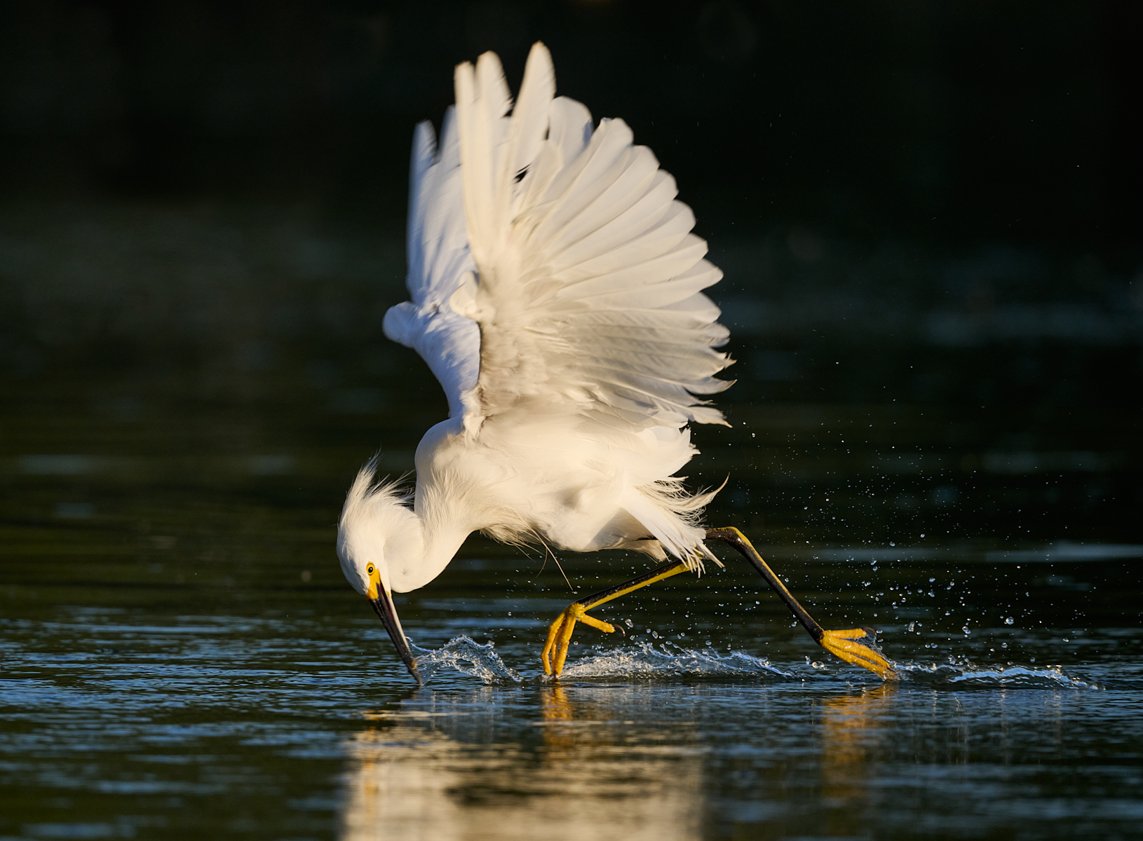
Comment |
This is so moody with the dark rain streaks. The slower shutter speed and consequent streaks of rain, as opposed to dots, works well to convey the mood. The upstretched wings give a nice shape as well as telling a story. Nice catch.
To me this crop feels unbalanced. I am thinking a vertical crop would work better with the pose of the bird and the shape of the limb. Space both above or below might work, depending on what you have in the original capture. |
Dec 12th |
| 67 |
Dec 22 |
Comment |
This is beautifully composed with the line of trees going off at the diagonal from the main foreground trees. The background being a nearly solid mass of trees adds to the sense of mystery- it looks like a place I wouldn't want to get lost or disoriented in! The color reflected from the fall foliage adds a good sense of season as well as a nice complement to all of the gray trunks.
I like the suggestion to darken the 2 nearest trees slightly. It does help the eye to move toward the lighter background and not get "stuck" in those brighter areas. But that's a pretty subtle change and I think it works both ways. I've never been in this area, this certainly stimulates an interest in it. |
Dec 12th |
| 67 |
Dec 22 |
Comment |
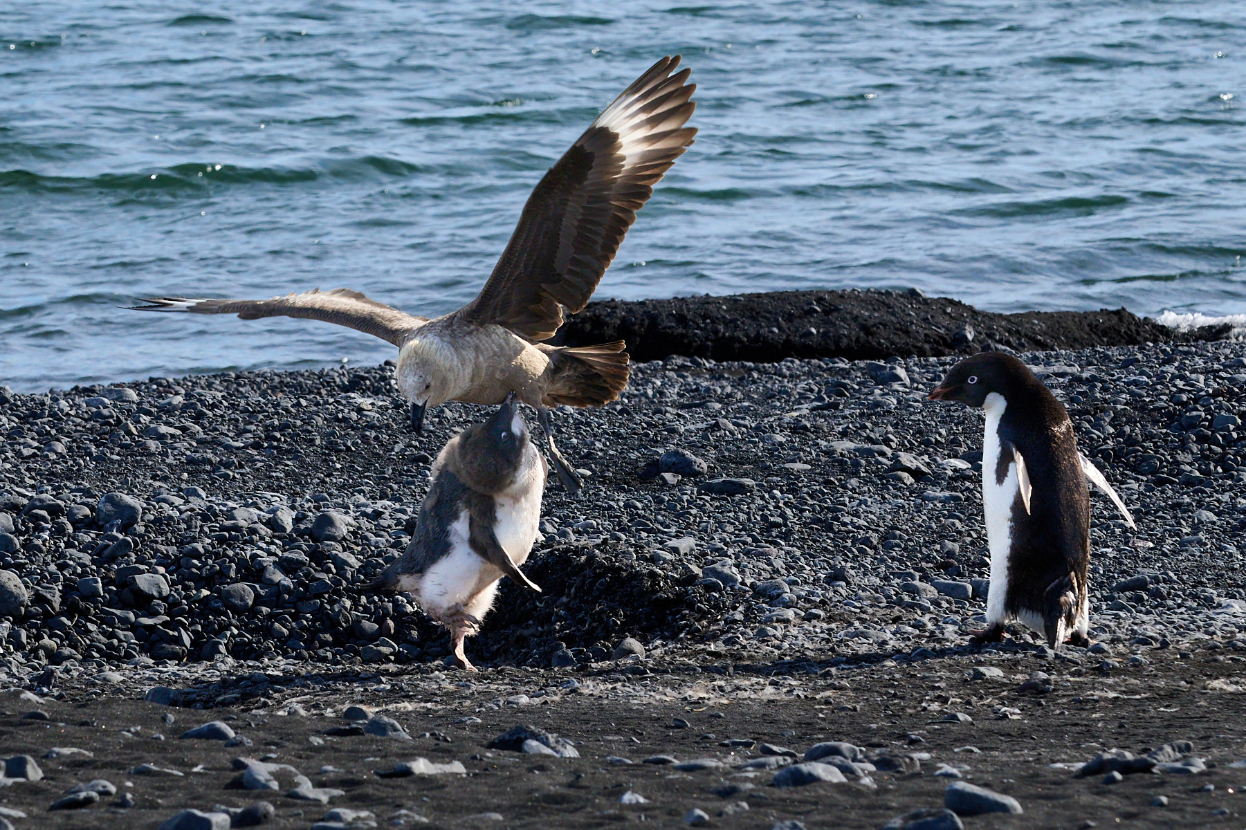
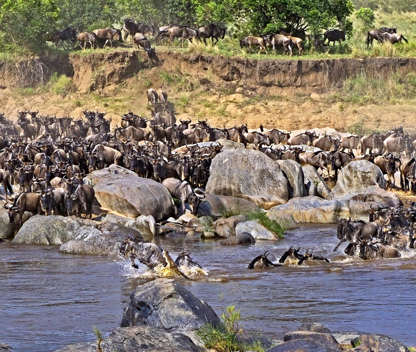
This is quite a dramatic scene, such chaos! Having witnessed crossings, it brings back memories of heat and stench... I love the overall scene for the reasons others have already stated. I too like Richard's crop and treatment.
Tonal range increase does help with the "plastic" feeling- it may also be in part due to loss of detail with the large crop. Since you wanted to highlight the croc, here's another suggestion for a crop that still leaves a good bit of the bigger scene while helping to emphasize the croc. I also increased expsoure and contrast, and used some clarity to help with the contrast as well. |
Dec 11th |
 |
| 67 |
Dec 22 |
Comment |
There is a lovely sense of movement and flow along the lines of this sandstone. Your processing richens the colors and makes that pattern even more pronounced. I like both your crop and the original composition, which I think has even more of that sense of flow. Both the sharp and soft look good to me. |
Dec 11th |
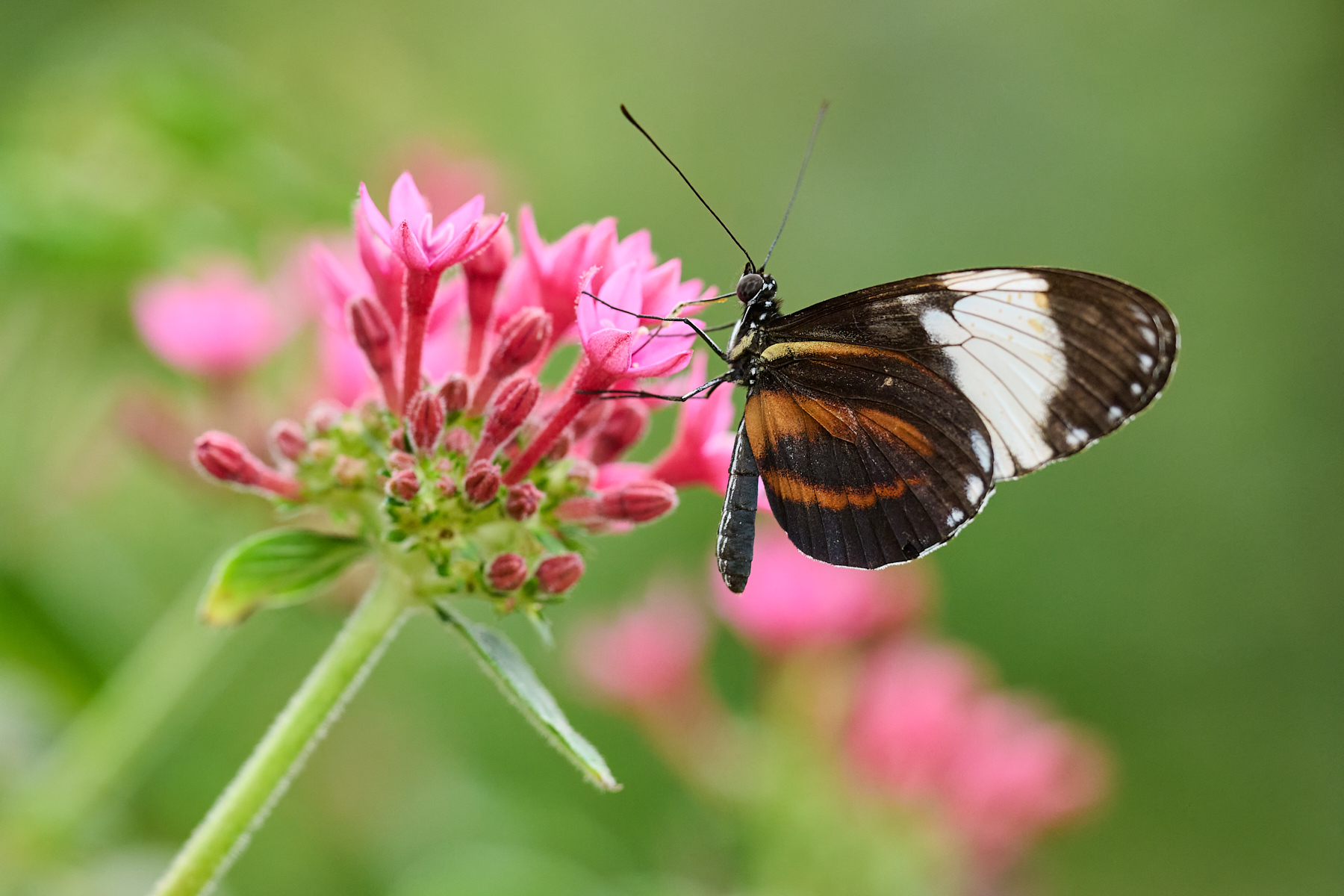
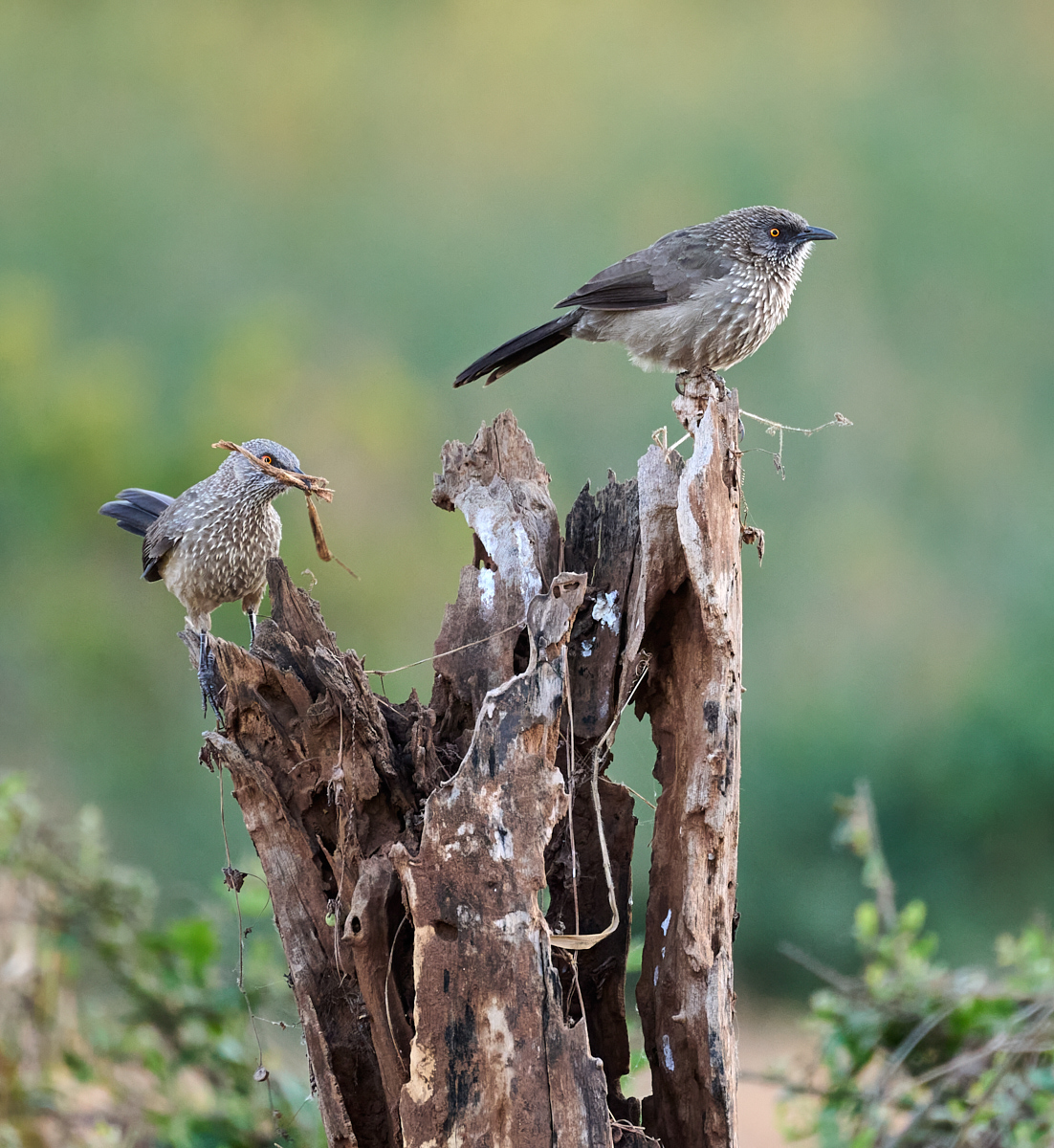
| 67 |
Dec 22 |
Reply |
It's a real trade-off trying to get sharpness in the butterfly yet keep the background nice and soft. More DoF tends to make the background - which is usually close in this garden- more pronounced, even while not getting the entire butterfly sharp. As long as tripods and focus-stacking aren't an option, getting as parallel as possible is what I usually try to do. It doesn't always work....
Thanks for the input on the flowers. |
Dec 11th |
| 67 |
Dec 22 |
Reply |
I do like the crop; it is a much different feel to the image though. |
Dec 11th |
| 67 |
Dec 22 |
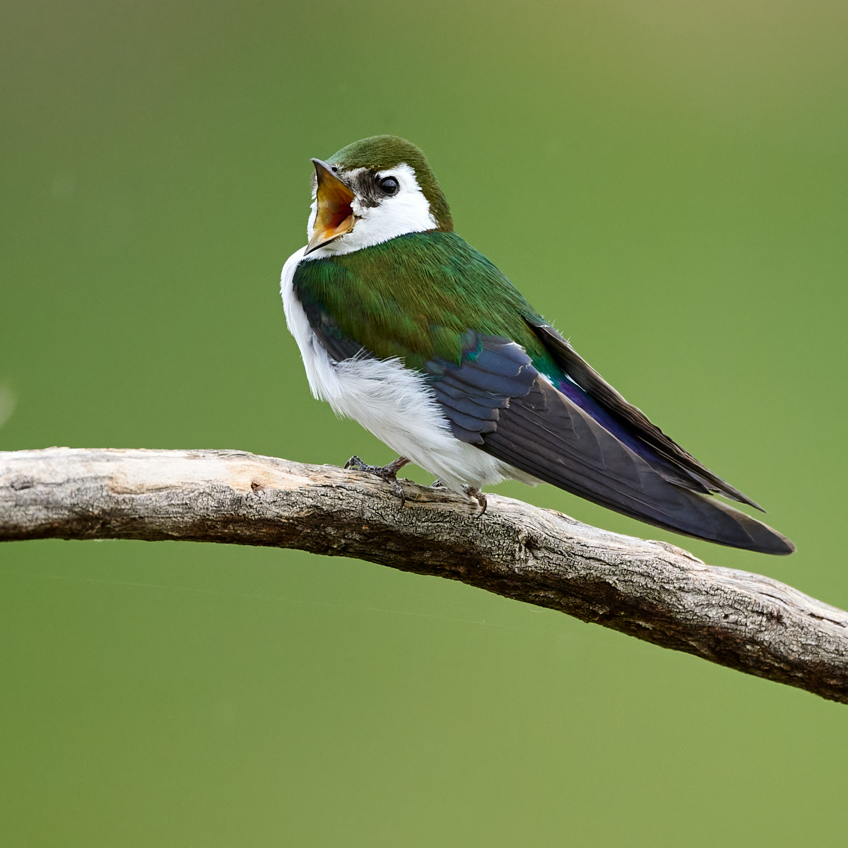
Reply |
I like the idea of doing some desaturation on the background to help it fade just a little bit. Thanks for the suggestion! |
Dec 11th |
6 comments - 4 replies for Group 67
|
6 comments - 4 replies Total
|