|
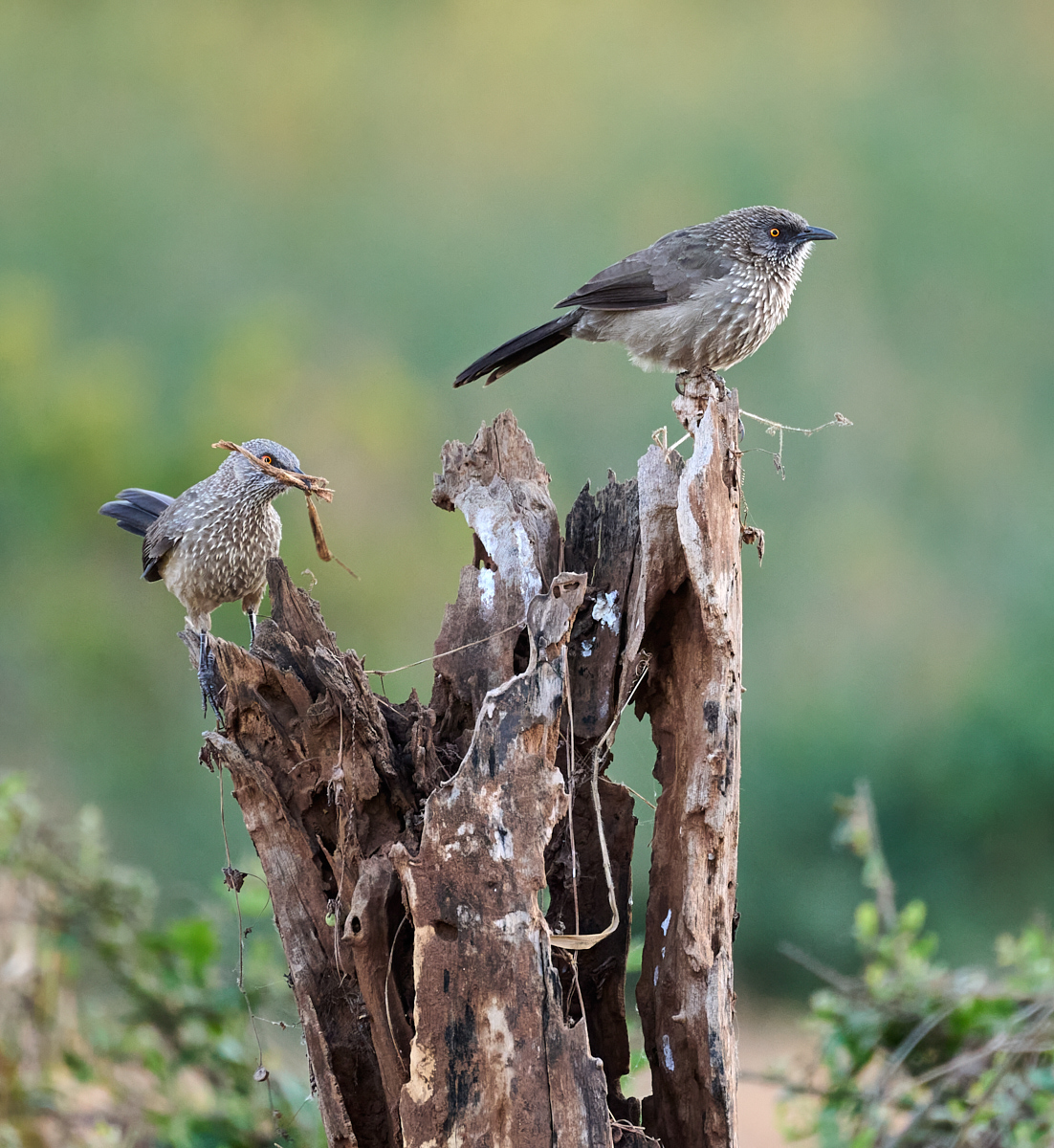
| Group |
Round |
C/R |
Comment |
Date |
Image |
| 67 |
Nov 22 |
Reply |
Thanks for the insights. I made a slight change in the crop and was able to tone down the rocks with Dehaze and shadows. |
Nov 25th |
 |
| 67 |
Nov 22 |
Reply |
Only several hundred shots of them feeding :) |
Nov 25th |
 |
| 67 |
Nov 22 |
Reply |
I like this b&w version a lot. Now the texture in the fur and interesting shapes of the monkeys really stand out. I personally really like the white sky on this. Looking at this version, I think I'd crop the right so that all or most of that upper leaf cluster is gone- really simplify to just the animals and branches. |
Nov 25th |
| 67 |
Nov 22 |
Comment |
This is an intriguing scene with lots to look at and enjoy. So many shapes and layers. I think this is a good candidate for b/w for that reason. The first thing I notice in your version, though, is the sky since it has so much contrast. Since your focal point is the slot, a softer sky would help to not detract from that.
I do like Frank's crop, my eye goes right to the slot as it's now the brightest point. Also the flow of the composition leads to it as well. While I believe this has good b/w potential, I also find there's enough color to work. I did a bit of tweaking on it, mainly bringing up the exposure and then using clarity and dehaze to bring up some contrast. That also brought out the colors.
|
Nov 25th |
 |
| 67 |
Nov 22 |
Comment |
You were certainly lucky to have the combination of the sunset color AND a decent subject! Doesn't always happen that way (speaking from experience...)
I like your concept with the tree in the image, but it isn't sharp- must've been enough closer to you than the animals that f/2.8 wasn't enough DoF. I'd also leave more space on the right of it since you have it, rather than cutting it off.
That said, I like Larry's crop very much- quite simple and elegant. Sometimes less is more.
|
Nov 14th |
| 67 |
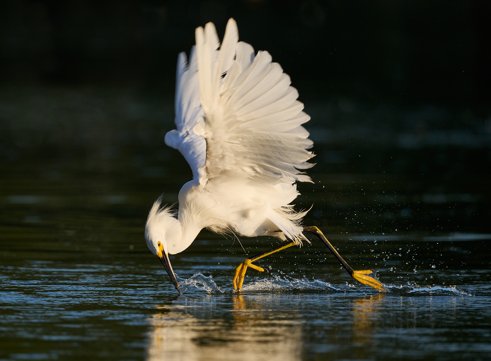
Nov 22 |
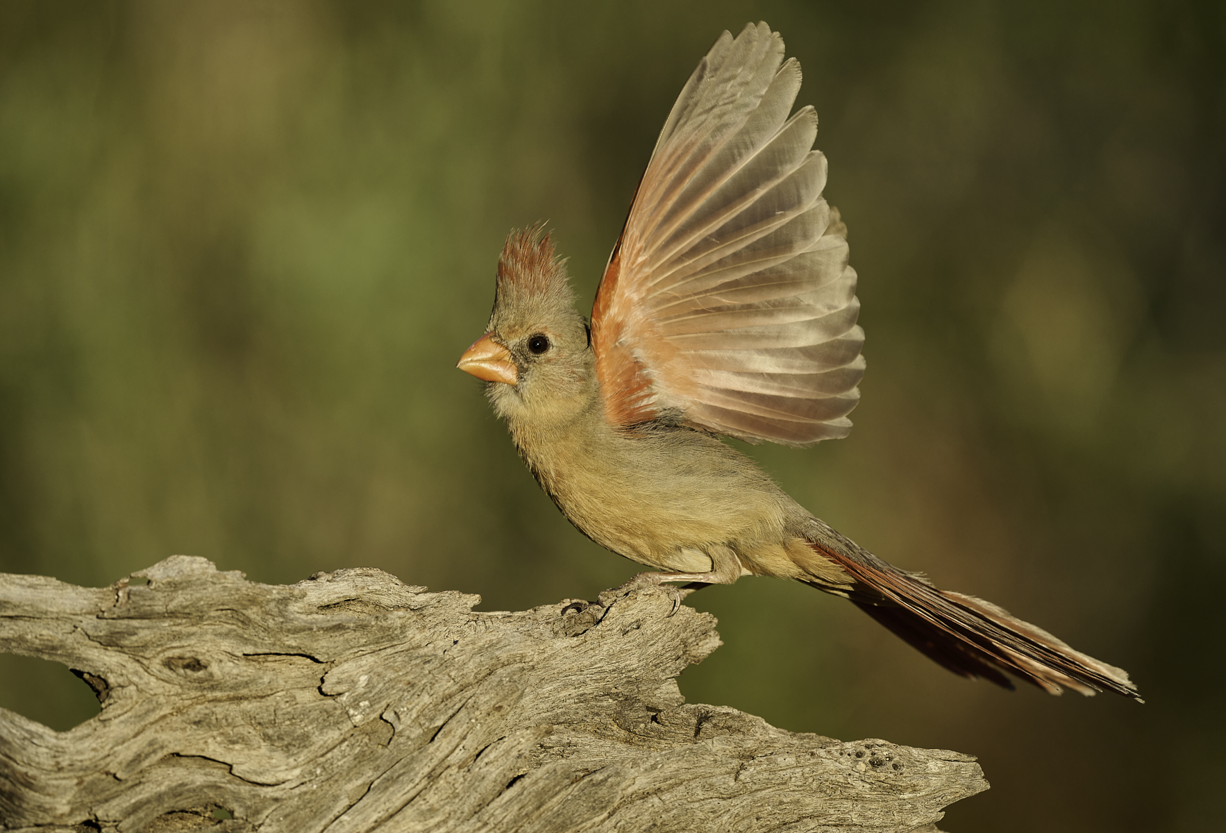
Comment |
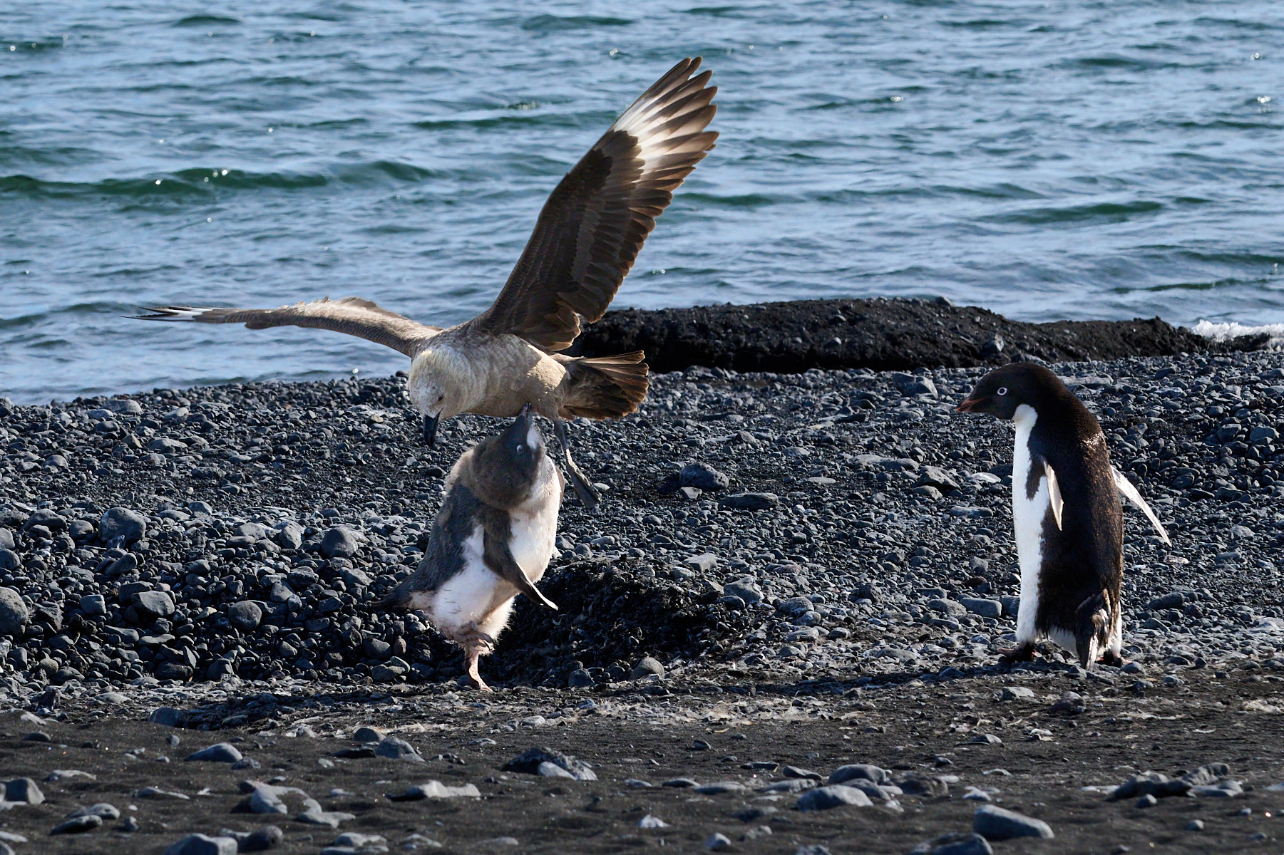
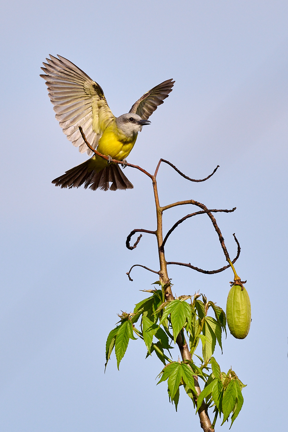
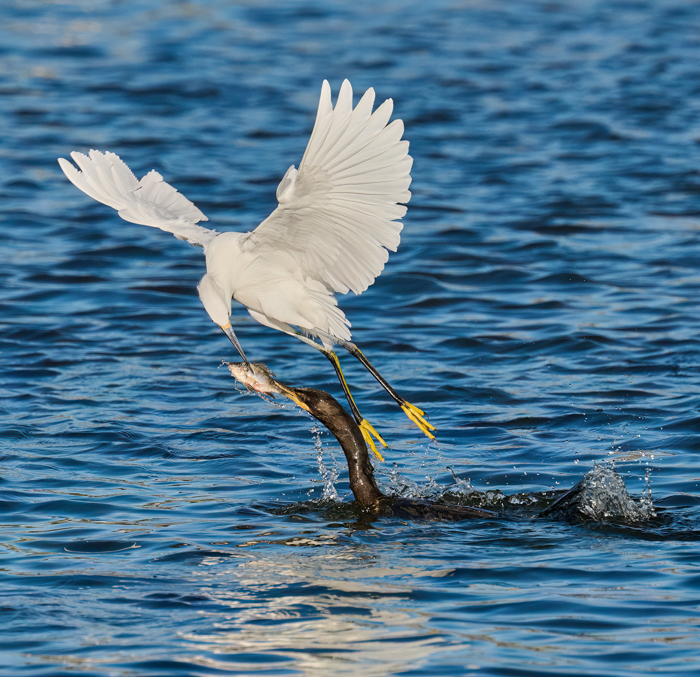
Perfect timing as it's taking off! Love the upstretched wings and the fact that they are separated so you can see both. I like the orientation of the image with the tree on the right side and the bird taking off to the left. It helps to hold your eye on the bird's eye and beak, where you'd start to go out the right side of the image if it were flipped the other way.
I might crop a small amount off of the top as the head is rather centered and I don't feel the space above the wings is adding much. I'll second Larry's suggestion to "remove" the branches in the lower left.
A striking bird, great pose, nice sky and light. Well done. |
Nov 14th |
| 67 |
Nov 22 |
Comment |
If you hadn't described how you combined the images with the different exposure times, I'd have never known. A clever solution to achieve your vision. I do like the way the trail of bubbles breaks up the black water and gives it some life.
The fall colors are rich and vibrant in the shade, and I like how the piles of orange leaves in the water carry that color through a bit more of the image.
Lovely, lovely image.
|
Nov 14th |
| 67 |
Nov 22 |
Comment |
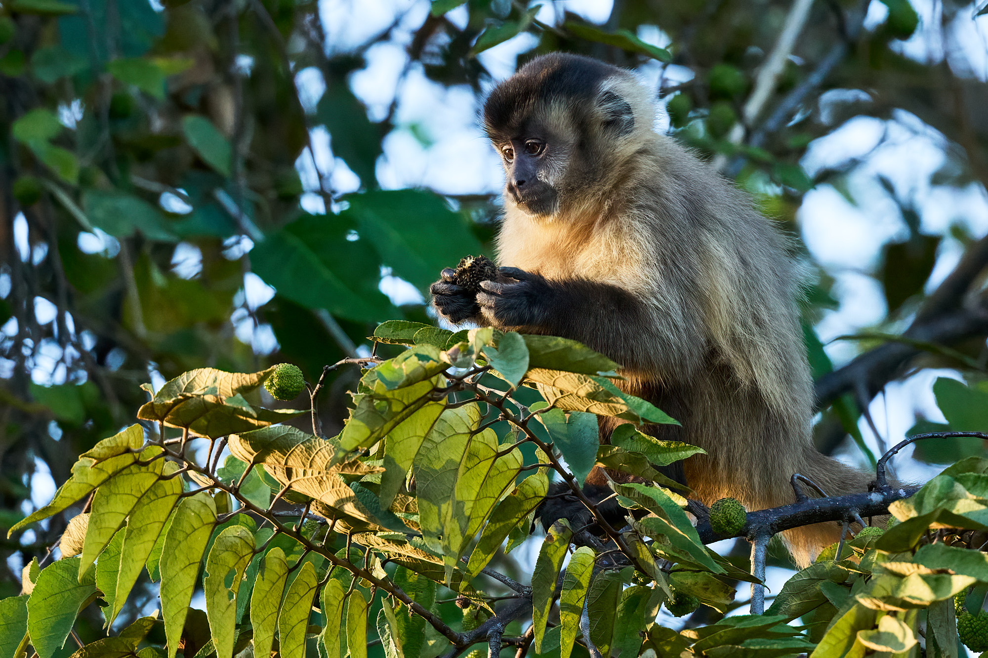
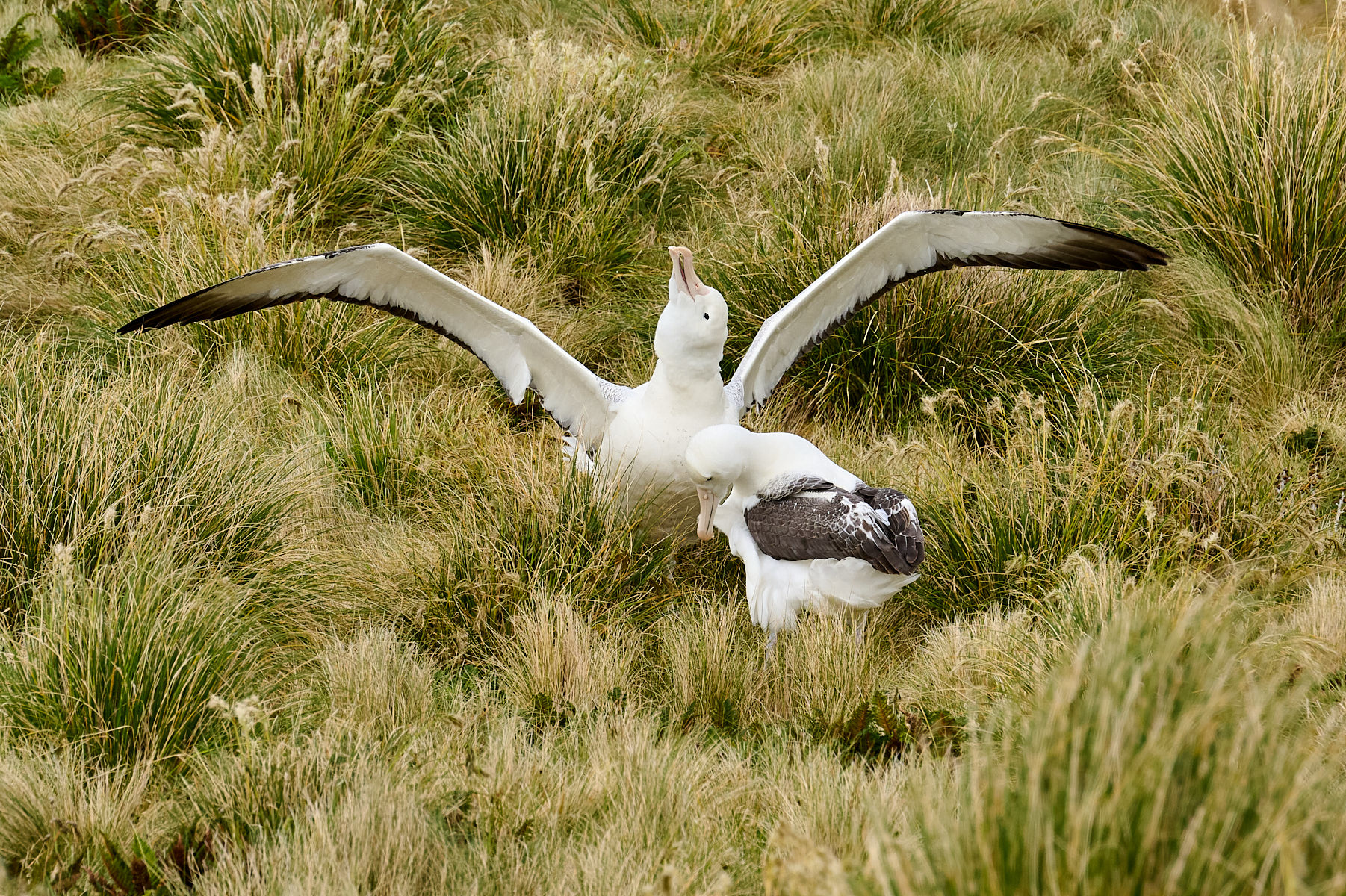
First, how cool to get a chance to spend time with these monkeys. They're so unique looking.
I also like the diagonal element and the interactions you described. It is a shame that there isn't just a bit more of the face of the groomer at the top showing, it does take away from the otherwise nice grouping.
Your processing overall looks very nice on the monkeys. Lots of color and detail.
The replaced sky is ok, I like that you've put in one that's consistent with the light on the subjects (no shadows on them).
To answer your question about the b&w, I would certainly try turning this in to a high key b&w with the original white sky. I can't say I've seen them score well in competition, honestly. But I really like that look personally and would print something like that, so if you like it, try it! |
Nov 14th |
| 67 |
Nov 22 |
Comment |
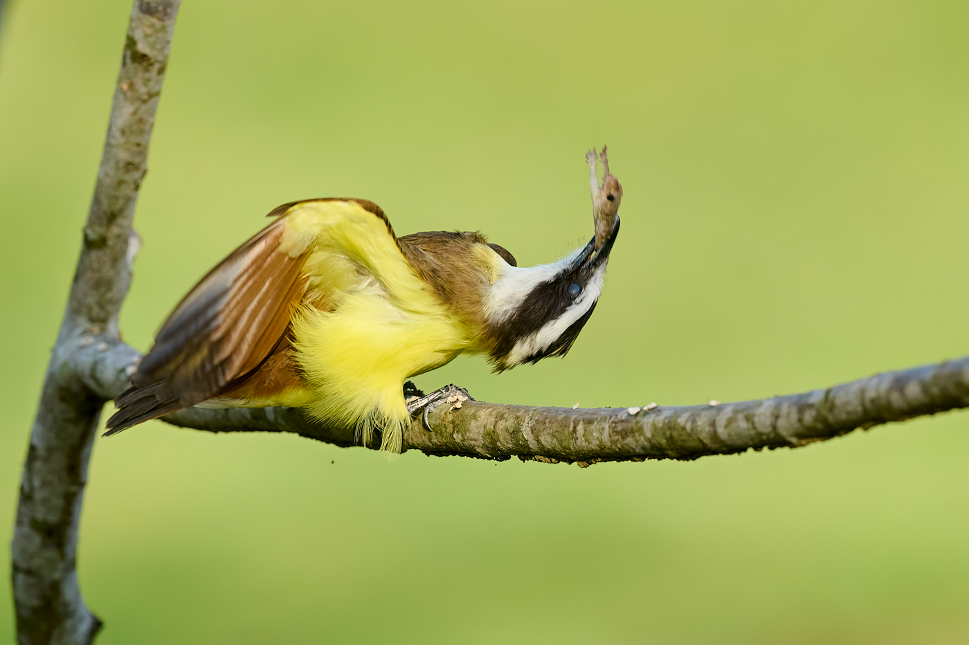
Agree the bird itself looks very nice. I don't even mind the head angle being tilted up like this.
I do like the colors of the sunlit foliage in the background, I think that is attractive and is a nice bit of color. The work you did in processing to "even out" the light on the bird and background is effective.
I do agree though that the foreground, out of focus foliage is what's distracting. Especially it seems that there's something blocking the bird's beak. Larry's vignette, darkening that foliage down, helps. Alternately, a tighter crop eliminating a bunch of what's on the right side would help. |
Nov 14th |
| 67 |
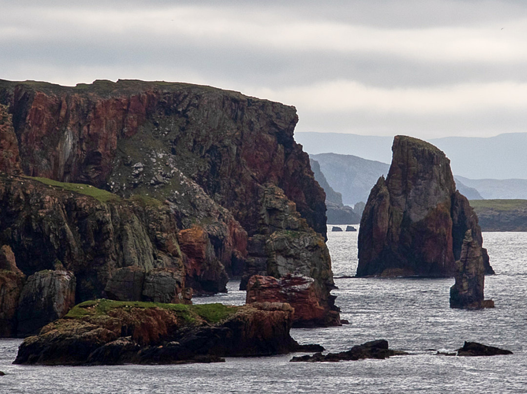
Nov 22 |
Comment |
Thanks Michael and Larry for your suggestions. I've played with various crops on the reflection, since that's what attracted me to the scene I hated to take out so much but I guess because it isn't a strong reflection it is better minimized. I've played with the hightlights and selectively saturated the rock. Hard to get it looking reasonable and not contrived! |
Nov 4th |
 |
| 67 |
Nov 22 |
Comment |
Thank you for the detailed input, Larry. I'm familiar with the Nature definition and rules but have never seen the "Levels" before. I'll play with your suggested edits. |
Nov 3rd |
8 comments - 3 replies for Group 67
|
8 comments - 3 replies Total
|