|
| Group |
Round |
C/R |
Comment |
Date |
Image |
| 16 |
May 24 |
Comment |
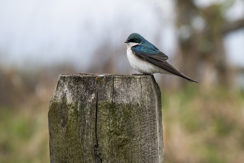
I like the bird the way it is flipped in the edited image, it looks much more appealing to me. I do like that I can see some of the branches in the background, it gives me some idea of what the bird is sitting in without being to distracting. Joan's crop is neat too, but it depends if you want the viewer to look at the bird more, or the scenery around it too (the tree is pretty in itself). |
May 16th |
| 16 |
May 24 |
Comment |
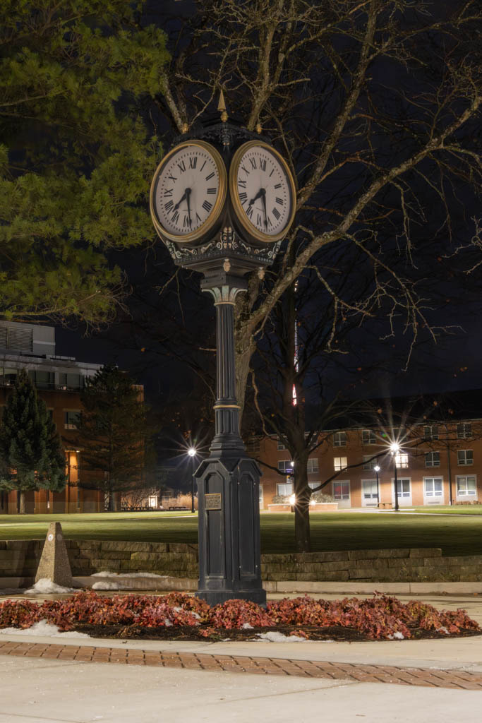
Very interesting image! The colors, sharpness and symmetry really make this image. I'd be interested in hearing about how you created it. |
May 16th |
| 16 |
May 24 |
Comment |
A few things I can think of that you can try. Adjusting blacks & whites is always a good start, this brings it back to what you saw it as. Also for this particular image I would play with the saturation and contrast, the colors seem a bit flat to me. |
May 16th |
| 16 |
May 24 |
Comment |
I really like the B/W image. The sharpness of it is what brings the detail out in the stork and gives it alot of texture. To me the blue sky is distracting from the main focus of the image. |
May 16th |
| 16 |
May 24 |
Comment |
The man standing next to the Bulls does give a perspective to them, but I find that he's too far away in the original image to make this effective. The added filter really does bring the colors back, it was very washed out before. |
May 16th |
5 comments - 0 replies for Group 16
|
5 comments - 0 replies Total
|