|
| Group |
Round |
C/R |
Comment |
Date |
Image |
| 16 |
Jan 24 |
Comment |
I like the black background, it makes sure your eyes are going to the beet. A white background would also work too. As for the composition I would like to see more of the side of the beet on the left side and have the whole beet in the image. |
Jan 21st |
| 16 |
Jan 24 |
Comment |
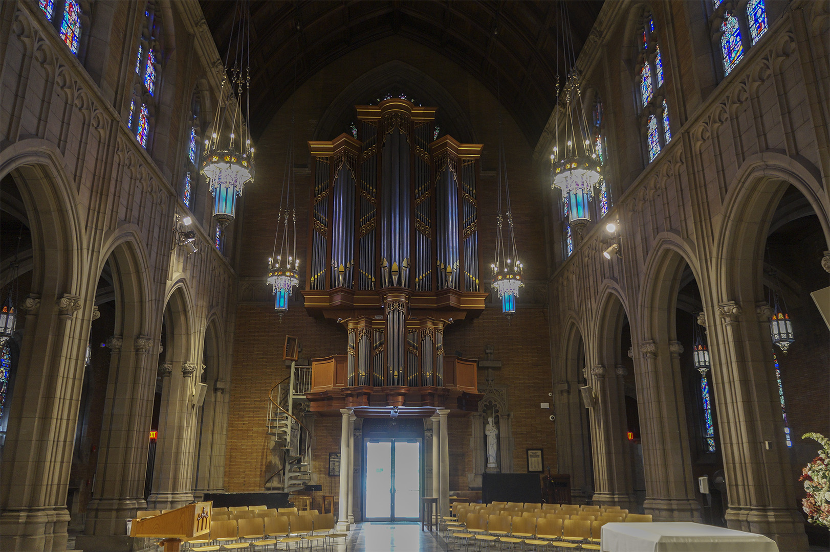
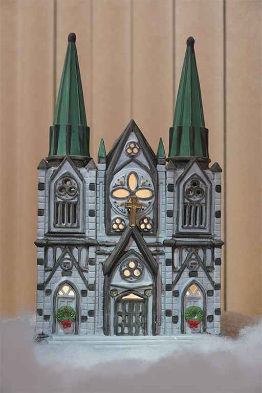
I like the contrast between the bright church and darker scene around it. It makes it seem that the church is bringing light to the world. If your concerned about it being too bright I would think that bringing down the highlights and up the shadows might help balance the lighting. |
Jan 21st |
| 16 |
Jan 24 |
Comment |
Cropping out the rocks on the side was a good idea, the image is less distracting now. I think that the mountains need some more saturation and contrast. They look washed out compared the the colorful foreground. Darlene's idea of darkening the sky would help with this and maybe add a tad of saturation to them. I really love the foreground, it's where my eyes are drawn to first when looking at the image. |
Jan 21st |
| 16 |
Jan 24 |
Comment |
I really like Terry's black and white idea. It makes the lighthouse timeless in nature. The only thing I would change is to add some more contrast to the colors. They look slightly washed out to me. |
Jan 21st |
| 16 |
Jan 24 |
Comment |
Defiantly like this image best in the black and white version. Adds some mystery to the man. I do agree that to image does need some more contrast, it looks too white and not much of the black. |
Jan 21st |
| 16 |
Jan 24 |
Comment |
Very nice image. Shows alot of the details on the clothing. The crowd makes it harder to crop on either side without cutting someone off. Terry's version without the crowd looks nice but it depends on if having the crowd adds to the story, or if you just want to focus on the performers. |
Jan 21st |
6 comments - 0 replies for Group 16
|
6 comments - 0 replies Total
|