|
| Group |
Round |
C/R |
Comment |
Date |
Image |
| 16 |
Feb 23 |
Comment |
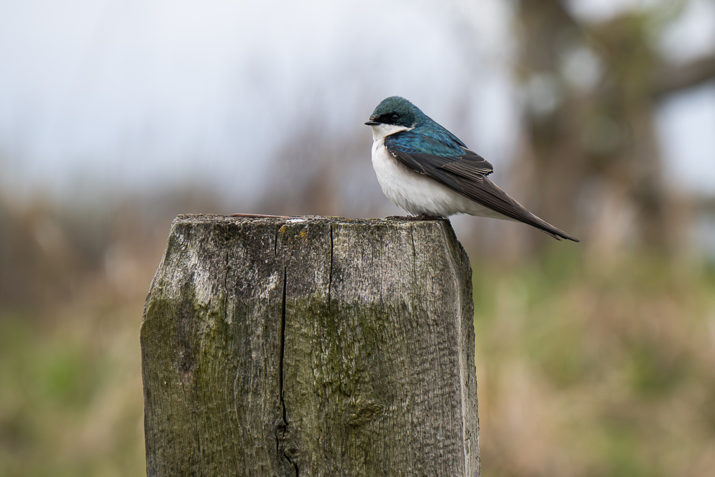
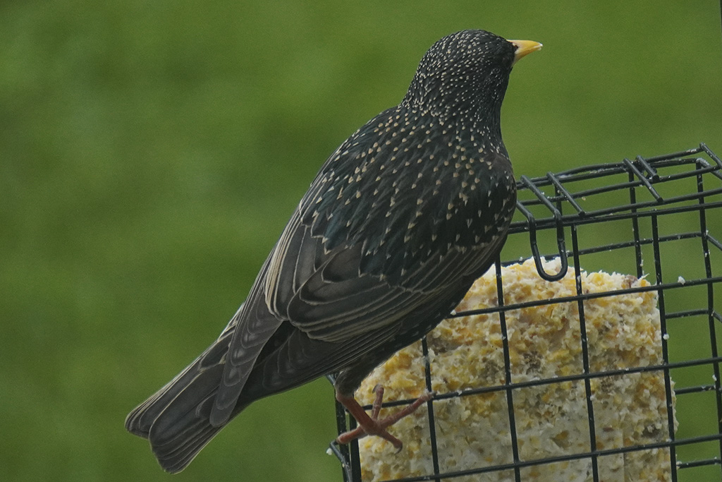
I think the bird is very cute! I find the image more appealing with the head towards the right vs the original image. The feathers look very much in focus. Very nice edits |
Feb 19th |
| 16 |
Feb 23 |
Comment |
The cherry blossom trees are very pretty! I like how the saturation in the sky was increased, but maybe its slightly too much. Maybe a happen medium between the original and edited version would bring it out enough but not be overpowering to the cherry blossom petals? |
Feb 19th |
| 16 |
Feb 23 |
Comment |
I think I would want to see more of the leaves left in at the bottom of the photo, it feels a bit cut off otherwise. I'm thinking a square crop would make the most sense of getting rid of the extra space but not all of the flower. You could probably change the color of the background to a different color, the blue is kindof blah. Maybe a darker shade of grey, black or a navy blue like color would look nice. |
Feb 17th |
| 16 |
Feb 23 |
Comment |
Love the bird, the feathers & eye are very well in focus and sharp. I also would think that blending/blurring the background more would bring more attention to the bird. |
Feb 17th |
| 16 |
Feb 23 |
Reply |
Never though about a square crop. I might try that! |
Feb 17th |
| 16 |
Feb 23 |
Comment |
I like how the image is flipped to have the heads pointed more to the right than to the left. I find this version more appealing. The square crop does the job of creating less distractions and focusing on the subject well. The only thing I would improve is lighten the faces a bit |
Feb 17th |
5 comments - 1 reply for Group 16
|
5 comments - 1 reply Total
|