|
| Group |
Round |
C/R |
Comment |
Date |
Image |
| 16 |
Dec 22 |
Reply |
Darkening the photo would be an interesting approach. I'll have to try that and see how it looks. Thanks! |
Dec 22nd |
| 16 |
Dec 22 |
Reply |
Thanks for the tip! I'll have to try that |
Dec 22nd |
| 16 |
Dec 22 |
Comment |
Great job with the cropping, the cropped version looks so much more professional! I find the B&W version best at showing your grandson but the color version is great at showing off the mural, so I guess it depends on the story you want to tell. The B&W does much better at hiding the reflection on the wall, but maybe that can be cleaned up some if you go with a color version. |
Dec 18th |
| 16 |
Dec 22 |
Comment |
Increase of the contrast and saturation makes a difference between the original and the edited versions. More details are brought back and the image appears slightly sharper and has less of a grey fog to the image. |
Dec 18th |
| 16 |
Dec 22 |
Comment |
I like the B&W version better than the color. B&W makes the photo look more dramatic and abstract. I do think it bring out the harshness of the life in Yosemite. The diagonal of the mountain brings your eyes to the single tree on the cliff, making for a nice composition. |
Dec 18th |
| 16 |
Dec 22 |
Comment |
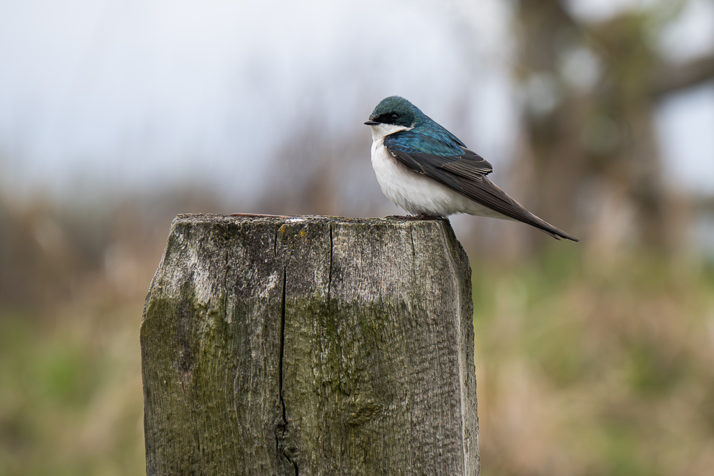
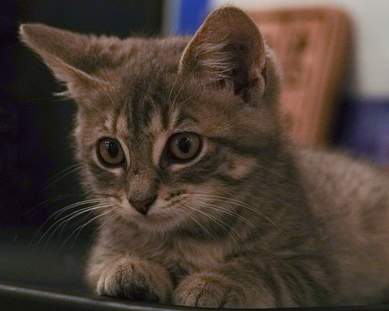
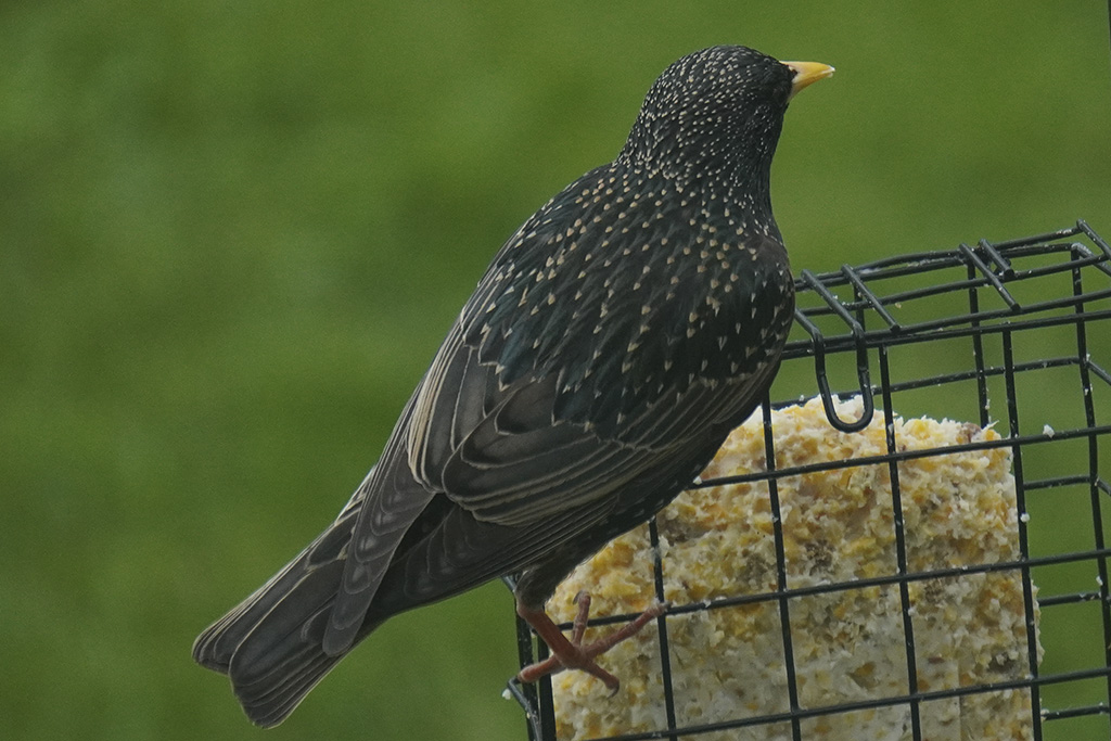
The increase in contrast and saturation bring alot back to the bird's detailing and makes it dramatically more sharper. Looks so much better than the original image! |
Dec 18th |
| 16 |
Dec 22 |
Comment |
I like the vertical crop, it works very well for this image as it zooms in on what is important and leaves out the image. |
Dec 18th |
| 16 |
Dec 22 |
Comment |
Like how you composed the image to not include their faces. The picture gives good contrast in coloring, those adjustments made work very well. |
Dec 18th |
6 comments - 2 replies for Group 16
|
6 comments - 2 replies Total
|