|
| Group |
Round |
C/R |
Comment |
Date |
Image |
| 1 |
Jun 23 |
Comment |
Great shot! |
Jun 17th |
| 1 |
Jun 23 |
Comment |
Love this one. The creativity is amazing |
Jun 17th |
2 comments - 0 replies for Group 1
|
| 2 |
Jun 23 |
Comment |
Great shot, excellent choice of background. The only change I would consider is to eliminate the blue "blackboard" in the background and leave it all black. |
Jun 17th |
 |
1 comment - 0 replies for Group 2
|
| 5 |
Jun 23 |
Reply |
I do have the latest version of photoshop and would be very grateful. As of now, I have all of next week pretty free with the exceptions of Tuesday 12-4 and Thursday 12-4 and every evening. I am on Eastern Daylight time and since you are so kind, I'll move around anything I can to accommodate you. Just email me at bevandstu@gmail.com. Thank you. |
Jun 17th |
| 5 |
Jun 23 |
Reply |
I saw your comment re masking and wondering if you'd be willing to show them to me as well. I'm still often at a loss when it comes to masking. |
Jun 17th |
| 5 |
Jun 23 |
Comment |
Love it! |
Jun 17th |
1 comment - 2 replies for Group 5
|
| 7 |
Jun 23 |
Comment |
What a beautiful combination of flowers |
Jun 17th |
1 comment - 0 replies for Group 7
|
| 20 |
Jun 23 |
Comment |
very creative |
Jun 17th |
1 comment - 0 replies for Group 20
|
| 24 |
Jun 23 |
Reply |
I'm going to have to make it a practice to watch the over saturating. Thanks to all. |
Jun 26th |
| 24 |
Jun 23 |
Reply |
Sure you have the skills...for a starter go to filter, blur and try several of the different options. You need to "select subject" "select inverse" and then have fun with the blur options under filter. |
Jun 17th |
| 24 |
Jun 23 |
Reply |
That's the beauty of the study groups. Over the years I've been involved, I learned more than I could have learned under any other circumstances. |
Jun 6th |
| 24 |
Jun 23 |
Reply |
I appreciate the sharpening but think I'd like the saturation somewhere between what you did and what I did. Would appreciate other comments. Thank you. |
Jun 6th |
| 24 |
Jun 23 |
Reply |
I tend to do that as I like them to pop but you're probably right |
Jun 3rd |
| 24 |
Jun 23 |
Comment |
Nice peaceful scene well photographed. Good result. |
Jun 3rd |
| 24 |
Jun 23 |
Comment |
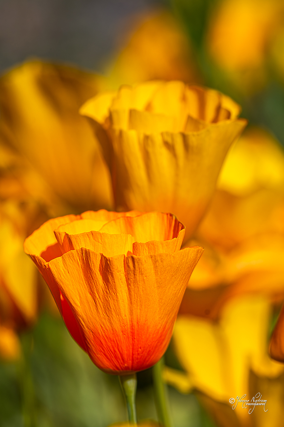
I love the image but I wanted the main flower to stand out a bit so I added some vibrance and a bit of saturation and then sharpened the flower itself. |
Jun 3rd |
 |
| 24 |
Jun 23 |
Comment |
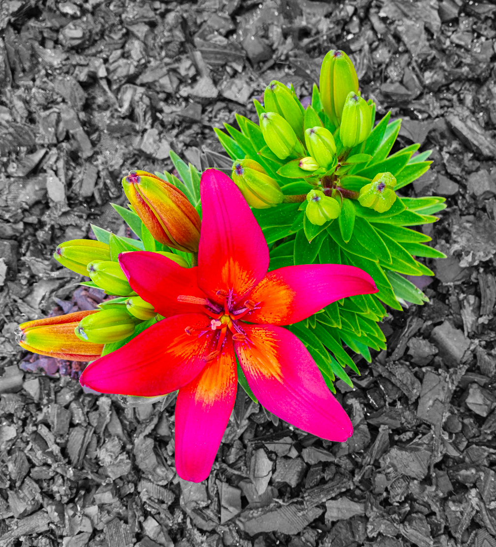
Love the flowers. I don't love the purple gravel as I think it distracts from the color of the flowers. So, I took it into photoshop and converted the gravel to a gray tone. I then added some vibrance and saturation to the flowers. Finally I cropped it a bit as I didn't care for all that gravel competing with the flowers. |
Jun 3rd |
 |
| 24 |
Jun 23 |
Comment |
Lovely image but on my screen a bit soft. I'd like to see the flowers a bit sharper. |
Jun 3rd |
| 24 |
Jun 23 |
Comment |
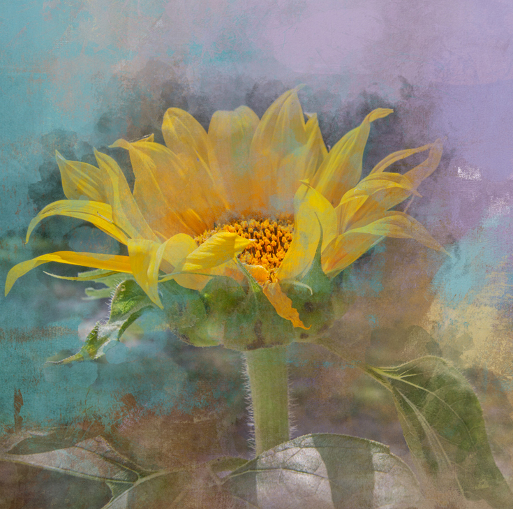
Although I love the flower and the background, I have a feeling would comment that there's a bit too much negative space on the right side. I've cropped it for your consideration. |
Jun 3rd |
 |
| 24 |
Jun 23 |
Comment |
The flower is exquisite. You did a great job of getting rid of the extraneous bits and pieces and I love the texture background you chose. Well done. |
Jun 3rd |
6 comments - 5 replies for Group 24
|
| 48 |
Jun 23 |
Reply |
Thank you so very much |
Jun 18th |
| 48 |
Jun 23 |
Reply |
thanks |
Jun 8th |
| 48 |
Jun 23 |
Reply |
thanks |
Jun 7th |
| 48 |
Jun 23 |
Reply |
We do not have a creative club and are done till September with competitions. I do have FCC but have never been successful with them. I may give it one last shot. However, most important is that I want to thank you so much for your kind words. |
Jun 5th |
| 48 |
Jun 23 |
Reply |
That was my thought. Thanks |
Jun 4th |
| 48 |
Jun 23 |
Reply |
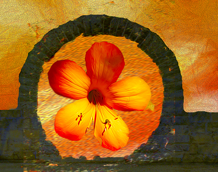
Since I received a few valid suggestions, I decided to work on it a bit more and use all of the suggestions to improve it. When it was done, I decided that I perfer my original but thank all of you for yourinput and ideas and welcome any further comments. |
Jun 3rd |
 |
| 48 |
Jun 23 |
Comment |
Thank you so much. It is really appreciated. |
Jun 2nd |
1 comment - 6 replies for Group 48
|
| 58 |
Jun 23 |
Reply |
Sorry if I'm missing something here in the story line. Based on your comments, I'm fine with it as it was. Sorry for my misunderstanding. |
Jun 18th |
| 58 |
Jun 23 |
Reply |
I did see that but made my comments based on what I saw as the distraction. |
Jun 18th |
| 58 |
Jun 23 |
Comment |
I found that the fellow on the right was a bit removed from the other two wearing a bright white outfit, he tended to be a bit distracting for me. So, I cropped the image and with content aware fill eliminated the pole on the right, making the couple the subject. I don't know if it's better or worse but would be interested in your thoughts. |
Jun 18th |
 |
| 58 |
Jun 23 |
Comment |
Images like this makes me sorry I missed the fair this year. I do prefer Isaac's flip as the final rendition. |
Jun 18th |
2 comments - 2 replies for Group 58
|
| 65 |
Jun 23 |
Comment |
Love it Melanie. |
Jun 18th |
| 65 |
Jun 23 |
Comment |
Different strokes for different folks. . . I love the saturation you achieved. |
Jun 18th |
2 comments - 0 replies for Group 65
|
| 70 |
Jun 23 |
Comment |
This is really eye opening and very well executed. |
Jun 18th |
1 comment - 0 replies for Group 70
|
| 72 |
Jun 23 |
Reply |
You are most welcome. That's what I love about these study groups - having another eye for better or worse. |
Jun 19th |
| 72 |
Jun 23 |
Comment |
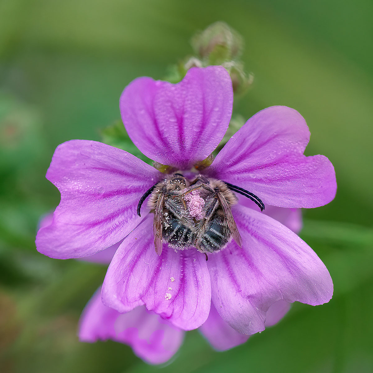
Beautiful flower but a little soft. I also felt it could use a little "punch". So I selected the flower added a touch of vibrance and saturation and then chose sharpen and did a touch of sharpening. What do you think? |
Jun 18th |
 |
1 comment - 1 reply for Group 72
|
| 74 |
Jun 23 |
Comment |
This is an excellent image but when I look at the finished image and compare it to Original 2, the second appears to have a bit more "punch" which I tend to prefer. |
Jun 18th |
| 74 |
Jun 23 |
Comment |
As I could not open it in PS because it is html rather than jpg, I will just describe my suggestion. I love the b&w rendition but I would open it in PS and add a touch of vibrance and saturation and consider the result. Overall well done. |
Jun 18th |
2 comments - 0 replies for Group 74
|
| 77 |
Jun 23 |
Comment |
I followed Linda's lead by using vibrance and saturation to increase the contrast against the dark background. Lovely image. |
Jun 18th |
1 comment - 0 replies for Group 77
|
| 80 |
Jun 23 |
Comment |
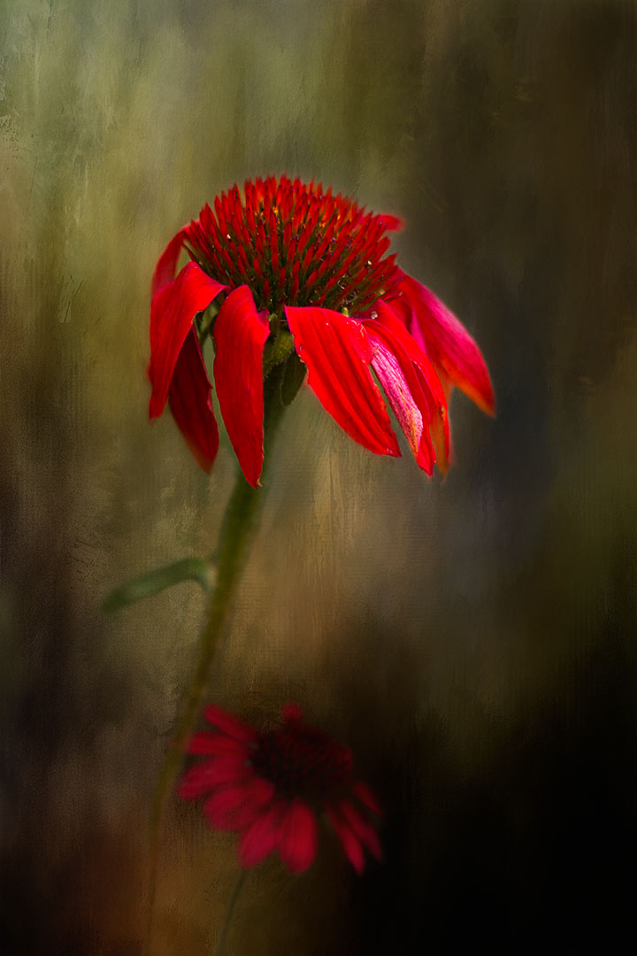
Because you have chosen such a dark background which I do like, I decided to try adding a touch of vibrance and saturation in Photoshop to the flower itself. What do you think? |
Jun 18th |
 |
1 comment - 0 replies for Group 80
|
| 85 |
Jun 23 |
Comment |
Beautiful image. What an incentive to consider purchasing a drone. |
Jun 18th |
1 comment - 0 replies for Group 85
|
| 86 |
Jun 23 |
Comment |
I never cease to be amazed at the phone images. A agree with Steven. I think the original is preferable. |
Jun 18th |
1 comment - 0 replies for Group 86
|
| 88 |
Jun 23 |
Comment |
takes me back to my memories of our Kenya safari and the wonderful memories. Beautifully done
|
Jun 18th |
1 comment - 0 replies for Group 88
|
| 90 |
Jun 23 |
Comment |
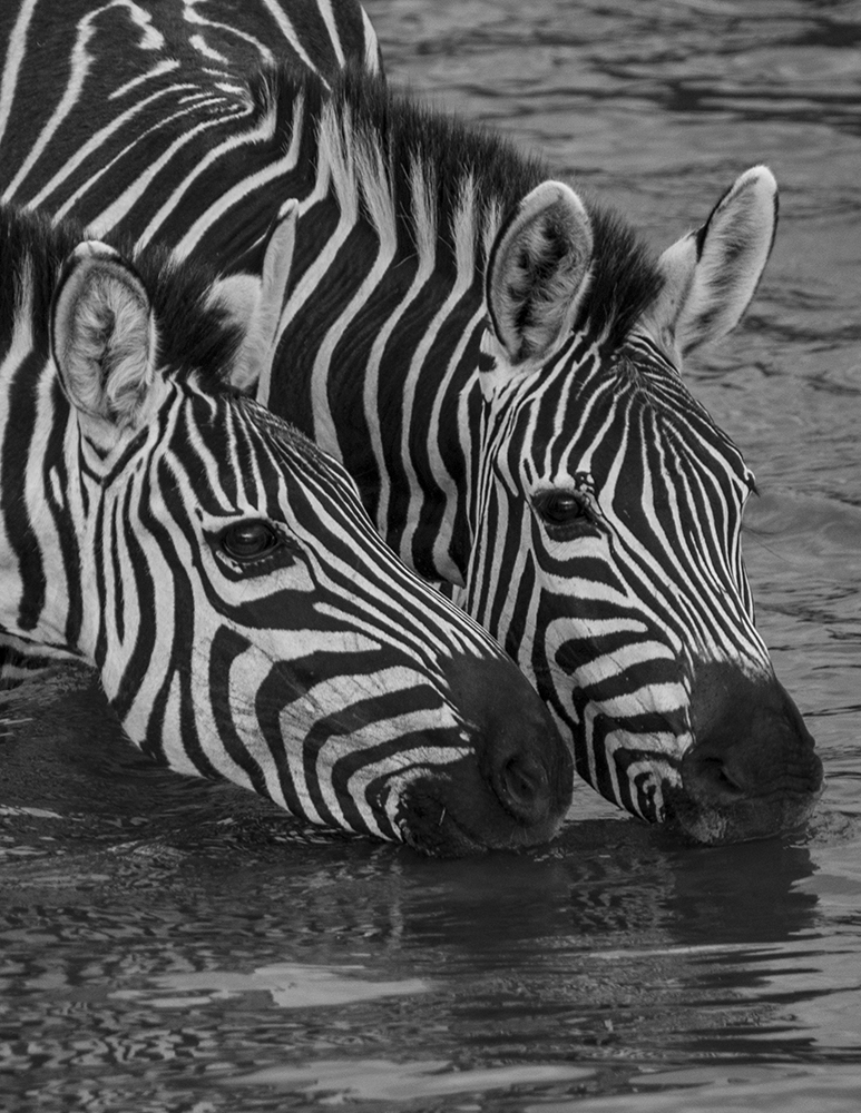
I added a touch of vibrance and saturation to your image and I think that added a bit of Pop. What do you think |
Jun 17th |
 |
1 comment - 0 replies for Group 90
|
| 99 |
Jun 23 |
Comment |
Overall well done |
Jun 17th |
1 comment - 0 replies for Group 99
|
28 comments - 16 replies Total
|