|
| Group |
Round |
C/R |
Comment |
Date |
Image |
| 1 |
Sep 22 |
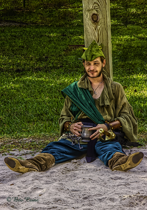
Comment |
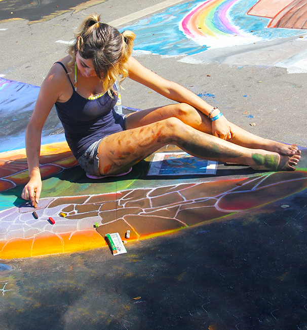
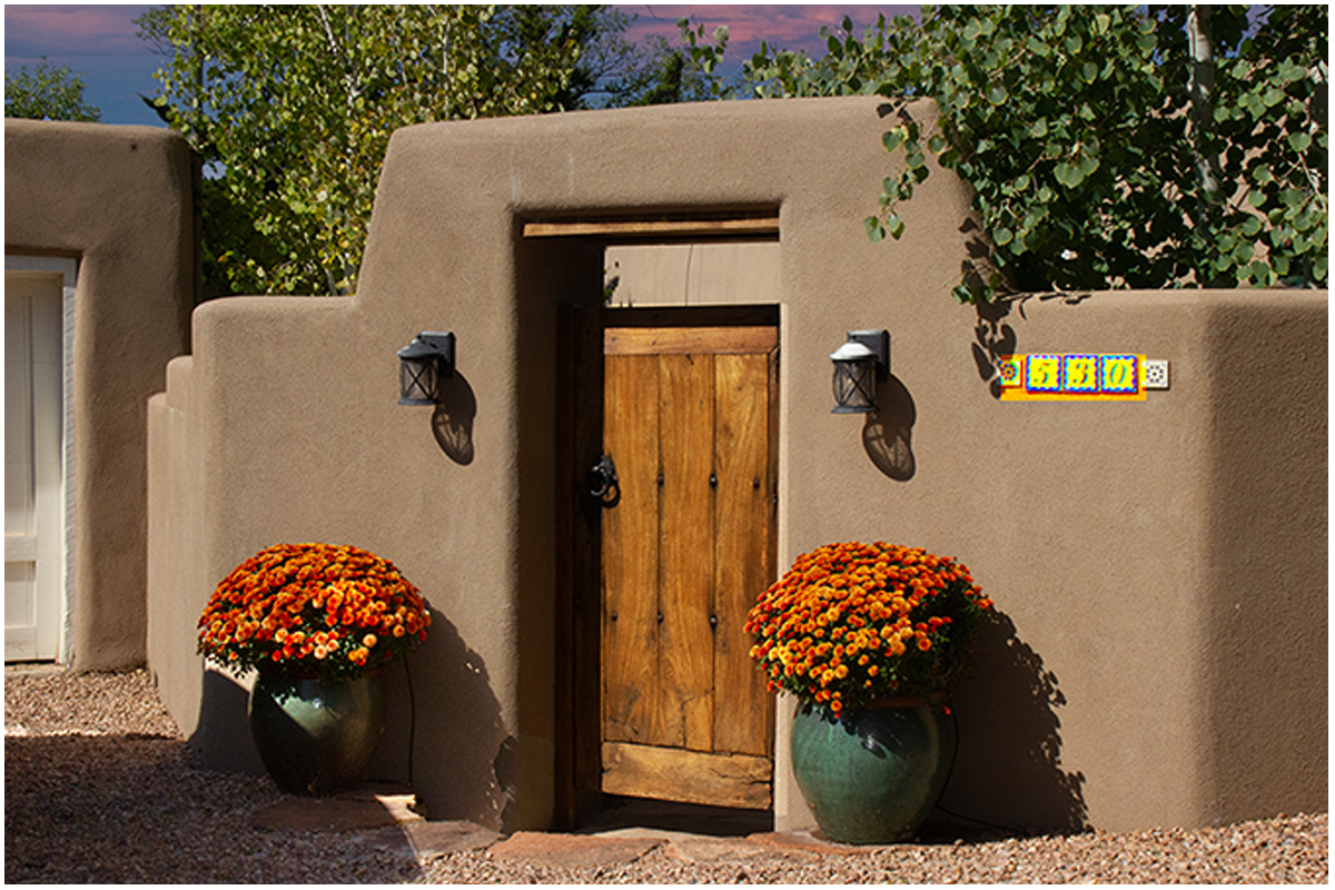
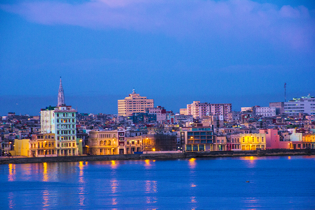
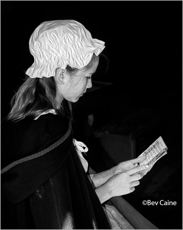
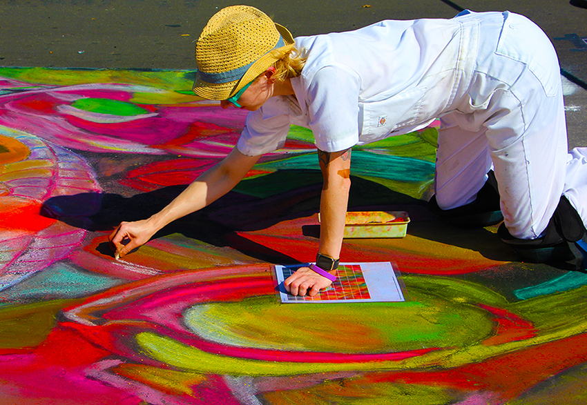
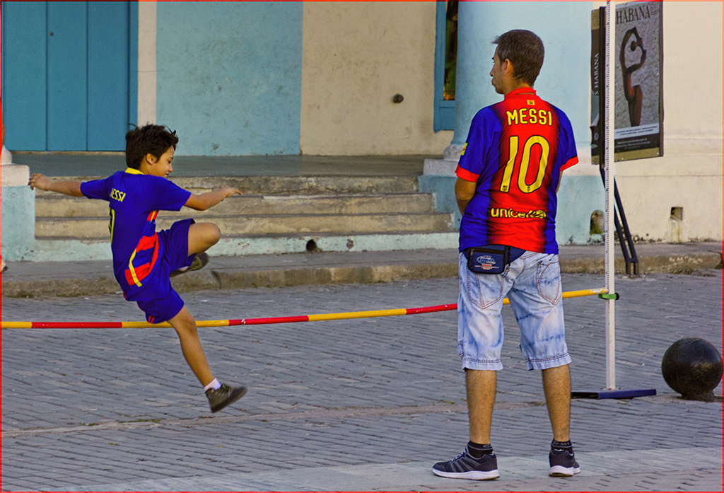
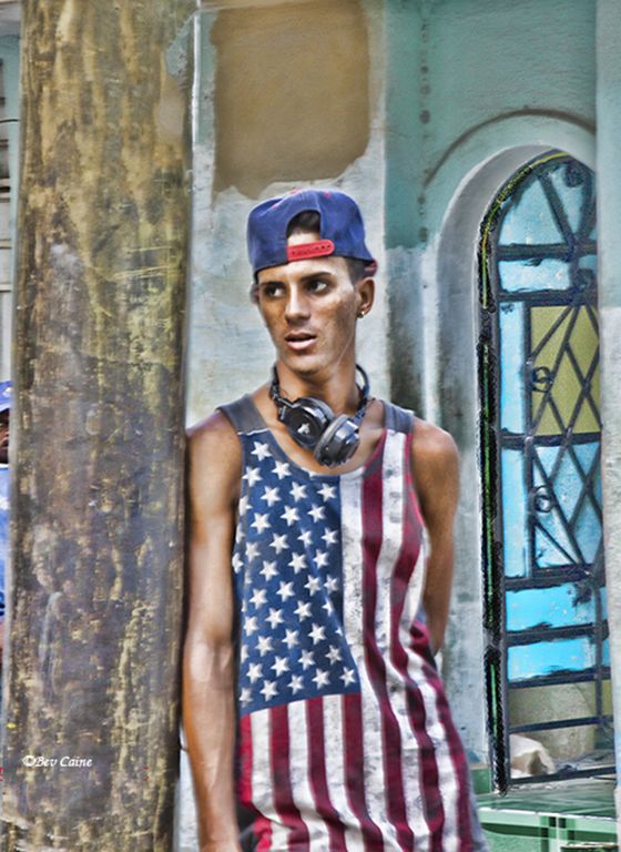
Nice image. Well composed. Excellent street scene. |
Sep 4th |
| 1 |
Sep 22 |
Comment |
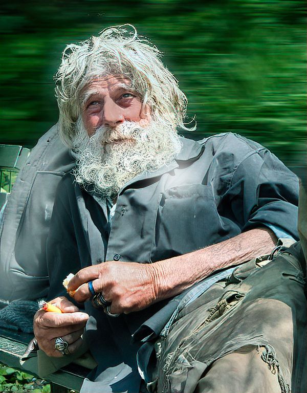
Great shot. Couldn't be better. |
Sep 4th |
| 1 |
Sep 22 |
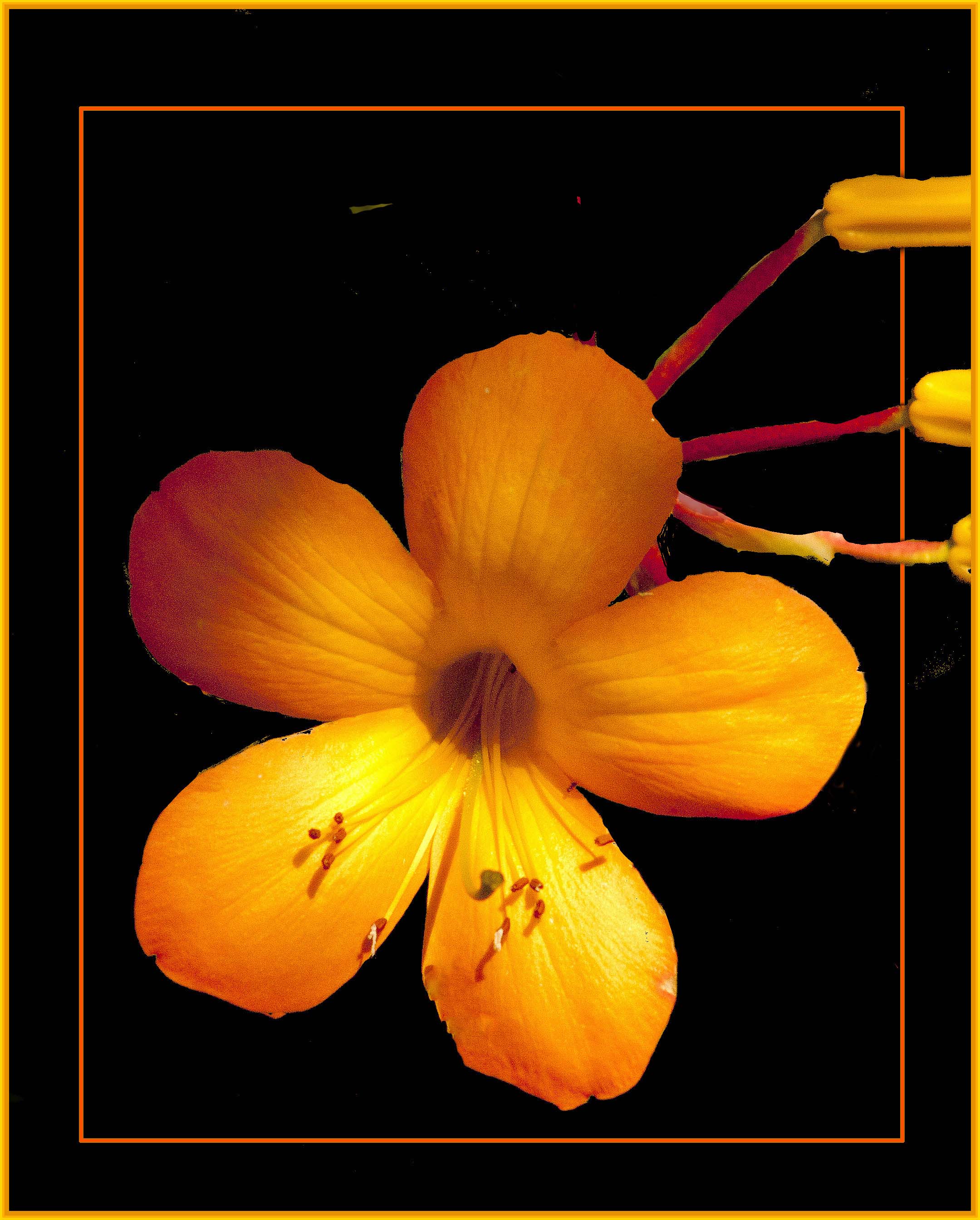
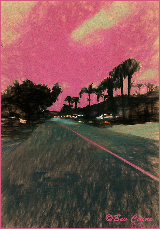
Comment |
This is a great capture. I felt it was lacking a bit of oomph so I opened it in photoshop and went to image/adjustments/vibrance and increased both the vibrance and the saturation a bit. Following that I went to sky replacement in photoshop and chose what you see. Hope you like it. |
Sep 4th |
 |
3 comments - 0 replies for Group 1
|
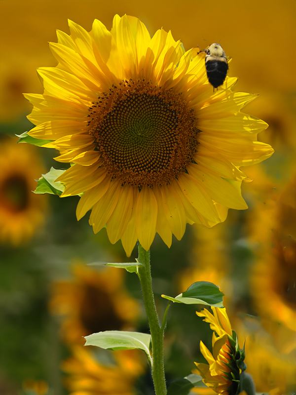
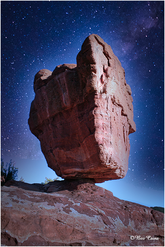
| 2 |
Sep 22 |
Comment |
This is just lovely. Best wishes for many more to come. We're heading for 66 and it gets better every year. Always something to look forward to. |
Sep 4th |
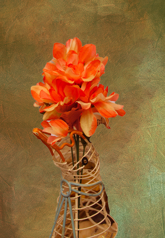
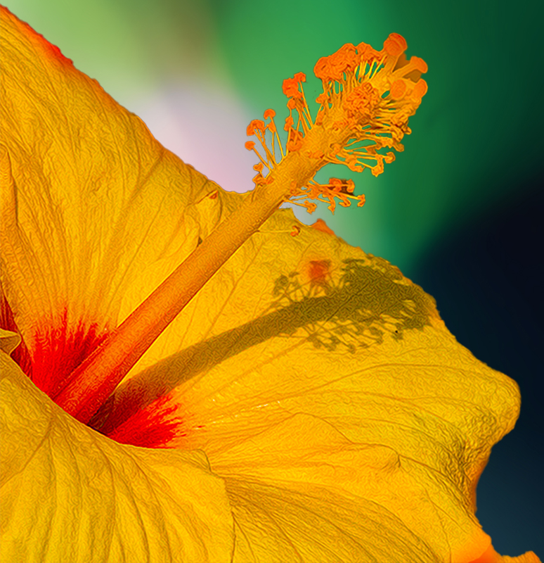
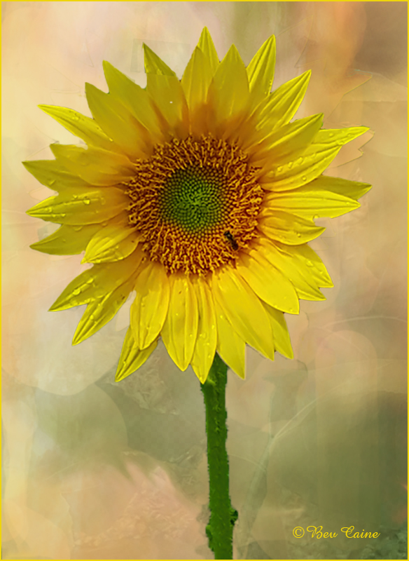
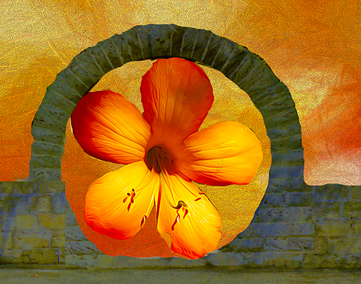
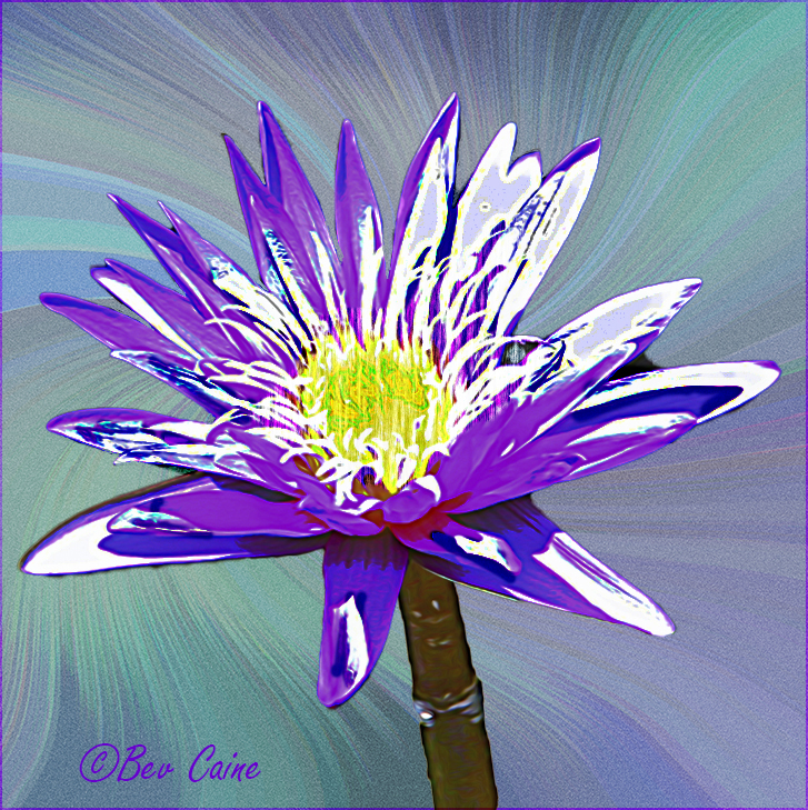
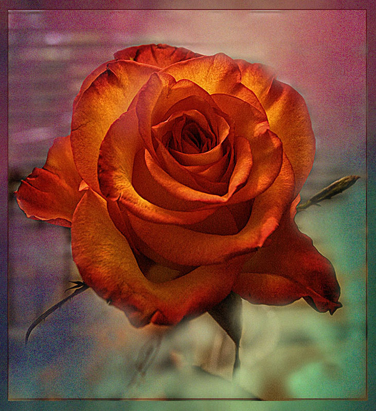
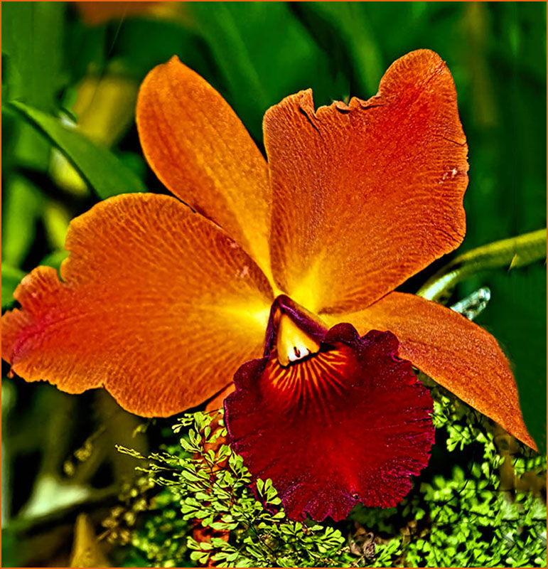
| 2 |
Sep 22 |
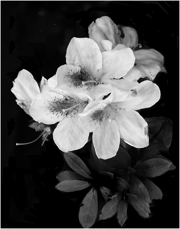
Comment |
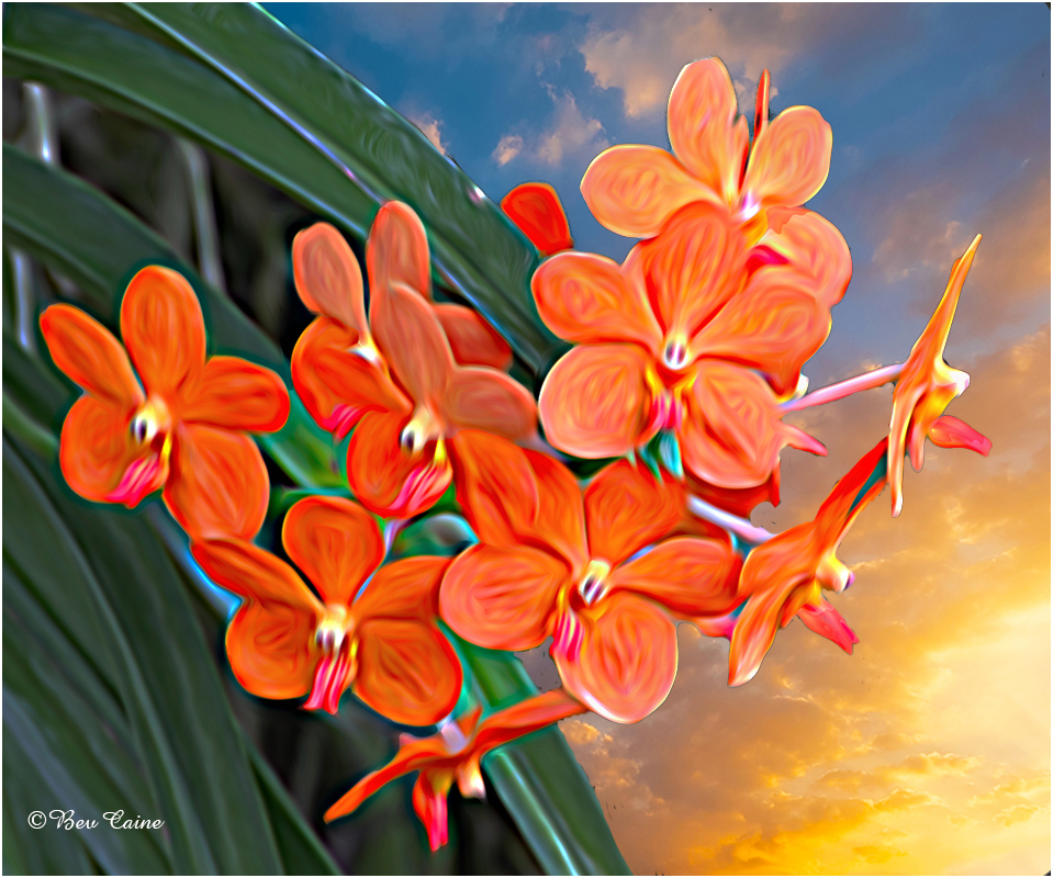
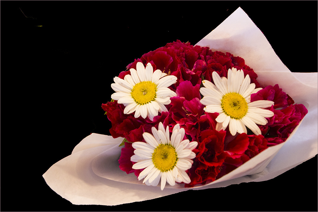
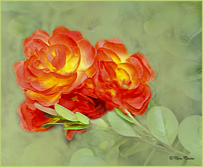
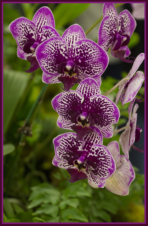
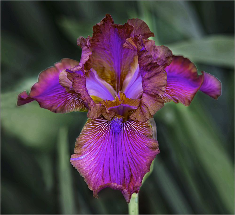
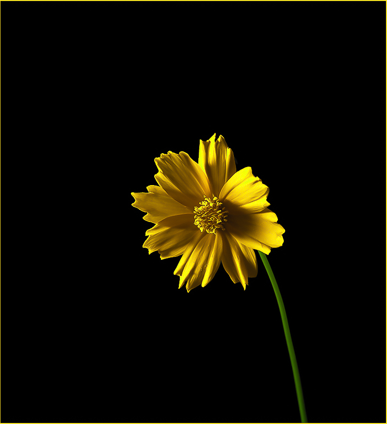
Lovely flower but I felt that the overall was lacking some punch. So I took it into Photoshop and first selected the flower and in image/adjustments/vibrance I played with the vibrance and saturation. I then did an inverse selection and toned down the background to give the flower that extra step. What do you think? |
Sep 4th |
 |
2 comments - 0 replies for Group 2
|
| 4 |
Sep 22 |
Comment |
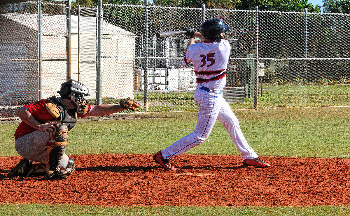
Nice image. Well done |
Sep 4th |
| 4 |
Sep 22 |
Comment |
I agree that this is an excellent job. And Gary, I'll have to keep your note re Naples in mind. We have friends who winter in Marco Island and hopefully next time we get down that way, I'll have an opportunity to visit Rev |
Sep 4th |
2 comments - 0 replies for Group 4
|
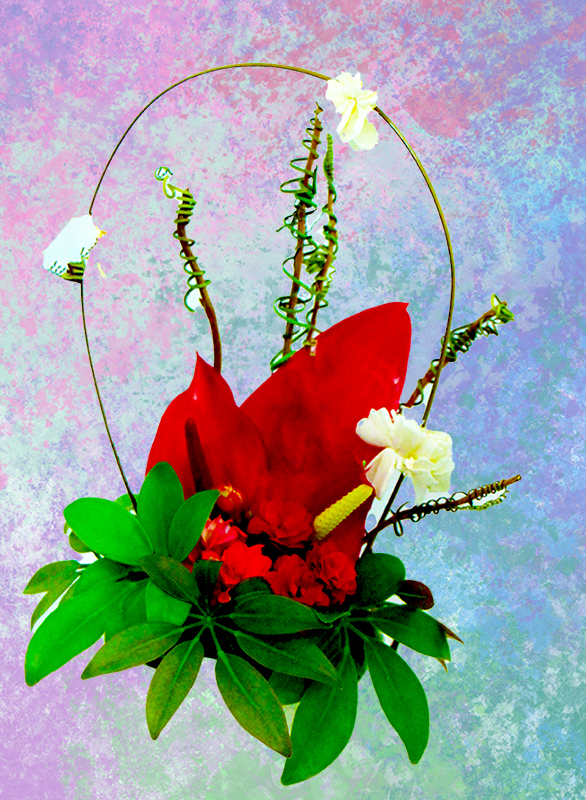
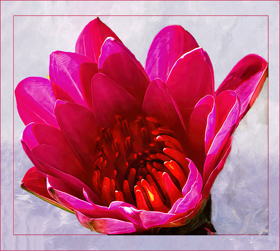
| 5 |
Sep 22 |
Comment |
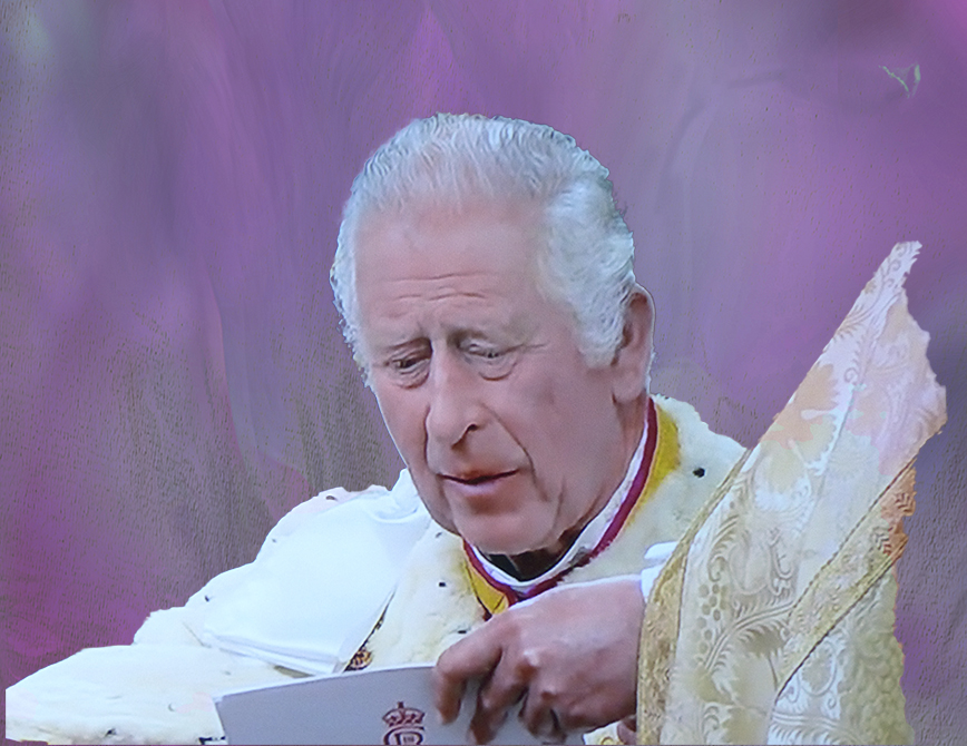
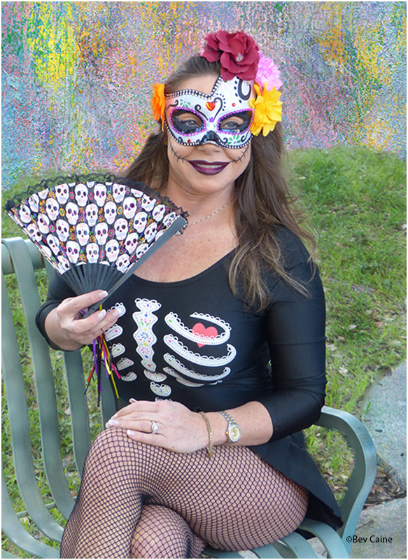
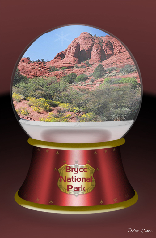
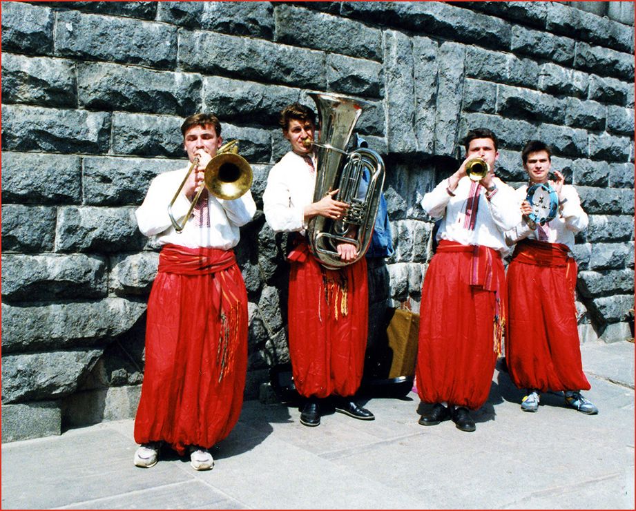
Great capture. Pretty much everything said; however, I prefer the red of the original image as I believe it stands out more. Keep up the good work. |
Sep 4th |
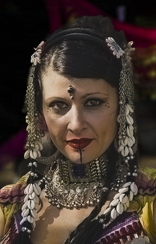
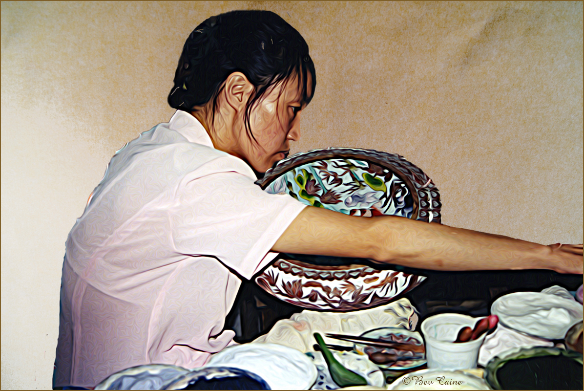
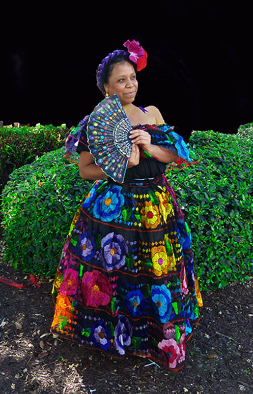
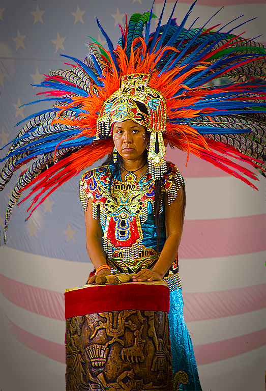
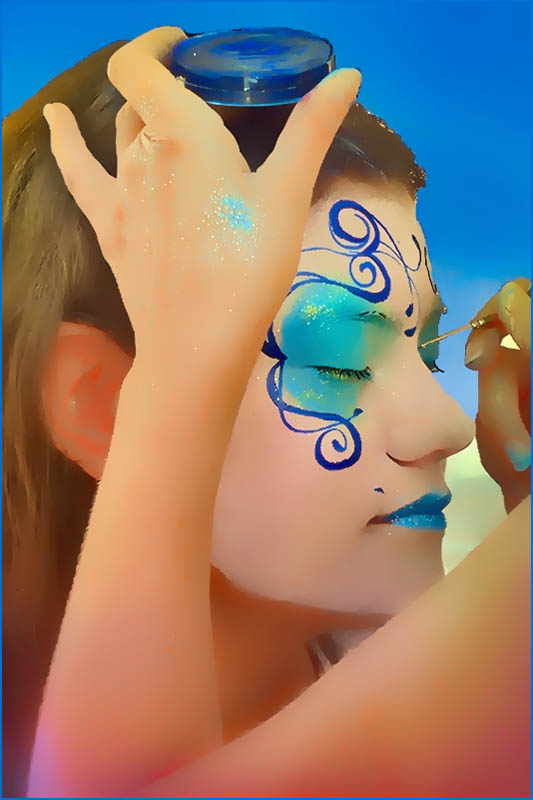
| 5 |
Sep 22 |
Comment |
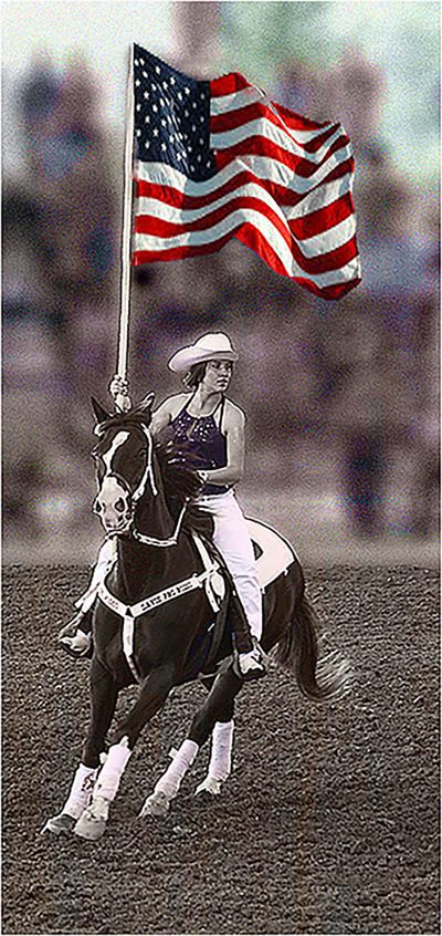
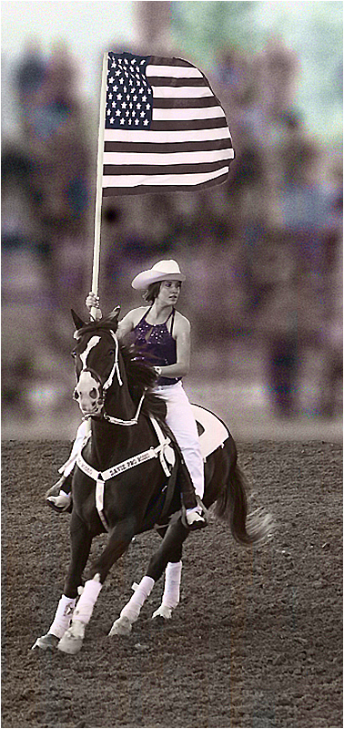
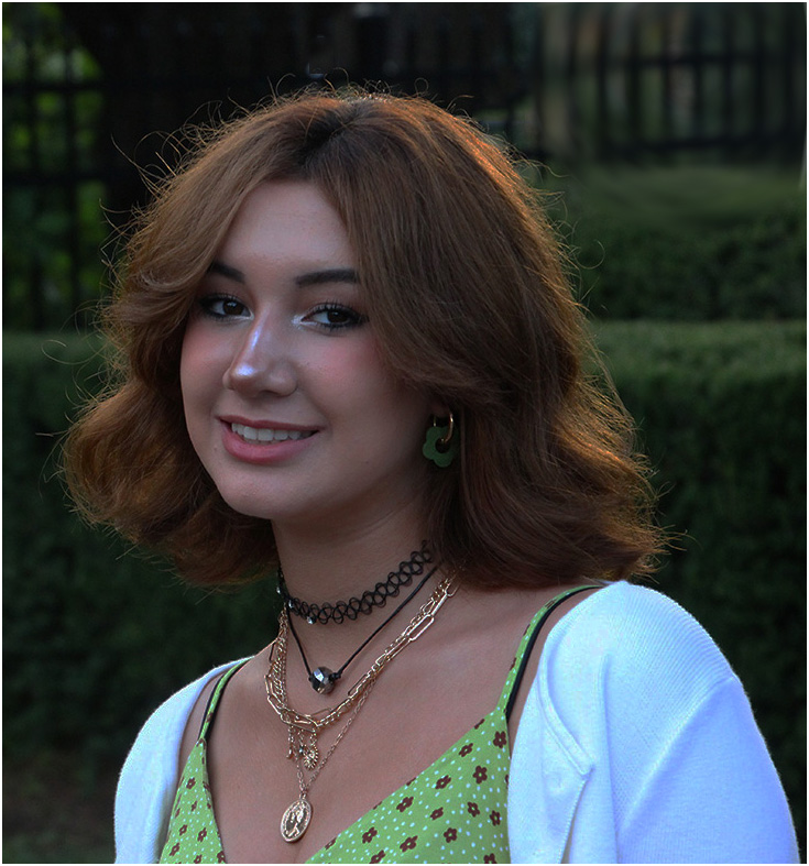
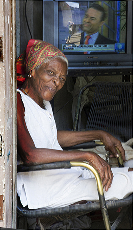
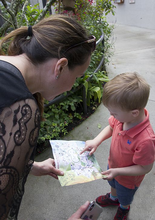
At first look I didn't even see the woman; however, when I did notice her it was neither an enhancement nor a distraction. She was just there. I think overall I prefer David's rendition. |
Sep 4th |
| 5 |
Sep 22 |
Comment |
Wonderful. Your post processing on the background is a huge plus to the overall image |
Sep 4th |
3 comments - 0 replies for Group 5
|
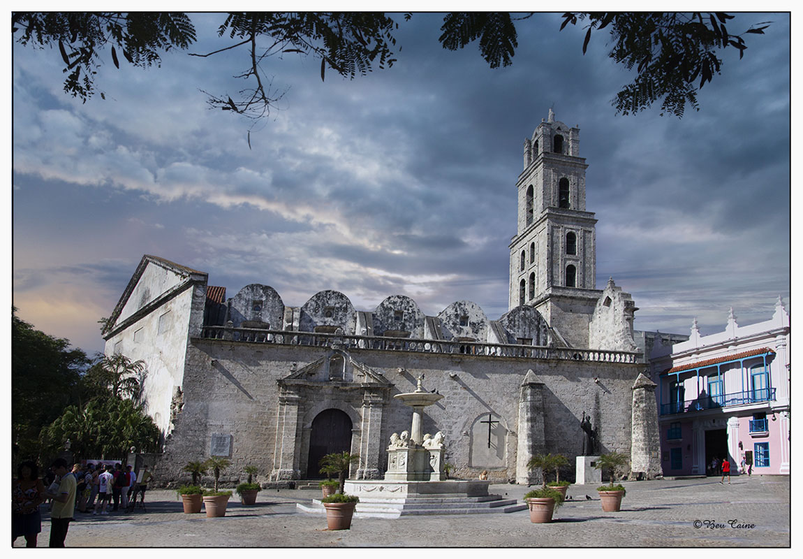
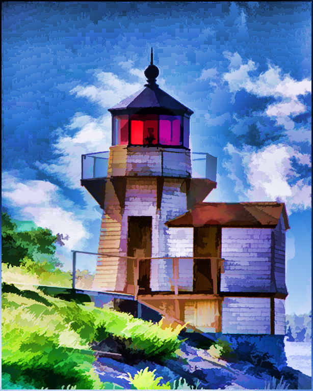
| 7 |
Sep 22 |
Comment |
|
Sep 4th |
 |
| 7 |
Sep 22 |
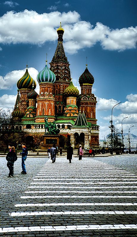
Comment |
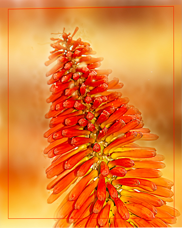
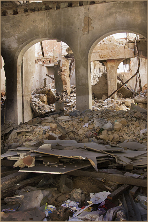
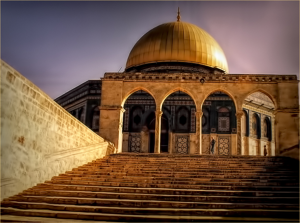
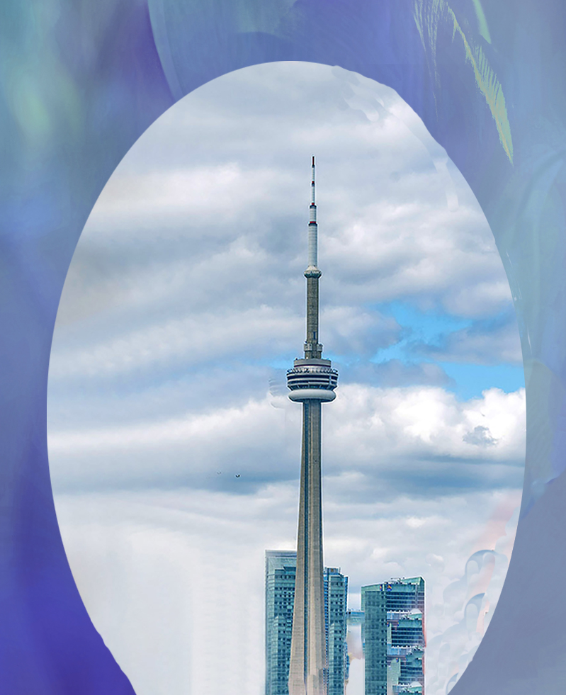
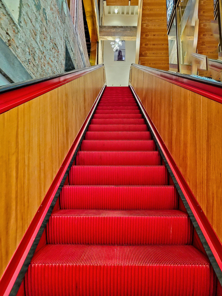
The tower is great but I find the red very distracting. So I opened it in photoshop and chose on of the myriad of textures I have and came up with the attached. I wonder what you think. |
Sep 4th |
2 comments - 0 replies for Group 7
|
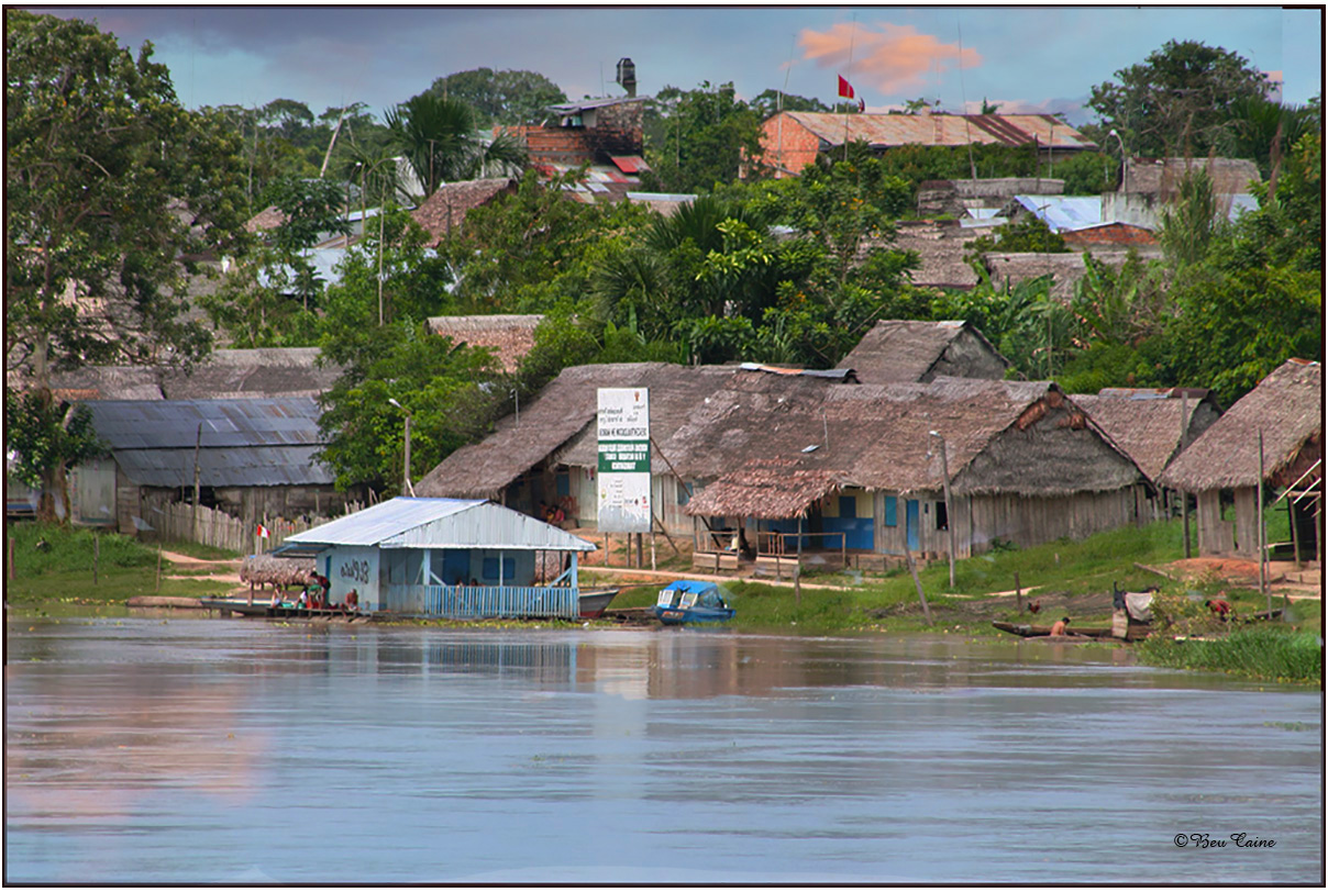
| 8 |
Sep 22 |
Comment |
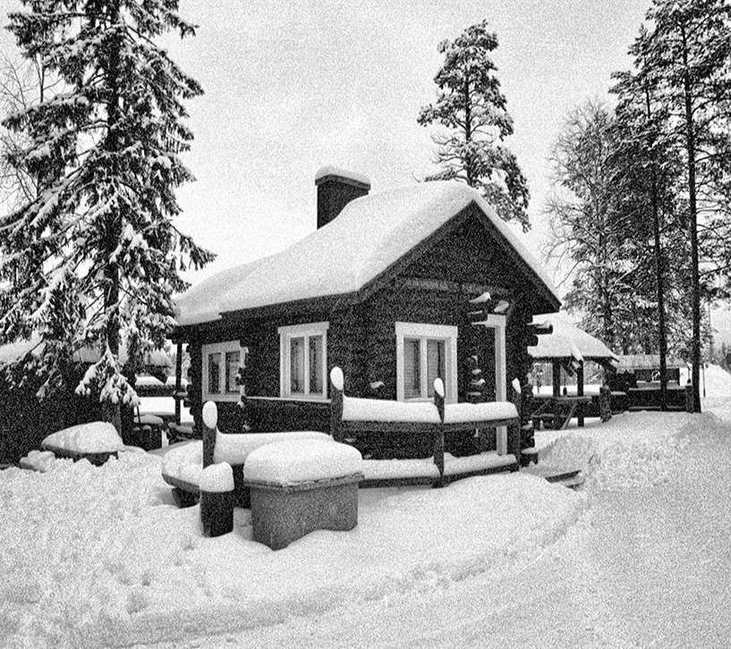
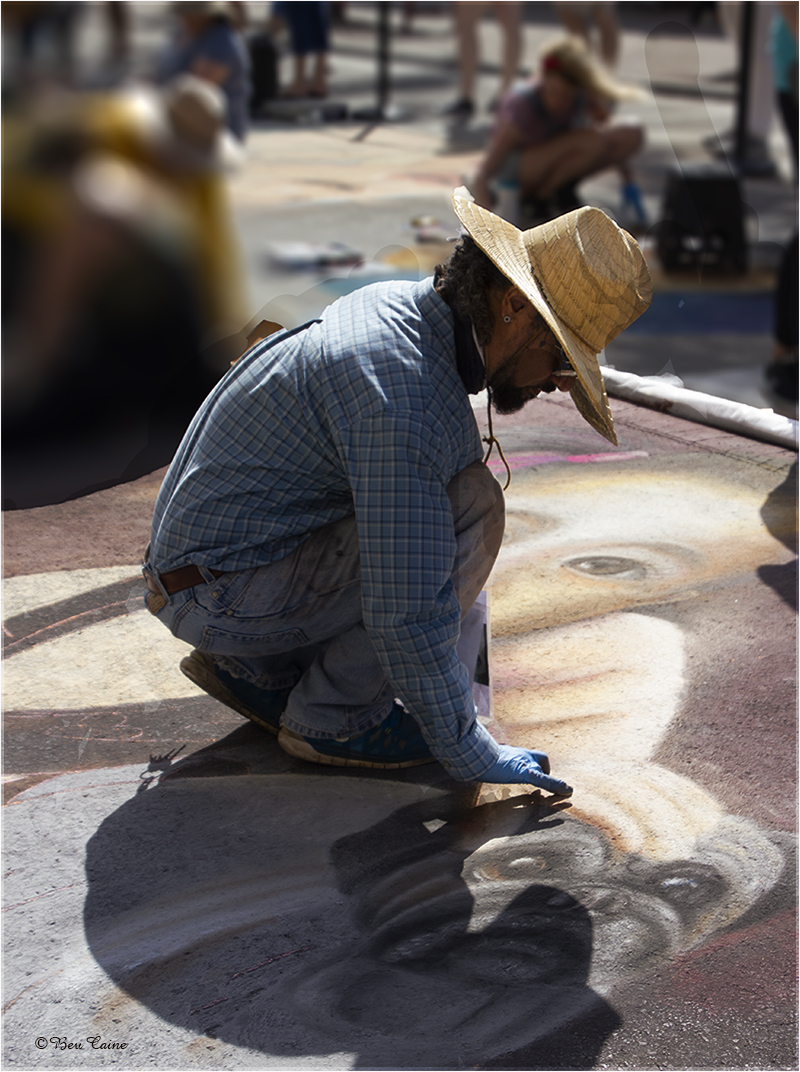
Very nice but I wish you would expound a bit on your commentary regarding when, where, time of year, etc. |
Sep 10th |
| 8 |
Sep 22 |
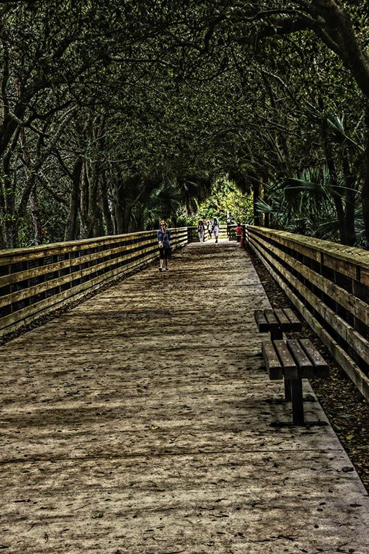
Comment |
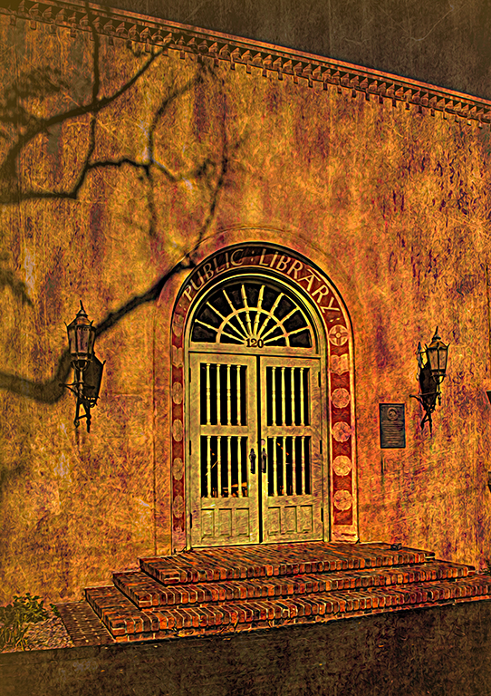
Great leading lines but I found the panel on the right with all the wording a major distraction so I did a very quick edit fill content aware to eliminate it. It is not perfect but just a suggested alternative. |
Sep 10th |
 |
2 comments - 0 replies for Group 8
|
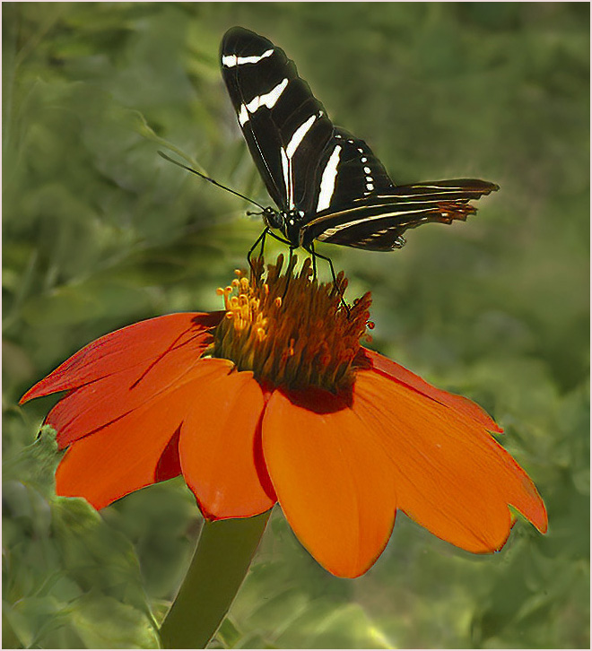
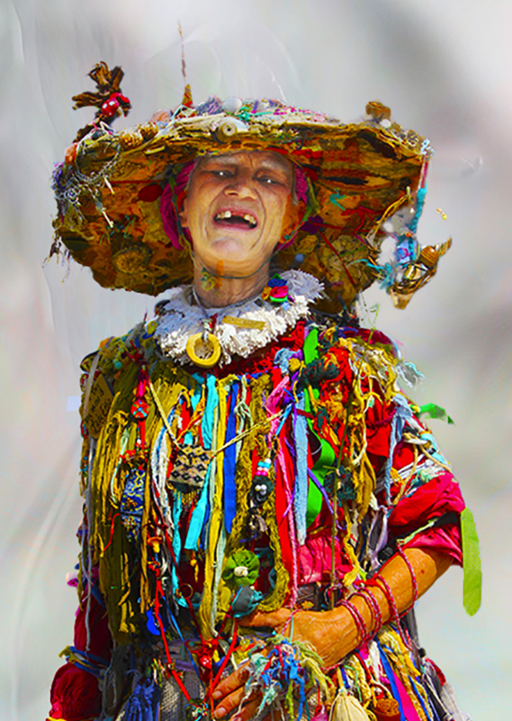
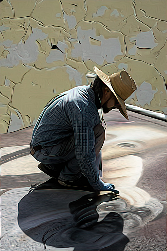
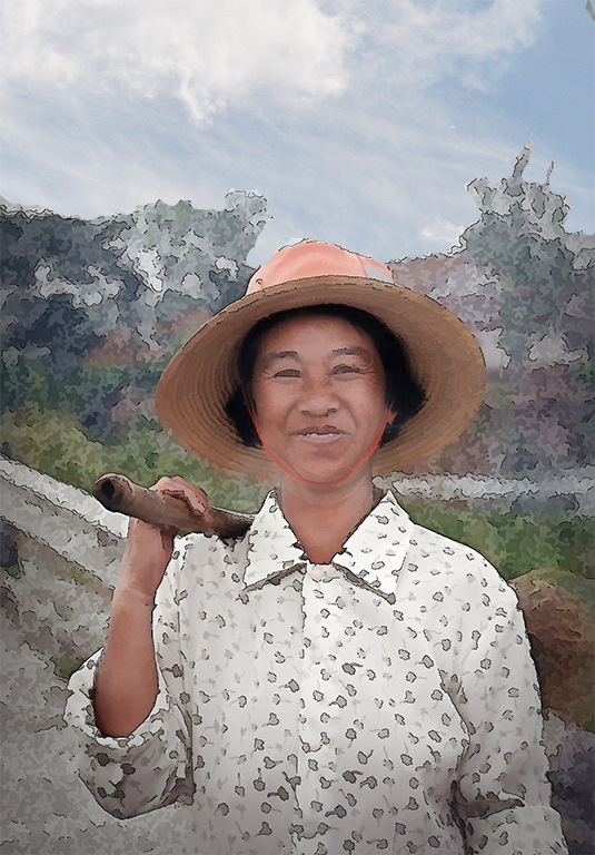
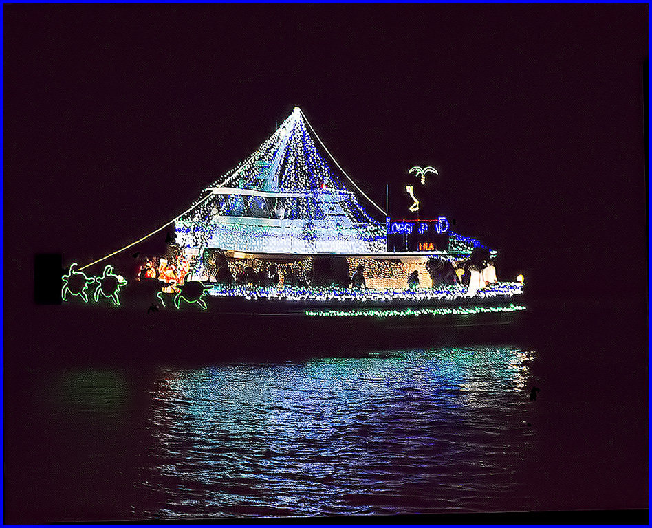
| 9 |
Sep 22 |
Comment |
Great image. Wish they had things quite this interesting in Florida. |
Sep 10th |
| 9 |
Sep 22 |
Comment |
Great image. Wish they had things quite this interesting in Florida. |
Sep 10th |
| 9 |
Sep 22 |
Comment |
This is a beautiful image but I must tell you that you really should have more info on when, where, and how the final image was arrived at. That's what makes the study groups so worthwhile |
Sep 8th |
| 9 |
Sep 22 |
Comment |
This is a great composition. Congratulations on the ribbons. |
Sep 8th |
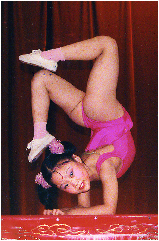
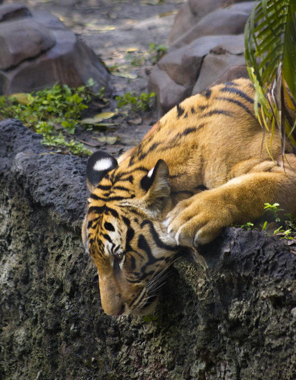
| 9 |
Sep 22 |
Comment |
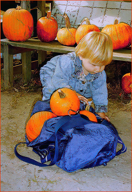
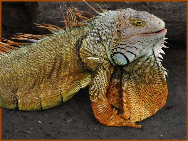
This is such an adorable image. The only thing I might have tried would be to attempt to clone out the thing on the lower right corner, or maybe just darken it a bit so that the blue is a lot less eye catching. |
Sep 8th |
5 comments - 0 replies for Group 9
|
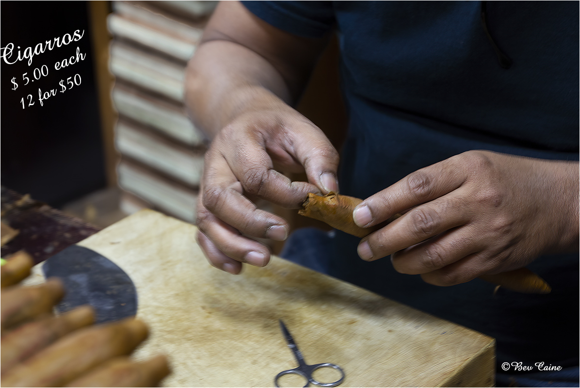
| 10 |
Sep 22 |
Comment |
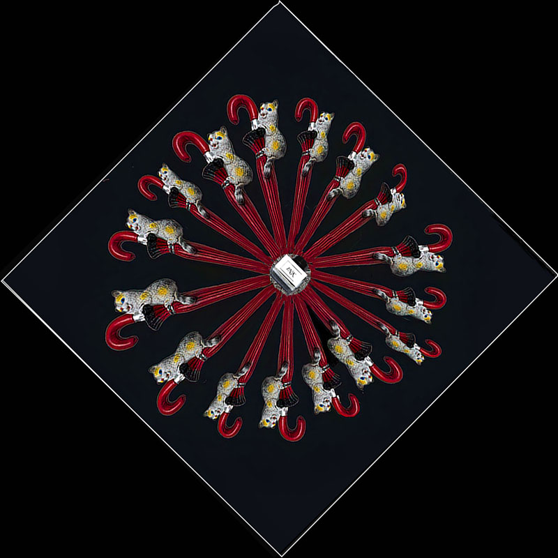
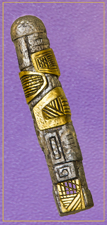
Sorry, I disagree with her. I believe it's a very interesting abstract and doesn't have to be anything "geometric". Very well done. I'd love more info on this lens attachment and whether it would be compatible with Tamron Canon lens. |
Sep 10th |
1 comment - 0 replies for Group 10
|
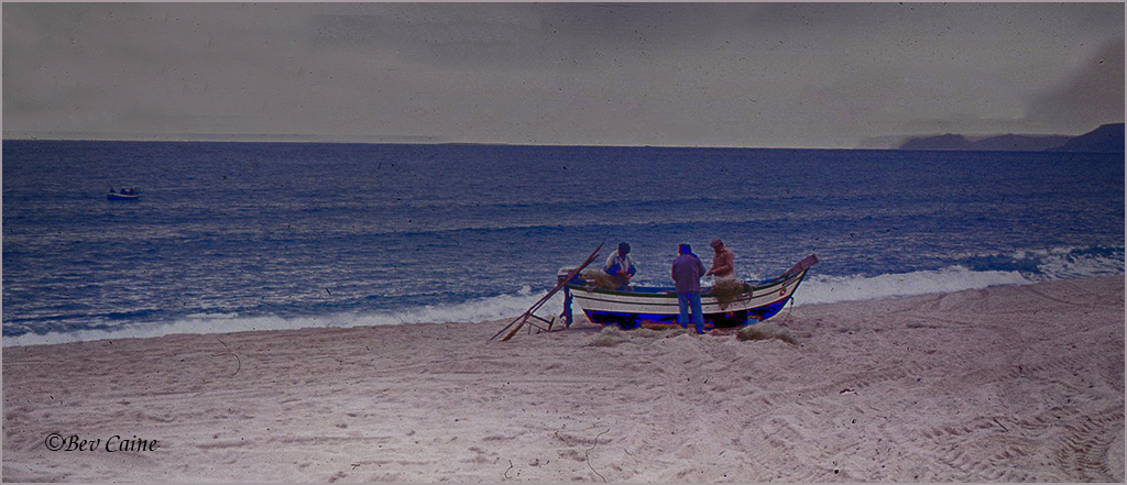
| 16 |
Sep 22 |
Comment |
Love the image you chose to exhibit. I use my telephoto exclusively and get some great shots with. I'm actually using a tamron 16-300 and would sooner give up my children than my lens. |
Sep 10th |
1 comment - 0 replies for Group 16
|
| 17 |
Sep 22 |
Comment |
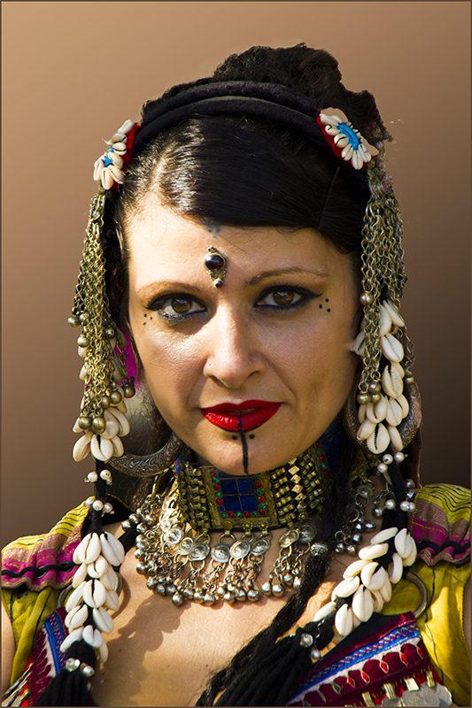
I love going to these pow wows but we haven't had a really good one here in a while. Great shot..and I do agree with Peter re the shine on her cheek. |
Sep 10th |
| 17 |
Sep 22 |
Comment |
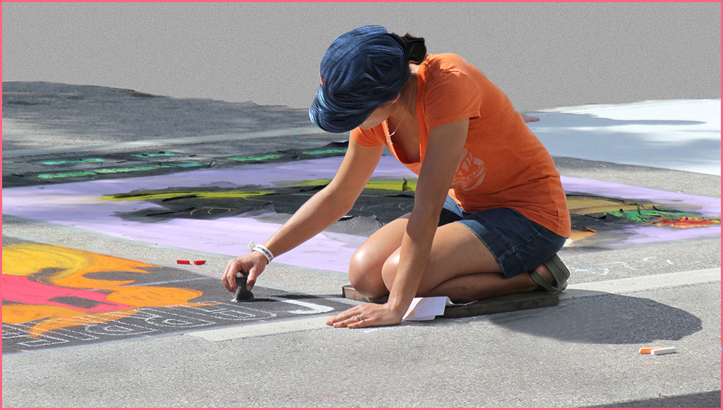
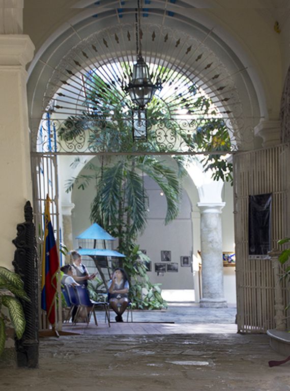
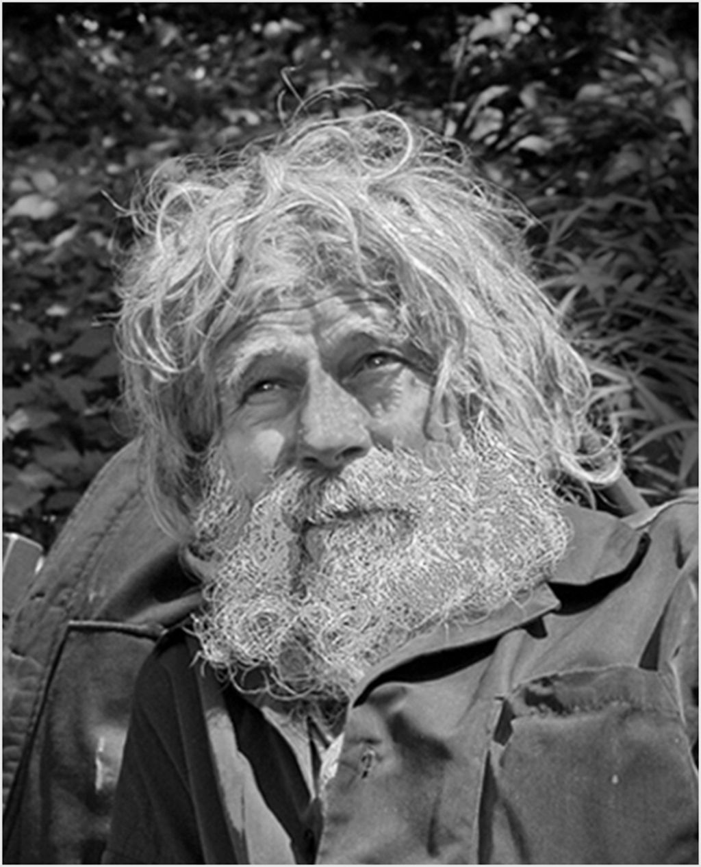
This is such a great subject. I get the feeling that I wonder what they're talking about behind those umbrellas. I do find a halo effect around the blue umbrella. That could probably have been avoided had you used Topaz Sharpen AI and gotten the image a bit sharper.
|
Sep 10th |
| 17 |
Sep 22 |
Comment |
Nice image and if you google Robbie Burns Home Scotland you'll get everything you might want to know. |
Sep 10th |
| 17 |
Sep 22 |
Comment |
Nice image and if you google Robbie Burns Home Scotland you'll get everything you might want to know. |
Sep 10th |
4 comments - 0 replies for Group 17
|
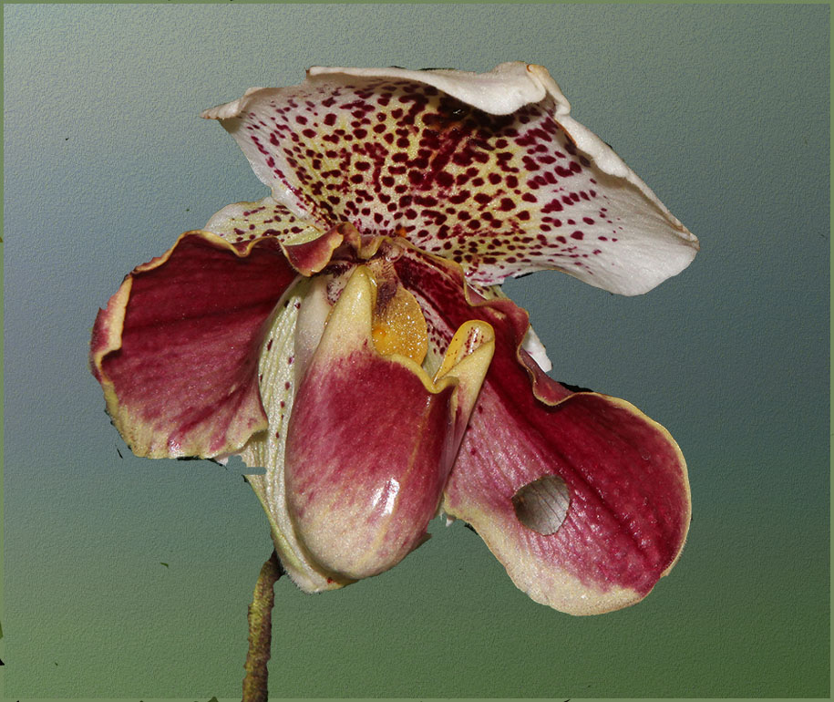
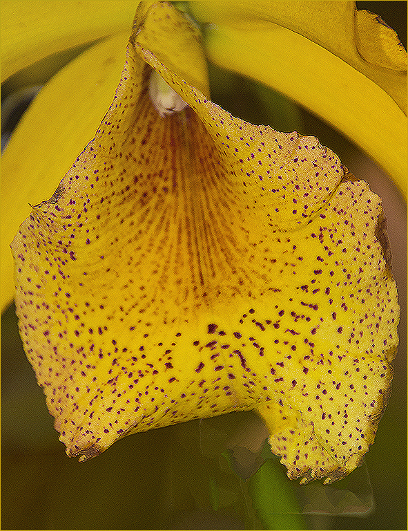
| 19 |
Sep 22 |
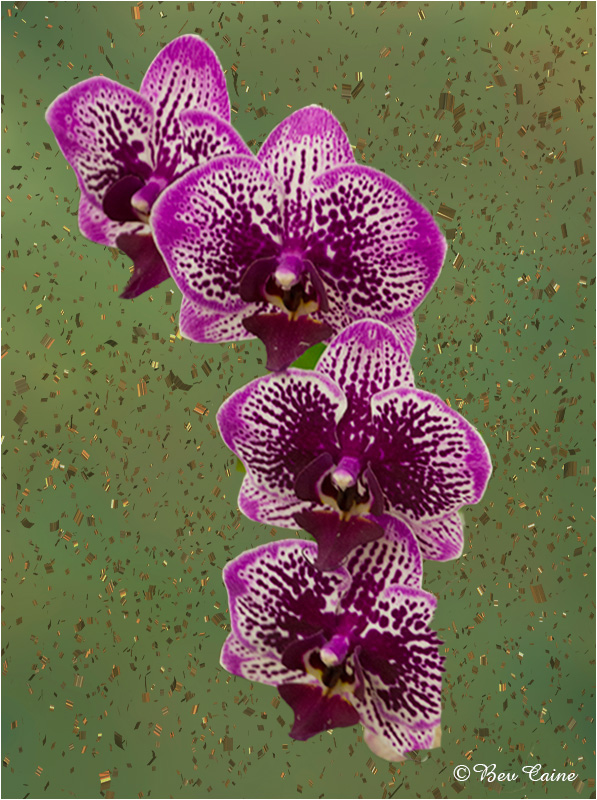
Comment |
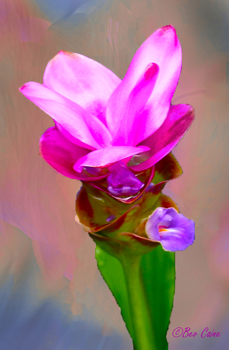
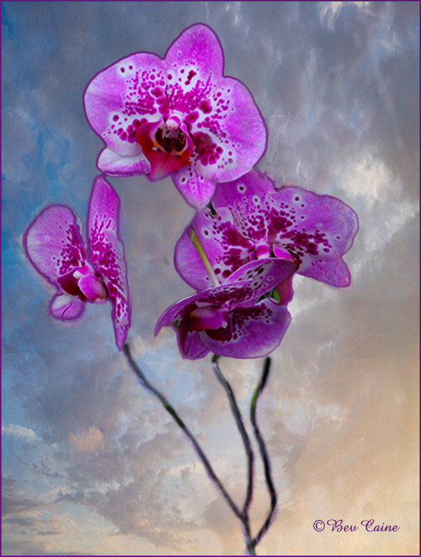
Love the flower. Black background really makes it stand out but it's a bit too much dead space. |
Sep 10th |
 |
1 comment - 0 replies for Group 19
|
| 24 |
Sep 22 |
Reply |
nice improvement |
Sep 16th |
| 24 |
Sep 22 |
Reply |
Ditto to Fred's review. Leaf was a bit extraneous |
Sep 16th |
| 24 |
Sep 22 |
Comment |
Thanks. If I hit a really lucky streak, I might get a decent score in the club competition |
Sep 16th |
| 24 |
Sep 22 |
Comment |
Thank
|
Sep 13th |
| 24 |
Sep 22 |
Comment |
Thanks to all |
Sep 12th |
| 24 |
Sep 22 |
Comment |
Thank you for the compliment |
Sep 6th |
| 24 |
Sep 22 |
Comment |
|
Sep 5th |
 |
| 24 |
Sep 22 |
Comment |
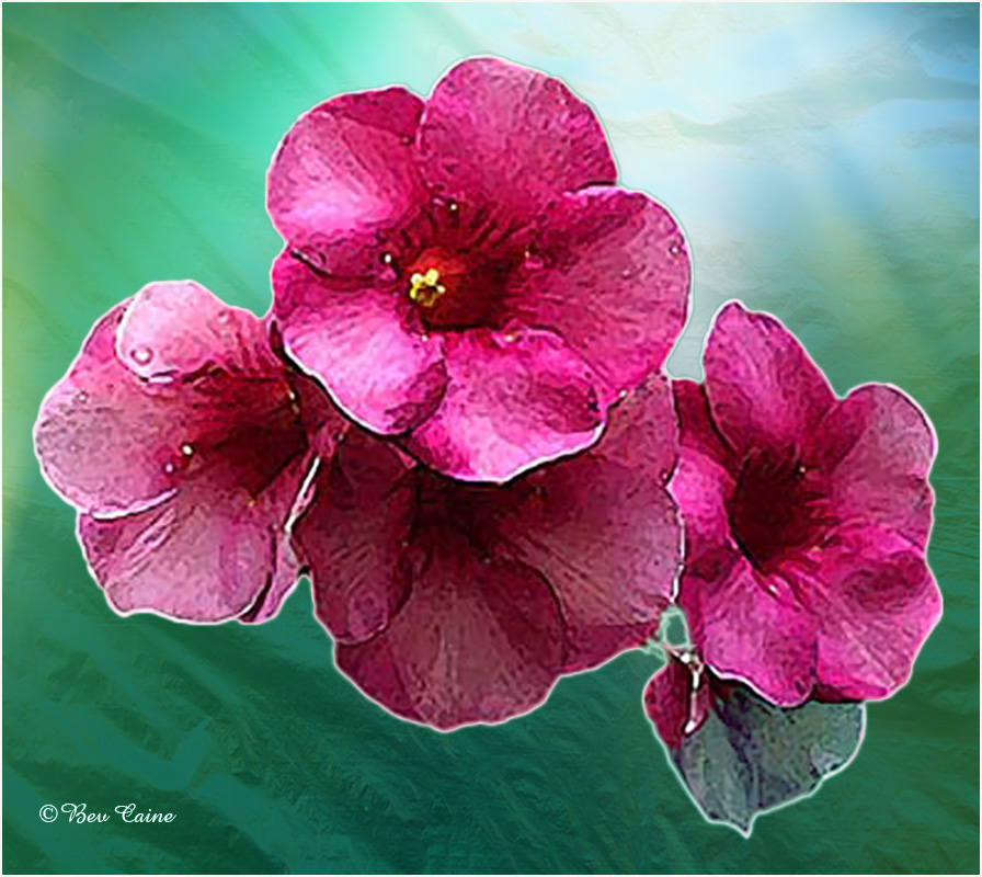
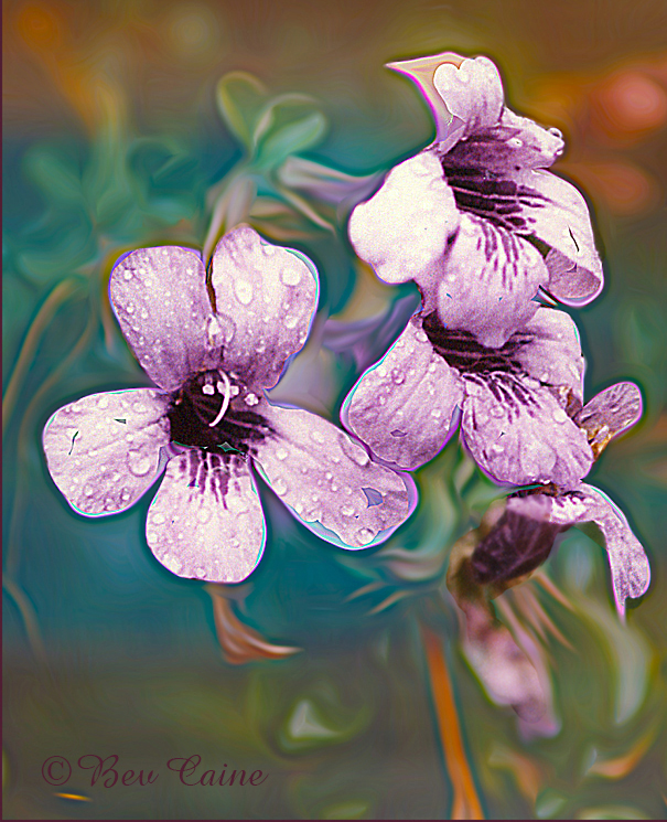
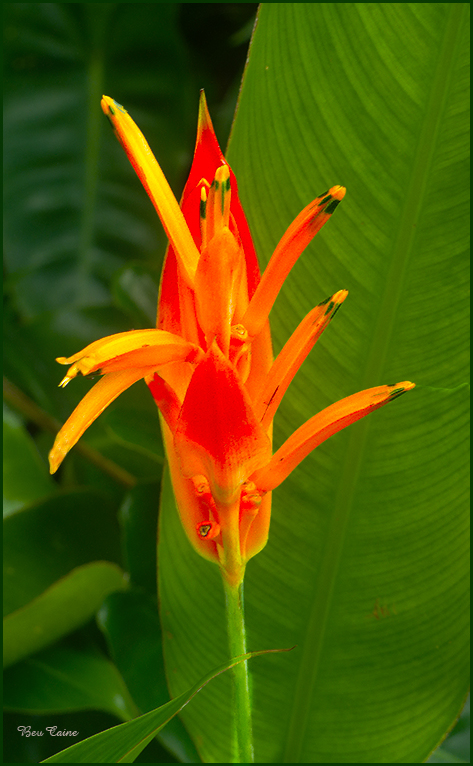
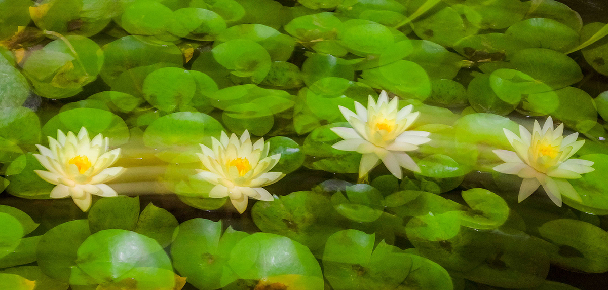
Nice image but I felt it could use more contrast so I went into Photoshop = image/adjust/vibrance and individually added a bit of vibrance and increased the saturation on the flowers. It did exacerbate the green a bit more which could probably be adjusted as well and I finished by doing an inverse selection and toned down the brightness of the green to help the flowers stand out a bit.. What do you think? |
Sep 5th |
| 24 |
Sep 22 |
Comment |
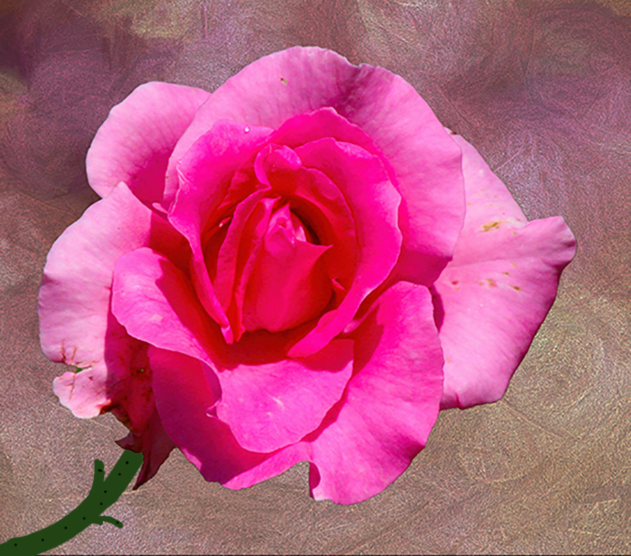
Flower is beautiful. Gorgeous image with spectacular lighting. |
Sep 5th |
| 24 |
Sep 22 |
Comment |
Beautiful flower. Well adjusted, etc. but I would eliminate only the leaf sticking out on the right site. It's a bit of a distraction. |
Sep 5th |
| 24 |
Sep 22 |
Comment |
Beautiful image. Love what you did in post processing. |
Sep 5th |
| 24 |
Sep 22 |
Comment |
Lovely image. I'm not sure why you reversed the image. Both work but I think I prefer the original position. |
Sep 5th |
| 24 |
Sep 22 |
Comment |
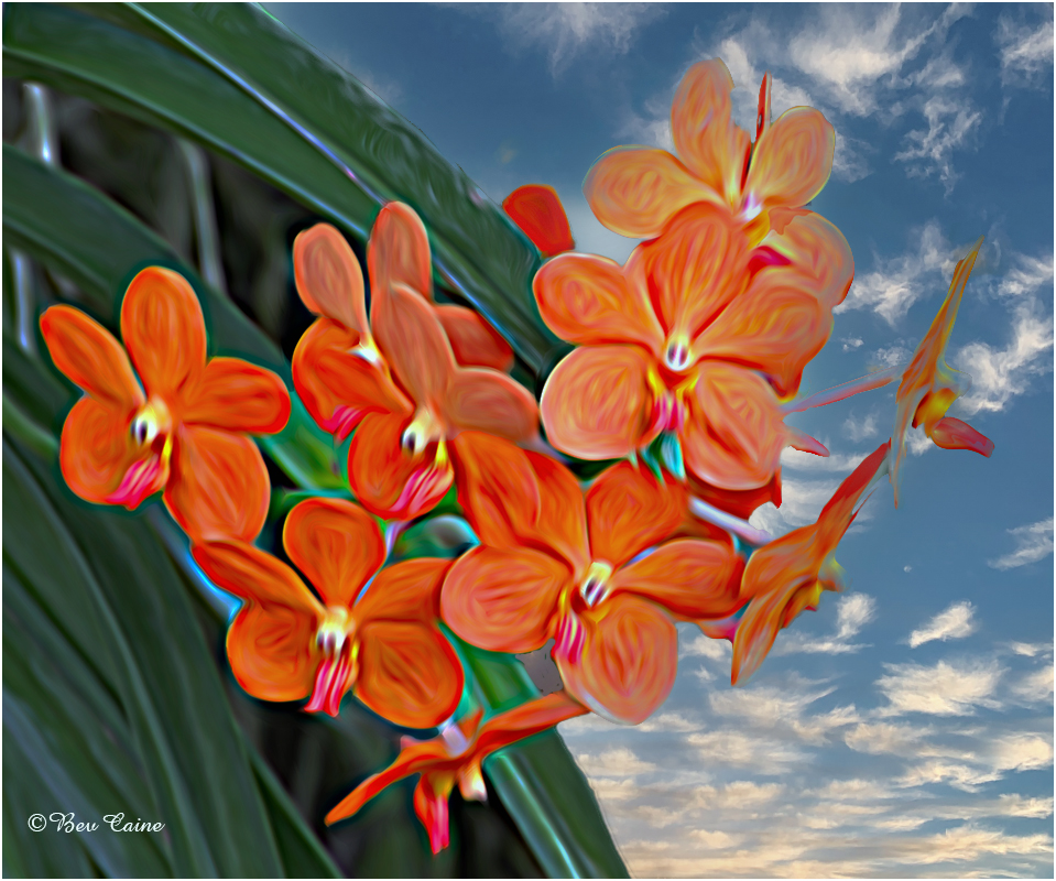
The leaves are beautiful but I'd like to see the background a bit lighter for more extreme contrast. |
Sep 5th |
11 comments - 2 replies for Group 24
|
| 48 |
Sep 22 |
Comment |
Thanks |
Sep 7th |
| 48 |
Sep 22 |
Reply |
Actually the background was also my creation (I couldn't find the true original) but then decided it might be too cluttered so I changed it to this one. Thanks for the input. |
Sep 5th |
1 comment - 1 reply for Group 48
|
| 69 |
Sep 22 |
Reply |
Thanks. SOS as they say in French. Do let us know if you're heading down this way again we enjoyed it so much. |
Sep 15th |
| 69 |
Sep 22 |
Comment |
Fabulous once in a lifetime shot. |
Sep 15th |
1 comment - 1 reply for Group 69
|
39 comments - 4 replies Total
|