|
| Group |
Round |
C/R |
Comment |
Date |
Image |
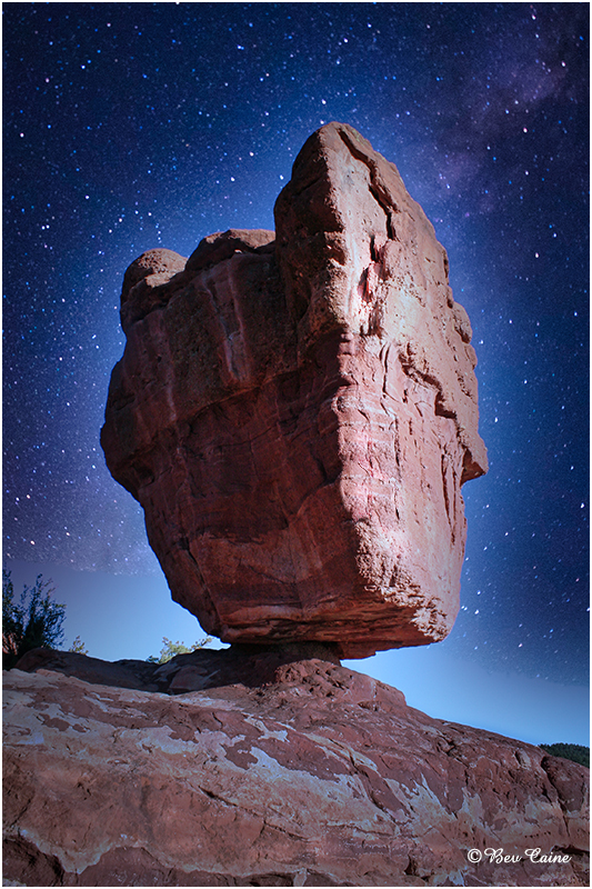
| 1 |
Aug 22 |
Reply |
You're welcome. I just didn't want to overdo it. |
Aug 12th |
| 1 |
Aug 22 |
Comment |
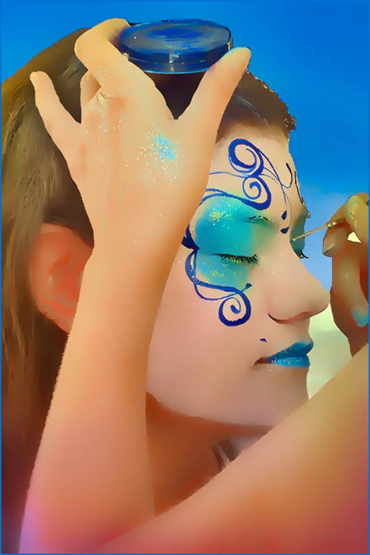
Great shot. I selectively brightened a few spots with a non-destructive layer mask. Wonder what you think. |
Aug 12th |
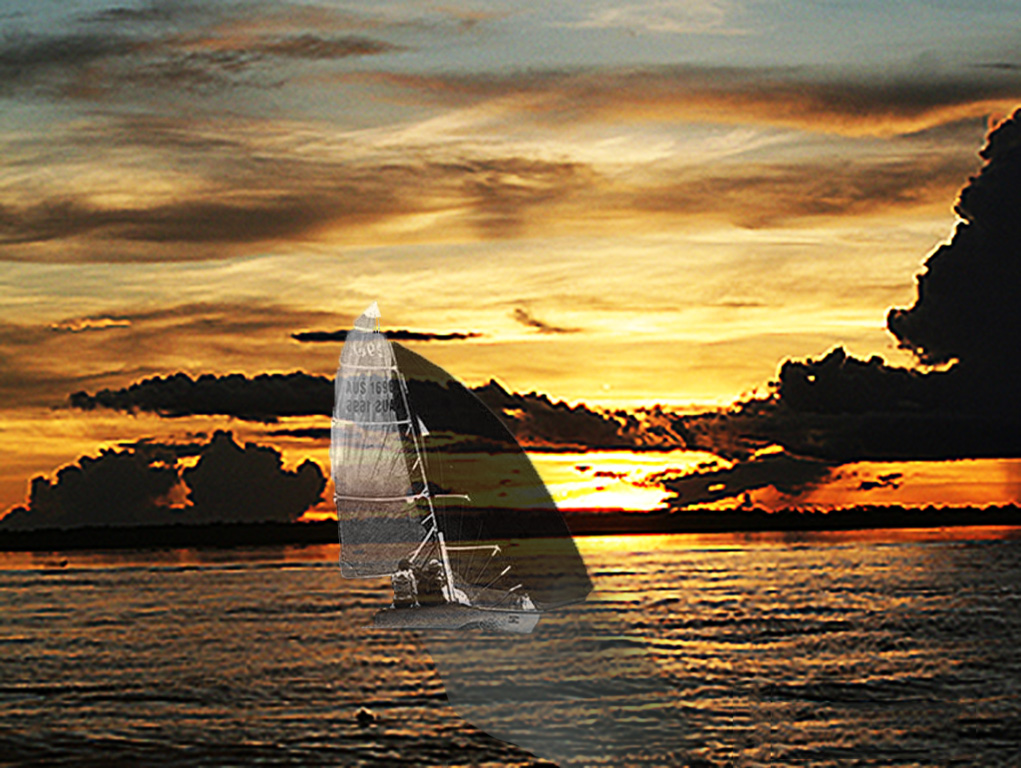
 |
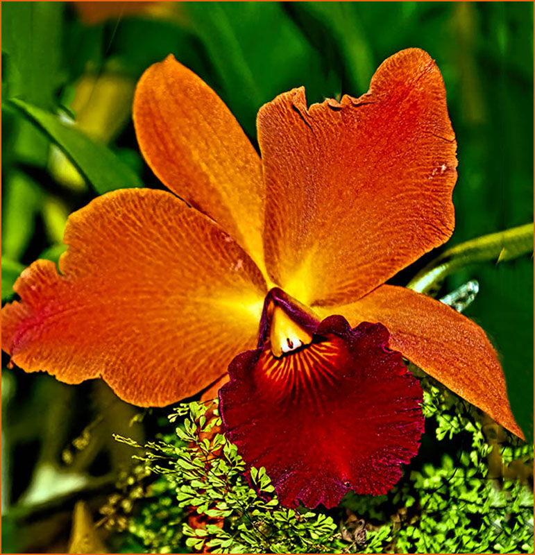
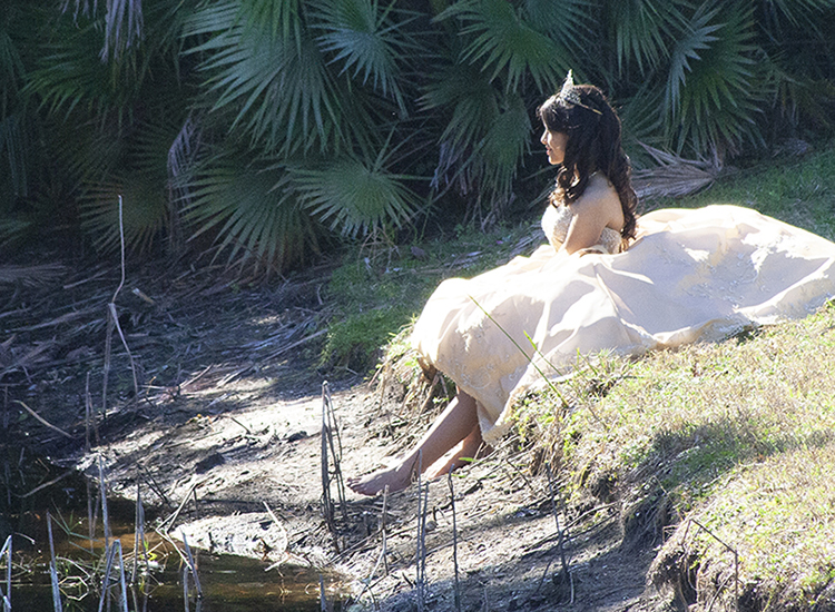
| 1 |
Aug 22 |
Comment |
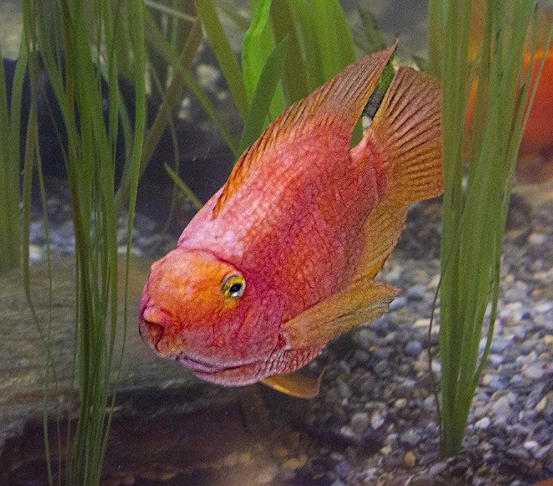
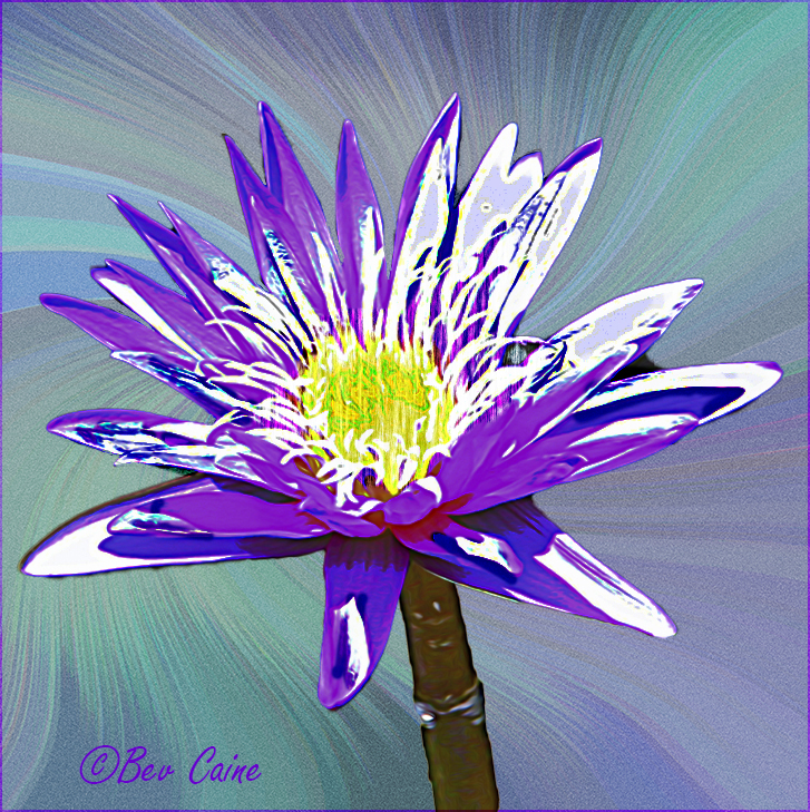
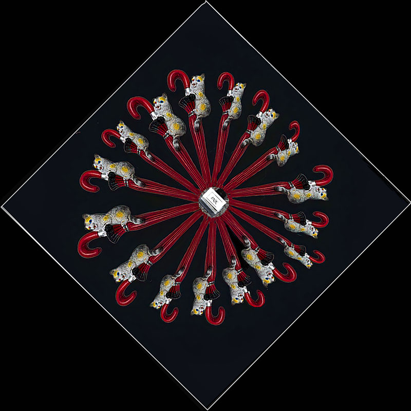
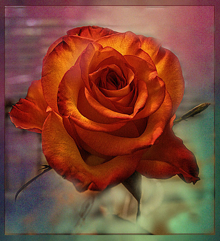
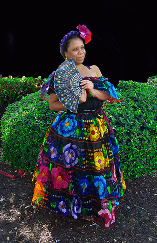
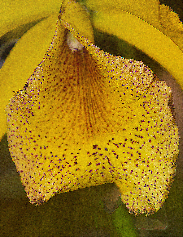
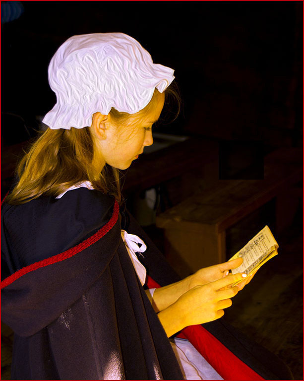
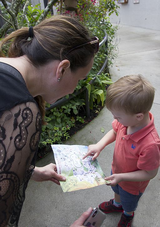
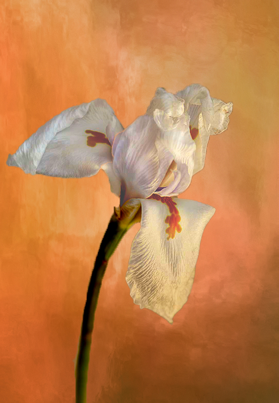
So delicate and so pretty |
Aug 12th |
2 comments - 1 reply for Group 1
|
| 2 |
Aug 22 |
Comment |
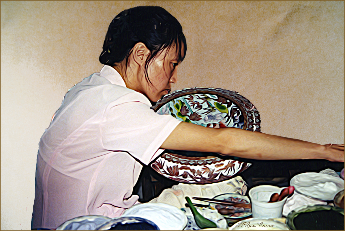
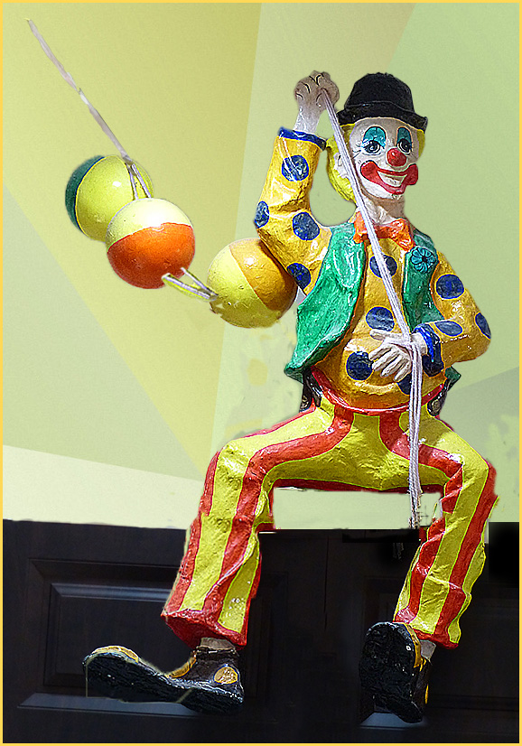
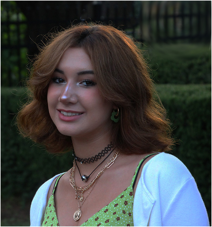
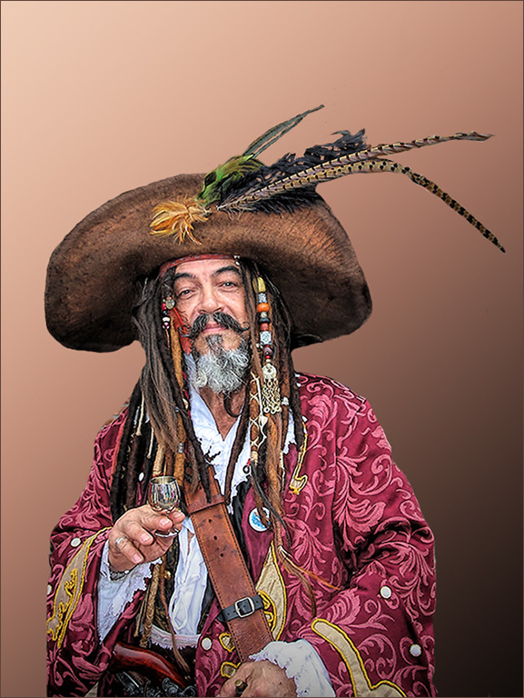
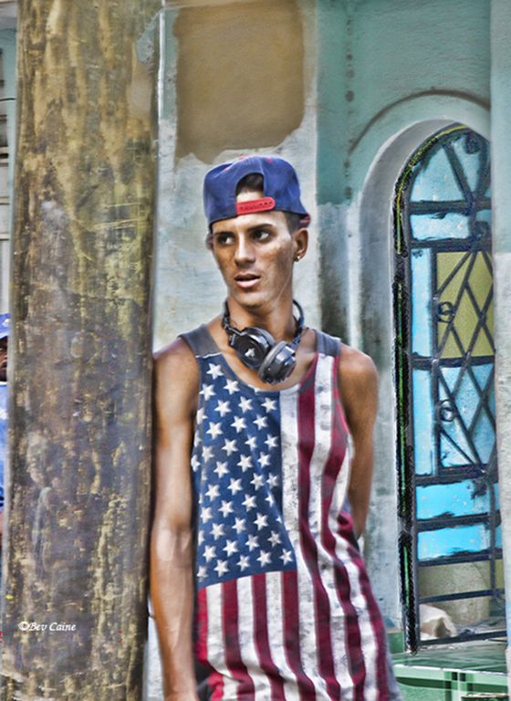
The only thing I did was to brighten up his face a tad using a non destructive layer mask. |
Aug 12th |
 |
| 2 |
Aug 22 |
Comment |
Can't get much better than this. |
Aug 12th |
2 comments - 0 replies for Group 2
|
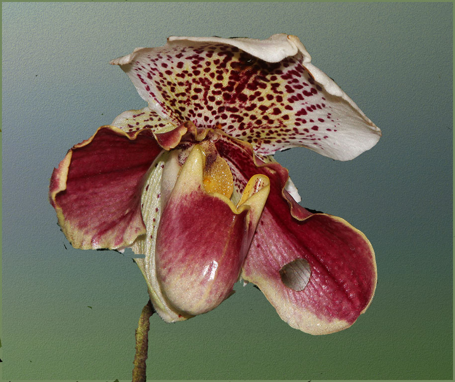
| 3 |
Aug 22 |
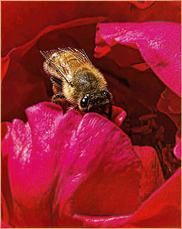
Comment |
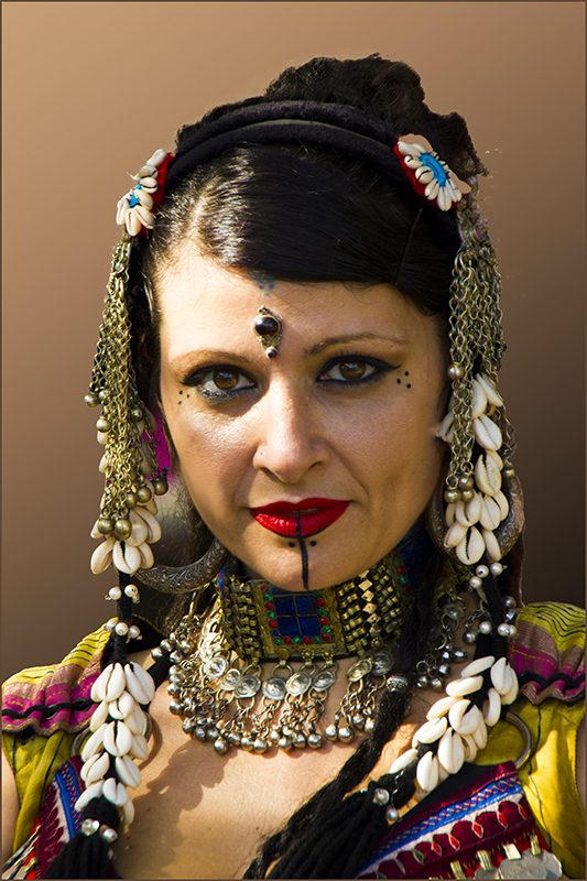
Not only is this a lucky shot, but it is a very beautiful image. Very well done. |
Aug 12th |
1 comment - 0 replies for Group 3
|
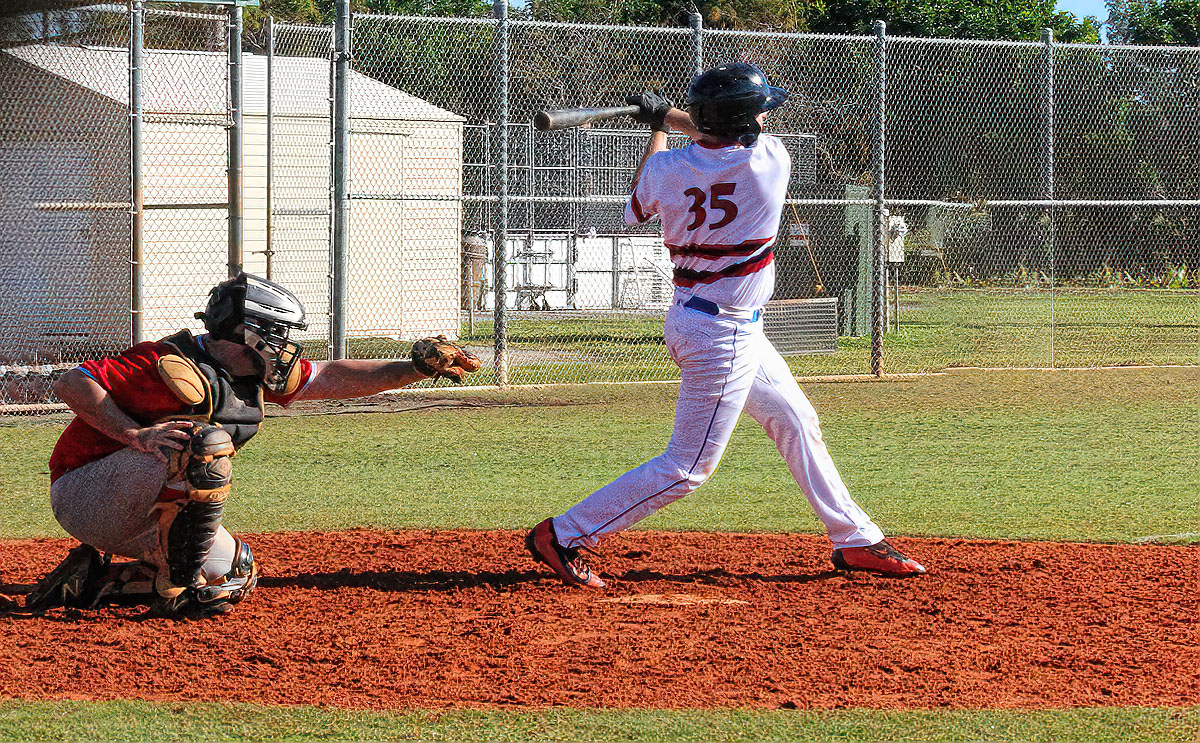
| 4 |
Aug 22 |
Comment |
Isaac's suggestion took this image from beautiful to superb. |
Aug 12th |
1 comment - 0 replies for Group 4
|
| 5 |
Aug 22 |
Comment |
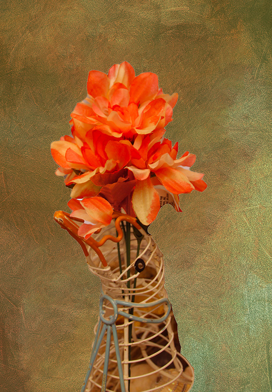
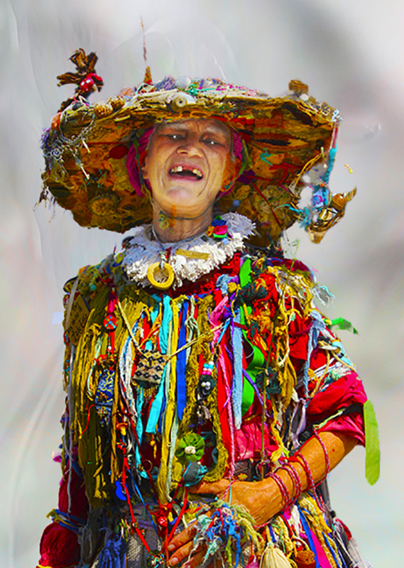
One of these days I'll figure out what to do with the hundreds of dollars of yarn sitting in my closet...you are giving me the inspiration. |
Aug 12th |
1 comment - 0 replies for Group 5
|
| 6 |
Aug 22 |
Reply |
Flower groups are new and they filled so quickly that I couldn't believe it. If you're interested either email Barbara Miller - bembrit@bellsouth.net or let me know and I'll contact her so that if there are no current openings she can get you on an active waiting list. I'm the administrator of group 24 - pay us a visit. |
Aug 15th |
| 6 |
Aug 22 |
Comment |
With images like this one, you should join one of the newly created flower groups. Beautiful. |
Aug 12th |
1 comment - 1 reply for Group 6
|
| 10 |
Aug 22 |
Reply |
I still have both. |
Aug 13th |
| 10 |
Aug 22 |
Comment |
I love this image...it's just so cool. Your comment that Glow is not available gave me an incentive to research that further. I'm not sure if you meant as a stand-alone, or not available at all, but I did find it in the original Topaz package on my computer and was able to use it. It may not have been updated. |
Aug 13th |
1 comment - 1 reply for Group 10
|
| 11 |
Aug 22 |
Comment |
Gorgeous image. Should be a winner in any competition. |
Aug 13th |
| 11 |
Aug 22 |
Comment |
Gorgeous image. Should be a winner in any competition. |
Aug 13th |
2 comments - 0 replies for Group 11
|
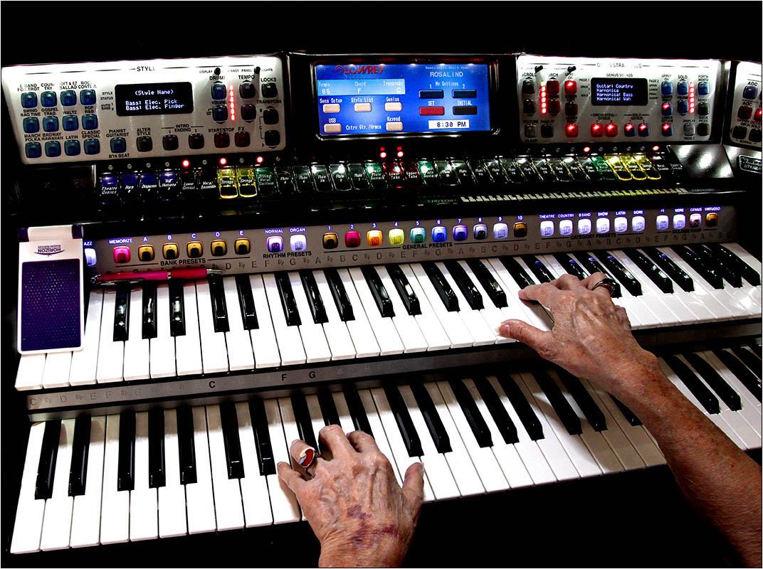
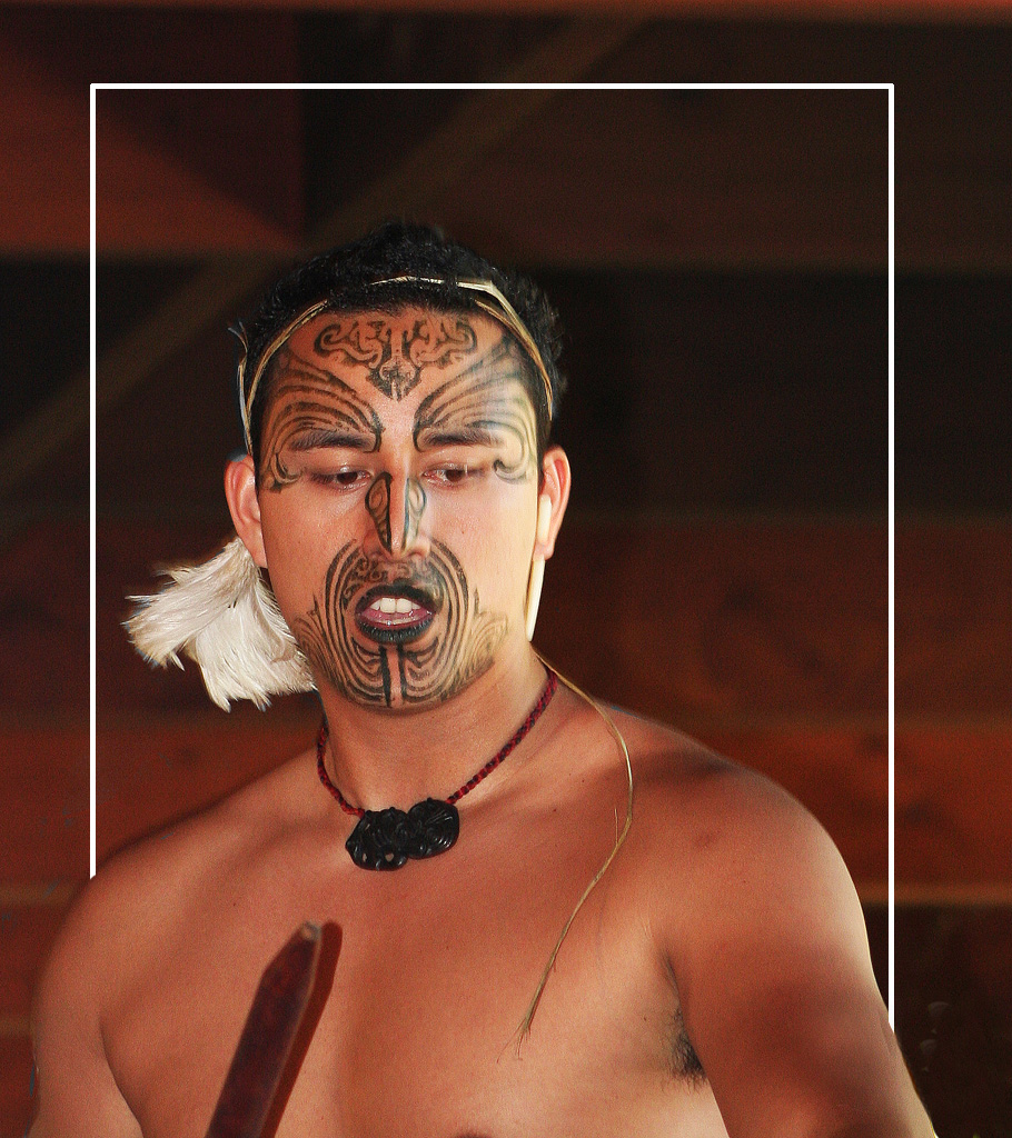
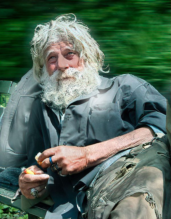
| 14 |
Aug 22 |
Comment |
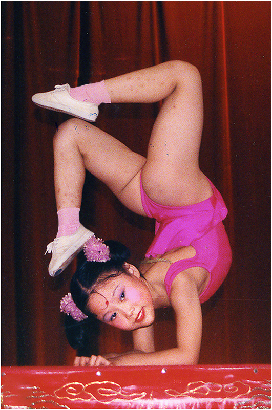
A Great capture. If I didn't know it was posed, I'd be wondering how to get lucky enough to get an image at that moment. |
Aug 13th |
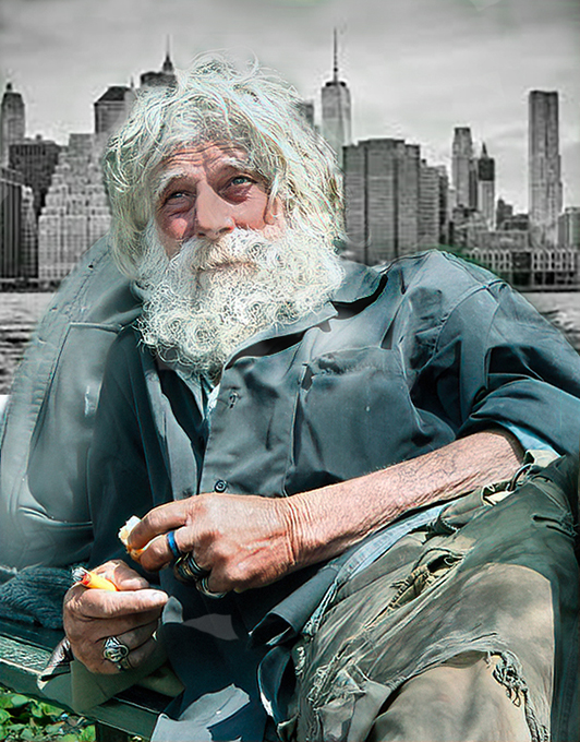
| 14 |
Aug 22 |
Comment |
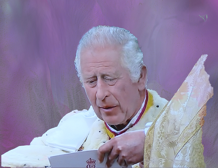
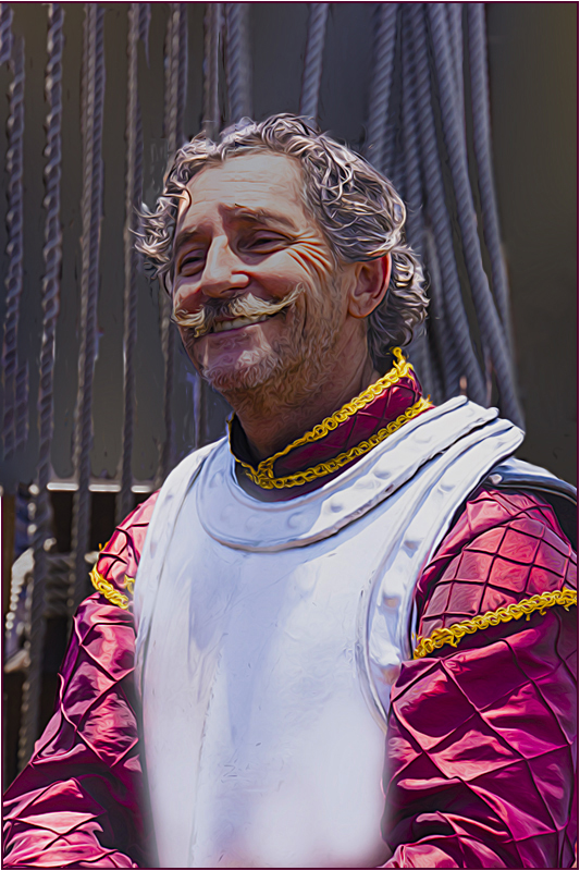
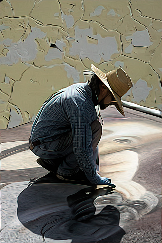
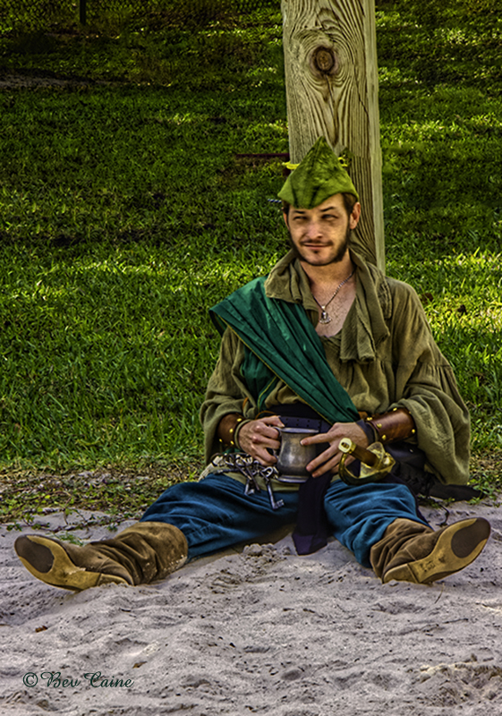
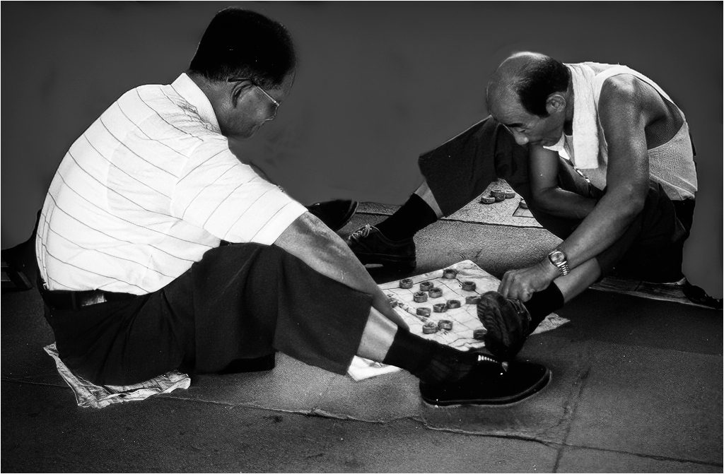
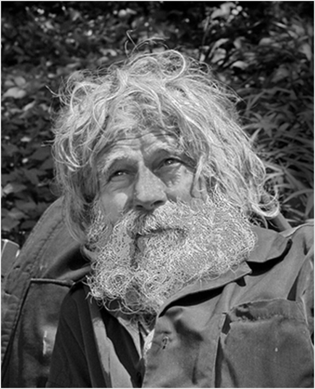
Very interesting and overall well done image. I would reduce the intensity of the blue on the back wall as that is where my eye went first. As to the watch face, I selected it and with about a 2-3 percent opacity painted it with a touch of black to tone it down. What bothered me more, was the bright blue on the wall. So I selected it and then toned that down a bit as well to keep the focus on the gentleman. What doo you think? |
Aug 13th |
 |
2 comments - 0 replies for Group 14
|
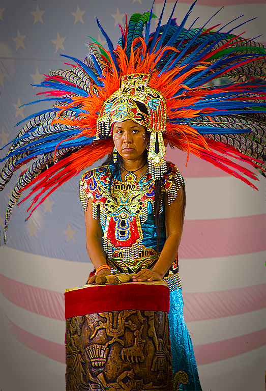
| 15 |
Aug 22 |
Comment |
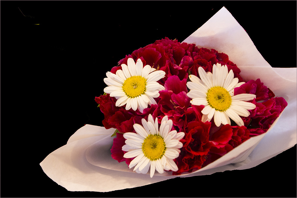
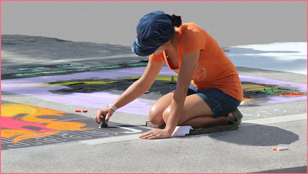
I've often thought of doing something like this while having my nails done and you have now given me the incentive. Great image |
Aug 13th |
1 comment - 0 replies for Group 15
|
| 16 |
Aug 22 |
Comment |
Very creative and extremely well done. |
Aug 13th |
1 comment - 0 replies for Group 16
|
| 17 |
Aug 22 |
Comment |
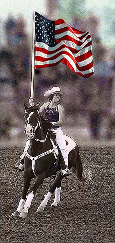
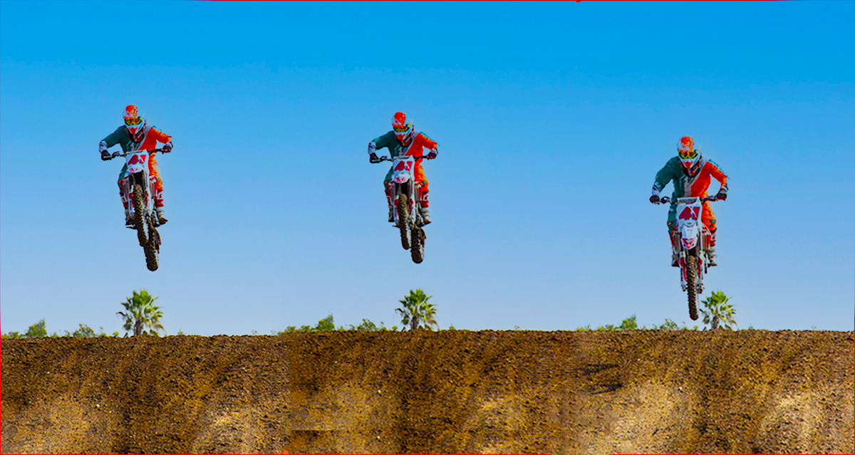
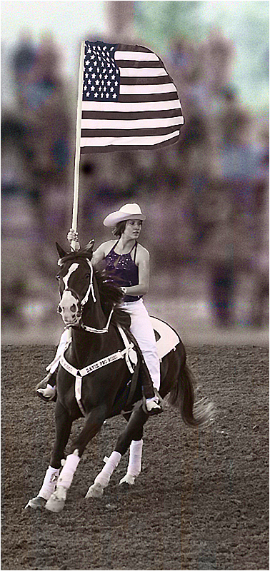
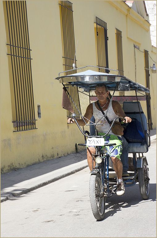
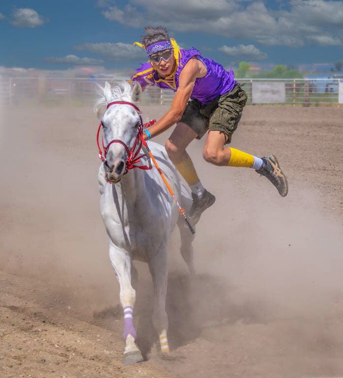
I changed the sky in Photoshop and darkened it a bit. I think it made the rider stand out just a bit more |
Aug 13th |
 |
1 comment - 0 replies for Group 17
|
| 18 |
Aug 22 |
Comment |
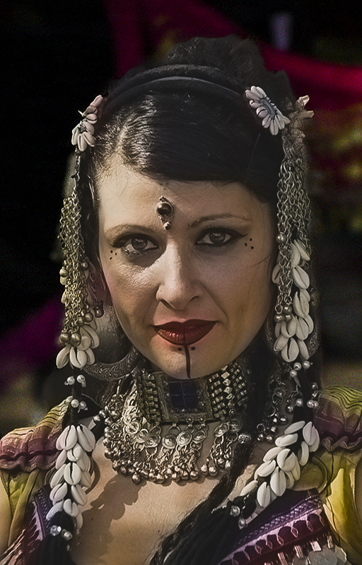
Love the sepia version. |
Aug 13th |
1 comment - 0 replies for Group 18
|
| 20 |
Aug 22 |
Comment |
very creative with a great result |
Aug 13th |
1 comment - 0 replies for Group 20
|
| 21 |
Aug 22 |
Reply |
Come and visit me in 24 & 48. Always look forward to fresh eyes.
|
Aug 27th |
| 21 |
Aug 22 |
Comment |
You never cease to amaze me all the way back to when we were both in group 9. Fabulous result. |
Aug 12th |
1 comment - 1 reply for Group 21
|
| 22 |
Aug 22 |
Reply |
thanks for the heads up |
Aug 13th |
| 22 |
Aug 22 |
Comment |
I've used polar coordinates often but not lucky enough to get this kind of result. Oh well, back to the drawing board or better yet back to photoshop. |
Aug 12th |
1 comment - 1 reply for Group 22
|
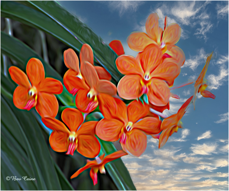
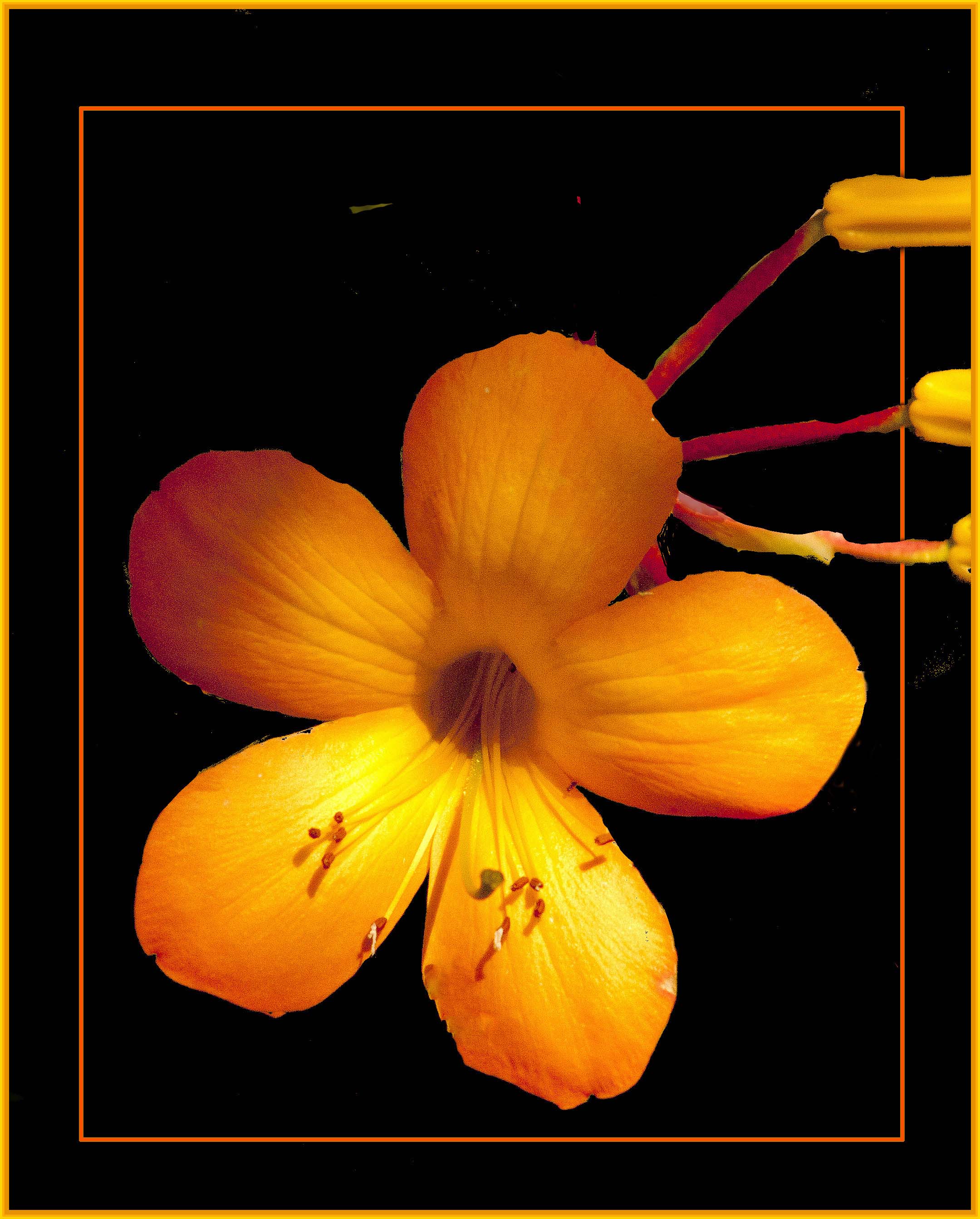
| 24 |
Aug 22 |
Reply |
I do sometimes have that problem and keep hoping my eyes don't get any worse. Thanks. |
Aug 24th |
| 24 |
Aug 22 |
Reply |
You did a great job. Changes are subtle but just make the flower stand out a bit more. Thanks |
Aug 22nd |
| 24 |
Aug 22 |
Reply |
Could always tone it down a bit. I have a myriad of textures that I bought from Marie Altenburg's website and just love every one of them |
Aug 9th |
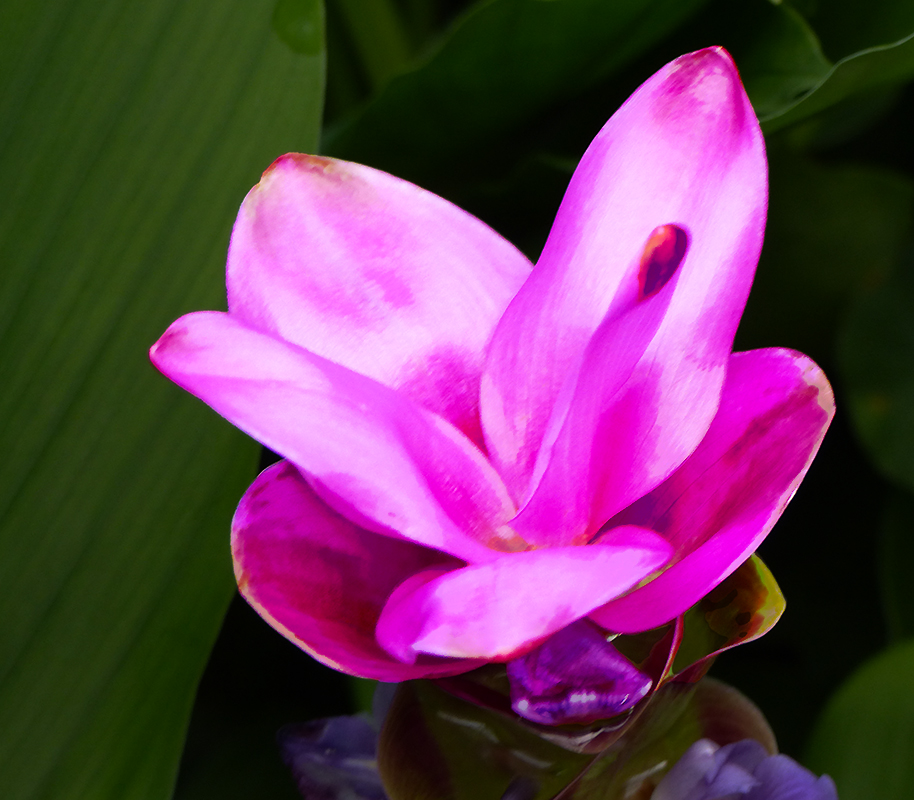
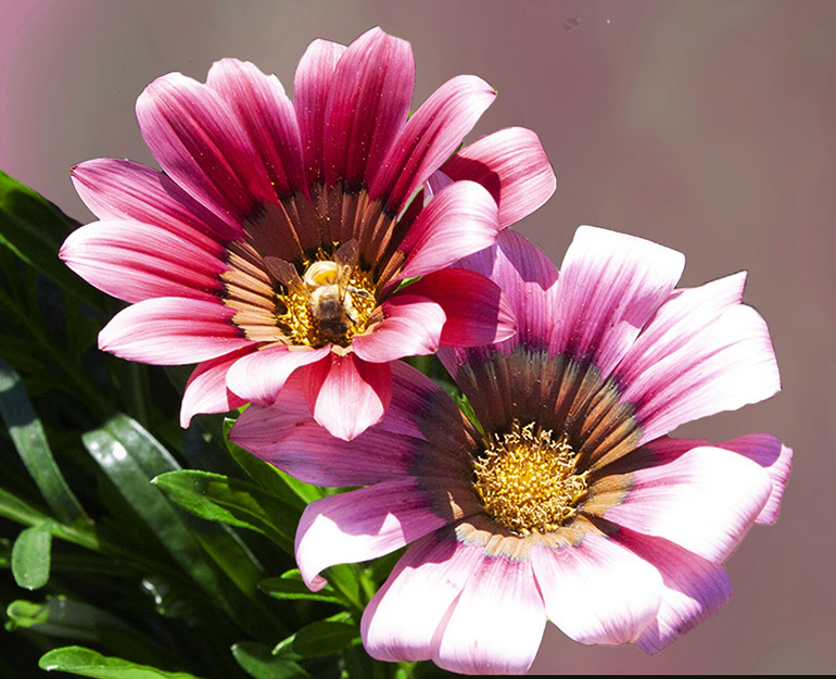
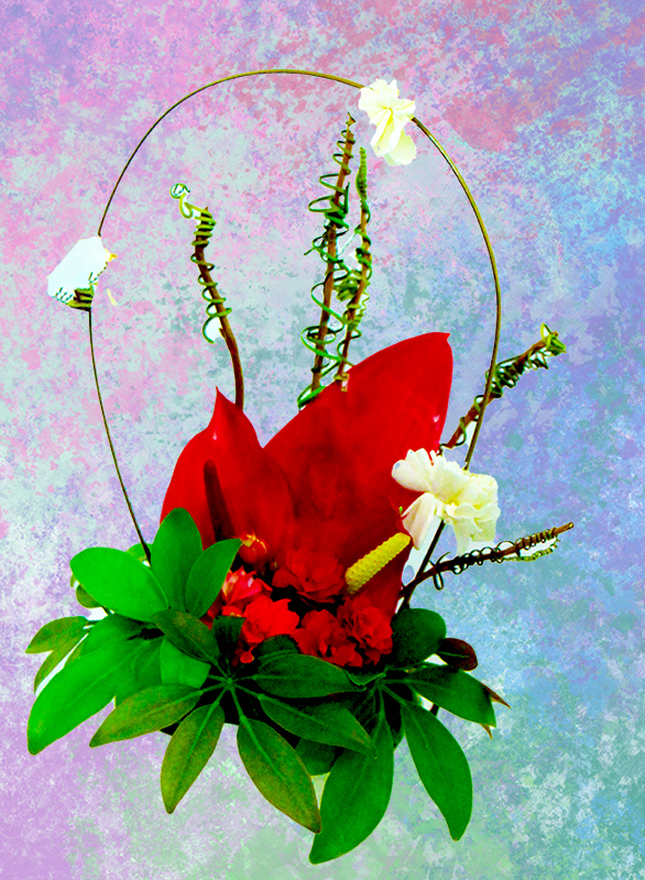
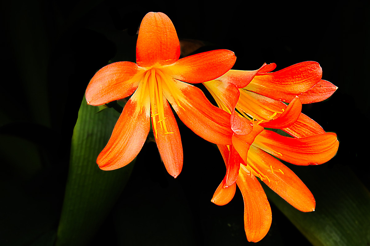
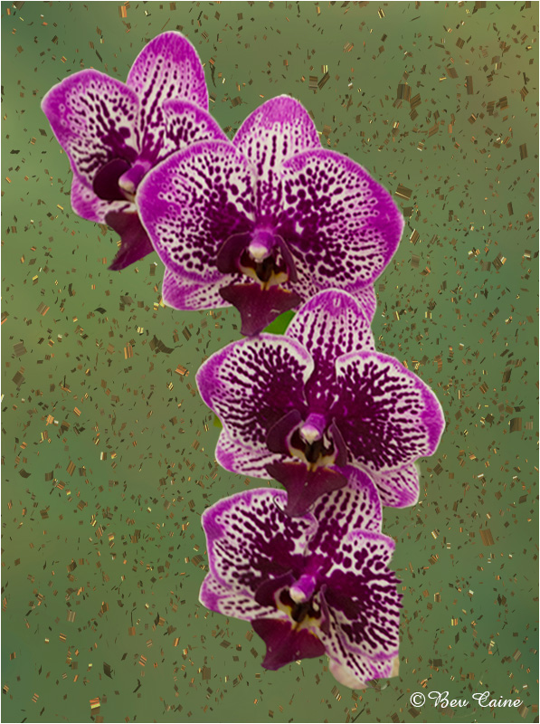
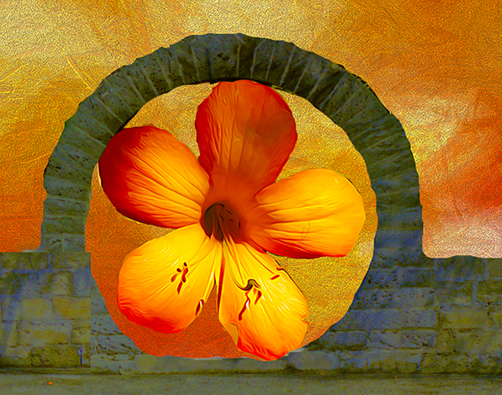
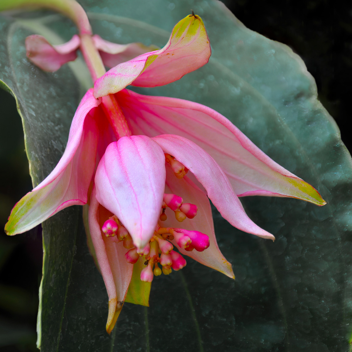
| 24 |
Aug 22 |
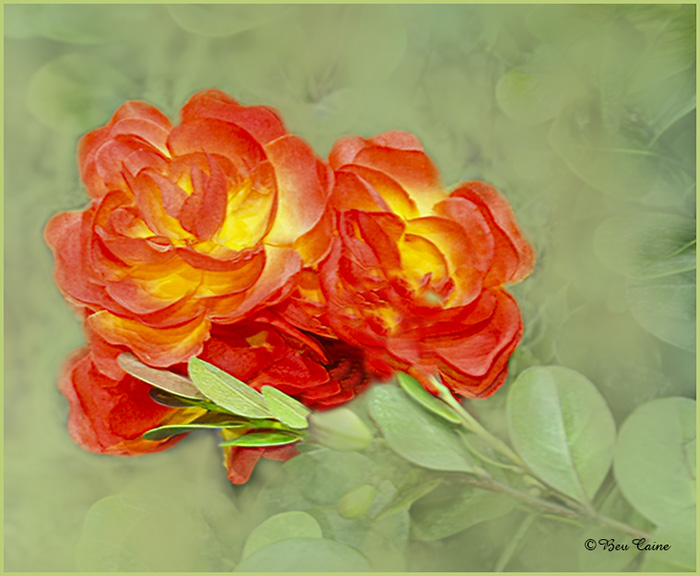
Comment |
I love the flower but I don't think your background does anything to enhance the overall image. So I went into my "stash" of textures and came up with the following. I then went to image-adjustments-vibrance and added a bit of vibrance and saturation and followed with image adjustments and adjusted the brightness a bit as well. What do you think? |
Aug 9th |
 |
| 24 |
Aug 22 |
Reply |
I actually did not sharpen the leaves as much because I wanted the flower to stand out more, but I really do like your rendition so I brought mine back into Photoshop to work on it and decided to remove the leaf on the left altogether and added the texture to those on the right. What do you think? |
Aug 5th |
 |
| 24 |
Aug 22 |
Comment |
This is gorgeous. Love it! |
Aug 2nd |
| 24 |
Aug 22 |
Reply |
That's just a matter of one stop less or more - personal preference. |
Aug 1st |
| 24 |
Aug 22 |
Comment |
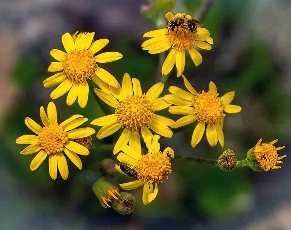
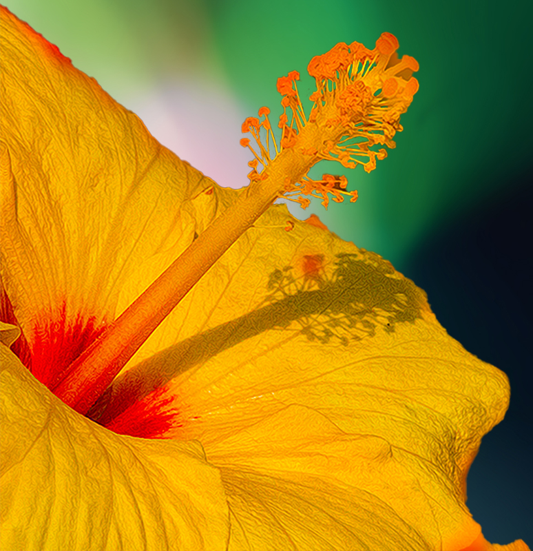
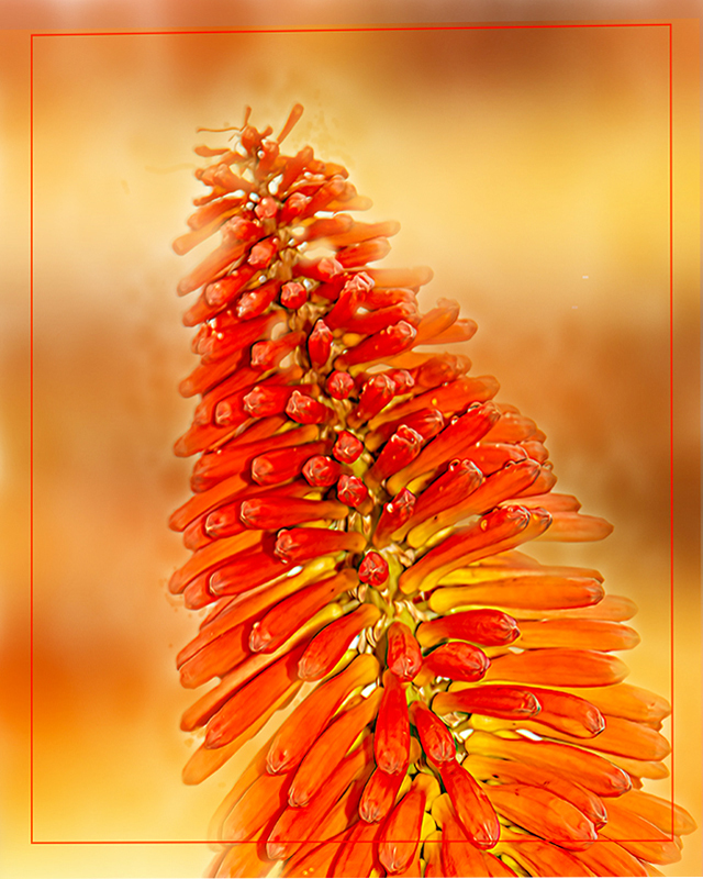
I love playing with these kind of things and this one is no exception. Just for the fun of it, I took it into photoshop and created a non-destructive layer mask to see if I could make it pop a bit more. Here is the result. What do you think? |
Aug 1st |
 |
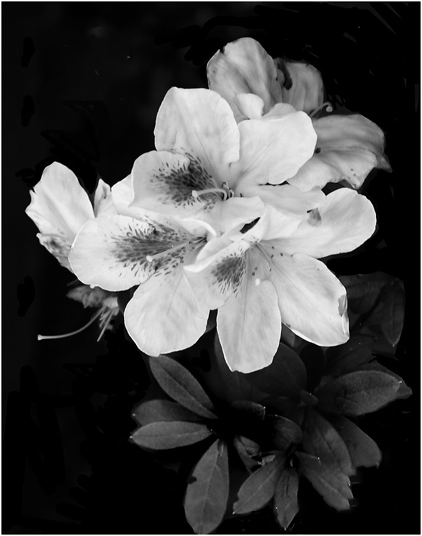
| 24 |
Aug 22 |
Comment |
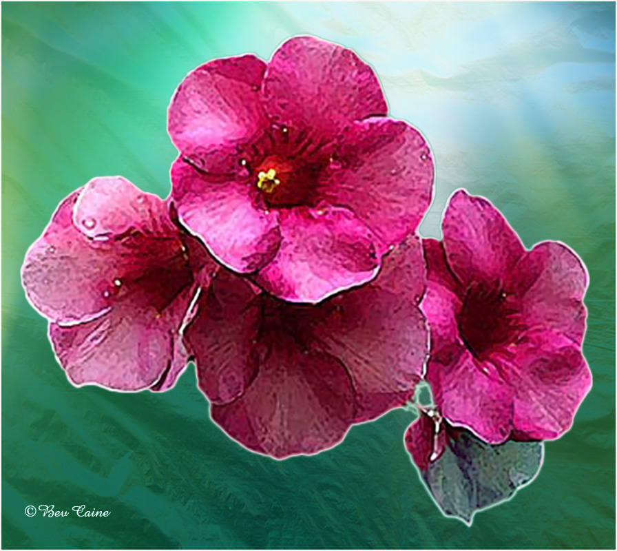
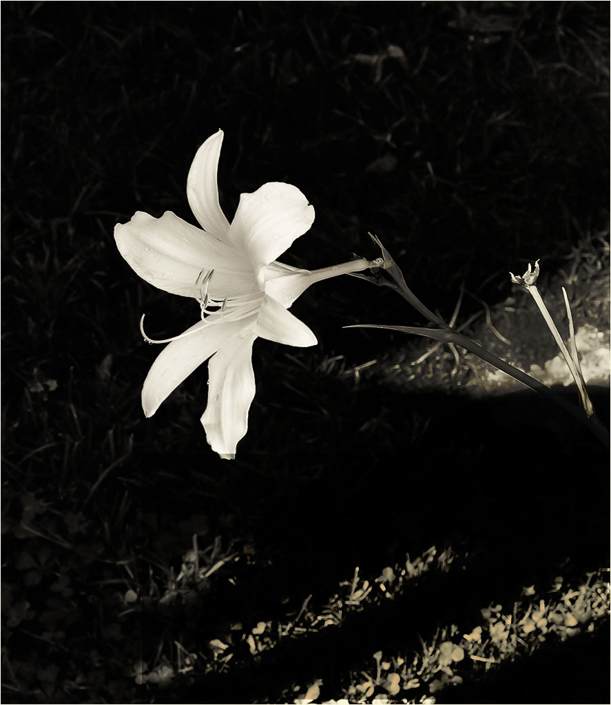
This is a lovely monochrome. Don't see any improvement suggestions necessary but would have loved to see the original, as I am a fan of color in flowers. |
Aug 1st |
| 24 |
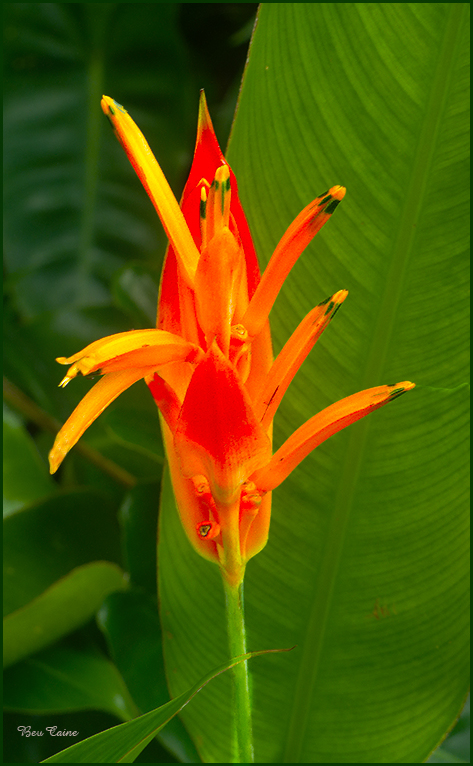
Aug 22 |
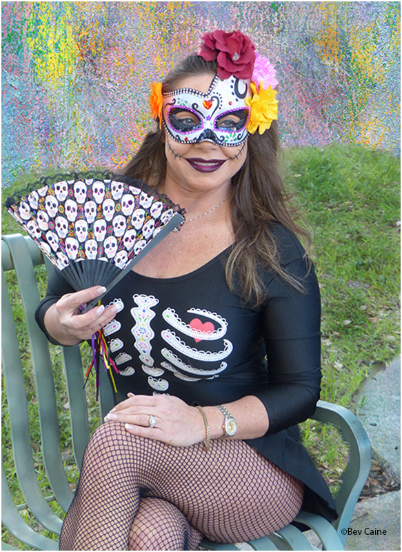
Comment |
My only suggestion would be a bit more contrast between the subject and background. So I went into Photoshop - image-adjustments-vibrance-saturation and increased both just a tad. What do you think? |
Aug 1st |
 |
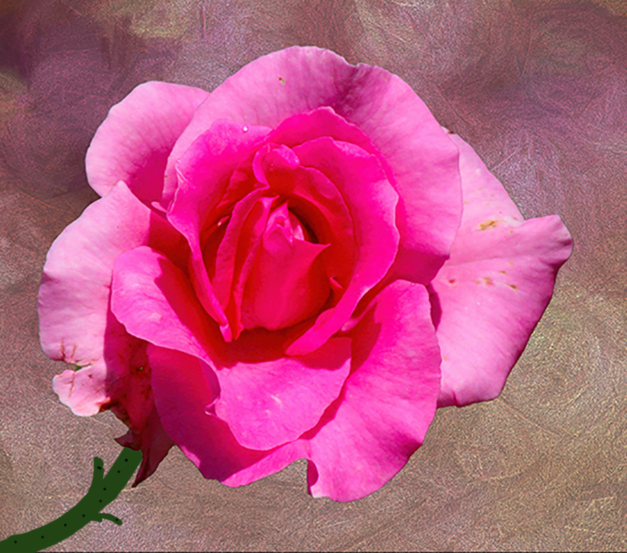
| 24 |
Aug 22 |
Comment |
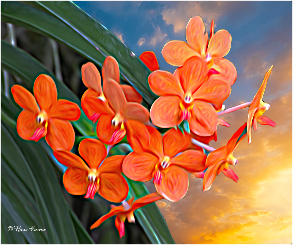
Tom, I duplicated the layer and brought it into Topaz Studio 2. I sharpened it and them brought it back into Photoshop. I used image, adjustments, vibrance and increased the vibrance and increased the contrast. I then selected the subject and inversed the selection. Went on to the filters in Photoshop and blurred the background a bit to make the flower stand out. What do you think? |
Aug 1st |
 |
6 comments - 5 replies for Group 24
|
| 42 |
Aug 22 |
Reply |
Wish I could, but since my husband had a minor stroke 6 months ago I think our traveling days for that kind of trip are over. |
Aug 13th |
| 42 |
Aug 22 |
Comment |
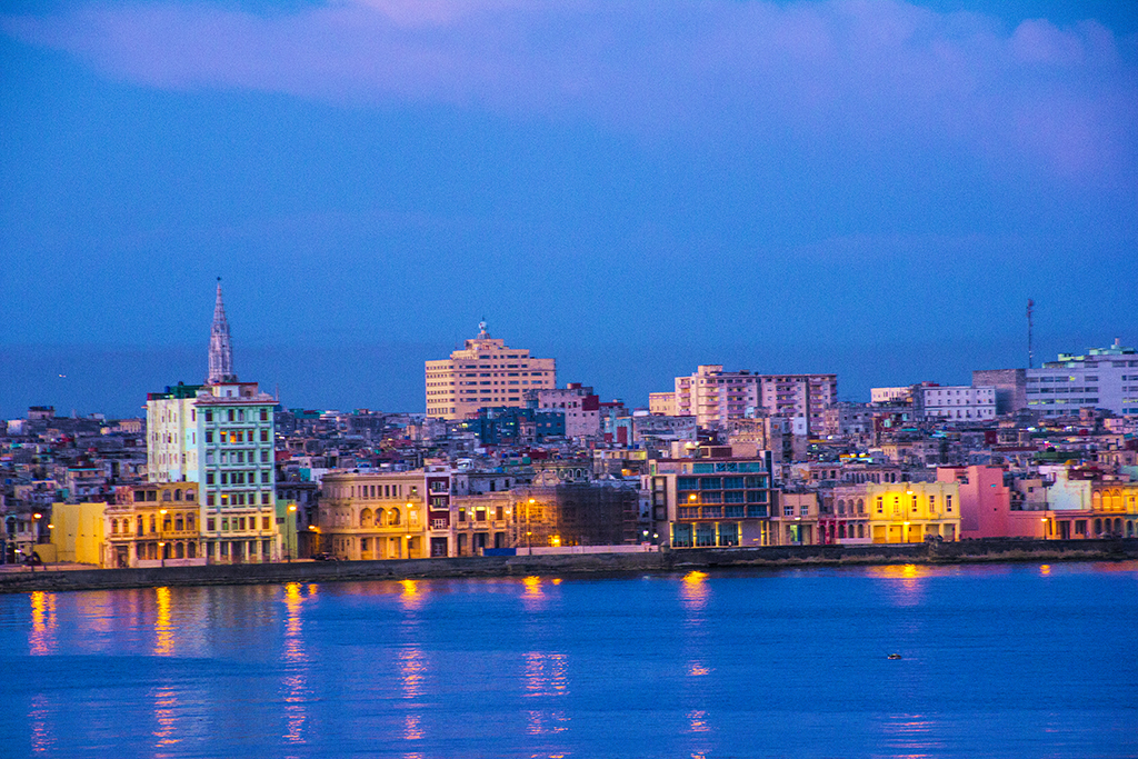
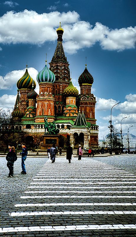
This is an absolutely gorgeous image of one of the places I'd love to visit some day |
Aug 12th |
| 42 |
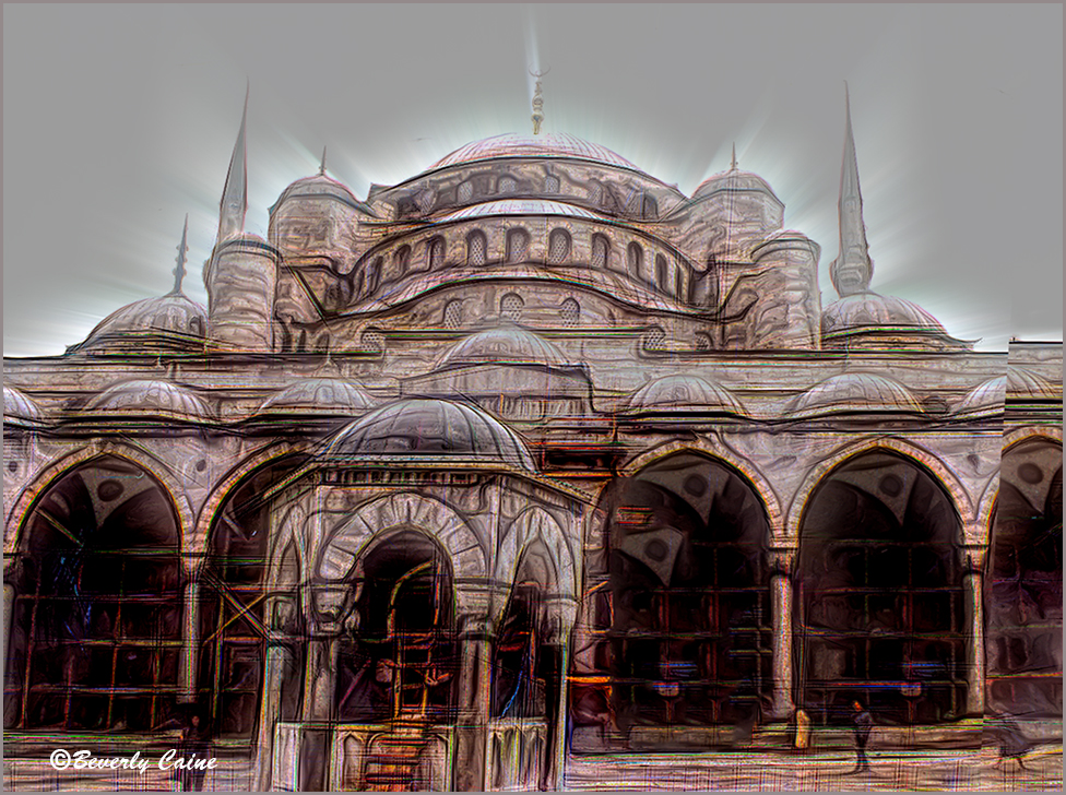
Aug 22 |
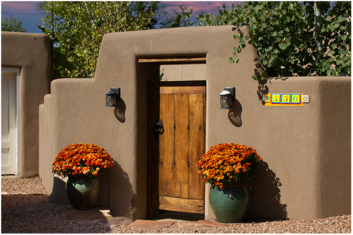
Comment |
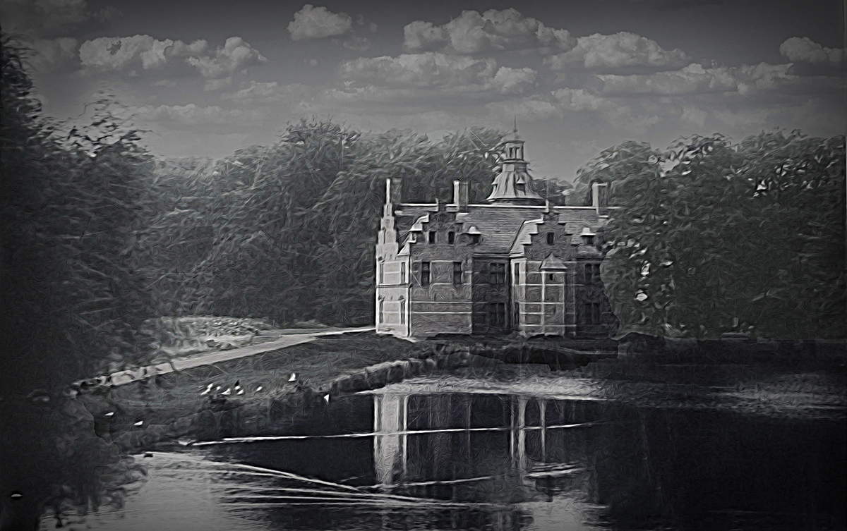
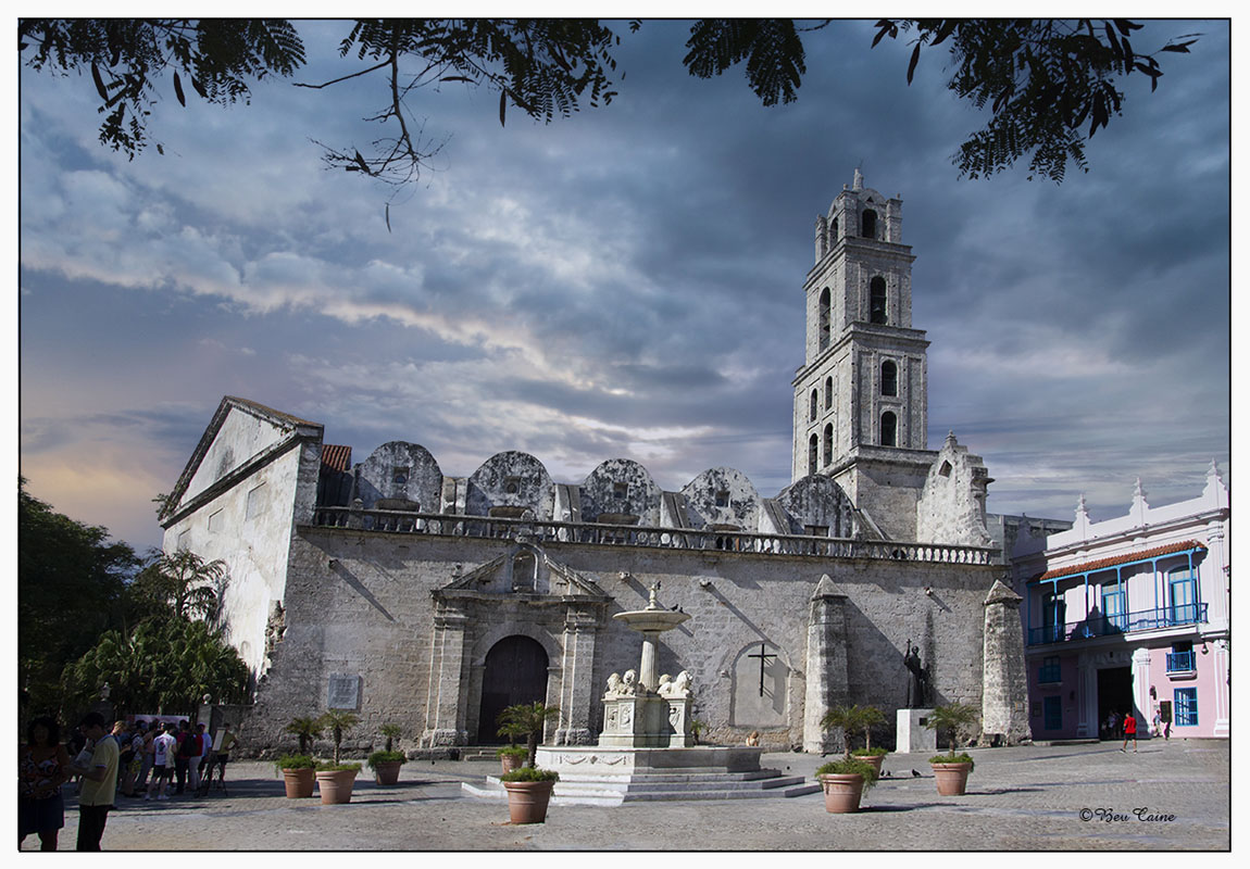
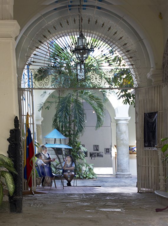
If you look it carefully, you might notice that the image is a very small amount off straight. So I opened it in Photoshop, created a blank canvas and pasted it to the blank canvas. I then straightened it using image/transform/distort. Following that I filled in the blank space at the top using the edit/fill/content aware and followed that by using the clone tool as necessary, As a final touch, I copied the "brick" lines at the top that needed to be replaced. |
Aug 12th |
 |
2 comments - 1 reply for Group 42
|
| 45 |
Aug 22 |
Comment |
Great shot! |
Aug 20th |
1 comment - 0 replies for Group 45
|
| 47 |
Aug 22 |
Comment |
This is such a great image. I actually spent some time conjuring up stories in my mind as I looked at it. I would definitely consider entering it into any competition. |
Aug 20th |
| 47 |
Aug 22 |
Comment |
Great capture. I do think the removal of the tree is central to having a phenomenal image. Well done to both you and Ed |
Aug 20th |
2 comments - 0 replies for Group 47
|
| 48 |
Aug 22 |
Reply |
I saw a great webinar yesterday and loved it so I just bought a bunch of textures and backgrounds from his website. Can't wait to get started playing with them. Thanks for the nice comments. |
Aug 27th |
| 48 |
Aug 22 |
Comment |
I took it back into Photoshop this morning and played with the sharpen filters in Topaz Studio2 and got the attached result. If I had done Sharpen AI it probably would have better but I couldn't get it to open for me. Will play with that one later. |
Aug 20th |
 |
| 48 |
Aug 22 |
Comment |
I took it back into Photoshop this morning and played with the sharpen filters in Topaz Studio2 and got the attached result. If I had done Sharpen AI it probably would have better but I couldn't get it to open for me. Will play with that one later. |
Aug 20th |
 |
| 48 |
Aug 22 |
Reply |
Just think, if you stop here, I would hitch a ride with you. Arent' you lucky |
Aug 8th |
 |
| 48 |
Aug 22 |
Reply |
have you done Jupiter. I've seen some really good evening shots but can't get up there for me. It's about 30 minutes north and with Stu not driving I don't cherish that night driving at night. |
Aug 7th |
| 48 |
Aug 22 |
Reply |
thanks |
Aug 5th |
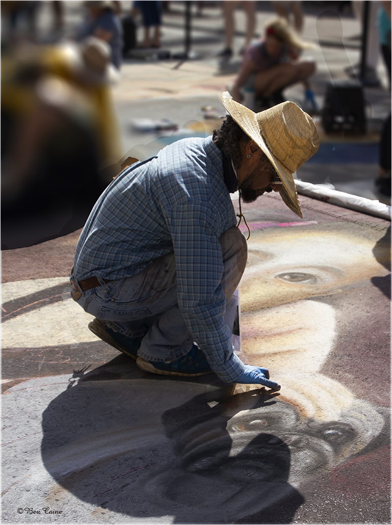
| 48 |
Aug 22 |
Reply |
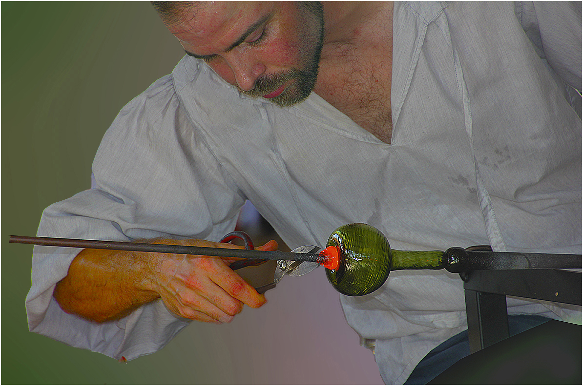
No adjustments to the painter other than maybe lightening him up a bit because I was apparently shooting into the sun and he was a bit dark. The painting itself was his creation and he was painting it in the abstract. |
Aug 5th |
| 48 |
Aug 22 |
Reply |
I absolutely love using various textures. I probably have more than I'll ever need and keep buying more. Thanks for your kind remarks. |
Aug 5th |
| 48 |
Aug 22 |
Comment |
Ditto to Tom's comment. Beautifully done! |
Aug 5th |
| 48 |
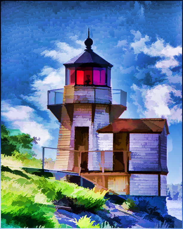
Aug 22 |
Comment |
In that the focus in this image is about the lighthouse, I cropped a bit off the left side, which although pretty, for me is a bit extraneous. What do you think? |
Aug 5th |
 |
| 48 |
Aug 22 |
Comment |
Ditto to Tom's improvement. Was about to do the same thing till I noticed that he beat me to it. Nice image. |
Aug 5th |
| 48 |
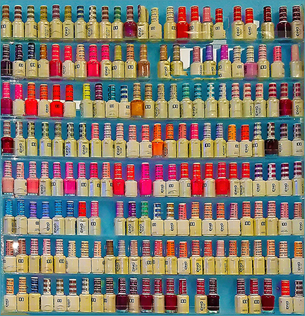
Aug 22 |
Comment |
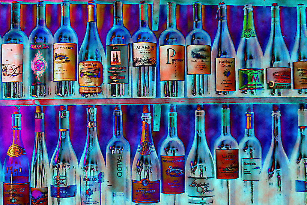
I, too, much prefer the color. Wish all the labels were equally sharp. |
Aug 5th |
| 48 |
Aug 22 |
Comment |
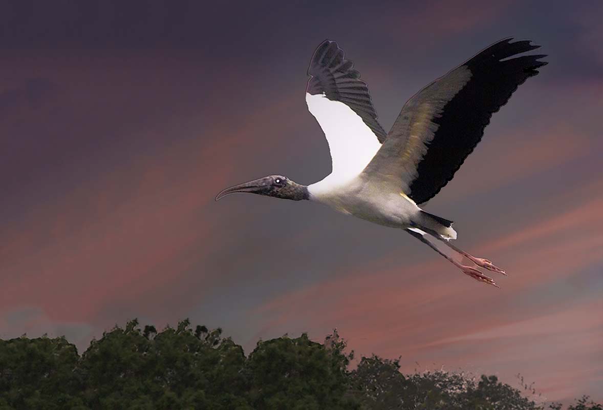
Paul, I agree with Tom but I took an added step and went to image - adjustments- brightness and toned down the background a bit so that the bird stands out a bit more. |
Aug 5th |
 |
| 48 |
Aug 22 |
Reply |
Thanks so much. |
Aug 3rd |
7 comments - 7 replies for Group 48
|
| 77 |
Aug 22 |
Comment |
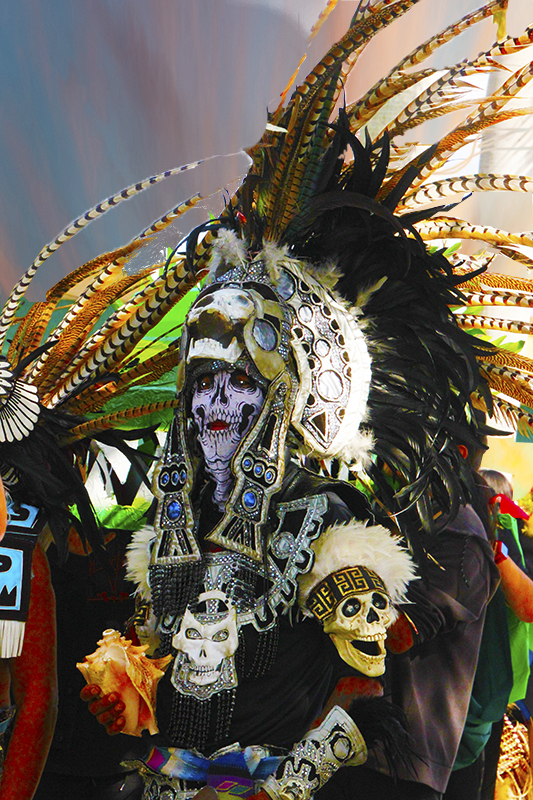
As I was in the middle of monitoring all of the groups I absolutely had to stop and read your description as to how you created this fabulous image. This should be a winner everywhere. Well done! |
Aug 12th |
1 comment - 0 replies for Group 77
|
| 84 |
Aug 22 |
Comment |
After all that work you created a fascinating video. Well done. |
Jul 6th |
1 comment - 0 replies for Group 84
|
| 95 |
Aug 22 |
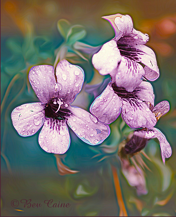
Comment |
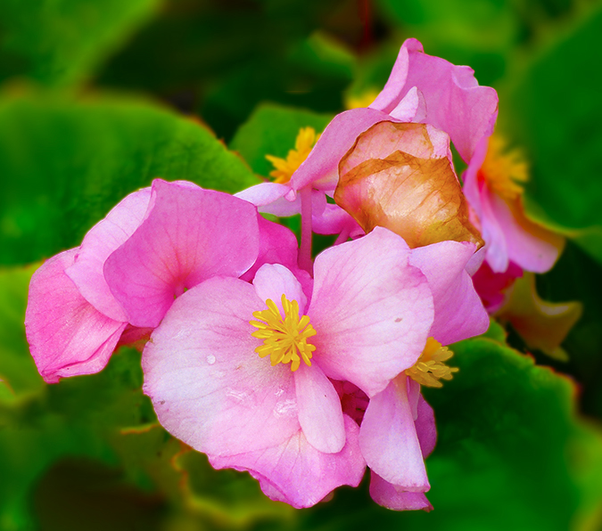
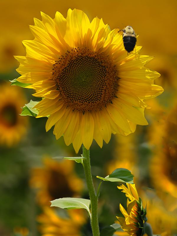
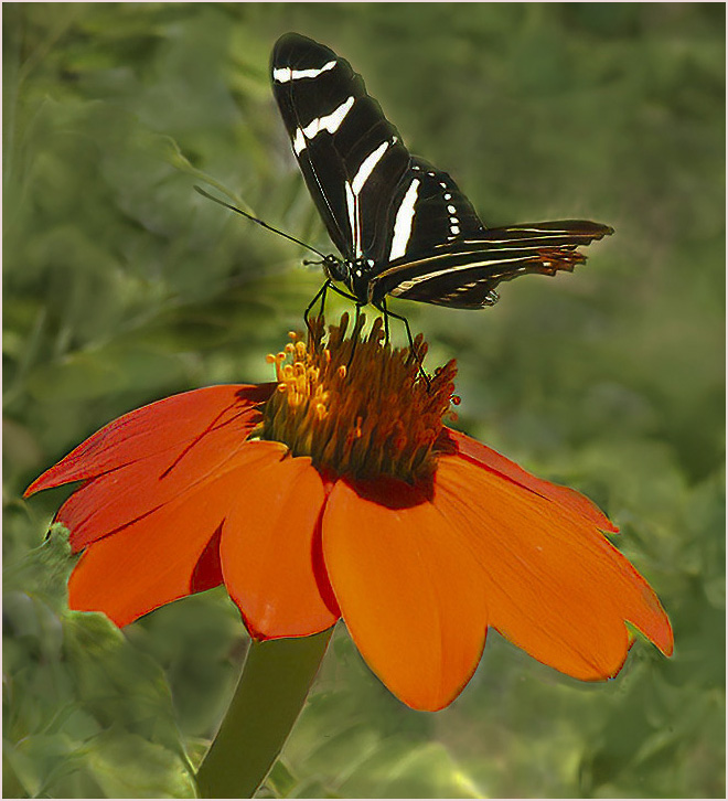
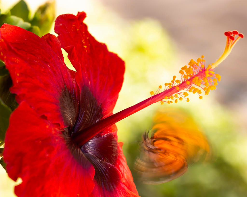
On my screen, the flower is a bit soft so I tried sharpening it a bit in Topaz Studio 2 - I then opened it in adjust-vibrance- saturation and increased both the vibrance and saturation on the flower. Personally I would have waited for the butterfly to land on the flower. In this image I find it a bit distracting. |
Aug 14th |
 |
1 comment - 0 replies for Group 95
|
| 96 |
Aug 22 |
Comment |
This is a beautiful image and I love the story behind it. As I read it, I wondered if I could explain what made me take the picture other than it captured my eye or I was seeing something that I might be able to use in a club competition. Very well done. |
Aug 14th |
1 comment - 0 replies for Group 96
|
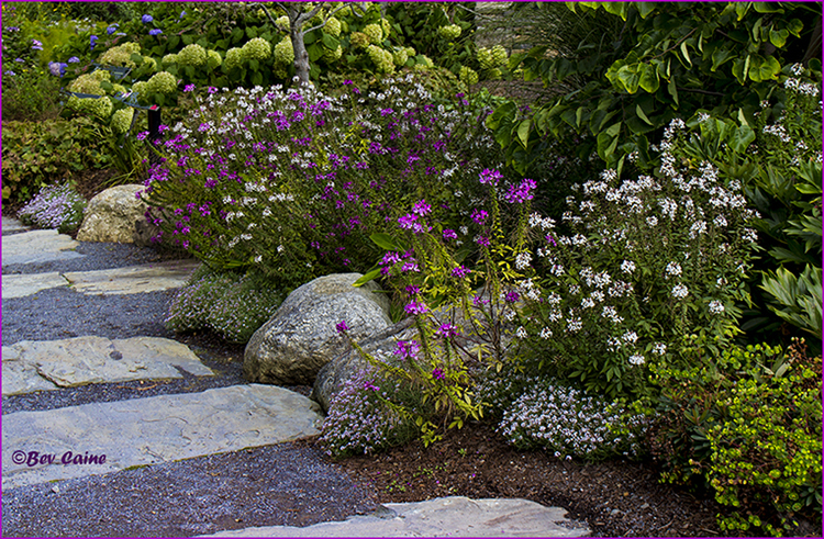
| 99 |
Aug 22 |
Comment |
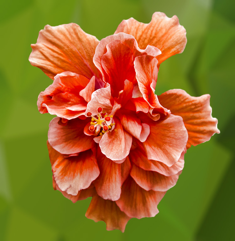
I don' have a problem with the background leaves, flowers, etc. but I felt that they were to bright. I brought the image into Photoshop and just made a couple of adjustments in image-adjustments-brightness and toned down the brightness. |
Aug 14th |
 |
1 comment - 0 replies for Group 99
|
43 comments - 18 replies Total
|