|
| Group |
Round |
C/R |
Comment |
Date |
Image |
| 1 |
Jun 22 |
Comment |
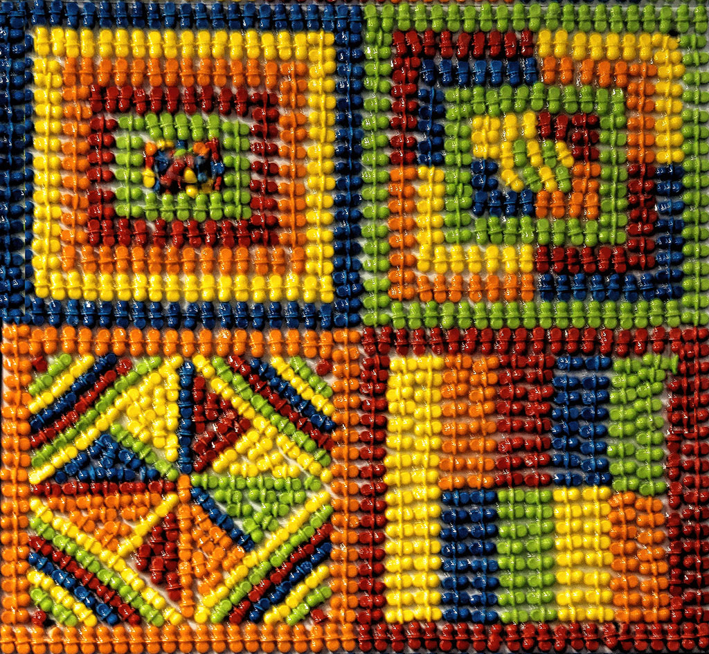
It is so easy. Go to Mariealtenburg.com take a look at her textures. It involves basically a cut and paste process with a little fine tuning. If you get hooked, email me and I'll walk you through it once or twice |
Jun 16th |
| 1 |
Jun 22 |
Comment |
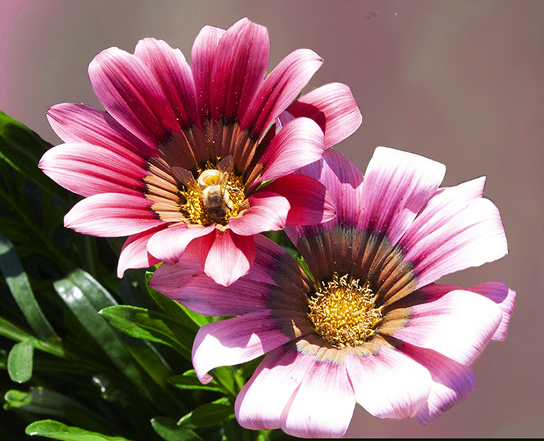
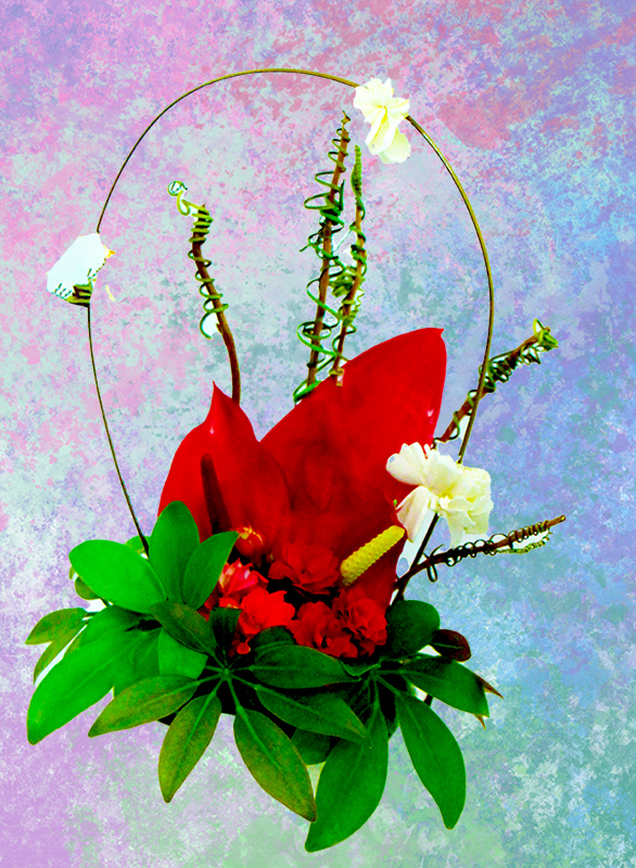
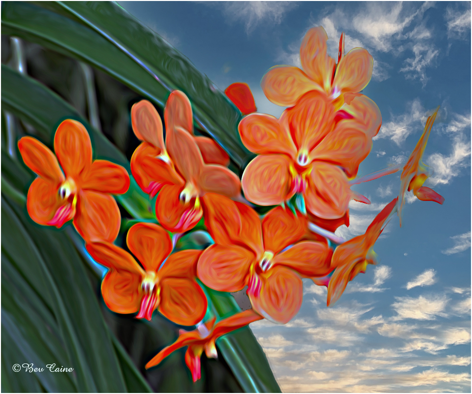
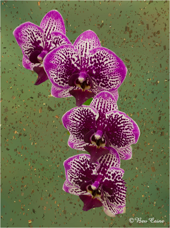
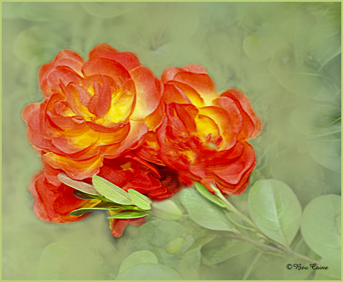
The main subject is beautiful but I find that all the greenery is a bit distracting. So I decided to play with textures and came up with the attached. What do you think? |
Jun 15th |
 |
2 comments - 0 replies for Group 1
|
| 2 |
Jun 22 |
Comment |
Fabulous result. The sky makes the image a winner for me |
Jun 15th |
1 comment - 0 replies for Group 2
|
| 3 |
Jun 22 |
Comment |
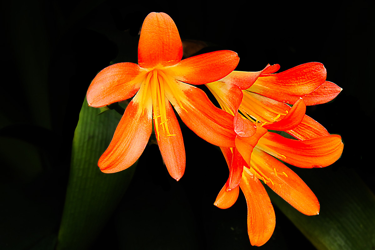
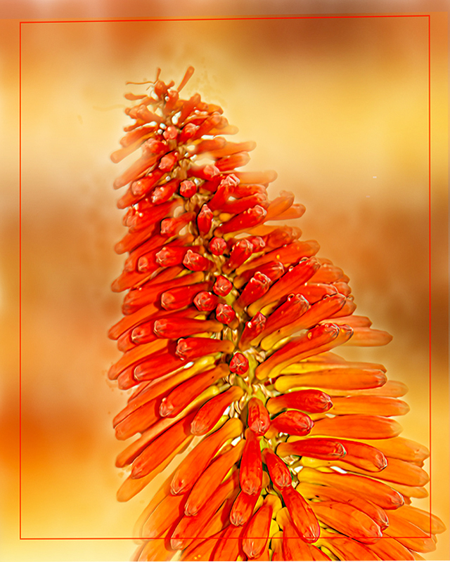
I was going to comment on the orange in the background and then saw Luann's suggestion which I think is right on. |
Jun 15th |
| 3 |
Jun 22 |
Comment |
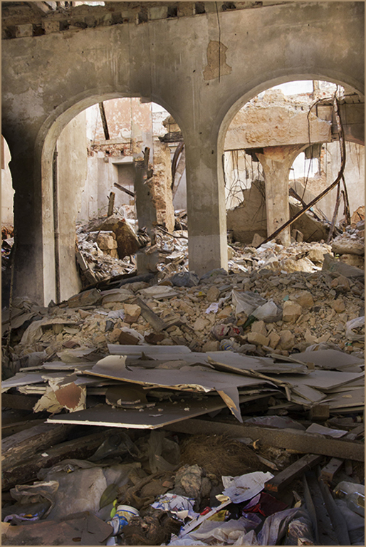
Extremely well done. Gives the viewer a moment to reflect on the tragedy of war. |
Jun 15th |
2 comments - 0 replies for Group 3
|
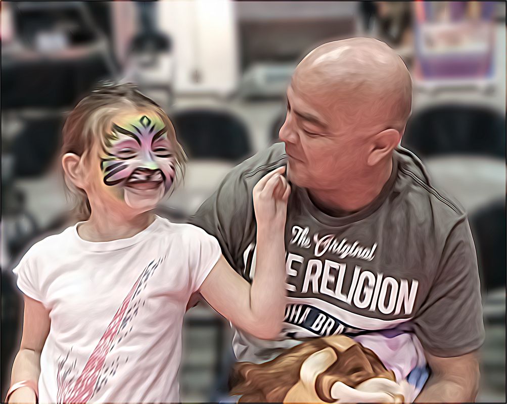
| 5 |
Jun 22 |
Comment |
You are so creative. |
Jun 15th |
| 5 |
Jun 22 |
Comment |
Lovely image of happiness. I like David's improvement. |
Jun 15th |
2 comments - 0 replies for Group 5
|
| 6 |
Jun 22 |
Comment |
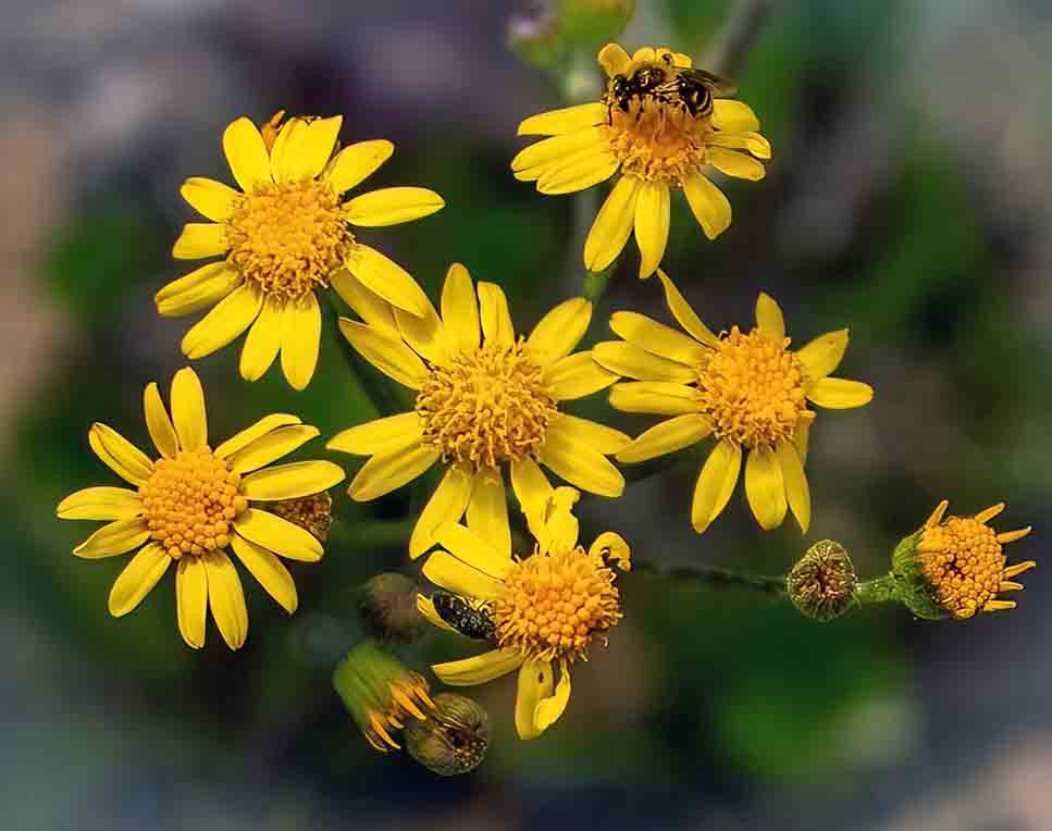
I agree with the previous comments as well. I found that although I very much liked the flower it didn't really "grab" me. So I took it into photoshop - image -adjust-vibrance. I adjusted the vibrance and saturation and then went to sharpen - smart sharpen and played with those sliders a bit and came up with the attached. |
Jun 17th |
 |
| 6 |
Jun 22 |
Comment |
Excellent result. If you really enjoy flower shooting visit the website phlorography. You'll see some fabulous work there and get some great ideas.
|
Jun 17th |
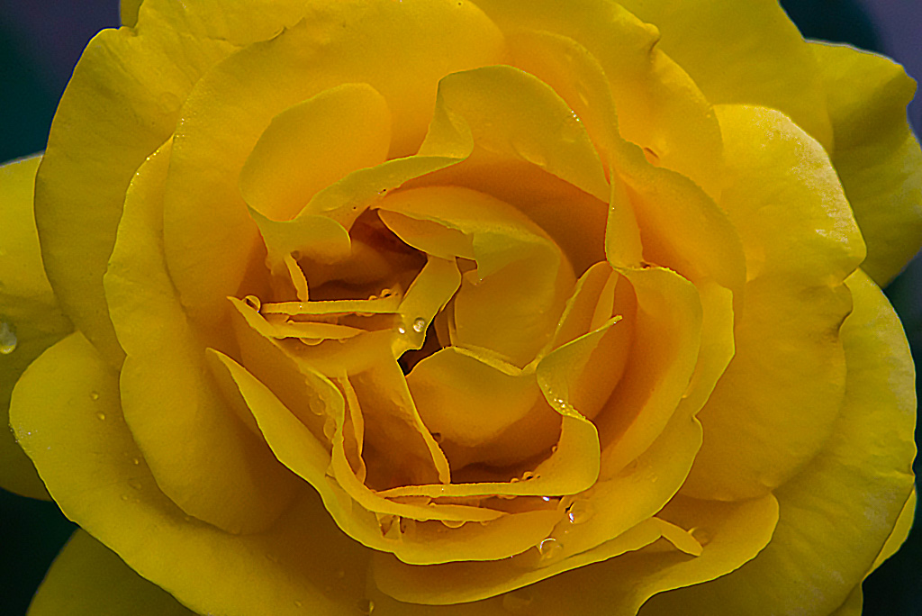
| 6 |
Jun 22 |
Comment |
This image is gorgeous to say the least. As a Florida resident I'd love to know where this is as I'm very into shooting flowers and water lilies are a wonderful option. |
Jun 17th |
3 comments - 0 replies for Group 6
|
| 7 |
Jun 22 |
Comment |
The enhancements you made really make the image stand out. Very well done. |
Jun 17th |
1 comment - 0 replies for Group 7
|
| 8 |
Jun 22 |
Comment |
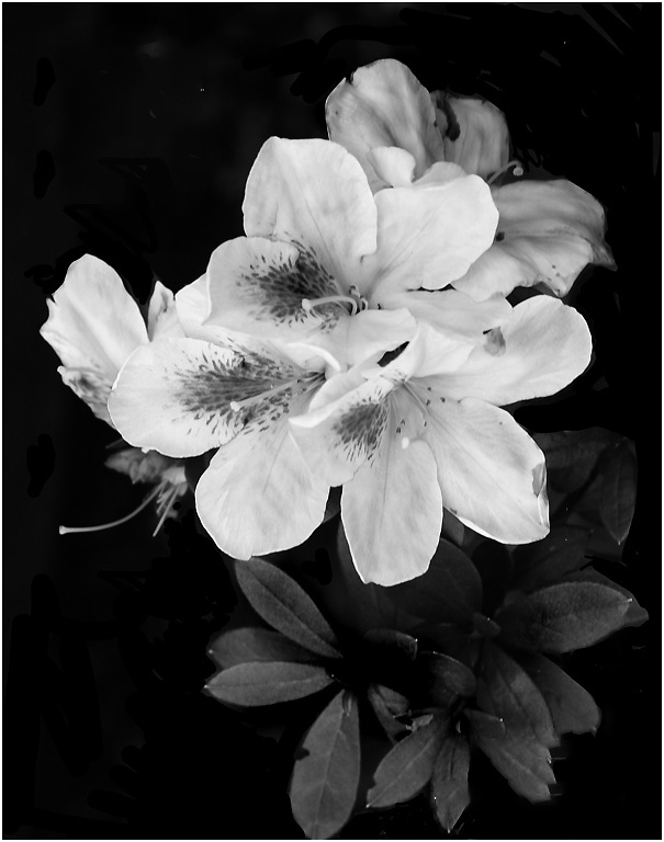
There are times when monochrome is a hands down winner. This is one of those times. |
Jun 17th |
1 comment - 0 replies for Group 8
|
| 9 |
Jun 22 |
Reply |
beautiful |
Jun 17th |
| 9 |
Jun 22 |
Comment |
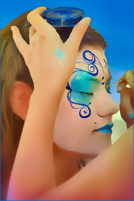
Love the blue coloring. Was that natural or did you adjust to create it? |
Jun 17th |
1 comment - 1 reply for Group 9
|
| 10 |
Jun 22 |
Reply |
don't hesitate to email me or call 561-752-3992 if you need any assistance. |
Jun 18th |
| 10 |
Jun 22 |
Reply |
any time |
Jun 17th |
| 10 |
Jun 22 |
Comment |
It's pretty but my taste leans toward a sharper result. If you would like some lessons, email me at bevandstu@gmail.com and I'll be happy to work with you or better yet, call me at 561-752-3992 I'll be home all week-end and we can talk. |
Jun 17th |
| 10 |
Jun 22 |
Comment |
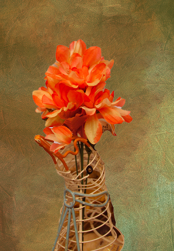
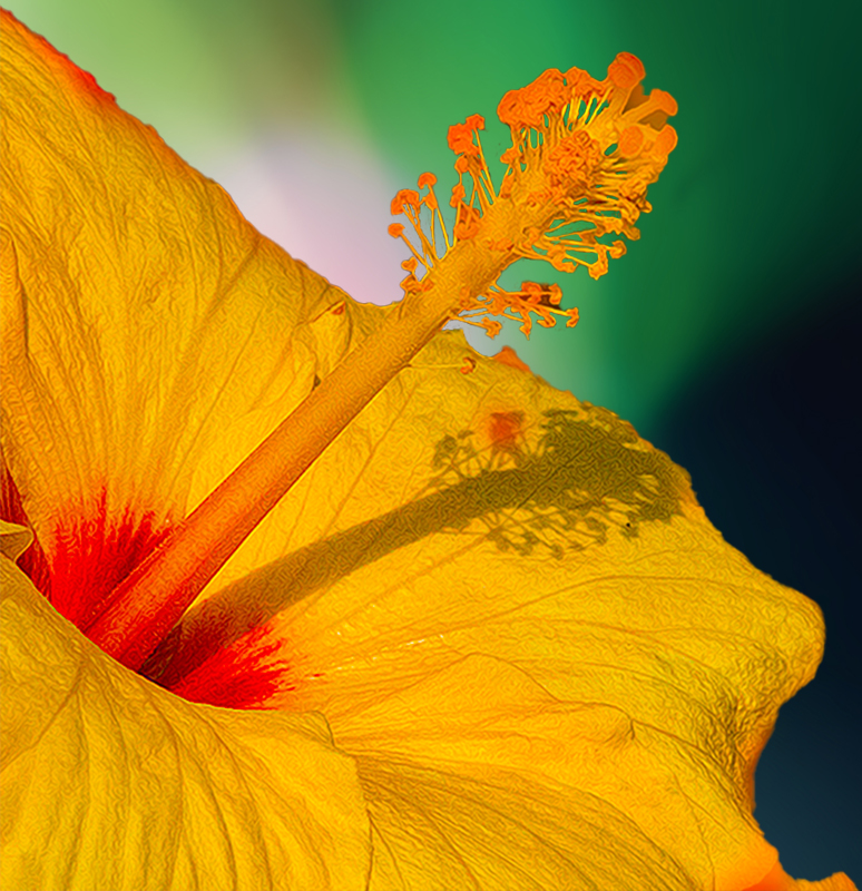
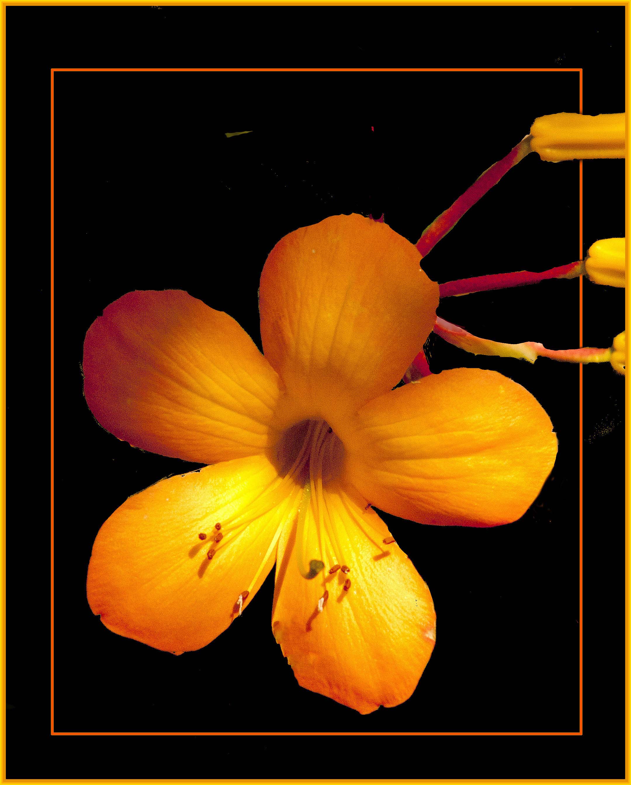
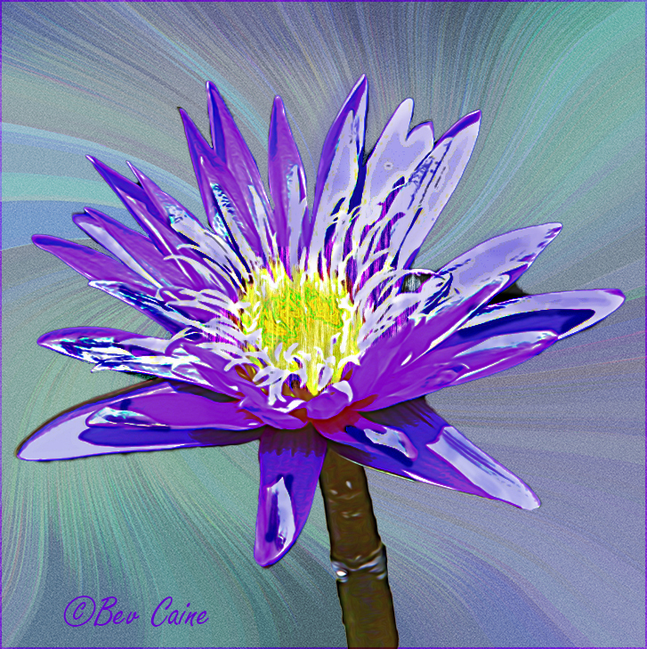
Beautiful flower. Have you ever tried working with textures? Here's an example for your consideration. |
Jun 17th |
 |
| 10 |
Jun 22 |
Comment |
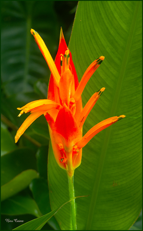
I definitely prefer #1. I wonder if you have ever considered
using a textured background? Sometimes they offer fabulous results. |
Jun 17th |
3 comments - 2 replies for Group 10
|
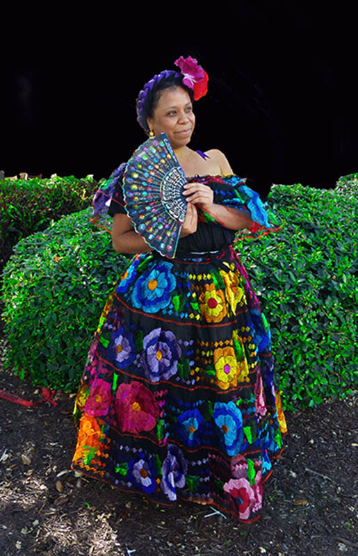
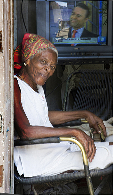
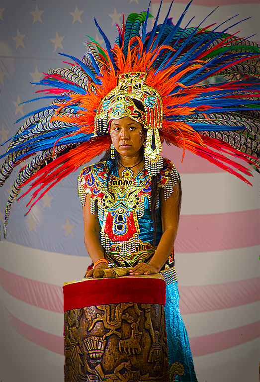
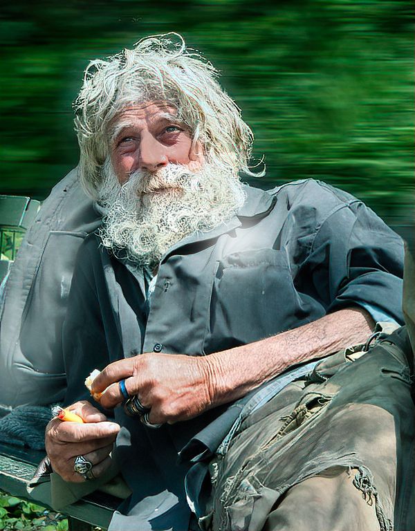
| 12 |
Jun 22 |
Comment |
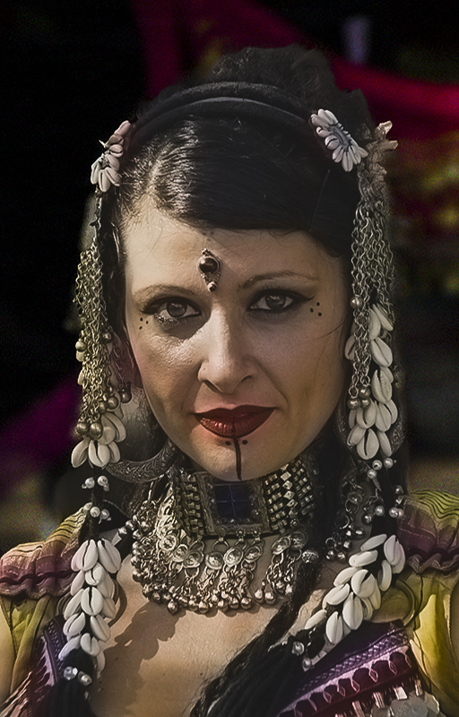
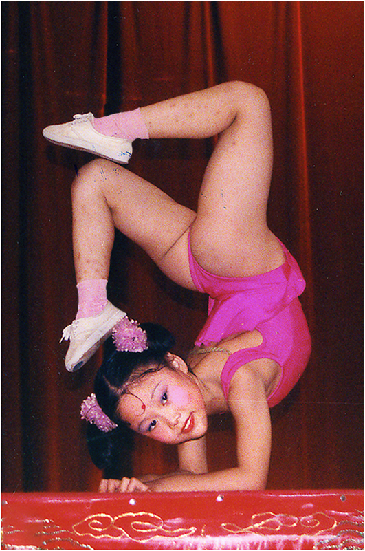
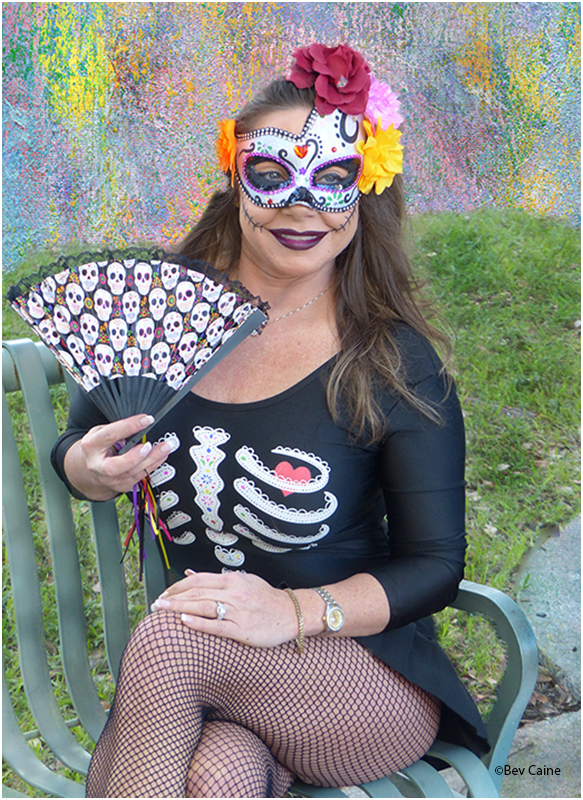
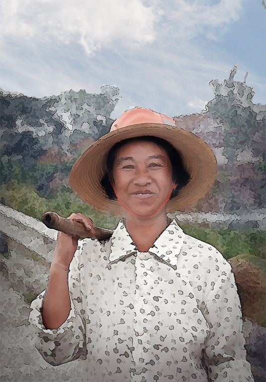
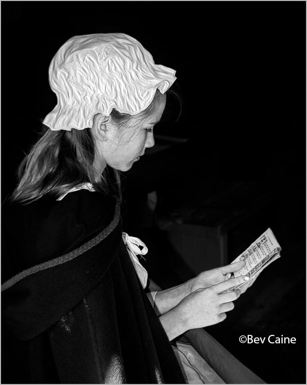
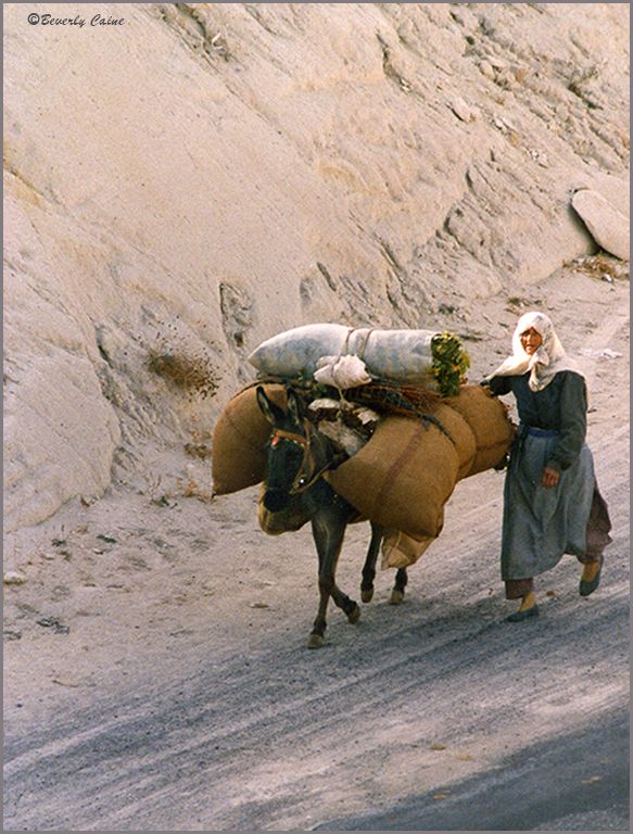
I'd like to steal her away but at 84 I could probably not handle more than a short time. She is absolutely a heart stealer. |
Jun 17th |
| 12 |
Jun 22 |
Comment |
Wonderful capture. |
Jun 17th |
2 comments - 0 replies for Group 12
|
| 13 |
Jun 22 |
Comment |
Two words say it all LOVE IT!! |
Jun 17th |
1 comment - 0 replies for Group 13
|
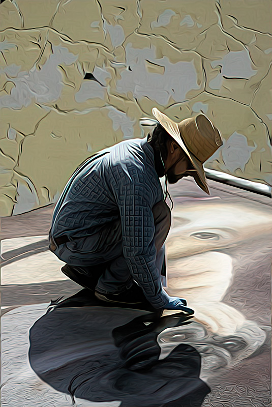
| 17 |
Jun 22 |
Comment |
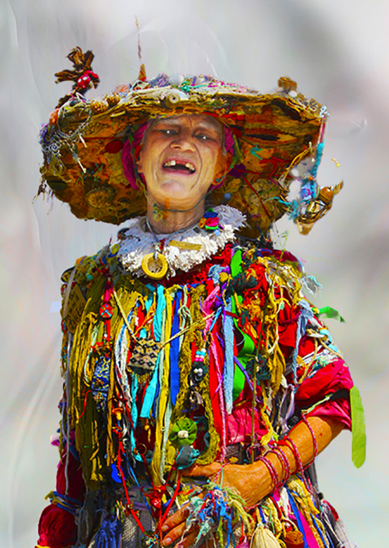
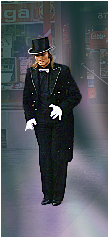
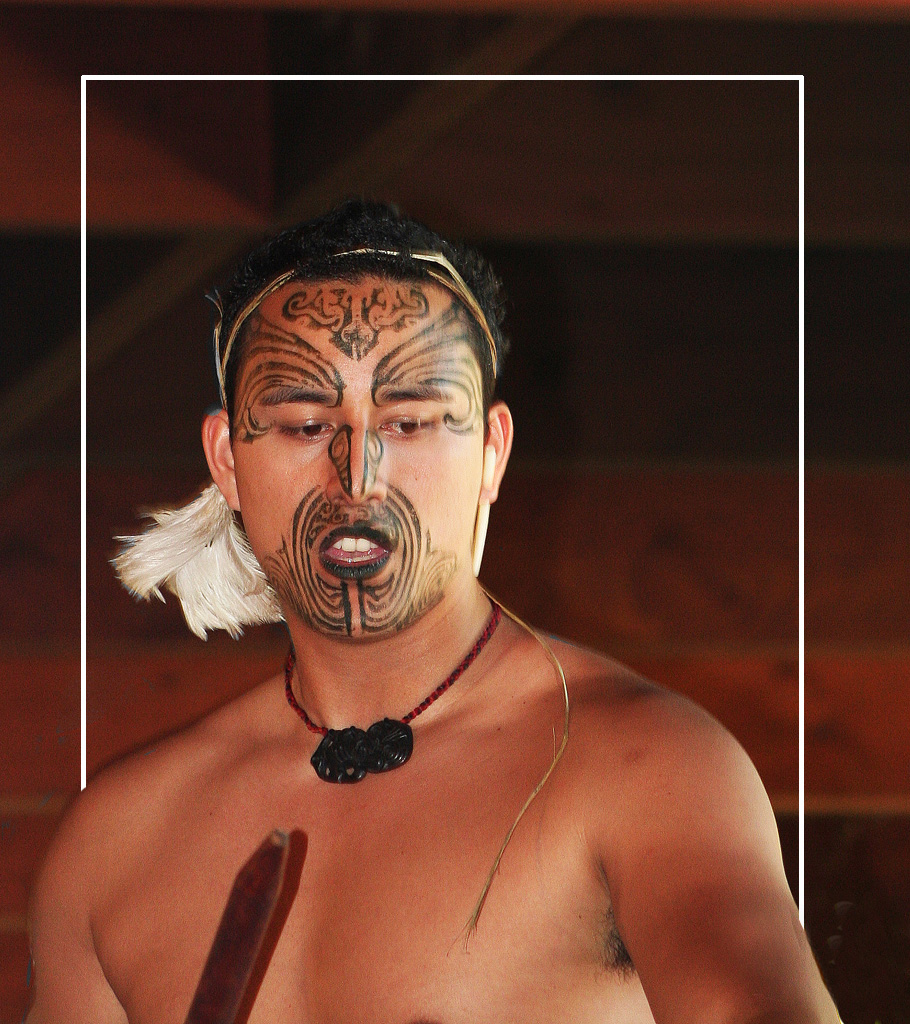
No insult to the image but I wonder.... Is that your twin brother? |
Jun 17th |
 |
1 comment - 0 replies for Group 17
|
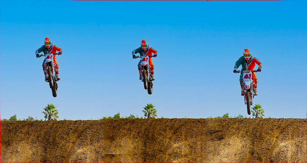
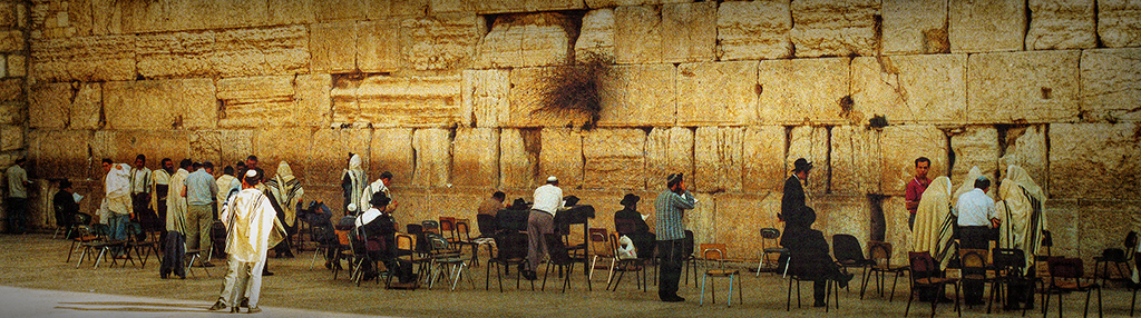
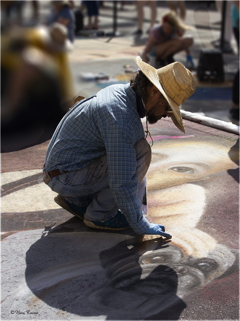
| 21 |
Jun 22 |
Comment |
The creativity behind this is beyond mind boggling. Beautifully executed as well.
|
Jun 17th |
| 21 |
Jun 22 |
Comment |
This is so very creative. I hope that you won't mind if I steal the idea one of these days with something other than tomatoes. Wonderful result. |
Jun 17th |
2 comments - 0 replies for Group 21
|
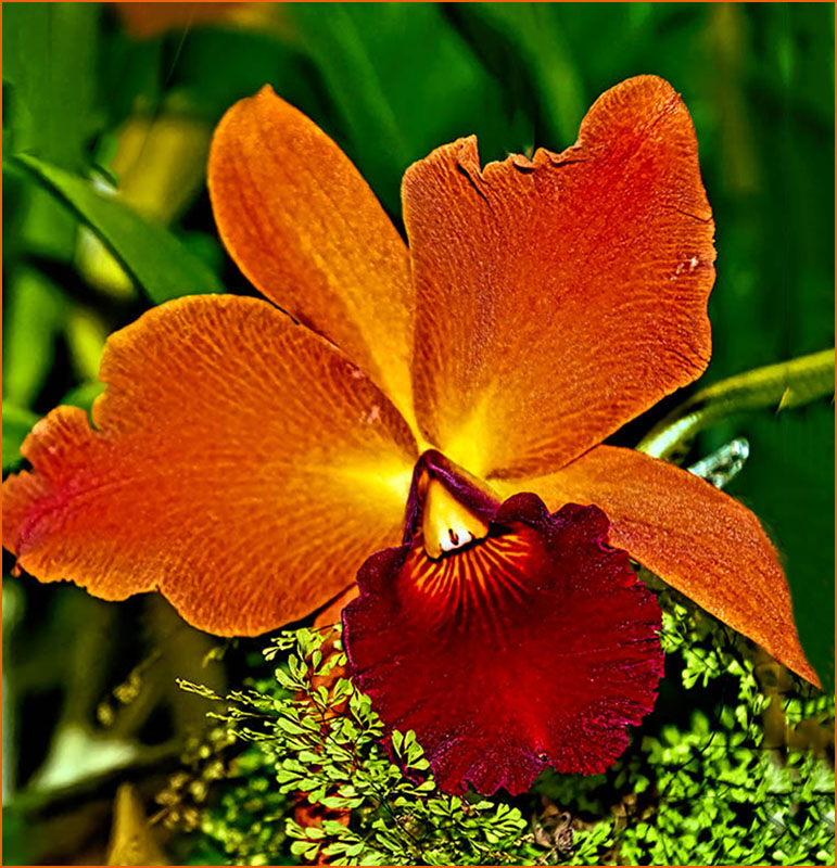
| 27 |
Jun 22 |
Comment |
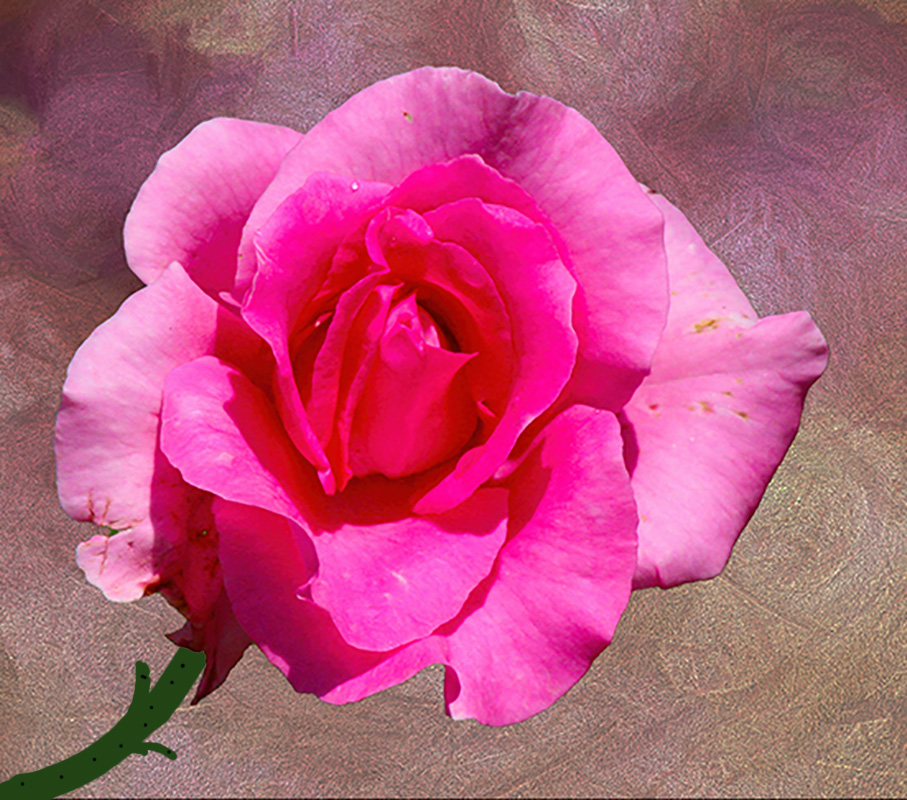
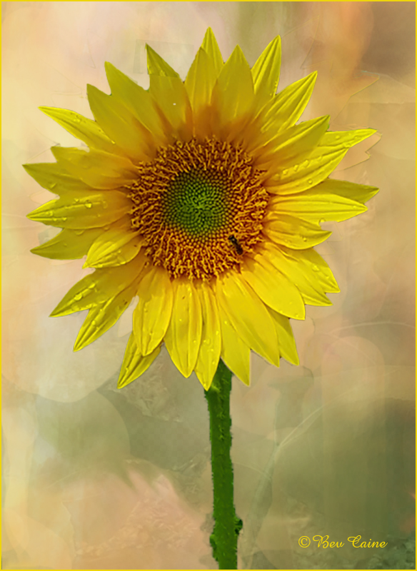
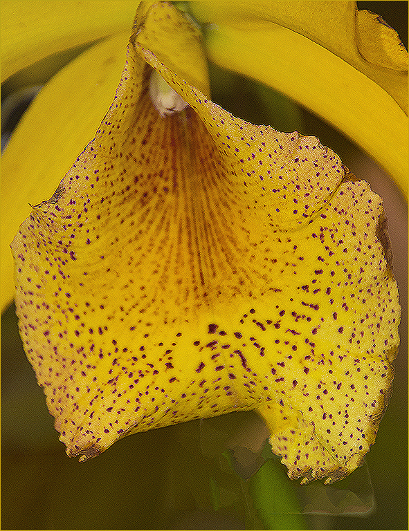
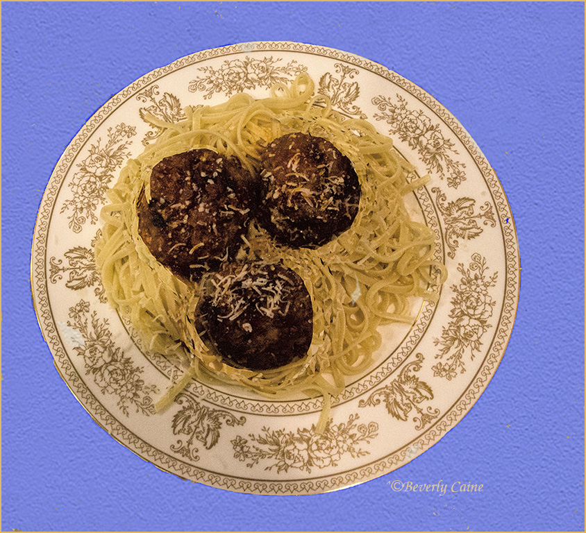
Flower is gorgeous...background not so. So, I decided to play with a few of my texture files and created the attached using a couple of layers. What do you think? |
Jun 17th |
 |
1 comment - 0 replies for Group 27
|
| 48 |
Jun 22 |
Reply |
Thank you for taking the time to review my image and your comments. |
Jun 21st |
| 48 |
Jun 22 |
Reply |
I didn't see the reduction in sharpness, but that's probably my vision. So, I took it back into photoshop and used the sharpen filter. Hope this is better. |
Jun 19th |
 |
| 48 |
Jun 22 |
Reply |
Just saw Marie's latest textures. Just posted a couple of days ago....absolutely phenomenal! |
Jun 14th |
| 48 |
Jun 22 |
Comment |
Nice technique. Keep up the good work. |
Jun 14th |
| 48 |
Jun 22 |
Comment |
Somehow I know I can always count on you for a winner |
Jun 14th |
| 48 |
Jun 22 |
Comment |
Great shot. Love Tom's comments. I just purchased a pass to the Palm Beach Zoo in the hopes that I'll be encouraged to get there more often so I don't waste the money. As I can bring a guest free if anyone would like to join me when the weather cools down, just email or call and it's a date |
Jun 14th |
| 48 |
Jun 22 |
Comment |
The image is technically correct but I'd like, as Tom said, to see something to draw attention to the water. |
Jun 14th |
| 48 |
Jun 22 |
Comment |
I brought this into photoshop, selected the sky,then selected inverse. Opened adjustments, vibrance, and increased the saturation and vibrance just a bit. What do you think? |
Jun 14th |
 |
| 48 |
Jun 22 |
Reply |
Planning on entering it. June already submitted so it will probably have to wait till Sept.. Keep your fingers crossed for me |
Jun 5th |
| 48 |
Jun 22 |
Reply |
Thanks so much. If your wife ever needs this kind of background, send her to mariealtenburg.com. Her texture assortment of textures is phenomenal. |
Jun 4th |
| 48 |
Jun 22 |
Reply |
do you prefer the color changes I made on the flower? |
Jun 3rd |
| 48 |
Jun 22 |
Reply |
|
Jun 3rd |
 |
| 48 |
Jun 22 |
Comment |
Thanks. I'll give the color change suggestion a try and post it in a day or so. As to the background, take a look at Marie Altenburg's site. I've bought a few of her textures and find that they are the backbone of all the textures I use. |
Jun 3rd |
6 comments - 7 replies for Group 48
|
| 59 |
Jun 22 |
Comment |
I'll never understand judges. I had something similar that I got a 10 out of 10 a year or so ago so I submitted another from the same trip and got an 8. Go figure. |
Jun 21st |
| 59 |
Jun 22 |
Comment |
Phenomenal capture at a minimum. Good luck in future exhibitions. |
Jun 18th |
2 comments - 0 replies for Group 59
|
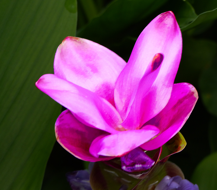
| 60 |
Jun 22 |
Reply |
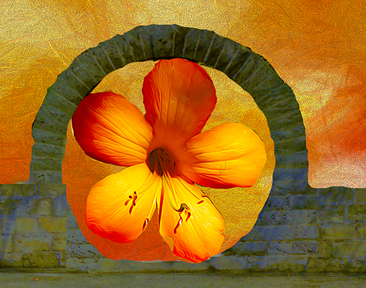
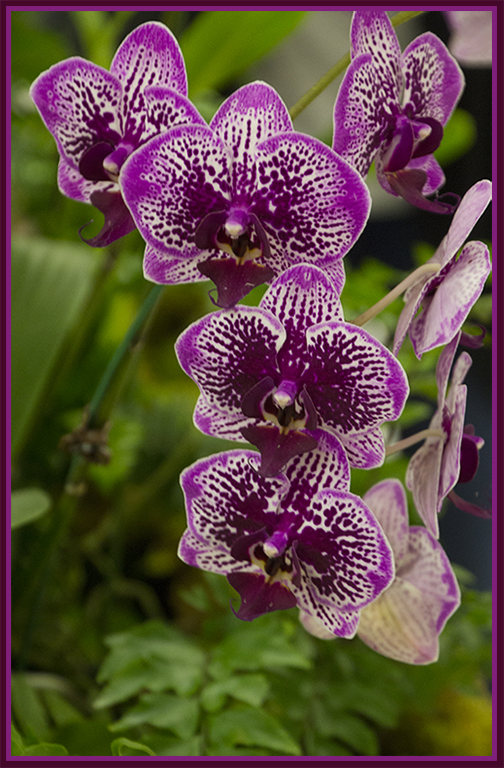
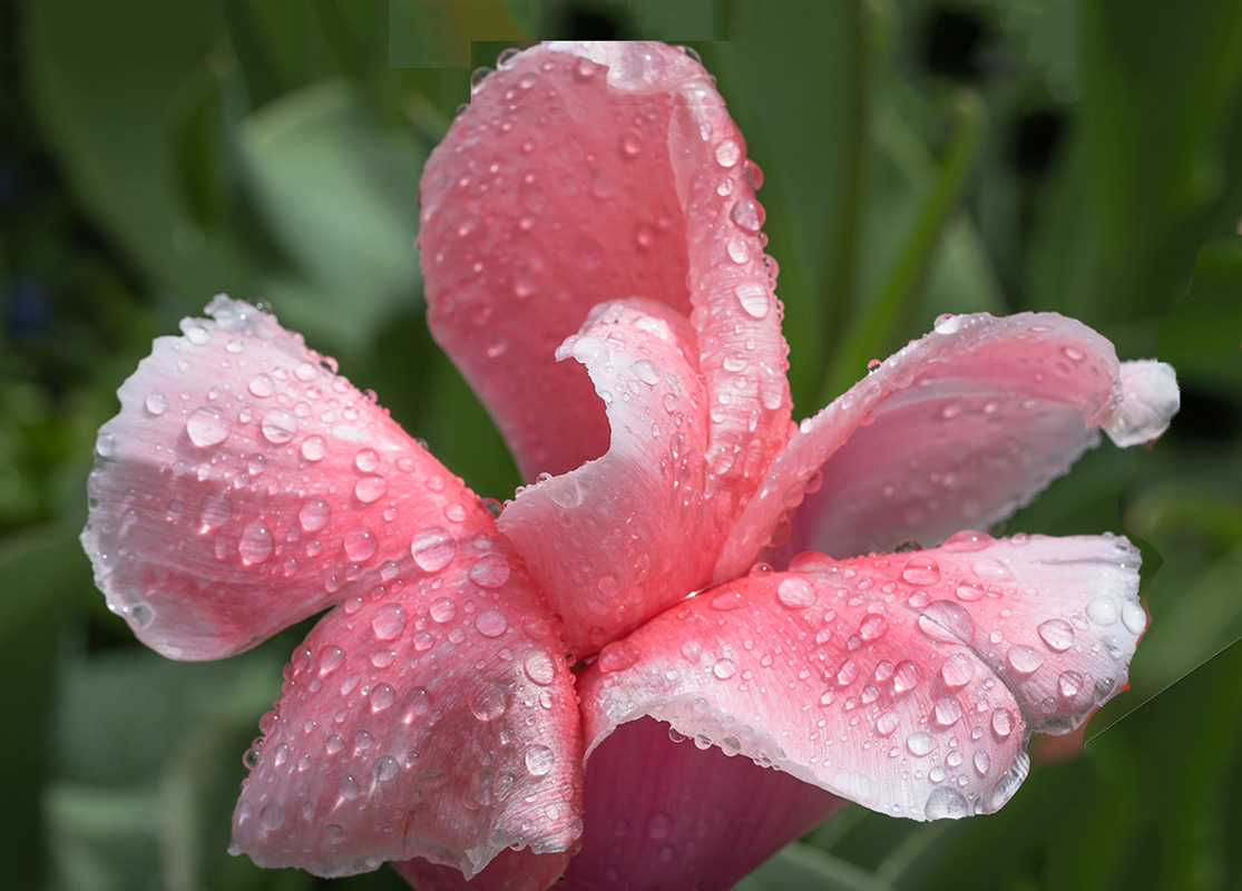
Actually I do use photoshop but being towards the end of reviewing and working on more than a dozen images, my eyes must have been deceiving me. I didn't see the line. The major problem was that your image was so close to the top it was a bit tight. What I did was increase the size of the canvas and then did a content aware fill on the blank space. I first had to copy the top round edge of the flower so I that I could paste it back in place avoid cut off appearance of that top petal and then fill the white space in sections. |
Jun 18th |
| 60 |
Jun 22 |
Comment |
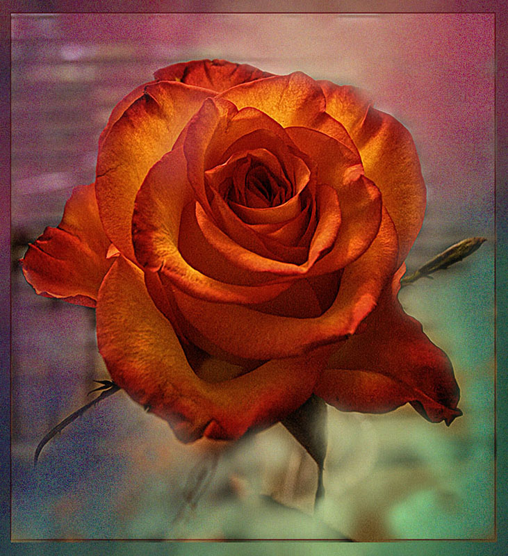
The flower is lovely. The red on the right isn't for me. So it took a few steps but I got rid of it. What do you think? |
Jun 18th |
 |
1 comment - 1 reply for Group 60
|
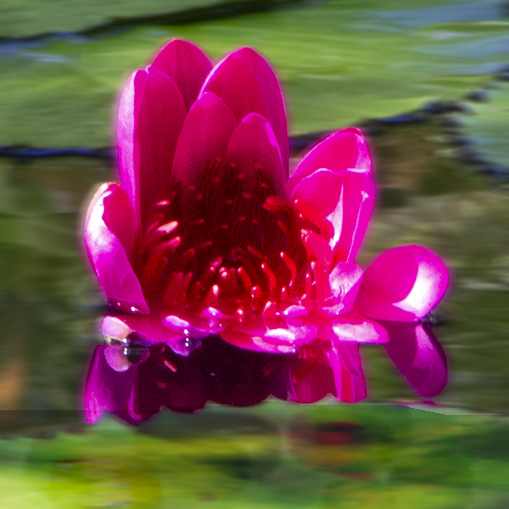
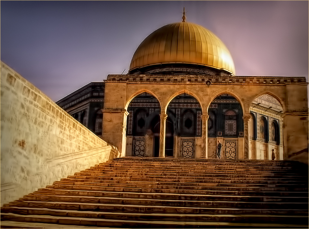
| 62 |
Jun 22 |
Reply |
You are most welcome. |
Jun 3rd |
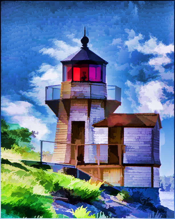
| 62 |
Jun 22 |
Comment |
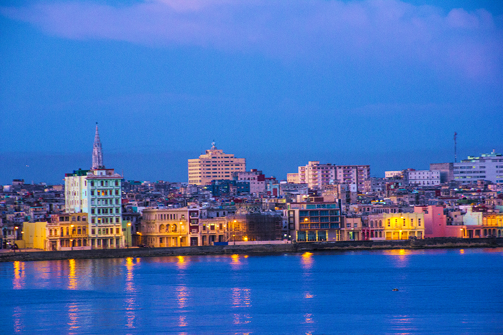
Very well done. For me the vignette is the perfect finish to bring the tower into the foreground. |
Jun 2nd |
1 comment - 1 reply for Group 62
|
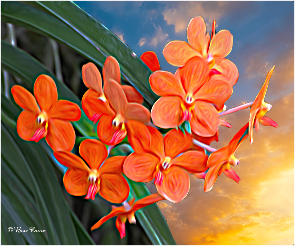
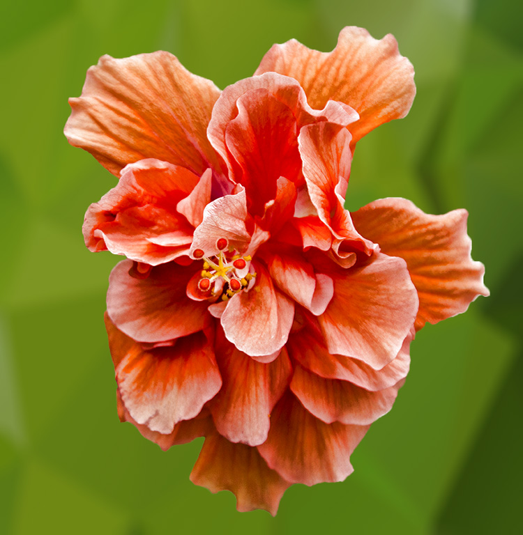
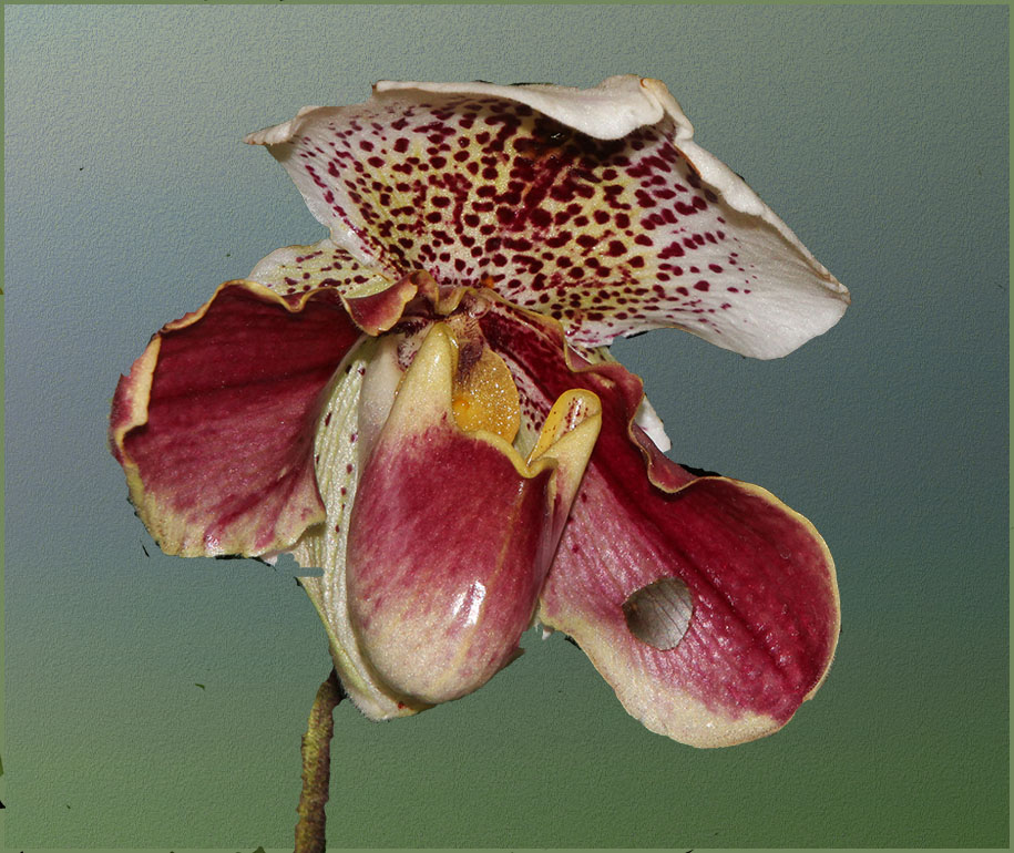
| 63 |
Jun 22 |
Comment |
Do you have a phone number for Adobe support? They are fabulous. |
Jun 22nd |
| 63 |
Jun 22 |
Comment |
I'm ok with the forward flower being the sharpest of the bunch but I brought it into Topaz Studio2 and increased the overall sharpness and added a bit of "punch" by increasing the vibrance just a touch. I also changed you stroke from the white to a smaller yellow one as I felt that the white was distracting. What do you think? |
Jun 18th |
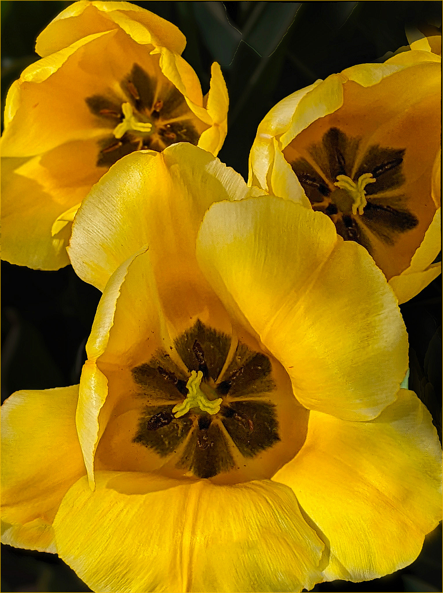 |
| 63 |
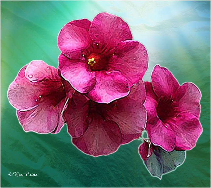
Jun 22 |
Comment |
One of my favorite flower photographers once said "less is more" and with this image, I think the extra greenery on the left is a bit of an overkill. On that basis, the only change I considered was to crop them out and make this a vertical image. What do you think? |
Jun 18th |
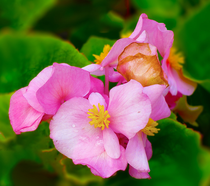
| 63 |
Jun 22 |
Comment |
I found that huge leaf on the upper left a bit distracting from the beauty of the center of the flower so I cloned it out. I then created two additional layers and reduced the opacity of the background on both of those layers, flattened the image so that the rose still had it's original brightness and contrast. What do you think? |
Jun 18th |
 |
4 comments - 0 replies for Group 63
|
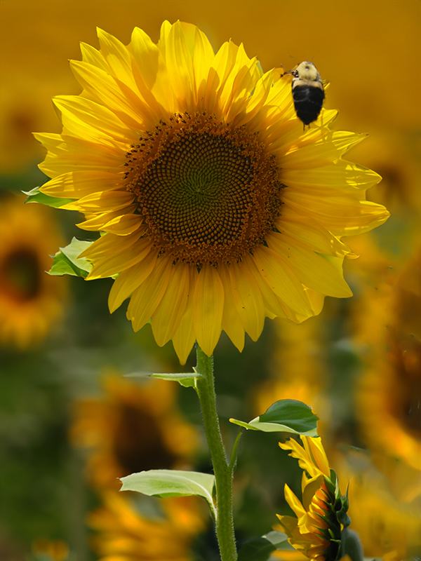
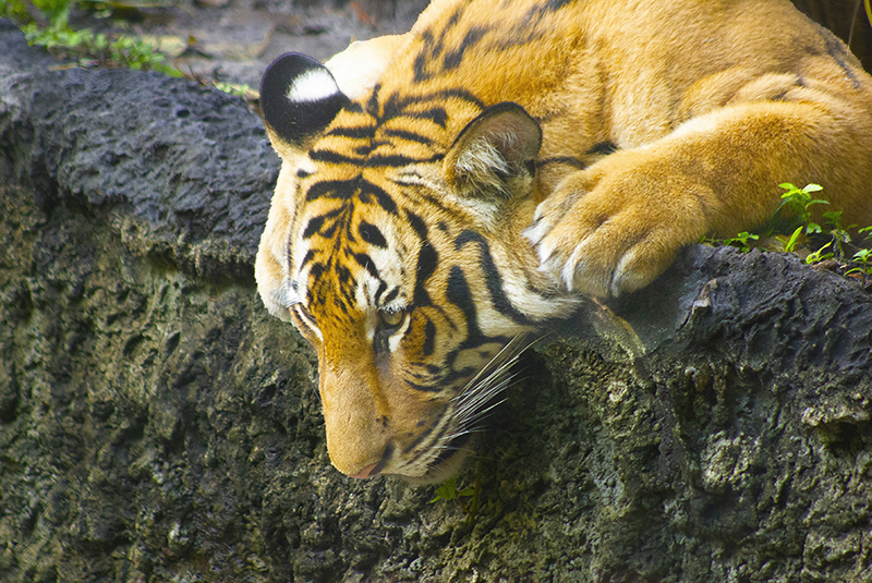
| 66 |
Jun 22 |
Comment |
Great image. I keep toying with the idea of having one of my cameras set up for IR but now being very limited in where we and how we can travel, I wonder if it's worth it. Then I see an image like this and I am re-inspired. |
Jun 18th |
1 comment - 0 replies for Group 66
|
| 67 |
Jun 22 |
Comment |
Great capture. Well done |
Jun 18th |
1 comment - 0 replies for Group 67
|
| 69 |
Jun 22 |
Comment |
Beautiful image Merv |
Jun 18th |
1 comment - 0 replies for Group 69
|
| 70 |
Jun 22 |
Comment |
Whatever improvements you have made to the out of camera image have created a spectacular image that I'd love to have in my living room. |
Jun 18th |
| 70 |
Jun 22 |
Comment |
Whatever improvements you have made to the out of camera image have created a spectacular image that I'd love to have in my living room. |
Jun 18th |
2 comments - 0 replies for Group 70
|
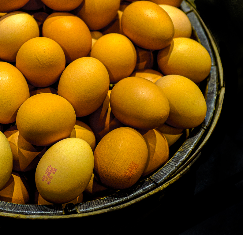
| 77 |
Jun 22 |
Comment |
What I did was select the bowl and then selected inverse and got rid of the extraneous almost background on the right by blackening the entire thing. I then focused on the eggs and in image/adjust/vibrance enhanced the saturation and increased the vibrance. Just a few simple "fixes" that I think make a difference. What do you think? |
Jun 18th |
 |
1 comment - 0 replies for Group 77
|
| 78 |
Jun 22 |
Comment |
When I first saw this I wondered what it is. As this bird is reasonably plentiful here in S Florida, I've seen many images of them but never one so purple. I don't know if it's in your post processing or the light but I love the color even though it's probably not something I'll ever see again. No, the few browns do not bother me. Never even saw them till I read your explanation of what was done. Lovely image. |
Jun 18th |
| 78 |
Jun 22 |
Comment |
I do like Jason's crop as it leaves more to the imagination as to what's going on. I have never heard the term LUTs so I would welcome any input as to what that is. Overall a well-done image. |
Jun 18th |
2 comments - 0 replies for Group 78
|
| 79 |
Jun 22 |
Comment |
This is just beautiful. |
Jun 18th |
1 comment - 0 replies for Group 79
|
| 86 |
Jun 22 |
Comment |
Great capture. I think if you made some of the suggestions offered, you'd have a winner all the way around. |
Jun 18th |
1 comment - 0 replies for Group 86
|
| 89 |
Jun 22 |
Comment |
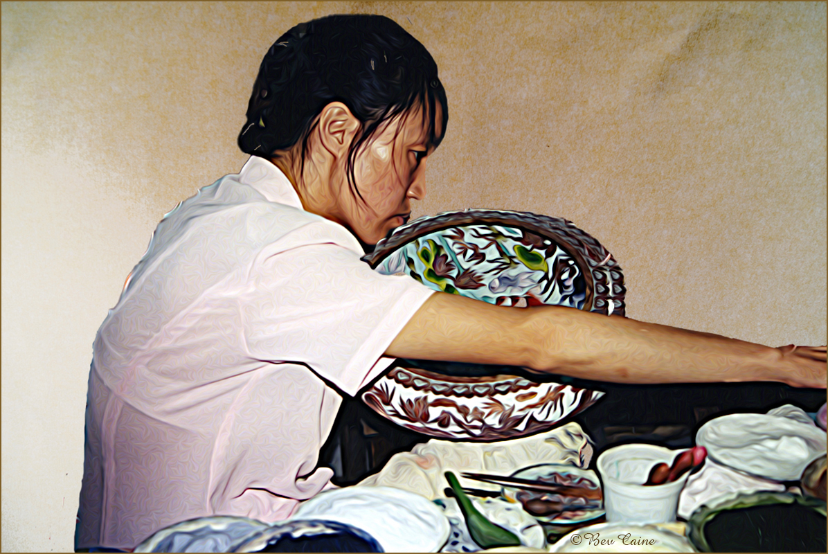
Following the previous comments, the only thing I am going to add is that I took it into Topaz Studio 2 and sharpened it a bit. |
Jun 18th |
 |
| 89 |
Jun 22 |
Comment |
Following the previous comments, the only thing I am going to add is that I took it into Topaz Studio 2 and sharpened it a bit. |
Jun 18th |
 |
2 comments - 0 replies for Group 89
|
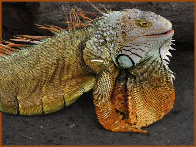
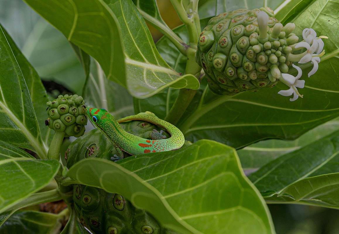
| 93 |
Jun 22 |
Comment |
This is a great shot. My only suggestion in addition to the above would be to darken the background just enough so that the gecko stands out just a bit. I selected him, did an inverse and then toned down everything else using adjustments/brightness and lowered the prompt just a tab. What do you think? |
Jun 18th |
 |
1 comment - 0 replies for Group 93
|
| 94 |
Jun 22 |
Comment |
I did understand that but as I said I don't use Lightroom but am gradually expanding my "talents" in using Photoshop. Thanks for all the info. |
Jun 18th |
| 94 |
Jun 22 |
Reply |
Thanks. I must have misinterpreted your comment re Topaz add-on. I have and use all of them as needed. I do not use Lightroom as I have never devoted the time to learning it. Maybe in my next life :) |
Jun 18th |
| 94 |
Jun 22 |
Comment |
Love the image overall. Particularly like what you did with the background. I have a bunch of Topaz but I'm not familiar with the one you used. Is it a separate item or part of some other one? And, another question...did you blur the background or use an independent texture to create the background? Whatever you did works extremely well. |
Jun 18th |
2 comments - 1 reply for Group 94
|
52 comments - 13 replies Total
|