|
| Group |
Round |
C/R |
Comment |
Date |
Image |
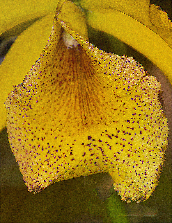
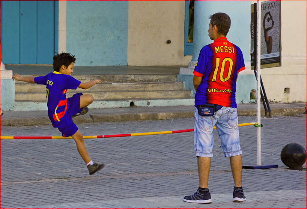
| 1 |
Apr 22 |
Comment |
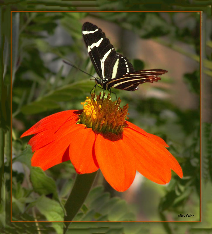
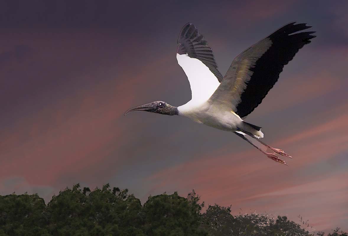
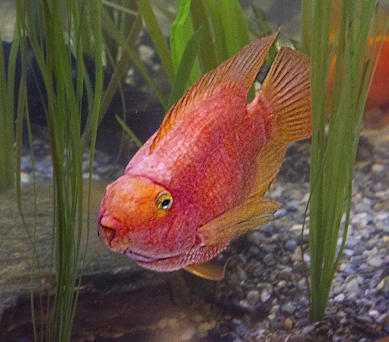
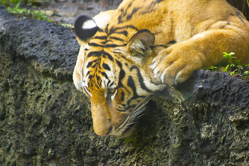
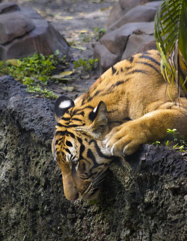
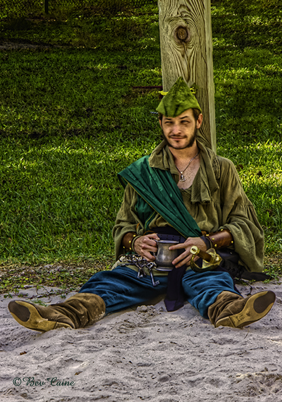
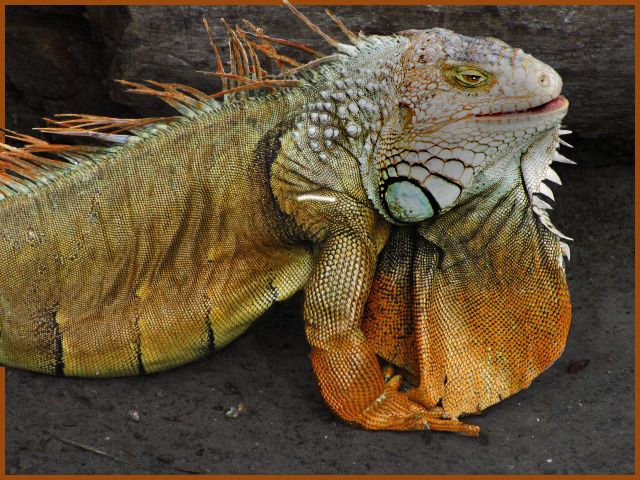
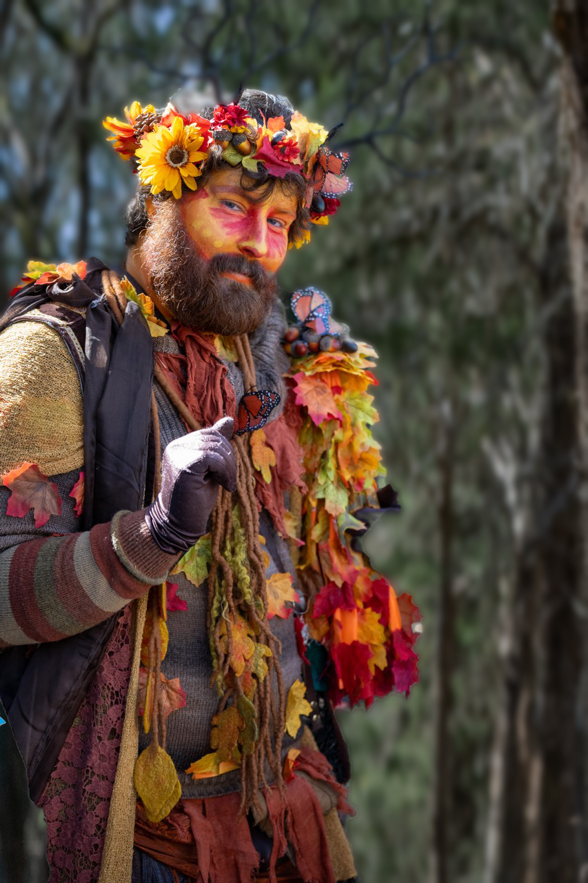
Great shot but a touch too contrasty for my taste. So I took it into photoshop and selectively darkened this fellow and the foliage that he was sitting on. Hope you like it. |
Apr 3rd |
 |
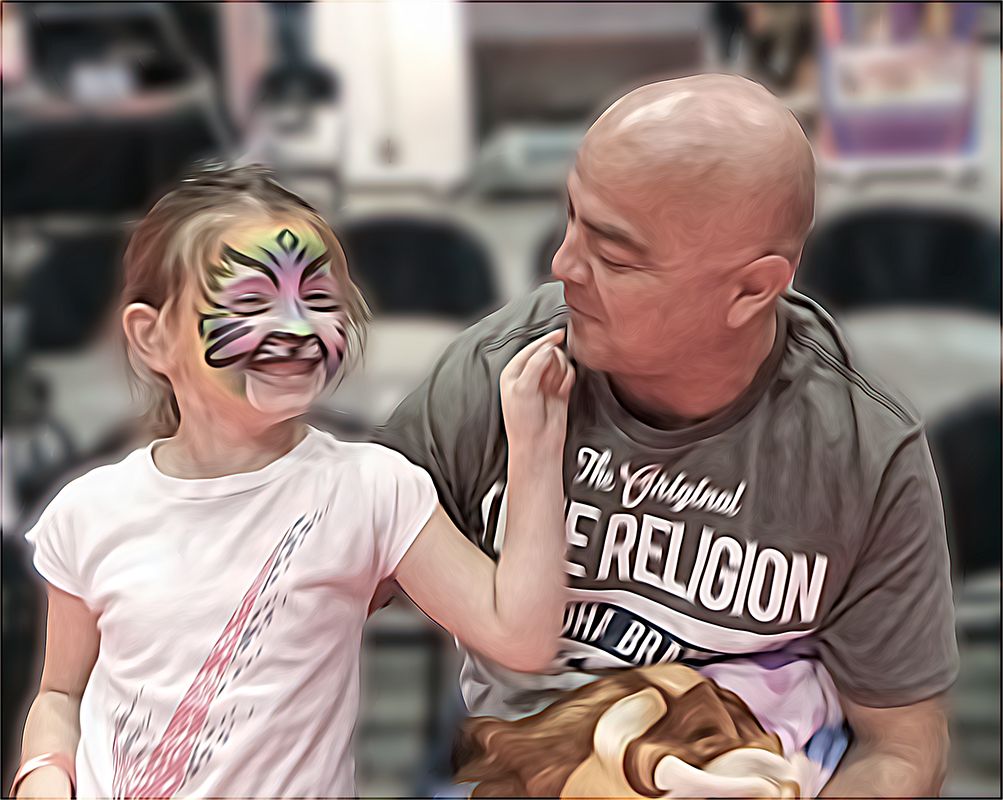
| 1 |
Apr 22 |
Comment |
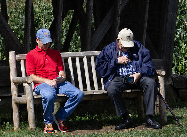
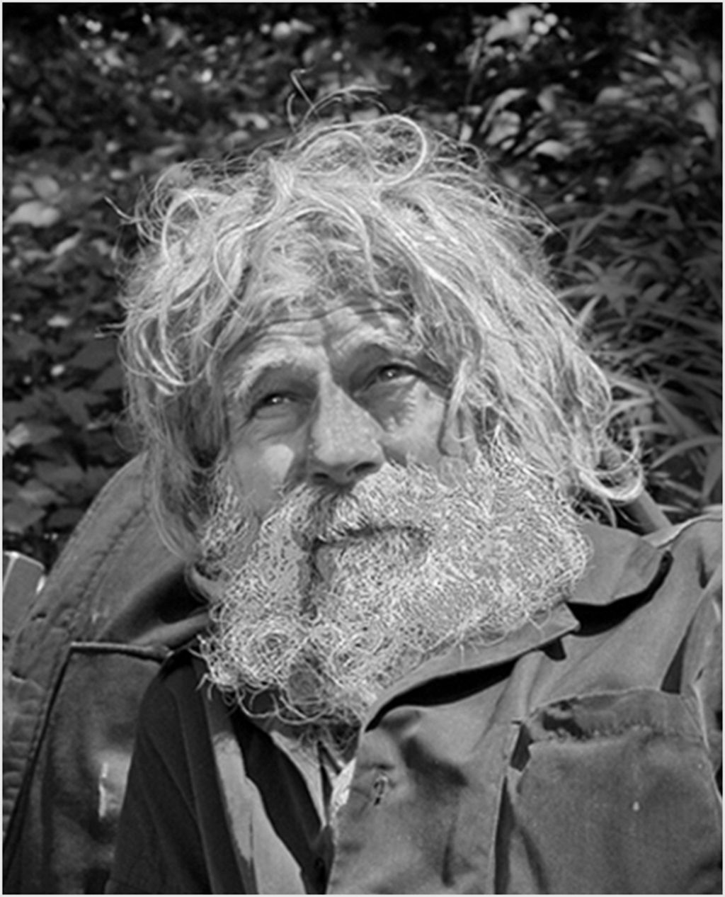
Loved the Bronx zoo as a child and as we are now in Florida haven't been there in more than 50 years. This is a great image and whatever you did do, you obliterated the glass. Wonderful result. |
Apr 3rd |
2 comments - 0 replies for Group 1
|
| 2 |
Apr 22 |
Comment |
You're welcome |
Apr 29th |
| 2 |
Apr 22 |
Reply |
Thanks |
Apr 21st |
| 2 |
Apr 22 |
Comment |
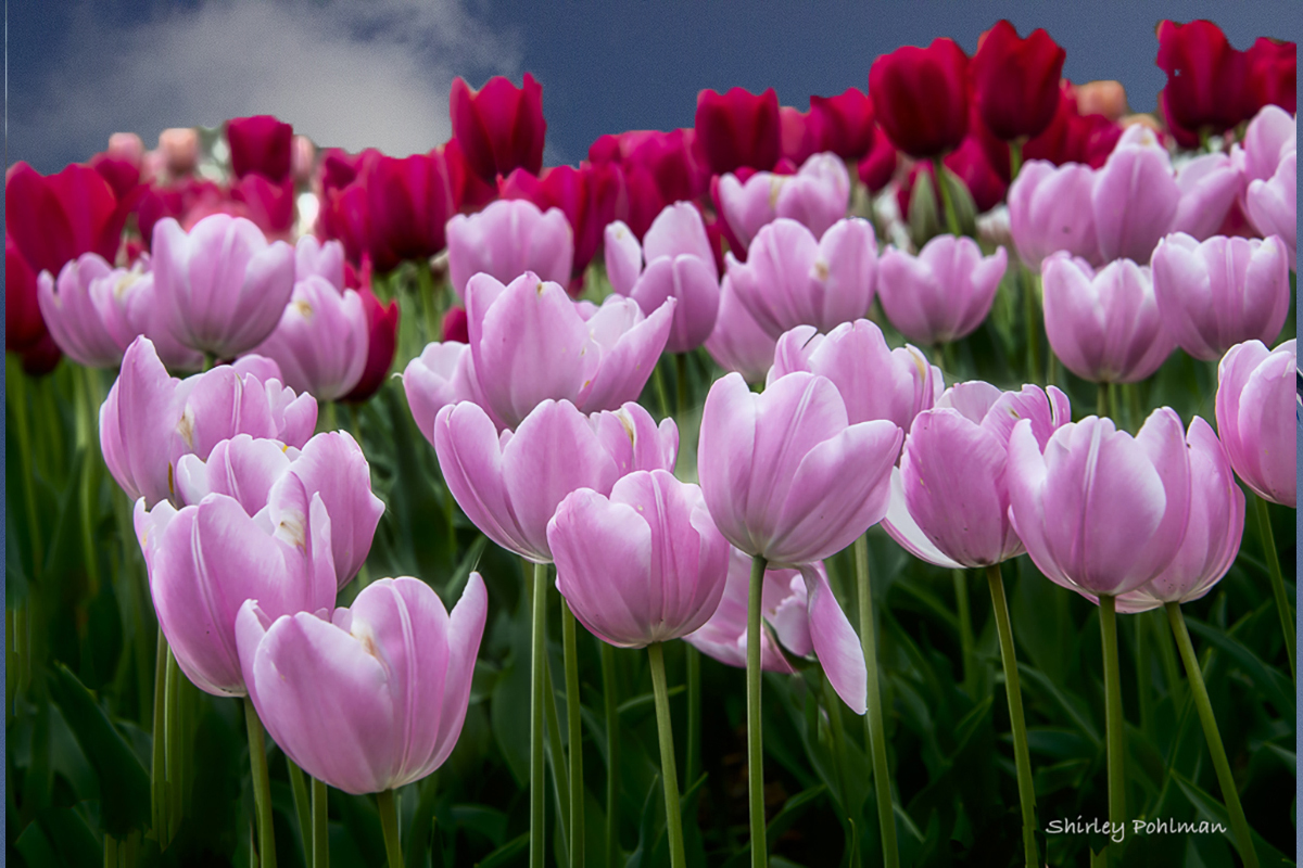
I don't care for the darkened background, but what do you think of a sky |
Apr 20th |
 |
| 2 |
Apr 22 |
Comment |
You did a great job. The improvements you made really added to the image. Congratulations on a job well done |
Apr 3rd |
| 2 |
Apr 22 |
Comment |
Lovely image but find the white in the background very distracting so I selected that and chose one of my textures as a replacement. What do you think? |
Apr 3rd |
 |
4 comments - 1 reply for Group 2
|
| 3 |
Apr 22 |
Comment |
You're welcome. Come and visit me in 48 any time. |
Apr 3rd |
| 3 |
Apr 22 |
Comment |
I like your sky but I thought the building lost a little bit of "oomph" so I went to image, adjustments, vibrance and increased both the vibrance and the saturation and then went to brightness and toned it down just a tiny bit. What do you think. |
Apr 3rd |
 |
| 3 |
Apr 22 |
Comment |
Hope you don't mind that I will chime in on the conversation. If you only showed the image without the original, I would not necessarily think it had been creatively edited. If both were shown I would be more inclined to think it had been edited. However, the next question is, does the club have criteria for what makes up a creative image. I belonged to a club where one member threatened to quit because the creative images were so much better than his and there was no creative section in the competitions at the time.
That said, I think what you did enhances this image tremendously and certainly gives me the impetus to try it with so many of the trees down here in south Florida. |
Apr 3rd |
3 comments - 0 replies for Group 3
|
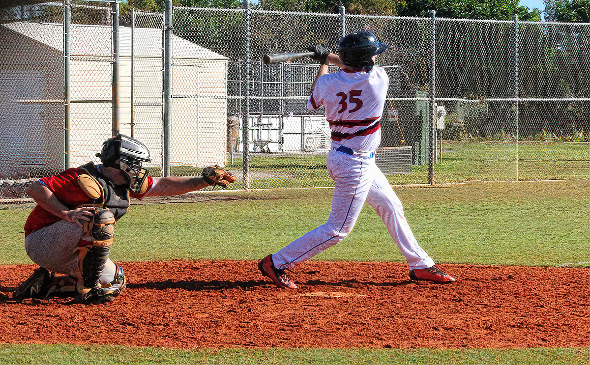
| 4 |
Apr 22 |
Comment |
I love Eric's comments re being in study groups. I wish he would go into all the groups and say the same thing. We have such difficulty in getting many members to see the value of just that! |
Apr 23rd |
| 4 |
Apr 22 |
Reply |
Sorry I guess I misunderstood. I assumed you were photographed a plane that was landing. Sorry. It is a great creation |
Apr 3rd |
| 4 |
Apr 22 |
Comment |
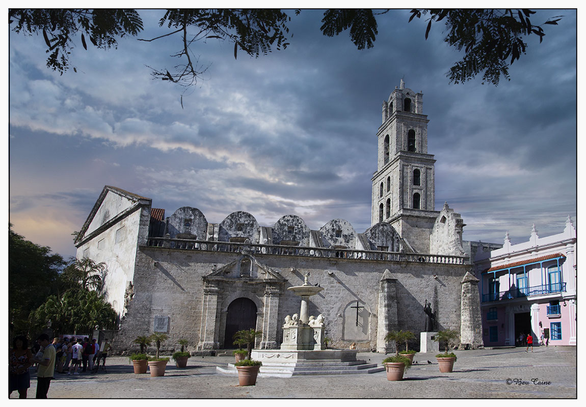
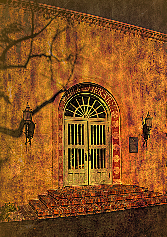
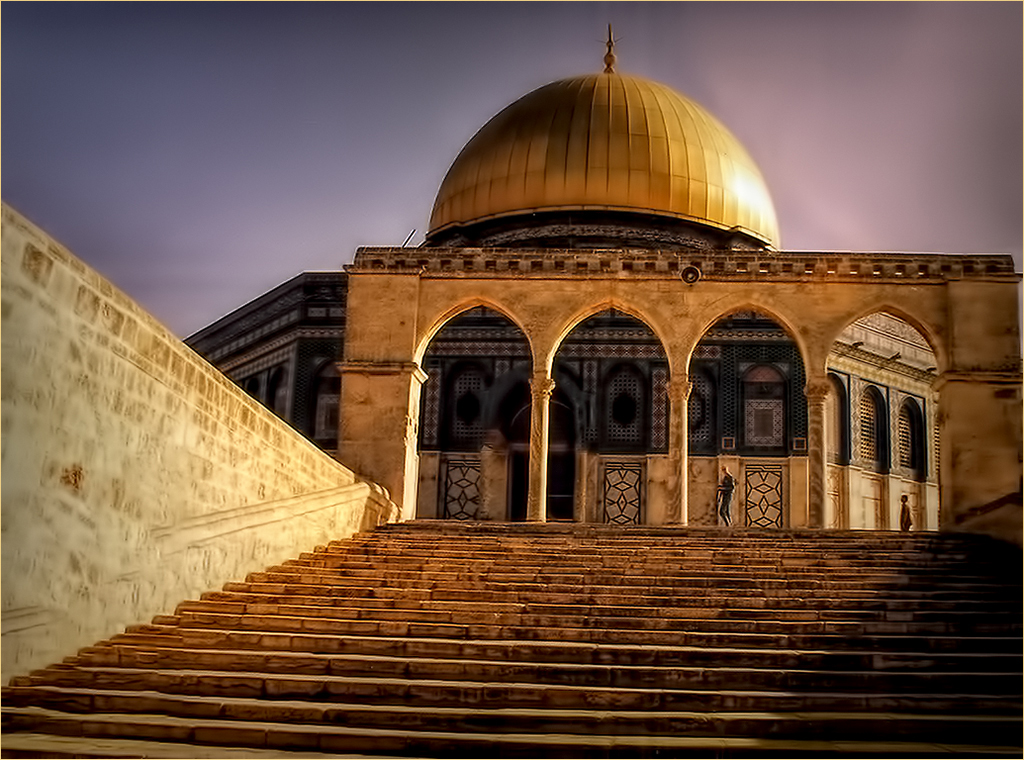
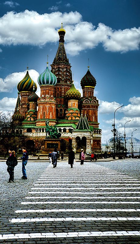
I like this image very much. It reminds me of an image of the cathedral in Obidos, Portugal that I sent to Petersons Photographic many years ago on a lark and found that it got published. My only corrective comment would be (and please note that I used to drive my first photographic comment with this) is that it is off by an almost miniscule angle tilting toward the left. If you to Extras and View or Control H in photoshop, you can see it if you look closely at the perfectly straight vertical lines. |
Apr 3rd |
| 4 |
Apr 22 |
Comment |
This is a great image Isaac, but the final result is not the same plane that is your original image. |
Apr 3rd |
3 comments - 1 reply for Group 4
|
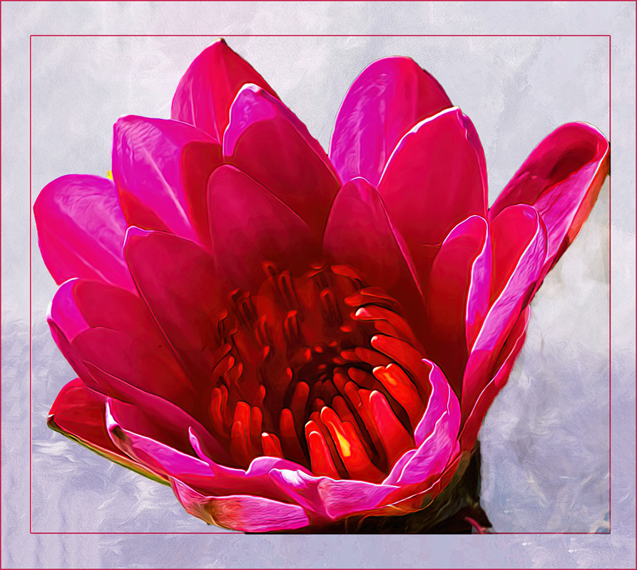
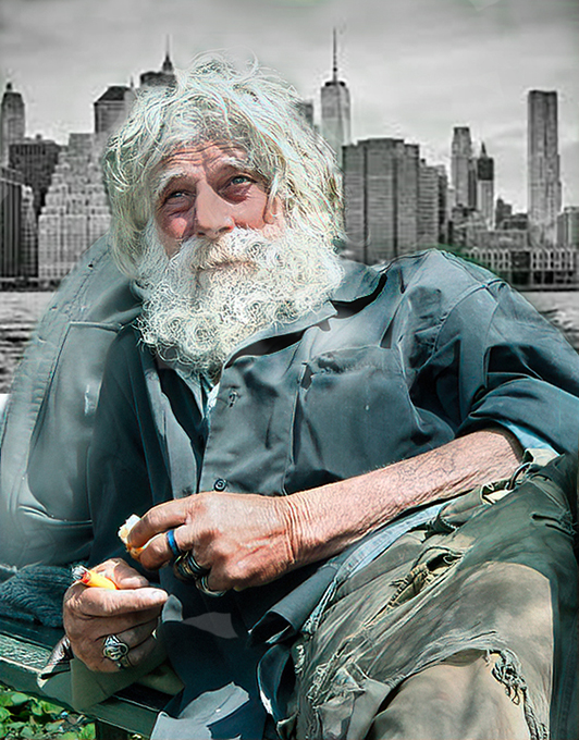
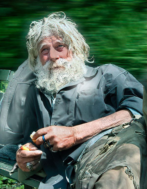
| 5 |
Apr 22 |
Comment |
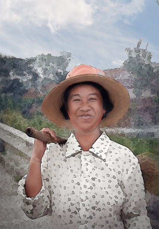
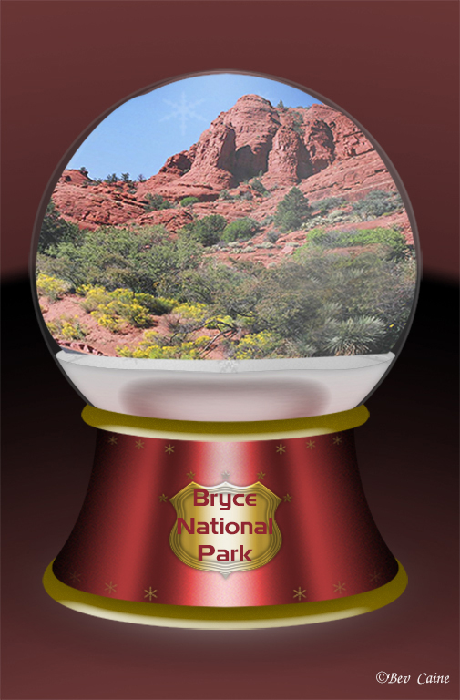
I think it's a great image from one of the venues I love to visit, but I do think it needed a bit more pop. So I took it into photoshop, selected the background by selecting the image and then did inverse, and darkened it a bit using adjustments I followed that by using adjustments, vibrance and increased both the vibrance and saturation of the image. Do you like the result. |
Apr 3rd |
 |
| 5 |
Apr 22 |
Comment |
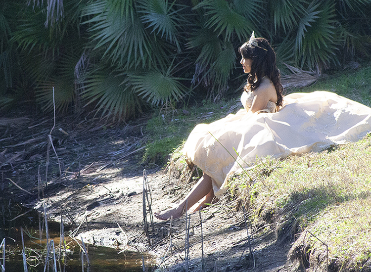
Adorable. |
Apr 3rd |
2 comments - 0 replies for Group 5
|
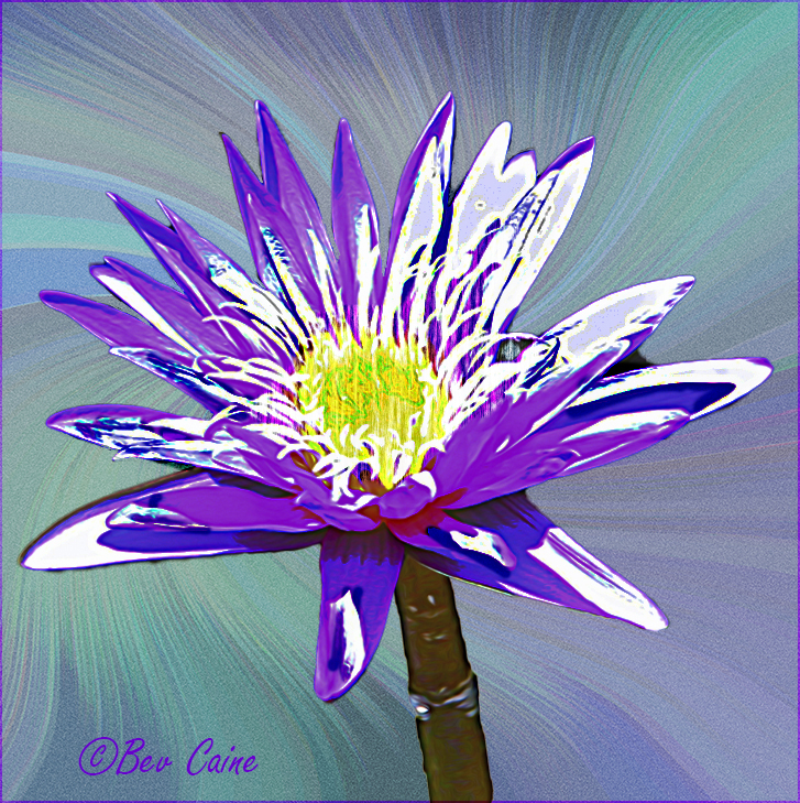
| 6 |
Apr 22 |
Comment |
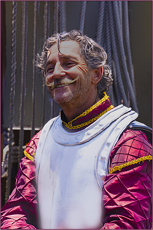
My favorite photography and superbly executed. Absolutely lovely |
Apr 3rd |
1 comment - 0 replies for Group 6
|
| 15 |
Apr 22 |
Comment |
Personally, I like this image and I think that the halo is an added plus. I don't think they're ugly at all and on my screen they are quite sharp. |
Apr 3rd |
1 comment - 0 replies for Group 15
|
| 17 |
Apr 22 |
Comment |
Took out both on the left and I, too, agree with the gentlemen...much more "striking" |
Apr 11th |
 |
1 comment - 0 replies for Group 17
|
| 20 |
Apr 22 |
Comment |
This is a lovely image, but you would do your group members and visitors a service if you would include a bit as to how you created this |
Apr 4th |
| 20 |
Apr 22 |
Comment |
I love your result. I a very interested in using textures and would be curious to know where did you get, or how you created this texture |
Apr 4th |
| 20 |
Apr 22 |
Comment |
I love your result. I a very interested in using textures and would be curious to know where did you get, or how you created this texture |
Apr 4th |
| 20 |
Apr 22 |
Comment |
This is great. No room for improvement here as far as I'm concerned |
Apr 3rd |
4 comments - 0 replies for Group 20
|
| 21 |
Apr 22 |
Reply |
I am definitely a New Yorker at heart, but my son in law who is an NYPD warns me that if I come back I wouldn't recognize it and I would be devastated. So I just revel in my memories. |
Apr 5th |
| 21 |
Apr 22 |
Comment |
In a sentence....Love the creativity.....Love the result |
Apr 4th |
| 21 |
Apr 22 |
Comment |
Coney Island always had a special place in my heart. My grandmother's brother lived there and we visited often. I wasn't big on the rides as I always had a fear of heights but would give anything for a Nathan's hot dog and French fries.
That said, this image is really special. Love what you did with the sky and I do appreciate the effort that created the "other half" of the ride..
|
Apr 4th |
2 comments - 1 reply for Group 21
|
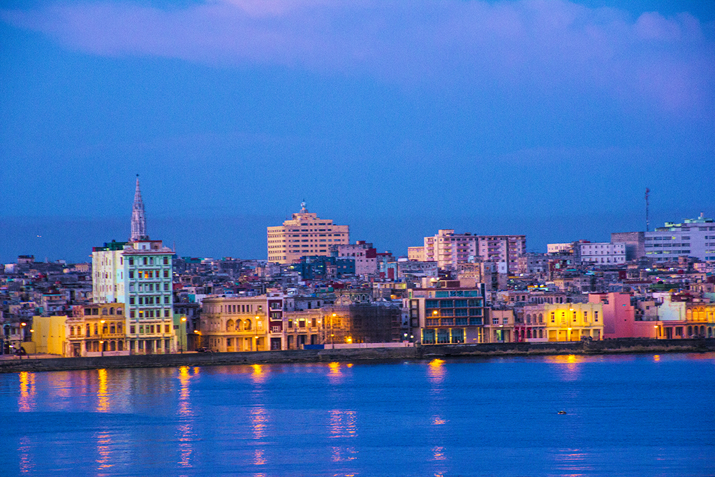
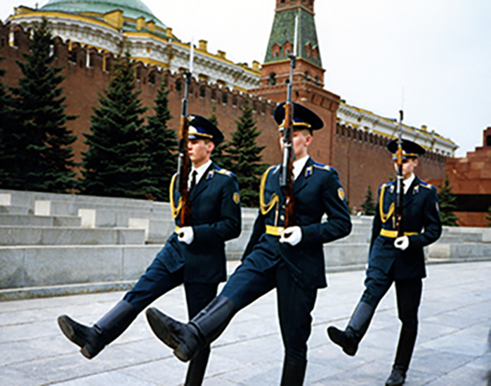
| 22 |
Apr 22 |
Comment |
Great image. I do agree with Joseph re the brightness and it does bring back memories of the 2014 Albuquerque conference. Well Done |
Apr 4th |
1 comment - 0 replies for Group 22
|
| 23 |
Apr 22 |
Reply |
Just saw your note and will be heading to my group shortly to read your remarks. I agree with you 100% of these study groups |
Apr 7th |
| 23 |
Apr 22 |
Comment |
This is a fabulous result from the original which you were kind enough to submit. Your comments re the viewer suggesting changes, improvements, etc. are exactly what these groups are about....learning new techniques, seeing different images, and getting ideas from each other. I have come across some who say "don't change my image" and get insulted if I make a suggestion they don't like. I just chalk it up to "their loss". Do come and visit me in group 48. Would love another opinion on my submission this month.
|
Apr 4th |
1 comment - 1 reply for Group 23
|
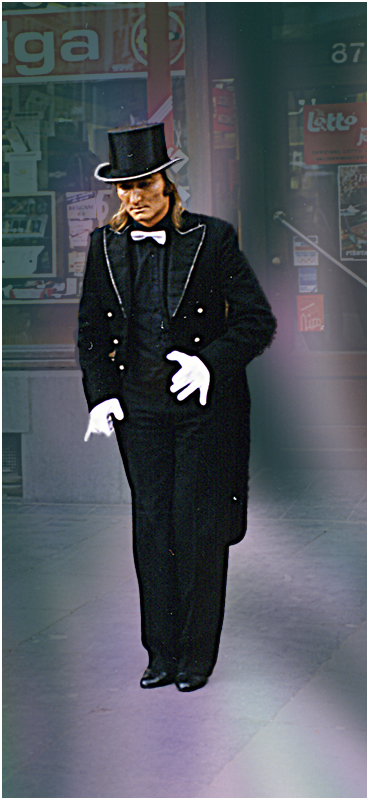
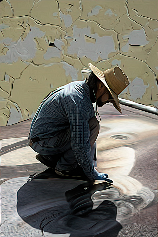
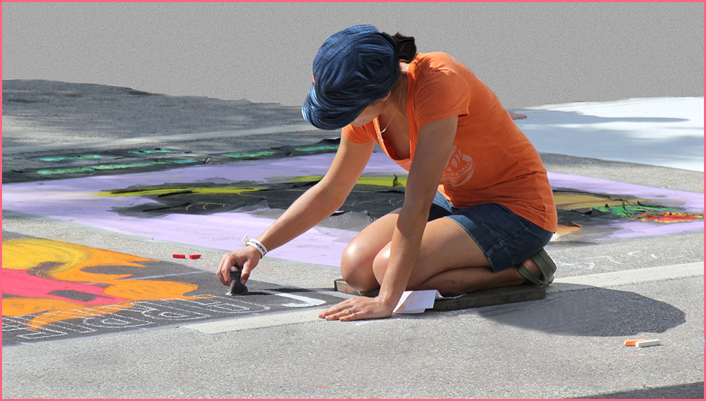
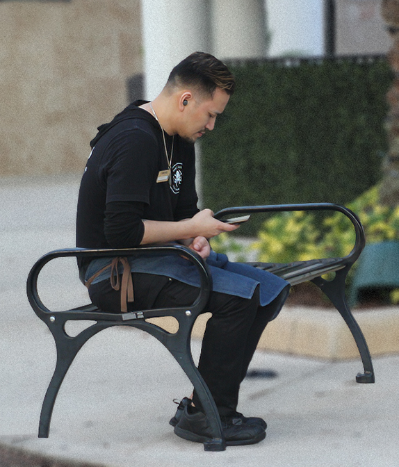
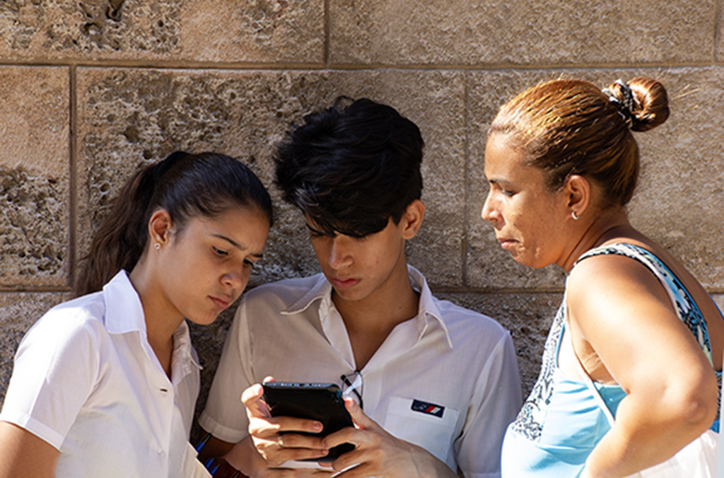
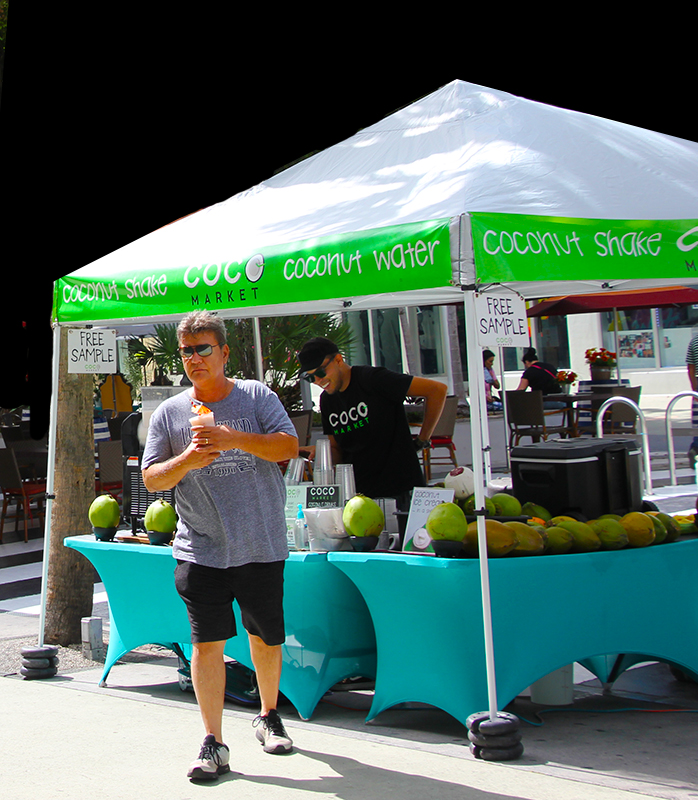
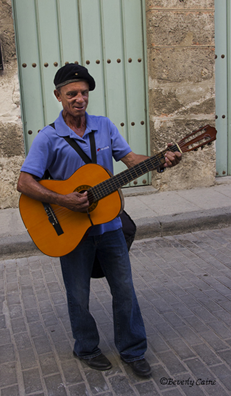
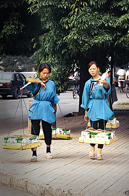
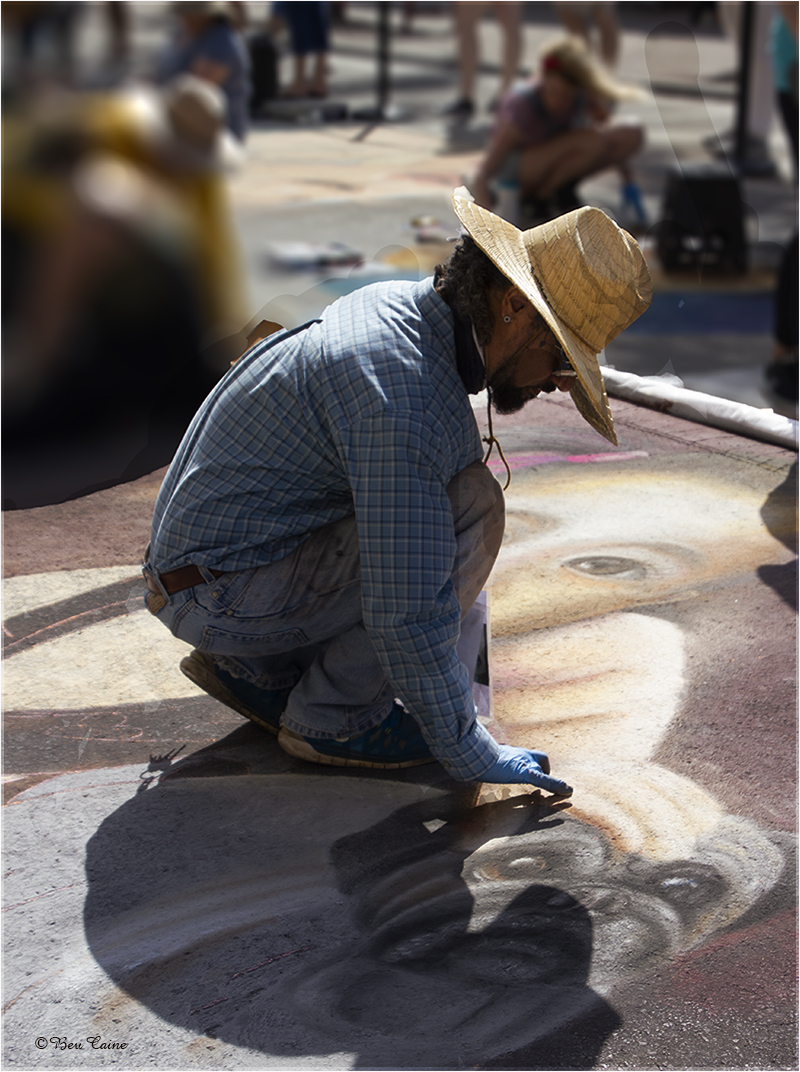
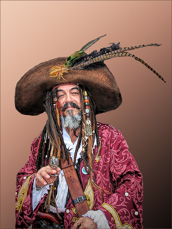
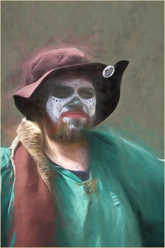
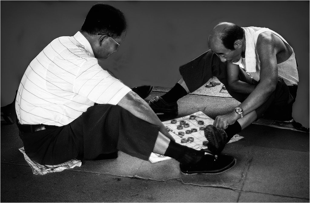
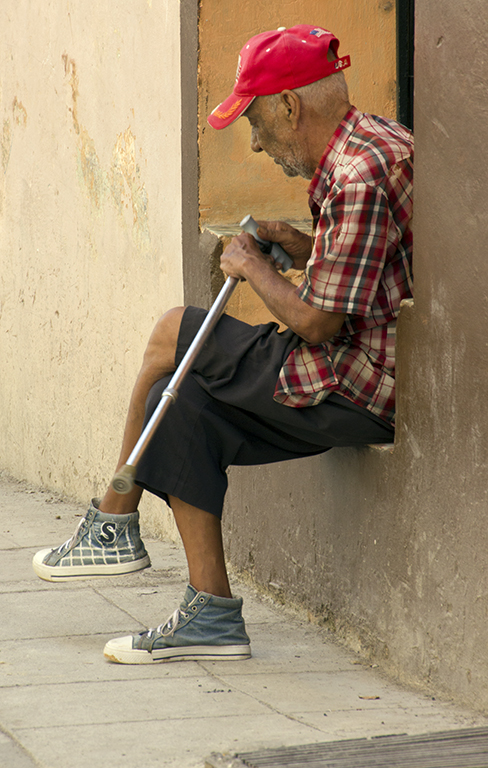
| 48 |
Apr 22 |
Comment |
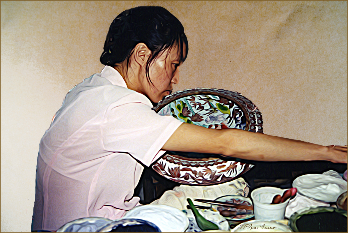
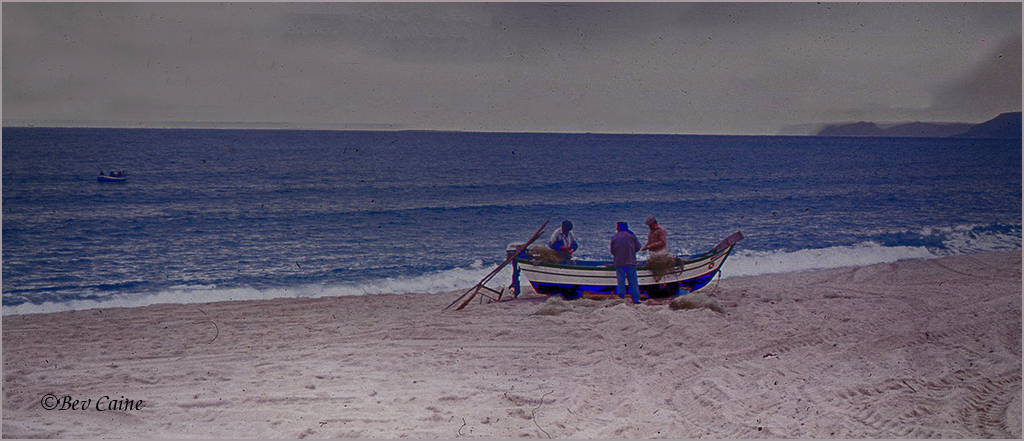
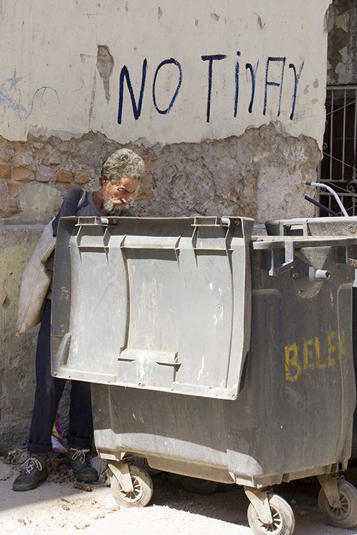
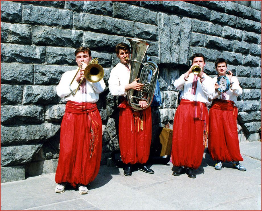
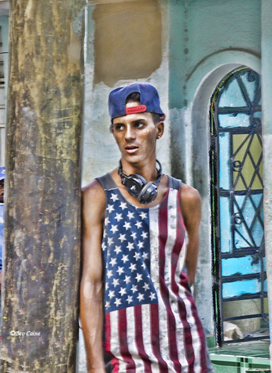
I think this would do very well in a street photography competition. It's very well executed and tells a nice story. |
Apr 8th |
| 48 |
Apr 22 |
Comment |
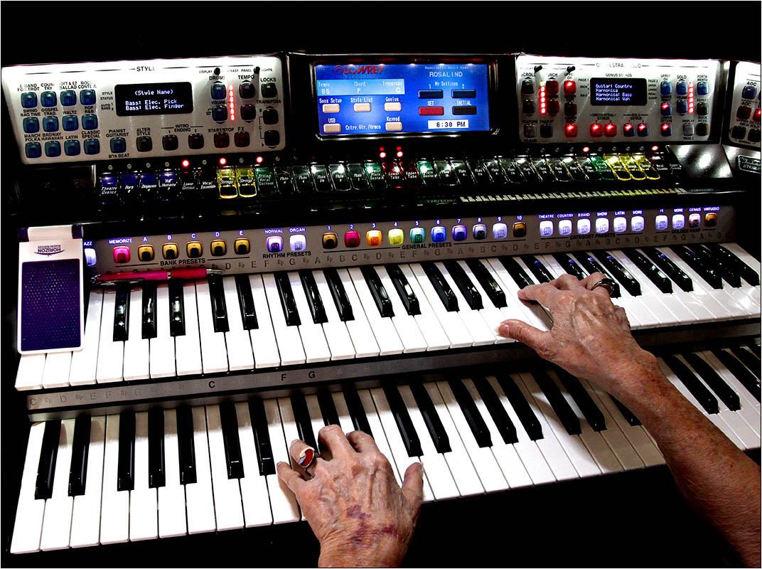
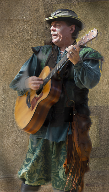
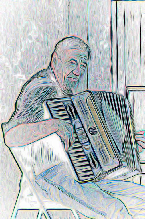
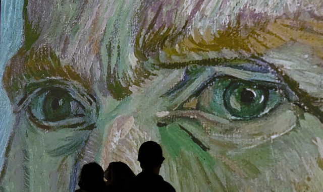
I love this image. I am perfectly ok without his eyes as this "pose" tells me he is really concentrating on creating his music which is what it's all about. |
Apr 8th |
| 48 |
Apr 22 |
Comment |
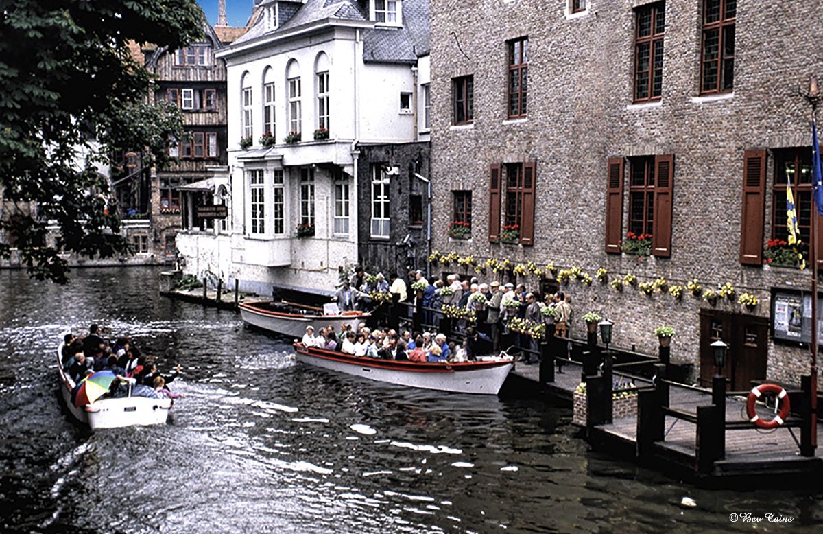
I used to have a membership there and visit whenever I had some free time. Loved it. This is a great image; and, yes I think Tom's crop is a great improvement. The dead space is extraneous. |
Apr 8th |
| 48 |
Apr 22 |
Comment |
They've all said it all. It's really super. I don't have an Iphone...simply an Android and every time I try to take a photo it takes me forever to find it so I guess I'll be a Canon girl forever.. I am, however, amazed by the quality of the work I've seen that comes from my friend's phone. |
Apr 8th |
| 48 |
Apr 22 |
Comment |
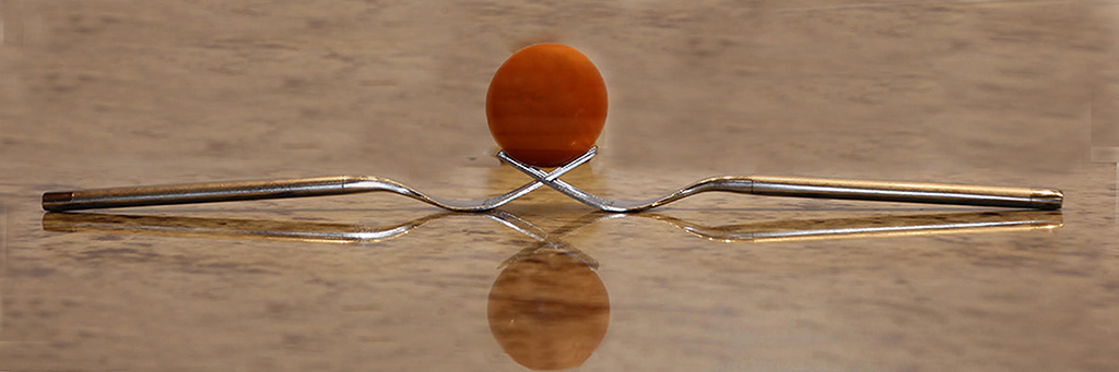
This is a pretty image but not one that I would call exciting. So I tried to "pump it up a bit" by changing the sky. All I did was go into Photoshop, click sky replacement and came up with the attached. What do you think? |
Apr 8th |
 |
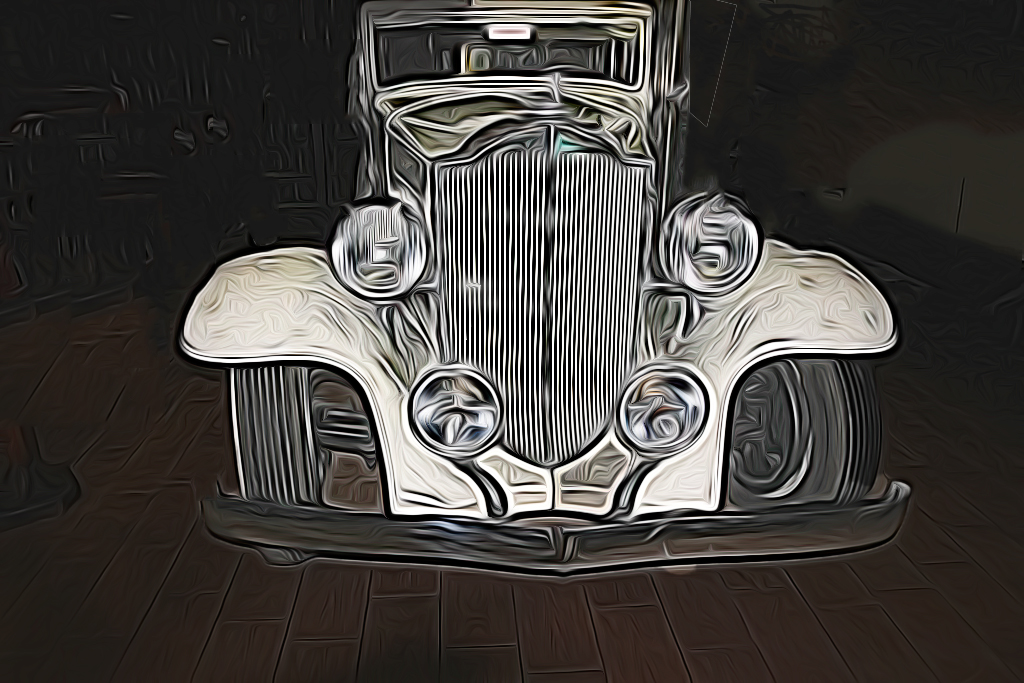
| 48 |
Apr 22 |
Comment |
This is extremely well done. I almost think I see the propellors turning. |
Apr 8th |
| 48 |
Apr 22 |
Reply |
You definitely have the talent...the hardest part is having the patience. |
Apr 8th |
| 48 |
Apr 22 |
Reply |
ME TOO |
Apr 8th |
| 48 |
Apr 22 |
Reply |
Thanks. Interesting enough I spoke with my friend who was the judge last night and asked her what would have improved the image. Believe it or not, her suggestion was to consider making one pen a different color. So much for judges. |
Apr 8th |
| 48 |
Apr 22 |
Reply |
I love it I'm not familiar with PS filters and would love to know more about where and how |
Apr 7th |
| 48 |
Apr 22 |
Comment |
Got an 8 out of 10. I was very disappointed. Her comments were nothing worthwhile for me...."I don't know, I'm not sure" etc. And I also entered last month's image which was what I thought highly rated by our group and that also got an 8. So much for judges. |
Apr 7th |
| 48 |
Apr 22 |
Comment |
Got an 8 out of 10. I was very disappointed. Her comments were nothing worthwhile for me...."I don't know, I'm not sure" etc. And I also entered last month's image which was what I thought highly rated by our group and that also got an 8. So much for judges. |
Apr 7th |
| 48 |
Apr 22 |
Reply |
I sounds much more complicated than it is. Any time you want to try it, call me and I'll walk you through it. 561-752-3992 |
Apr 4th |
| 48 |
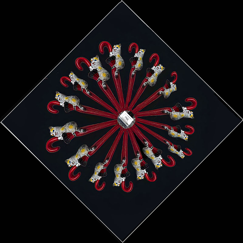
Apr 22 |
Reply |
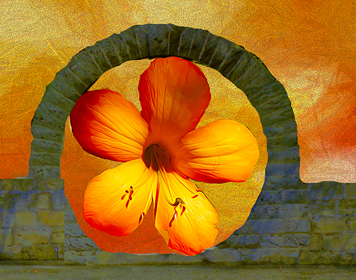
I started with a circle. I then created a new layer and copied and pasted one pen. Each pen was copied and pasted on a separate layer. I turned and twisted them into position by going to edit, transform, rotate and gradually rotated them so that the point was in the center of the circle. Once that was set, I painted the original circle layer black and then placed a white stroke around the whole thing. As I wasn't happy with the center because I couldn't get the pen points to touch in the center, I took the ink bottle from another pen image I had and placed in the center thus also giving me a name for the image. When all that was done, I flattened the image again and then went to image rotation arbitrary and turned the image to where I wanted it Hopes this helps. |
Apr 3rd |
| 48 |
Apr 22 |
Reply |
I had a deadline as the competition is this Tuesday so I submitted it as is and am hoping for the best. The reason I went with the ink bottle was that no matter how I tried, I couldn't get the pen points to line up so I used that as a way of hiding them. Thanks to both of you for your input. |
Apr 2nd |
8 comments - 7 replies for Group 48
|
33 comments - 11 replies Total
|