|
| Group |
Round |
C/R |
Comment |
Date |
Image |
| 1 |
Mar 21 |
Reply |
Do you have Topaz Studio 2? If so, open it, go to Adjust AI - play around with the sliders and see what you like, for additional push after what you've done there you can go into Image, Adjust, Vibrance and increase that a touch and increase the saturation...see what you come up with. |
Mar 4th |
| 1 |
Mar 21 |
Comment |
Visiting from 48 & 80
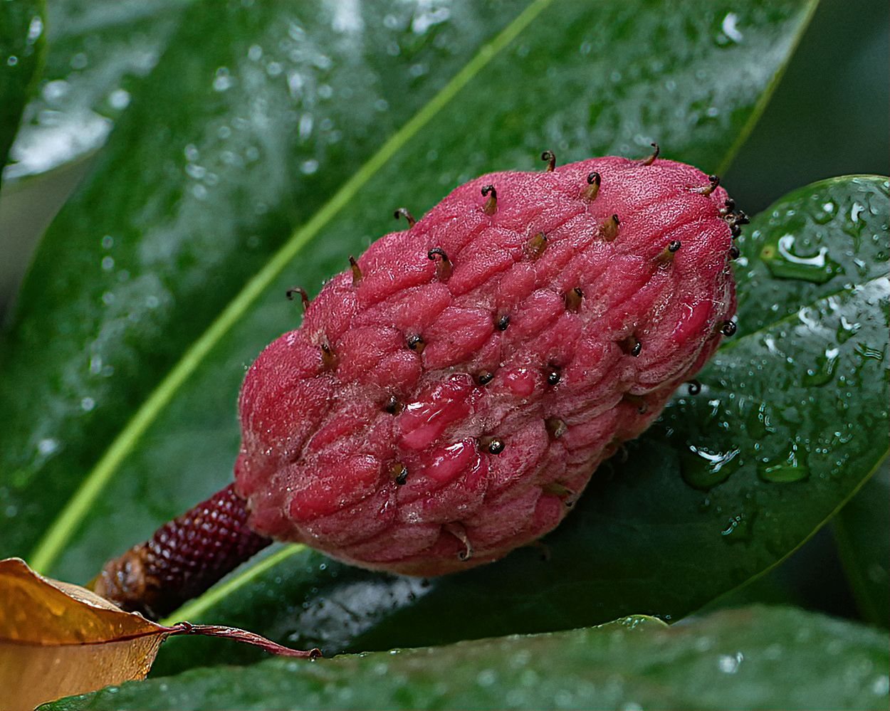
The composition is great but I couldn't quite put my finger on to what I felt was missing so I took it into Topaz Studio two and played around a bit and came up with this which I think has a bit more impact. What do you think?
|
Mar 2nd |
 |
| 1 |
Mar 21 |
Comment |
Visiting from 48 & 80
How graceful. Beautiful bird against a perfect background of a sky that is not overpowering the bird. Well done. |
Mar 2nd |
2 comments - 1 reply for Group 1
|
| 3 |
Mar 21 |
Reply |
Talking about Amazon....I've been wanting to purchase a pair of house slippers for a couple of weeks and been unable to get out due to many other commitments. Finally gave up and went to Amazon...bought them in 5 minutes and never had to leave my house. |
Mar 7th |
| 3 |
Mar 21 |
Reply |
Talking about Amazon....I've been wanting to purchase a pair of house slippers for a couple of weeks and been unable to get out due to many other commitments. Finally gave up and went to Amazon...bought them in 5 minutes and never had to leave my house. |
Mar 7th |
| 3 |
Mar 21 |
Reply |
no problem |
Mar 4th |
| 3 |
Mar 21 |
Comment |
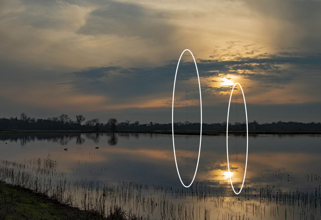
I love this image but I noticed two things that disturbed. I couldn't figure out if it was supposed to be part of the image or an artifact that should be removed so I highlighted them for you to decide. |
Mar 2nd |
 |
| 3 |
Mar 21 |
Reply |
Just went to Amazon - they have more foam core than the Michaels near me ever had and it gets delivered right to my front door. |
Mar 2nd |
| 3 |
Mar 21 |
Comment |
Visiting from 48 & 80
I did this once for a club competition assignment and I have to tell you, yours came out much better than mine. Beautiful image. Thanks LuAnn for the suggestion on the foam core and I don't doubt that you can probably get it on Amazon. I'm going to give it a shot later today as I have a couple of things that I bought in a dollar store I want to try it with.
|
Mar 2nd |
2 comments - 4 replies for Group 3
|
| 4 |
Mar 21 |
Comment |
Nice image Isaac. And some people say you can't see anything on a cruise. How wrong they are. |
Mar 2nd |
| 4 |
Mar 21 |
Comment |
The image is beautiful but what surprised me more was hearing the name Skaneateles. About 30 years ago, I was on a cruise out of New York and met a couple from Skaneateles which was the first time I ever heard of this town in upstate NY. She was a photographer and I don't remember what he did. We lost touch but I will never forget that they were the ones who convinced me that the ultimate photographic journey was Africa...they had just returned. Were they ever right. As a travel agent who has been around the world, I consider that one of my all time favorite trips. |
Mar 2nd |
2 comments - 0 replies for Group 4
|
| 5 |
Mar 21 |
Reply |
Thanks - fabulous result |
Mar 2nd |
| 5 |
Mar 21 |
Comment |
Visiting from 48 & 80
Brings me right back to our visit to Japan many years ago. I find it interesting that so many of us are now scanning from negatives. I think we're all a bit COVID crazy and being in so much have the time to enjoy wonderful memories.
This is a beautiful image that tells the story at first look.
Well done. |
Mar 1st |
| 5 |
Mar 21 |
Comment |
I've been playing with Marie's methods since she gave a webinar at Coral Springs and also have a problem softening the edges. My hand is not steady enough so I usually stick with the sharp edges. This is magnificent How did you create the texture with the two colors? I haven't perfected that yet. |
Mar 1st |
2 comments - 1 reply for Group 5
|
| 9 |
Mar 21 |
Reply |
Love it. Glad you like it as well. |
Mar 15th |
| 9 |
Mar 21 |
Comment |
This is a lovely image. My only suggestion would be to tone down the pink a little bit. To my eye it overpowers the green. But that's a personal opinion, not meant to denigrate the fine work you've done on this image. Hoping you'll come and visit me in group 48 once in a while. |
Mar 11th |
1 comment - 1 reply for Group 9
|
| 10 |
Mar 21 |
Comment |
The best part is seeing how many things a "stroke of the brush" can be created and all are lovely. |
Mar 18th |
| 10 |
Mar 21 |
Comment |
Sorry I should have said administrator of group 48. Leave it to my husband to catch the error |
Mar 15th |
| 10 |
Mar 21 |
Comment |
Visiting from 48 & 80
I've had more whale watching opportunities but never had this kind of luck. Donna's improvement is terrific. Great capture and I think if you pick up on Donna's suggestion, you'll have a hands down winner |
Mar 12th |
| 10 |
Mar 21 |
Comment |
Visiting from 48 & 80
This image has evolved somewhat to become an abstract probably thanks to the glass that you shot through. I'm personally not a big fan of abstract but I do like this one very much and am somewhat intrigued with the result. |
Mar 12th |
| 10 |
Mar 21 |
Comment |
Visiting as a member of 80 and administrator of 80
Not only is your image very well done and intriguing, but I must commend you on your description as well as your description of what you did and why. That's what these study groups are all about. |
Mar 12th |
| 10 |
Mar 21 |
Comment |
Visiting from 48 & 80
This image immediately caught my eye. However, I wish you had provided more info on what it's all about, what you did, where it was taken, etc. Where were these lights and/or were they functional, decorative, etc.
Overall a very nice image. |
Mar 12th |
6 comments - 0 replies for Group 10
|
| 12 |
Mar 21 |
Comment |
Visiting from 48 & 80
I love the concept but I have reservations about the composition. I think I would like to see one complete flower as the centerpiece of the image with possibly a few smaller flowers surrounding the main subject |
Mar 12th |
| 12 |
Mar 21 |
Comment |
Visiting from 48 & 80
I love the concept but I have reservations about the composition. I think I would like to see one complete flower as the centerpiece of the image with possibly a few smaller flowers surrounding the main subject |
Mar 12th |
2 comments - 0 replies for Group 12
|
| 13 |
Mar 21 |
Comment |
Visiting from 48 & 80
Wow! the colors of the frog are super and so tack sharp they make this image stand out and gives the appearance of the frog just sitting there staring at the photographer. Well done! |
Mar 13th |
| 13 |
Mar 21 |
Comment |
Visiting from 48 & 80
Wow! the colors of the frog are super and so tack sharp they make this image stand out and gives the appearance of the frog just sitting there staring at the photographer. Well done! |
Mar 13th |
| 13 |
Mar 21 |
Comment |
Visiting from 48 & 80
Great image. I agree with Judith re cropping just a bit off the back to eliminate some of he out of focus "tail" of the snake, but I would leave a small amount of that to preserve the depth of field appearance |
Mar 13th |
3 comments - 0 replies for Group 13
|
| 15 |
Mar 21 |
Comment |
Visiting from 48 & 80
You couldn't have chosen a better title for this image. You did a great job on your improvements...keep up the good work |
Mar 13th |
| 15 |
Mar 21 |
Comment |
Visiting from 48 & 80
I love flower photography. You did a great job on the background. I do think that if you could brighten the center of the flower and sharpen just that a tad, it would really pull the eye there and away from the softer back petals. If you have Topaz Studio 2 there are enough options to play with there that may improve this image the little bit it could use. Overall well done |
Mar 13th |
| 15 |
Mar 21 |
Comment |
Visiting from 48 & 80
Love what you did here. It is so aptly titled as well. I keep coming back to it and admiring the result. Very well done. |
Mar 13th |
3 comments - 0 replies for Group 15
|
| 16 |
Mar 21 |
Comment |
Great composition. I do see quite a bit of noise, which you can easily get rid of if you have any of the Topaz filters. Several of them offer noise reduction and they do a great job. Don't mean to be super critical but I find the white background a bit "blinding" I would try offering a change option but for the moment I'm relegated to my laptop which doesn't have most of my photoshop amenities. Overall a great catch |
Mar 13th |
1 comment - 0 replies for Group 16
|
| 17 |
Mar 21 |
Comment |
Visiting from 48 & 80
Love this image. Makes the viewer wonder what's going on in her mind. Beautifully captured. |
Mar 13th |
| 17 |
Mar 21 |
Comment |
Your tweak is an improvement over my suggestion. Nice |
Mar 13th |
| 17 |
Mar 21 |
Comment |
Visiting from 48 & 80
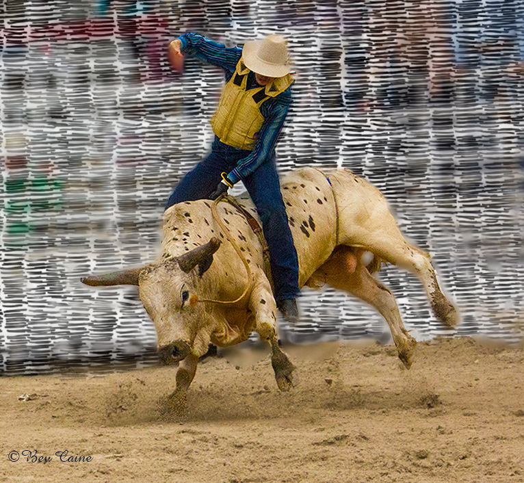
This is a great action shot. To offer another option, I recently had a similar situation and instead of converting to a monochrome, I used a texture I had found online and built a fence. I was able to keep the color but eliminate what I didn't want. Final result here for your consideration |
Mar 11th |
 |
3 comments - 0 replies for Group 17
|
| 19 |
Mar 21 |
Comment |
Visiting from 48 & 80
Easy fix to remove the power line. Select the wires individually, content aware fill. Took me les than five minutes...Otherwise, a lovely image. |
Mar 13th |
 |
1 comment - 0 replies for Group 19
|
| 20 |
Mar 21 |
Comment |
Visiting from 48 & 80
You did a a great job. The trick here was to envision what you wanted and accomplish it perfectly. Great result. |
Mar 13th |
| 20 |
Mar 21 |
Comment |
Visiting from 48 & 80
From a very pretty flower picture you created a masterpiece. Well done. My guess is that the processing included a very talented use of textures for a starter. |
Mar 13th |
2 comments - 0 replies for Group 20
|
| 22 |
Mar 21 |
Comment |
Visiting from 48 & 80
This image is so cute. As the other comments say it all. I saw your comment that you wish you had more experience in working with layers. Check out MarieAltenburg.com she has some interesting stuff on working with textures and I believe she may have some information. I believe she will also give lessons and knowing her work and how much I've learned from her, it's the best money you can spend. |
Mar 13th |
| 22 |
Mar 21 |
Comment |
Visiting from 48 & 80
This image is terrific. I used to have directions and lost them over the years. So, I've taken the liberty of printing your directions as I've been wanting to get back to this technique. |
Mar 13th |
| 22 |
Mar 21 |
Comment |
Visiting from 48 & 80
You did a lot of work on this image but it was really worth it in the end. Just lovely |
Mar 13th |
3 comments - 0 replies for Group 22
|
| 23 |
Mar 21 |
Comment |
Visiting from 48 & 80
Great capture. I'm not sure about the title, but I can't think of anything better. I do appreciate Shirley's comments on the mask because I have such ambivalent feelings about it myself. |
Mar 13th |
| 23 |
Mar 21 |
Comment |
Visiting from 48 & 80
Those eyes, the expression, I wouldn't want to be within 1/2 mile of him unless there was a fence between us. Great Capture. |
Mar 13th |
| 23 |
Mar 21 |
Comment |
Visiting from 48 & 80
Great image . However if you are working with Photoshop's latest version, sky replacement is as easy as one click. |
Mar 13th |
 |
3 comments - 0 replies for Group 23
|
| 24 |
Mar 21 |
Comment |
Visiting from 48 & 80
You did a great job of moving the dancers. I cropped off a lot of the dead space on top and wonder what you think. I loved that show when we were in China, but that was long before I became seriously involved in photography so I don't have anything worth posting. |
Mar 13th |
 |
1 comment - 0 replies for Group 24
|
| 25 |
Mar 21 |
Comment |
Visiting from 48 & 80
For a tomato lover, this is absolutely luscious. Makes me jealous that I never thought about doing something like this. |
Mar 13th |
1 comment - 0 replies for Group 25
|
| 27 |
Mar 21 |
Comment |
Visiting from 48 & 80
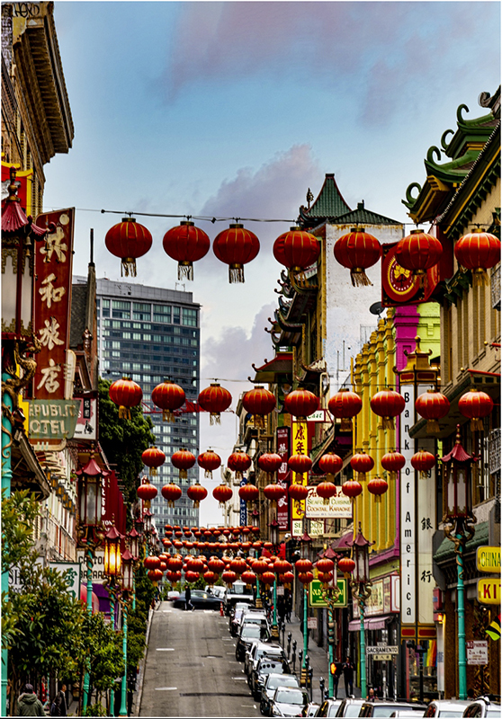
I, too find this image too busy. The first thing I did was crop out the huge light at the top of the image and then, in attempt to bring everything in a bit closer I did a transform distort an narrowed the image a bit giving the feel of leading lines. What do you think? |
Mar 13th |
 |
1 comment - 0 replies for Group 27
|
| 29 |
Mar 21 |
Comment |
Visiting from 48 & 80
Beautiful image just as it is, but I. too, would remove that small boat. |
Mar 14th |
| 29 |
Mar 21 |
Comment |
Visiting from 48 & 80
This image tells a story not uncommon to every city all over the world. I agree with Bob's comments regarding removing the motorcycles for the reasons he mentioned. The image is sharp and well done, it's just that the composition could use a little tweaking. |
Mar 14th |
| 29 |
Mar 21 |
Comment |
Visiting from 48 & 80
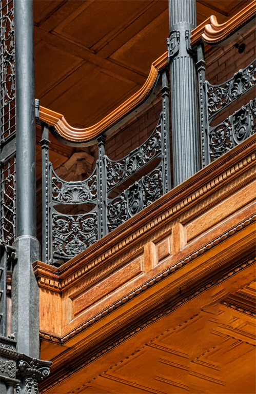
I agree with the previous comments re the post so I opened it in photoshop, selected just the post and did a content aware fill and I believe it is a great improvement. Otherwise a great image. |
Mar 14th |
 |
| 29 |
Mar 21 |
Comment |
Great image Bill |
Mar 14th |
4 comments - 0 replies for Group 29
|
| 30 |
Mar 21 |
Comment |
Visiting from 48 & 80
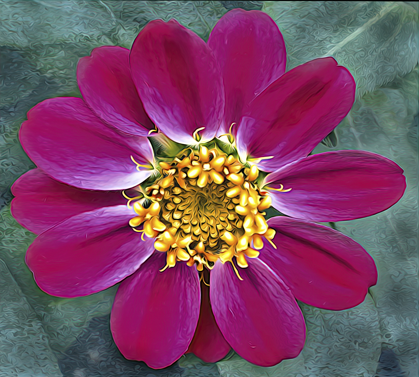
The flower is beautiful. The color combination works well. But as previously said, the stamens are a bit soft. You select these and sharpen them and then if it affects the background think about replacing it with a texture. My tablet isn't working at the moment so it's a bit rough but here is my thought. |
Mar 19th |
 |
| 30 |
Mar 21 |
Comment |
Visiting from 48 & 80
I, too, find this image a bit over crowded. I hate to get involved in what appears to be an argument over composition, but as an administrator of another group, I would be very distressed if this occurred in my group. Sometimes improving an image comes down to cropping out portions of the image and apparently that is what Judy did. We do not have to like all of the suggestions we receive, but I, for one, am grateful for all opinions. I accept many, and ignore many others but always thank those who are kind enough to take the time to review and often do just what Judy did. And sometimes cropping out half an image is the best way to improve it which may change the entire image. Certainly, suggested changes or alterations to an image are done in an attempt to be critical but rather offering other options with an eye to making that image interesting, less cluttered, etc. and should never take the comments as an offense.
|
Mar 14th |
2 comments - 0 replies for Group 30
|
| 34 |
Mar 21 |
Reply |
In that case yes. It is very well done and with my aging eyes, I sometimes look for a bit more light. |
Mar 15th |
| 34 |
Mar 21 |
Comment |
Visiting from 48 & 80
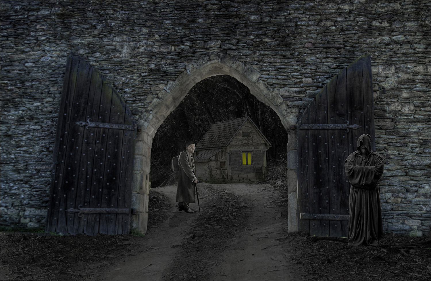
I find this image intriguing. However, and I don't doubt it's my own vision, I'd like to see it just a wee bit lighter. So, I'm attaching what I think might work but still retain the intrigue for your consideration |
Mar 14th |
 |
1 comment - 1 reply for Group 34
|
| 35 |
Mar 21 |
Comment |
Thanks Julie but since this pandemic, I don't think I've shot more than a couple of dozen images so I'll probably get around to it one of these days |
Mar 16th |
| 35 |
Mar 21 |
Reply |
Sorry, my eyes must be deceiving me |
Mar 15th |
| 35 |
Mar 21 |
Comment |
Visiting from 48 & 80
What an improvement over the original. I have a camera I was thinking about convert and then the pandemic came to visit and I haven't done anything but revive old images. |
Mar 14th |
| 35 |
Mar 21 |
Comment |
Visiting from 48 & 80
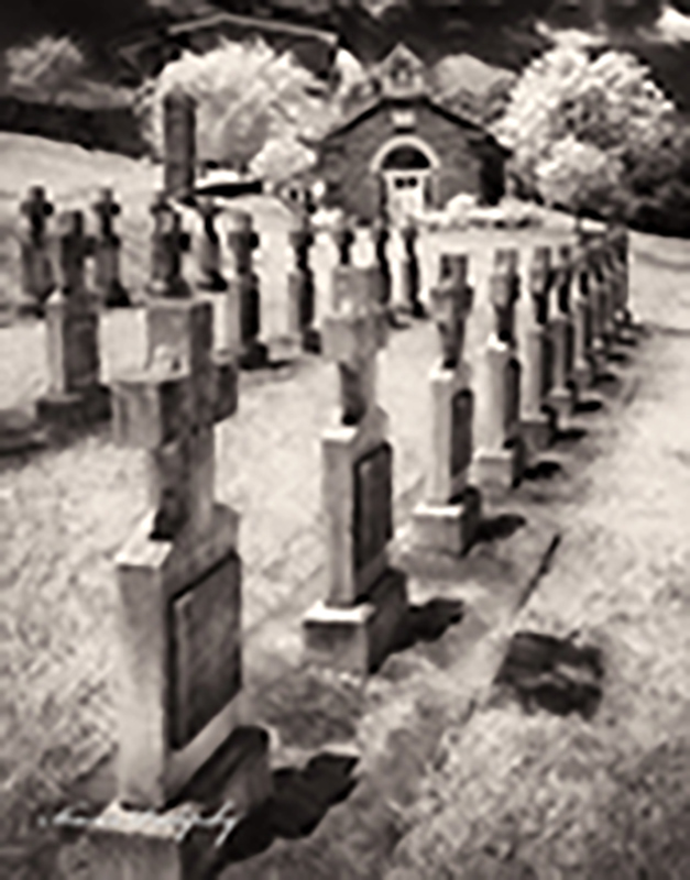
I find the image very well done. However; and it may be my eyes only, I find it a bit too dark. I went into Topaz Studio 2 - Chose AI Clear then went to Filters -Stylistic - Smudge and moved the sharpening up just a tiny bit. I think it makes a difference. What do you think |
Mar 14th |
 |
3 comments - 1 reply for Group 35
|
| 36 |
Mar 21 |
Comment |
Larry this is absolutely gorgeous |
Mar 14th |
| 36 |
Mar 21 |
Comment |
Larry this is absolutely gorgeous |
Mar 14th |
2 comments - 0 replies for Group 36
|
| 38 |
Mar 21 |
Comment |
Visiting from 48 & 80
I like the image very much as you presented but Gabrielle's improvement is just that added plus. Sorry Art, your suggestion does not work for me.
|
Mar 15th |
| 38 |
Mar 21 |
Comment |
Art you have so much talent in creating something beautiful from a pile of junk. Wonderful image. |
Mar 15th |
| 38 |
Mar 21 |
Comment |
Visiting from 48 & 80
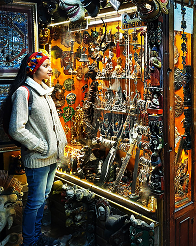
I love the colors in this image, but as Art commented it is a bit too busy. What I did was flip it horizontally and edit it to remove some of the background to eliminate some of the background exhibits which reduced quite a bit of the extraneous color and add more focus on the young lady. |
Mar 15th |
 |
| 38 |
Mar 21 |
Comment |
Visiting from 48 & 80
I love the colors in this image, but as Art commented it is a bit too busy. What I did was flip it horizontally and edit it to remove some of the background to eliminate some of the background exhibits which reduced quite a bit of the extraneous color and add more focus on the young lady. |
Mar 15th |
 |
4 comments - 0 replies for Group 38
|
| 39 |
Mar 21 |
Reply |
That's what I thought. As an administrator, I recommend that when they provide me with more than one original, they clarify in what order they want it posted as we have to choose the sequence in which they are posted. Just saves a bit of confusion when looking to comment on the images. I do commend you on the work you did. |
Mar 15th |
| 39 |
Mar 21 |
Comment |
Visiting from 48 & 80
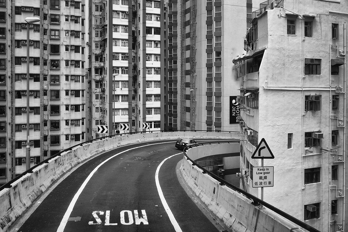
Overall a great example of the concrete jungle many of us (not me thank heaven) are living in today. However the yellow sign on the original was very distracting and while you were able to remove it somewhat in your finished version, I still found myself constantly looking at the darkened version.
Please excuse the kind of sloppy spot on the building my tablet isn't working at the moment and I don't have the control in my right hand. (I'm a southpaw who uses a mouse with my right hand) |
Mar 15th |
 |
| 39 |
Mar 21 |
Comment |
Visiting from 48 & 80
Overall a great example of the concrete jungle many of us (not me thank heaven) are living in today. However the yellow sign on the original was very distracting and while you were able to remove it somewhat in your finished version, I still found myself constantly looking at the darkened version.
Please excuse the kind of sloppy spot on the building my tablet isn't working at the moment and I don't have the control in my right hand. (I'm a southpaw who uses a mouse with my right hand) |
Mar 15th |
 |
| 39 |
Mar 21 |
Comment |
Visiting from 48 & 80
This is an excellent start but I would like to make a couple of suggestions. Try extending the black background and then extending the one leaf that is cut off. And, number 2, cut the size of the stroke. I think it would do well with a much thinner stroke |
Mar 15th |
| 39 |
Mar 21 |
Comment |
Visiting from 48 & 80
This is a great result. I do wonder, however, if you mislabeled the original and Original 2 and they should have been reversed. |
Mar 15th |
4 comments - 1 reply for Group 39
|
| 42 |
Mar 21 |
Comment |
In this case I probably consider leaving the hanging rope as it is the tether to the ground. |
Mar 19th |
| 42 |
Mar 21 |
Comment |
Beautiful image. Makes me want to come back to Vegas but with my husband who hates it, I doubt that it will happen. The only thing I would eliminate here would be the wires on the right going from the Las Vegas sign up to the top of lights. |
Mar 11th |
| 42 |
Mar 21 |
Comment |
Visiting from 48 & 80
Nice image. Image is very sharp which adds to its attraction. Well done. |
Mar 11th |
| 42 |
Mar 21 |
Comment |
Visiting from 48 & 80
I have to agree with Michael. If you have the inserts to make the body of the boots stand up, I would suggest that you try again with the boots standing up so to speak. In this image what is prominent are the white spots but it is very difficult to define what they are lighting up.. |
Mar 11th |
4 comments - 0 replies for Group 42
|
| 43 |
Mar 21 |
Comment |
Visiting from 48 & 80
This is a beautiful image but I wish you had cropped it in closer. I also wish I knew more about the monastery itself. |
Mar 19th |
| 43 |
Mar 21 |
Comment |
Visiting from 48 & 80
This is a beautiful image but I wish you had told us more about the subject, maybe a bit of history, why you shot, etc. I am intrigued by your title |
Mar 19th |
| 43 |
Mar 21 |
Comment |
Visiting from 48 &80
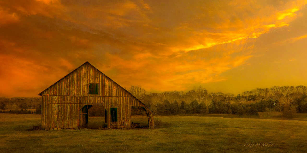
This image is a fantastic improvement over a pretty picture. I don't think I would touch it at all other than maybe drop the brightness on the barn itself to make it stand out just a bit more. |
Mar 19th |
 |
3 comments - 0 replies for Group 43
|
| 44 |
Mar 21 |
Comment |
Thanks for your response. I enter club competitions so I guess I tend to have an eye for what I thing would score better. It is a well done image. |
Mar 19th |
| 44 |
Mar 21 |
Comment |
Visiting from 48 & 80
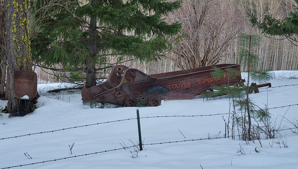
Very interesting image. I did find the top row of the barbed wire crossing the subject a bit distracting so with a few strokes of content aware fill I got rid of it. What do you think? |
Mar 19th |
 |
| 44 |
Mar 21 |
Comment |
Visiting from 48 & 80
This is beautiful. I do agree with Brad on the blue reflection it tends to pull my eye away from the window and the leading line effect |
Mar 19th |
3 comments - 0 replies for Group 44
|
| 48 |
Mar 21 |
Reply |
I have to tell you in my experience Adobe has a fabulous support system and they talk to you on the phone. Don't hesitate to use them. |
Mar 21st |
| 48 |
Mar 21 |
Comment |
Lloyd, I saw your comment about removing the branch. Editing that should be fairly simple. Select the branch (in sections if you have to) and do a content aware fill. Good Luck and let's see your result. |
Mar 19th |
| 48 |
Mar 21 |
Comment |
Nice image. And, sorry but since I'm so late in reviewing, pretty much has been said by all of the others. Sorry to all for the delay...lost track of time. |
Mar 19th |
| 48 |
Mar 21 |
Comment |
Once again, Welcome to the group.
This image is gorgeous. You did a beautiful sharpening job where needed and chose my favorite color to boot. Keep up the good work. |
Mar 19th |
| 48 |
Mar 21 |
Comment |
Once again, Welcome to the group.
This image is gorgeous. You did a beautiful sharpening job where needed and chose my favorite color to boot. Keep up the good work. |
Mar 19th |
| 48 |
Mar 21 |
Comment |
Once again, Welcome to the group.
This image is gorgeous. You did a beautiful sharpening job where needed and chose my favorite color to boot. Keep up the good work. |
Mar 19th |
| 48 |
Mar 21 |
Comment |
Thanks all for your positive comments. I think I'll submit it for the April competition and see how the judge tears it apart. |
Mar 19th |
| 48 |
Mar 21 |
Comment |
Great image Jamie. And, I do see the wires in the original and you did a great job of removing them. |
Mar 19th |
| 48 |
Mar 21 |
Reply |
Just purchased my first set of Marie's textures. From one group I got enough variety to get two different images changed for the much better today. |
Mar 6th |
| 48 |
Mar 21 |
Comment |
I did change the upper background using a texture. The process was similar to what Marie Altenburg described in the January 2021 issue of the PSA Journal. That is the first article I copied to save forever. Thank you for your comments |
Mar 5th |
| 48 |
Mar 21 |
Reply |
Thanks for the positive comment. |
Mar 4th |
| 48 |
Mar 21 |
Comment |
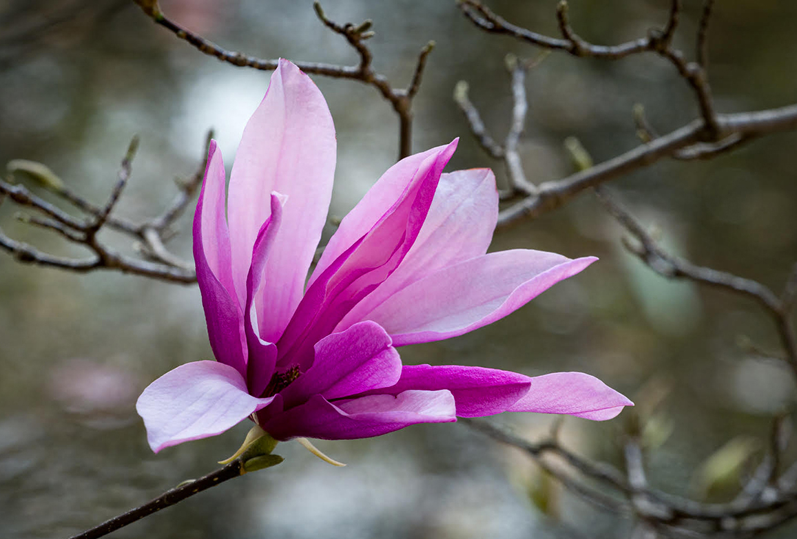
I love this image and have only one minor suggestion. I took it into photoshop and went to image-adjust-vibrance-saturation and just increased the saturation a tiny bit jus on the flower. What do you think? |
Mar 3rd |
 |
| 48 |
Mar 21 |
Comment |
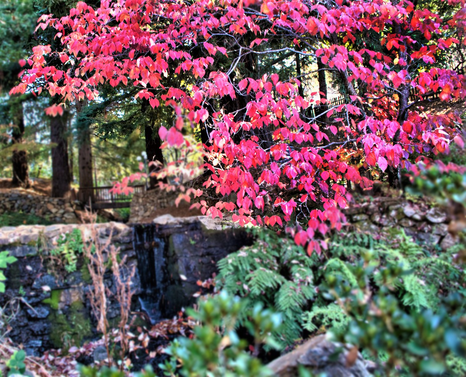
Jean, this is a lovely scene but I think that the red maple which is beautiful needed a bit of "punch". I used a non destructive layer mask to "accent" it more and then selected the background. Took that into photoshop, used a minimal amount of gaussian blur just to "desharpen" it and force the eye to head right to the red maple. Hope you like it. |
Mar 3rd |
 |
| 48 |
Mar 21 |
Reply |
Try it with flowers it works wonders. See Barbara Miller's post in group 5 |
Mar 2nd |
| 48 |
Mar 21 |
Comment |
Great shot. I recently saw a webinar by Marie Altenburg...she also had an article in the January PSA journal... on working with textures so I thought I'd play with this one. It's not my best work as I was interrupted several times but I hope it will give you food for thought. |
Mar 2nd |
 |
11 comments - 4 replies for Group 48
|
| 49 |
Mar 21 |
Comment |
Visiting from 48 & 80
For me the most beautiful part of the image is the horizon. I would not want to divide the image 50/50 but I can see cutting off some of the top and maybe extending the lake a bit to accentuate the reflections. |
Mar 19th |
| 49 |
Mar 21 |
Comment |
And here's the third one. |
Mar 19th |
 |
| 49 |
Mar 21 |
Comment |
Visiting from 48 & 80
This is an interesting image. That said, after reading the comments, I did go to the website which has a better image, but it still is quite hazy. I understand what you were trying to accomplish but I think you have several images in one here and you might be better off separating them. As I cannot put more than 1 image in a response, I'll add my suggestions individually. |
Mar 19th |
 |
| 49 |
Mar 21 |
Comment |
Visiting from 48 & 80
This is an interesting image. That said, after reading the comments, I did go to the website which has a better image, but it still is quite hazy. I understand what you were trying to accomplish but I think you have several images in one here and you might be better off separating them. As I cannot put more than 1 image in a response, I'll add my suggestions individually. |
Mar 19th |
 |
4 comments - 0 replies for Group 49
|
| 51 |
Mar 21 |
Comment |
Visiting from 48 & 80
I never cease to be amazed at what comes out of phones these days. Beautiful image. |
Mar 19th |
1 comment - 0 replies for Group 51
|
| 52 |
Mar 21 |
Reply |
well deserved |
Mar 20th |
| 52 |
Mar 21 |
Reply |
Post processing. After reading the article, if you have any questions or if I can help in any way, don't hesitate to either email or call me at 561-752-3992. |
Mar 20th |
| 52 |
Mar 21 |
Comment |
Visiting from 48 & 80
Beautiful image. Excellent competition. Congratulations on a keen eye and great execution. |
Mar 20th |
| 52 |
Mar 21 |
Comment |
Visiting from 48 & 80
I love the image. I've just begun working with textures. Yours here is beautiful. If you missed it, read Marie Altenburg's article in the January issue of the PSA Journal. It's the best I've seen. |
Mar 20th |
2 comments - 2 replies for Group 52
|
| 53 |
Mar 21 |
Reply |
I prefer the more pronounced contrast between the colors. |
Mar 21st |
| 53 |
Mar 21 |
Comment |
Visiting from 48 & 80
I think Tom's image with the more pronounced background is quite a bit more striking. Love the framing. |
Mar 20th |
1 comment - 1 reply for Group 53
|
| 54 |
Mar 21 |
Comment |
Visiting from 48 & 80
I found this very interesting but a bit confusing with all the different textures involved. I think the coloring in Peggy's image makes a huge positive difference. |
Mar 20th |
| 54 |
Mar 21 |
Comment |
Visiting from 48 & 80
Just too cute and well done |
Mar 20th |
2 comments - 0 replies for Group 54
|
| 55 |
Mar 21 |
Comment |
visiting from 48 & 80
Gorgeous! The only thing I would consider is a 1 or 2 stroke frame either in white or a shade of the purple of the flower |
Mar 20th |
1 comment - 0 replies for Group 55
|
| 56 |
Mar 21 |
Comment |
Visiting from 48 & 80
Wonderful image. I really must get into finding and/or purchasing more brushes in Photoshop and find some tutorials on using them. This is a terrific result. |
Mar 20th |
| 56 |
Mar 21 |
Comment |
Visiting from 48 & 80
Wow - Will I ever have the patience and talent to get half as good as this! It's wonderful.
|
Mar 20th |
2 comments - 0 replies for Group 56
|
| 58 |
Mar 21 |
Comment |
Gloria, I actually prefer the color image. I just wish the fellow eating his lunch were a bit larger but I really don't see any way to accomplish that. |
Mar 20th |
| 58 |
Mar 21 |
Comment |
Isaac, this is a fascinating image. The expression on the little one is priceless. But do note that the image you posted as the original is not the same image. |
Mar 20th |
2 comments - 0 replies for Group 58
|
| 59 |
Mar 21 |
Comment |
Visiting from 48 & 80
This is a very nice image but although I am not a sports photographer I would have to agree with the others in reference to competitions. |
Mar 20th |
1 comment - 0 replies for Group 59
|
| 62 |
Mar 21 |
Comment |
Visiting from 48 & 80
The work you did on this really paid off. You took a nice image and made it outstanding. The changing of the light made a huge difference, a technique I have yet to learn. Thanks for the inspiration. |
Mar 21st |
| 62 |
Mar 21 |
Comment |
Visiting from 48 &80
I very much like the sky replacement. However as was previously suggested, in the future try walking around the main image several times and shooting at various angles. The car is very well done but I find that my eye keep roaming from the car to the windmill. Since the car is the subject, I might have tried to find a way to eliminate the windmill when photographing the original. |
Mar 21st |
| 62 |
Mar 21 |
Comment |
Hi, visiting from 48 & 80
We were there. It was such an exciting experience. Personally, I prefer your image. All the cropping leaves something missing for me. Although the vehicles may not be necessary, they are a true picture of what was going on at the time. Maybe for competition the image would do better with the crops, but I guess different strokes for different folks. Well done. |
Mar 21st |
3 comments - 0 replies for Group 62
|
| 63 |
Mar 21 |
Comment |
Visiting from 48 & 80
If I found this guy in my shower I would have run out screaming. The image is fabulous and I love that you placed a stroke to enclose him in the image rather than let him run loose. |
Mar 21st |
| 63 |
Mar 21 |
Comment |
Visiting from 48 & 80
Beautiful image. My only suggestion would be to consider aa 1 or 2 px stroke to in the same color as the background of the flower to keep it from floating in space. |
Mar 21st |
2 comments - 0 replies for Group 63
|
| 64 |
Mar 21 |
Comment |
Visiting from 48 & 80
Fabulous image. Love the textures down to the last details. Shooting through those arches and capturing that background was a huge success for me. |
Mar 21st |
1 comment - 0 replies for Group 64
|
| 69 |
Mar 21 |
Comment |
Hi Candy. I would consider toning down the seaweed as it took me a minute to find the animal because of the seaweed calling my eye. |
Mar 21st |
| 69 |
Mar 21 |
Comment |
Great shot Merv. Somehow I never get quite that lucky at either Green Cay or Wakodahatchee but I keep trying. |
Mar 21st |
| 69 |
Mar 21 |
Comment |
Hi Brenda. I have to agree with Isaac. I think it's a much better image with a lot less distraction. |
Mar 21st |
3 comments - 0 replies for Group 69
|
| 70 |
Mar 21 |
Reply |
I am so glad that you visited my group and encouraged you to expand your own opportunities. Do continue to visit other groups, you never know what you can find. |
Mar 22nd |
| 70 |
Mar 21 |
Comment |
Visiting from 48 & 80
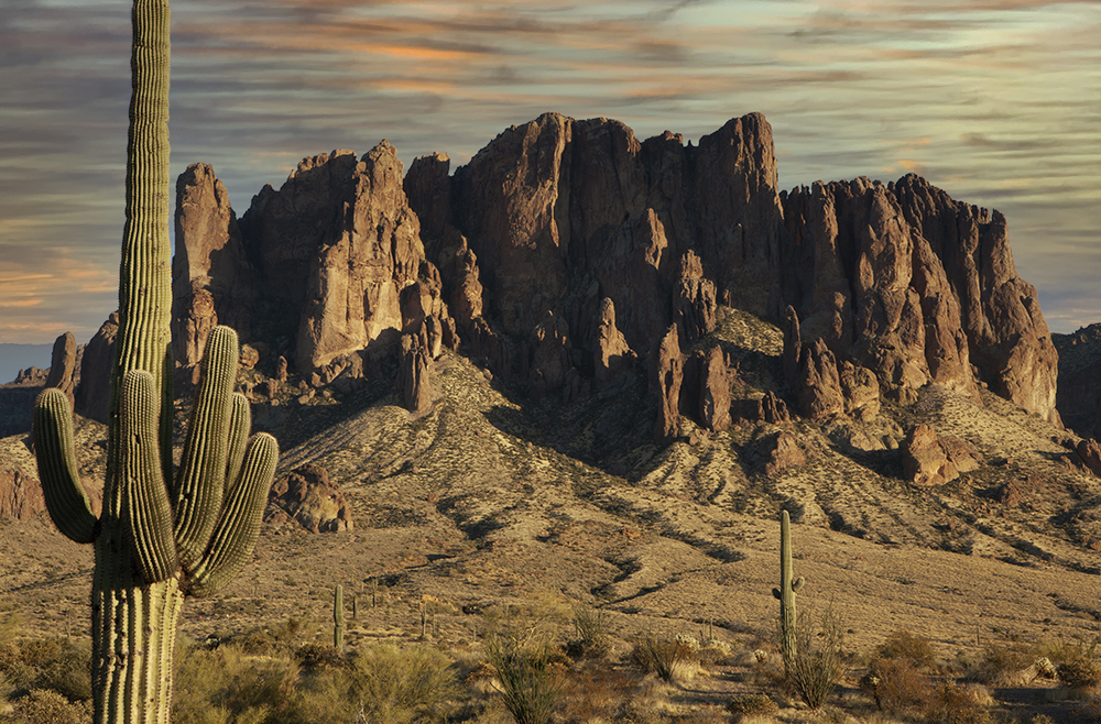
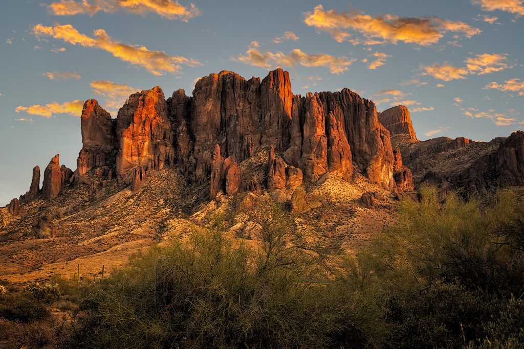
The image is really nice but I found the sky kind of blah so I moved into Photoshop and did a sky replacement. I those this one because I felt that the clouds picked up and enhanced the colors in the mountain. What do you think? |
Mar 21st |
 |
| 70 |
Mar 21 |
Comment |
Visiting from 48 & 80
What an eye catching image. The colors, the trees and the lamps all fall into place for an excellent image with the lady looking at the lights being an added plus. |
Mar 21st |
2 comments - 1 reply for Group 70
|
| 72 |
Mar 21 |
Comment |
Great image in spite of the weather |
Mar 21st |
1 comment - 0 replies for Group 72
|
| 74 |
Mar 21 |
Reply |
My pleasure. Do come and visit our group some time. We look forward to comments and suggestions. |
Mar 21st |
| 74 |
Mar 21 |
Comment |
Visiting from 48 & 80
I love the image but I felt it was missing punch so I took it into Photoshop. Went to Image-Adjustments- Vibrance-Contrast and raised both the vibrance and contrast till I liked it. I then went to Filter-Sharpen - and increased the sharpness just a bit. Not stark changes but just a bit of added punch. What do you think? |
Mar 21st |
 |
1 comment - 1 reply for Group 74
|
| 77 |
Mar 21 |
Comment |
I, too, played with this technique several years ago and then misplaced the instructions. This one is very well done. The stem you created is an excellent added plus |
Mar 23rd |
1 comment - 0 replies for Group 77
|
| 80 |
Mar 21 |
Reply |
Thanks so much I'll have to try this when I get my computer back. |
Mar 23rd |
| 80 |
Mar 21 |
Reply |
Here you go in response to the request for the original. Open to suggestions. |
Mar 18th |
 |
| 80 |
Mar 21 |
Comment |
Thanks. I did not change the background, just blurred it a bit to keep the subject the main attraction. Any suggestions? |
Mar 17th |
| 80 |
Mar 21 |
Comment |
Nice image. I much prefer the monochrome. This image does not need the distraction of color. It's tack sharp and his position makes me wonder if he's listening to his radio, putting hearing aids or cotton to blunt the noise once the motorcycle starts up or doing something else. Well done |
Mar 11th |
| 80 |
Mar 21 |
Comment |
This is an adorable image. Glad you got rid of some of the extraneous stuff. It really shows the love between the boy and his dog.
As to the settings, if you're working in photoshop, and the bottom of the file column there's thing that says file info. Most times you can get all your settings right there on the original photo. Once you've worked the image, you have to return to the original to get that data.
|
Mar 11th |
| 80 |
Mar 21 |
Comment |
Great crop. Tells the story of a typical NYC mess. It is truly as you put it the essence of the image. Very well done. |
Mar 2nd |
| 80 |
Mar 21 |
Comment |
Great image. Tells the story of a vibrant city and all the activity. Great conversion from film to digital. |
Mar 1st |
| 80 |
Mar 21 |
Comment |
Wow! What did you step in to get so lucky to get a shot like this? Perfect colors, very exciting moments and tells the story at first glance. |
Mar 1st |
6 comments - 2 replies for Group 80
|
| 88 |
Mar 21 |
Comment |
That's my perpetual problem |
Mar 28th |
| 88 |
Mar 21 |
Comment |
Brought it into Photoshop. Opened Topaz Sharpen AI and here is the result. |
Mar 28th |
 |
2 comments - 0 replies for Group 88
|
| 89 |
Mar 21 |
Comment |
I wasn't trying to create the perfect image, simply a suggestion for consideration. |
Mar 30th |
| 89 |
Mar 21 |
Reply |
The reflection is the same sky, I just copied it and flipped it. Maybe a bit lighter because I didn't want it exact. But the intent was to promote the idea. |
Mar 30th |
| 89 |
Mar 21 |
Comment |
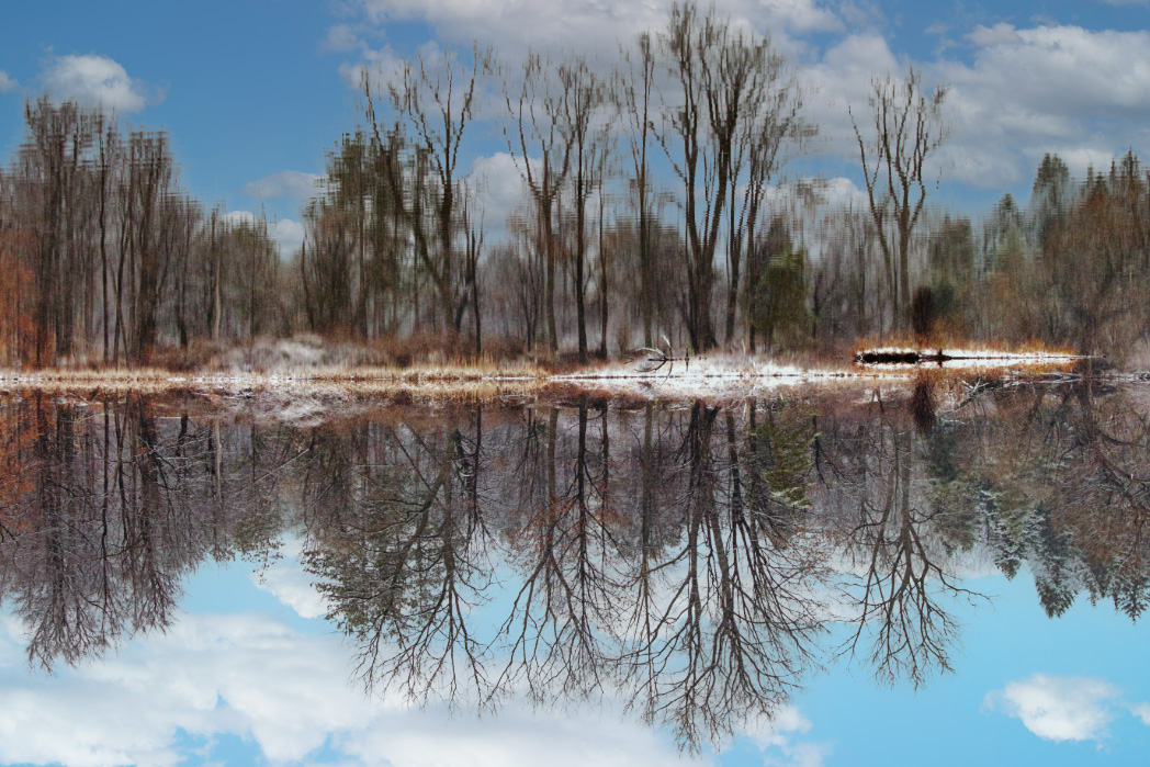
I like the image but was not enamored by the bland sky. So I sent into Photoshop and did a sky replacement. Then I figured I'd try a reflection so I lightened the sky a bit and then rotated the image 180 degrees. Flattened the layers created the by the sky replacement. Created another sky replacement and here you have it. Better or Worse? |
Mar 28th |
 |
| 89 |
Mar 21 |
Comment |
Beautiful image. Love the rainbow. |
Mar 28th |
3 comments - 1 reply for Group 89
|
| 90 |
Mar 21 |
Comment |
I love the crocus but I found the out of focus background flowers a bit distracting. So I referred to Marie Altenburg's article on working with textures in the January issue of the PSA Journal and came up with this result. I wonder what you think. |
Mar 28th |
 |
| 90 |
Mar 21 |
Comment |
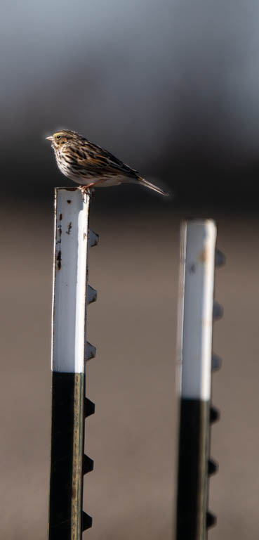
I, too, found the out of focus poles very distracting. I chose to keep only the two on the extreme right. I also did a Non Destructive Layer Mask and brightened up the bird a bit to really make it stand out. FYI Non Destructive Layer Mas-- duplicate layer, select all -content aware fill - 50% Gray and then change view to overlay in the layers panel. Paint the selected sections, black to darken, white to brighten...and voila you have the result you're looking for. Flatten layers. and Save |
Mar 28th |
 |
2 comments - 0 replies for Group 90
|
| 91 |
Mar 21 |
Comment |
Your choice of IR makes the image. Extremely well done. |
Mar 28th |
1 comment - 0 replies for Group 91
|
| 92 |
Mar 21 |
Comment |
No problem. I enjoy visiting other groups as it is usually a very good learning experience for me as well as getting the gratification for me of being able to maybe help another fellow photographer with a valid suggestion here and there |
Mar 28th |
| 92 |
Mar 21 |
Comment |
I like the monochrome, but the original is also a very interesting option. I like that you eliminated the walkers on the left side an overall obtained a well done image. |
Mar 28th |
| 92 |
Mar 21 |
Comment |
Well done image. I have the Tamron 16-300 lens and it's the one I carry 100% of the time unless I have something special in mind. It's a fabulous lens and has given me innumerable great images. |
Mar 28th |
| 92 |
Mar 21 |
Comment |
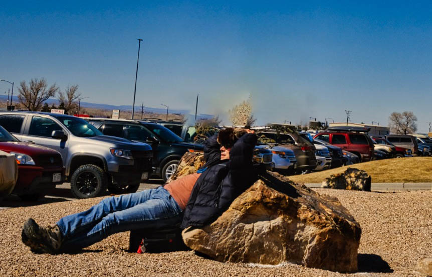
I, too, found the tree a bit distracting and somewhat extraneous. So, I selected it in Photoshop and did a content aware, fill and got rid of it. I also eliminated a few of the poles and cropped it to a true horizontal view rather than the squarish appearance and wonder what you think of the result. |
Mar 28th |
 |
| 92 |
Mar 21 |
Comment |
I, too, found the tree a bit distracting and somewhat extraneous. So, I selected it in Photoshop and did a content aware, fill and got rid of it. I also eliminated a few of the poles and cropped it to a true horizontal view rather than the squarish appearance and wonder what you think of the result. |
Mar 28th |
 |
5 comments - 0 replies for Group 92
|
| 98 |
Mar 21 |
Comment |
You're welcome - Good Luck |
Mar 28th |
| 98 |
Mar 21 |
Comment |
Sometimes if the noise is visible. It does do some sharpening but I've had better success with Sharpen |
Mar 28th |
| 98 |
Mar 21 |
Comment |
The whole image. I use Sharpen on every image before submitting for a competition. Try it, I think you'll see a great improvement |
Mar 28th |
| 98 |
Mar 21 |
Comment |
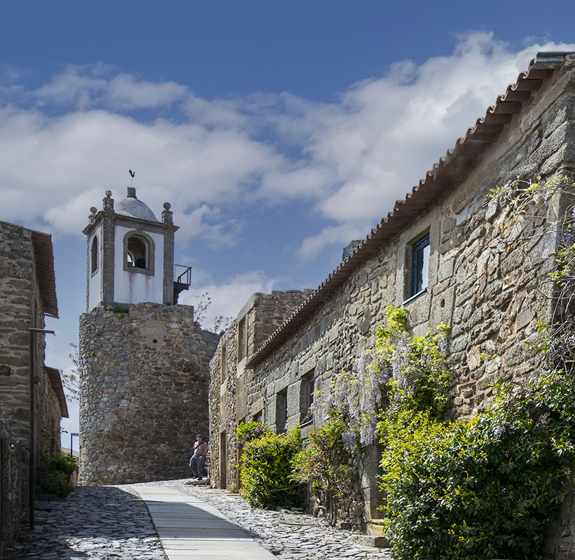
Love the image but found the sky too bland. So I went into Photoshop Sky Replacement and created the attached. What do you think |
Mar 27th |
 |
| 98 |
Mar 21 |
Comment |
I brought your image into Topaz Sharpen AI to see what it would do for the tail. The result is attached |
Mar 27th |
 |
5 comments - 0 replies for Group 98
|
134 comments - 22 replies Total
|