|
| Group |
Round |
C/R |
Comment |
Date |
Image |
| 1 |
Apr 20 |
Comment |
Visiting from 48 & 80
Probably the best overall investment you could make is to purchase Topaz Studio 2 which has several filters and would make your life 1000% easier and give you more options than you can ever count, or use. |
Apr 7th |
| 1 |
Apr 20 |
Comment |
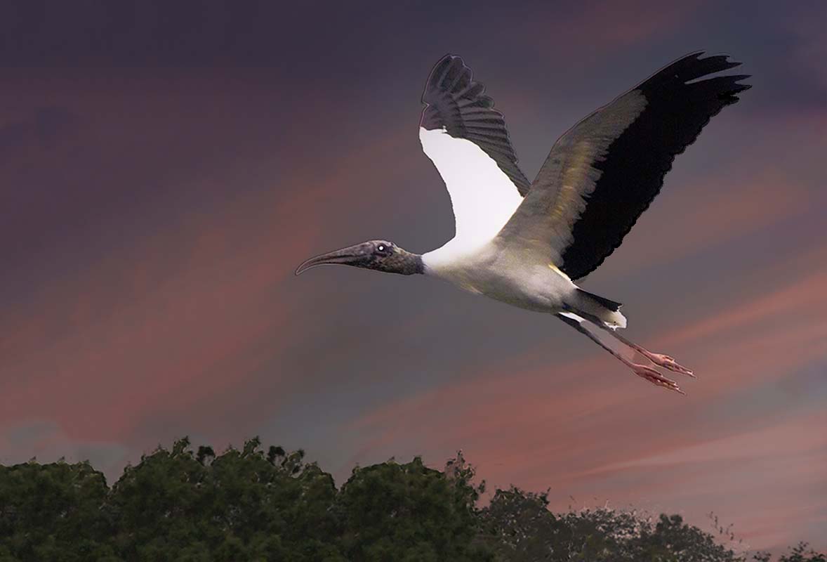
Visiting from 48 & 80
I love shooting animals and this one is a beauty. However, I find the almost white background too bright and not enhancing the image.
I opened the image in Luminar 4, duplicated the image and then added a sky to the top layer. I then reversed the layer order CS6, reduced the opacity of the now top layer to get a feel for the sky.
|
Apr 7th |
 |
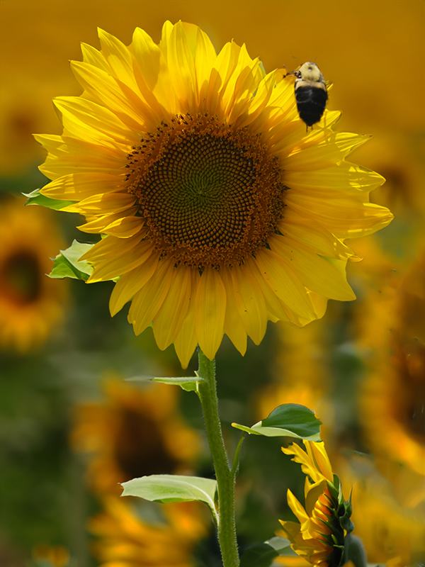
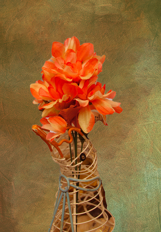
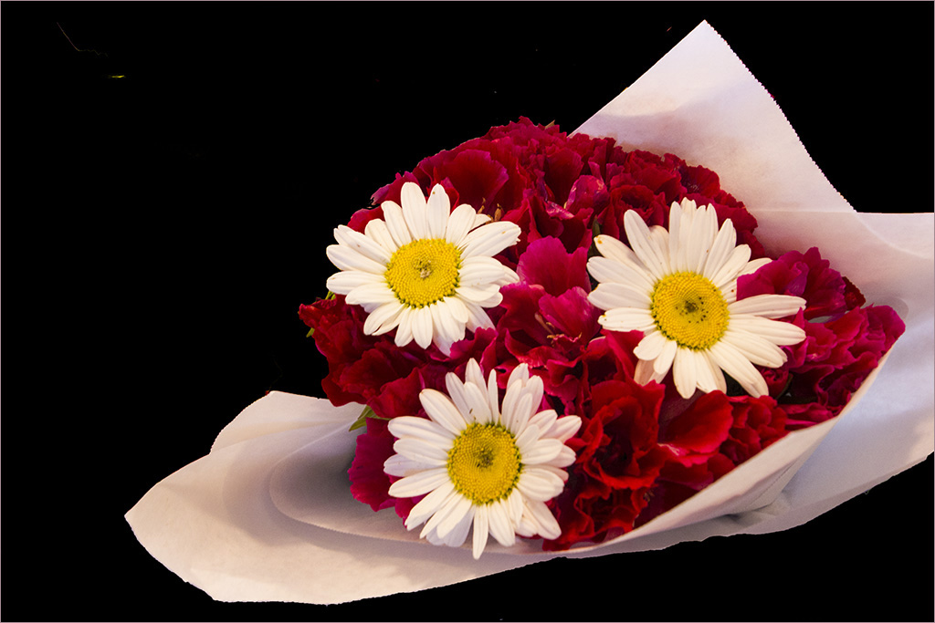
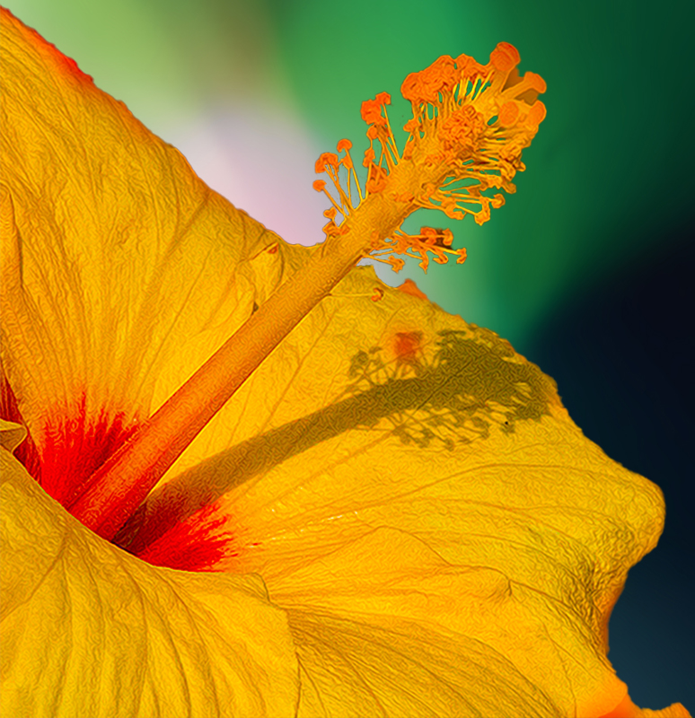
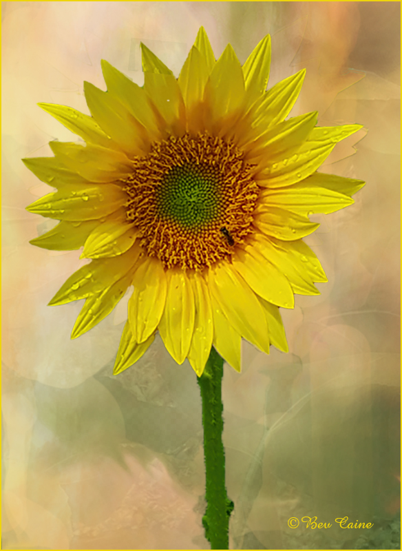
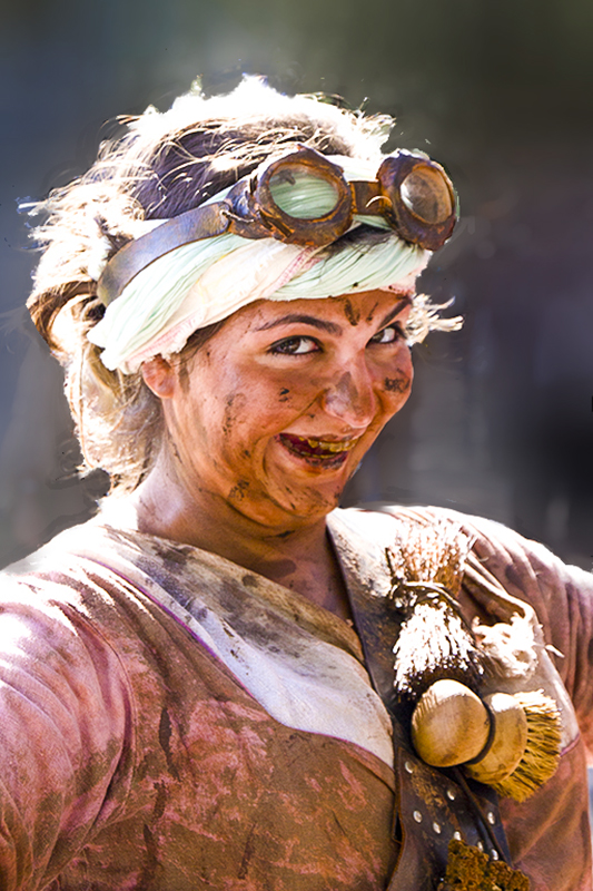
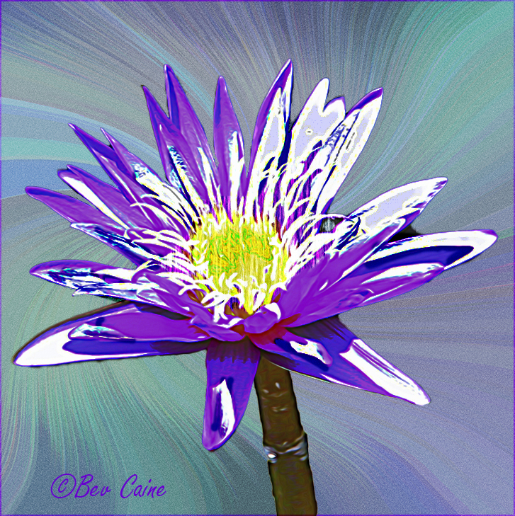
| 1 |
Apr 20 |
Comment |
Visiting from 48 & 80
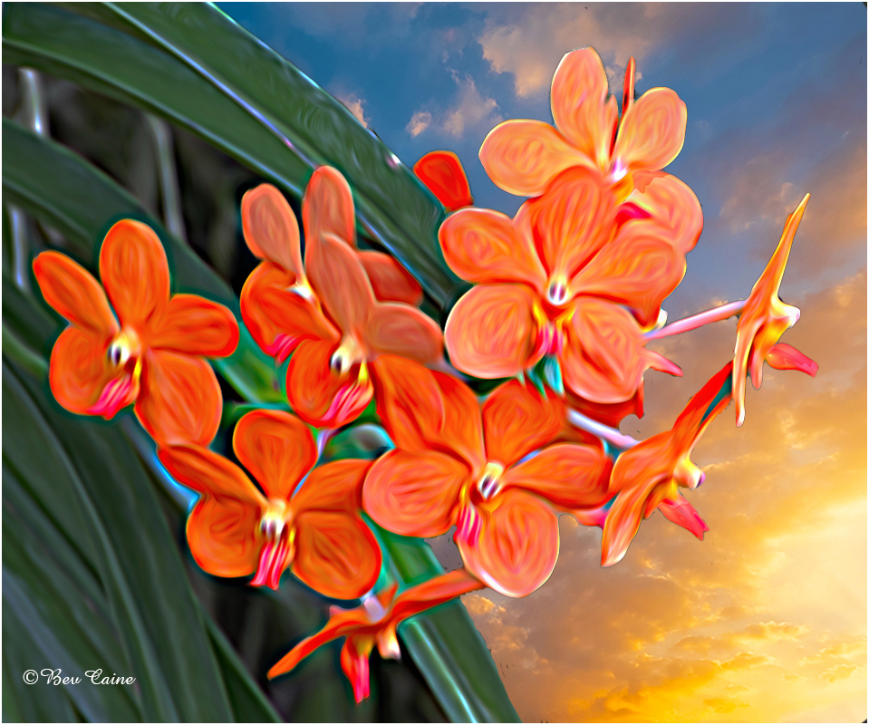
I've been doing a bit of flower photography myself lately and having a lot of fun with it. I love this flower but found it a bit soft so I took it into Topaz Studio 2 and used that sharpening option to enhance it just a bit. I've attached it here for your consideration. |
Apr 7th |
 |
3 comments - 0 replies for Group 1
|
| 2 |
Apr 20 |
Comment |
Visiting from 48 & 80
This in monochrome is a sure-fire winner in my eyes. |
Apr 7th |
| 2 |
Apr 20 |
Comment |
Visiting from 48 & 80
Beautiful image and very successful compositing result. |
Apr 7th |
| 2 |
Apr 20 |
Comment |
Sorry forgot to click on the image with my previous comment. |
Apr 7th |
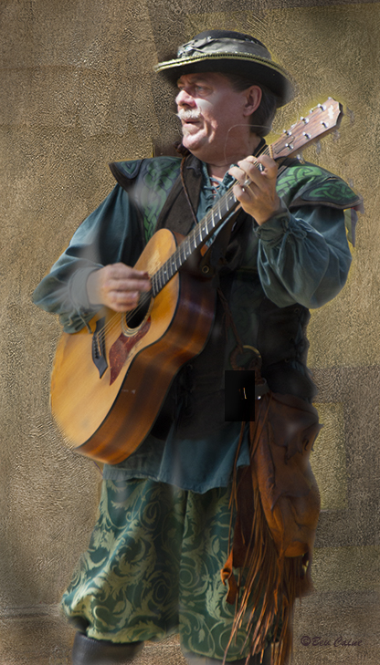
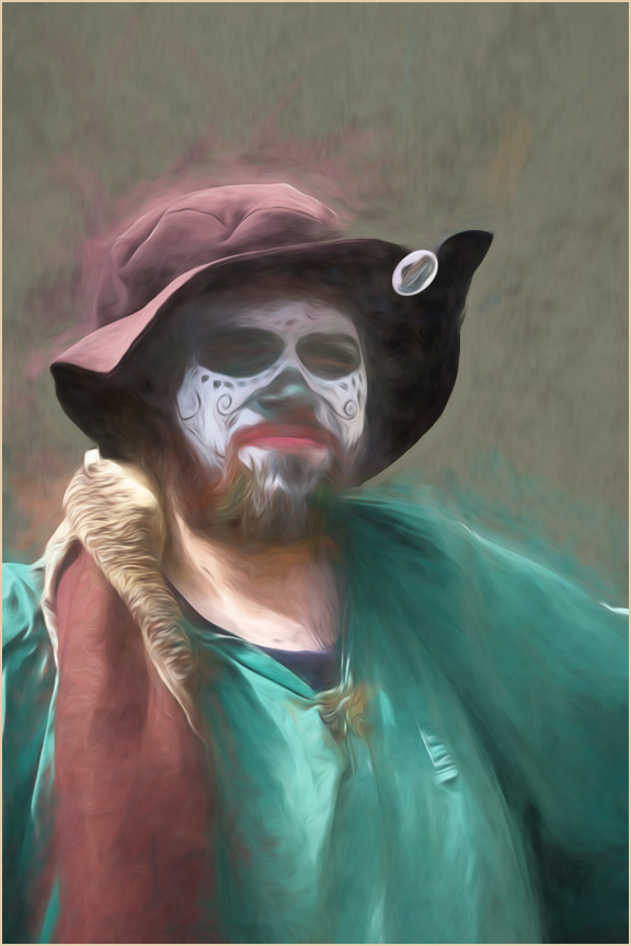
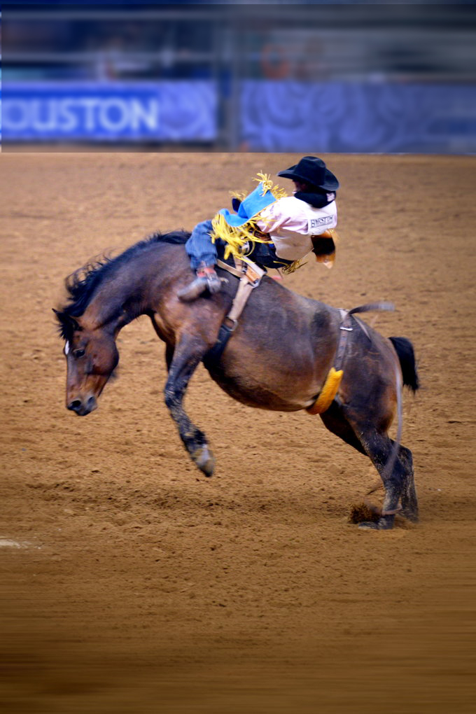 |
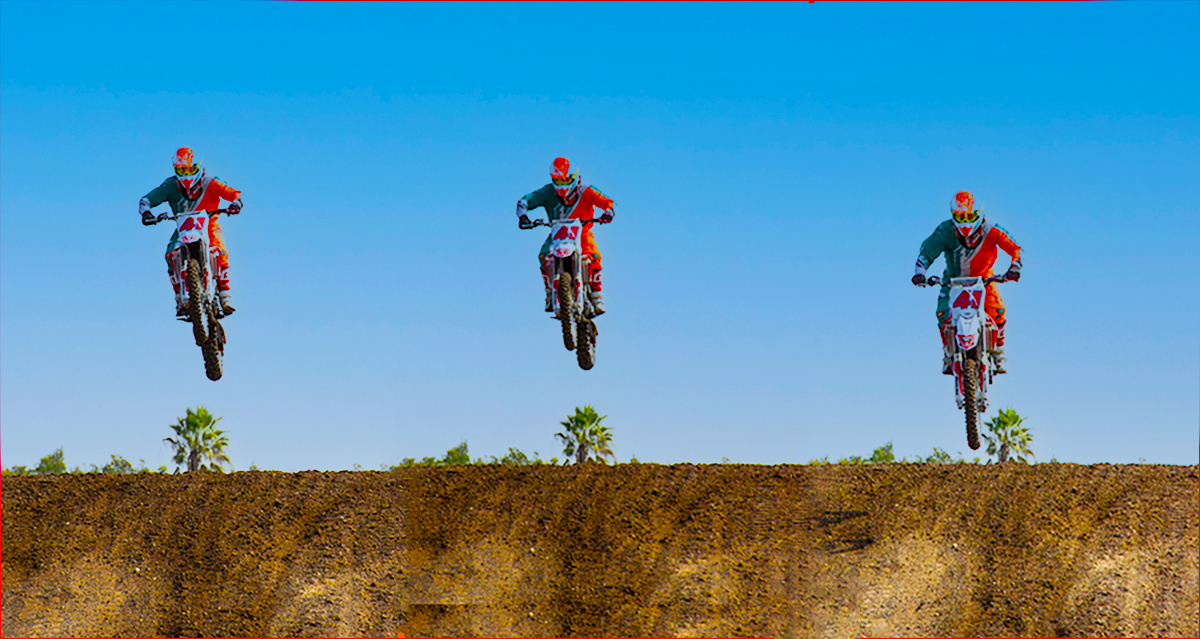
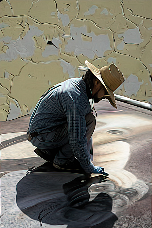
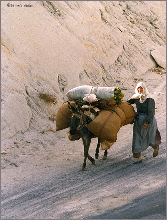
| 2 |
Apr 20 |
Comment |
Visiting from 48 & 80
I can't begin to tell you how many times I've tried to capture this kind of image.
I don't have a problem with the lower dirt, but I do find that the bright blue on the upper third of the image distracting.
I copied the image into Photohop CS6, selected the top portion of he image and reduced the brightness using adjustments/brightness and gradually reduced the brightness.
I then selected the rider and increased the brightness by just a minimal amount. Hope you like my result. |
Apr 7th |
4 comments - 0 replies for Group 2
|
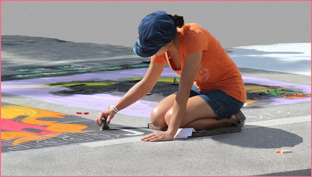
| 3 |
Apr 20 |
Comment |
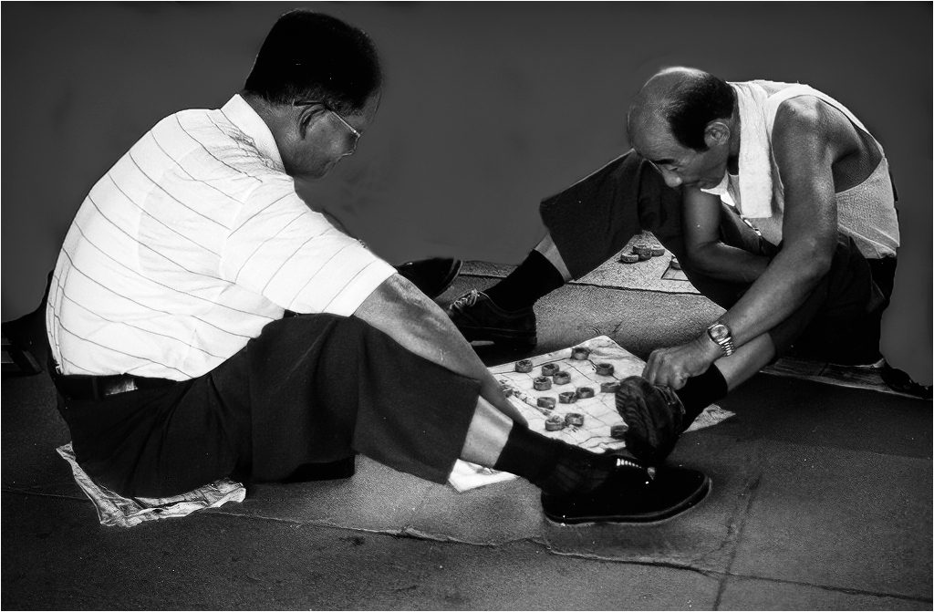
Visiting from 48 & 80
Great image. No need for improvement here. |
Apr 7th |
1 comment - 0 replies for Group 3
|
| 5 |
Apr 20 |
Comment |
Phenomenal is the understatement of the year! This is absolutely WONDERFUL! |
Apr 7th |
1 comment - 0 replies for Group 5
|
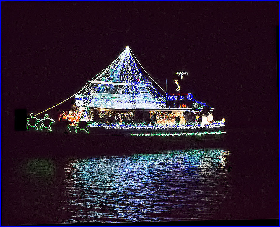
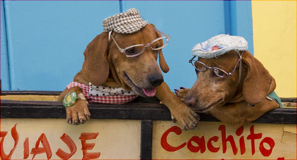
| 7 |
Apr 20 |
Reply |
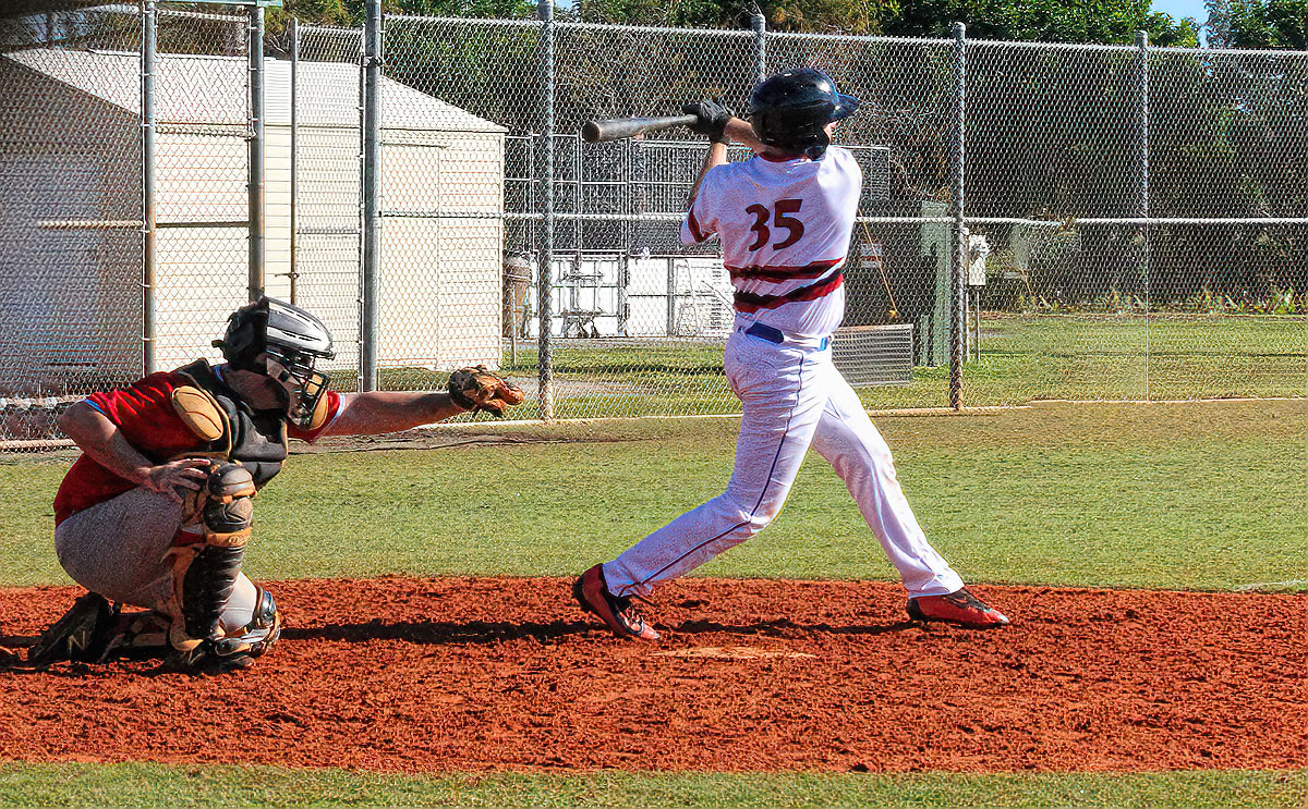
OOPS, thought that was another boat |
Apr 7th |
| 7 |
Apr 20 |
Comment |
Visiting from 48 & 80
Nice image and the sign pointing to the wording is an eye catching food for thought. |
Apr 7th |
| 7 |
Apr 20 |
Comment |
Love the image but I don't see the raft either. |
Apr 7th |
2 comments - 1 reply for Group 7
|
| 8 |
Apr 20 |
Comment |
Visiting from 48 & 80
WOW! This is is a winner. Was the sky this red or did you enhance it? Overall its a 10 out of 10 for me! |
Apr 7th |
1 comment - 0 replies for Group 8
|
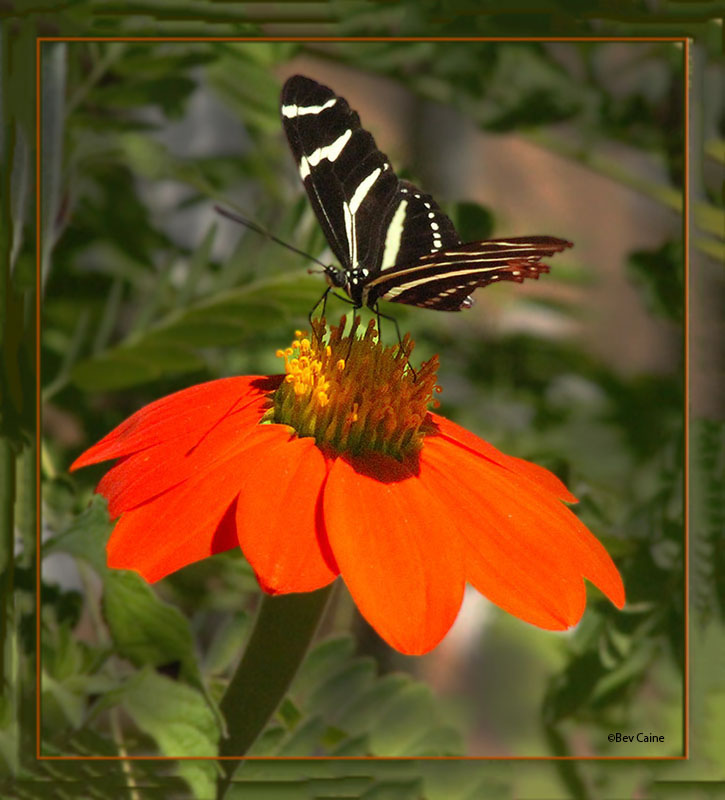
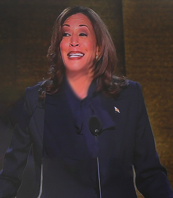
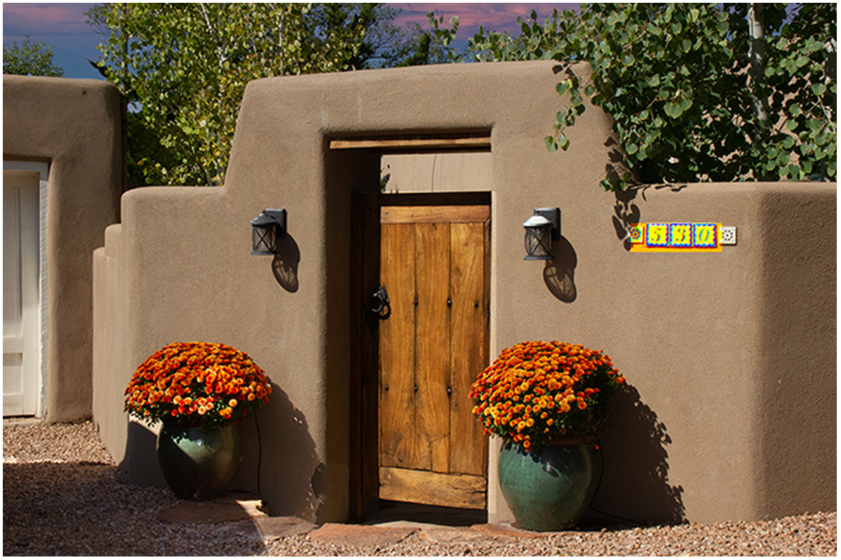
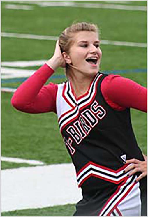
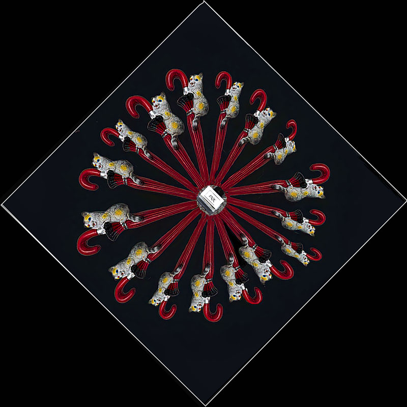
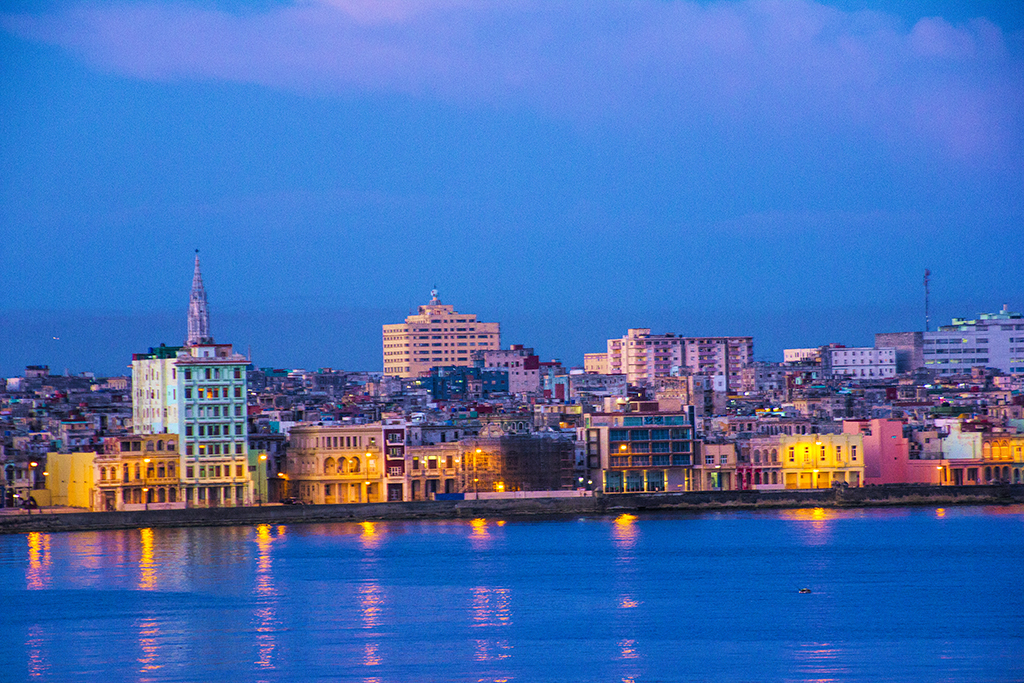
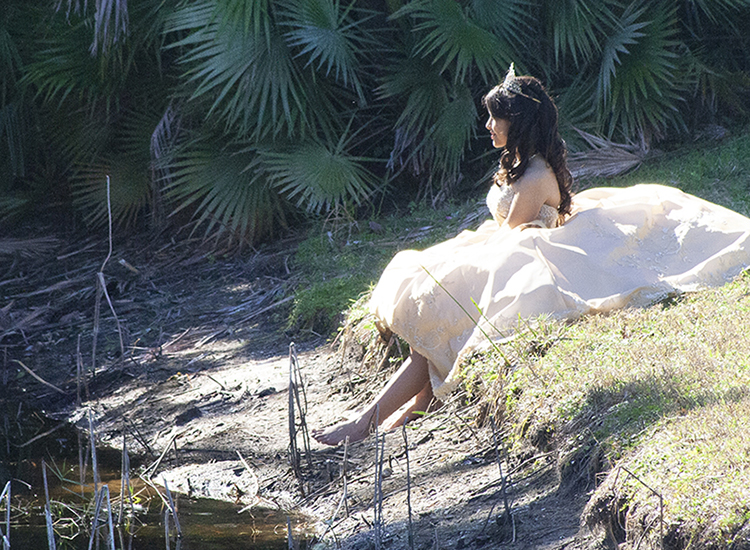
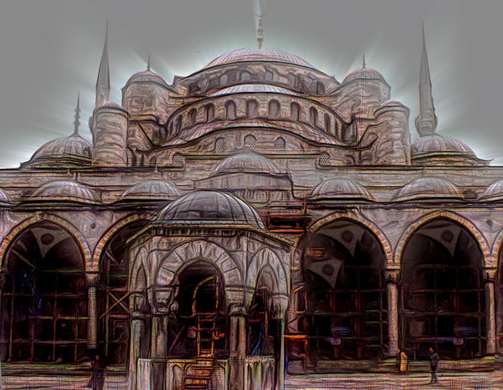
| 12 |
Apr 20 |
Comment |
l live in Florida and have never seen palm trees of these colors. Are they real? Great image. |
Apr 7th |
1 comment - 0 replies for Group 12
|
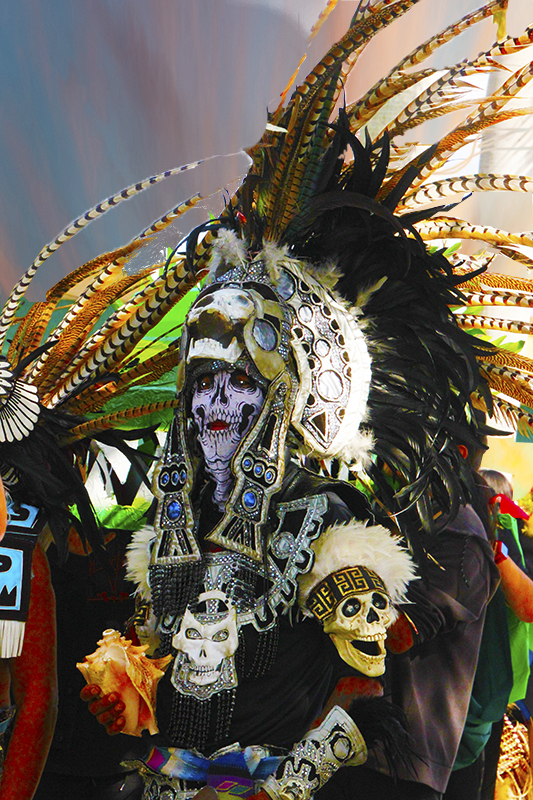
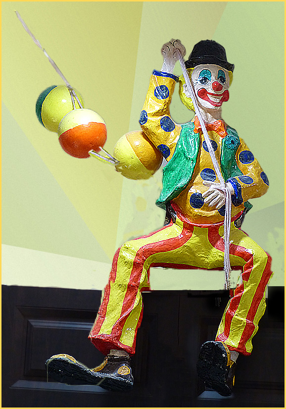
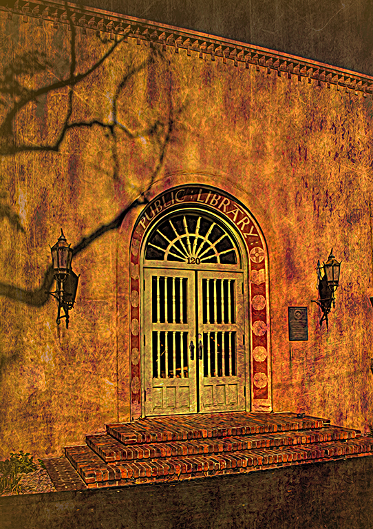
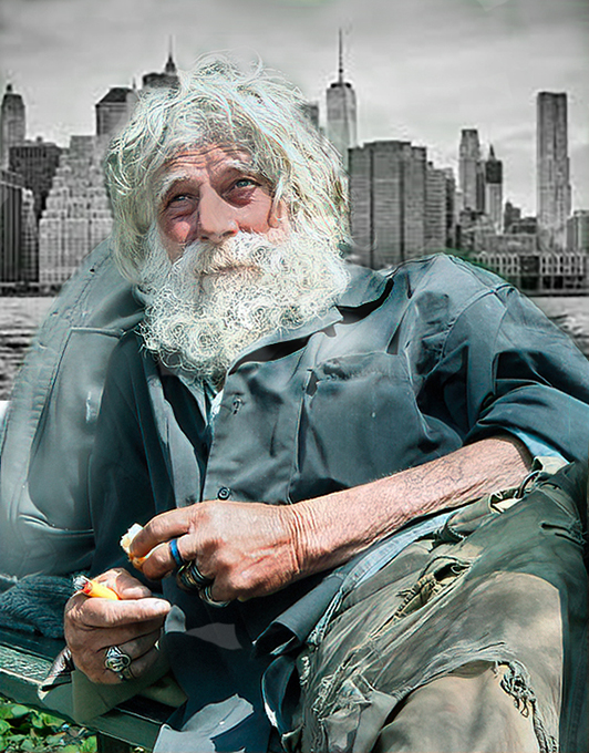
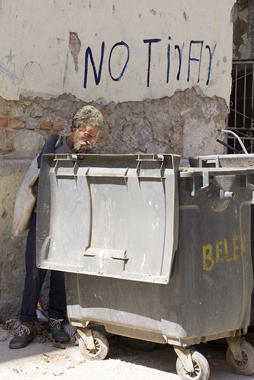
| 14 |
Apr 20 |
Comment |
Visiting from 48 & 80
For me, this image is a sign of today's times. It is very well done and at the time tells a story.
|
Apr 7th |
1 comment - 0 replies for Group 14
|
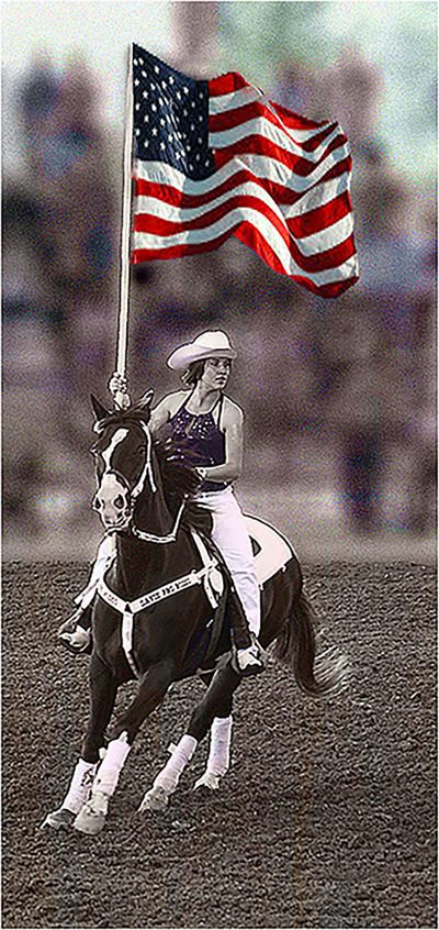
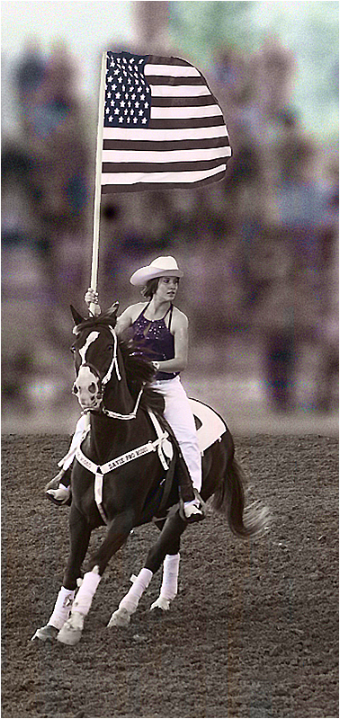
| 16 |
Apr 20 |
Reply |
Both blurred versions are an improvement on the color version but I still prefer the b/w color combination. |
Apr 10th |
| 16 |
Apr 20 |
Comment |
Joan, the color is lovely but the horse and rider really jump out in the b/w version. To my eye in the color version the horse and rider are much too dark and kind of blend into all the color. |
Apr 9th |
| 16 |
Apr 20 |
Comment |
Visiting from 48 & 80
I like this image overall but would like to offer a couple of comments.I would recommend cropping a bit off the right to eliminate the back of the man in the jacket
After the fact, I would have hoped you have another image of the same group to eliminate the store backing with the white printing on black which I find distracting. You might try that in Photoshop but I predict a tedious job.
|
Apr 7th |
| 16 |
Apr 20 |
Comment |
Do I ever wish we had gotten to that site when Coral Springs was doing it but we got cancelled out thanks to Corona. Hopefully next year.
What a fabulous image! For me the black and white change only emphasizes the rider which is what this image is all about. |
Apr 7th |
3 comments - 1 reply for Group 16
|
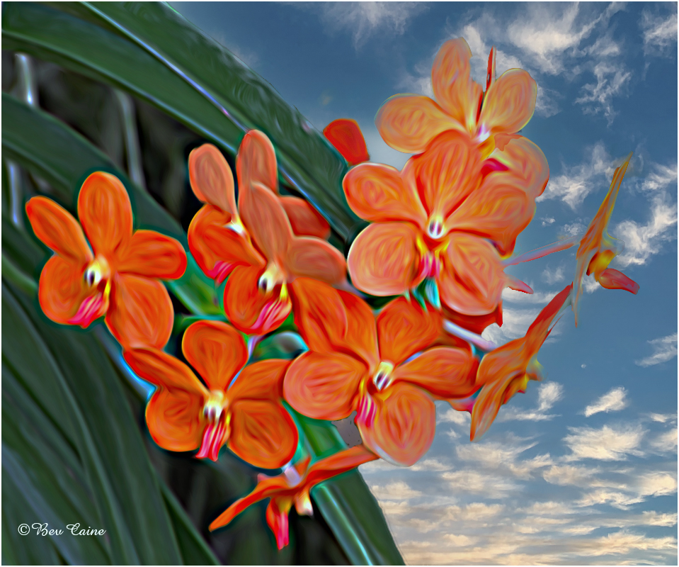
| 17 |
Apr 20 |
Comment |
Like the effect on the water. Just not quite sure about the sort of stroke effect on the right side of the waterfall. Very kind of painterly effect. Love all the options we can create with filters these days. |
Apr 7th |
| 17 |
Apr 20 |
Reply |
Sorry for the duplication in my comments. My photoshop is down on my desktop and I was using my laptop and apparently clicked twice.
At any rate, as I said, I really appreciated your effort.
Stay well and keep shooting. |
Apr 7th |
| 17 |
Apr 20 |
Comment |
Visiting from 48 & 80
I think an improvement to this image might be to eliminate the blues all together and have it on a black background which would enhance the appearance of all of the wonderful colors in the background. |
Apr 7th |
 |
| 17 |
Apr 20 |
Comment |
Visiting from 48 & 80
I think an improvement to this image might be to eliminate the blues all together and have it on a black background which would enhance the appearance of all of the wonderful colors in the background. |
Apr 7th |
 |
| 17 |
Apr 20 |
Comment |
Visiting from 48 & 80
Great image...no need for any alterations here! |
Apr 7th |
4 comments - 1 reply for Group 17
|
| 18 |
Apr 20 |
Comment |
You are so creative! And very well done. |
Apr 7th |
1 comment - 0 replies for Group 18
|
| 19 |
Apr 20 |
Comment |
Visiting from 48 & 80
This is very well done. Love the the foliage across the top it's a great natural frame combined with that on the right. Very successful finish |
Apr 9th |
| 19 |
Apr 20 |
Comment |
Visiting from 48 & 80
I love the hotel but find the extreme colors of the Tetons attracting my attention more than I'd like. Sky is interesting but not one that I am particularly fond of. I've often used Topaz only to find myself maybe just overdoing it a bit trying to combine looks, which I suspect may have happened here. I would consider toning down the mountains and see if it makes any significant difference to your eye. |
Apr 9th |
| 19 |
Apr 20 |
Comment |
Visiting from 48 & 80
I agree with Marcella re taking the white out of the top. As the image is about the locks, the white bar is extraneous and distracting. Otherwise a very interesting image and the story enhances the overall. |
Apr 9th |
3 comments - 0 replies for Group 19
|
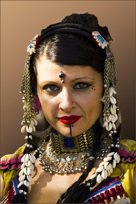
| 22 |
Apr 20 |
Comment |
Visiting from 48 &80
This is an absolutely beautiful image. Love the work you did on it. Brought the whole image alive. |
Apr 9th |
1 comment - 0 replies for Group 22
|
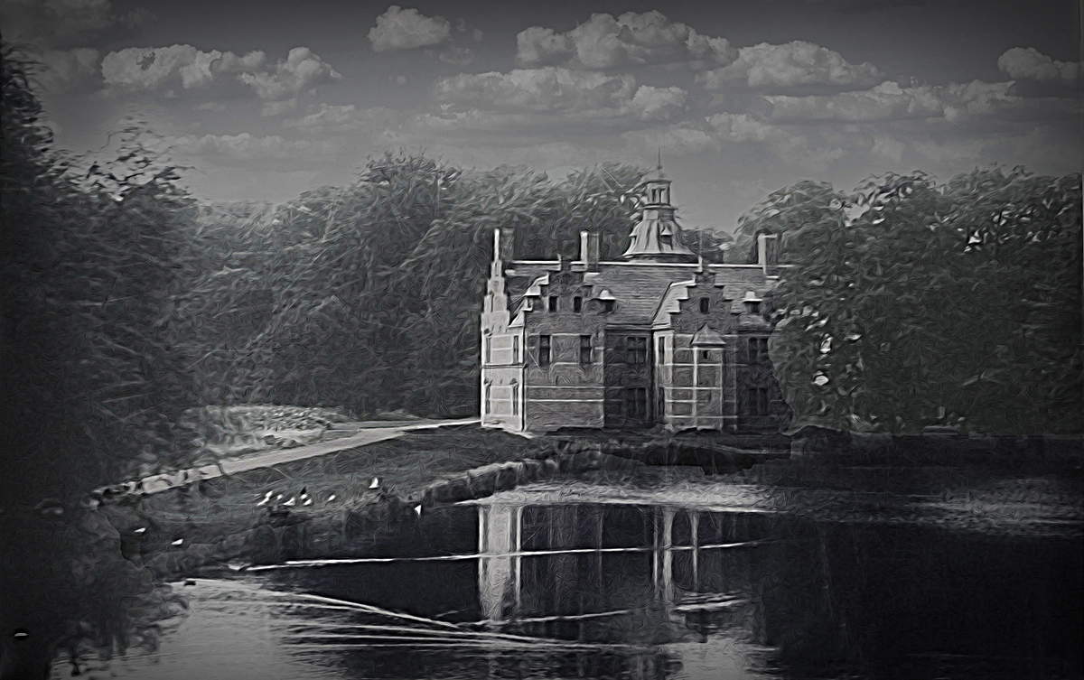
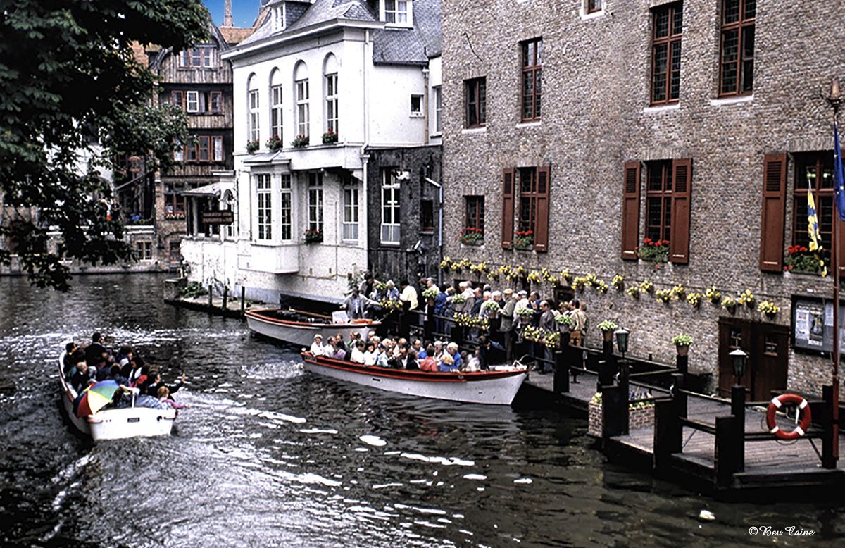
| 25 |
Apr 20 |
Comment |
Visiting from 48 & 80
Brings me back to my visit to Brugges over 30 years ago and would return in a heartbeat if I had he opportunity.
Lovely image and very well done. |
Apr 9th |
1 comment - 0 replies for Group 25
|
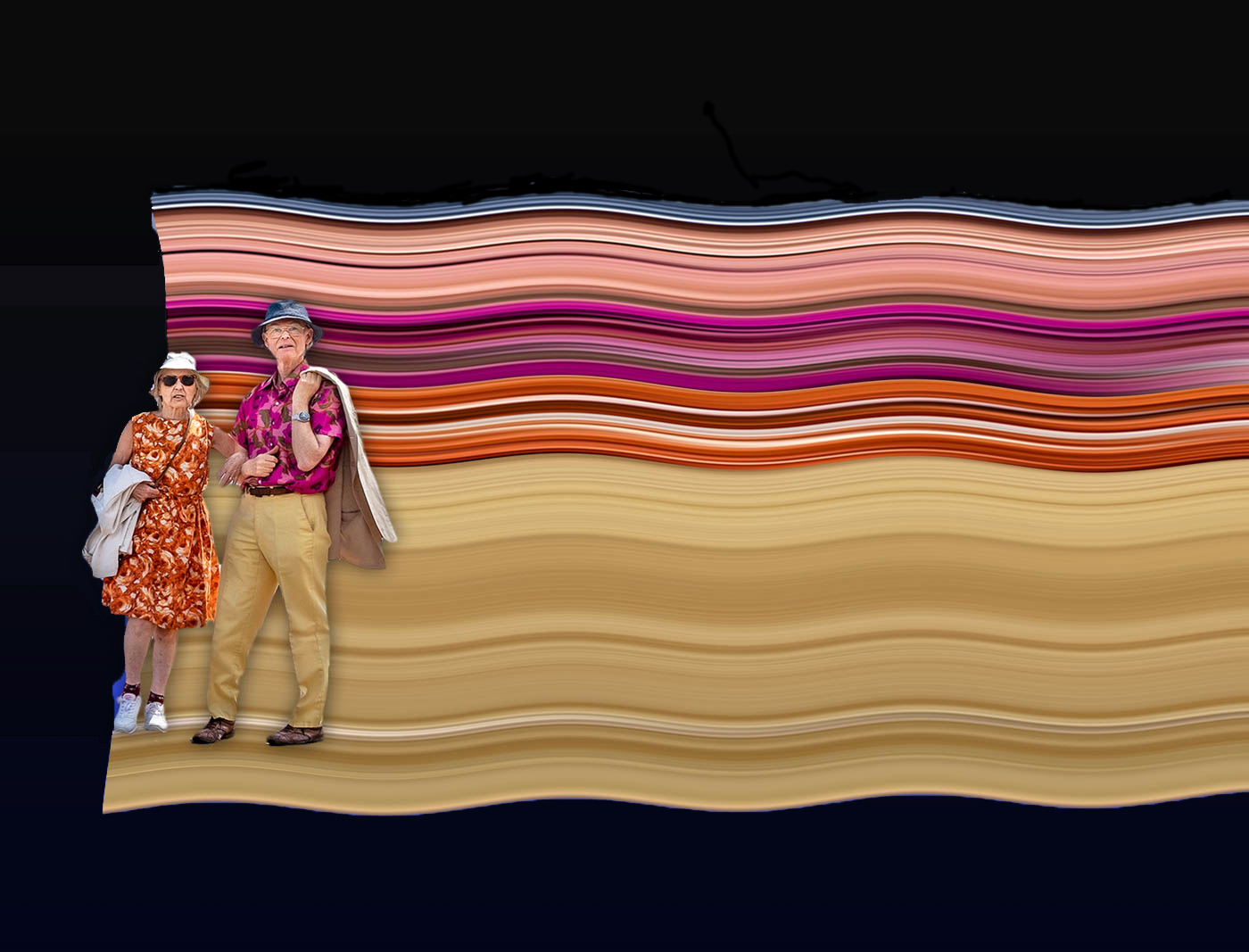
| 26 |
Apr 20 |
Comment |
Nice image Merv. Have often hoped to get to S. Africa but the older we get, the further away it seems to be. The only thing I would like to see adjusted a tad is the face of the fellow on the left, as it's a bit dark and can easily be corrected with a non-destructive layer mask.
|
Apr 9th |
1 comment - 0 replies for Group 26
|
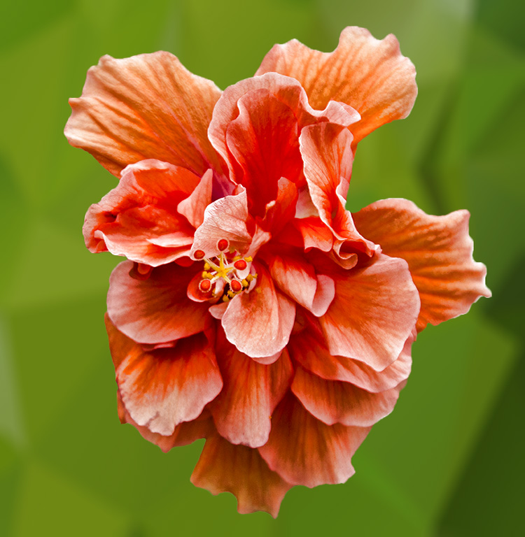
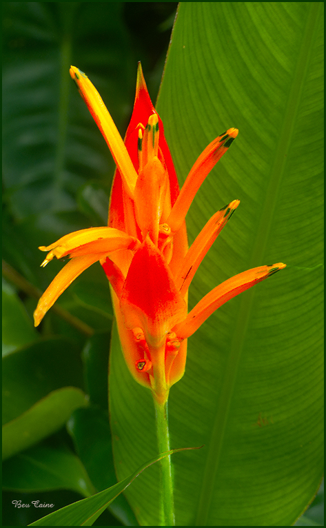
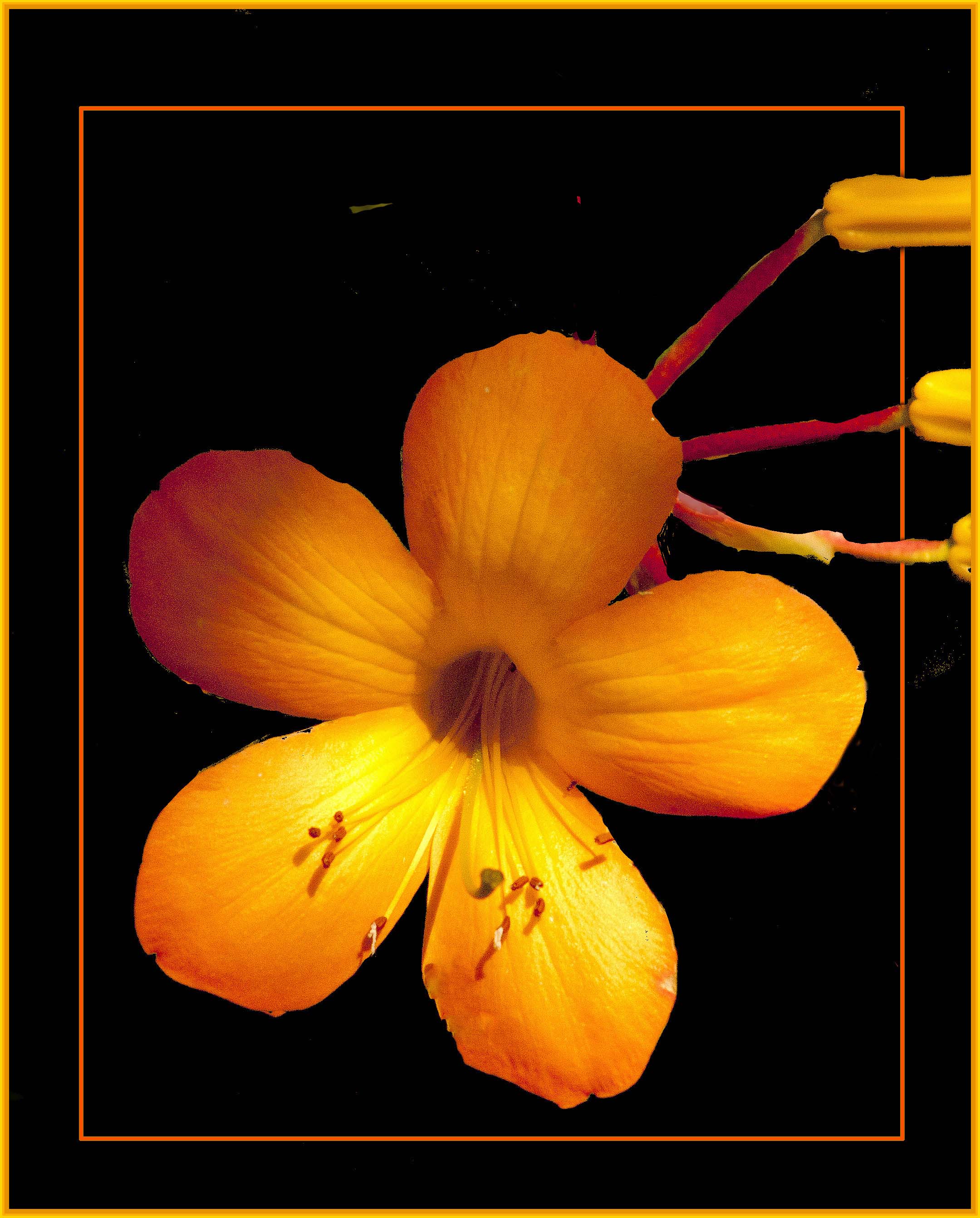
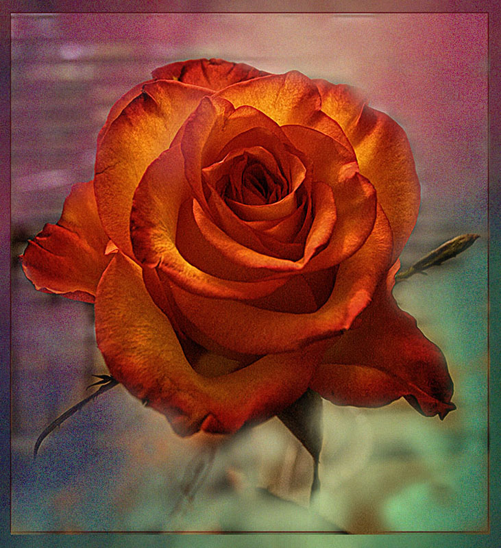
| 27 |
Apr 20 |
Comment |
|
Apr 9th |
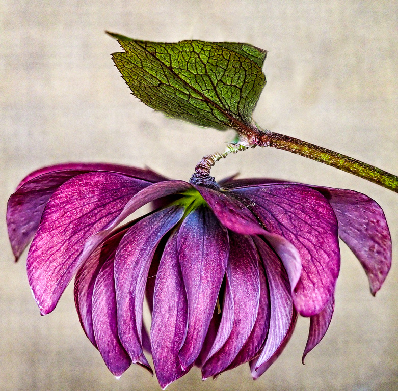 |
| 27 |
Apr 20 |
Comment |
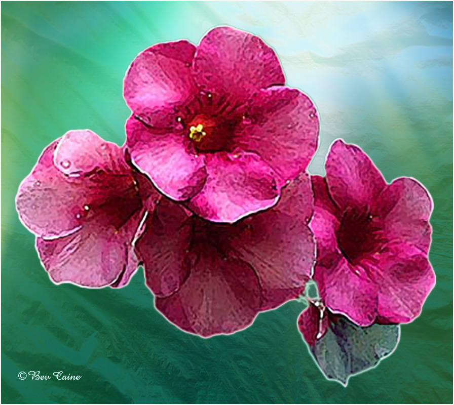
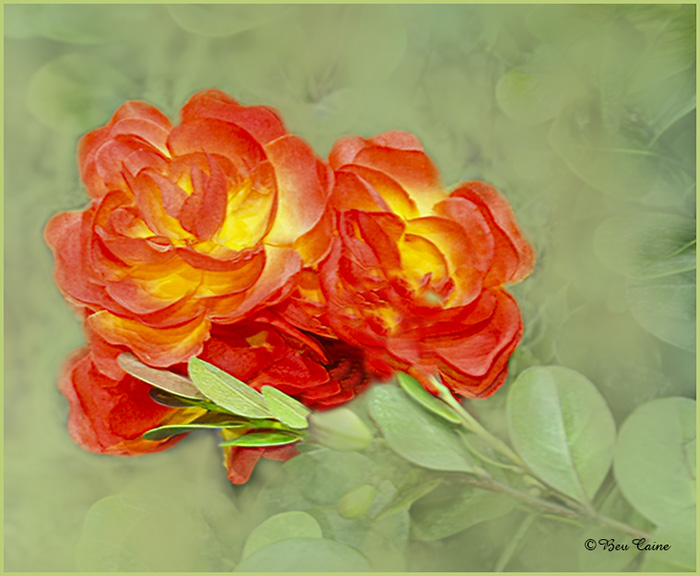
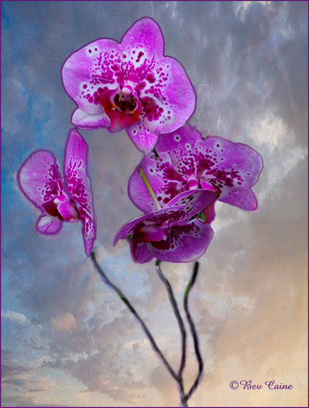
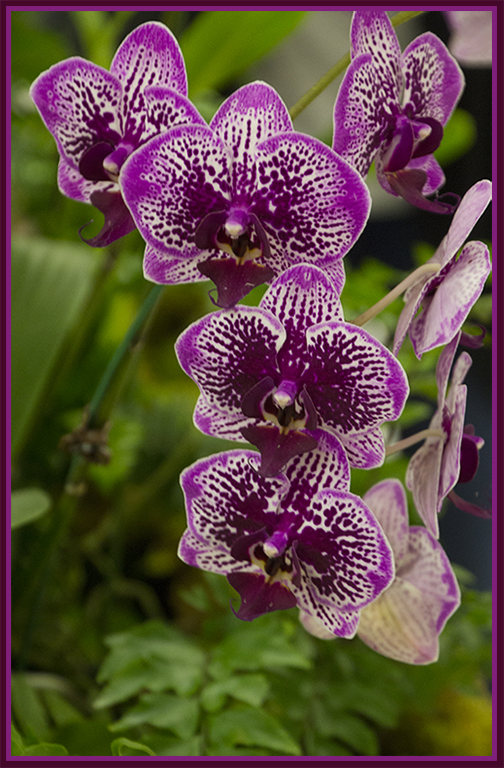
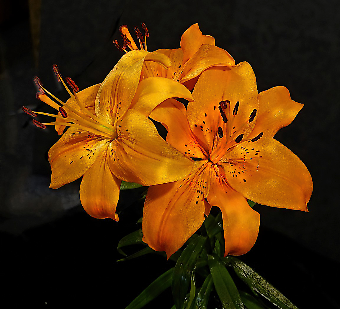
Visiting from 48 & 80. The colors on this flower are my favorite. I am disturbed by the bright green leaf behind the leaf on the stem, so I took it into photoshop and removed them by cloning. Overall, however, well done. |
Apr 9th |
2 comments - 0 replies for Group 27
|
| 28 |
Apr 20 |
Comment |
|
Apr 10th |
| 28 |
Apr 20 |
Comment |
Thank you. So far we are well but a bit anxious waiting for results for my son in law who is NYPD and was tested yesterday. Please keep him in mind. |
Apr 10th |
| 28 |
Apr 20 |
Comment |
Visiting from 48 & 80
Amazing is the understatement of the year! Well worth anything you did to achieve this result. |
Apr 9th |
3 comments - 0 replies for Group 28
|
| 29 |
Apr 20 |
Comment |
Visiting from 48 & 80
Both your original and Karen's suggestion are beautiful. Took me a bit to get used to Luminar but am loving it more every time I use it and my husband just bought another of their filters for us to play with.
Well done. |
Apr 9th |
| 29 |
Apr 20 |
Comment |
Visiting from 48 & 80
This is an absolutely beautiful image. As to the luminar question, I, too, use it but don't hesitate to alter the suggested improvements when I see the need. |
Apr 9th |
2 comments - 0 replies for Group 29
|
| 32 |
Apr 20 |
Comment |
Visiting from 48 & 80
Diana's image and suggested improvement takes the image from nice to eye catching. Steve, don't underrate yourself. The more you play with filters, the more you will begin to see possibilities. Have fun! |
Apr 9th |
| 32 |
Apr 20 |
Comment |
Visiting from 48 & 80
Agree with Stephen re crop on the left. I took this into Topaz Adjust AI and chose from several of the options. I think it gave the image a bit more oomph! |
Apr 9th |
 |
2 comments - 0 replies for Group 32
|
| 34 |
Apr 20 |
Comment |
Very well done Candy. Will have to look into those backgrounds. I'm always looking for new ones. |
Apr 9th |
| 34 |
Apr 20 |
Comment |
Visiting from 48 & 80
Fabulous result. Was this one of those things that kept you busy during the long days of self quarantine?
|
Apr 9th |
2 comments - 0 replies for Group 34
|
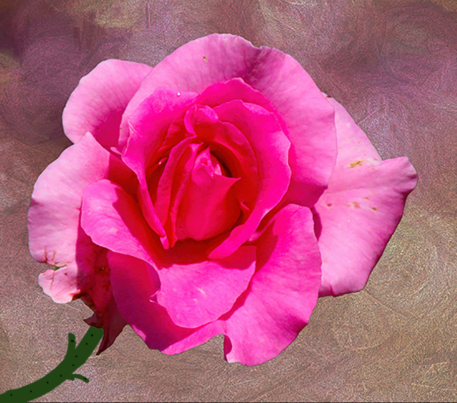
| 35 |
Apr 20 |
Reply |
Years ago, I did mats. Today my mat cutter sits in the garage and I just go to Michaels or wherever to cut the mat. Saves the stress and wasted mats. Keep up the good work! |
Apr 10th |
| 35 |
Apr 20 |
Comment |
Visiting from 48 & 80
First Congratulations on the award. I, personally found the background rack of what I assume are jackets and coats a bit distracting so I did a couple of things. First I copped to get rid of the extraneous stuff on the left side. I then created a non destructive layer mask and darkened the background. Flattened the image and they repeated the action to lighten the boots just a drop to make them stand out even more.
Would be interested in your thoughts on this alternate suggestion. |
Apr 9th |
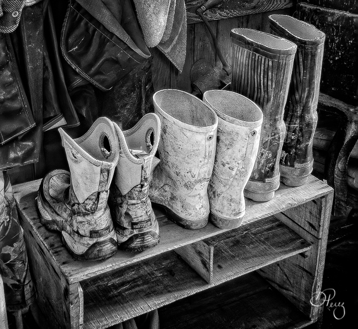 |
| 35 |
Apr 20 |
Comment |
Visiting from 48 & 80
This is a very well done image but I think that you might crop off a bit of the foreground because it is really a lot of dead space. |
Apr 9th |
| 35 |
Apr 20 |
Comment |
Visiting from 48 & 80
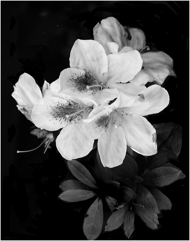
Beautiful image. The b/w is so much more outstanding than the pinkish color of your original. Overall very well done and a winner in my eyes. |
Apr 9th |
3 comments - 1 reply for Group 35
|
| 36 |
Apr 20 |
Comment |
I love this image. Eliminating the light on the bricks was an easy trick. Copy a section of the chimney, paste it onto the lights and then transform the pasted section to cover the light. See my completed process as an fyi. Overall a fabulous image. |
Apr 9th |
 |
1 comment - 0 replies for Group 36
|
| 44 |
Apr 20 |
Comment |
|
Apr 9th |
| 44 |
Apr 20 |
Comment |
Visiting from 48 & 80
This is a beautiful image, but for me, a little too light. I would suggest toning down the brightness just a bit and compare the results. |
Apr 9th |
| 44 |
Apr 20 |
Comment |
Visiting from 48 & 80
Beautiful image. Whatever you did to this one was a huge success.
As to Adobe. I never gave in to CC and now I'm so happy I didn't. Still working with CS6 and figure that one of these days I'll start learning Lightroom.
|
Apr 9th |
3 comments - 0 replies for Group 44
|
| 47 |
Apr 20 |
Comment |
I thought St. Petersburg was fabulous when we went many years ago but this sounds wonderful. |
Apr 10th |
| 47 |
Apr 20 |
Comment |
I thought St. Petersburg was fabulous when we went many years ago but this sounds wonderful. |
Apr 10th |
| 47 |
Apr 20 |
Comment |
Visiting from 48 & 80
I love a really good monochrome image and this one fits the bill to a T. The fact that you chose sepia tones is for me a total success. |
Apr 9th |
3 comments - 0 replies for Group 47
|
| 48 |
Apr 20 |
Comment |
Thanks Jamie. I am almost embarrassed to say that I totally misread. Have to speak to my ophthalmologist about trading in my eyes for a pair that are about 40 years younger. |
Apr 14th |
| 48 |
Apr 20 |
Reply |
Don't know how to do it in Lightroom but in Photoshop the first attempt should be as follows:
Duplicate the Layer
Select the entire Image
Go to Edit. Fill and then select 50% Gray (Do not worry after you follow the next step, you will see the image)
Look on the layer panel and click on the spot that says Normal and change to Overlay
Select the Paintbrush and choose black to darken or white to brighten
Set the opacity in the layer panel to between 10 and 15 percent
Start painting what you want to correct.
Pick any image and try it for fun. It's easy and sometimes works a miracle.
Email me any time you have a problem. If you want my phone number, email me, as I'd rather not put it on an open forum. I will be happy to walk you through it.
|
Apr 13th |
| 48 |
Apr 20 |
Comment |
This is a great capture. I would suggest toning down the background a bit as I find it a touch too bright but otherwise extremely well done. |
Apr 13th |
| 48 |
Apr 20 |
Comment |
Thanks so much - The effort is very much appreciated. |
Apr 10th |
| 48 |
Apr 20 |
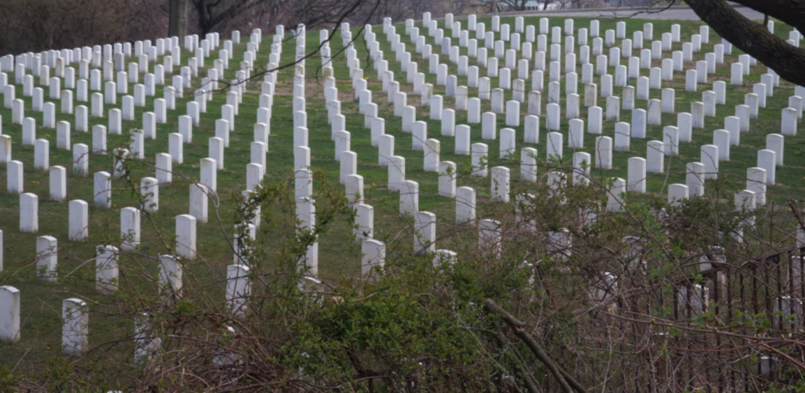
Comment |
We had a National Cemetery in Pinelawn not far from where I lived when we were in NY and I always said I was going to photograph the headstones. I was told years ago that the particular pattern was specifically created so that any that one looked they would see a V which was meant to designate victory.
That said, in this case, I find the background less than interesting and not really necessary so I offer you a cropped version focusing on the gravestones and a view of the V formation.
|
Apr 9th |
 |
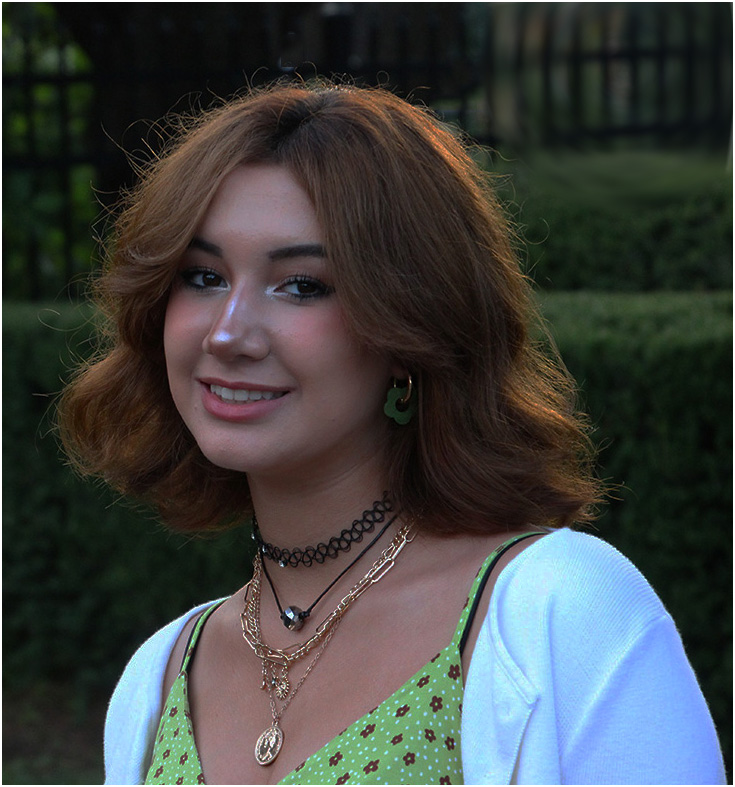
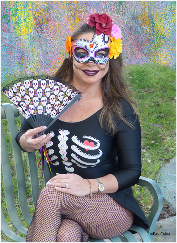
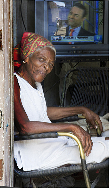
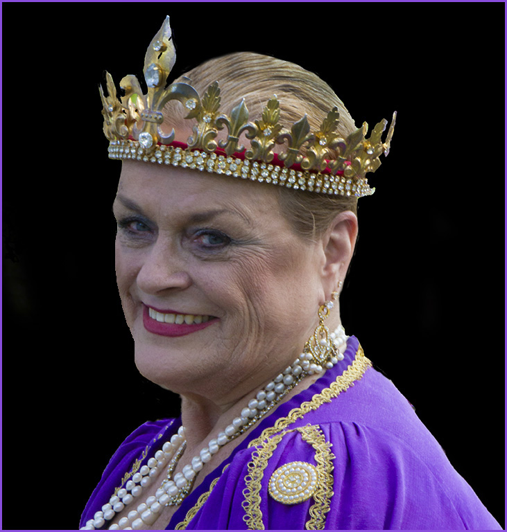
| 48 |
Apr 20 |
Comment |
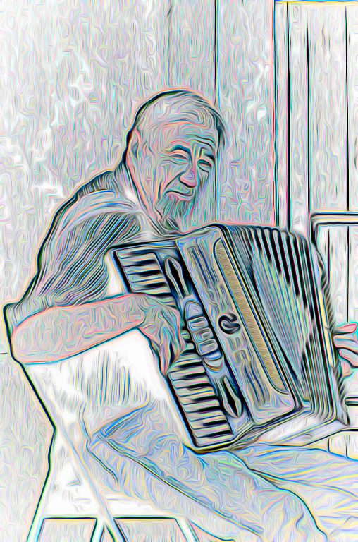
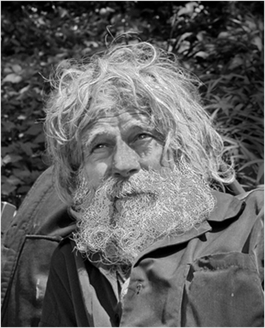
I think Steve's monochrome is a valuable addition, but I really like the color version as well. Excellent portrait either way |
Apr 8th |
| 48 |
Apr 20 |
Reply |
sorry forgot to push the right button so here is the change |
Apr 8th |
| 48 |
Apr 20 |
Comment |
|
Apr 8th |
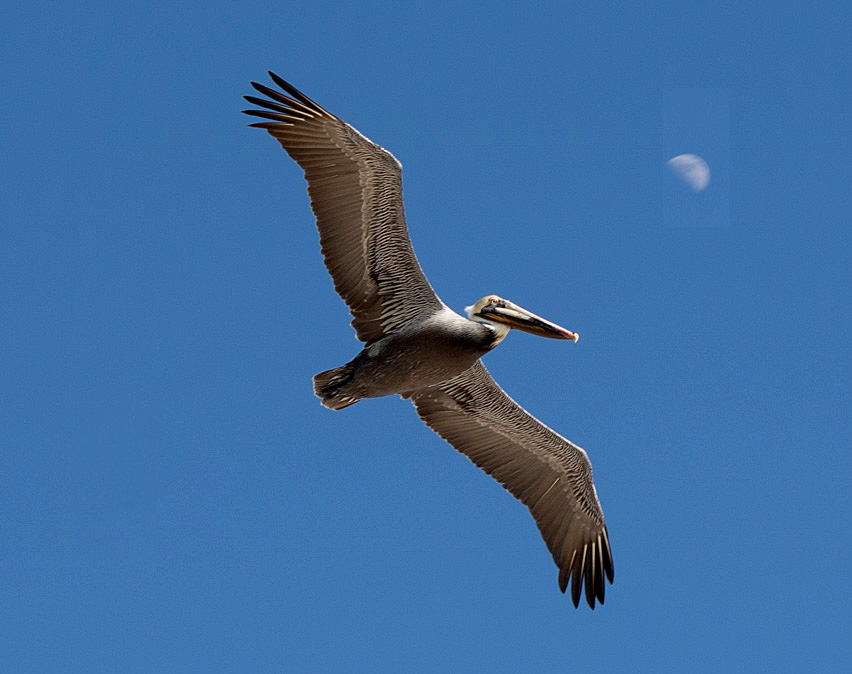 |
| 48 |
Apr 20 |
Comment |
Great image but as it is titled Fly me to the Moon, and the moon was behind him, I took the liberty of moving the moon's position by copying and pasting the moon. I then moved it where I wanted it, flattened the image, and did a content aware fill. Voila! flying to the moon instead of away from it. Can't do this in a nature category, but it's a good trick to have in your pocket. |
Apr 8th |
| 48 |
Apr 20 |
Comment |
This is a well done image. I do agree with Neil's crop and lighting change. It brightens up the image and enhances it quite a bit. Nice work. |
Apr 8th |
| 48 |
Apr 20 |
Reply |
The black spots are there because I totally missed them and you are 100 percent right, they don't belong. The leaf is easily removable with a content aware fill. Thanks for making me aware of the black spots.... guess my eyesight isn't what it was 30 or more years ago. |
Apr 8th |
| 48 |
Apr 20 |
Reply |
Hope this makes more sense |
Apr 7th |
| 48 |
Apr 20 |
Comment |
Thanks. Actually looking at it again I see a lot of imperfections in addition to the fact that the one posted as Original 2 should have been the final one. I was trying to get the effect of the background in original 2 so I will go ahead and change it and see if that makes anything better. |
Apr 7th |
9 comments - 4 replies for Group 48
|
| 51 |
Apr 20 |
Reply |
Join the club! |
Apr 10th |
| 51 |
Apr 20 |
Comment |
Visiting from 48 & 80
Love the sense of humor or is it desperation? The image is very apropros to our times and well executed.
Stay safe and sane. |
Apr 9th |
1 comment - 1 reply for Group 51
|
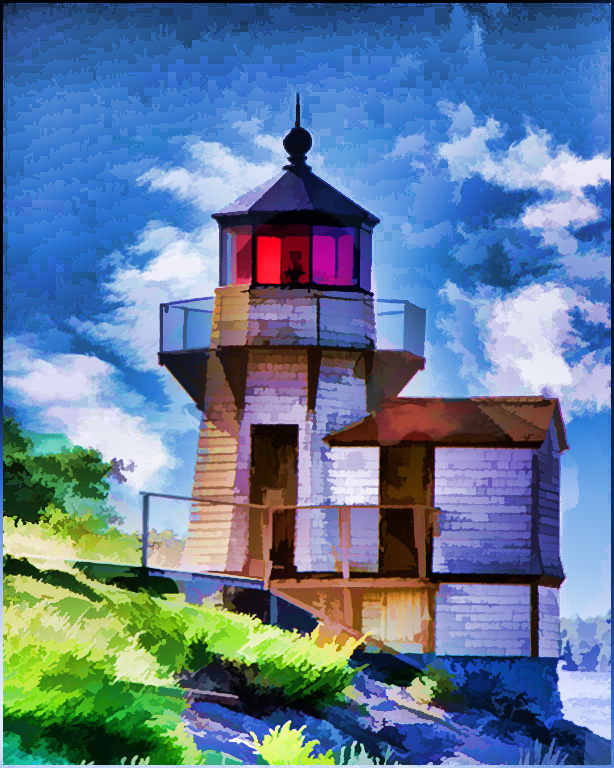
| 53 |
Apr 20 |
Comment |
I don't know if it's my vision or imagination, but the building itself seems to be leaning a bit backward. Otherwise, I love your sky application and the overall result. |
Apr 9th |
1 comment - 0 replies for Group 53
|
| 60 |
Apr 20 |
Comment |
Visiting from 48 & 80
Great imagination to begin with and superb execution. Wonderful image. |
Apr 9th |
1 comment - 0 replies for Group 60
|
| 63 |
Apr 20 |
Comment |
Visiting from 48 & 80
Wonderful image. Brings me back nostalgic memories of our trip to China almost 30 years ago. |
Apr 9th |
1 comment - 0 replies for Group 63
|
| 66 |
Apr 20 |
Comment |
I am a big fan of elephant images ever since our own visit to Africa some 30 years ago. I'd love to see this one's face a little better which you could probably accomplish with a non-destructive layer mask easily enough.
Overall, it's a really good image that might benefit from just a slight tweak. |
Apr 9th |
| 66 |
Apr 20 |
Comment |
Beautiful image with superb execution. |
Apr 9th |
3 comments - 0 replies for Group 66
|
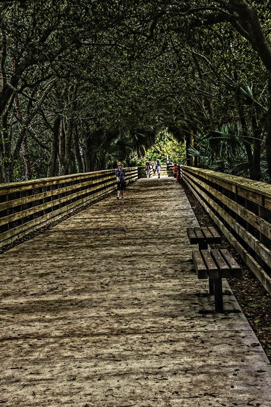
| 69 |
Apr 20 |
Comment |
Hi Brenda. Nice image, but I do agree that a subject on the path would be more than just an added plus.
Stay safe in these trying times. |
Apr 9th |
1 comment - 0 replies for Group 69
|
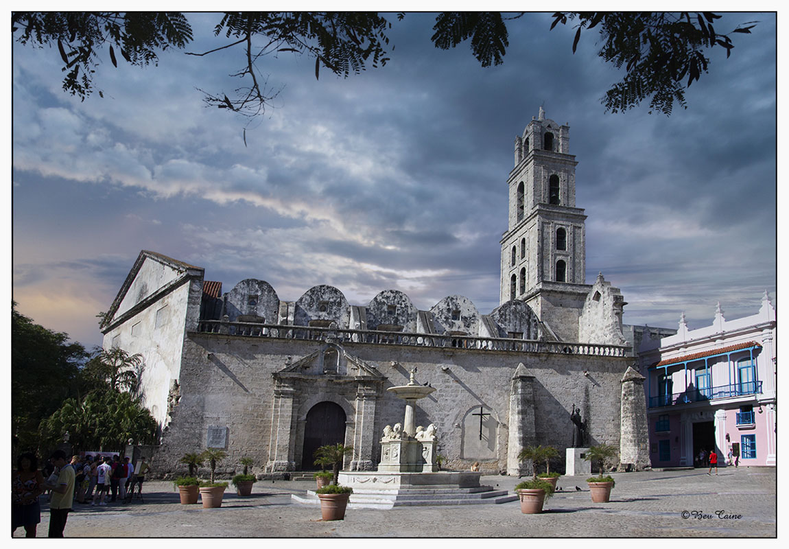
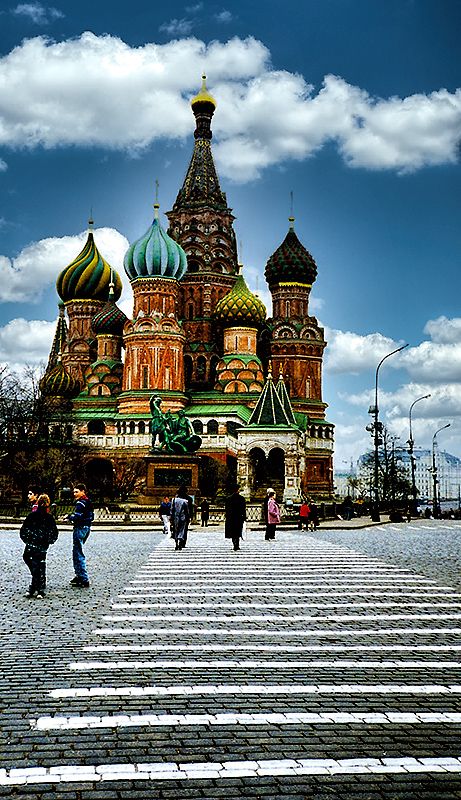
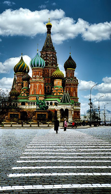
| 80 |
Apr 20 |
Reply |
Thanks to all. Great Suggestions |
Apr 14th |
| 80 |
Apr 20 |
Comment |
I kind of thought they were a reasonable leading line to the Basilica |
Apr 11th |
| 80 |
Apr 20 |
Reply |
Had to take out a couple but was not difficult with content aware fill. If you've never used this technique, let me know & I'll give you the lowdown. |
Apr 11th |
 |
| 80 |
Apr 20 |
Reply |
Had to take out a couple but was not difficult with content aware fill. If you've never used this technique, let me know & I'll give you the lowdown. |
Apr 11th |
|
| 80 |
Apr 20 |
Reply |
Had to take out a couple but was not difficult with content aware fill. If you've never used this technique, let me know & I'll give you the lowdown. |
Apr 11th |
|
| 80 |
Apr 20 |
Reply |
Had to take out a couple but was not difficult with content aware fill. If you've never used this technique, let me know & I'll give you the lowdown. |
Apr 11th |
|
| 80 |
Apr 20 |
Reply |
Had to take out a couple but was not difficult with content aware fill. If you've never used this technique, let me know & I'll give you the lowdown. |
Apr 11th |
 |
| 80 |
Apr 20 |
Comment |
Appreciate your comments, but honestly I don't see the haze you're referring to. Guess I have to begin to admit that my eyes are getting the best of me. |
Apr 10th |
| 80 |
Apr 20 |
Reply |
I have those too but Luminar is so easy it's a pleasure. Thanks for visiting. |
Apr 9th |
| 80 |
Apr 20 |
Reply |
Thanks so much. I do find with Luminar skies on some images I have to use layers and tone them down a bit by altering the opacity on the top layer but in this case I felt the strong one worked better. |
Apr 9th |
| 80 |
Apr 20 |
Reply |
In looking at it again, I realized that the sky was actually done with Luminar 4 - And thanks for your comments. |
Apr 7th |
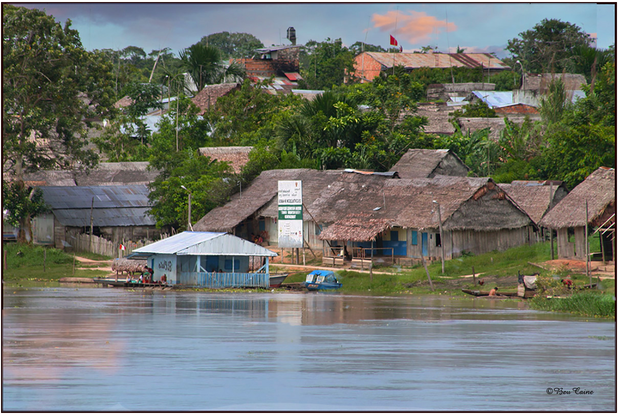
| 80 |
Apr 20 |
Comment |
I agree with Steve re the subject is a really good one. The problem I have and I don't see a way to correct it other than maybe having shot from another angle, is the flowers on the left side of the image. I find them a bit distracting and can't begin to think of how to eliminate them. Other than that one thing, this is a very well done image. |
Apr 7th |
| 80 |
Apr 20 |
Comment |
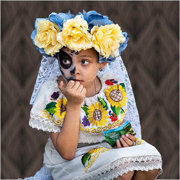
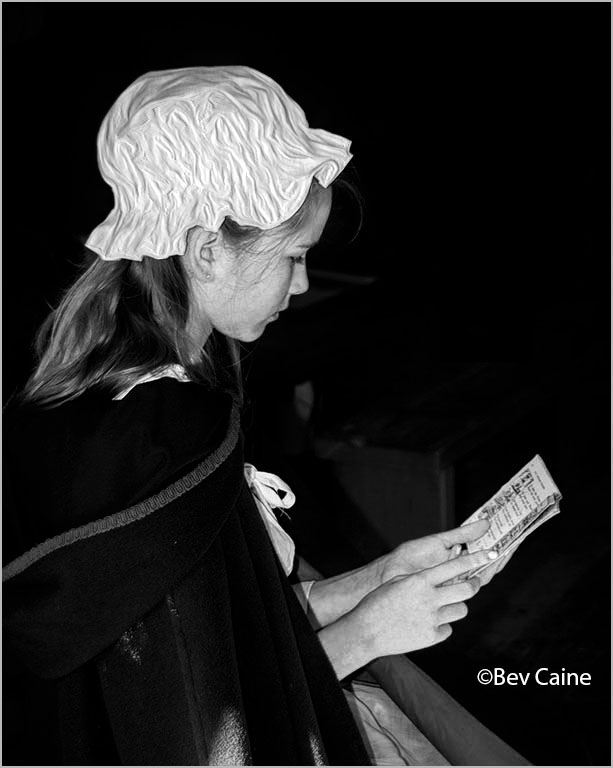
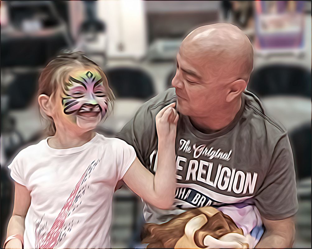
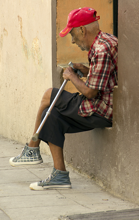
The image, in my view, is much better in monochrome as it eliminates the distracting yellow "toy" in the little girl's right hand. Overall this is a very well done image and the expression on the little girl's face is priceless. |
Apr 7th |
| 80 |
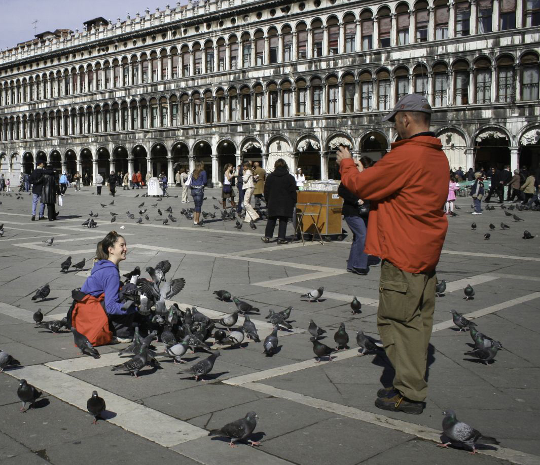
Apr 20 |
Comment |
I love the smile on her face, as well as the entire subject but the problem for me is that because of the attempt to get the entire building as a background, the subject is diminished in the overall image. The photographer stands out, but she is the smallest part of the image. I chose to crop the image to eliminate a large part of the building bringing the focus more directly to her.
The other option would be to eliminate the photographer entirely, and just hone in on her. |
Apr 7th |
 |
| 80 |
Apr 20 |
Comment |
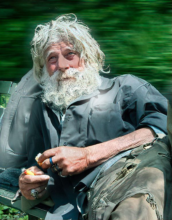
The image tells a story but on my screen the subject is too bright and the background offers little to enhance the image. I chose to blur out the background and make the whole image a tad darker. I would appreciate your thoughts on my suggestions. |
Apr 7th |
 |
| 80 |
Apr 20 |
Comment |
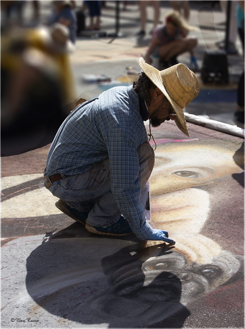
I love the image but find that the "window" on the right with all the toys is a little too bright and attracts my eye away from your subject. l So I used a non destructive layer mask and toned it down a bit. You could probably do the same thing by outlining the whole window and using adjustment/brightness and tone down the brightness |
Apr 7th |
 |
7 comments - 9 replies for Group 80
|
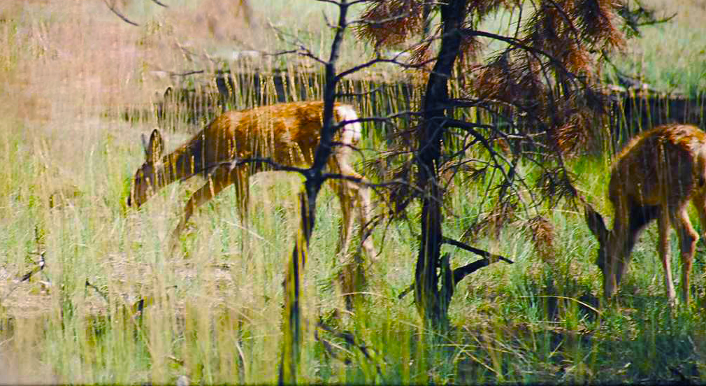
| 94 |
Apr 20 |
Comment |
|
Apr 23rd |
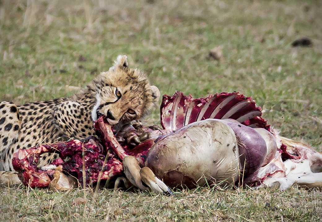 |
| 94 |
Apr 20 |
Comment |
Visiting from 48 & 80
Nice image. Brings me back to Kenya in 1989 when we were lucky enough to catch a cheetah kill and unlucky enough to have only a 300 mm lens.
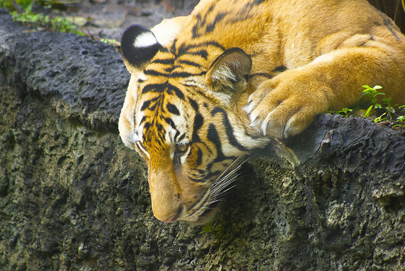
My only suggestion, if allowed in nature images, would be to darken the background grass just a bit to bring the animals even more prominently to the foreground. The other group members' cropping suggestions make sense as well.
|
Apr 23rd |
2 comments - 0 replies for Group 94
|
| 95 |
Apr 20 |
Comment |
very easy ... if you run into a problem, don't hesitate to call me 561-752-3992...I'm in almost always due to social distancing. |
Apr 24th |
| 95 |
Apr 20 |
Reply |
I tried to show you the result but I don't know if it's visible on your screen. I'm working on my laptop and find it a bit difficult to see. |
Apr 23rd |
| 95 |
Apr 20 |
Comment |
|
Apr 23rd |
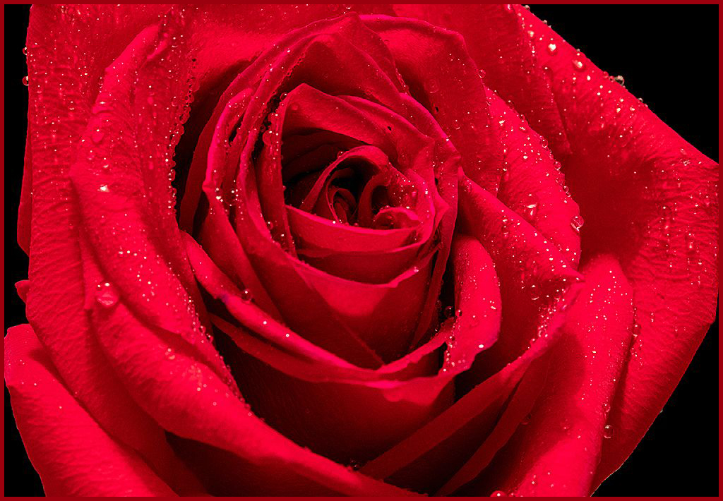 |
| 95 |
Apr 20 |
Comment |
Visiting from 48 & 80
It's a beautiful image. The simplest way to create a border in Windows - Photoshop
Select All
Edit
Stroke
(Stroke will pick up the color from your sample in tools)
Adjust the size of your border in the box at the top
And you're done! |
Apr 23rd |
3 comments - 1 reply for Group 95
|
78 comments - 19 replies Total
|