|
| Group |
Round |
C/R |
Comment |
Date |
Image |
| 3 |
Jul 18 |
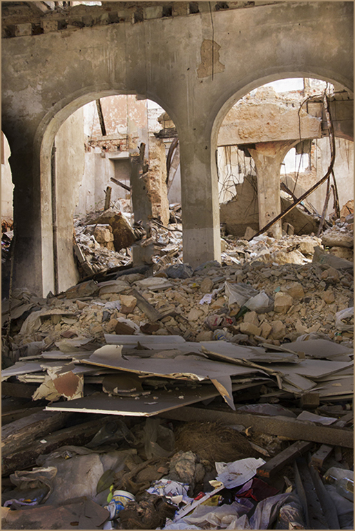
Comment |
I'm the administrator of group 48 and visit all the groups every month. Congratulations! May she be as happy as my own daughter is with her spouse after 16 years. Love the image. |
Jul 10th |
1 comment - 0 replies for Group 3
|
| 5 |
Jul 18 |
Comment |
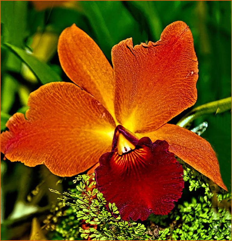
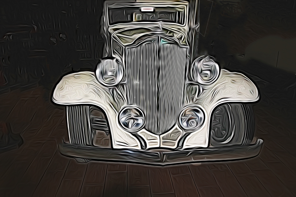
Beautiful image. I will definitely try it one of these days if I have the patience to see it through to the finish. Very well done. |
Jul 10th |
1 comment - 0 replies for Group 5
|
| 8 |
Jul 18 |
Comment |
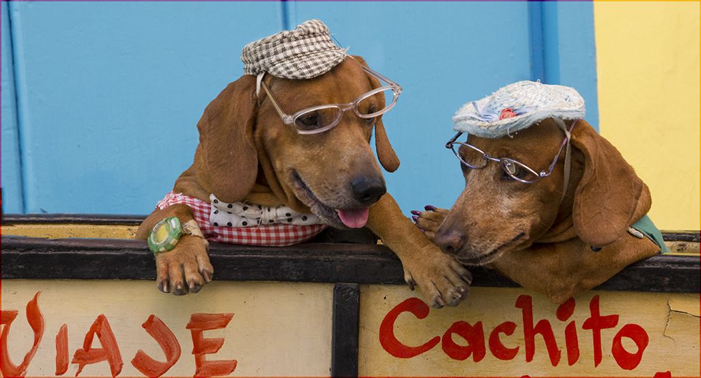
Mark, you are so creative that I am often intimidated by your talent. @onderful result! |
Jul 10th |
1 comment - 0 replies for Group 8
|
| 9 |
Jul 18 |
Comment |
so happpy to hear from you that you were not personally affected |
Jul 27th |
| 9 |
Jul 18 |
Comment |
Shaikh, I just read about the bombing in Islamabad. Are you ok? |
Jul 26th |
| 9 |
Jul 18 |
Comment |
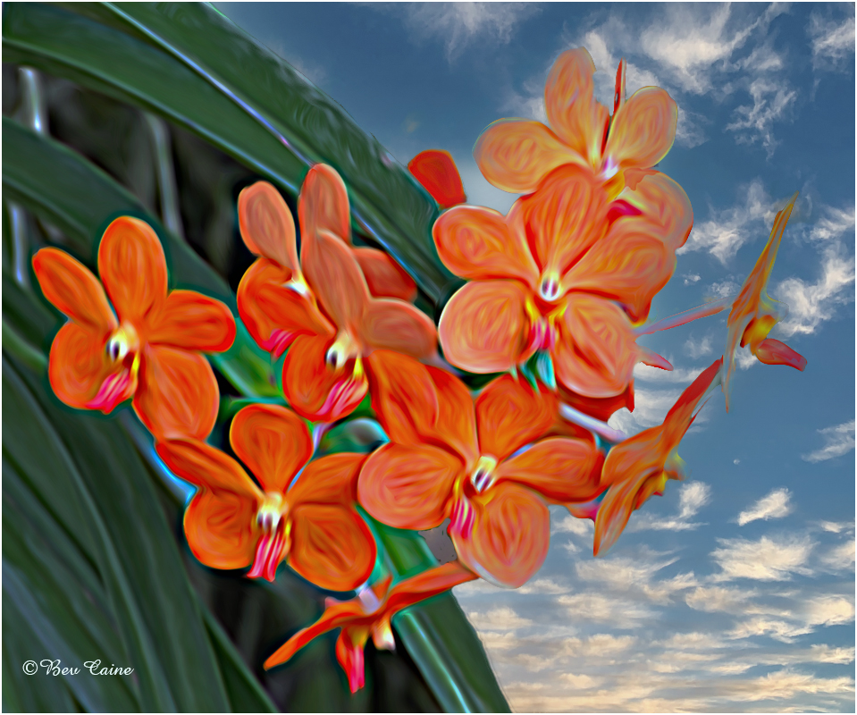
Your talent never ceases to amaze me. Wonderful image. |
Jul 14th |
3 comments - 0 replies for Group 9
|
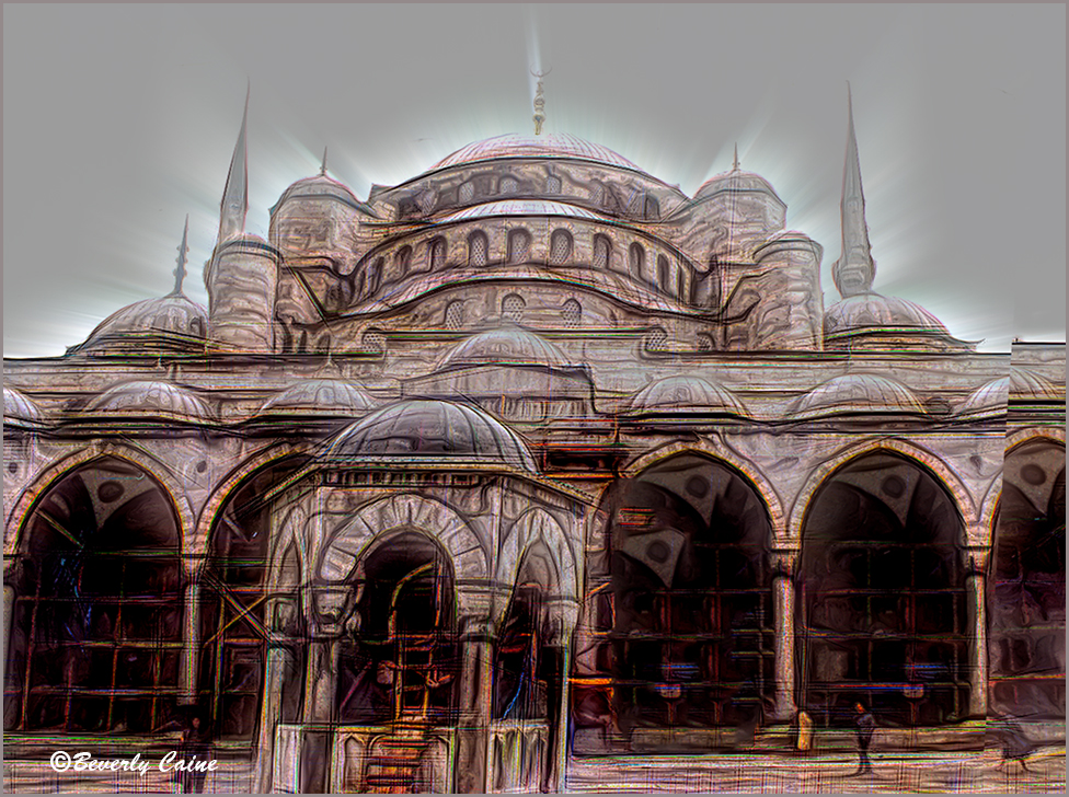
| 17 |
Jul 18 |
Comment |
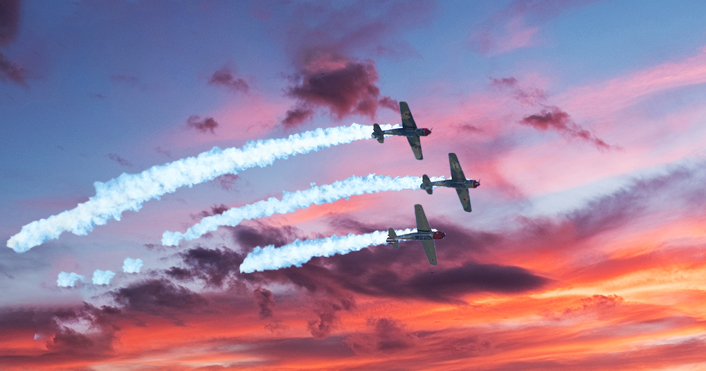
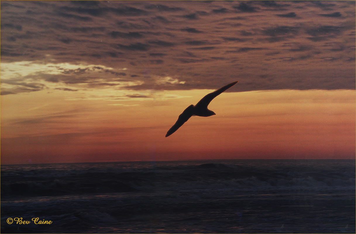
Hi. Great image but I, too, agree with the consensus re the crane. I feel that it brings the eye to the towers more effectively. Love the dark sky. |
Jul 11th |
1 comment - 0 replies for Group 17
|
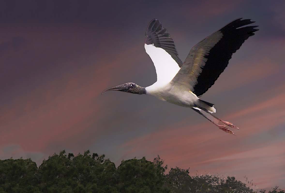
| 19 |
Jul 18 |
Comment |
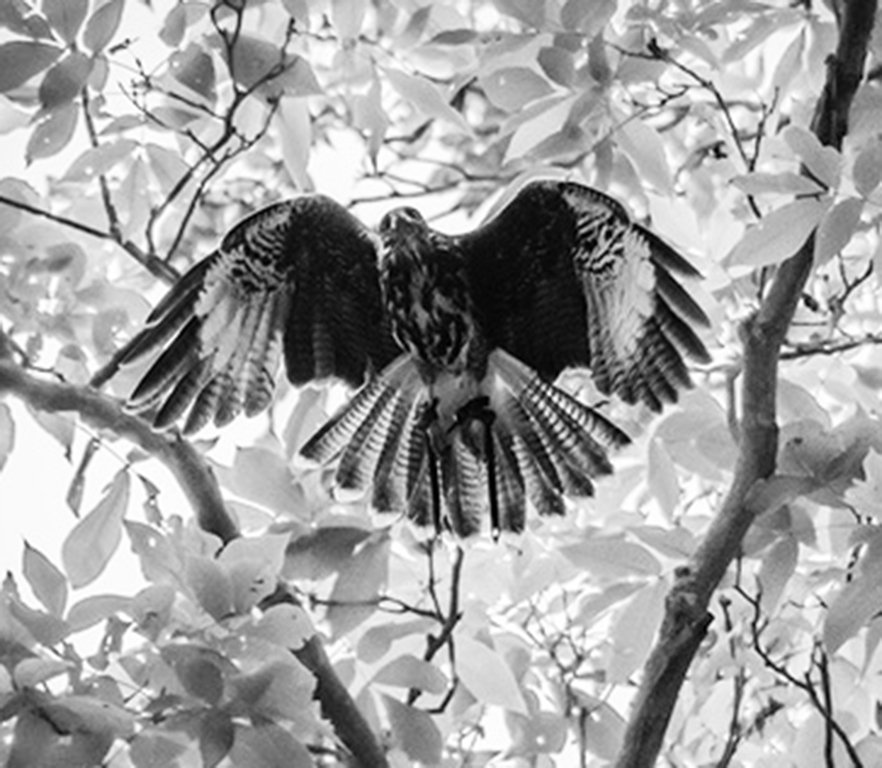
I am the administrator of group 48 and enjoy visiting all the groups, finding it a great learning experience. After reading the comments on your image, I decided to try a few of the suggestions. I found this result much more to my liking than darkening the background. And I felt that by cropping some of the background, the hawk stands out quite a bit more. What do you think? |
Jul 11th |
 |
1 comment - 0 replies for Group 19
|
| 20 |
Jul 18 |
Comment |
By the way I also eliminated the vertical bar and fixed the dent with a simple content aware fill in one step for each. |
Jul 11th |
| 20 |
Jul 18 |
Comment |
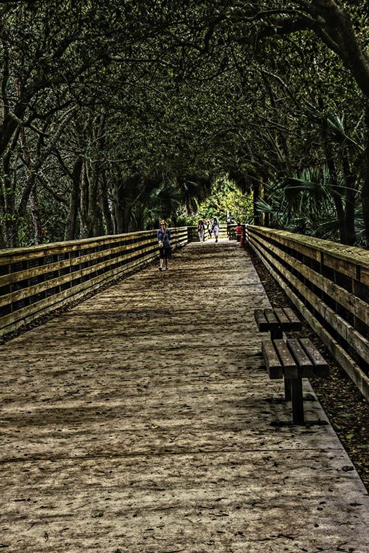
I am the administrator of group 48 and visit all the groups as a great learning experience. I tried cropping your image and in accordance with some of the suggestions "shortened" the bridge, in my visual feedback. Personally, I much prefer your image which expresses the expanse of the scene. |
Jul 11th |
 |
2 comments - 0 replies for Group 20
|
| 26 |
Jul 18 |
Comment |
I am the administrator and visit all the groups as a learning experience. I actually like that small sign as it tells where you are. However, I also like a challenge, so I took your image into Photoshop CS6 and came up with the image I have included in my feedback. What I did was select each line separately and used the content aware tool. After I did all three I then selected the total area and once again used the content aware for the space where the three lines were. When I was done with that, tha section was a bit bright so I toned it down one notch and then while the entire inside of the circle was still selected, used the sharpen filter, again only one notch to sharpen the center a bit. What do you think of the result?" |
Jul 14th |
 |
1 comment - 0 replies for Group 26
|
| 29 |
Jul 18 |
Comment |
I am the administrator of Group 48 and I visit all the groups as a great learning experience. I love this image the colors are wonderful. As I was looking at it, it appeared to be a wee bit off straight so I took it into my photoshop and just transformed it by about a hairline or two. I don't mean to be critical, and I wonder if anyone else saw it. I, too, would like to see the top |
Jul 14th |
1 comment - 0 replies for Group 29
|
| 48 |
Jul 18 |
Reply |
I know nothing about Lightroom. However, if you have photoshop, I will be happy to email you the instructions, very simple if a technomoron like me can make it work. |
Jul 17th |
| 48 |
Jul 18 |
Comment |
Just a thought on Neils comment on the hand...a non destructive layer mask should solve that problem in toning it down to almost any degree you might like |
Jul 17th |
| 48 |
Jul 18 |
Comment |
Just going through all the images again and saw your original. To be honest I prefer the original. I'd like to see it with another filter of sometimes the first shot is the best. |
Jul 16th |
| 48 |
Jul 18 |
Comment |
Thanks. Anxious to see Neil's reaction |
Jul 15th |
| 48 |
Jul 18 |
Comment |
Just selected the whole image, transform,and rotate just a couple of degrees |
Jul 15th |
| 48 |
Jul 18 |
Comment |
After re-reading Margaret's comment I decided to play a bit again. I chose the quick selection tool and selected just the window. I then went to image-adjustment-brightness-contrast-and reduced the brightness of just that area enough so you can see that there is something there, but not so much that the white is glaringly obvious. What is your take on this result? |
Jul 15th |
 |
| 48 |
Jul 18 |
Reply |
see if this is any better |
Jul 15th |
 |
| 48 |
Jul 18 |
Comment |
The original is so old I have no recollection of the original sky, but it may be an effect of the filter. Any suggestion for altering it? |
Jul 15th |
| 48 |
Jul 18 |
Reply |
Any time you're stumped in Photoshop, don't hesitate to email or call me at 561-752-3992 |
Jul 13th |
| 48 |
Jul 18 |
Comment |
I think we've said all there is to say about this series and look forward to new images and new techniques in the future. |
Jul 13th |
| 48 |
Jul 18 |
Comment |
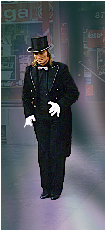
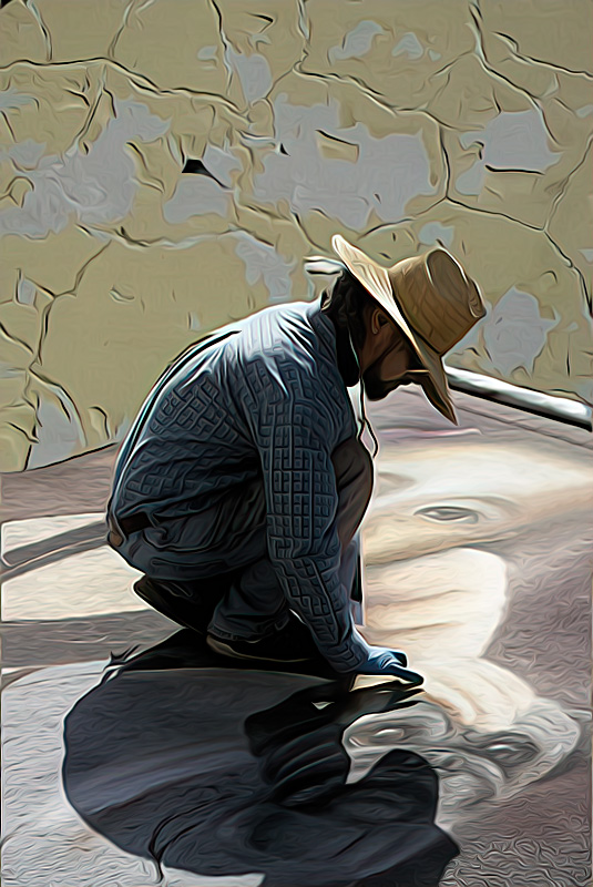
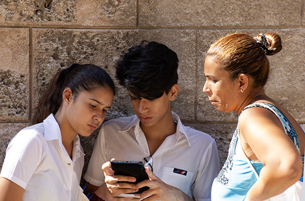
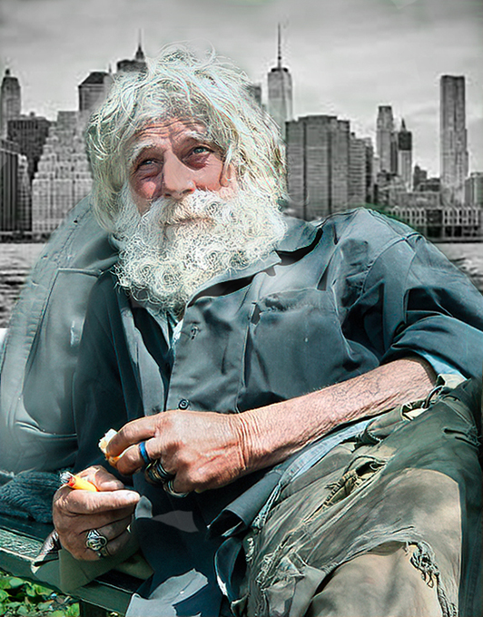
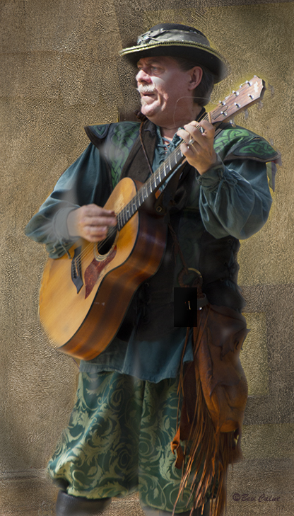
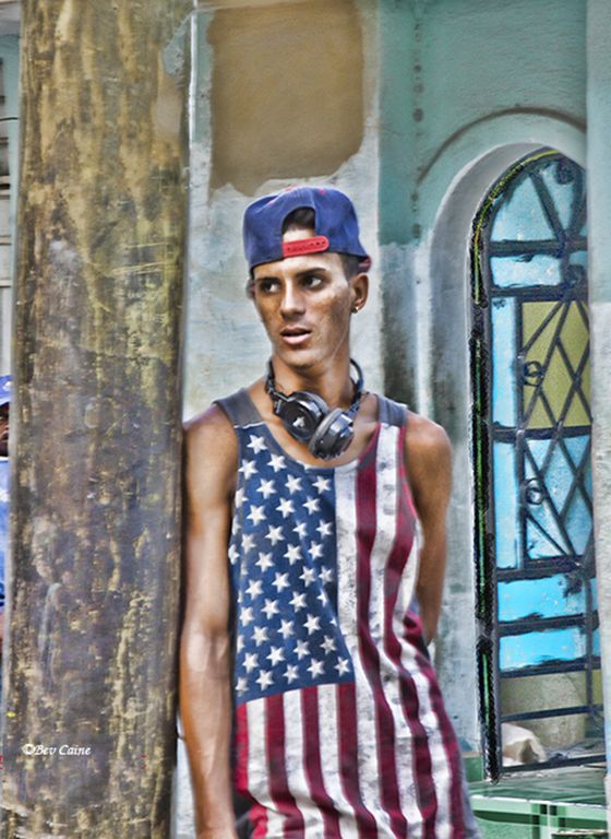
I am a fan of a "bit brighter" so, I went to image, adjustment, brightness, and just increased the overall just a drop. I liked the idea of the sun shining through to his face. I then selected those gorgeous eyes individually and did the same thing to make them stand out. Overall this is a great image and my adjustments are purely personal taste. Would like other opinions. |
Jul 13th |
 |
| 48 |
Jul 18 |
Comment |
I like the image subject, but am not enamored with the filters you chose. I'd like to see the original which you can, and should submit when you submit your original. It's also a good idea to tell us what filters you did use (I know, I don't always do it either, but I should note them as I work with them) so that the group can take advantage of your knowledge.
Thanks. |
Jul 13th |
| 48 |
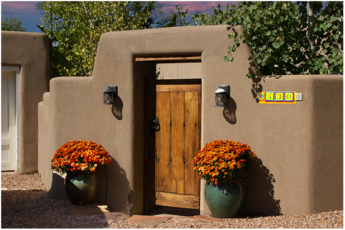
Jul 18 |
Comment |
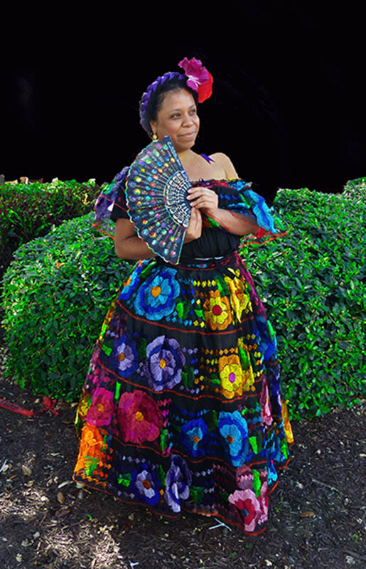
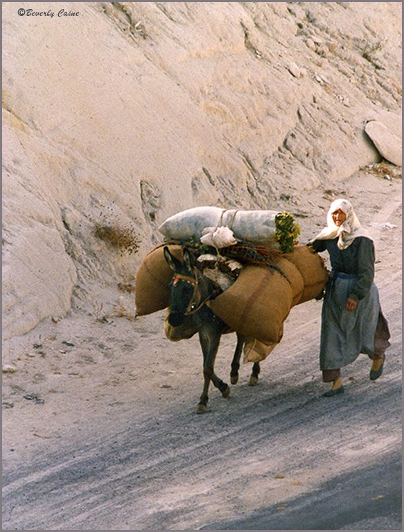
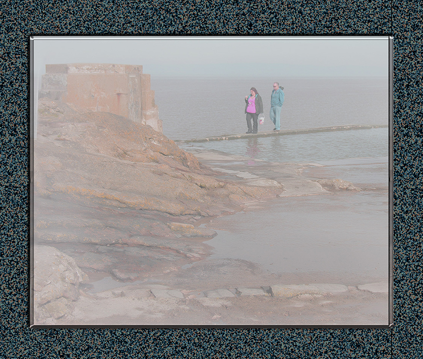
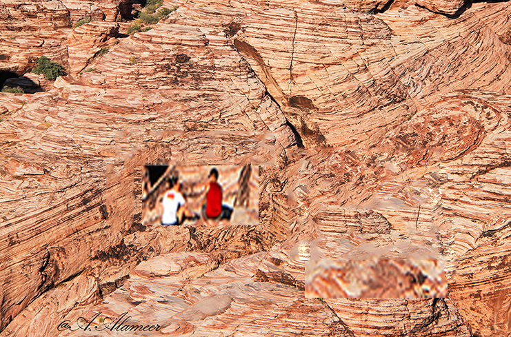
The colors and texture of the desert is great' however.the couple is almost not visible they are so small. I did a little playing in Photoshop, selecting them and increasing their size. To do a totally correct job would take more time than I had, but I think you get the idea. Hope you approve. |
Jul 13th |
 |
| 48 |
Jul 18 |
Comment |
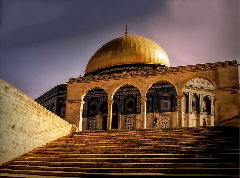
This image is "picture perfect". There are times when my "tongue hangs out" for a sky like this one. Everything says a beautiful day with everything in good order. |
Jul 13th |
| 48 |
Jul 18 |
Comment |
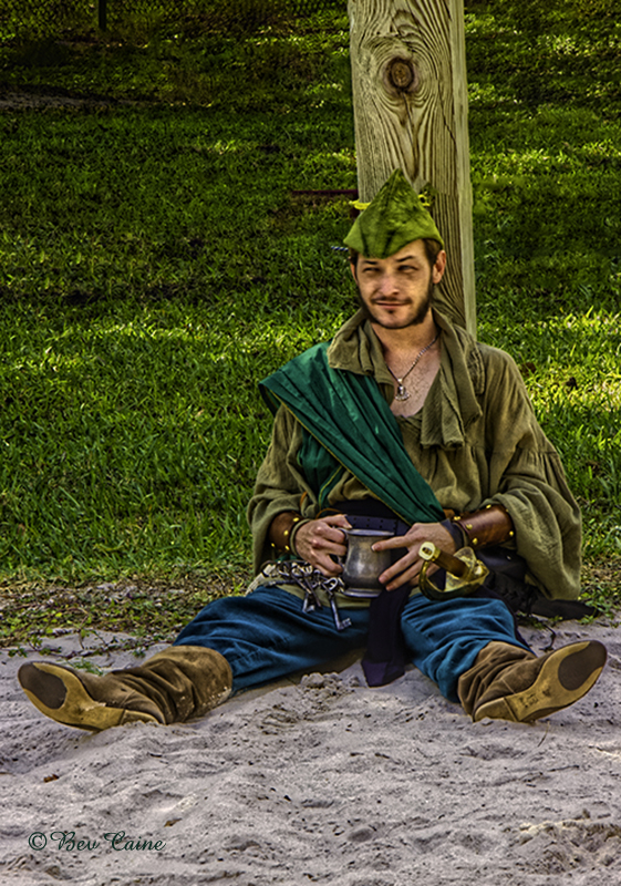
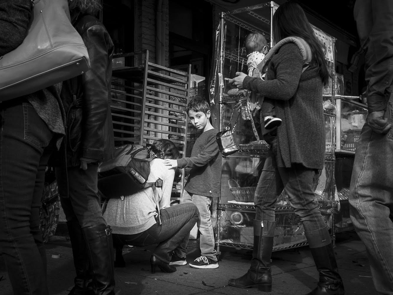
I like the image. And as Margaret said, as you seem to prefer a lot of black, I left that alone. However, in my visual feedback, I brightened up the subject a bit to make them stand out a bit more. |
Jul 13th |
 |
| 48 |
Jul 18 |
Comment |
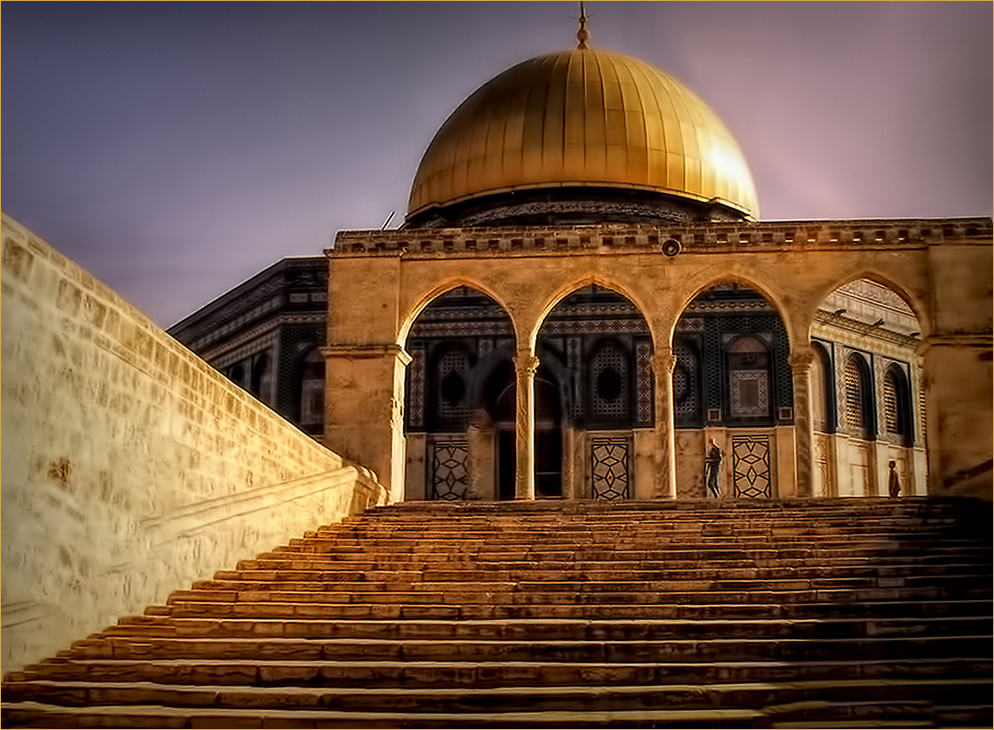
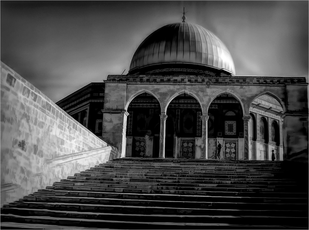
That's what I did in PS - Used Transform, skew and using the grid lines as a guide, straightened the steps and kept the roof level as well, but it distorts the entire image. If I just turn the whole image to straighten the steps, the roof line gets skewed and the sky changes as well. |
Jul 12th |
| 48 |
Jul 18 |
Comment |
In the original, the roof line is perfectly straight as I lined it up with the guides in CS6. However, I went back in to the image to straighten the steps. I am not really happy with that result as it changes the entire perspective, but I look forward to your comment. |
Jul 11th |
 |
| 48 |
Jul 18 |
Comment |
Thanks to both of you for your monochrome suggestion. Personally after doing it, I prefer the color version. What do you think? |
Jul 9th |
 |
15 comments - 3 replies for Group 48
|
| 57 |
Jul 18 |
Comment |
I am visiting from group 48. I tried playing with this image myself to create the steam rising from the coffee but could not figure out how to do that. Would love to know if anyone else knows how to create that smoke which could be the "crowning glory" to the image. |
Jul 14th |
1 comment - 0 replies for Group 57
|
28 comments - 3 replies Total
|