|
| Group |
Round |
C/R |
Comment |
Date |
Image |
| 9 |
Jul 17 |
Comment |
my typing obviously is not great - wonderful improvement |
Jul 16th |
| 9 |
Jul 17 |
Comment |
Great work. Wonderful improcemwnr |
Jul 16th |
2 comments - 0 replies for Group 9
|
| 22 |
Jul 17 |
Comment |
I like viewing all the images every month and learn a lot from all my fellow photographers. I love this image and would love to know how it's done. If you can find the instructions would you be kind enough to email them to me at bevandstu@gmail.com.
Thanks a million.
Bev Caine |
Jul 16th |
1 comment - 0 replies for Group 22
|
| 48 |
Jul 17 |
Comment |
Thanks so much. You did a great job |
Jul 17th |
| 48 |
Jul 17 |
Comment |
Would you be kind enough to give me a hint of your photoshop process. The background change itself is a 100% improvement over the original. Thanks |
Jul 15th |
| 48 |
Jul 17 |
Comment |
Actually this one was easier than most, I selected the sections I wanted to work on individually and then used adjustments -- brightness - and reduced the brightness a bit. |
Jul 15th |
| 48 |
Jul 17 |
Comment |
Margaret, sometimes I have to use the content aware in very small sections and repeat often to get the result I'm looking for. Try that and see if it helps.
And thanks to all for your comments |
Jul 8th |
| 48 |
Jul 17 |
Comment |
You did the best with what you had and came up with a good portrait. I would have loved to see the original as well as your processing processes. |
Jul 7th |
| 48 |
Jul 17 |
Comment |
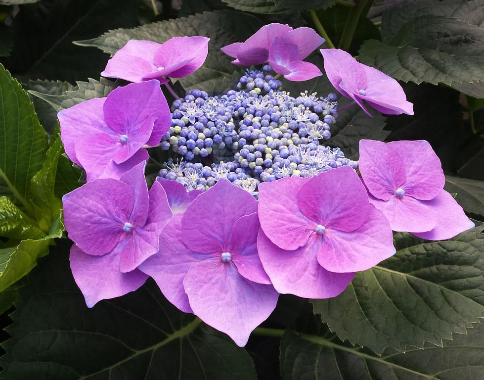
I am a sucker for hydrangeas because I remember the one growing in my grandfather's back yard and how tenderly he cared for it.
Overall, I like the image but felt it could use a little pop. So in my review, I highlighted the petals with the selection tool and using adjustments raised the vibrance to it's maximum. I then selected the center and did the same in an effort to give the blues a bit more "look at me too" effect. Would appreciate your comment. |
Jul 7th |
 |
| 48 |
Jul 17 |
Comment |
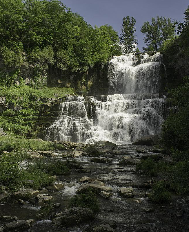
This is a nice image, but to me it's all about the waterfall. Too much almost black on the right and the bright green is taking away from the fall. So I converted it to a vertical and made the fall really pop. What do you think? |
Jul 7th |
 |
| 48 |
Jul 17 |
Comment |
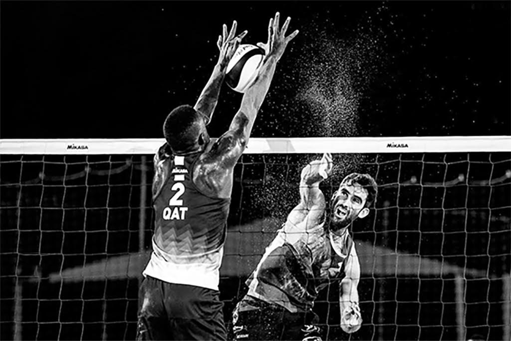
Great action shot. The only change I would recommend is to remove the spotlight. It keeps pulling my eye to it. I did it very easily by using the quick selection and then content aware fill. |
Jul 7th |
 |
8 comments - 0 replies for Group 48
|
| 60 |
Jul 17 |
Comment |
I, too, like the sand presentation and will try it next time I have the opportunity. If you have one without the leaf (just sand) you might want to save it to use as a background for something else. |
Jul 16th |
1 comment - 0 replies for Group 60
|
12 comments - 0 replies Total
|