|
| Group |
Round |
C/R |
Comment |
Date |
Image |
| 35 |
Sep 22 |
Comment |
Thank you all for your comments. |
Sep 20th |
| 35 |
Sep 22 |
Reply |
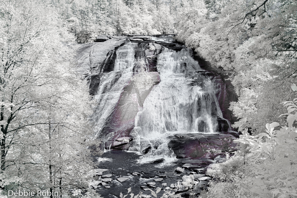
Thank you, Stuart. I have tried this two ways, one, the cropped version and this one. I like both, and both present different aspects of viewing. This one, the viewer almost has a voyeur way of seeing the falls-as if s/he is glimpsing a secretive view of the beauty, as opposed to being 'up front and personal' with the falls. Thank you, for your perspective. |
Sep 12th |
| 35 |
Sep 22 |
Reply |
I would crop it right where the sky begins on the right side. The triangle on the top are not where my eye wants to go. I enjoy wandering around the people, the leading lines on the road, experiencing all of the textures. I do not think the top triangle is as important. This is a wonderful image that survives very well without the architectural triangle. |
Sep 10th |
| 35 |
Sep 22 |
Comment |
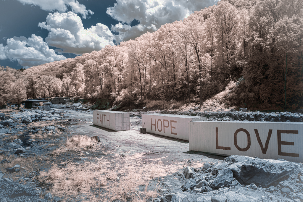
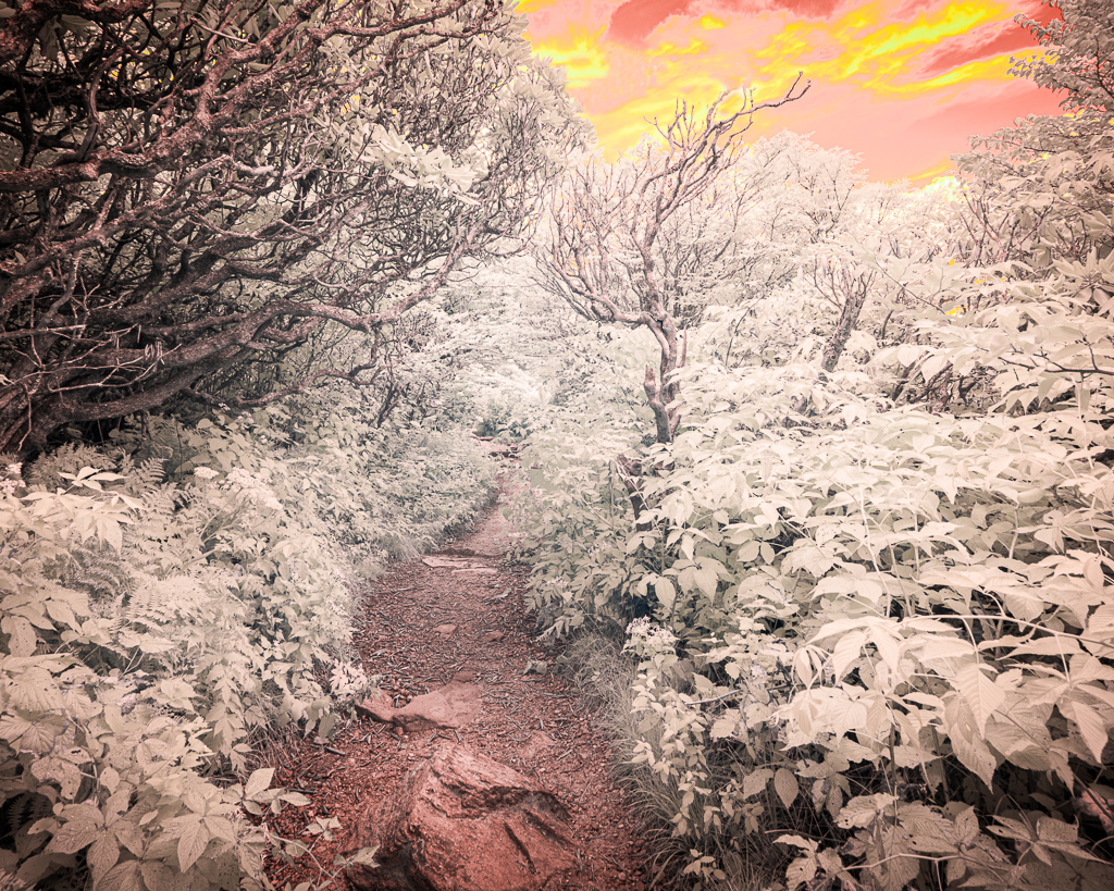
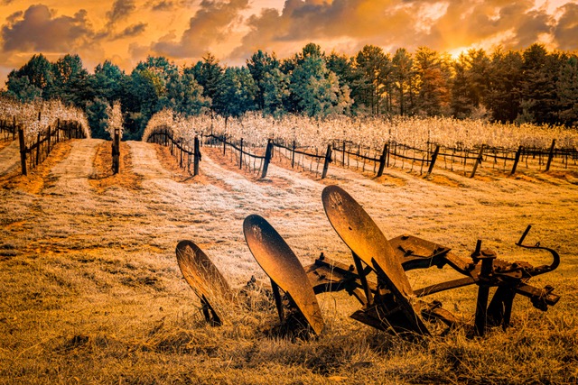
The palette is wonderful as is the scenery. The whites are portrayed well, the sky and the brush as well. It could be the 'landing' of the space craft too! |
Sep 10th |
| 35 |
Sep 22 |
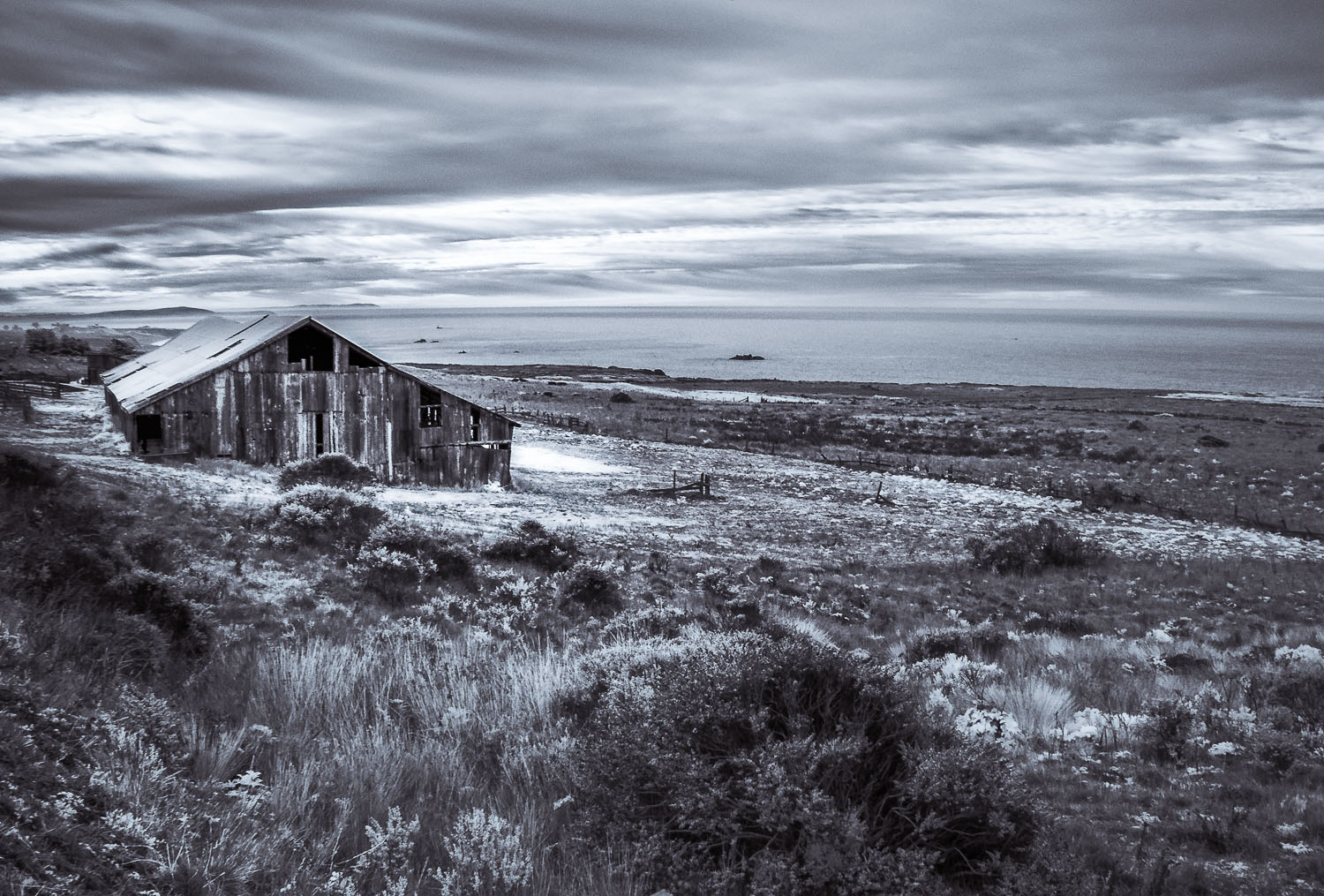
Comment |
You were very successful with your processing. It does look like an old film photo. I am led to the castle and then wander around and check out the people and the architecture. The only thing that I might do differently is to crop the top where the sky is as it does not compliment the beautiful buildings. |
Sep 10th |
| 35 |
Sep 22 |
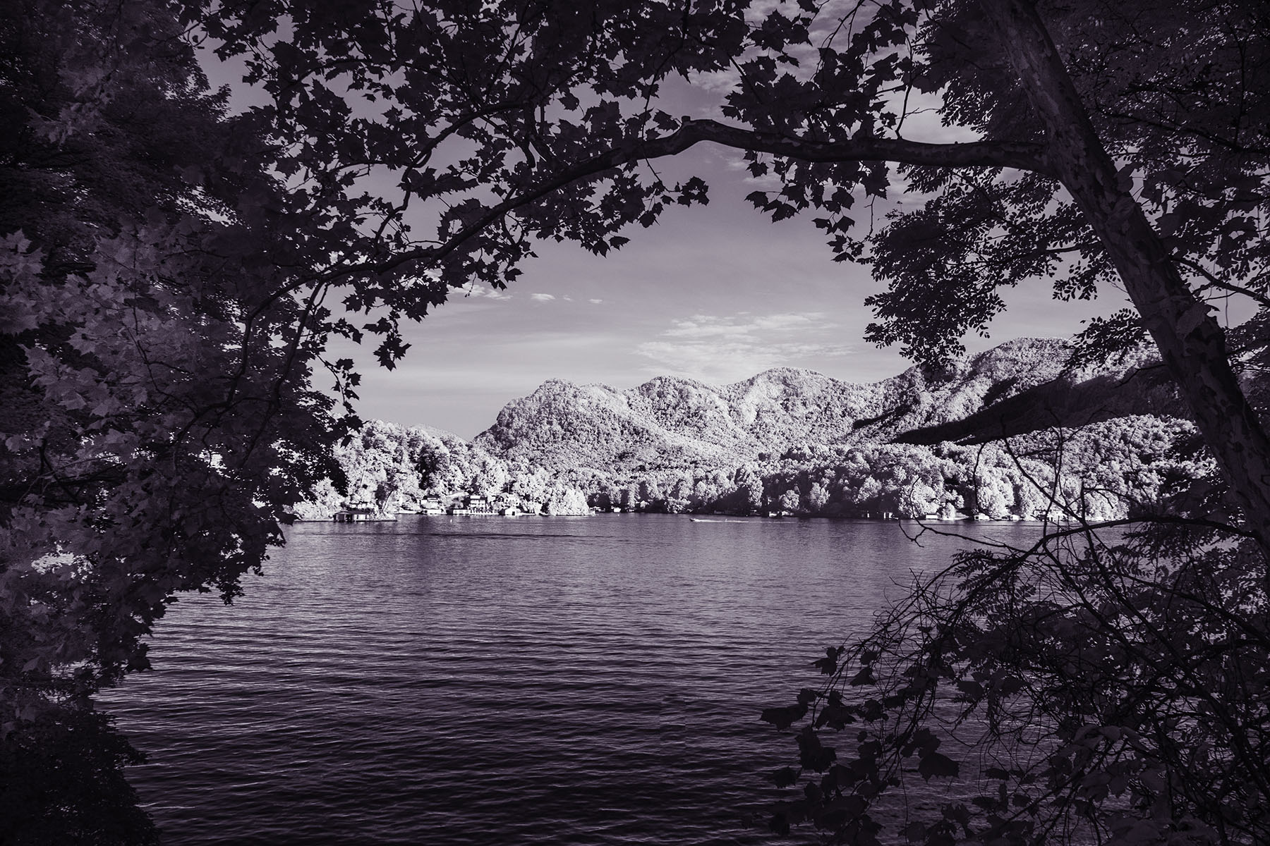
Comment |
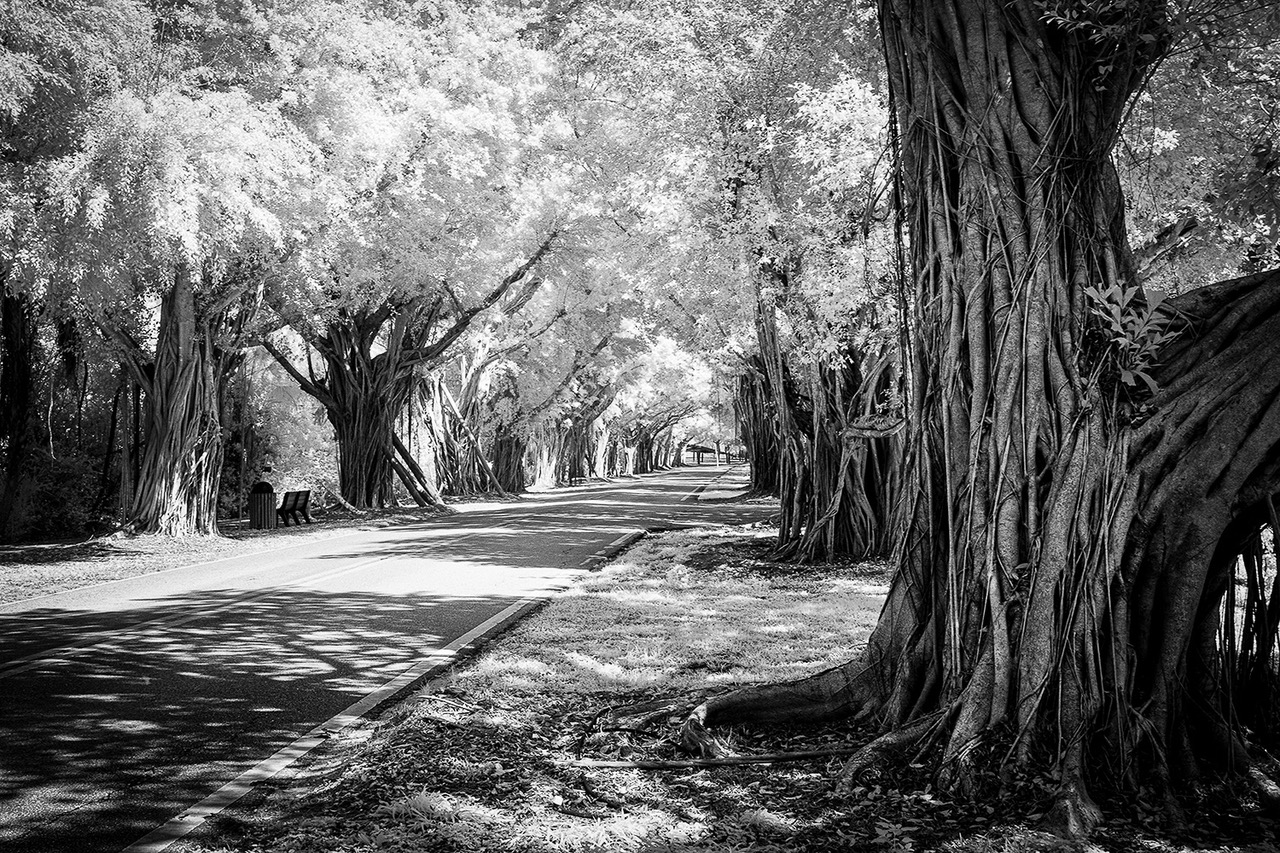
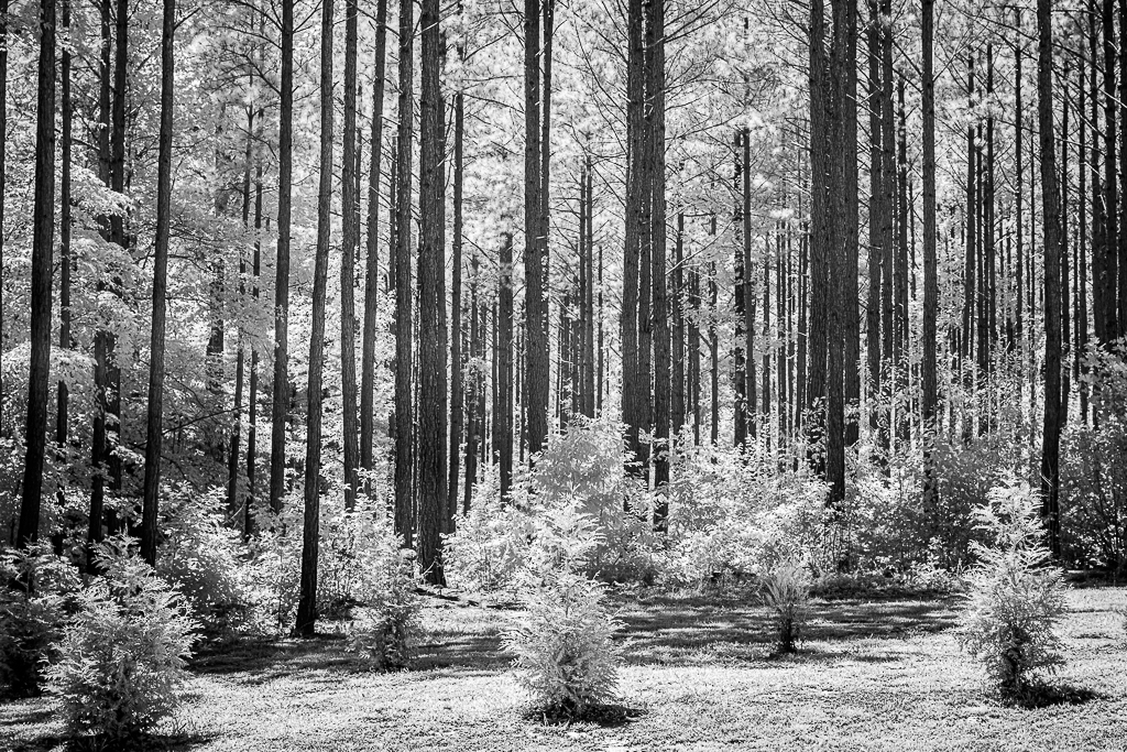
A great image. Love the framing of the trees. Your whites are nice and bright without blowing them out. |
Sep 10th |
| 35 |
Sep 22 |
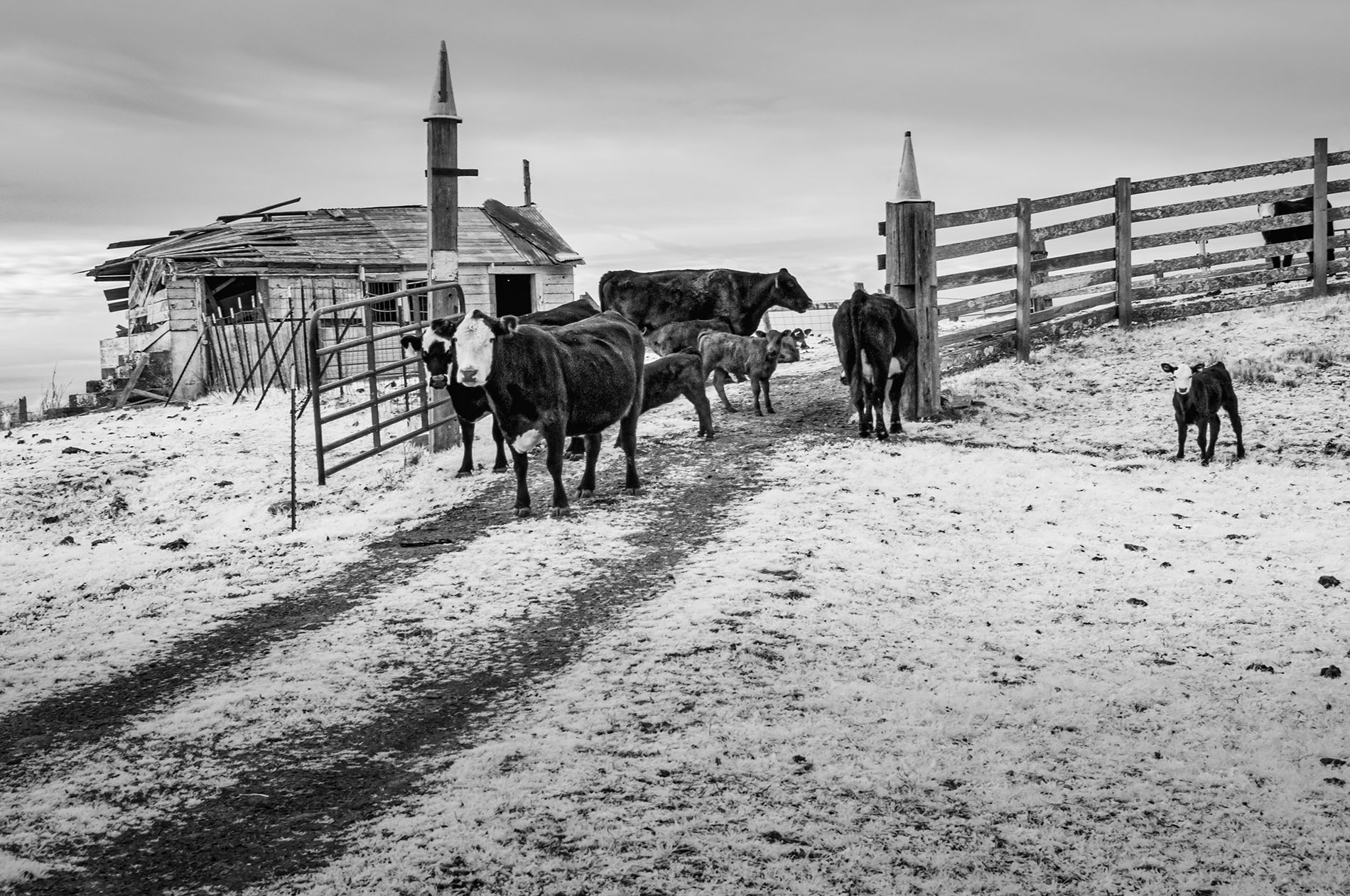
Comment |
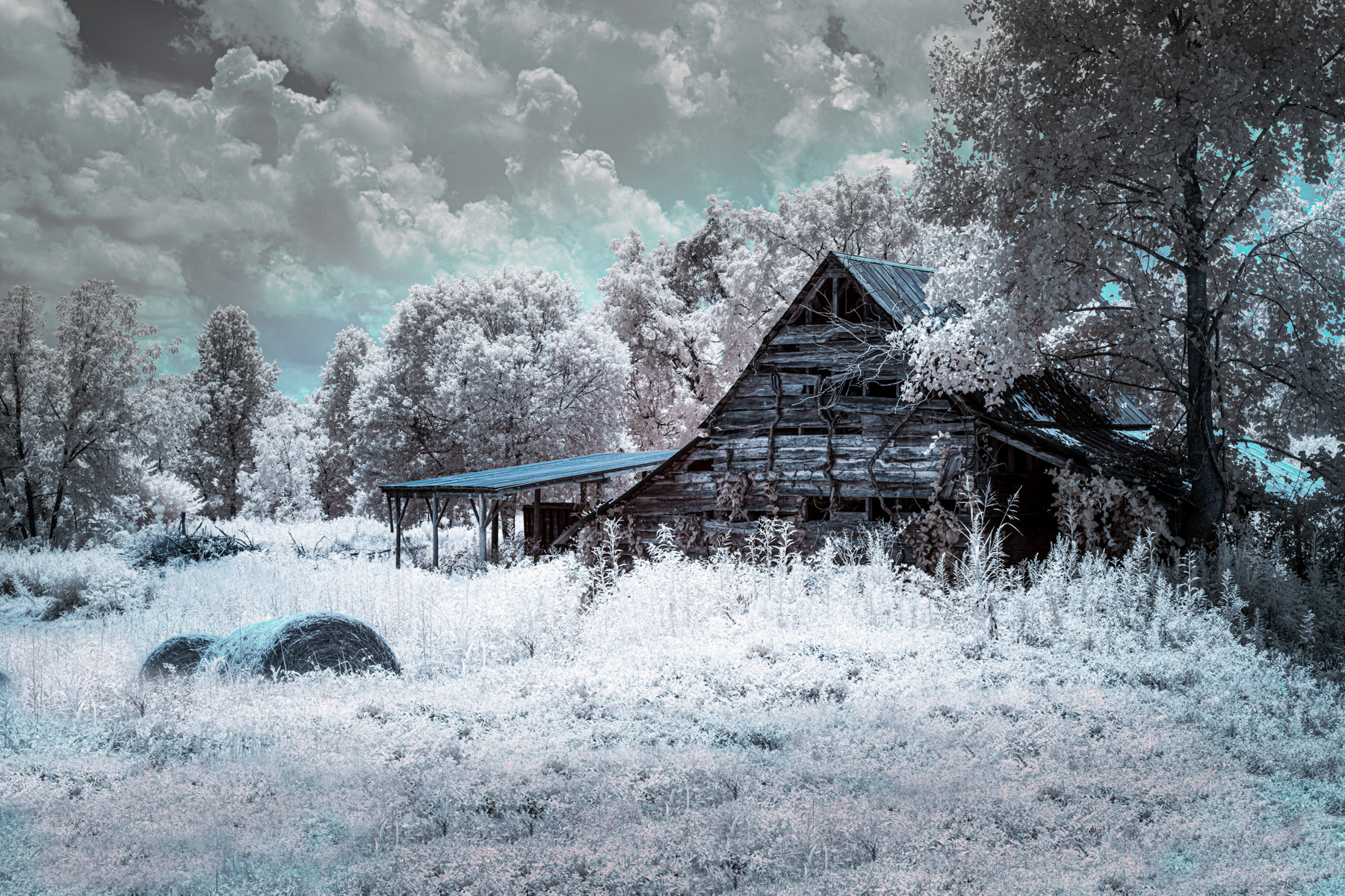
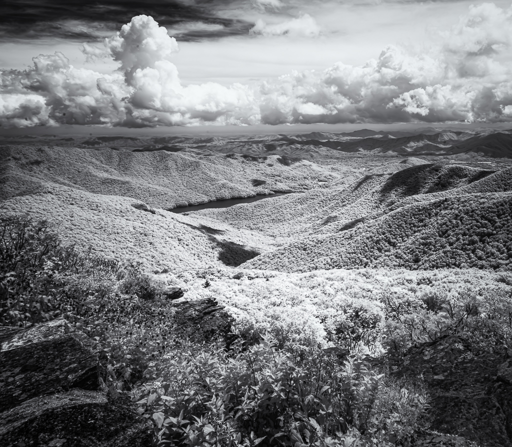
You created a beautiful image from your infrared shot. It makes me feel as if I am on another planet. I enjoy the palette and appreciate the sand color against the lavender brush. I appreciate the added clouds but think that you could pull down the highlights so that they don't appear as white. |
Sep 10th |
| 35 |
Sep 22 |
Comment |
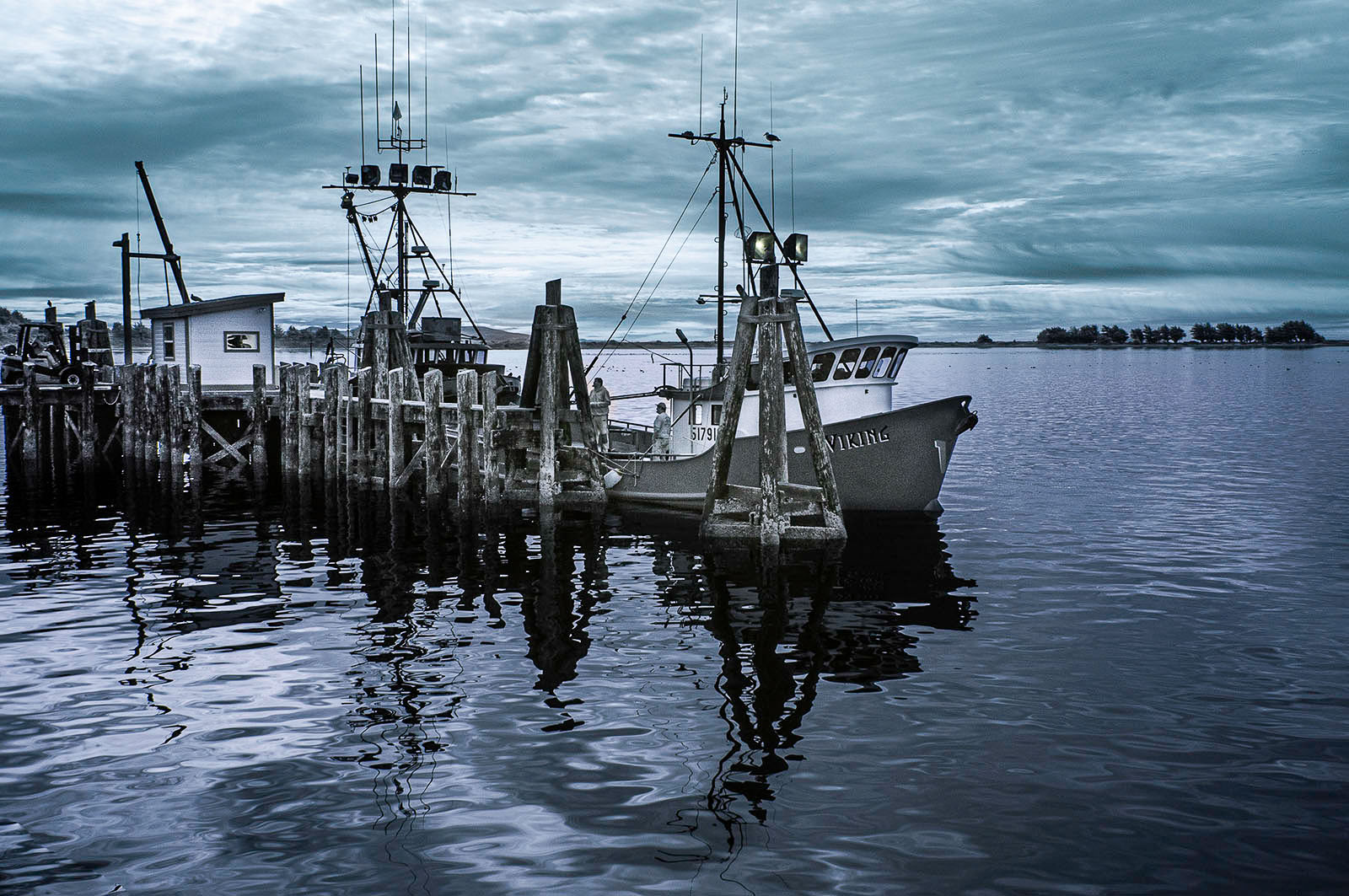
Nice subject matter for repeating patterns. I like the introduction of blue to contrast with the b&w. You exhibit the texture well. I might brighten the whites a bit if you can without blowing them out. |
Sep 10th |
6 comments - 2 replies for Group 35
|
6 comments - 2 replies Total
|