|
| Group |
Round |
C/R |
Comment |
Date |
Image |
| 31 |
May 23 |
Comment |
Ella,
I tried using lights a while back but I did not adapt to using them in my work. Your images make me realize I am missing out on a way to really enhance the quality of my work.
Thank you for experimenting in May. Susan |
May 23rd |
| 31 |
May 23 |
Reply |
John,
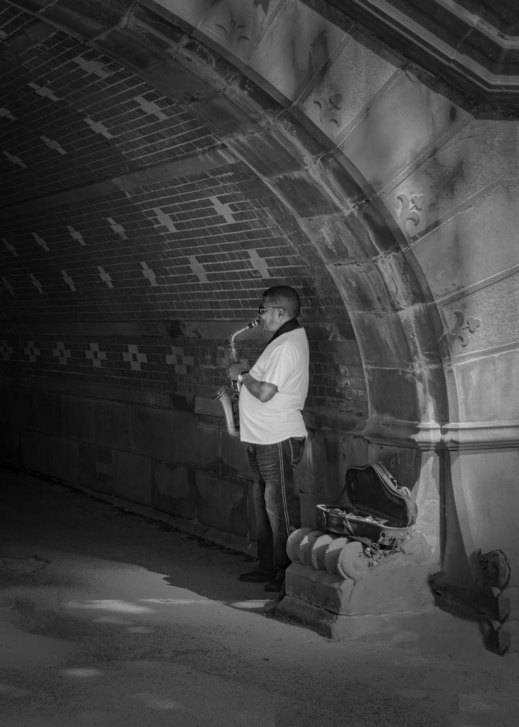
It was a lucky shot as I had just walked through the tunnel and turned around to hear him play. I saw him blending into the surroundings which to me was part of his story. Susan |
May 23rd |
| 31 |
May 23 |
Reply |
Nick,
Thank you for the suggestion to focus the light on th e musician. My fellow photographer processed the image in color but I found this put more emphasis of the bridge detail and mot the player. Will try your suggestions later today. Susan |
May 23rd |
| 31 |
May 23 |
Comment |
Ed,
Like the others in the group, I enjoyed viewing your image. It is shot in such a way to make the building even more dramatic. Great use of editing to enhance the shot. Susan |
May 23rd |
| 31 |
May 23 |
Comment |
Nick,
I enjoyed viewing your image. The darkened clouds at the top of the image, keep my eyes focused on the view. The tree on the right is well positioned. I always struggle with how to crop around the tree closest to the edge. It is there but focus is still on the larger tree next to it.
I am interested in the timing of applying DeNoise as I always do it as part of my initial cleanup. Is there a reason to do it at the end? Generally this is when I would use output sharpening. Susan
|
May 23rd |
| 31 |
May 23 |
Comment |
Ian,
I enjoy the walk down Salt Pine Lane. I like the edits done by Nick and removal of the overhead wire. I would also remove the branches on the top of the roof (although some may like the story they convey to the viewer). I would also remove the part of the table on the lower left. I find the them distracting. Susan |
May 23rd |
| 31 |
May 23 |
Comment |
Peter,
I have only been there in the fall. I like the scene in winter better but not sure I would like the cold. It is a wonderful image and needs no improvement. Susan |
May 23rd |
| 31 |
May 23 |
Comment |
John
Being late to the party, I would have to say I like the edits done by Nick. I find the original image leaves me with trying to figure out the focus of the image. My eye goes to the area of the branch on the left (C shaped with he little extension on it) but getting there I am disappointed with what I see. With the background contrasted I see the flow of the branches with the distracting background. Susan |
May 23rd |
6 comments - 2 replies for Group 31
|
| 35 |
May 23 |
Comment |
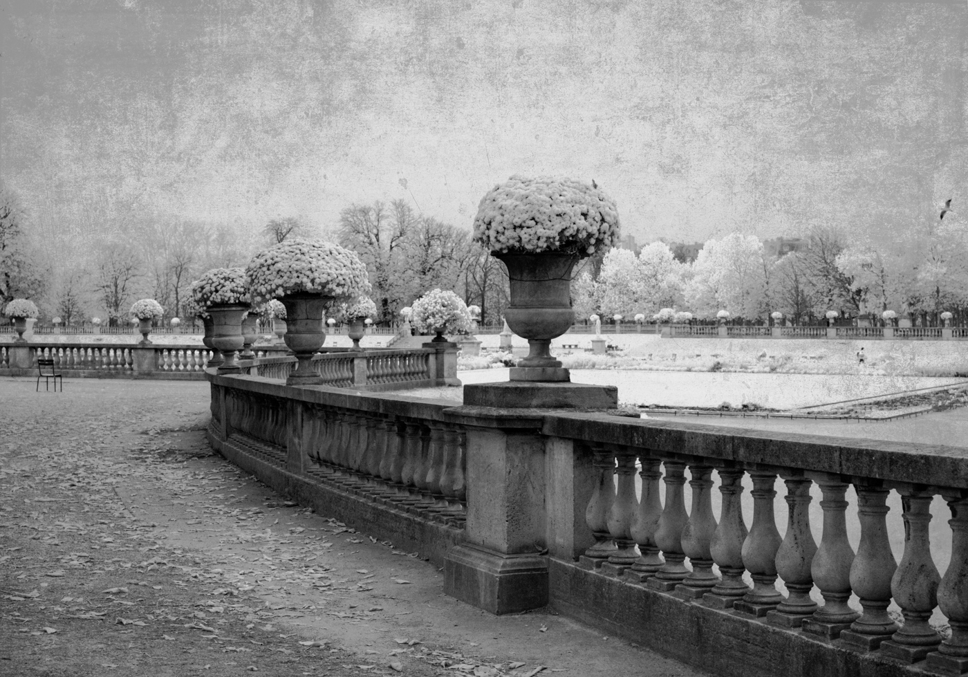
Thank you for the suggestions. I will try putting in some clouds and removing the texture. I did clone out other chairs but left this one to symbolize no one was looking at the gardens. Will get ride of it. Also I went back and played with the whiteness of the mums in first three vases. I like my redone version as it places the focus on flowers. I also cloned out the bird on the right side. Alwasy room for improvement. Thanks, again. Susan |
May 23rd |
| 35 |
May 23 |
Comment |
Lauren,
Generally I prefer the B&W versions of IR images. However,in this case, I do like the color. I suggest darkening the light color in the background (could be another group of tulips) on the left and also some of the light color on the right of the tree. Susan |
May 23rd |
| 35 |
May 23 |
Comment |
Nelson,
I agree with both of Laurens comments re the bluish hue on the column and the straightness of the image. Good contrast between the building and the white trees. Overall, well done. Susan |
May 23rd |
| 35 |
May 23 |
Comment |
Tatu,
I have used Snapseed on my iPhone images and occasionally with a standard image on my iPad. Never thought to try it with IR. the effect you have achieved is great. I enjoy viewing the image especially with the blue/purple surrounding. Susan |
May 23rd |
| 35 |
May 23 |
Comment |
Debbie,
In this image, I think the sun flares hide the main focus of the image, the shack. Although I agree with the suggestion to crop some of foreground, I like the proportions on each side of the image. Cropping too much may change the proportions of the image. I would suggest darkening the white cloud a the top of the image as it draws my eye out of the image. Susan |
May 23rd |
5 comments - 0 replies for Group 35
|
11 comments - 2 replies Total
|