|
| Group |
Round |
C/R |
Comment |
Date |
Image |
| 76 |
Jun 25 |
Reply |
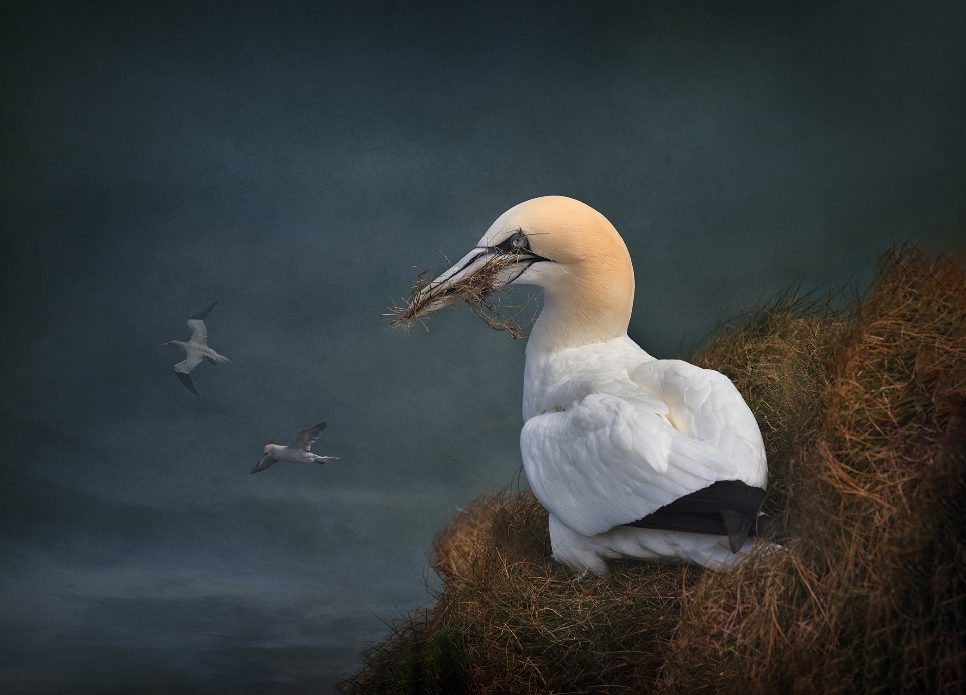
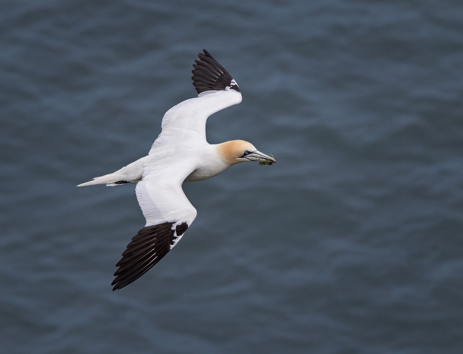
Thanks Jay. No danger involved as some of the gannets nest quite close to the top of the cliffs at Bempton. They can be photographed from the cliff-top path, behind a safety fence. I took about 2000 pictures of gannets, and liked this one because of the grass it was holding. |
Jun 27th |
| 76 |
Jun 25 |
Reply |
Thanks Ian. It might go in a competition, so hopefully will 'look good' there as well. |
Jun 27th |
| 76 |
Jun 25 |
Reply |
Thanks Henriette. In this case, my thought process was that I had zoomed in too much on the bird, so had to add more space in processing...if only I took it right in the first place! |
Jun 27th |
| 76 |
Jun 25 |
Reply |
Fair enough on the 'adding things', Sanford. Some people like it, some don't - each to their own. What is important to me is to be honest about what you have done and don't try to deceive people. |
Jun 27th |
| 76 |
Jun 25 |
Comment |
This feels a bit like Cubism meets Jackson Pollock - the slight hint of vertical lines and blocks gives a cubist feel, whilst the flowing colours remind me of Jackson Pollock. All the pastel shades work well together and the pinks at the bottom look like flames rising up. Print it large and sell it to an art dealer for lots of money! |
Jun 27th |
| 76 |
Jun 25 |
Comment |
Straight into the sun is challenging and you are always going to end up with a silhouette. It does give us a nice 'end of the day' feel, but I think I am with Sanford in that I actually prefer the original - I prefer a bit more space around the boat, and the water is not quite as dark. I went back to your original, lightened the shadows and dropped the highlights, then applied a vignette using the Nik effects Darken/Lighten center. What do you think? |
Jun 27th |
 |
| 76 |
Jun 25 |
Comment |
Sanford - I think your book of portraits could be quite large from what we have seen! This is another excellent street photo, with good engagement from your subject, nicely separated from the background and great colours. Any suggestions? A very minor one, which is that the side of her face is a little red - probably reflecting her jacket. You could try a very slight de-saturation of red in that area, but if you do, keep it subtle. Great natural portrait. |
Jun 27th |
| 76 |
Jun 25 |
Comment |
Coming from the UK, the finer details of softball are completely lost on me! However I understand about capturing the 'critical moment' and I think you have done that here. We can see the action and we have nice triangle between the two players and the referee (umpire? judge? I don't know!) scrutinising the play. The spectators are not too much of a distraction and your cropping has got everything in the image that we need. My only suggestion would be to try cropping out the vertical post on the right and see if you think it improves the image. Overall, a good action shot. |
Jun 27th |
| 76 |
Jun 25 |
Comment |
Is that allowed - giving is three pictures to comment on? Well you are the Group Administrator Ian, so I guess it's OK.
I think "Original 2" is my favourite, as I really like the vivid blues and the structure is nicely framed by the skyscrapers in the background. I do feel the tilt and perspective are a little off though, so I tried a simple perspective/skew adjustment to level up the 'horizon', then cropped off the sign at the left - I think its better, but you can decide yourself.
I also like the city scape with all those matching blue tones. I would be tempted to crop out the building on the right as it is cut in two, and it would be nice to see a bit more water, but a fine night skyline nonetheless.
Whilst the Opera House is an iconic building, I find this my least favourite! Interesting to see the lighting effects, but it feels a bit flat and side-on, and there is quite a lot of water in the foreground.
So there you are, three critiques! All are well taken with good control of the lighting, so well done on that. |
Jun 27th |
 |
5 comments - 4 replies for Group 76
|
5 comments - 4 replies Total
|