|
| Group |
Round |
C/R |
Comment |
Date |
Image |
| 76 |
Jun 24 |
Reply |
Thanks Henriette. I do not always have a clear idea of what I want at the start. In this case, the model and set were provided by the photoshoot organisers and during processing I often try something then reverse it - a bit of a random walk until I am happy with the image. |
Jun 28th |
| 76 |
Jun 24 |
Reply |
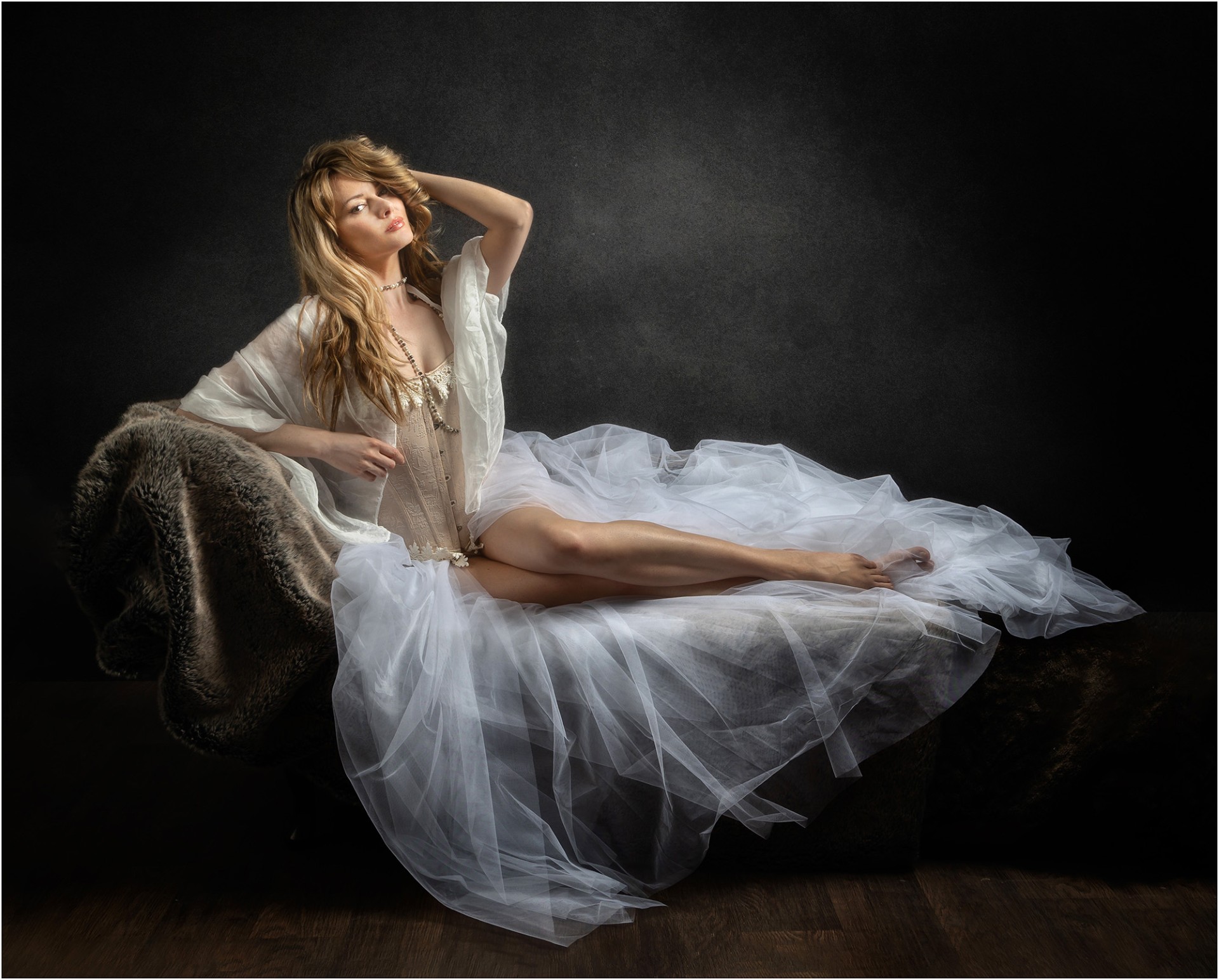
Thanks Trey. Fortunately it was my wife's idea to go on this photoshoot, so she can't accuse me of being up to anything! I think this is about my limit in terms of suggestiveness - we occasionally see nude photographs in competitions and exhibitions, but I would not be comfortable with that type of photography. |
Jun 28th |
| 76 |
Jun 24 |
Reply |
Thank-you Jay. If it looks professional, a lot is down to the professional model - they do know how to strike a pose! |
Jun 28th |
| 76 |
Jun 24 |
Reply |
Thanks for your comments Ian. |
Jun 28th |
| 76 |
Jun 24 |
Reply |
Thanks for your comments Sophie. I have certainly found with some of the pictures I took that the model was trying to hold a pose that I asked for, but as she was not sitting comfortably, the picture did not look right. I take your point that her right hand might be a little stiff - not so easy to do any editing on that! |
Jun 15th |
| 76 |
Jun 24 |
Comment |
Very soft indeed and I hope you achieved the effect you were after. Nice colours as well. For me though, I would have preferred to see the centre stamens a bit sharper to give the image a clearer point of focus - with the lensbaby that might mean photographing the stamens in the centre with a wider field of view then cropping. I also find the two hard edges towards the top a little distracting - they could be softened to match the rest of the image with some Gaussian blur. I've tried sharpening the stamens and blurring the edges - what do you think? |
Jun 15th |
 |
| 76 |
Jun 24 |
Comment |
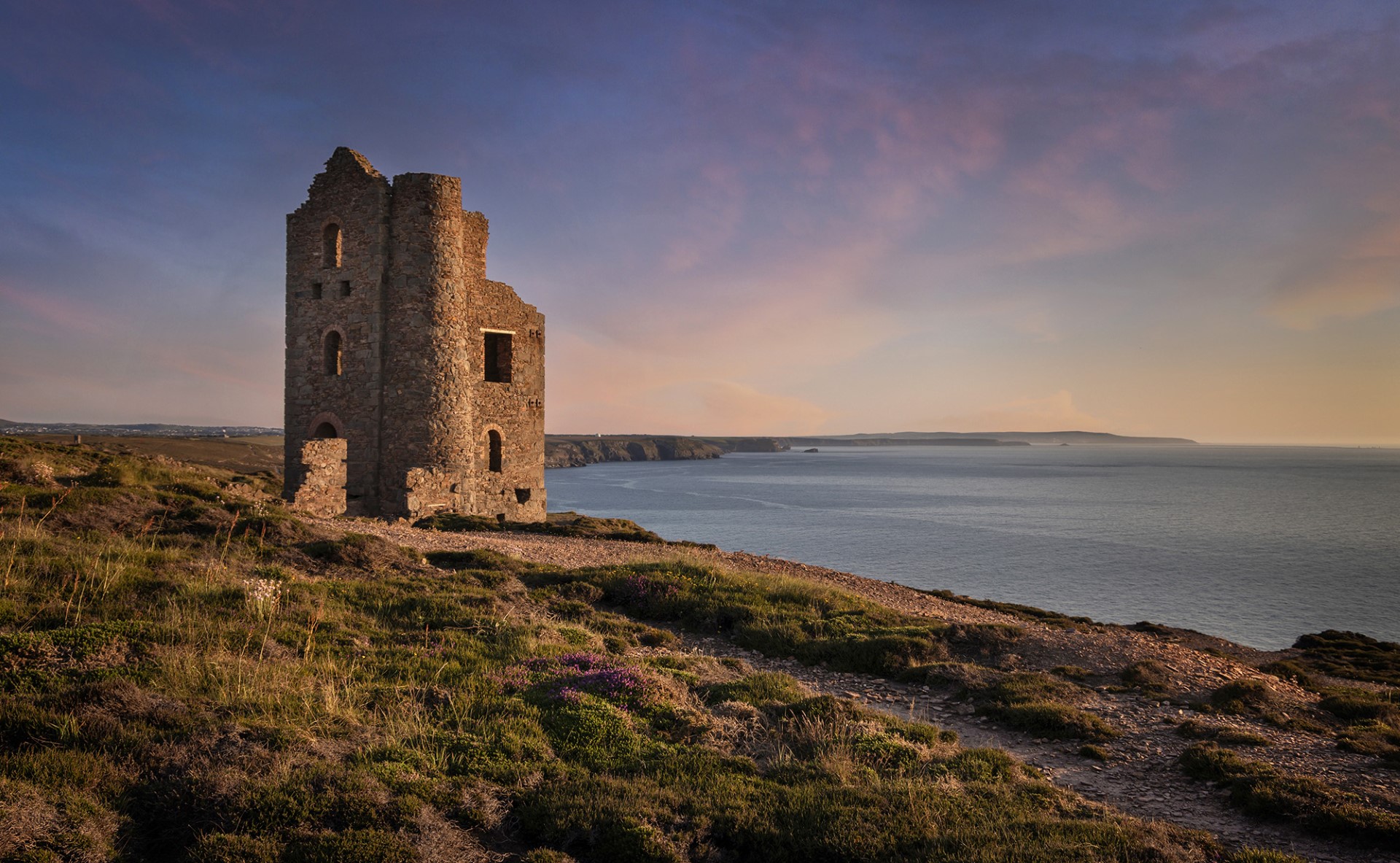
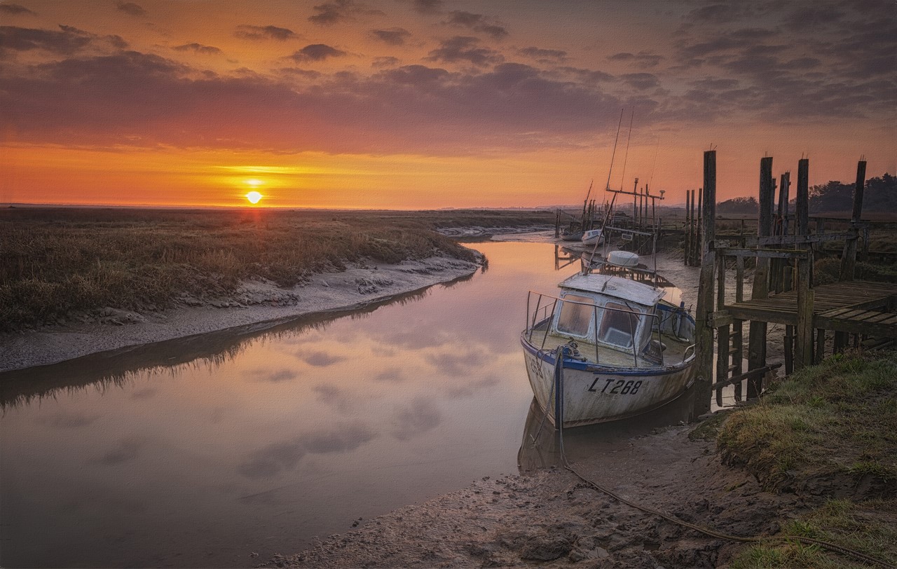
I think you have achieved your silhouette objective very well, and the subject makes for a strong graphical image. It also stands up very well to the hard crop from the original and mono is an obvious choice which you have handled well. Would I do anything different? No.......except (there's always something!) there are a few dust spots on the image - above the boat and left and right of the parachute. Honestly I am not looking for problems, but once spotted (no pun!) I think it best to mention it. |
Jun 10th |
| 76 |
Jun 24 |
Comment |
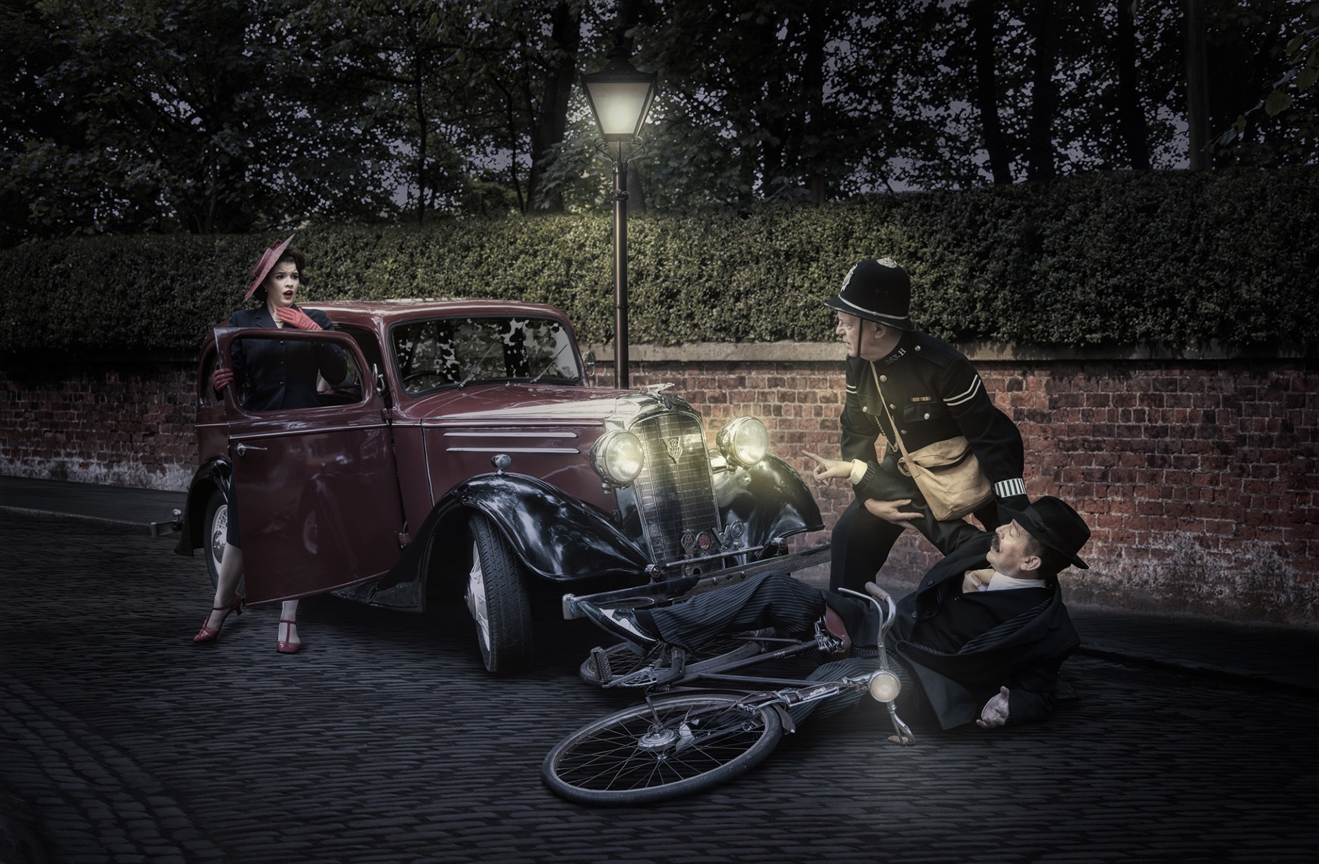
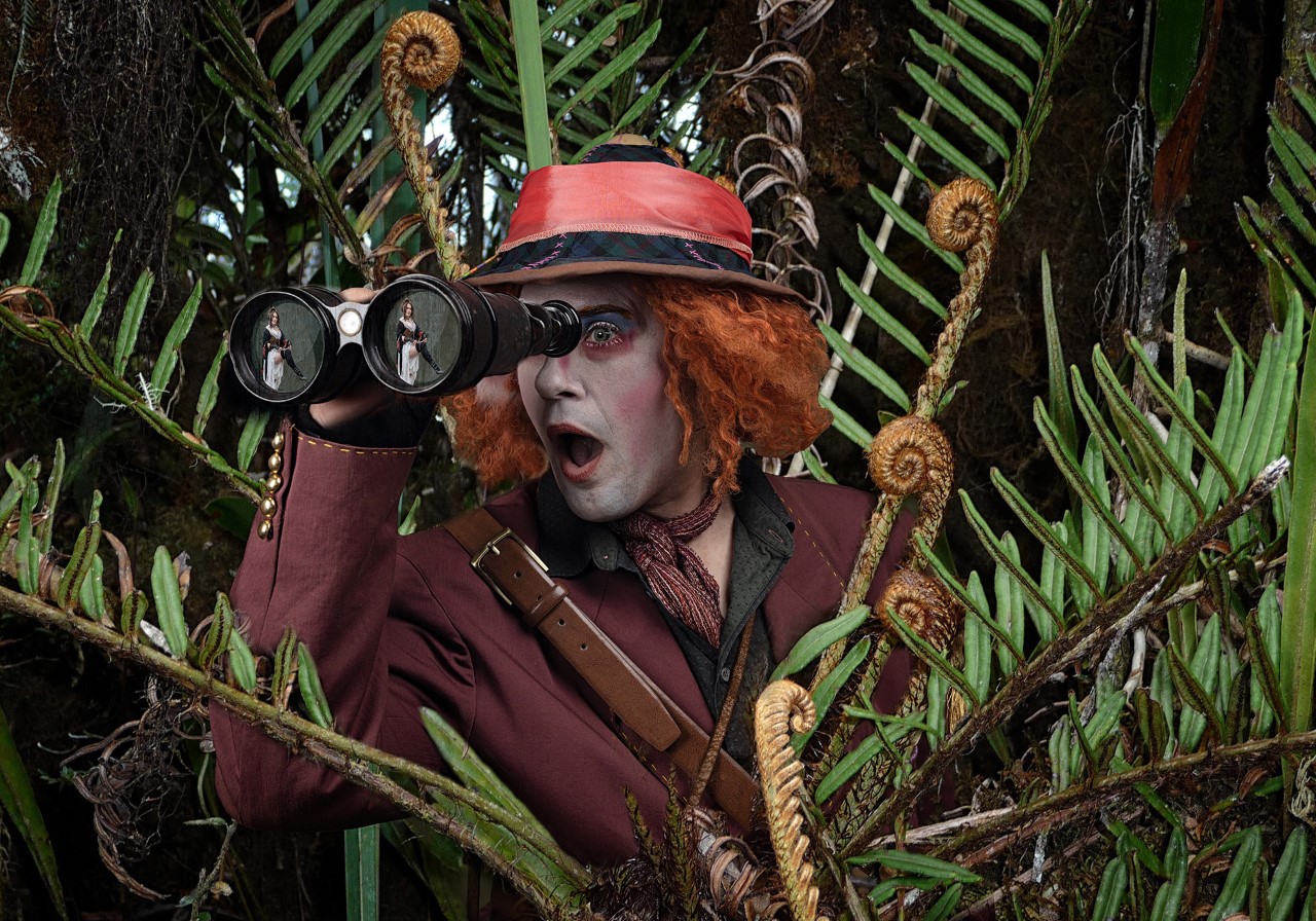
What some people can achieve with their bodies is simply astonishing, and your circus pictures show us that. In this case the figure gives us a wonderful shape in the frame, well suited to a square crop. The lighting conditions look difficult, but the blue cast reminds us that this is circus lighting and you have handled it well, with no over-exposed areas. Did you do some editing towards the bottom of the image, because there looks to be a 'ghost' of his head to the left of his hand. If you plan to use this image in a competition, I would tidy that up first, but otherwise well done. |
Jun 10th |
| 76 |
Jun 24 |
Comment |
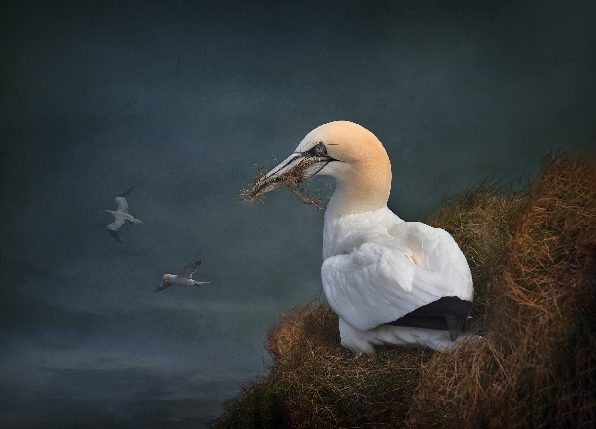
I always like the way you process 'greens' like the moss in the background - the treatment brings out the textures very well. I can understand your interest in photographing this plant if you have not seen it before and I commend your use of stacking to get more depth of field (was the focus done manually, or does your camera handle that automatically?). Looking closely there might be a little ghosting around the bright plant on the right, which is probably a stacking artefact - you could look at that in the full-size image. Also, did you consider just presenting the flower on the right - for me that's the stronger half of the image. |
Jun 10th |
| 76 |
Jun 24 |
Comment |
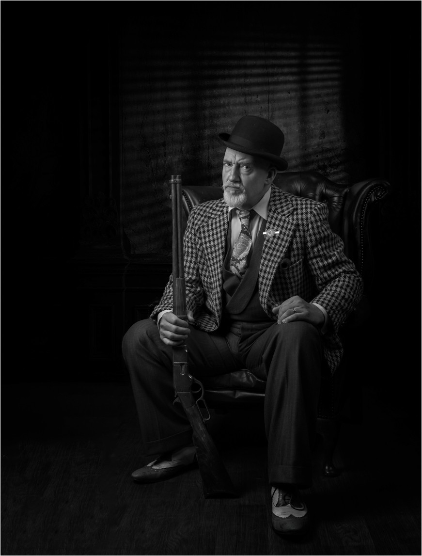
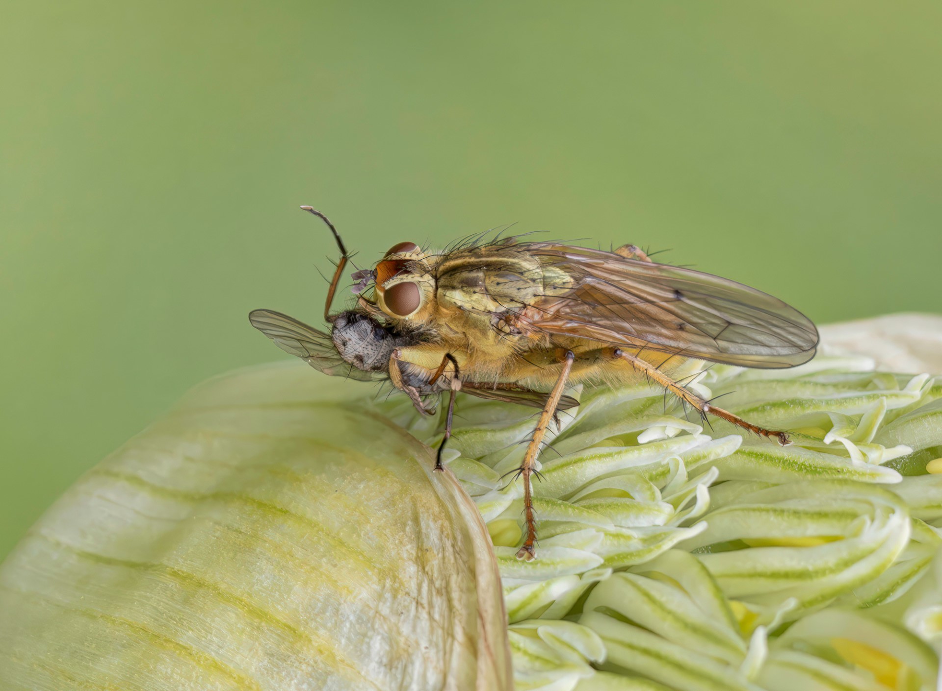
I really like your 'Marlboro Man'. He looks suitably weather beaten and craggy, so makes a great subject. I also like the low point of view which means he is photographed against the sky - it give an air of importance and strength which suits his character. From a technical point, I am surprised at the very high ISO, but there is little noise, so you got away with that. Any suggestions? I can see you have brightened him up from the original, but perhaps a little more local lightening under his hat would bring up his eyes a bit more. But well done on a great subject. |
Jun 10th |
5 comments - 5 replies for Group 76
|
5 comments - 5 replies Total
|