|
| Group |
Round |
C/R |
Comment |
Date |
Image |
| 76 |
Jun 23 |
Reply |
Thanks Trey. |
Jun 30th |
| 76 |
Jun 23 |
Reply |
Thank you for your comments Henriette. |
Jun 29th |
| 76 |
Jun 23 |
Reply |
Thanks Jay. With extension tubes I find it best to use autofocus and start zoomed out and standing back slightly, then gradually adjust position and zoom whilst holding the focus. |
Jun 29th |
| 76 |
Jun 23 |
Reply |
Ah yes, I forgot about the 'straight out of camera' bit. PS Congratulations on winning the first Test Match! |
Jun 21st |
| 76 |
Jun 23 |
Reply |
Thanks Sophie. I took a quick look at reviews of Pur Raw 2 and that also looks like a good option for handling noise/sharpening. |
Jun 20th |
| 76 |
Jun 23 |
Reply |
Thanks Sanford. Yes the lesson is not to throw images away as future developments might make them recoverable. I am currently working through some very old (1980s) slides, using PS/Topaz to clean them all up - I couldn't do that until now. |
Jun 20th |
| 76 |
Jun 23 |
Reply |
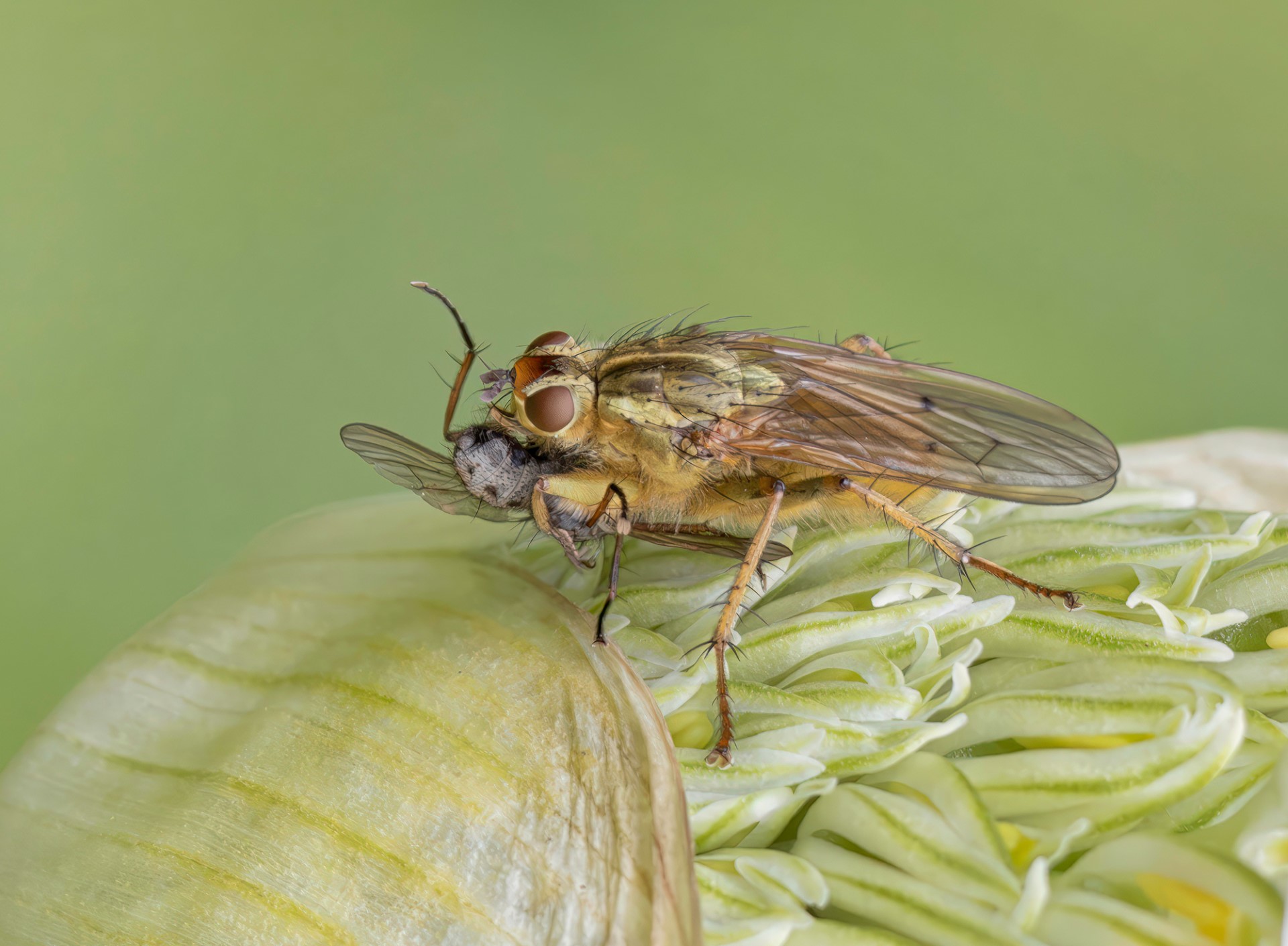
Thanks Ian. I think in this case the fly was too intent on its prey to be bothered by any lenses, but yes, very often insects will take fright if you get too close. |
Jun 20th |
| 76 |
Jun 23 |
Comment |
This is all about the observation of the photographer, seeing the possibility of the nose smelling the cans. Your question about the photographer's contribution is relevant. Sometimes I see photographs of street art and they are just a record of someone else's art, with little input from the photographer, but here we have the photographer's vision adding to the image. A small comment on the composition is that the person's lip just above the cans is slightly distracting, breaking the link between the cans and the nose - could a lower point of view have hidden the lip and moved the cans closer to the nose for a better sniff? I think it would be better, but it is an amusing and 'well seen' image as it is. |
Jun 20th |
| 76 |
Jun 23 |
Comment |
Firstly, well done on the original image - I've never managed a picture of a Golden Eagle, so I'm a bit jealous! I really like the main mono version of the image. The removal of the surplus branches and simplified 'line drawing' effect reminds me of Japanese art. I find the colours in the sepia version slightly insipid, so I am not so keen on that one. I like the square crop - the branches nicely fill up the lower half of the image. Now the detail - yes, there are some dust spots to clone out, and we can see some remains of branches at the very bottom left. I can also see that some of the branches go a bit fuzzy at the tips where they have been cloned out. Try using a small hard edged clone brush around the branch tips to leave a sharper edge. Overall though, a really good capture and I like the effect you have achieved. |
Jun 20th |
| 76 |
Jun 23 |
Reply |
Ian - as you mentioned magazines, our club had a talk by a landscape photographer recently and he showed some images where he had left large areas of blank space. They looked unbalanced, so why frame the image that way? Because it allows magazine editors to fill the empty space with words! |
Jun 20th |
| 76 |
Jun 23 |
Comment |
This does tell a good wildlife story, with the lions sheltering from the heat in the only shady spot around. Your high key approach gives us an impression of the hot, dry, dusty conditions. Normally I am not a fan of a white vignette, but here it works. I am surprised that you were only using a 38mm focal length - perhaps it was too hot for the lions to chase after photographers? |
Jun 20th |
| 76 |
Jun 23 |
Comment |
Have to agree that then end result is similar to Ian's, but obviously from a very different starting point. The original image is a picture of nothing much, but by processing to remove the surface 'scum' and give it a metallic sheen, it becomes an abstract art work. I could see it reproduced large and hung in an art gallery. You've given me some ideas! |
Jun 20th |
| 76 |
Jun 23 |
Comment |
As an abstract image I think it works very well. I particularly like the subdued grey tones and the 'arrow point' which you have placed at the centre so that it acts as the focal point of the image. If you have other similar images, I could see this working as a triptych, with parts of the cars flowing together. There are a couple of prominent dust flecks, and once you see them they snag the eye. The biggest flecks could be cloned out, or the dust and scratches filter in Photoshop would remove all the dust flecks. |
Jun 20th |
| 76 |
Jun 23 |
Comment |
An interesting character who obviously takes pride in his bike, even if he's not too happy about the parade. I always find it interesting to see bikers without a crash helmet - illegal in the UK - but if he was wearing one, you would have no picture! Yes, the background is a bit cluttered, but you have done well to take attention away from that by darkening and cropping. As the biker should be our main point of interest, I find his face a bit too dark - it could be lightened a little which would allow us to see his expression better. Also, I would paint over the orange car highlights which still remain and darken the patches of grass immediately in front and behind the biker. Small details though, you've already done most of the work. |
Jun 20th |
6 comments - 8 replies for Group 76
|
6 comments - 8 replies Total
|