|
| Group |
Round |
C/R |
Comment |
Date |
Image |
| 76 |
Jan 23 |
Reply |
Thanks Jay. That's exactly what I am trying to achieve, so that it does not look like an obvious composite. |
Jan 14th |
| 76 |
Jan 23 |
Reply |
Thanks Ian. There's a Facebook Group where I can post the image and the models can see them, but I have not done that yet. However Holly is a very well photographed model, so she already has lots of feedback. |
Jan 14th |
| 76 |
Jan 23 |
Reply |
Thanks Henriette. I have tried cropping off the top so that the image is concentrated on Holly and I think that works as well and it's a simpler image. No reason why I could not have two versions. |
Jan 14th |
| 76 |
Jan 23 |
Reply |
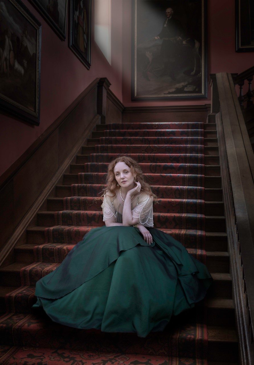
Thanks Sophie. In this group I am realising that you look for a story in an image, and here you are seeing things I had not thought of myself. I mainly chose the stair setting simply because the perspective fitted together, but I like your interpretation and now I will say that's what I had in mind all along! |
Jan 14th |
| 76 |
Jan 23 |
Comment |
Lots of greenery in this to remind us Northerners of summer! Whilst I agree with Henriette that the cyanotype is probably the strongest of the three presented images, I think converting to mono loses what you probably wanted to capture in the first place - the white bark against the green foliage. You said you have not done much with the original, but I think there's more that could be done. My suggestion would be to return to the original and try to soften out the contrast and enhance the green saturation to emphasise the white on green of the tree bark. Just my opinion! |
Jan 8th |
| 76 |
Jan 23 |
Comment |
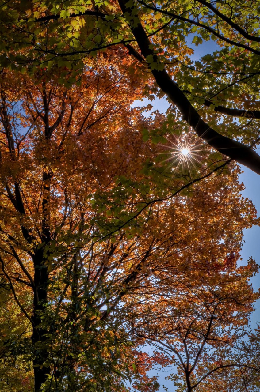
That's a very nice starburst effect which gives the image a good focal point. I also like the golden autumn colours (spelt correctly of course!!) which you have brought out from the original. Well done on pulling some blue out of the original, but to get even more blue sky, Henriette's suggestion of a colour mask is a good one. I hope you don't mind, but I had a play with your image. I created a colour mask by selecting an area of sky, then adjusted the range to restrict it to just the bright sky, then pushed the colour temperature way into the blue - result attached. Maybe too much blue now, but it can be adjusted to suit. |
Jan 8th |
 |
| 76 |
Jan 23 |
Comment |
I like the timing of this image - it is good that we have the blurred cyclist in the foreground for some movement, but then enough detail in the second cyclist for him to act as the focal point. I also like that the lead cyclist is wearing a bright colour which means he/she stands out from the background despite being blurred. Also the curved sequence of lights and light/dark hoops gives the image depth - so a lot to like. Do we need the full height of the tunnel? I tried cropping below the top light and found myself concentrating more on the main subject, which is the riders. What do you think? |
Jan 8th |
| 76 |
Jan 23 |
Comment |
A lovely image of the camel perfectly positioned on a sand dune. I can see you have cropped out the tracks on the right, which gives the impression the camel and rider have appeared out of the desert. The final colours are a big improvement on the original and I like the early morning/late afternoon feel of the light on the golden sand. I thought the camel and rider stood out OK, but you could crop in a bit if you wanted to make them larger in the frame. Also being picky, there was a dust spot in the original and unfortunately we can still see evidence of the cloning in the final image - always a danger with a flat blue sky. But that's a minor detail, and overall this is a very evocative image. |
Jan 8th |
| 76 |
Jan 23 |
Comment |
A lot of my images end up with UCM (Unintentional Camera Movement), which is usually not so successful!
ICM is an interesting technique and one where it is difficult to predict what the outcome will be. I imagine you would have had several attempts at this with different results? Here you have been brave enough to go completely abstract, however that makes it a very difficult image to comment on as there is no 'composition' and no way to say whether the colours and saturation are 'realistic'. So we are left with a basic response of whether we like it or not, and I would say a guarded yes, but for me I would like to see some definition of the trees remaining in the ICM image, so we get an idea of what we are looking at. Ian is correct about the dust spots - interesting that even with ICM, the dust spots stay in the same place! |
Jan 8th |
| 76 |
Jan 23 |
Comment |
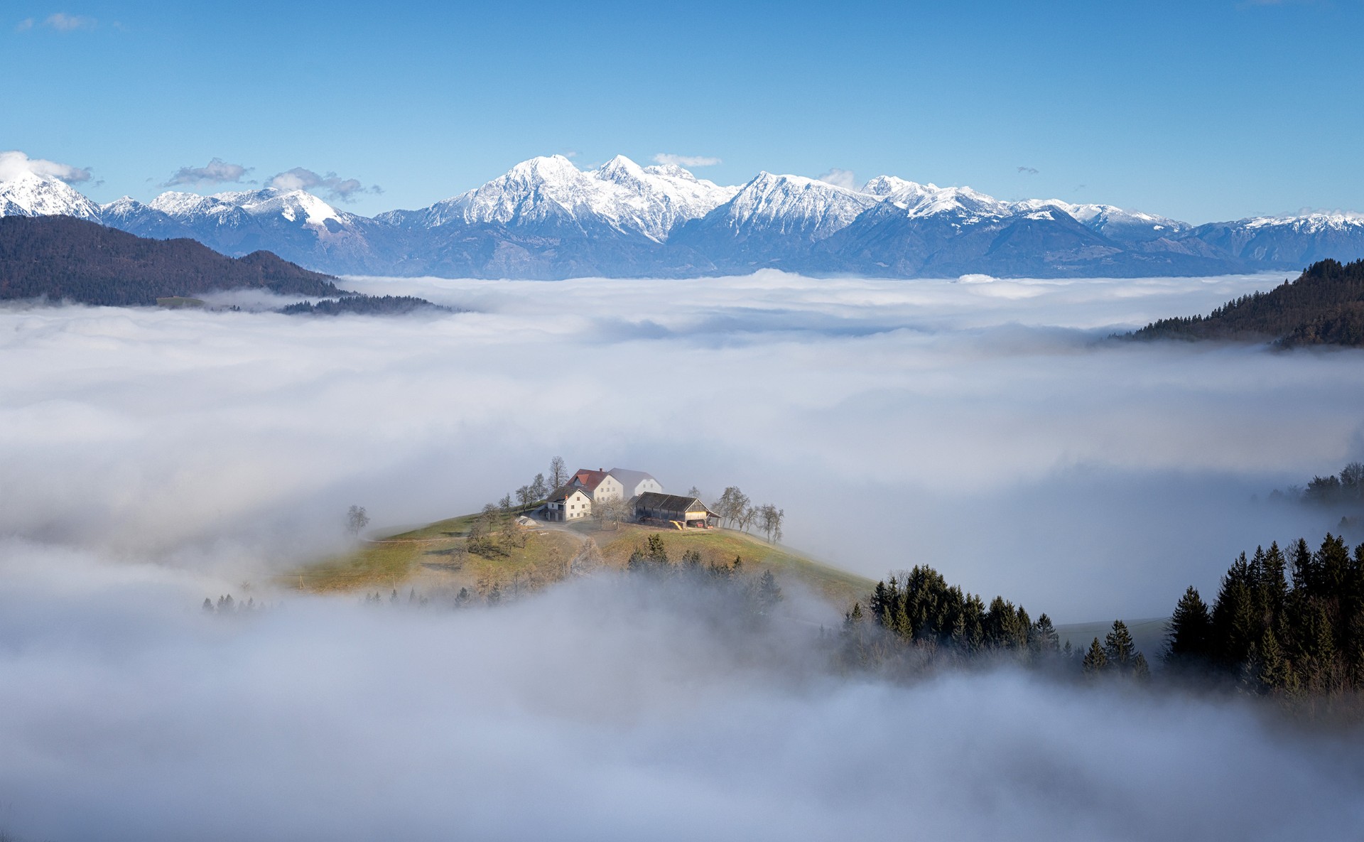
Well that's your Christmas cards sorted for next year! I love this, and I'm really jealous that we don't get snow like that in the UK. The building and location look interesting anyway, but the snow takes the image to a whole different level. I think your adjustments from the original (cropping and lightening the building) all work very well, so overall an excellent image. |
Jan 8th |
6 comments - 4 replies for Group 76
|
6 comments - 4 replies Total
|