|
| Group |
Round |
C/R |
Comment |
Date |
Image |
| 76 |
Dec 22 |
Reply |
Thanks Trey. I have a different version where I cloned out the bits of seaweed in the foreground, but if I use this in a Travel comp, I can only crop. Dodge/burn is completely OK though, so I can look at that. |
Dec 20th |
| 76 |
Dec 22 |
Reply |
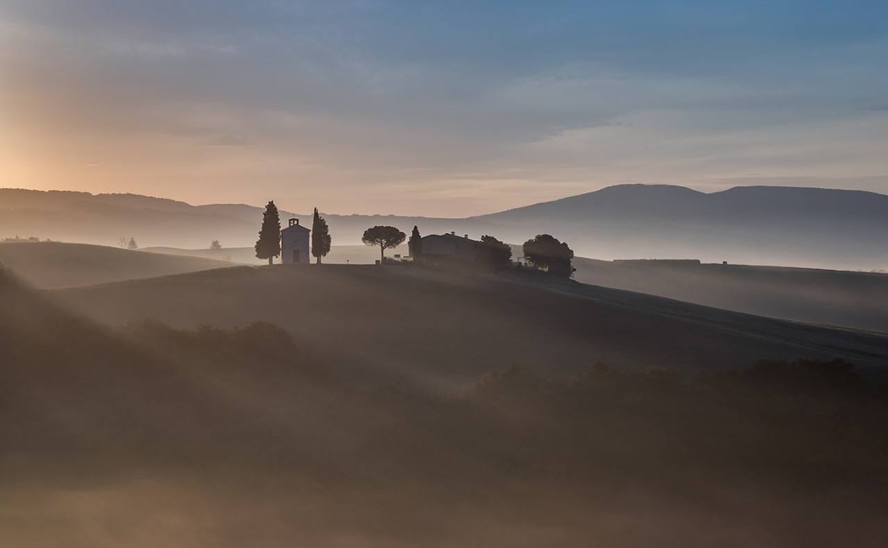
Thanks for your comments Sophie. I did a search - is it the house at St Cado or Castel Meur you were thinking of? Perhaps I need a visit to Brittany! |
Dec 20th |
| 76 |
Dec 22 |
Reply |
Thanks for your comments Trey. Yes, I don't want to loose the bit of red in the sky, but I could darken that brighter area a bit. |
Dec 13th |
| 76 |
Dec 22 |
Reply |
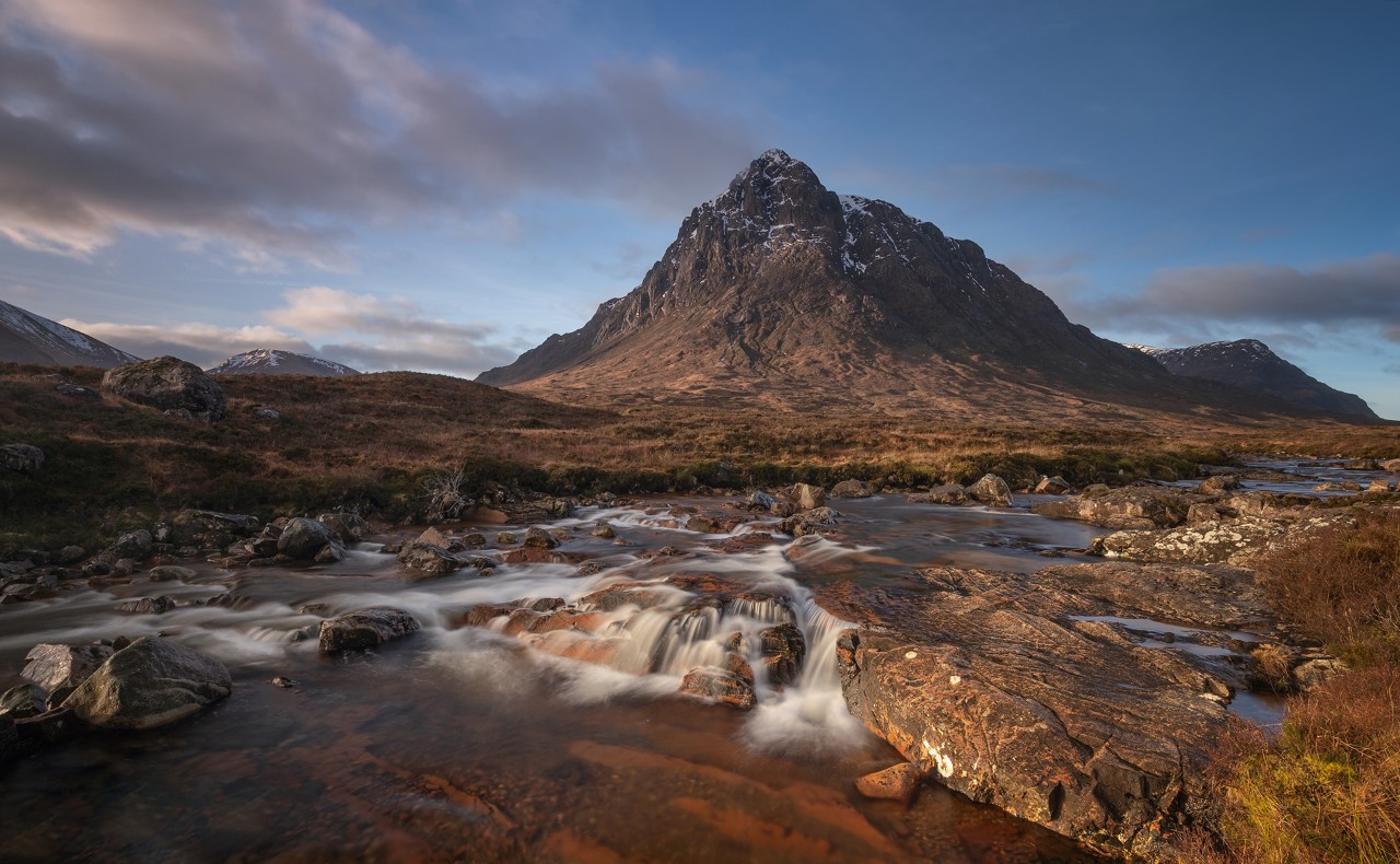
Interesting about the stacking - I would have thought you had enough depth of field at F11, but maybe not. As for the vignette, it's often a good idea for landscapes, but in this case the foreground grass in the original is a flat even tone, so a strong vignette shows up on the grass, hence my suggestion to reduce it a bit. |
Dec 12th |
| 76 |
Dec 22 |
Reply |
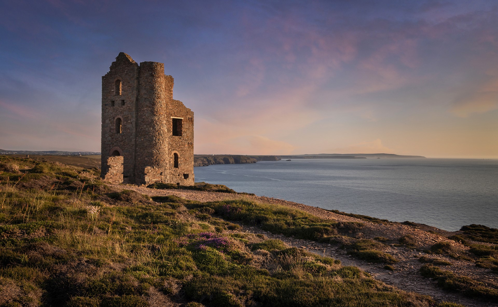
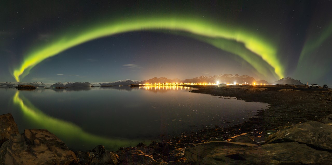
Thanks Sanford. I think you are correct that it is a little unbalanced. I would have liked to get more of the red behind the church, but that would have meant wading out to sea and I was already in the water and as far out as my boots would allow! I might try darkening the right a bit as you suggest. |
Dec 12th |
| 76 |
Dec 22 |
Reply |
Thanks for your comments. |
Dec 12th |
| 76 |
Dec 22 |
Reply |
Thanks for the feedback. Due to the arcane rules of FIAP exhibitions, it turns out I no longer need new images for my next level, so this will go on the back burner for a while. |
Dec 12th |
| 76 |
Dec 22 |
Comment |
Wow - I really like this. An intriguing image with lovey colours. It's not easy to work out what we are actually looking at here (though I'm guessing that's Mars?). I agree with Sanford that cropping out the single person on the right might improve the image, but I might suggest going further and crop out the buildings on both sides, leaving just the people and the view. Then they look like they are on some interplanetary craft gazing out at the planet they are travelling towards. Nice one! |
Dec 12th |
| 76 |
Dec 22 |
Comment |
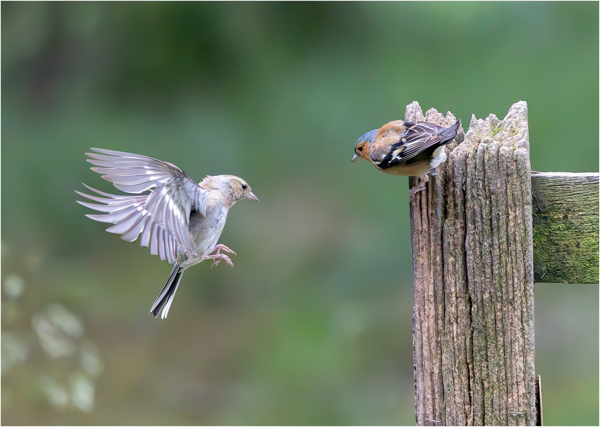
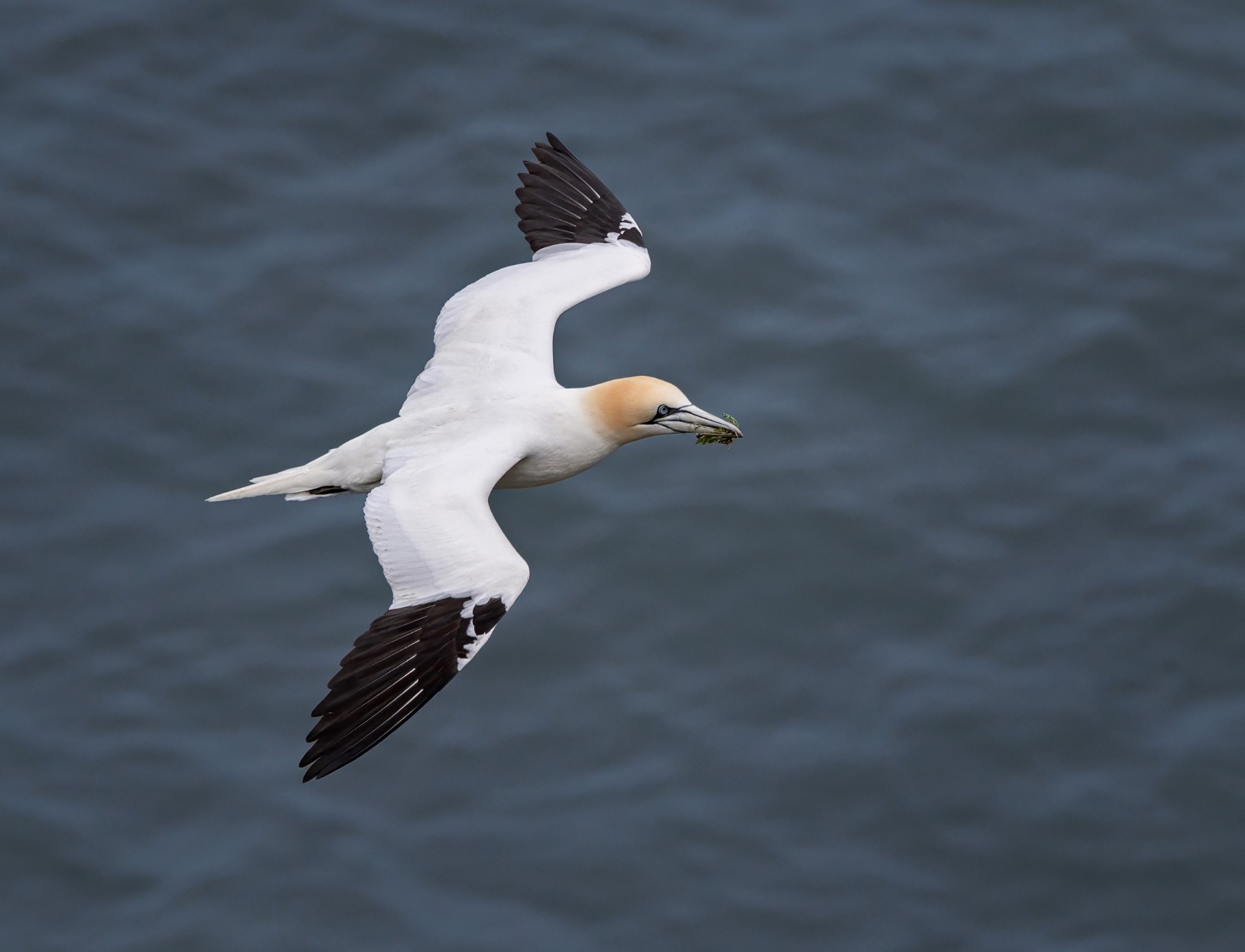
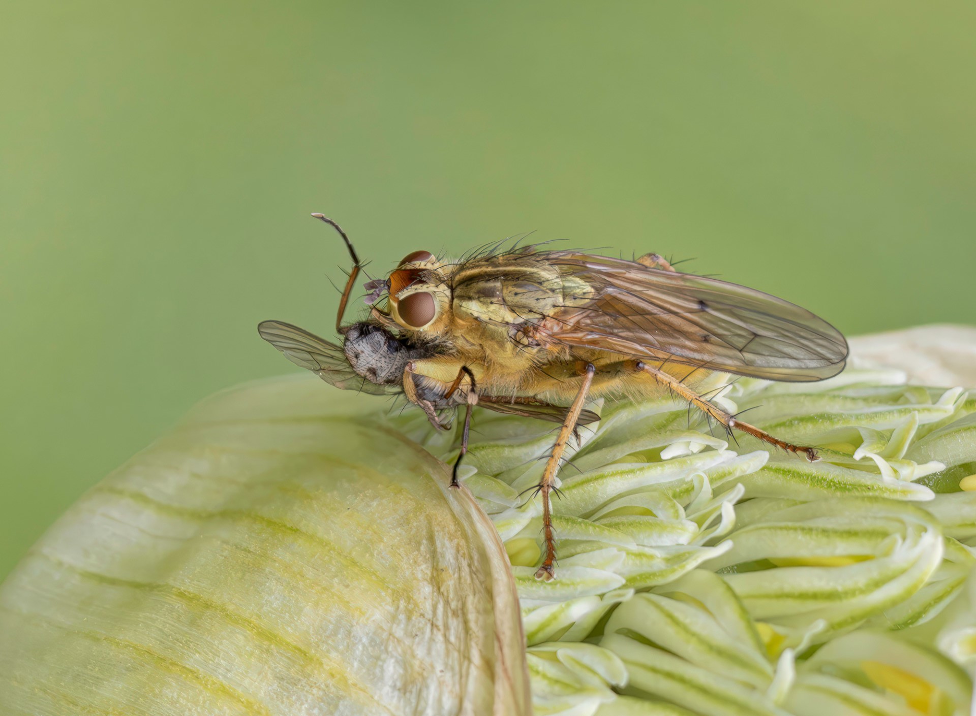
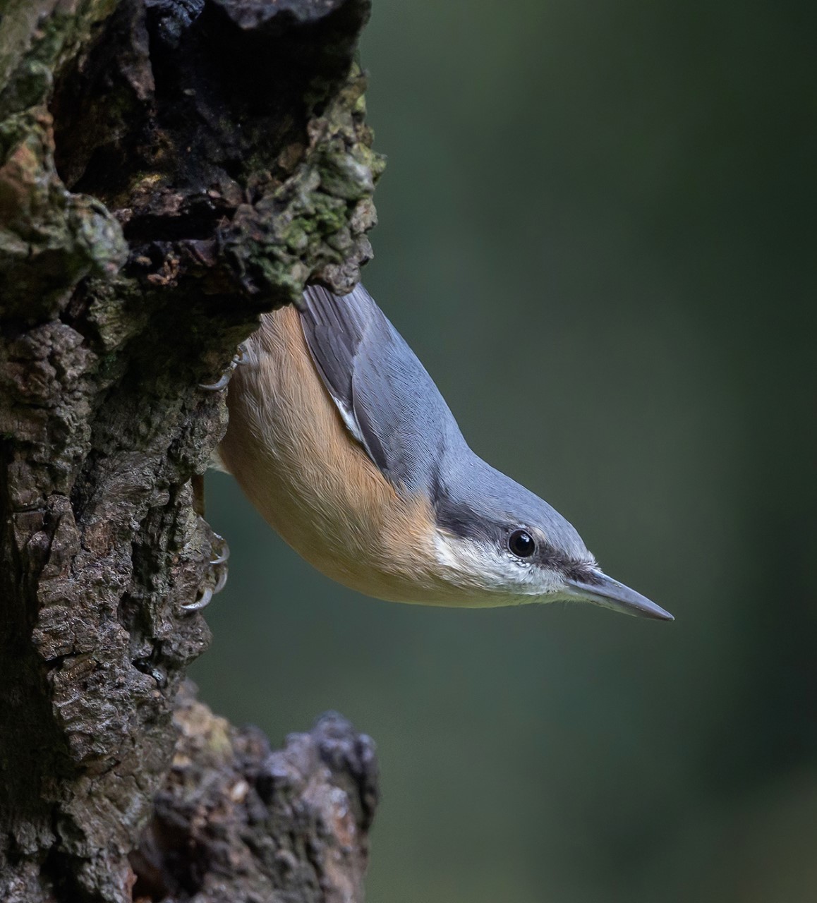
My initial thought was that we are looking at the wrong side of the bird, but you have explained your reasoning. I think in the context of a series of images showing different views of the bird, this works OK, but as a stand-alone image in (say) a competition you would inevitably get the comment that we can't see the eyes of the main bird. Having said that there is great detail in the bird's feathers and you have cropped in nicely, but I also agree that the image looks rather bright. I think the original only needed a slight boost in exposure. |
Dec 12th |
| 76 |
Dec 22 |
Comment |
A good colourful image. I think you have done exactly the right thing in cropping out the sky as it was very bright with no interest anyway, and I like the extra bit of saturation in the final version. With a 'jumble' of subjects it is often difficult to know where to start and stop the image. I agree with others that the glare on the right could be cropped out. For me the 'main boat' is the orange one as it projects forward of the others, but it comes very close to the left edge of the frame. You could give it a little separation by expanding the canvas and adding a 'content aware filled' strip to the left side. |
Dec 12th |
| 76 |
Dec 22 |
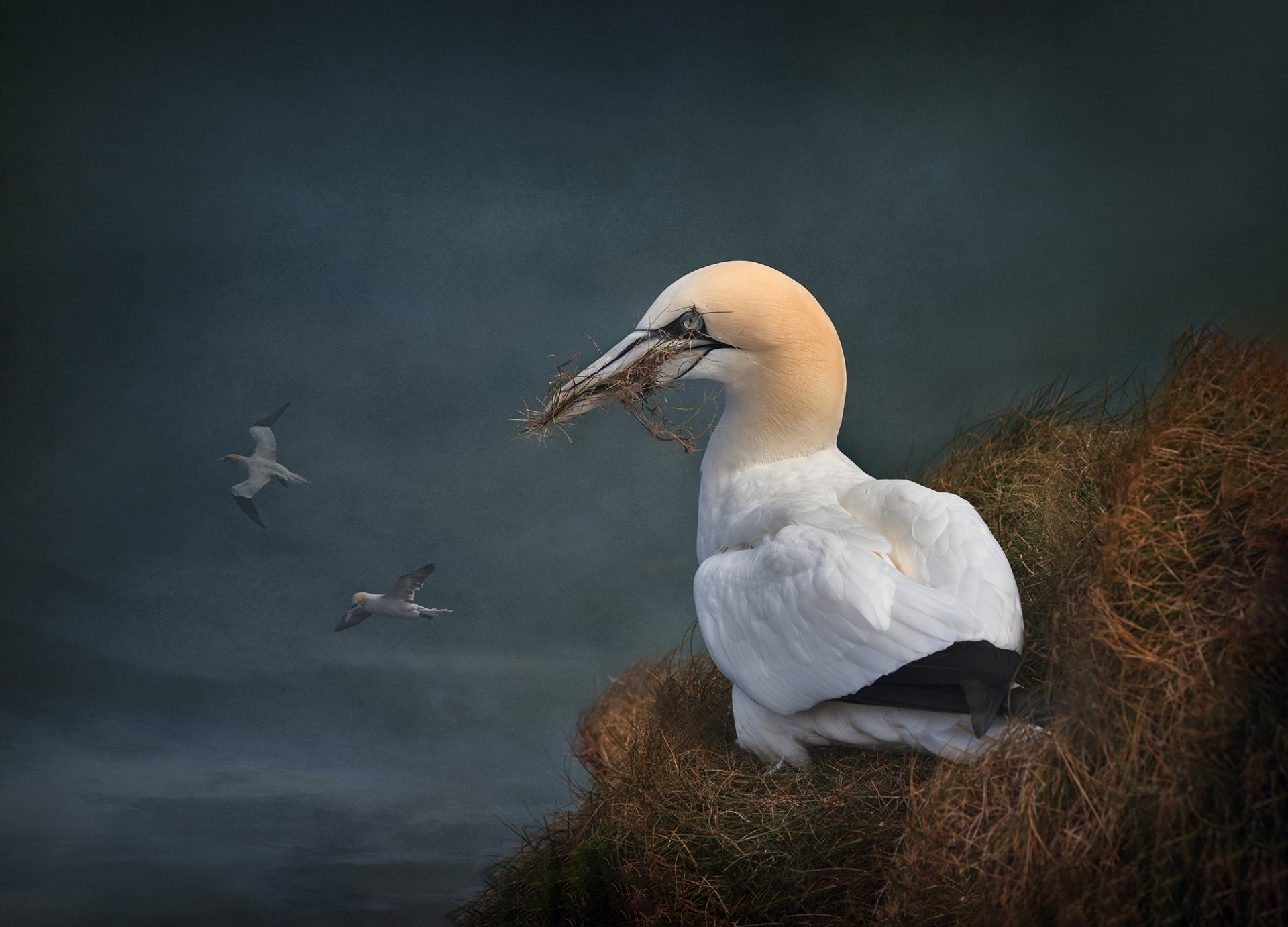
Comment |
Interesting to see this bird in action - it always helps in wildlife if the subject is actually doing something. I agree that the image is improved by cropping so that the bird is now flying into the image, and I think it helps that the foreground birds are out of focus so they do not detract from the main subject. Comparing the original and final images, I find the final version has a bit of a yellow colour cast and there looks to be an over-exposed area under the bird's wing that looked OK in the original - maybe something to look into? |
Dec 12th |
| 76 |
Dec 22 |
Comment |
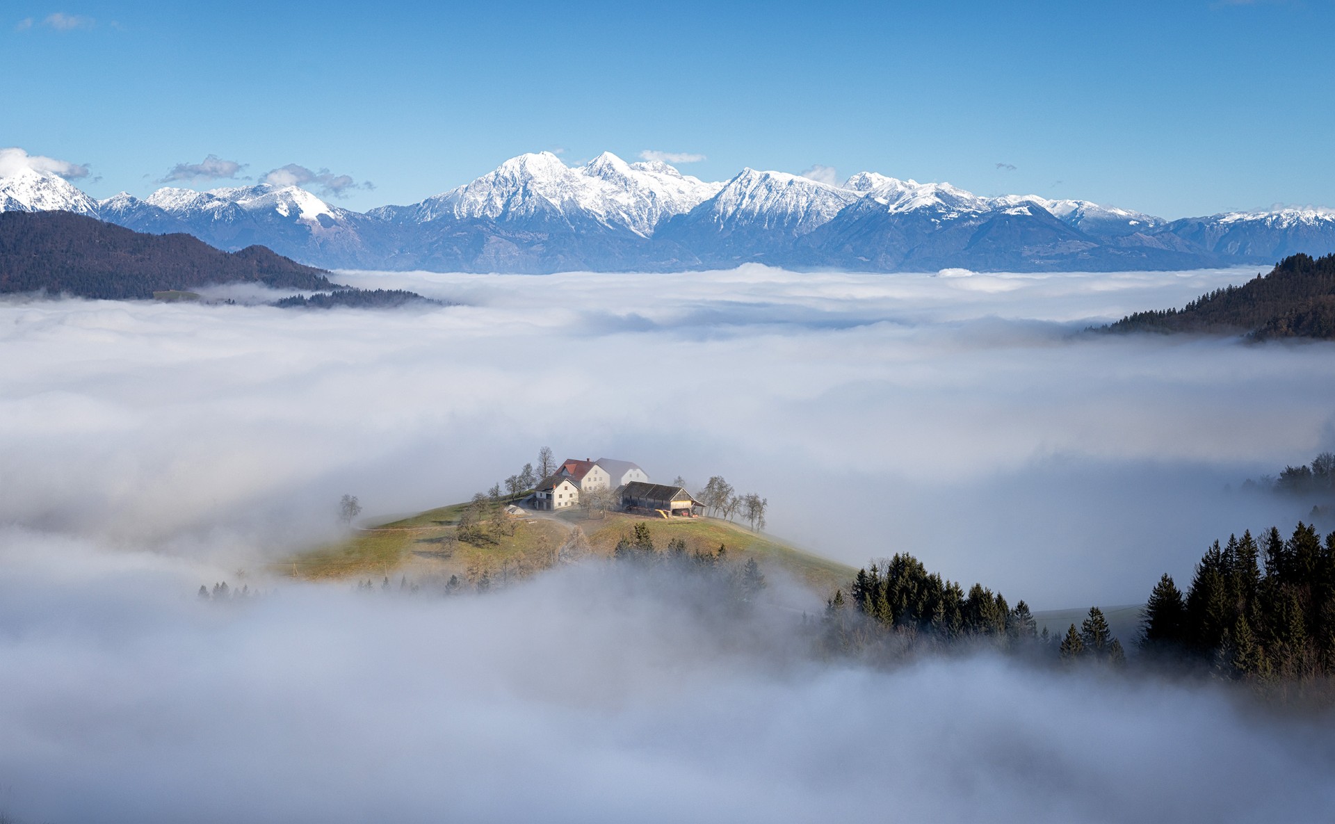
Old buildings make great photographic subjects. I like the composition, with the building positioned between the two front bales, offset to one side and balanced by the autumn trees. The sky has plenty of drama, and I don't think it looks overdone. I would however suggest that you reduce the strength of the vignette as I think it looks a bit too obvious, and I would also suggest darkening the roof of the building a little as it's quite a bit brighter than the walls. But a nicely composed shot of an interesting subject.
(PS - I'm interested that this is a stacked image - was that exposure or focus stacking or something else?) |
Dec 12th |
| 76 |
Dec 22 |
Comment |
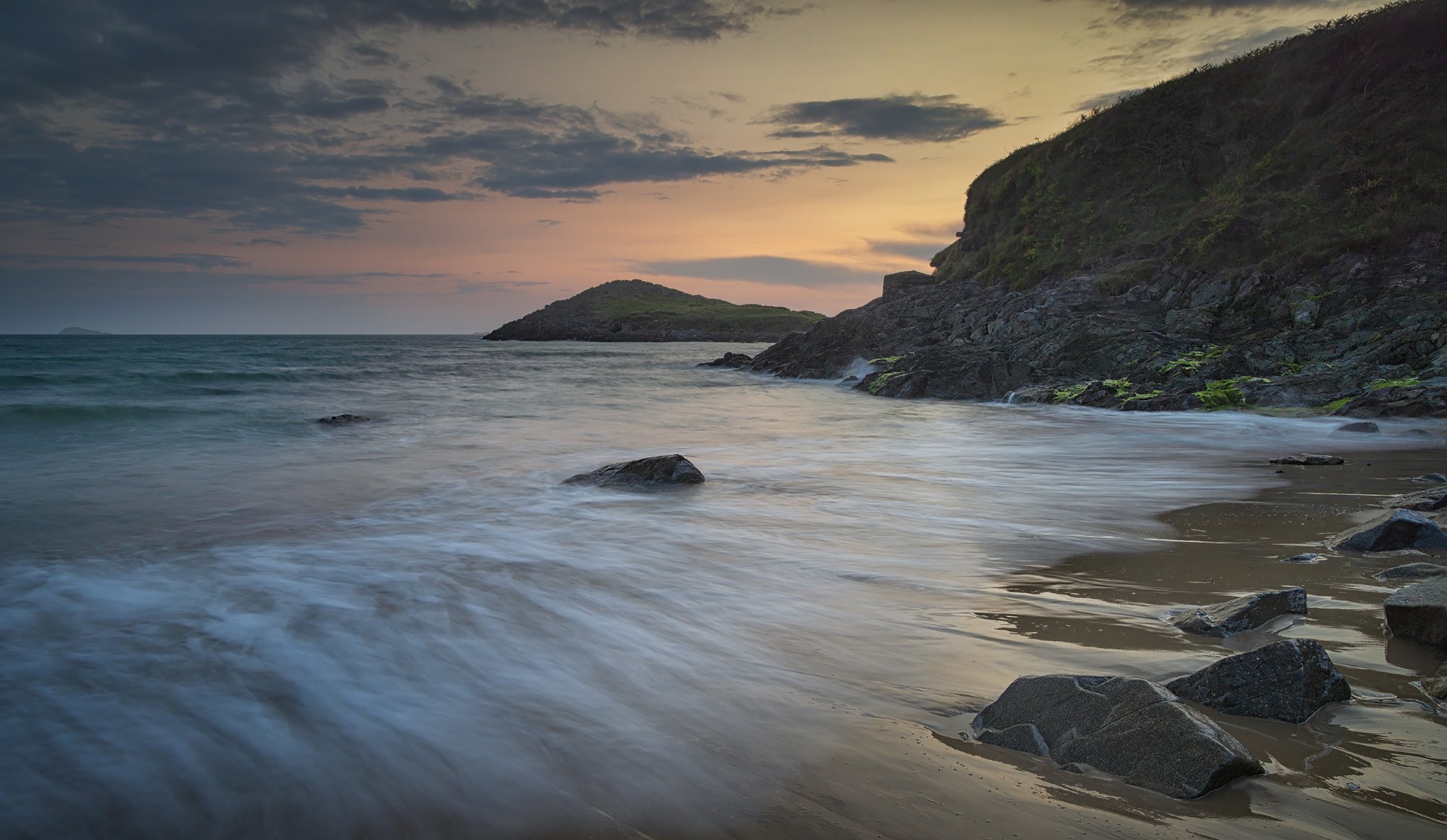
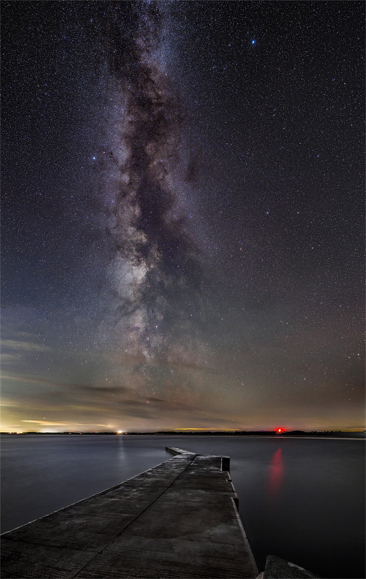
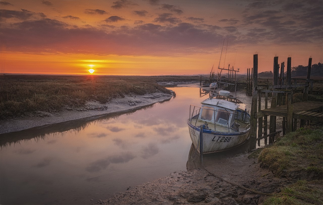
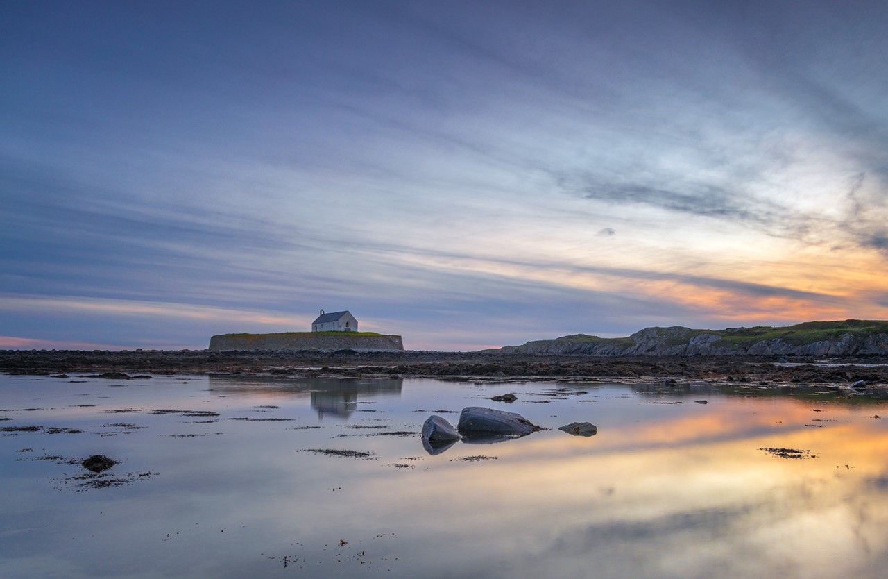
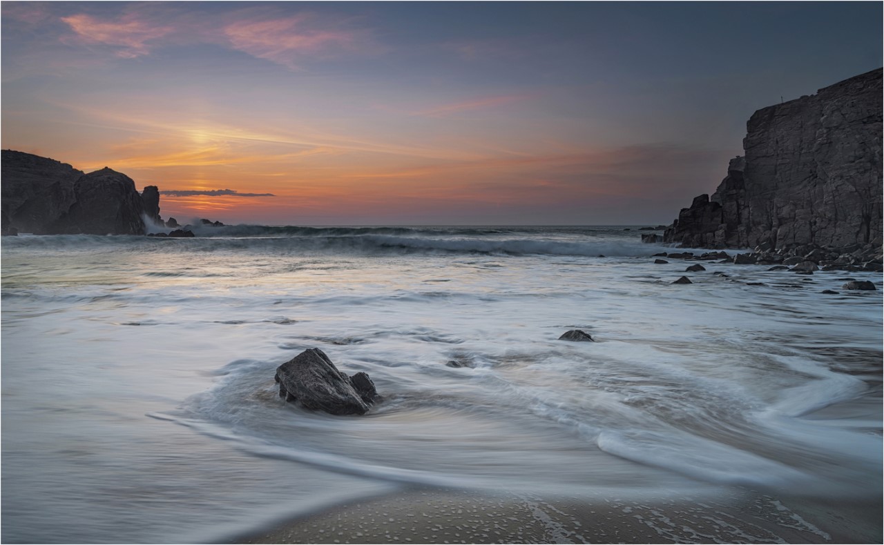
A very nice long exposure image of a fine colourful sunrise. I like the composition with the triangular shape of the foreground rock pointing into the image and your choice of shutter speed is good - long enough to blur the water, but not so long that it messes up the clouds. Would I do anything different? I might have left more of the foreground rock in the image - to me that's the most interesting part, and maybe add a slight vignette to concentrate attention even more down the centre of the image where the rock is pointing. Just some suggestions. |
Dec 12th |
6 comments - 7 replies for Group 76
|
6 comments - 7 replies Total
|