|
| Group |
Round |
C/R |
Comment |
Date |
Image |
| 70 |
May 24 |
Comment |
Thanks so much, Geoff!
|
May 13th |
| 70 |
May 24 |
Comment |
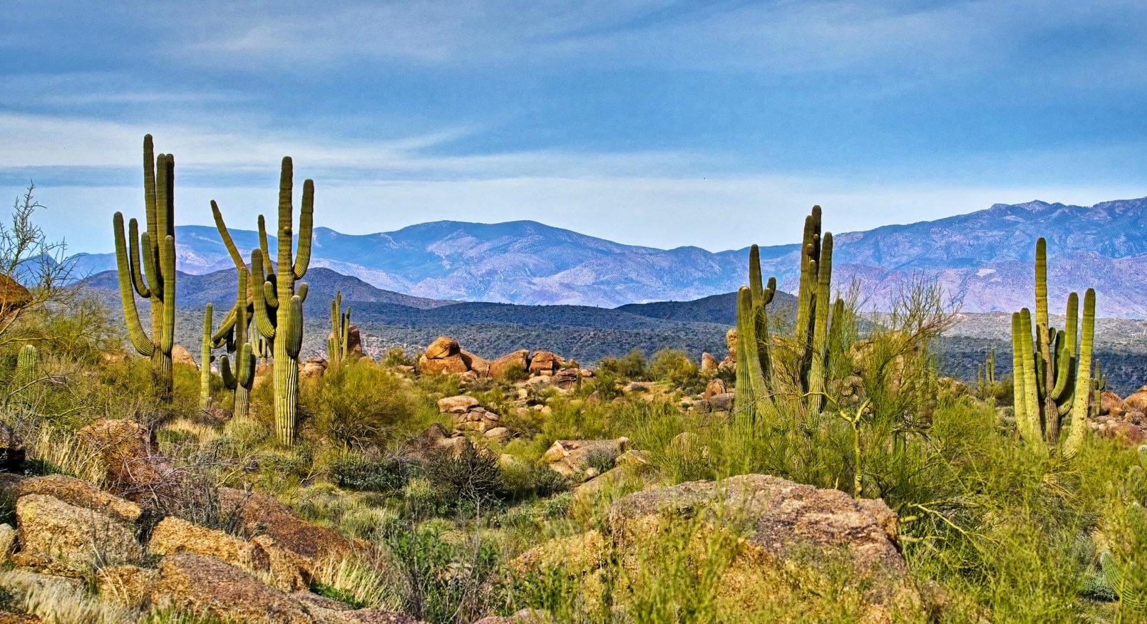
Hi Pierre, You're in my favorite part of the world right now: the American Southwest. I love cacti, especially these tall saguaro cacti against the backdrop of the mountains. I wonder if cropping a bit of the foreground to make the cacti more prominent, and then darkening the sky in the background might make them stand out a bit more. Attached is my effort to try to do that. |
May 5th |
 |
| 70 |
May 24 |
Comment |
Hi Frans, I absolutely love this image- especially after the colors of the cabin have been enhanced. The simplicity of the cabin with the tree on the lonely finger of land are very appealing, and the person going into the cabin adds a lovely personal touch. I'm not necessarily opposed to sky replacement when the sky is detracting, but I agree with Pierre that his version of enhancing the natural sky seems a little more attractive. But, great picture! |
May 5th |
| 70 |
May 24 |
Comment |
Hi Kathryn,
I love the image- and yes, it does look cold! I agree with Pierre that the birds add life and perspective to the image- just wish they were a bit closer or more identifiable. But the picture is a strong story-telling image of a place most of us will never get to go.
|
May 5th |
| 70 |
May 24 |
Comment |
Hi Geoff,
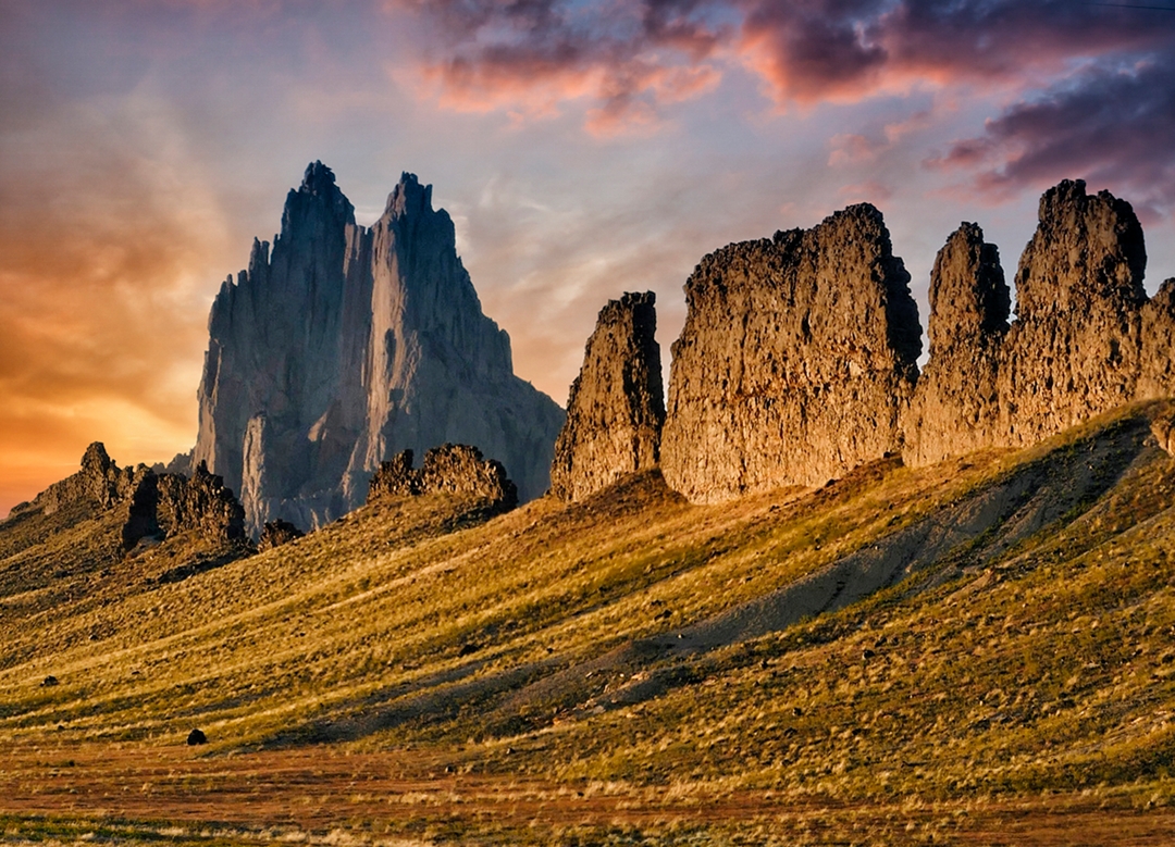
The mountains are beautiful- especially as a pano image. However, I agree with Pierre that the black area in the front is a little distracting. Like he did, I tried to process it just a bit more to see if it could get some detail in it, but was generally unable to do so. I think this dark area needs to be more identifiable to make it a strong picture. |
May 5th |
| 70 |
May 24 |
Comment |
Hi Stefaan- Nice image! Like Pierre said, it's an appealing long exposure picture which gives it a darker, moody feel. Good job. |
May 5th |
| 70 |
May 24 |
Comment |
Hi Tami, I'm very drawn to the evening colors of the water, rocks and sky, but I also like the starburst in the upper right, which I think adds a little life to the image. I know starbursts are a matter of personal taste, but I really think this one adds to the picture rather than takes away. |
May 5th |
| 70 |
May 24 |
Reply |
Thanks, Pierre- Excellent comments, as usual! Yes, I did darken the landscape in the foreground just a bit to make the lighthouse more prominent, but didn't use vignetting, per se. About the line at the top, you're very perceptive, because I honestly didn't even see it until you pointed it out, but will definitely remove it before using the image again. |
May 5th |
7 comments - 1 reply for Group 70
|
7 comments - 1 reply Total
|