|
| Group |
Round |
C/R |
Comment |
Date |
Image |
| 70 |
Jan 24 |
Reply |
Thanks, Geoff! Fortunately- or unfortunately- the New Mexico skies are mostly bright blue. It's hard to find days with clouds. But, they're still nice when contrasted with the red soils and hills. |
Jan 28th |
| 70 |
Jan 24 |
Comment |
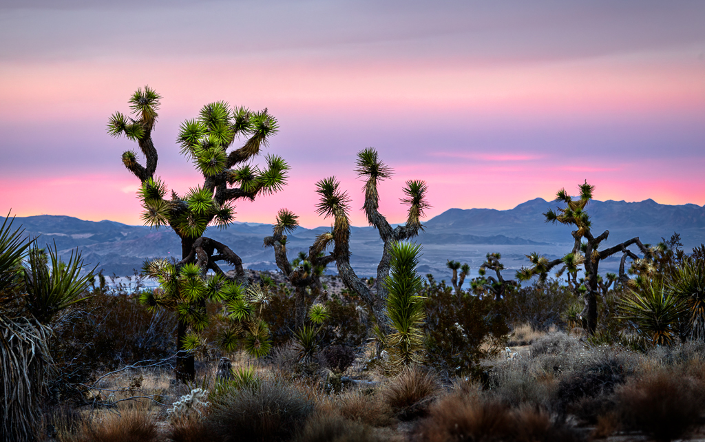
Hi Frans- You're in one of my favorite places! I love the contrast of the spikey Joshua Trees in the foreground with the smooth blue mountains in the background. The colors of the sky really add to the attractiveness of the image! My personal preference would be to have a little more light and detail in the foreground to see the trees and bushes a bit better. I tried this with the attached image. |
Jan 28th |
 |
| 70 |
Jan 24 |
Comment |
Hi Kathryn- This image is like WOW- I love it! The big arch grabs your attention, and then you start to see the distant mountains and the stars and whispy clouds in the sky. That's an image I'd love to have on my wall. Just perfect!!
|
Jan 28th |
| 70 |
Jan 24 |
Comment |
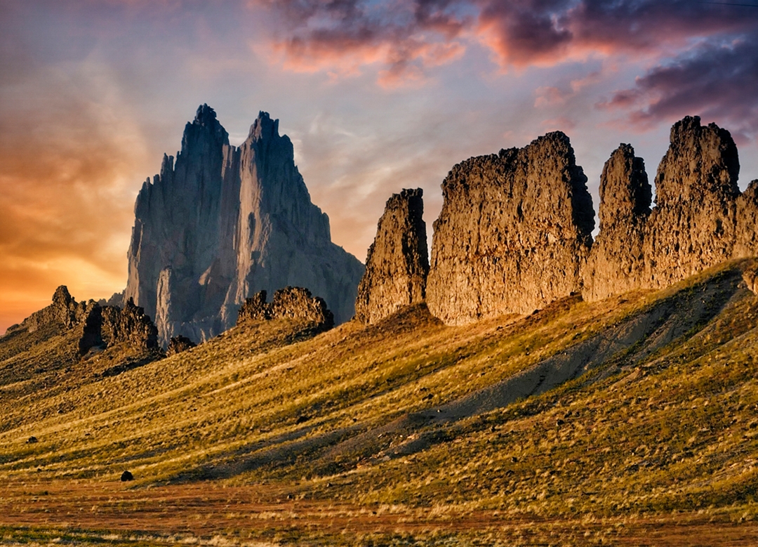
Hi Geoff- Your picture of Ayres Rock is really appealing- makes me want to go there myself. It helps the image to have a couple of trees near the rock to give it some sense of size and perspective. I'm drawn to the bold red color with the contrast of the green grass and blue flowers in the front. No suggestions for edits!
|
Jan 28th |
| 70 |
Jan 24 |
Reply |
Hi Stefaan- I like the journalistic quality of the image, and I'm a bit more drawn to color than to b/w for this. I think it you could mute the colors a bit in this color picture to make them more natural, it would be even more appealing. |
Jan 28th |
| 70 |
Jan 24 |
Reply |
Yes, I can imagine it would look very nice in B/W. |
Jan 28th |
| 70 |
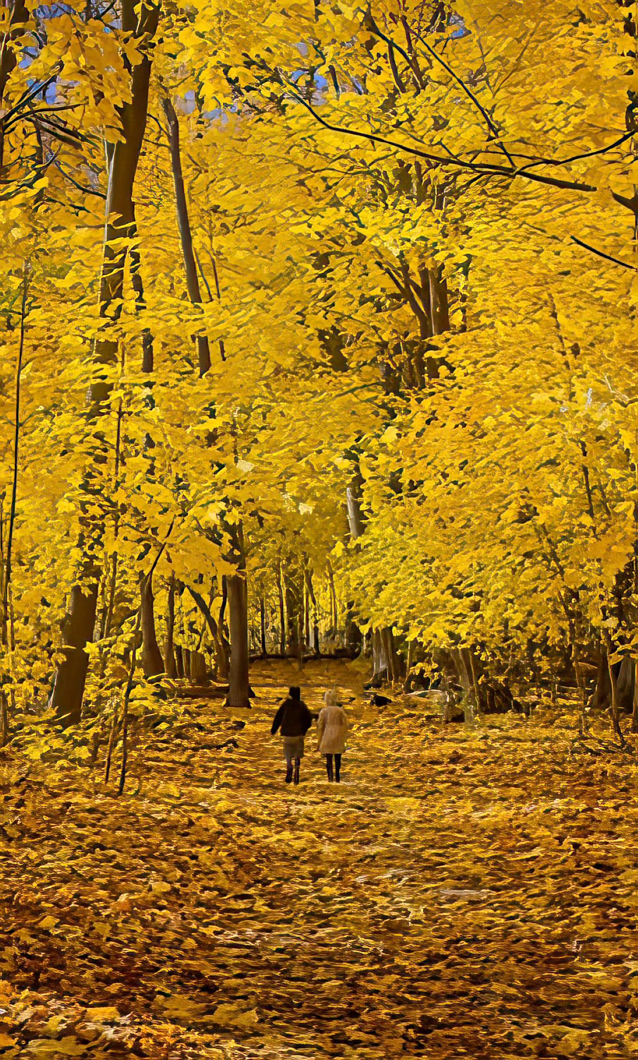
Jan 24 |
Comment |
Hi Pierre- Like the others, I'm really drawn to the warm Fall colors of this picture. However, I almost didn't see your wife and son in the picture because they blend in so well with the trees. I wonder if they would be more the center of attention if they were a bit closer and they were wearing red or blue coats, or something to make them stand out more from the picture. I edoitted the pic to make the people a little closer- but didn't change the coat colors. What do you think? |
Jan 28th |
 |
| 70 |
Jan 24 |
Comment |
Hi Tami- Fully agree with previous comments. The water with the bench in the front and mountains in the back is very appealing- really leads your eye through the picture. Great job. |
Jan 28th |
| 70 |
Jan 24 |
Reply |
Thanks so much, Frans! That's a good observation and you made a definite improvement with the cloning. With the bright sun, it was hard to prevent overexposure, so I darkened the picture and reduced the highlights, but that didn't fully relieve the "hot" spots in front. I really like what you did. |
Jan 28th |
| 70 |
Jan 24 |
Reply |
Thanks, Stefaan. No, I didn't use HDR (don't really know how!), but I did darken the picture and highlights a bit because the sun was so bright and made the whites in the tents to lose their detail. Thanks for your comment!
|
Jan 28th |
| 70 |
Jan 24 |
Reply |
Thanks, Pierre! I also wish I could have backed up further for a wider angle, but that wasn't possible. These tents are so dramatic, but it's hard to find a good angle to catch them. |
Jan 28th |
5 comments - 6 replies for Group 70
|
5 comments - 6 replies Total
|