|
| Group |
Round |
C/R |
Comment |
Date |
Image |
| 70 |
Aug 23 |
Reply |
thanks so much for your thoughts, Geoff!
|
Aug 26th |
| 70 |
Aug 23 |
Comment |
Hi Frans,
I love the waterfall, especially seeing it flow down over several levels. I particularly like water which has not been "smoothed" like most other waterfall pictures: it gives a stronger feeling of the power and movement of the water like you experience in person when you are there. The trees and greenery around it are great framing. Sometimes it's nice to have a human element to give it perspective, but in this case, the young woman is a bit distracting. It seems strange that she's standing in the middle of waterfall working on her cellphone, rather than enjoying the scenery. I think I'd rather just see and feel the grandeur of the waterfall. |
Aug 20th |
| 70 |
Aug 23 |
Comment |
Hi Kathryn- i love this scene and the way you captured it! The placement of the little island is perfect and the mountains just seem to flow down to it. This is a picture that you could sell and it would enhance anyone's wall. Great job!
|
Aug 20th |
| 70 |
Aug 23 |
Comment |
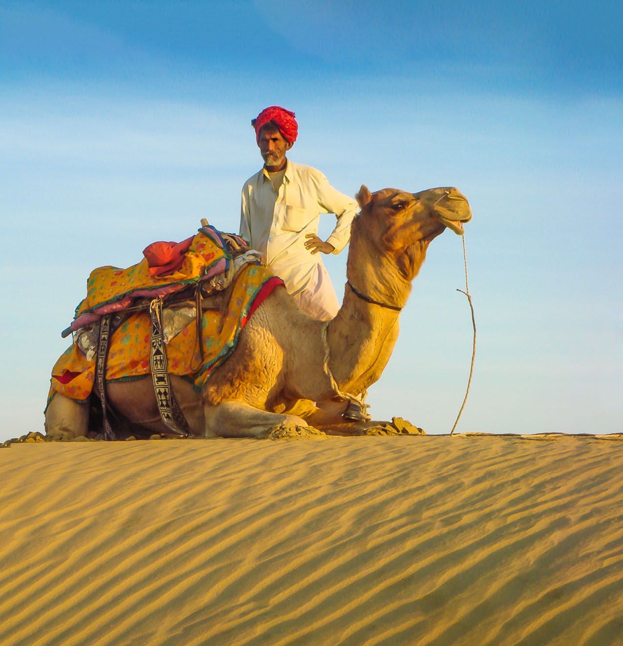
Hi Geoff, I agree with the others: love the angles, the colors and the story it tells! it seems to me that it might be stronger if there were a little more breathing room around the camel and driver, and a little more of the sand in the front. I made a small modification to see if this worked, and I think I like it a little more. I'm really envious that you were able to go to Rajasthan to capture such a remarkable scene! Great job!
|
Aug 20th |
 |
| 70 |
Aug 23 |
Comment |
Hi Pierre- Love the sunset over the water- always a favorite! I agree with others about the distracting limbs on the left, and maybe a need for a focal point in the water. I'm also distracted just a bit by the light-colored object in the bottom center of the picture which looks like it might be a discarded rag or some kind of trash. Seems like it would be better to remove that so it doesn't take away from the rest of the picture. But you captured a beautiful sunset with some lovely rays!
|
Aug 20th |
| 70 |
Aug 23 |
Comment |
Hi Tami- the colors on the bridge and in the background give me almost the feeling of a holiday picture, almost appropriate for a winter greeting card. I like it. Others have mentioned the lack of or need of sharpness, but I'm drawn to the misty, moodiness of the scene- a place I'd like to be. I agree with Frans that it would be desirable to see the other end of this lovely bridge, and maybe, a little less of the green bank on the left side. But I still like the picture.
|
Aug 20th |
| 70 |
Aug 23 |
Comment |
Hi Stefaan- I really like this: the simplicity, the strong contrast of colors, and the combination of bumpy rocks and smooth water. The bridge is a great leading line, and the little buoy adds a nice note of interest. I think this is a great composition- very attractive and appealing! My only comment is that I wonder if it might be a little stronger if there were not so much open space on the right and the bridge was brought a little more to the center? |
Aug 20th |
| 70 |
Aug 23 |
Reply |
Thanks, Frans! Glad you also understand the challenges and decisions in big landscapes. Incidentally, I was just blown away by the beautiful images in your little video which Pierre shared. I need to learn some of those editing techniques from you- Wow, you truly created some spectacular images! |
Aug 20th |
| 70 |
Aug 23 |
Reply |
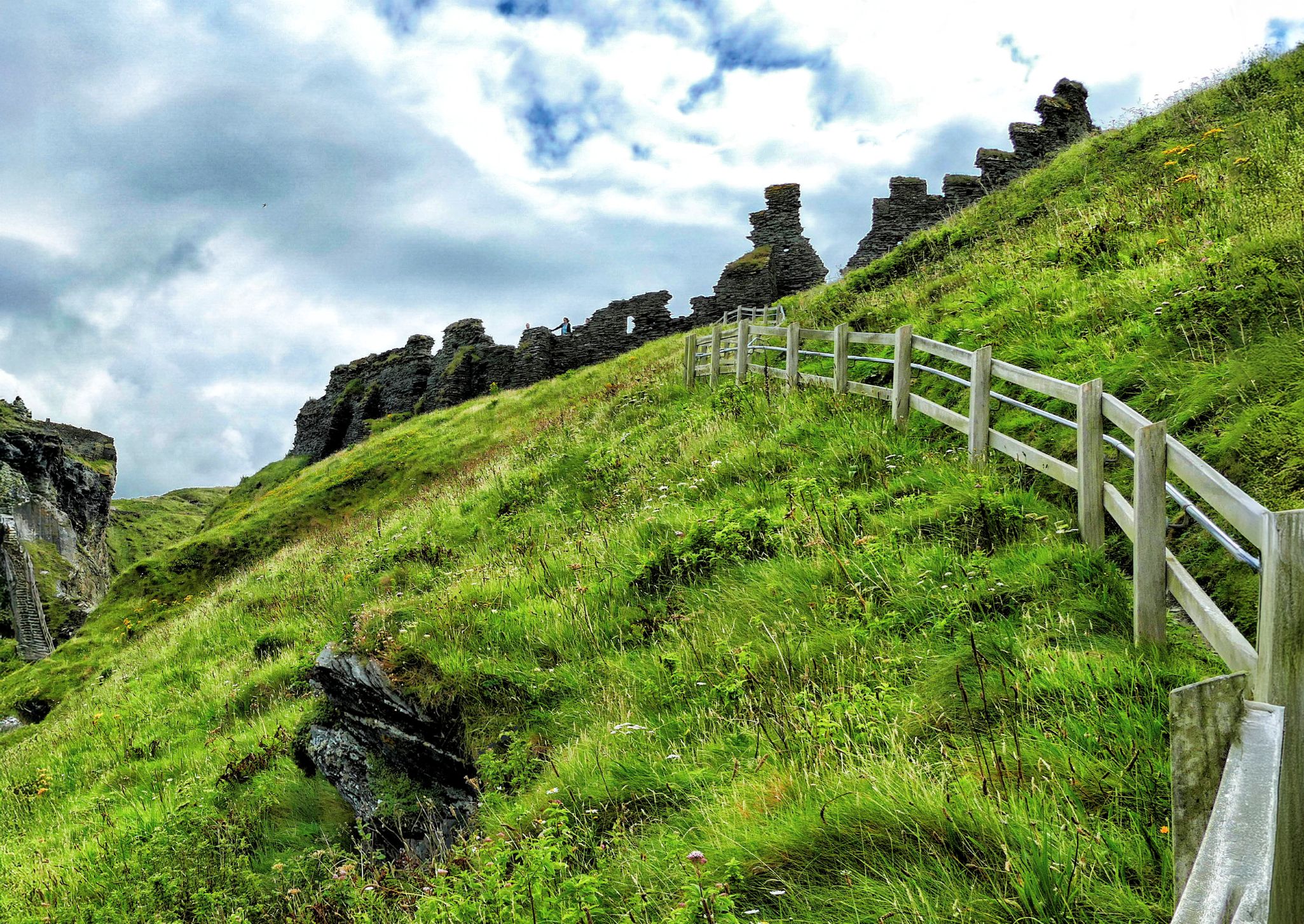
Thanks, Kathryn- The path up to the top of the chimneys was definitely a challenge. I had to borrow some poles from a friend who was more agile than I in order to get up the cliff. Very perceptive comments about the fringing, which I've struggled with in the past. I guess I've never used defringing in ACR, but need to get acquainted with that-- thanks so much! And yes, I couldn't recommend the landscapes around northern New Mexico more highly- especially around and north of the Abiquiu area. HOpe you can get there soon!
|
Aug 20th |
| 70 |
Aug 23 |
Reply |
Thanks so much, Pierre- great observations! Yes, there are a lot of decisions to make with big landscapes. The pano was vertical in order to capture more of the big chimneys, but since my real interest was in bringing out the Pedernal Peak in the rear, I didn't want to include the full width of the chimneys. The one on the right was fairly narrow, but the one on the left was quite wide and didn't seem to balance well with the other one. So, I cropped them down to frame Pedernal, which was a much smaller element. The chimneys themselves are a magnificent subject, but that's not what I wanted to focus on. Thanks for your thoughts!
|
Aug 20th |
| 70 |
Aug 23 |
Reply |
Hi Stefaan- Welcome to the group! We'll enjoy seeing your images and comments. In response to your questions, yes, I generally feel that Topaz sharpener helps to improve the image- and in this case, especially the Pedernal Peak in the distance. I may tend to overuse sharpening, but it's generally an improvement. Regarding the pano, it was a vertical pano to take in more of the rocks on the bottom, but I wanted to make the Pedernal Peak the focal point, so I cropped the sides a bit to use the chimneys as framing for the Peak. And yes, I used the same aperture settings for the whole pano. No, I didn't use ND filters this time, but I darkened that clouds a bit with the Dehaze slider of Camera Raw. Great questions! I know you'll add a lot to this group! |
Aug 20th |
6 comments - 5 replies for Group 70
|
6 comments - 5 replies Total
|