|
| Group |
Round |
C/R |
Comment |
Date |
Image |
| 58 |
May 24 |
Comment |
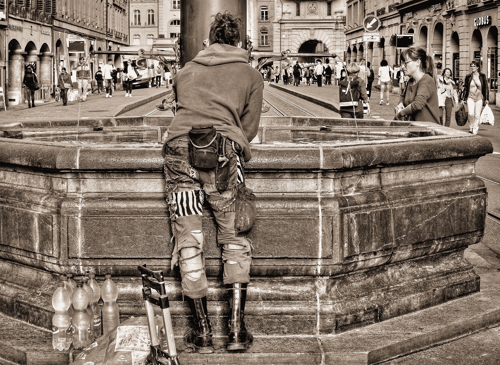
Well, Pinaki, I don't know what to say about this image. When I first saw it I was puzzled as to what I was looking at. I didn't see the yellow boots until I read others' comments pointing them out. I wish they were more visible because to me they tell the story of this man walking along with his big load of vegetation. |
May 28th |
| 58 |
May 24 |
Reply |
Thank you very much for your nice comment, Sergio. |
May 28th |
| 58 |
May 24 |
Reply |
Thank you very much for your comment, Pinaki. Much appreciated. |
May 28th |
| 58 |
May 24 |
Reply |
Thanks, Bruce. I debated between using the color and monochrome versions because I also like the color one. I appreciate your nice comment. |
May 28th |
| 58 |
May 24 |
Reply |
Thank you, Bev! |
May 28th |
| 58 |
May 24 |
Reply |
Thank you, Ed. I sincerely take your "old grainy images" comment as a compliment! |
May 28th |
| 58 |
May 24 |
Reply |
Thank you, Lance! |
May 28th |
| 58 |
May 24 |
Reply |
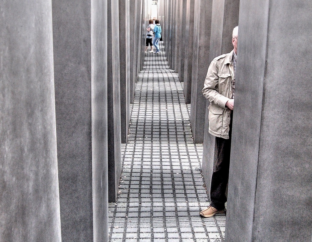
Isaac -- I like the title Mystery Man! Thanks for suggesting it. |
May 28th |
| 58 |
May 24 |
Comment |
Hi Sergio -- This is a neat image. The bright light at the center top is somewhat destracting, but I can see reasons to leave it in such as preserving the whole arch shape and accounting for the nice square of light on the ground. The figure in the mural seems to be looking at the figures walking toward him which is an interesting narrative. I feel a strong urge to make the vertical elements on either side of the mural straight but maybe that is my hangup. Nice work. |
May 28th |
| 58 |
May 24 |
Comment |
Hi Ed -- The sax player seems to be the main interest and I might have cropped tighter on her to remove some of the clutter. I also like the guy who appears between the speakers on the right. |
May 28th |
| 58 |
May 24 |
Comment |
Bruce -- The two figures of the musicians are dynamic and and well lit. The building looming over them distracts a bit for me. Nice shot. |
May 28th |
| 58 |
May 24 |
Comment |
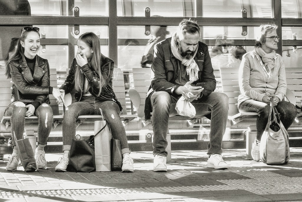
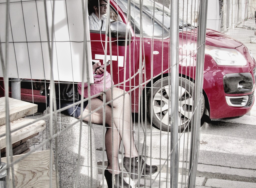
Bev -- I'm going to suggest that the main interest is the two teens and the figure on the right is superfluous. She is much more brightly lit and seems separate. So I'm thinking crop tightly, featuring the teens and the hands holding the phone, and leave out the right-hand figure completely. My personal choice would be to make it monochrome. Just an idea. |
May 28th |
| 58 |
May 24 |
Comment |
Isaac -- That's an awful lot of bloody meat for me but that's my problem. It's an interesting subject and the vendor's face and gesture are good. Using color really gives the full effect of the meat on display. |
May 28th |
6 comments - 7 replies for Group 58
|
| 99 |
May 24 |
Reply |
Thanks very much for your comment, Gary. |
May 28th |
| 99 |
May 24 |
Reply |
Thank you very much. Barbara! |
May 28th |
| 99 |
May 24 |
Reply |
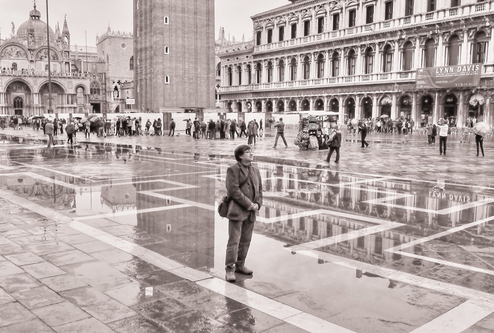
Peter -- Your cropping suggestion is such an interesting idea. It results in really an altogether different photograph -- not a bad thing! I hope the arch is straight because that's important to me, but I know how things can look slightly off plumb even when they're straight. Thank you for the thoughtful comment. |
May 28th |
| 99 |
May 24 |
Reply |
Hi Lance -- I'm very interested in the point you make about "cleaning up" an image by removing things like electrical fixtures and bright lights. In general I prefer a more "warts and all" approach, preserving the setting as it actually appeared instead of prettifying it. So I agree with you. At the time I was very interested in all those repeating chair backs so that was a major conideration in the composition. Thanks for taking the time to comment on this image. |
May 28th |
| 99 |
May 24 |
Comment |
Peter -- this image appeals to me very much. The way the figures are separated yet together; their individual body language and the white area surrounding them; the costumes, all make the story very intriguing. I think this is wonderful. |
May 3rd |
| 99 |
May 24 |
Comment |
Gerard -- I think this is a very successful image; your contortions were not for nought. Great idea to use a black card behind it to isolate the "sculpture", which it does look like. I like that you cropped tight and filled the frame with the subject. Very nice. |
May 3rd |
| 99 |
May 24 |
Comment |
Barbara -- This is really nice! Beautiful composition and the softbox lighting is perfect. The shape of the flower and the attitude of the leaves creates a dynamic composition. I love this image and would happily hang it on my wall. Congratulations! |
May 3rd |
| 99 |
May 24 |
Reply |
Hi Gerard -- I love your phrase, "somber and resonant with age." I also like the horizontal and vertical lines providing a little tension. Thanks for the interesting feedback. |
May 3rd |
| 99 |
May 24 |
Reply |
Hi Don -- Thanks for the nice feedback. Removing the glare from the lights and the unsightly electrical box certainly results in a cleaner-looking image, so thanks for that. Not sure about the "dust spots". Noise, for sure. |
May 3rd |
3 comments - 6 replies for Group 99
|
9 comments - 13 replies Total
|