|
| Group |
Round |
C/R |
Comment |
Date |
Image |
| 58 |
Dec 23 |
Reply |
Hi Gloria -- Thanks for your thoughtful observations. |
Dec 27th |
| 58 |
Dec 23 |
Reply |
Hi Isaac -- Your observation that the girl is imitating the horses' gait is very perceptive. I hadn't thought of it. |
Dec 22nd |
| 58 |
Dec 23 |
Reply |
Thank you, Pinaki! |
Dec 22nd |
| 58 |
Dec 23 |
Comment |
Hi Ed--I would definately crop much tighter, eliminating the parking signs for sure and probably also the big green blob on the left. The story is about the family, especially the little boy, but they're somewhat hard to see. I know you were shooting on the fly; you had a good instinct to show this Christmas moment |
Dec 18th |
| 58 |
Dec 23 |
Comment |
Bruce--I also like Isaac's crop for greater impact. You capitalized on a great opportunity for some very creative framing. I think color is a good choice because of his jacket and the nearly monochrome background. I like the image a lot. |
Dec 18th |
| 58 |
Dec 23 |
Comment |
Hi Pinaki--The figure of the vendor with his bubble gadget is excellent. I do wish the bubbles were more visible since they are a vital part of the story. I have to agree with Isaac about the background. Even though you have a shallow depth of field the background busy-ness intrudes on the main figure. I could live with the two figures of the woman in yellow and the man in the lower right corner, but the boy in blue and the pink area behind the vendor's head detract from the strength of the image. You show us such interesting subjects! |
Dec 18th |
| 58 |
Dec 23 |
Comment |
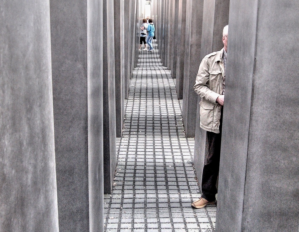
Isaac--I love these images you are showing us from Africa. I would not change anything except I would crop more closely at the top to diminish the busy wood elements, and then a little from the bottom to balance. It's a lovely image of "brothers" whether by blood or not. Also, I agree with the choice to use color rather than mono. |
Dec 18th |
4 comments - 3 replies for Group 58
|
| 99 |
Dec 23 |
Reply |
Hi John -- Your observation about the building guarding the harbor is interesting; it does seem guardian-like. |
Dec 22nd |
| 99 |
Dec 23 |
Comment |
John--I can relate! I love lines, too. I think this makes a fine monochrome image. Abstract subjects allow for lots of creative possibilities as you show us here. |
Dec 17th |
| 99 |
Dec 23 |
Comment |
Linda--This is so beautiful. I love the silvery quality of the highlights, the drape-y moss, and the reflections. I could live with this image on my wall and never tire of it. Congratulations! |
Dec 17th |
| 99 |
Dec 23 |
Comment |
Linda--You really got me going when you said you removed the boat to the RIGHT. I looked at the right side for a while but finally found the boat on the LEFT. I agree it was correct to remove it. Thanks for your always thoughtful feedback. |
Dec 17th |
| 99 |
Dec 23 |
Reply |
Thanks, Barbara! |
Dec 17th |
| 99 |
Dec 23 |
Reply |
Thanks, Peter. I never thought of the the big graphic "B" on the side of the ship as an issue but I see your point. I'm not sure what the letter means but many of the oil exploration ships have them so I guess I just accepted it as part of the scene. Linda has provided a darkened version for reference. |
Dec 17th |
| 99 |
Dec 23 |
Comment |
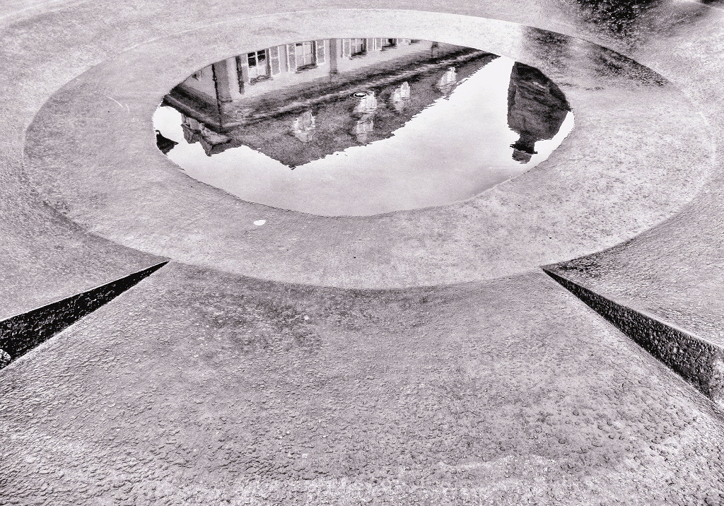
Tom--To me this is about dramatic light. It just happens to be bouncing off the chrome/steel of an ordinary water fountain which is transformed by it. I do think perhaps the highlights in the lower part of the image are a little too hot. |
Dec 3rd |
| 99 |
Dec 23 |
Comment |
Peter--You are brave to do an in-camera double exposure, and you got great results! I like (to photograph) brutalist architecture and I've made numerous parking garage images over the years so this really appeals to me. You were able to make all these parallel lines and concentric circles really dance. The little slice of forbidding sky adds to the effect. Bravo! |
Dec 3rd |
| 99 |
Dec 23 |
Reply |
Gerard--I'm glad you experiment with different unusual techniques; it broadens everyone's horizons. Having said that, I have to confess the color treatment in this case doesn't work for me. I love the image of the foot sculpture but the added color doesn't contribute anything in my opinion. I think Stephen's reference to the Eisenstaedt photo is interesting and relevant. |
Dec 3rd |
| 99 |
Dec 23 |
Comment |
Barbara--Another lovely still life. Using a lightbox is a great idea; the overall even light suits the details and texture of the gnarly pinecone. The interesting background provides a nice atmospheric narrative. The warm tone sems like a good choice. A very nice image.
|
Dec 3rd |
| 99 |
Dec 23 |
Comment |
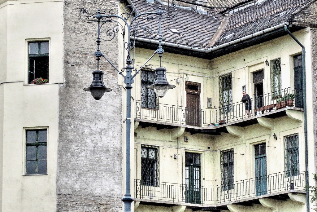
Gerard--Your thorough analysis of this image is very gratifying. It's an old favorite of mine (it was taken in 2011) for some of the reasons you mention, although I never defined them as well as you have. I think the architecture is the main feature. I never "saw" the UFO shape before but from now on that's what I'll always think of. You are right, of course, about the sliver of light on the right needing to go away. |
Dec 3rd |
7 comments - 4 replies for Group 99
|
11 comments - 7 replies Total
|