|
| Group |
Round |
C/R |
Comment |
Date |
Image |
| 58 |
Nov 23 |
Reply |
Hi Gloria -- Thanks for the nice feedback. I hadn't thought of the satellite dish particularly but your observation is right on.Glad you enjoyed the image. |
Nov 25th |
| 58 |
Nov 23 |
Reply |
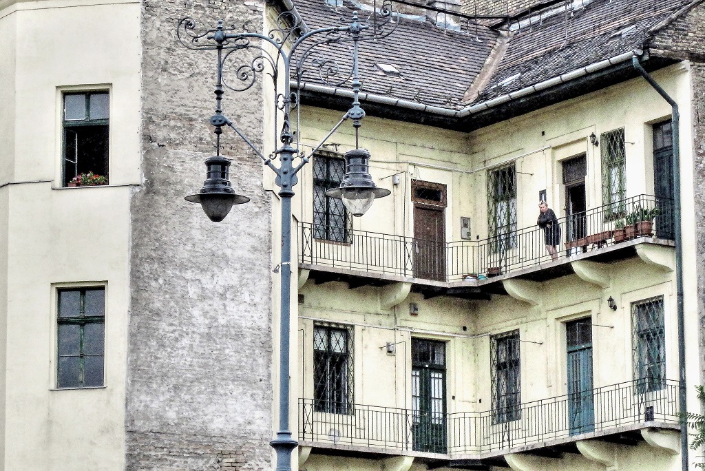
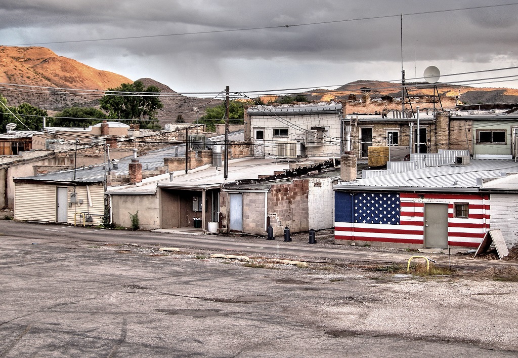
Hi Bruce -- I see your point. I was interested in the jumble of buildings and, of course, the flag. It was a desolate sort of place so that was my feeling about it at the time. Still, something like a dog in the scene would have created more interest. |
Nov 25th |
| 58 |
Nov 23 |
Comment |
Hi Gloria -- This portrait of a man and a boy doesn't give away too much. Apart from the craked old road suface at their feet we don't know anything about their environment. I like that they are isolated against the blank wall with no extraneous details cluttering up the composition. The man seems watchful; the boy concerned. Plenty of good detail in the clothing, and the warm tone works really well for this subject. I think this is a very nice image. |
Nov 20th |
| 58 |
Nov 23 |
Comment |
Hi Bruce -- I love this image! The narrative of the rail worker checking her watch on the train platform along with the clock and the sign creates such a great story. I agree with Isaac's cropping to reduce the dominance of the big red element on the right. Congratulations on a wonderful image. |
Nov 20th |
| 58 |
Nov 23 |
Comment |
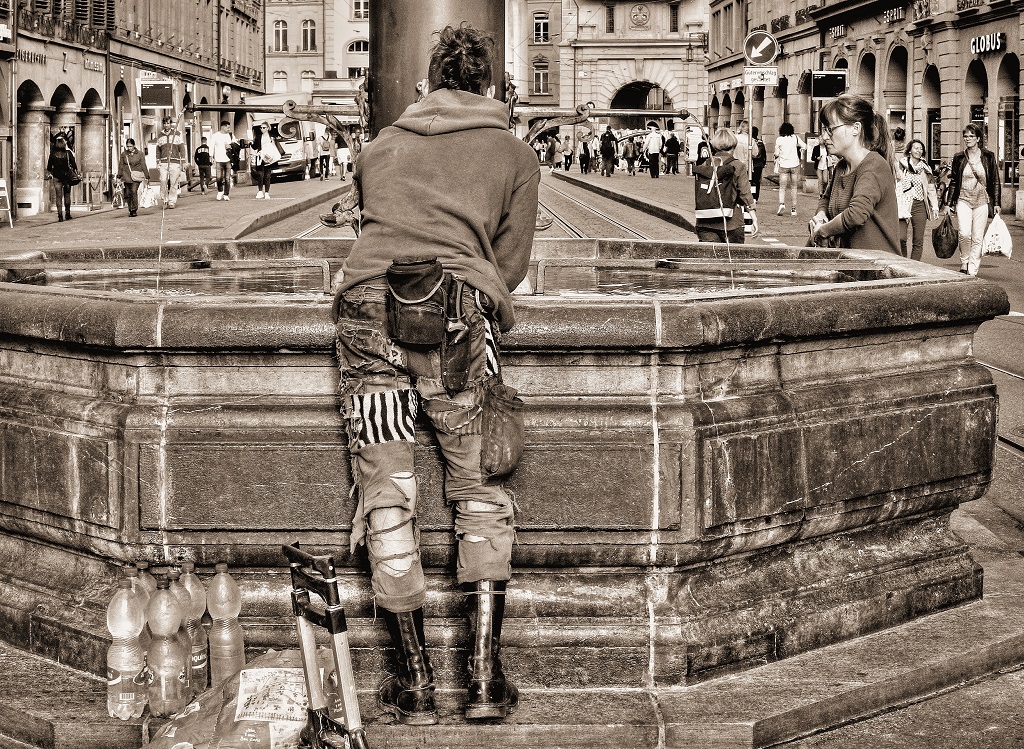
Hi Pinaki - All those colors are exciting; I would go crazy with such photographic opportunities! My feedback is about the composition. The wonderful central figure is obviously the subject but the guy gesturing in the back keeps drawing my eye away from him. Overall, the image conveys the atmosphere of an Egyptian market. |
Nov 20th |
| 58 |
Nov 23 |
Reply |
Hi Pinaki -- Thanks for your feedback. The idea was definately to convey the depressing atmosphere of the place. Sometimes I find ugly subjects interesting photographically. I think you're right about cropping the bottom edge more. |
Nov 13th |
| 58 |
Nov 23 |
Reply |
Glad it was useful! |
Nov 5th |
| 58 |
Nov 23 |
Comment |
Hi Ed -- I also agree that the mono version shows more detail. The figures nicely suggest the scale of the surrounding trees. I would suggest cropping some from the bottom to tighten things up a bit and eliminate some distracting lighter areas like the bottom right corner and the curved fern near bottom center. |
Nov 5th |
| 58 |
Nov 23 |
Comment |
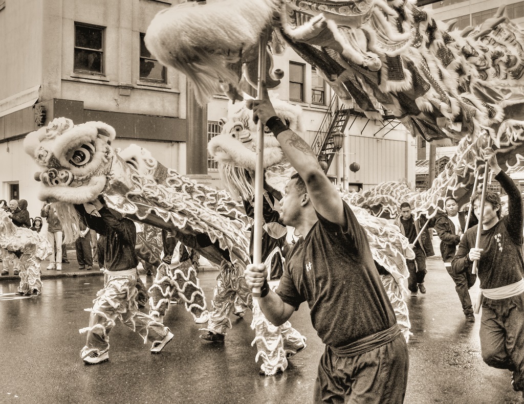
Isaac, you have the most interesting locations. Those beautiful saturated colors are like candy for my eyes. Honestly, though, I actually like the upper original shot showing the attendants receiving the gifts(?) even better. The men's faces and their clothing are interesting, as well as the goddess behind them. The wider shot has an awful lot going on. |
Nov 4th |
| 58 |
Nov 23 |
Reply |
Thanks, Ed. I appreciate your thoughtful perspective. I agree that a person in the shot would have to "match" the atmosphere and I'm not sure what that would look like. To me the image is about the backside of life; the part that's often hidden. The flag decoration in this setting seems particularly grim. I like your mono version, but I agree with Isaac about wanting the flag in color. |
Nov 4th |
| 58 |
Nov 23 |
Reply |
Hi Isaac - I see your point about scale. I usually prefer to have figures for scale, but in this case the emptiness of the landscape and this semi-deserted old town seemed to want a different treatment. None of the several images I made there show any people. It was a creative decision. |
Nov 4th |
5 comments - 6 replies for Group 58
|
| 99 |
Nov 23 |
Comment |
Hi Gerard -- You've given me lots of great feedback to think about. I do like the tighter crop that you've suggested. Since the image is really about the various textures, eliminating the clutter centers the interest on the real subject. I appreciate your observations. |
Nov 20th |
| 99 |
Nov 23 |
Reply |
Linda -- Thanks for the good feedback. The textures are what it's all about, I think. Your crop does look cleaner with less of the dirty wall. |
Nov 20th |
| 99 |
Nov 23 |
Reply |
Hi John -- Glad you enjoyed the image. Thanks for the feedback about competition and the overall tonality. I know nothing about competition but it would be interesting to learn about it. Any suggestions? |
Nov 20th |
| 99 |
Nov 23 |
Reply |
Thanks, Barbara. I see what you mean about the tones being very similar. Perhaps a little more contrast would be an improvement. |
Nov 6th |
| 99 |
Nov 23 |
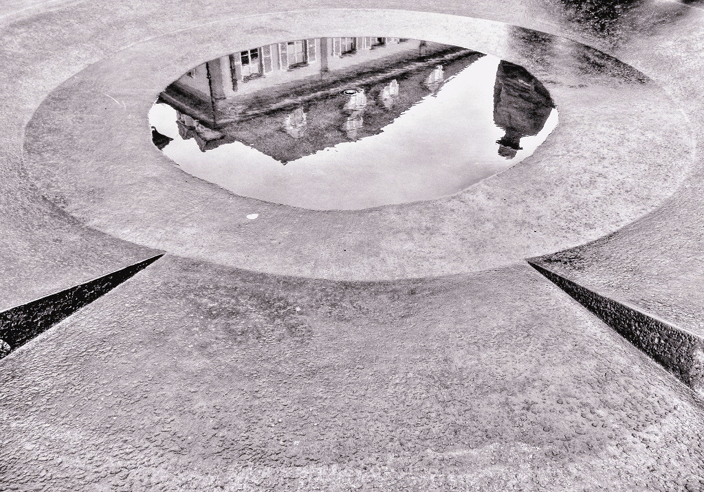
Comment |
Gerard -- You found an interesting solution for your vaulted ceiling/dead end problem. I agree with Peter about the face needing to be higher. I'm wondering about the dark arched vignetting between the face and the vault. It seems distracting to me and I can't stop looking at it. BTW: I think you've got a ribbed vault here rather than a barrel vault. Not that it matters. I'm envious you got to climb up on that scaffolding for a close look!
|
Nov 5th |
| 99 |
Nov 23 |
Comment |
Hi John -- A very pretty little lighthouse. I find myself wanting more from this image than it's giving me. I feel like I want to know more context for the Great Lakes environment around the impressive rock and this rather decorative lighthouse. It's a nice documentary shot but I'm having trouble with the tight vertical cropping. Just a thought! Welcome to the group. |
Nov 5th |
| 99 |
Nov 23 |
Comment |
Barbara -- I enjoy your quiet minimalist plant studies. This is nice and sharp so every element of the seedhead reads clearly. Isolating the stalks against black works beautifully. Wouldn't change a thing. |
Nov 5th |
| 99 |
Nov 23 |
Comment |
Linda -- I agree with Peter about cropping the left tree and maybe a sliver from the top. The image has a silvery quality that really appeals to me. My eye wants to go to the fallen trees on ground. They seem even more interesting than the standing trees, as you pointed out. Thanks for sharing this. |
Nov 4th |
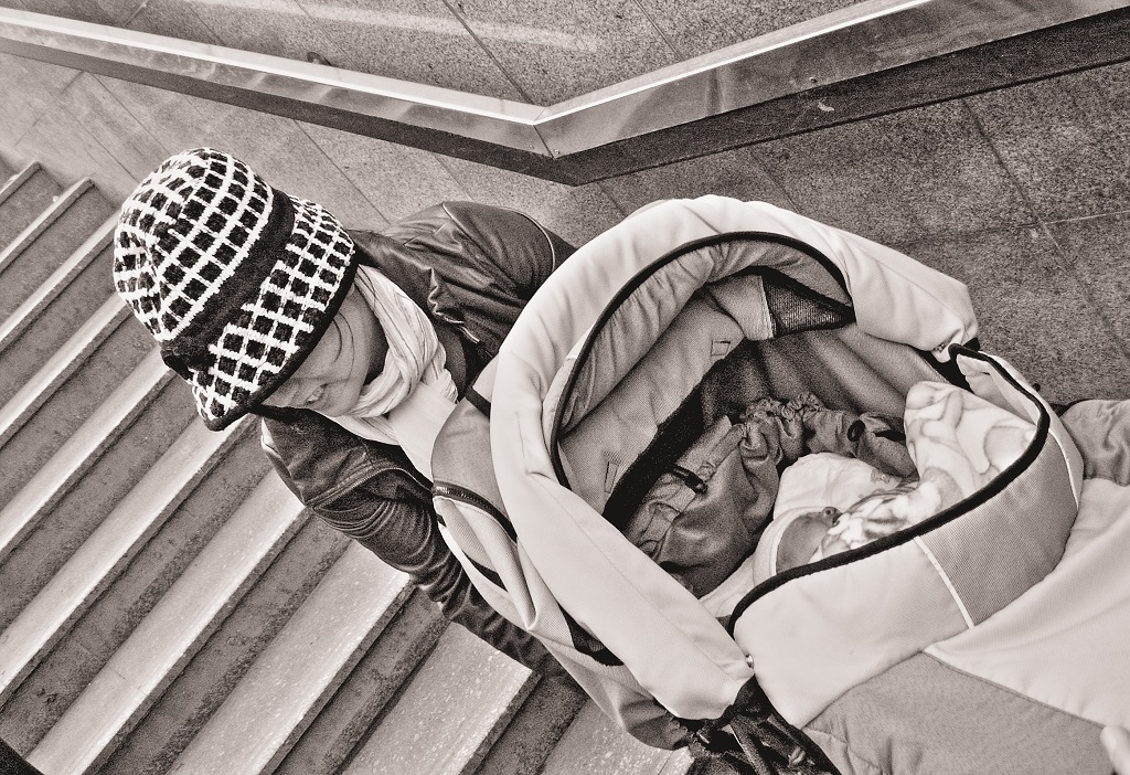
| 99 |
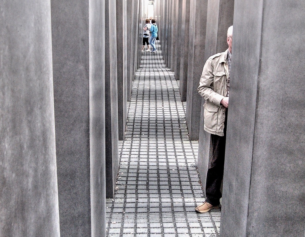
Nov 23 |
Comment |
Peter-- All kinds of interesting elements here. Monochrome certainly seems like the right choice. The woman really interests me. Her expression seems stressed; she's working, has her hands full - literally, there's her toddler looking for attention as well. And Batman looking on. Great story-telling. The curved lines on the fancy pram add some nice interest. |
Nov 3rd |
| 99 |
Nov 23 |
Reply |
Peter, thanks for saying what you think! Perhaps the fact that he's French is not relevent now that you mention it. I also find the multiple chair backs visually interesting. The combination of the hat and the little bit of profile worked for me. It will be interesting to hear how others see this. Thanks for your honesty! |
Nov 3rd |
6 comments - 4 replies for Group 99
|
11 comments - 10 replies Total
|